My Account     Contact Us     Cart

Optimizing Adobe Illustrator Documents with MAPublisher for Geospatial PDF Export

Adobe Illustrator documents with GIS data can be exported to georeferenced PDF files thanks to the MAPublisher Export Geospatial PDF feature. A geospatial PDF is an Adobe Acrobat file that contains geospatial coordinates. With coordinates, users can view and interact with the PDF to find and mark location data. MAPublisher exports all the MAP Attributes data in an Adobe Illustrator document into the geospatial PDF. Attribute values can subsequently be accessed and searched in Acrobat 9 (and 8 with limitations).

In order to ensure the best interoperability and geospatial PDF output results from your MAPublisher documents, the following work practices are recommended:

Convert document color mode to RGB

To ensure predictable color results, it is highly recommended to convert the documents color mode to RGB prior to exporting to Geospatial PDF. This is advisable especially if generating geospatial PDF documents to be used in conjunction with the PDF Maps app for IOS devices. The document color mode can be changed in Adobe Illustrator through File > Document Color Mode > RGB Color.

Colour mode

Crop data to the required extents using the MAP Vector Crop Tool

Remove any extraneous data not required for the geospatial PDF document by cropping the map using the Vector Crop Tool (located in the Adobe Illustrator Toolbar). If necessary, exclude data from being cropped by locking the its the appropriate layers.
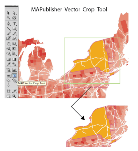
Vector crop

Remove unnecessary layers

Delete any map layers that are not required for the final PDF map document. This may include raster layers, hidden layers, and layers that are outside the mapping extent or art board. Not only will this decrease file size, it will also simplify your layers list and improve organization. Delete layers in the MAP Views panel or the Layers panel.
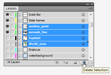
delete selection

Preserve data contained within sublayers

If your document contains map data organized within sublayers it will be necessary to reorganize/move this data to it’s parent layer if you wish to preserve it when converting to and from geospatial PDF. This is necessary because data contained on sublayers are forced into their parent layer by the Adobe Illustrator PDF exporter. Layers are also required for importing a geospatial PDF back into MAPublisher in order to assign a schema.

Remove unused attribute information

Data sets, especially those available through various data portals and government agencies can contain attribute information not suited or required for our mapping need, or perhaps we are only interested in the geometry of the data for representational purposes. In this case it is advisable to delete any attribute information that does not fulfill a purpose as this will unnecessarily increase the resultant file size. Select your data, open the MAP Attributes panel, and click the Edit Schema button. You may delete and organize your attributes using this panel.
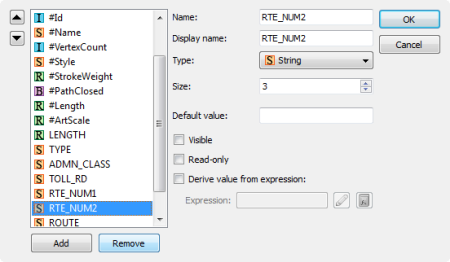
Edit attribute schema

Assign MAPublisher attributes to Adobe Illustrator Object names

This recommendation is not necessary but may be useful in some cases. In MAPublisher the #Id attribute column is a unique identifier MAPublisher uses internally to associate attributes with unique pieces of art. By default the art will have a name of “path” or “compound path” however it may be desirable to tag the object with a unique identifier from an existing attribute column for the purposes of making it easier to differentiate art objects within the Acrobat tree list, for example.

To do this we can use the “Apply Expression” option in the MAP Attributes panel. Simply designate the #Name column as the “Apply to” option while entering the name of the attribute column you wish to derive the attributes from as the “Expression”. For example in the screeshot below we are renaming the art objects contained in the #name column with values stoed in the “ROUTE” column with the results being reflected in the artwork listed in Illustrator Layers panel.

Use the Simplify Line Tool

Reduce the number of vertices available in MAP Line and Area layers by using the Simplify Line tool (located on the MAPublisher toolbar). This differs from the Adobe Illustrator Simplify Path tool because it takes into account X and Y coordinates. The proximity value or simplification tolerance is based on the vertical difference between the begin-end line and points off a line, not the distance between anchor points on the line.
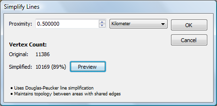
Simplify lines

Geospatial PDFs derived from or include images should be generated as 72 DPI

This has particular relevance when dealing with geospatial PDF files, especially those generated with Geographic Imager. When a 200 DPI (dots per inch) georeferenced image is converted to a geospatial PDF, the image will be embedded in the PDF as a 200 DPI image. However, when displayed by PDF viewing applications such as Acrobat or Illustrator it will appear as a 72 DPI image. Due to this, on export, MAPublisher converts the referencing to 72 DPI format since it must be imported back as 72 DPI
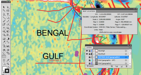
Geospatial PDF at 72 DPI

Following the above recommendations should help ease the transition of your MAPublisher documents to and from geospatial PDF.

 

Making dashed lines intersect at every intersection in MAPublisher

One of the great advantages of using Adobe Illustrator for a mapping project is that you can make great line styles easily. For example, to make a double line stroke and one of them is dashed:

01: Double Stroke Line

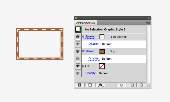
Double strokes are a line graphic style where two different line strokes overlap each other. For example, the image shows that there is a stroke with a brown color and its stroke size is 3 pts. On top of this brown line, there is a 1 pt white dash line:

02: Double stroke lines with the settings shown in the appearance panel

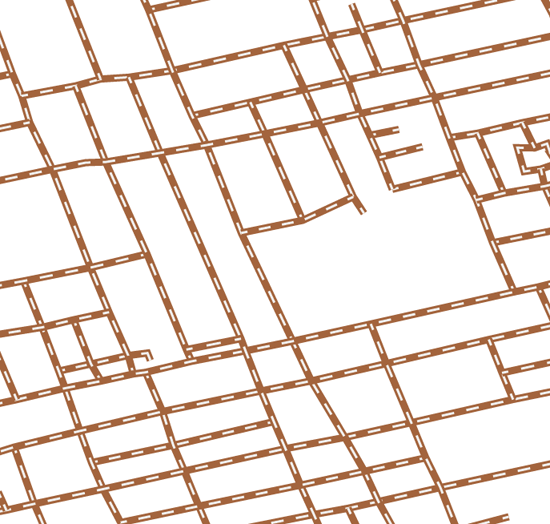
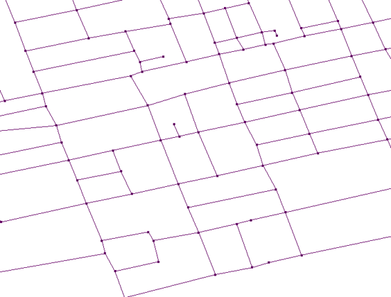
You might have an experience where you duplicated one line layer and assigned a different style for lines in each of those layers. However, this has some disadvantages. The file size will increase because all the line segments as well as the attribute information attached to every line object is duplicated. Also, when you apply the double stroke line to road layer, the white dash line does not intersect nicely at every intersection of the map:

02: Double stroke problem

With Adobe Illustrator CS5, these problems are solved.

0) Create a graphic style like the one shown above.

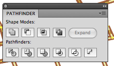
1) Open the Pathfinder panel (Window > Pathfinder).

03: Pathfinder Tool

2) Select all the line objects in the line layer.
Click the outline tool 04: Pathfinder - outline tool .

This function in the Pathfinder tool breaks lines at every intersection.

03: Pathfinder - function: breaking lines at every intersection

All the selected objects which were selected at Step 2 will be broken into segments at every intersection and they will be grouped as one object in the layer.

04: Pathfinder result - all the objects are now grouped.

3) Having the grouped objects selected, apply the graphic style with the double stoke.

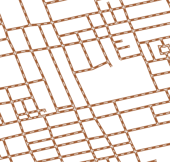
4) The white dashed line is intersected at every intersection nicely.
05: dashed lines intersect at every intersection

Quick tip

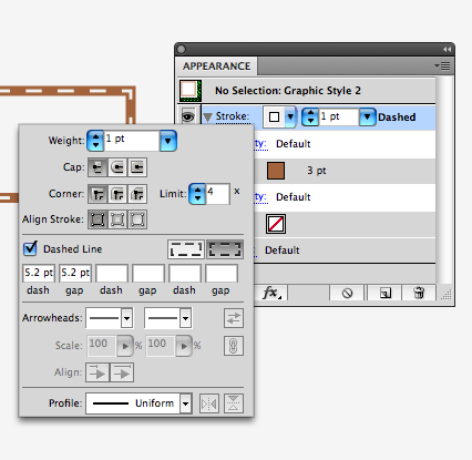
When creating double stroke, make sure to select the option trick tool “Align dashes to corners & path ends, adjusting length to fit” available next to the dash line option.

Note

Since this operation involves a pathfinder functions, the attribute information will not be matintained after the “outline” function is applied to those selected line works. Our development team is looking for a possible solution to keep the attribute information for the future version of MAPublisher.

Styling a MAPublisher Scale Bar

After generating a scale bar, it is placed in a MAP Legend layer. You can accept the default look of it, but majority of users will want to customize and style it to match their map.

Now I’ve just generated a simple scale bar. If you expand the Legend layer, you can see the object “MAPublisher Scalebar” is placed within it. This is a special object generated by MAPublisher and there is currently a dynamic link between the MAP View information (i.e. spatial information) and the scale bar object.

Generated Scale bar in the MAP Legend layer

In order to make a custom scale bar, you will have to break the dynamic link between MAPublisher and the scale bar object. In your own workflow, it’s important that you setup the scale before breaking the link because it will not rescale dynamically after the link is broken. Break the link by expanding the generated object.

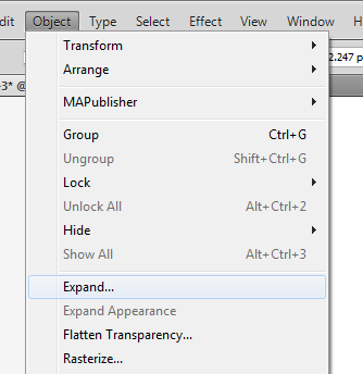
From the main menu, choose Object > Expand.

From Adobe Illustrator Menu, Object > Expand

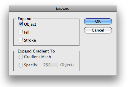
In the Expand dialog box, click the “Object” check box, then click OK.

Expand diaog window

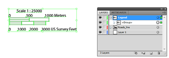
The result: the object <MAPublisher Scalebar> is replaced by an object called <Group> in the Layers panel. The connection between the scale bar object and MAPublisher is removed. The art in the scale bar object simply became grouped objects.

Expanded Scale Bar Object

At this point, select objects in the group and change its colors and lines by using the direct selection tool Adobe Direct Selection tool. The direct selection tool allows you to select individual object even if select objects is a part of a <Group> object.

If you are more comfortable with the selection tool Adobe Illustrator Selection Tool, you will want to read the suggestion below. It works, too.

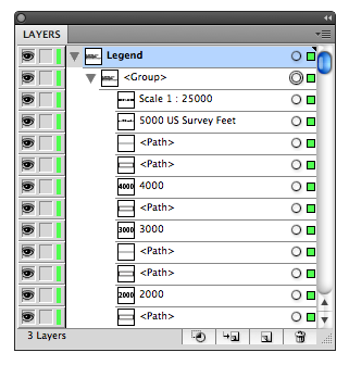
Take a look at the Layers panel again more closely. The screen capture of the Legend layer above shows that there is a <Group> object under the “Legend” layer. When the object tree under the “Legend” layer is expanded, you can see another <Group> object nested within a <Group> object. (a <Group> object containing a <Group> object). Since all the objects are still grouped, you can simply “ungroup” the art.

Expanded scale bar in the Layers panel

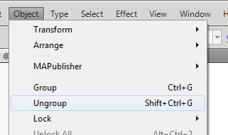
Select the <Group> object (i.e. the scale bar object for this example), then from the main menu, choose Object > Ungroup.

Adobe Illustrator menu: Ungroup

When you ungroup the object once, you now see only one <Group>. This <Group> object contains all the text, lines, and area objects composing a scale bar object.

Ungroup Once

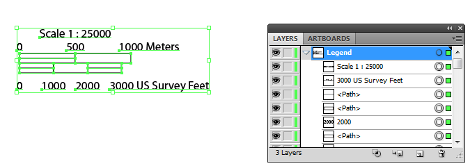
Now, ungroup the object once more. Finally you do not see the object <Group> anymore under the “Legend” layer. It indicates that every object in the layer can now be selected individually using the direct selection tool.

After the grouped object is ungrouped twice ....

Select the objects to edit and style them using Adobe Illustrator tools!

At the end ... now ready to be customized

Using MAPublisher and Illustrator tools to create great looking road layers

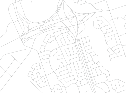
Here’s a question we receive at Avenza support quite often: I’ve located and imported a GIS layer of road lines with attributes for the city I’m mapping. How can I turn this:

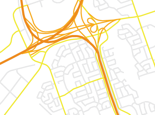
into this:

Getting Started

The workflow for this process involves the use of both MAPublisher and Adobe tools, specifically MAP Stylesheets and MAP Selections along with Illustrator’s Graphic Styles and the Appearance Panel.

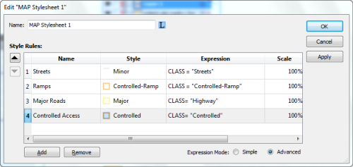
This process works on roads that have an attribute on which you can base classification rules. My road data has a column named “CLASS” with four categories: Controlled, Controlled-Ramp, Highway, and Street. I’ve created a graphic style for each and loaded them using “Open Graphic Style Library”. I keep the road styles I have created in a template document titled RoadStyles.ai so that I can import the graphic styles I need into whatever map I’m making from my template (see Adobe Graphic Styles Help).

Controlled Access Highway: Controlled Access Highway
Controlled Access Ramp: Controlled Access Ramp
Major Road: Major Road
Minor Road: Minor Road

These styles all have been created using the Illustrator Apprearance panel to overlay two strokes, the top stroke with a smaller weight and different colour than the bottom stroke (see Adobe Appearance Panel Help).

With our graphic styles set I can now apply the MAP Stylesheet I built using the following expressions:

Cleaning up with groups

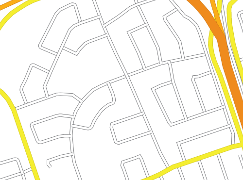
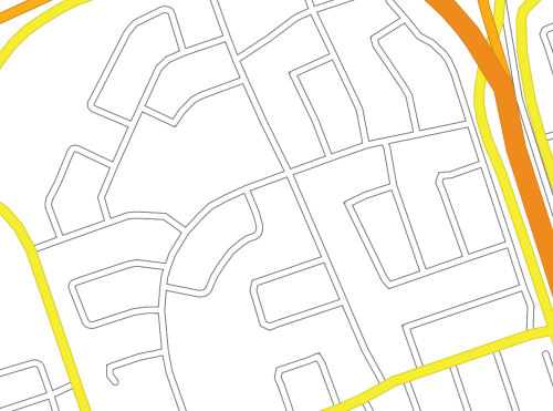
Once we apply these styles using MAPublisher Stylesheets, we will see what steps we muys take to get the appearance we want. Our roads look like this:

but we want them to look like this:

Why does this happen?

This occurs because MAP Stylesheets applies graphic styles at the path level. To look like intersections, each road classification must become one object, whether by being grouped or by turning the various paths into a compound path. Grouping is the preferred method for managing these objects since a compund path will delete the attributes of all paths that are being compounded. In this case, the street names field would be blank for our compound path object as dozens of streets are turned into one compund path. The consequence of this would be to make automatic labelling with MAPublisher Label Pro impossible. A set of paths turned into a group will not have their attributes available to MAPublisher while in a group, however these objects can always be ungrouped making individual paths and their original attributes available again.

Grouping Objects

In order to group our road classes we will have to select the road paths belonging to each class. The expressions we created when defining our MAP Stylesheet rules are available to us to use again through the Expression Library (new in MAPublisher 8.3). We can use MAP Selections to individually select each of our road classes. Once selected the street classes can be grouped using CTRL+G on your keyboard or Object > Group from the menu (See Adobe Group Help). The final step is to re-apply the graphic style appropriate to each group using the Adobe Graphic Style panel.

If we want to get technical here in considering what has happend to our artwork, using the Appearance panel we can see that each of the paths we initially imported now has a graphic style applied to it on two levels: at the path level (done through MAP Stylesheets) and at the group level (done by grouping and applying a graphic style to the group). It is possible to symbolize our artwork even further, at the layer level, by slecting the target symbol for our roads layer (See Adobe Layers Help). If desired we could apply a transparency at the layer level that would supersede all graphic styles used on objects in the layer. Our artwork will now have symbolization that suggests intersections, giving our road map a much neater appearance.

Tweaking

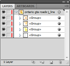
Now that our roads are grouped together, they are much easier to manage in the Illustrator Layers panel.

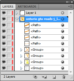
Groups can be stacked easily. My preference is to arrange with minor roads at the bottom, increasing to multi-laned divided highways at the top of the hierarchy. With our objects grouped it is easy to move objects between groups. Any path can be selected using the Direct Selection Tool and dragged in the Layers panel between groups. This is much simplier than having to use the Appearance panel to strip the path of both graphic styles and apply the desired style. There will be some situations where we will need to override the intersection appearances that result from grouping. In this image we have onramps that definitely do not interesect as this line work suggests!

To do this we must select the road lines that will be on top of the intersection, and using the Illustrator Layers panel, drag them from their group (it does not matter where in the layer hierarchy the are placed).

Our ungrouped ramps can now be sent backwards and forwards relative to other paths, giving a truer representation of the road network:

Using MAP Stylesheets to create a Legend

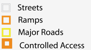
So why use stylesheets if we must manually group the objects after use? For a few reasons: it keeps us organized, it adds the expressions to the expression library, and most importantly MAP Stylesheets can automatically generate a Legend for us that reflects our Stylesheet rule names:

Good luck creating customized road styles! A deeper understanding of the Illustrator object styling hierarchy can go a long way in helping you use MAPublisher to leverage your GIS datasets!

News Archive