Are you using Adobe Creative Cloud 2015? Would you like to improve the performance of Adobe Illustrator? If so, participate in the Adobe Illustrator GPU performance beta program by registering here. Your participation will significantly help to improve the performance of Adobe Illustrator in the future.
Adobe CC 2015 introduced a new feature in Illustrator Preferences and depending on the combination of the environment components, you might have already experienced that the performance can be really slow especially when making maps. We all know that many Illustrator files with cartographic projects can be very complex in terms of file size, layer/object structure, number of features, geometry, effects and tasks to every object applied. As a result, even if a supported GPU card is installed, the performance of Adobe Illustrator can be very slow.
We would like to introduce this beta program to you and our customers so that we can assist the Adobe Illustrator team to receive the customer feedback directly to help the development of the future version of Adobe Illustrator. If you could participate in this beta program, your voice will directly reach to the Adobe Illustrator team so that they can closely investigate to enhance the feature.
If you or your organization have a floating license for MAPublisher or Geographic Imager, this blog post is for you. Having a floating license provides you with a lot of flexibility when you want to bring your laptop computer outside your work network and use MAPublisher and Georaphic Imager at home or in the field.
Let’s say you have a laptop computer and you want to work on your mapping project outside your office network. You can do it if your organization has a floating license.
Step 1: Make sure all the software is installed
On your laptop computer, make sure that you have MAPublisher for Adobe Illustrator or Geographic Imager for Adobe Photoshop installed and that there is a valid floating license (for one or each product).
Step 2: Connect your laptop to the network and to the licensing server
If you are not sure how to connect your laptop to the network and to the server, please contact your IT administrator. It is essential that your laptop computer is connected to the license server so that you can obtain a liecnse from it.
Step 3: Follow the steps in the MAPublisher/Geographic Imager license management window
Open the License Management dialog box.
If you’re using MAPublisher, access MAPublisher by going to Help > MAPublisher Licensing > License Management.
If you’re using Geographic Imager, access License Management by going to File > Automate > Geographic Imager: License Management.
Click the Floating button to open the Floating License Setup dialog box.
Make sure that the “Allow roaming licenses” option is selected. Click OK.
Click the “Use roaming license” option and specify the number of days in the Duration of borrow option. This indicates how long you want to use the license outside of your network.
Clicking the “Checkout” button will change the status of the license. In this example, we borrowed a license from the license server for two days (December 16, 2015 starting date).
Now you will be able to use your MAPublisher or Geographic license when your computer is disconnected from your work network. You might want to test it by closing Adobe Illustrator or Photoshop, disconnect your computer from the network, restart Adobe Illustrator or Photoshop, and see if you can use MAPublisher or Geographic Imager.
Having introduced some background information about text insertion point coordinate values in a previous post, it would be good to explore if this method works when trying to place text objects (annotations/labels) with a specific offset value. For example, if you have a point layer and there is an attribute for the offset value so that every object has a different offset value.
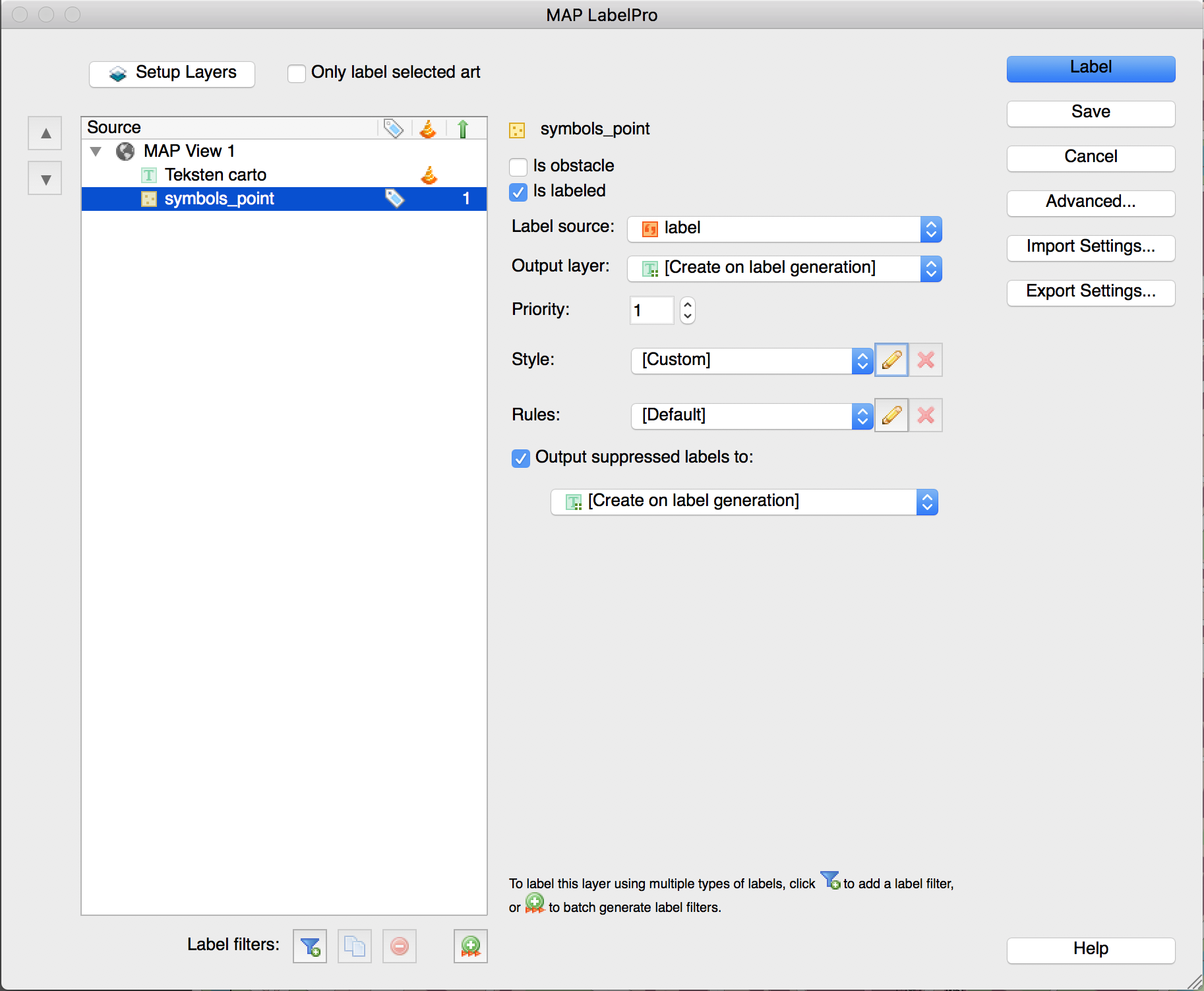
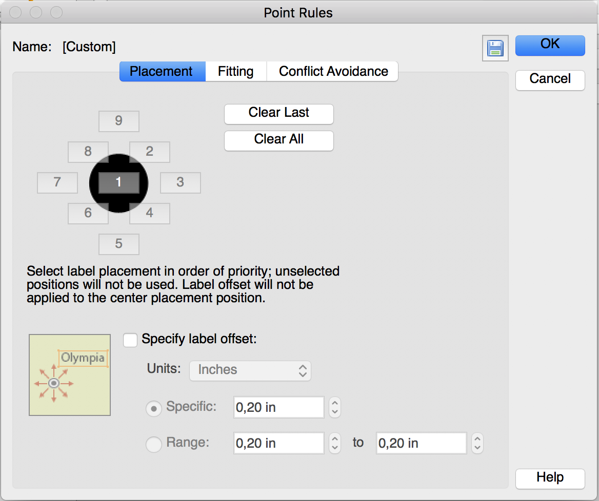
Placing text objects with a specific offset is possible in MAP LabelPro. You can specify the Label Offset value in the MAP LabelPro dialog box. However, this setting will be applied to all text labels. In the example below (see screenshot), all the text will be placed 0.2 inches away from the object. However, that does not help when every point has different offset value like this example. Also, MAP LabelPro uses page units, not the world/map units. In this example, the offset distance was specified in the world/map unit (metres).
There are two methods you can accomplish to make the text placed with offset value. The first method is the same as the step shown above. You can adjust the text placement position by calculating the “ideal” coordinate for the text insertion point. From a MAP layer (point, line, or area), generate text with a MAPublisher feature (MAP LabelPro or Feature Label). Then adjust the text position (maybe you will have to calculate a new position by adding/subtracting the offset values from the current point), then apply it to #MapX and #MapY. The second method is to adjust the position of the points first before labeling.
In the example below, a point layer with offset values in the attribute: x_Offset and y_Offset.
Step 1: Calculate coordinates with offset.
Create a copy of the layer just because the point value will be adjusted.
Make the #MapX and #MapY visible (so that it’s easy to see when calculating).
Create new columns (here we created “x+coord_withOffsetX” and “y+coord_withOffsetY”).
Calculate the new coordinate of the points for X and Y (here we used Apply Expression) as shown below.
Step 2: Move the points to the calculated coordinates with the offset values.
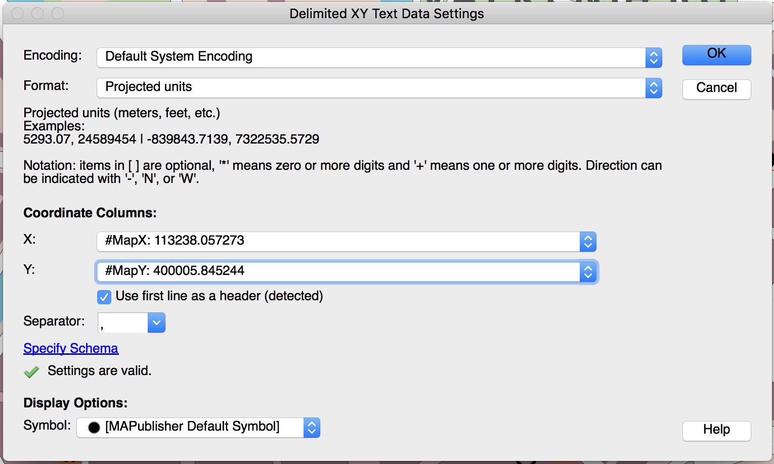
Use the same method as the one introduced in the previous post. This method works for the Point layer as well. Open the Edit Schema window and apply “x_coord_withOffset” and “y_coord_withOffset” to #MapX and #MapY, respectively.
Now, the points are moved to new position. The red point is the original and the blue points are the ones moved to the offset. Now you can label each points. After placing labels for the point layer (blue), you can make the point layer invisible.
Now you can run the label engine (MAP LabelPro / Label Feature) for the new point layer with offset.
In this blog post we’ll look at how you can control the order of layers in MAPublisher when using FME Auto.
FME currently doesn’t provide a way to explicitly define the output order of Feature Types in a workspace. In the Navigator you can reorder Readers and Writers to control the order in which they are run, but unfortunately you cannot do the same with the Feature Types they read and write respectively.
By default when you write layers to MAPublisher from FME using FME Auto, the layers are arranged first by geometry (text first, then Points, Lines, Polygons and lastly Images), then alphabetically by layer name. This behaviour can be changed by unchecking the FME Auto Parameter “Sort Layers by Geometry”. Once this has been turned off, MAPublisher will display layers in the order they are received from FME. Using this behaviour, some FME transformers and a Feature Type fanout (or new to 2015.1, specifying the Feature Type name) we can control the order of the layers in MAPublisher for optimal cartographic output.
The first thing we want to do is to add some input Feature Types.
We will then create a template AttributeCreator Transformer to give each layer two attributes: MP_LayerName and MP_Order. MP_LayerName will define the name of the layer in MAPublisher and MP_Order will determine the order the layer is passed to MAPublisher; hence the order in which it is displayed.
Each Feature Type will be connected to a copy of the AttributeCreator Transformer and the values will be populated for that layer. The layer with an order of 1 will be on top with larger numbers descending below.
Layer Name
Order
Border
1
Graticules
2
Pacific Groupings
3
Tiny Countries
4
Coastline
5
Lakes
6
Countries
7
Rivers
8
Glaciated Areas
9
Land
10
Ocean
11
Once this is done, all the inputs can be connected to a Sorter Transformer. The Sorter will be set to numeric and ascending.
Finally, the MAPublisher writer is added. The Sort by Geometry parameter needs to be set to No and the Feature Type name should be set by the MP_LayerName attribute we created earlier. This replaces Feature Type fanouts and has slightly new behaviour at FME 2015.1. It is explained more fully (here).
Once we run the workspace, we’ll see the layers in the Adobe Illustrator Layers panel in the exact order we specified.
Our friends at Cartagram published a blog about adding MAPublisher Web Author maps into WordPress. Using this workflow, anybody can add custom maps to their WordPress blog.
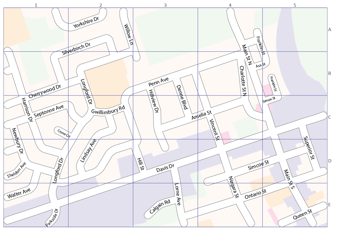
After a text placement engine places labels (e.g. annotations or labels) some manual adjustment is usually required. The major reason for this task is to avoid text colliding with other objects and to improve map aesthetics and composition. Here is an example map with the position of labels manually placed and adjusted. What do you usually do when updating your map and you have to update those labels?
When running a text placement engine, it is common that the placed labels (in red) do not match with the position of the existing labels (in black). Have you ever thought that it would be useful if the updated labels can be positioned in the same place as existing labels? This is definitely possible using a combination of MAPublisher features.
Workflow involved to perform this task:
Obtain the position coordinate of existing text objects
Create new attributes to record #MapX and #MapY of each text object insertion point
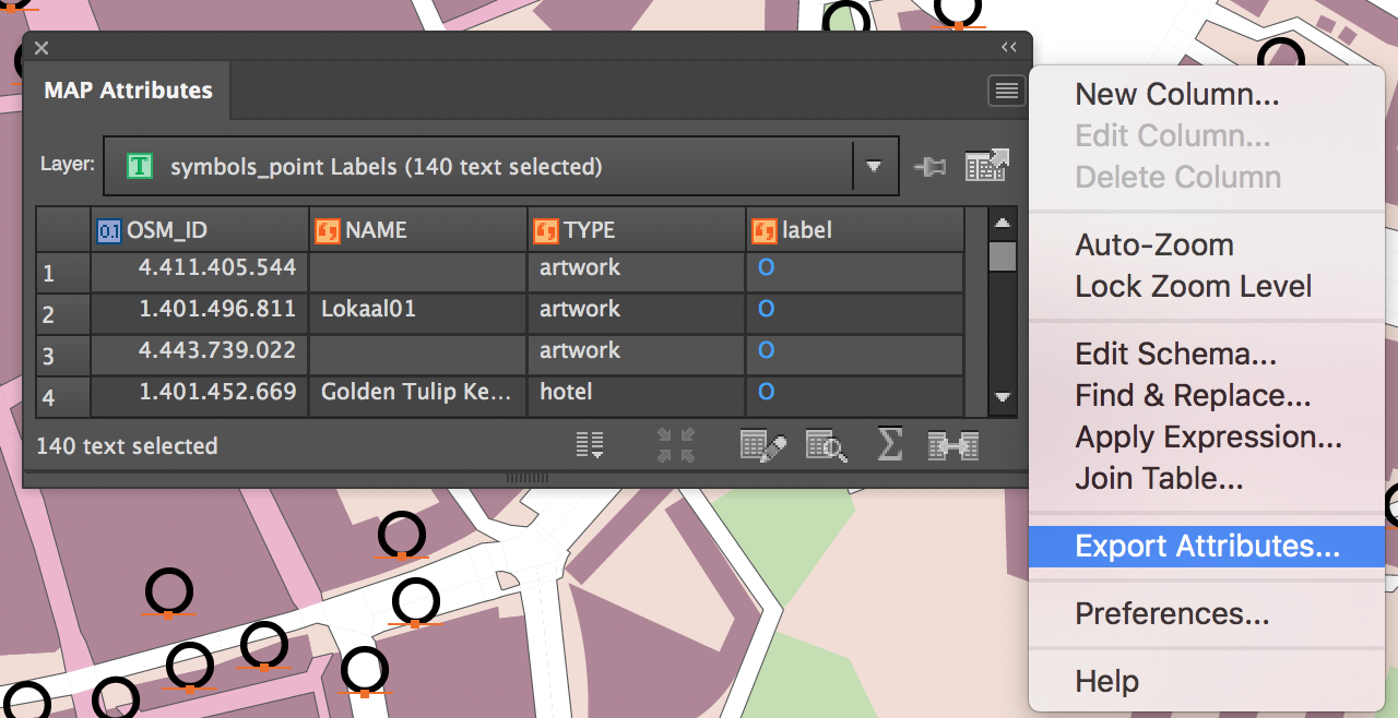
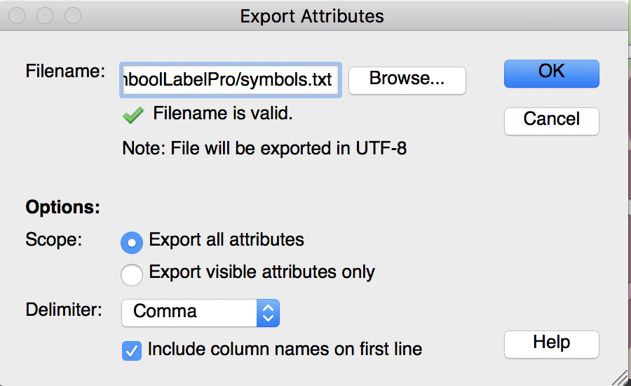
Export the attribute table as a text file
Transfer the deteremined coordinte values of the text objects to the MAP layer (point layer in this example)
Join Tables using a common attribute between two tables
Place labels for the MAP layer
MAP LabelPro or Label Features
Adjust the position by those determined coordinate values for the text objects
Applying the recorded value to #MapX and #MapY
Step 1: Find the coordinates of the text insertion point from a text layer.
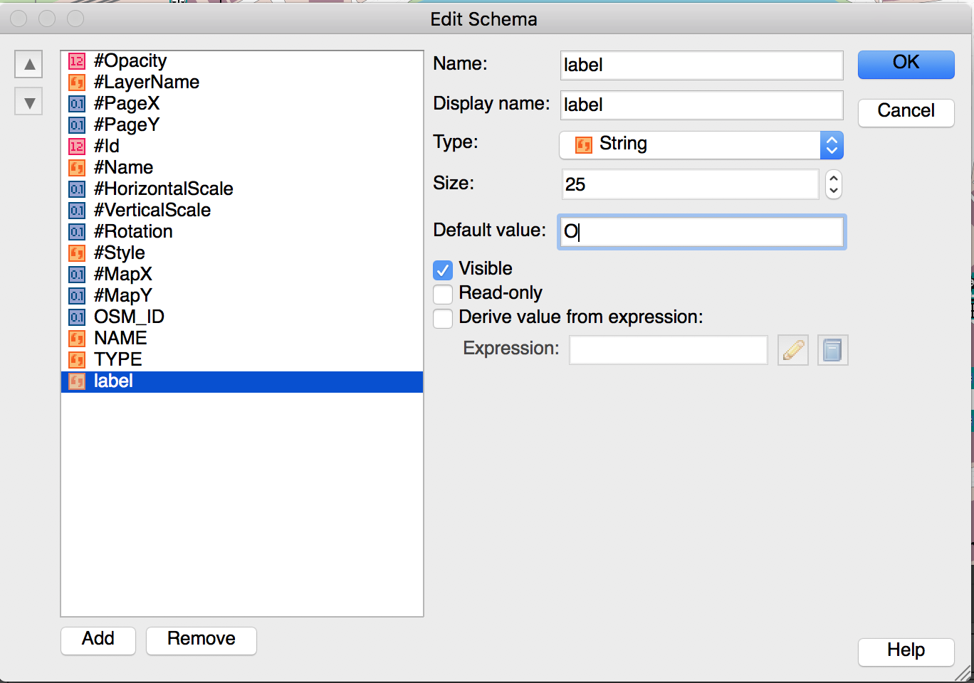
Every map object (point, line, area, image, and text) has a coordinate. MAPublisher calculates an insertion point when map objects are added to the artboard. For labels, a text insertion point can be seen as an anchor point or the square dot that is at the beginning of a text object. In this example, the text insertion point is placed at the lower-left corner of the word “Le Crocodile Restaurant” (highlighted in the red color in the screencapture below). The coordinate of this text insertion point is represented by the #MapX and #MapY attributes in the MAP Attribute panel. These two attributes are considered MAPublisher properties and are usually hidden. To display them, change their setting to “Visible” in the Edit Schema window as shown below.
Step 2: Record the coordinates of the text insertion point from a text layer.
Make the #MapX and #MapY coordinate values as useable attributes. Create new attributes called “TextCoord_X” and “TextCoord_Y”, then copy the values from #MapX and #MapY using Apply Expression.
Step 3: Prepare to copy coordinates of existing labels to the point layer.
The coordinate values of the text insertion coordinate of a text layer are now copied. The next step is to copy these coordinates from the text layer to the point layer. A simple method to do this is to use Join Tables based on a common attribute. In this example, the string field “RESTAURANT” is the common field in both text and point layers to make a connection. If you already have some other attributes (i.e. object ID or feature ID in both the text layer and the point layer, you should use that). Export the attributes as a text layer from the MAPublisher Attributes panel options menu.
Step 4: Join the Point layer to the exported attributes table.
Now, create a table join between the point layer table and the exported attribute table using the Join Table feature.
Below is the result from joining the tables together. There are also _MapX and _MapY columns because all visible attributes were exported. While the the step of copying attribute to TextCoord_X and TextCoord_Y was not totally be necessary, having columns named _MapX and _MapY could avoid some confusion because the point layer also has #MapX and #MapY columns. In this case, having attributes clearly indicating the values from the text insertion point is what is most important.
Step 5: Place labels with MAPublisher (inherit the attribute values from the point layer to text layer)
Now, place labels with MAPublisher using either Feature Label or MAP LabelPro. The important step here is to inherit the attributes from the point layer to the text layer (the target layer for generating new, updated labels).
When creating a new Text MAP layer, make sure that the “Base attribute schema on:” option is checked. This will allow the text layer to inherit the attributes from the point layer.
Below is the result of placing labels with MAP LabelPro (red labels). The result (in terms of the attribute structure) should be the same if labels are placed using Feature Labels. The position of new labels are not the same as the existing one. The label position can now be adjusted using the TextCoord_X and TextCoord_Y values.
Step 6: Move the text objects by adjusting the #MapX and #MapY.
As illustrated above, the text position is obtained from the text insertion point. The next step is to apply the text insertion point coordinates to the #MapX and #MapY attributes of the point layer using an expression with the Apply Expression feature or use the “Derive value from expression” option in the Edit Schema dialog box.
Apply the TextCoord_X and TextCoord_Y values to #MapX and #MapY, respectively.
The labels are now positioned in the exact same location as the existing text layer.
One of Adobe Illustrator’s powerful yet occasionally confusing features is the ability to apply fills, strokes and Graphic Styles to art at either the Object level or the Layer level. This is extremely useful because you can effectively use Layers to set up symbology templates so that any art that is drawn on a Layer inherits its appearance from that Layer. Confusion often arises when users combine art styles at both the Layer and Object levels, and cannot figure out why their map does not look how they expect it to look. Most of the examples here are going to be based around using the Appearance panel to apply strokes and fills.
Selecting Objects or Selecting Layers
The first decision you have to make is how you select your art. You can either select the layer that the art is on or directly select the art itself. This determines where the changes you make get applied. In order to select the layer, click the circle to the right of a layer name in the Layers panel. You will see that the layer is selected (also known as targeted) by the addition of another circle around the first circle.
To select all the art on a layer you can either click in the space to the right of the circle, or Alt-click the layer name.
If you expand the layer you can see that the art is targeted rather than the layer.
Whichever method you use, you will see the art on the canvas appear as selected.
Of course you can select individual art using the Selection tool or clicking to the right of the circle next to the object name in the Layer panel.
Changing Strokes and Fills
One advantage of selecting art at the layer level over selecting art directly is the access to the strokes and fills in the Appearance panel.
If you select the layer, you do not get direct access to the art’s strokes or fills, however if you select the art you do.
You can add more strokes or fills in the Appearance panel, but if you want to add strokes or fills at the layer level, they are additional to the strokes or fills that are defined at the object level. We can see this if we style the fields individually with different fills, perhaps representing different crop types. We could also add a stroke to each object, or we can add the stroke to the layer. Adding strokes or fills like this is useful when you want to ensure that all art on that layer shares the same symbology.
Directly changing the appearance of objects is reflected both in the Appearance panel and the object thumbnails in the Layers panel.
However, if you add extra strokes or fills at the layer level, these are not shown in the objects thumbnails.
One important consideration is that it is not possible to use the Appearance panel to adjust several pieces of art with different fills or strokes that are applied at the object level. For example, suppose we have changed the colours of several building outlines, and now want to change them back to black. If we select them all, we will see that the stroke option is not available in the Appearance panel, rather it says Mixed Appearances. The fill is still available to be changed as it is the same for all objects.
Altering appearances can have different results if applied to objects or layers. A good example is a street style that is created with two strokes. If this is applied at the object level, each object is considered separate and you end up with overlapping paths.
However, if this style is applied at the layer level, the paths are styled at the same time and appear to be merged.
Applying Graphic Styles
Graphic Styles are great to easily add combinations of strokes, fills and effects to art, and these can also act differently when applied to objects or layers. In the Graphic Styles panel we have a Graphic Style with null fill and stroke, but a drop shadow added. If we try to add this directly to the building art, the null fill and stroke will cause the buildings to disappear.
However we can add it to the Buildings layer and the effect is successfully combined with the object level appearance.
Resolving Appearance Confusion
As mentioned earlier, it is possible to combine object level and layer level appearances. This can get complicated if you have different objects on the same layer with different appearances as well as appearance modifications at the layer level. Trying to work out why you cannot adjust the style of your paths because you are getting Mixed Appearance in the Appearance panel can be frustrating.
The easiest method to fix this is to use the Clear appearance button in the Appearance panel. Keep in mind that this will totally remove any appearance formatting that you have applied to your layers or objects, so it is worth creating Graphic Styles of the appearances you want to retain. Just like changing appearances, this button works at both the object and layer levels.
An example of how layer and object appearances can get confused is multiple white strokes applied to different text objects in different ways. The user has created several text objects labelling fields and added strokes to them in various different ways. However, he’d like to remove the strokes from all the text now. You can see that the different labels all have black fills and white strokes, but are subtly different.
The first thing to do is check the Layers panel. We can see that the target indicator for the Field Labels layer is raised. This indicates that an appearance has been applied to this layer.
Once we click on this we can use the Appearance panel to remove it with the “Clear Appearance” button.
That has removed the stroke from the layer and one of the text objects now has no stroke, but some of them still do.
If you expand the Field Labels layer in the layers panel you will see that some of the objects on the layer also have appearances applied directly to them.
You can select these objects and use the Appearance panel to remove its strokes as well by clicking the Clear Appearance button.
This leaves us with one final label down in the bottom right corner that still has a stroke, but has not had its appearance modified via the Appearance panel.
The easiest way to remove the stroke from this object is just to make sure the stroke is in front of the fill at the bottom of the main toolbar and click on the “None” option. Now all our field labels have a simple style.
How MAPublisher works
MAPublisher styling tools all work on an object level. This is because MAPublisher has the ability to independently style objects by attributes they possess. For example you can create a new MAP Theme for the Fields layer based on an attribute called “crop”. This will style each field differently using depending upon its crop type.
Objects will be styled using standard fills and strokes, rather than using the Appearance panel.
The MAPublisher FME Auto add-on connects the analysis and processing capabilities of Safe Software’s FME Desktop with the cartographic design and publishing environment of MAPublisherand Adobe Illustrator. Since MAPublisher 9.5, it has been possible to import georeferenced raster layers as well as vector data. This adds an extra layer of power and convenience to the FME and MAPublisher integration. The ETL (Extract, Transform, Load) power of FME can be used to pre-process raster images and load them into MAPublisher where they can be overlaid with cartographically styled vector layers.
Several components are needed to load a raster from FME into Adobe Illustrator. This example uses a generic reader for the input features. It then gets the bounding box coordinates and sends them to a second workspace that connects to a Web Map Service (WMS) and downloads Toronto imagery. The information necessary to run the second workspace is stored as attributes that are passed to published parameters in the second workspace. This imagery is stored in an intermediate GeoTIFF, which is then read by the first workspace and sent to the MAPublisher writer along with the original data. The WMS source and working coordinate system are already set, but can be modified if the study area is in a different location.
Several of the key parameters for executing the workspace are exposed as published parameters to make running the workspace easier. The user can set the desired pixel size and the pixel dimensions for the WMS request are automatically calculated. The bounding box can be buffered if required to provide extra imagery around the input data.
MAPublisher MAP Themes are stored in an Adobe Illustrator file that the MAPublisher writer uses as a template. In this case, these MAP Themes are linked to the names of the layers stored in the input data. More flexible themes could be created that bases its symbology on geometry or attribute values.
The example FME workspaces, input data and template illustrator document are attached below in the useful resources section.
Useful Resources
WMS provided by the City of Toronto here
Primary FME Workspace: Download
Secondary FME Workspace: Download
Input Data: Download
Template Illustrator Document: Download
Example completed Illustrator Document: Download
Drawing inspiration from this Safe software blog post we have developed an FME workflow that allows the user to update multiple MAPublisher templates with additional layers using two workspaces and a workspacerunner transformer.
The folder structure for the project follows one possible standard arrangement. A data folder contains the shapefile that is being added to the existing .ai files. An output folder gathers the intermediate .ffs files generated by FME that pass the data to MAPublisher. The templates folder contains the .ai files that will have the layer added to them. Finally the workspaces folder contains the two workspaces required for the transformation.
The runner workspace uses a path reader to get the filenames and paths of the .ai files. A filter is applied to make sure only files with the extension “.ai” are read. After the path reader an attribute creator adds the path for the output .ffs files as an attribute. This is dynamically calculated based on the filenames of the input .ai files.
The full paths to the template files and the paths to the output ffs files are passed as published parameters to the worker workspace. Two published parameters have been created in the worker workspace and linked to parameters in the MAPublisher writer. This allows the writer to take the values passed from the runner workspace. The worker workspace is run once for every file that is in the folder of ai files, and these published parameters update dynamically for each one.
The worker workspace has a shapefile reader that reads in the layer that is going to be added to each template. At this point multiple readers or other transformers could be added to increase the complexity of the transformation.
When the runner workspace is launched each template is opened up, the shapefile is read and added to a new MAPView in the MAPublisher document. Equally it could be added to an existing MAPView with a matching coordinate system. These documents can be left open as shown here, or with the addition of another published parameter new output .ai files could also be specified.
Creating multiple maps that share cartographic styling is a common requirement for MAPublisher users. The most effective way to accomplish this is the use of MAP Themes. MAP Themes are a collection of thematic cartography tools designed to increase productivity by automating how styles and symbols are applied. Creating a number of MAP Themes based on regularly used layers with standard attribute schemas can greatly reduce the amount of time spent styling maps.
This guide will walk through creating and setting up MAP Themes to automatically apply to the appropriate layers upon import. If done correctly, rather than seeing this:
You will see this when importing data to MAPublisher:
1. Data Source
The data used in this guide comes from the publically available CanVec+ topographic database. CanVec+ contains a comprehensive set of layers optimized for display at 1:50,000 that are perfect for topographic mapping. In fact, many of these layers are used in the construction of the CanTopo Topographic mapping series available here.
The layers you receive from the CanVec+ download service will vary depending on what features are present in the extent chosen. The Geogratis Geospatial Data Extraction tool is the most convenient method to retrieve CanVec+ data. This guide uses a selection of CanVec+ layers styled similarly to the CanTopo maps.
All vector data was downloaded in an unprojected geodetic coordinate system and projected into a UTM projection MAP View.
The map shown above contains 12 vector layers and one raster layer, but we will only discuss the styling and configuration of three layers as the process is similar for the rest. You can download the Adobe Illustrator file at the bottom of the page if you want to examine the different layers, their graphic styles and MAP Themes.
MAP Themes are the primary method for applying attribute based cartographic symbology. A powerful feature is the ability to automatically do this on layer import based on geometry type or file name. By defining one or many graphic styles and a MAP Theme for each layer the layers can be automatically styled on import.
CanVec+ themes have a consistent naming scheme that makes them especially suitable for this sort of automated styling. Because each style is always named the same, it is simple to set up the MAP Themes to automatically apply when the layers are imported. The theme names are consistent but somewhat obscure, as are some of the attribute names and values. Luckily there is a specifications document that provides a guide to the various themes, datasets and attributes that are available. A link is provided in the useful resources section below. While the style guide is helpful, it can be difficult to navigate, so it has also been translated into a more easily readable Excel spreadsheet, which also available in the useful resources.
A CanTopo symbology guide is available for download and was used to help define the styles for the different layers used in this map. A link is available in the useful resources section at the bottom. The University of Toronto also hosts an old specifications guide, but as it is almost 14 years old it should not be assumed to be accurate. If you are looking for inspiration though, it is useful.
2. Example A: Building point locations
2a. Building Point Symbol
The Graphic style for the building symbols is a black square rotated to match the value in an orientation attribute. Using the CanTopo symbology guide a correctly sized square was created and then added to the symbol library.
2b. MAP Theme
A new Point Stylesheet MAP Theme was created called Buildings. The appropriate layer “bs_2010009_0” was added to the Theme and a rule was created named “All” as it will apply to all the building point locations. The Rule Expression is set to apply the Theme to all artwork as we want all the building points to look the same.
The Visual Properties tab was used to determine how the buildings would appear. The Symbol property was set to use the Building black square symbol created and added to the Symbol library earlier. The Rotation property was set to use the “orientatio” attribute. This ensures the buildings are oriented correctly.
Finally, and most importantly for the MAP Theme automation, the Auto-assign option was set so that any layer that matches the filename of the imported shapefile would automatically be styled using this theme.
3. Example B: Contours
3a. Contours Graphic Style
Two Graphic styles were created for the contours: one for the regular contours and one for the index contours at intervals of 100m. Both are grey, with the index contours slightly thicker (although it is hard to tell in the Graphic Styles panel.)
3b. MAP Theme
A Line Stylesheet MAP Theme was created called Contours. The layer “fo_1030009_1” was assigned to the MAP Theme. Two rules were created, one for index contours and one for regular contours. For the index contours, the Advanced Rule Expression builder is used to select any contour where the elevation is a multiple of 100, and the converse for the regular contours.
The Modulo (MOD) function makes this simple. For the index contours, the expression built as: “MOD(elevation,100)=0”. For the regular contours, the expression is “MOD(elevation,100)!=0”. The != operator means not equal to.
The Modulo function will be available with a future release of MAPublisher. If you are using an earlier version of MAPublisher, the same result for index contours can be had with this expression:
(elevation/100)-ROUNDDOWN(elevation/100,0)=0
If you do try and apply this MAP Theme with an earlier version of MAPublisher without changing the equations, it will not work and you will get errors.
Each rule is assigned the appropriate graphic style applied in the Visual Properties. Creating Graphic Styles in advance is much easier than trying to remember specific stroke/colour combinations and makes them re-usable.
It is worthwhile organizing them in the Graphic Styles panel and naming the Graphic Styles appropriately so you can easily remember which is which later.
The layer is then set as auto-assigned so that when it is imported in the future this MAP Theme will automatically be applied.
4. Example C: Roads
4a. Graphic Style
The Roads layer is the most complex as there are multiple different classes of roads, that are then broken down into sealed and unsealed surfaces, and can be at grade, tunnels or bridges. Several of the road classes are assigned the same Graphic Style, so each style was named after a representative road class and assigned to several MAP Theme Rules.
4b. MAP Theme
There are defined styles of roads in the CanTopo specifications, but these do not map directly to the attributes that are present in the CanVec roads dataset. There are several attributes that hold information about the composition of the road, but the ones that were used to define the MAP Theme Rules were:
roadclass: a heirachy of road types
structype: defines if the road is a road, a bridge or a tunnels
pavstatus: contains information on the road surface, if it is paved or unpaved.
A Line Stylesheet Theme was created called Roads. The layer tr_1760009_1 was assigned to this Theme. Each road class has its own rule. The rule expression determine what class of road it is, if it is a bridge or a tunnel, and if it is paved or unpaved. An example of this is “Arterial: Paved: Bridge” with the expression:
roadclass=3 AND pavstatus=1 AND (structype =1 OR structype =2 OR structype =3 OR structype =4)
which simply says select art that is an Arterial Road (roadclass=3) is paved (pavstatus=1) and one of four different types of bridge (structype 1 through 4).
As in previous examples, each rule is assigned a Graphic Style in the Visual Properties tab.
The layer is set to auto apply on import.
Once rules are created and applied to all the imported layers the end result looks like this:
5. Hillshade
In addition to vector data, the GeoGratis portal has raster terrain data available for download. There are digital elevation models, digital surface models, and a variety of derived products such as slope and aspect. For this map we downloaded a hillshade and adjusted the opacity so it would blend with the map style. The forest cover layer and the built up areas layer also had their blending modes adjusted so the hillshade would show through.
The hillshade was downloaded in an unprojected geodetic coordinate system and Geographic Imager was used to transform it into the UTM projection used for this map.
6. Final words
In order for the defined MAP Themes to be automatically applied to any imported data, the imported layer filenames must match those defined in the MAP Theme Rules as discussed above. If you would like to try it out with your own CanVec data extract, do the following:
Download the “Canvec_Data_Themes.ai” file linked below for the version of Illustrator you are using. Have a look at the data structure, layer names and MAP View properties of this document.
Also download the appropriate “Canvec_Data_Themes_Empty.ai” file to use as a template.
Download an extract of CanVec data as shapefiles.
Use the Advanced Import functionality to import the shapefiles into the empty document. Reproject the map if desired.
The imported data have the styles applied automatically. However, you will probably have a few layers that have no style. Use the methods detailed above to create new styles for those layers.
Currently, MAPublisher and Geographic Imager are NOT compatible with Adobe 2025 products or macOS 15 Sequoia. Please refrain from updating this software.