


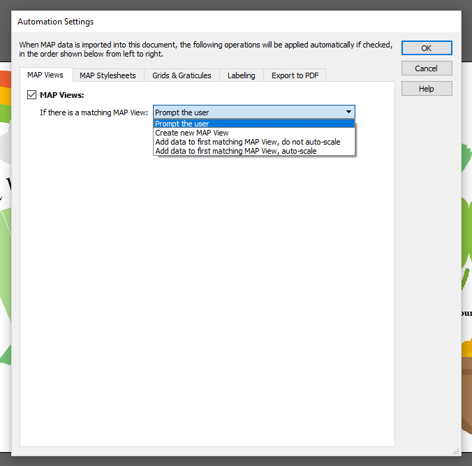
Does your map have data that updates periodically? Maybe your river data gets updated each year, or the lake boundaries change. Typically, this means importing all the data into your map again as things change. To make your life easier, MAPublisher has the option to Manage Data Links, which allows you to check for updates to linked data and to automatically apply the updates to the map! You can even set your MAP Theme Stylesheets to apply to the new data so you don’t have to re-style it manually.
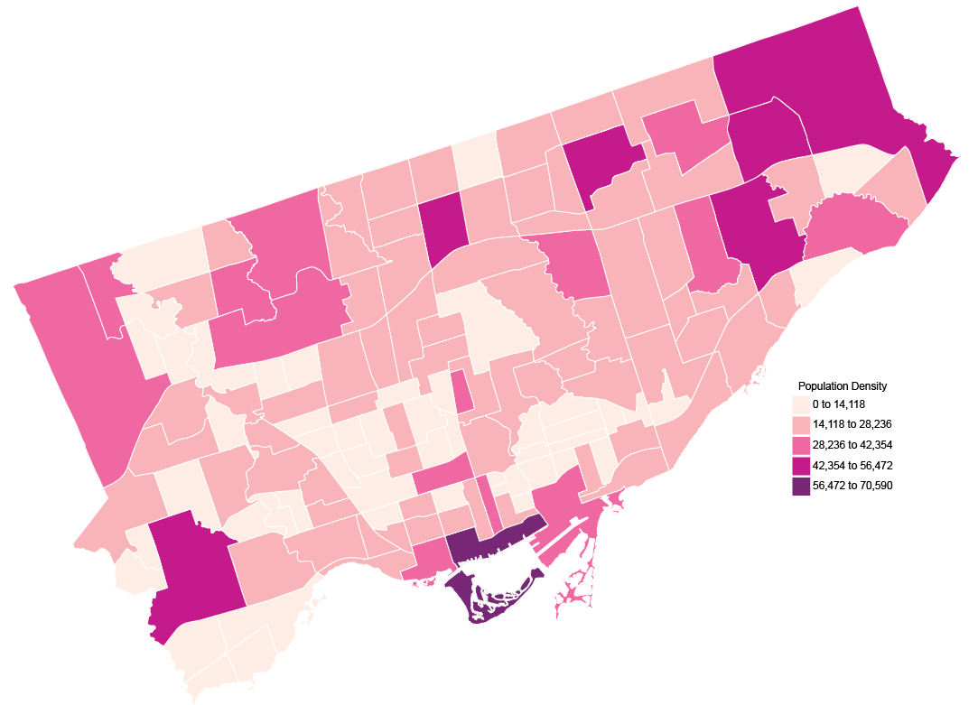
Say you’ve got a street map that you created last year. But, the city has updated the status of some of the streets. Some of the lanes have changed to local roads, and some of the minor arterial roads have been updated to major arterial. Instead of importing all of your data again, let’s create some data links (with linked MAP Theme Stylesheets) to update the map with ease.
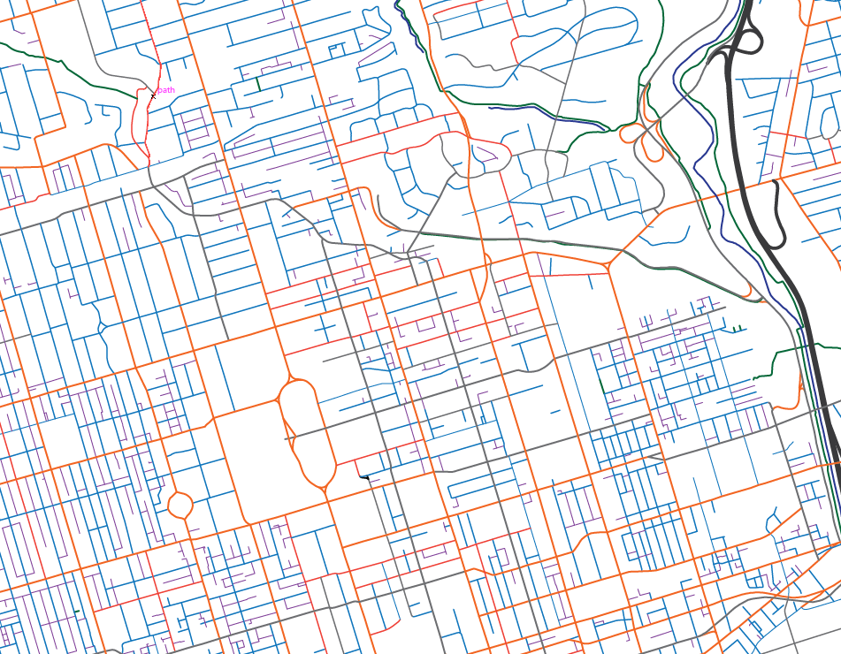
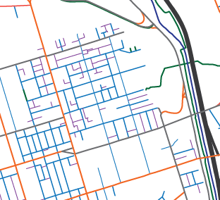
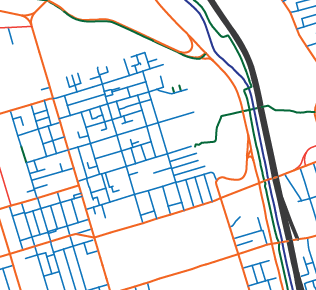
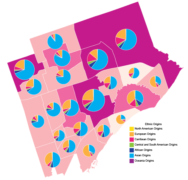
Let’s focus on a small inset of this map so we can better see the changes that will happen. In this example, we’ll focus on an area where we know the ‘laneways’ have changed to ‘local’ roads. Our laneways are purple, and our local roads are in blue.
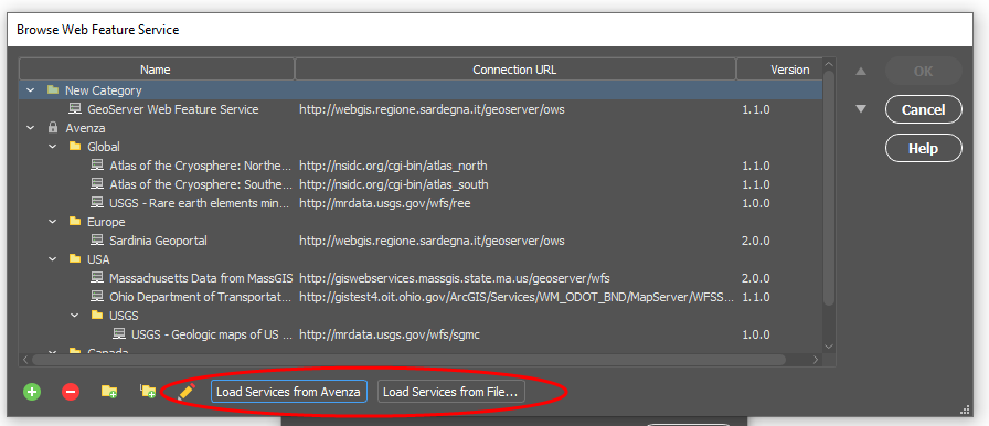
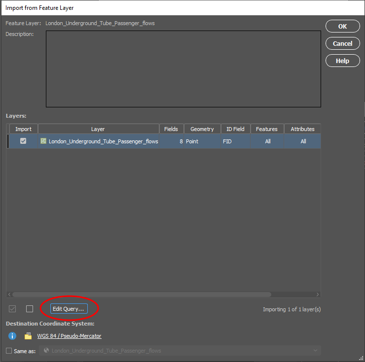
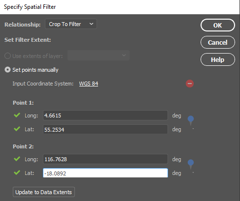
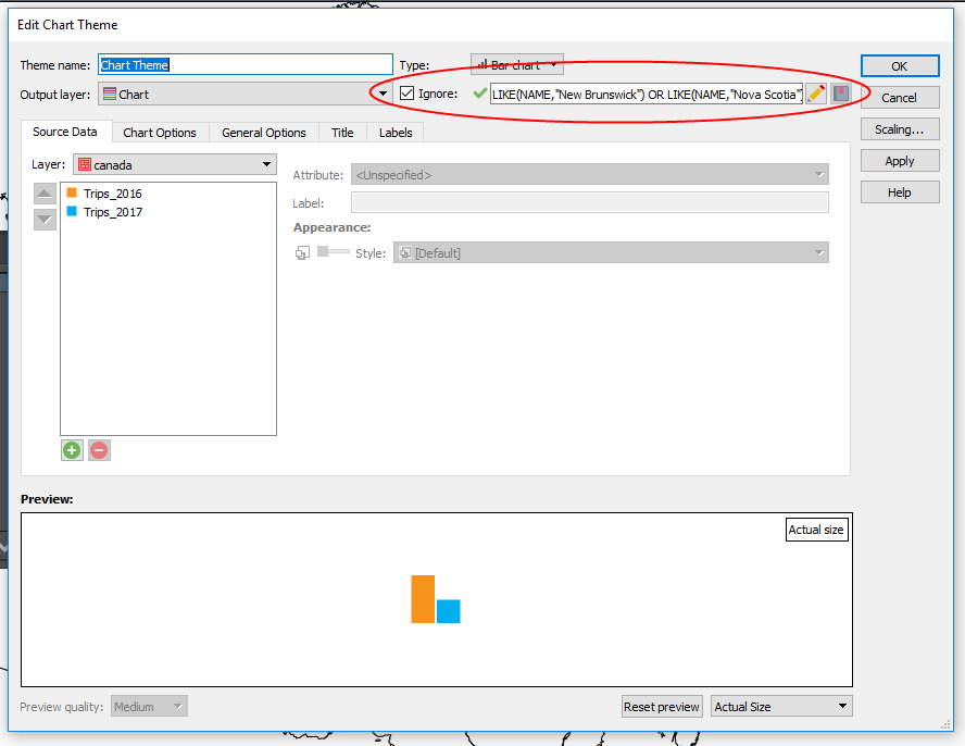
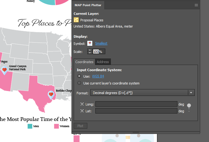
Now that we know what we’re looking for, let’s check out the data link itself. Your data link was automatically created when you imported your data. To access the data link, simply open the Manage Data Links in the MAP Views panel.
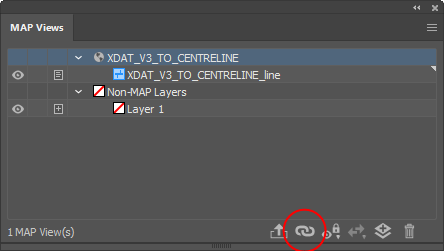
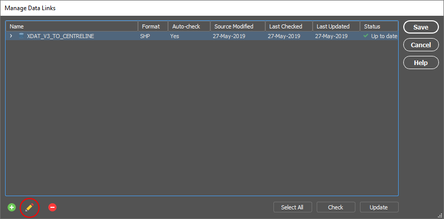
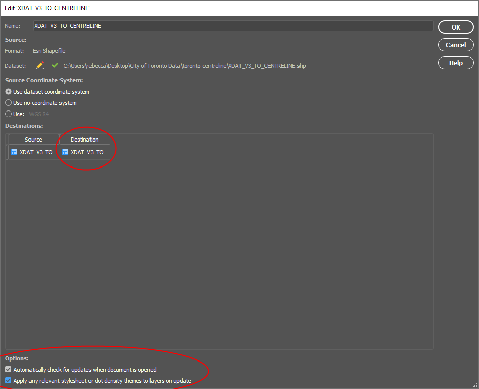
You’ll see that there is one data link, and that’s for the streets file we imported to make the map last year. To view the settings of the data link, click Edit (pencil icon) at the bottom-left of the dialog box.
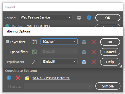
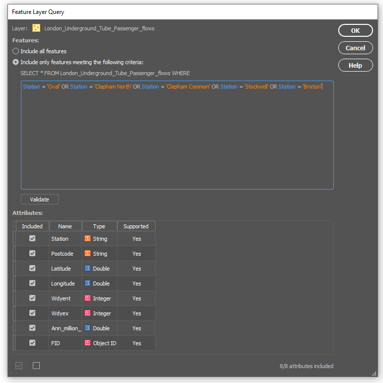
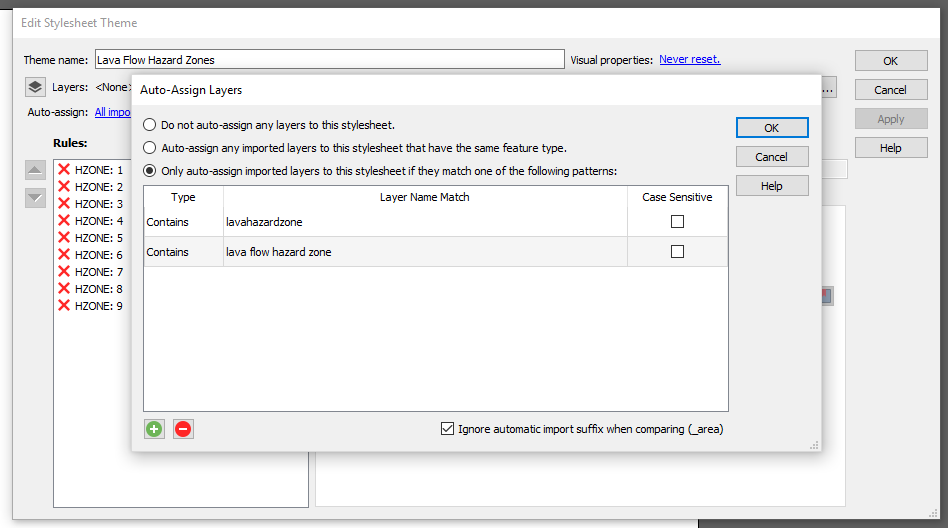
Now you have the option to turn on the ‘Automatically check for updates when the document is opened’ setting, and (or) turn on ‘Apply any relevant stylesheet or dot density themes to layers on update’. In order for the stylesheet option to work, be sure to set the appropriate destination layer.
Once all the settings are set, check if there are any data updates by clicking the Check button in the Manage Data Link window.
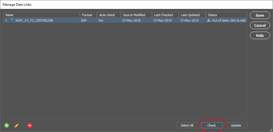
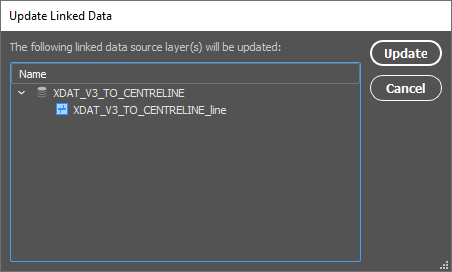
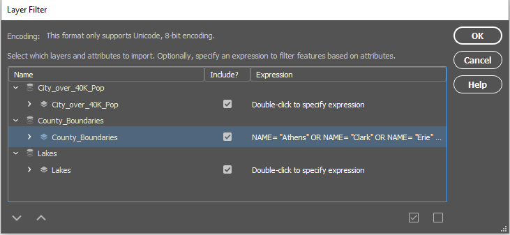
After checking we can see that the Status has updated to say that our data is out of date. Click the Update button to update the data. A dialog box will pop up to confirm that this is indeed the data you’d like to update. Click Update to start the update. I know that some of the ‘laneways’ have been changed to ‘local’ roads, and so the attribute has been updated. Since I created the MAP Theme using those, we should see the changes.
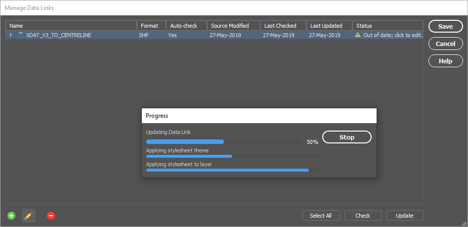
Once the update is finished, we can see on our map that all of our ‘laneways’ have changed to ‘local’ roads, and they have updated with the MAP Theme Stylesheet as well.
Using the Manage Data Links option is an easy way to update your data when updates become available! Save yourself the time and hassle of importing data over and over again and use the data links to your advantage. If you’re looking for more documentation, be sure to check out our help pages.


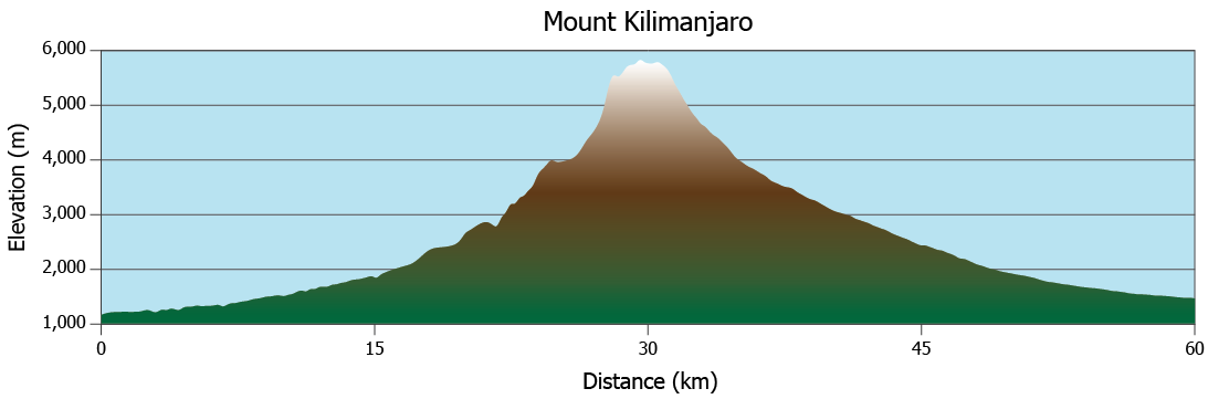


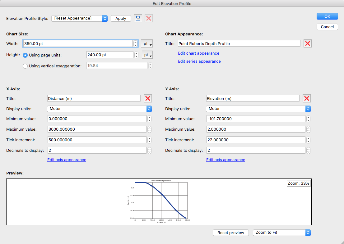
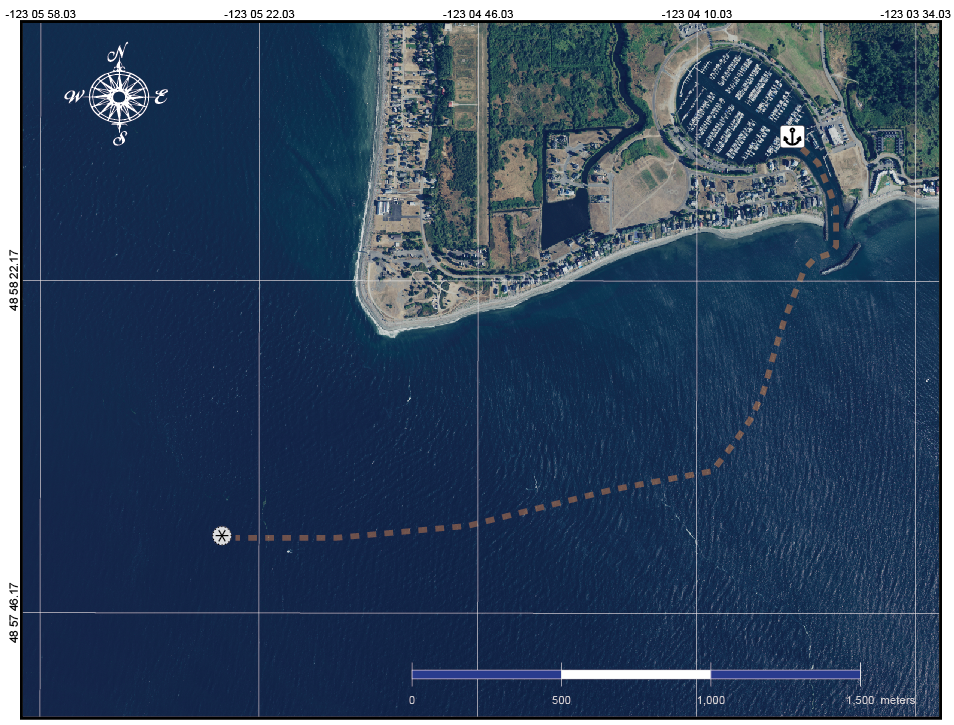
 The fluvial depth profile shows the increase in depth the deeper into the Strait.