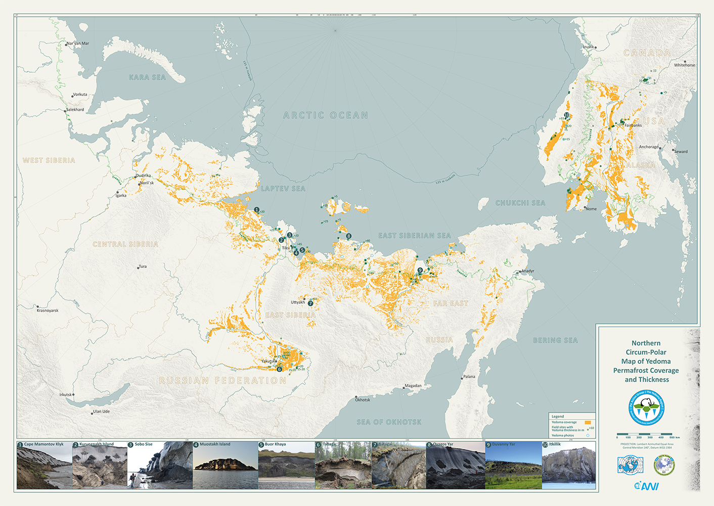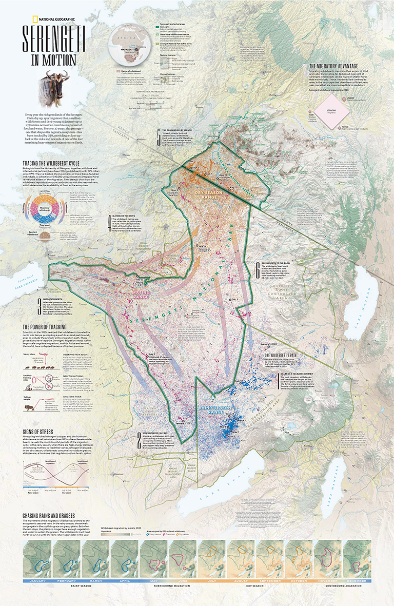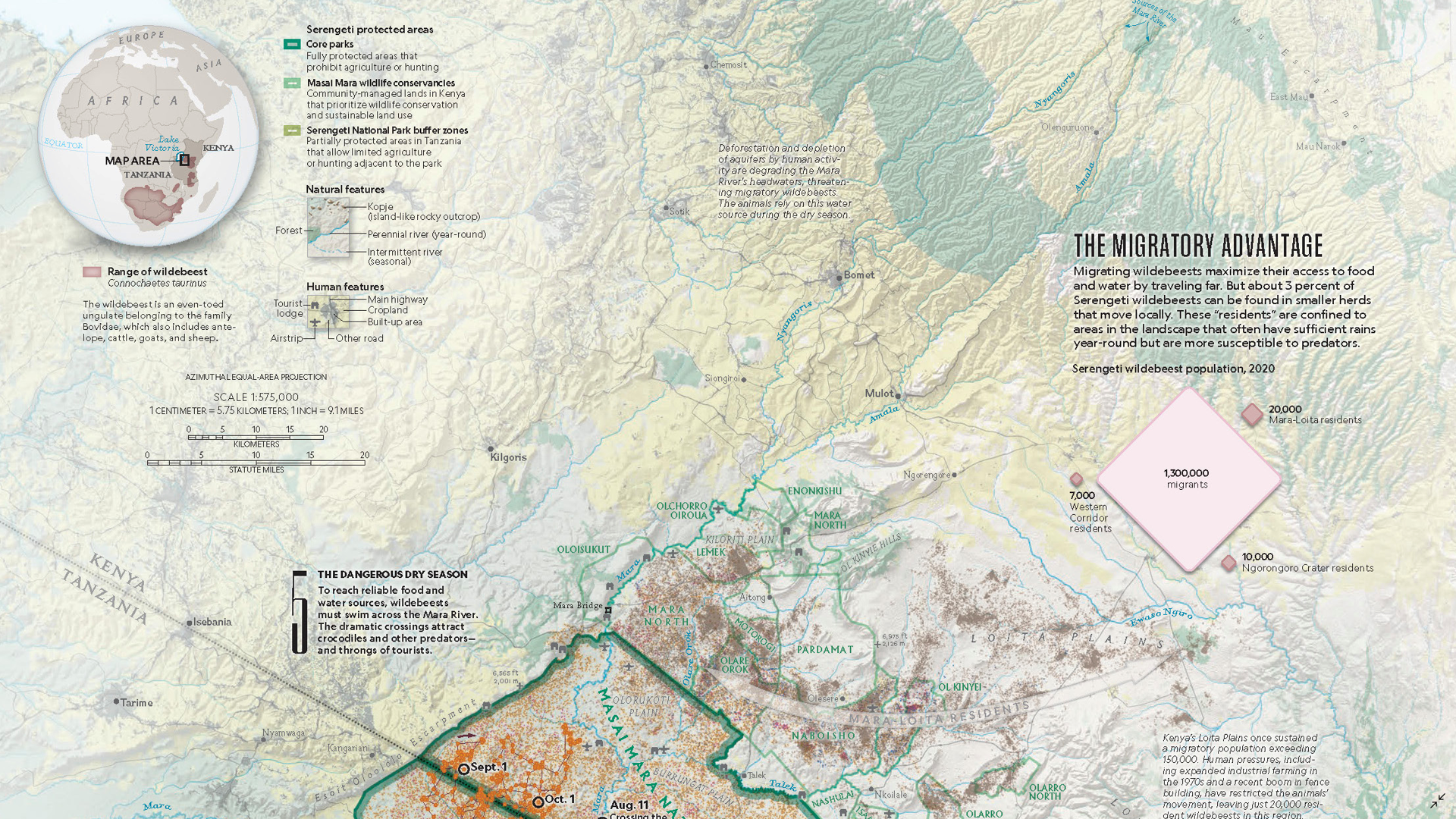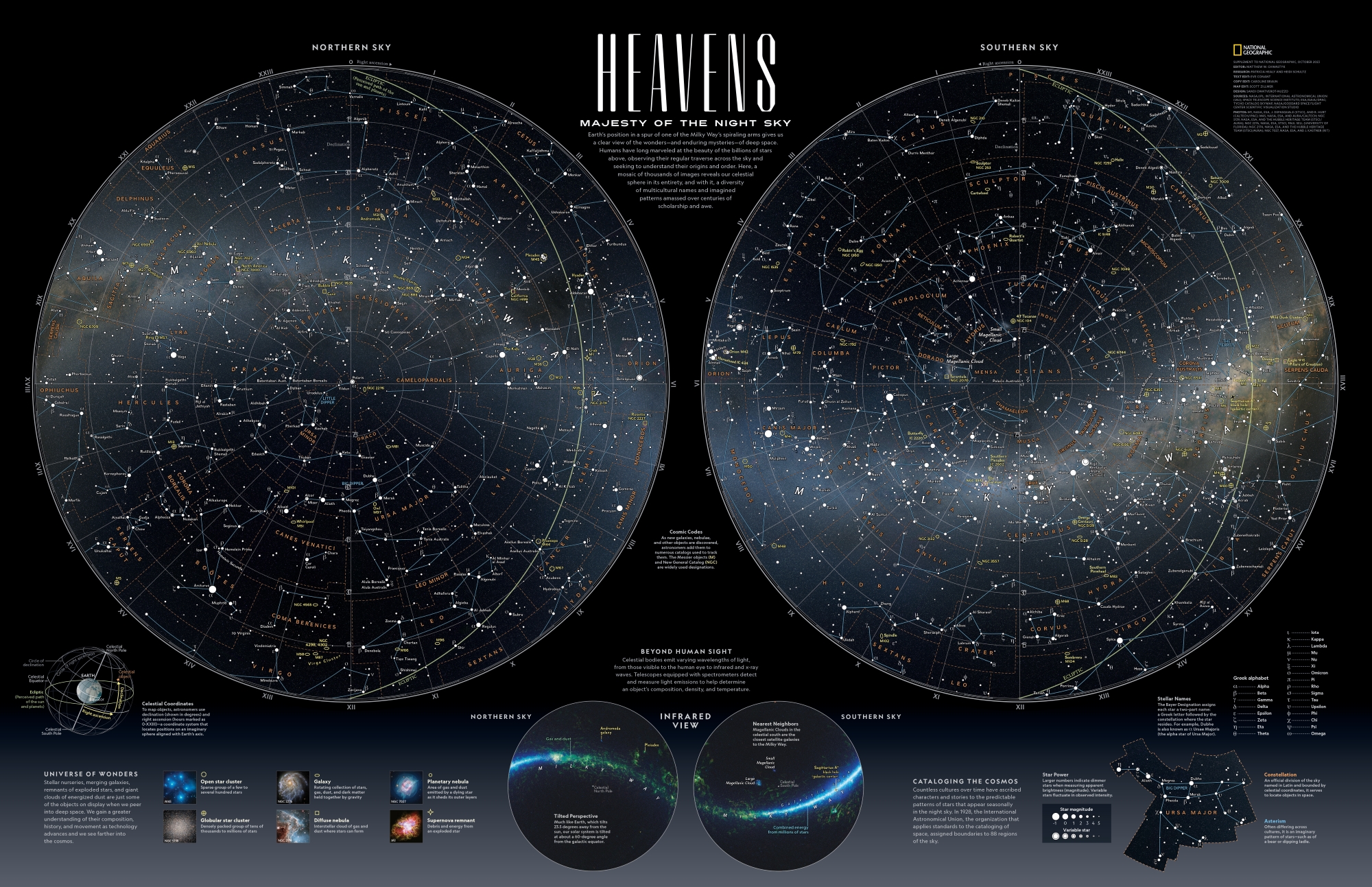
In this Map Spotlight, we are showcasing the Grand Prize winner of the 2024 Avenza Map Contest—Heavens: Majesty of the Night Sky by Matthew Chwastyk of National Geographic, with additional contributions from Patricia Healy, Heidi Schultz, Eve Conant, Caroline Braun, Scott Zillmer, and Sandi Owatverot-Nuzzo. This particular map was created for inclusion as a poster in the special space issue of National Geographic Magazine, using the most recent NASA data on star locations, constellation boundaries, asterisms, and deep-sky objects.
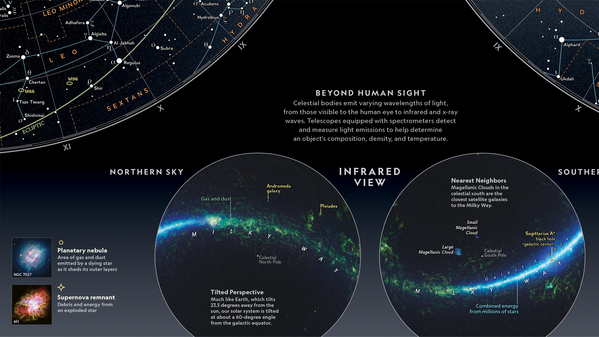
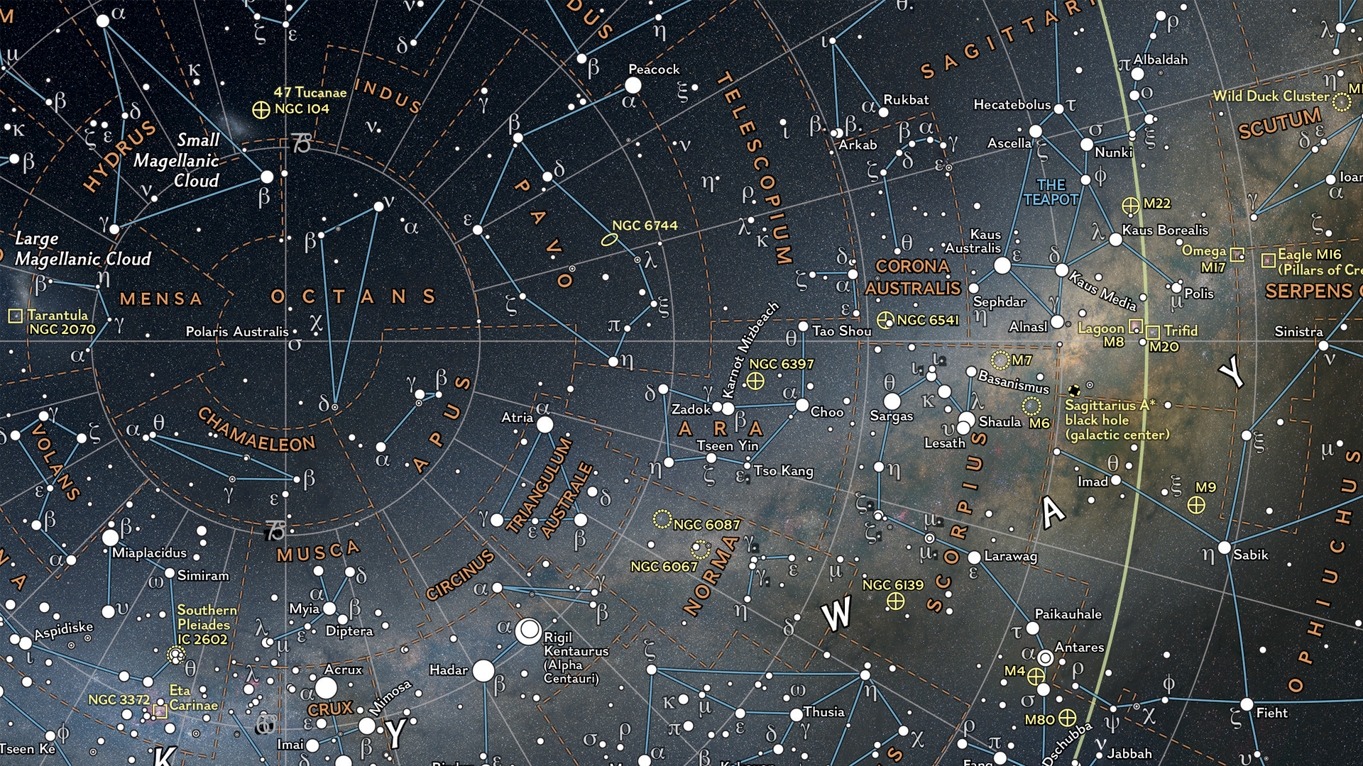
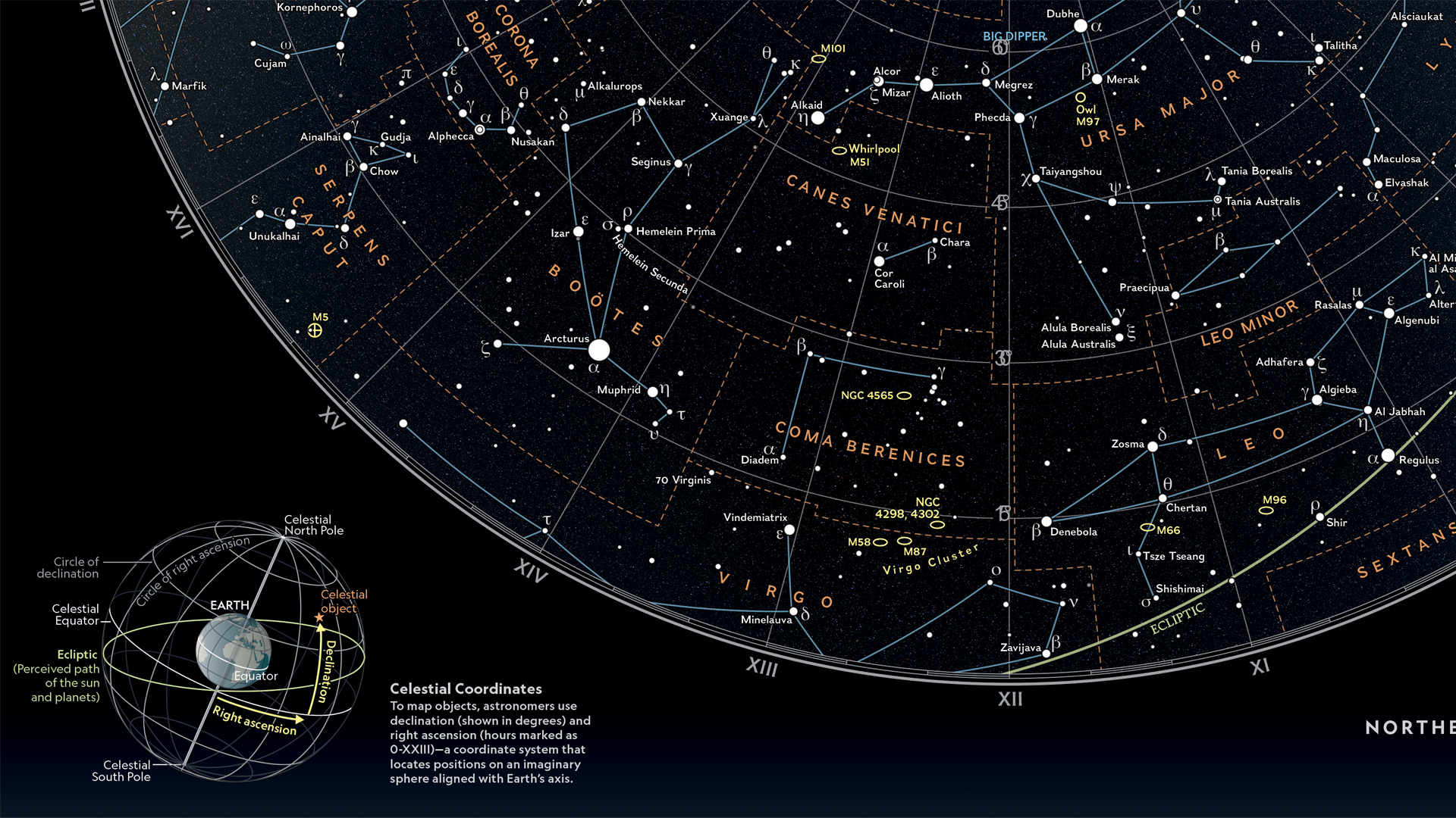
Matthew plotted stars of magnitude 5 and brighter, which marks the threshold for naked-eye visibility. Star magnitudes and variable stars are represented by graduated symbols, with brighter stars appearing larger. The stars are plotted on a supplemental set of hemispheres featuring the latest whole-sky survey projected into the map view to display how the sky appears in infrared, including a glowing representation of the Milky Way galaxy. Stars are labeled in both their traditional names and in Greek letters using the Bayer system. Matthew further enhanced the visual appeal of the map with a key containing representative images of deep-sky objects on the bottom left side.
Connect with Matt on X (Twitter) @mapchwastyk.
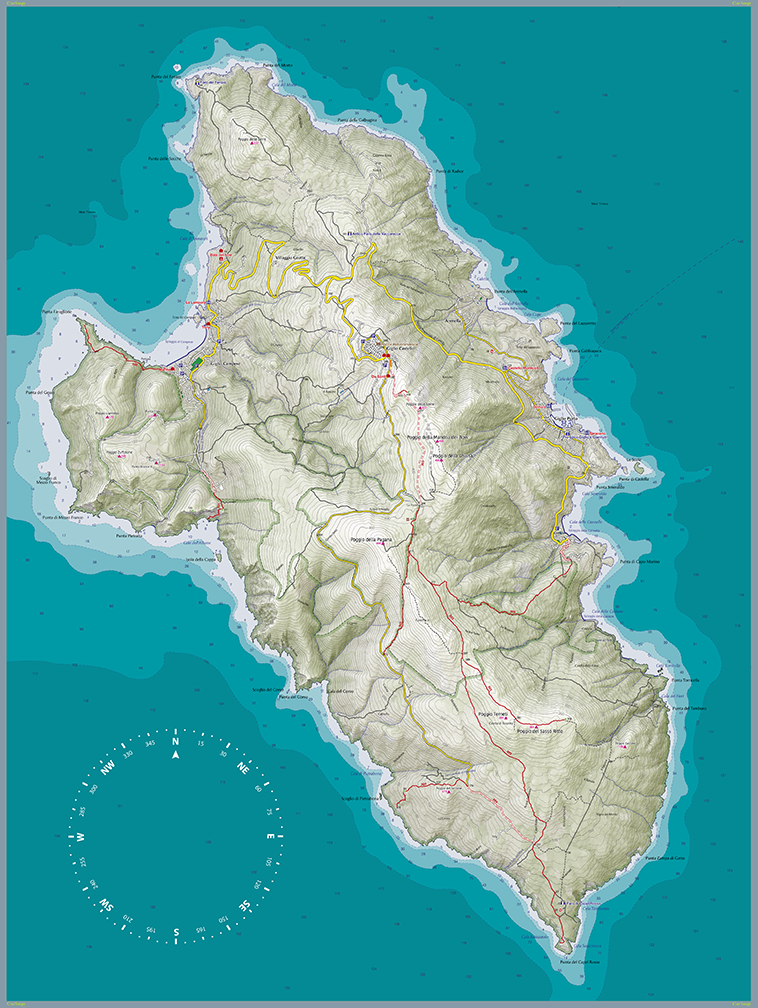
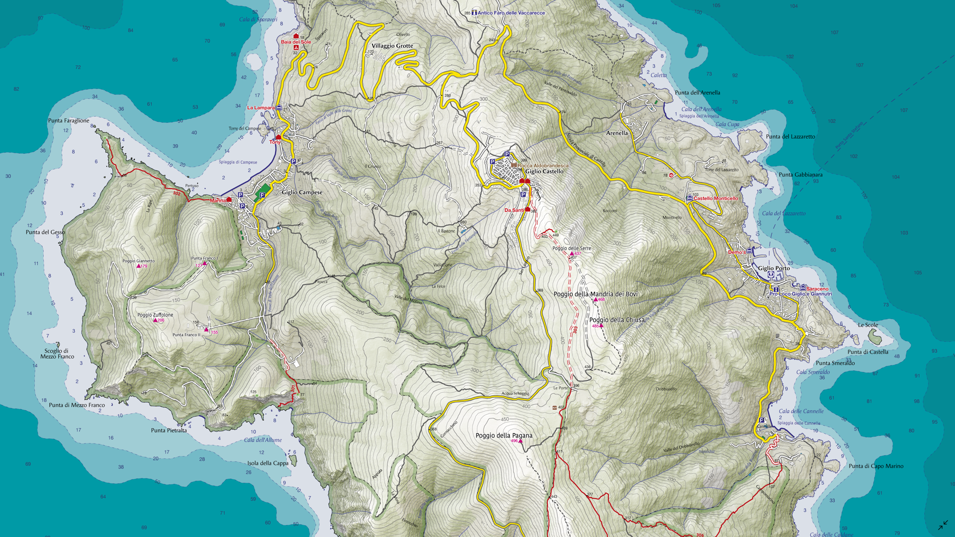
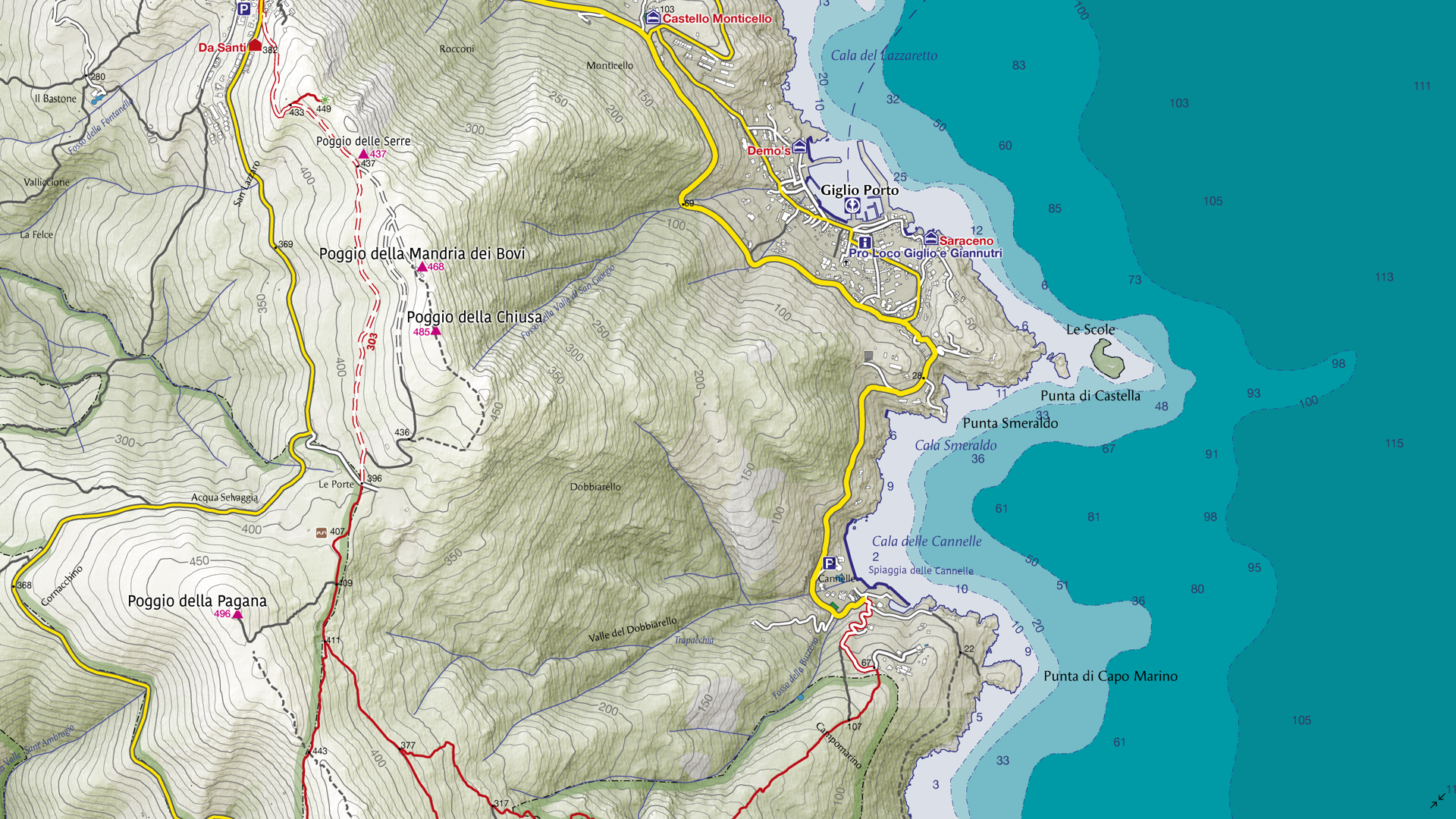
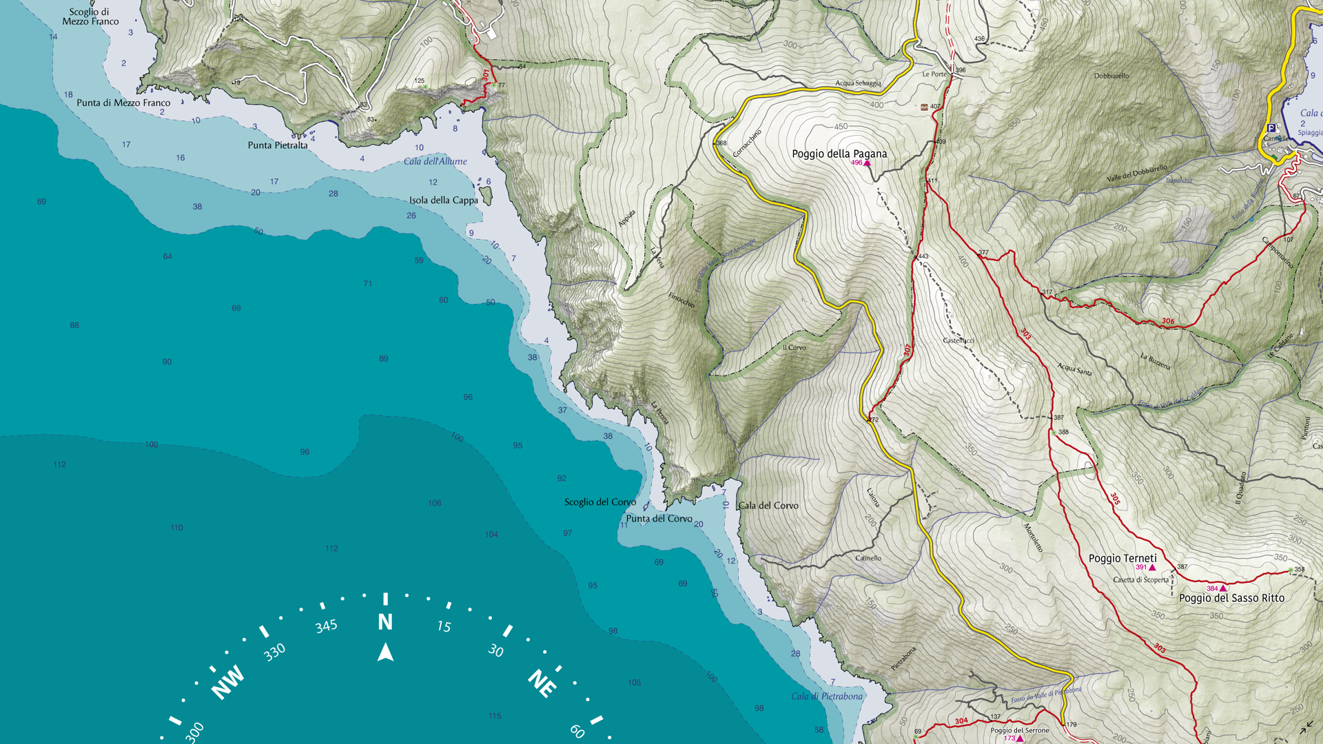
Select the images below to see a detailed look at Matthew’s map
Making the Map
One of the most eye-catching visual elements of this map is the sky imagery on which the star data is displayed. Matthew prepared this imagery to be used for the map by reprojecting it in Geographic Imager using the Transform tool. This is how the hemispheres of the two main maps were created, after which they were imported into MAPublisher.
In MAPublisher, Matthew used the MAP View Editor tool to create a workspace that utilized a hemispherical-shaped coordinate system, such as the stereographic projection. The MAP Point Plotter tool was used to place selected deep-sky objects on the map using estimated coordinates.
The MAP Themes tool was essential in allowing Matthew to approach the styling of the stars in a hierarchical format by categorizing them based on magnitude, ensuring the most prominent stars stood out the most. Stars were then labeled using the MAPublisher LabelPro add-on, with manual adjustments minimized by the intuitive nature of the tool.
Matthew used the Create Knockouts tool to improve label legibility by creating a mask around text in busy areas of the map. Map legibility was also improved by using the Simplify Art tool to generalize the detail on constellation lines. The Join Lines tool was used to group lines constituting asterisms together, making them easier to manage and style.
Read our other Map Spotlight blogs here, and check out the other winners of the Avenza Map Contest 2024 here!