My Account     Contact Us     Cart

Cartographer Chronicles: Craig Molyneux

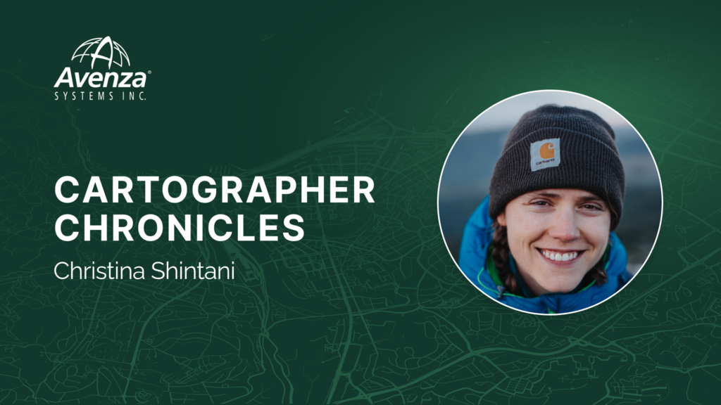
In this edition of Cartographer Chronicles, we interviewed Craig Molyneux, a veteran of the cartography industry and the winner of the second runner-up prize in the 2024 Avenza Map Contest! Craig’s journey in the world of cartography is a testament to the passion, adaptability, and ever-evolving landscape of mapmaking. Sparking from an interest in graphic design and a love for the outdoors, Craig found his calling in cartography, blending artistic skill with geographic precision. From hand-drawn maps to the early days of digital cartography, Craig has always been on the cutting edge of the industry. Through his company, CartDeco, he has worked with major publishers, created award-winning maps, and inspired the next generation of cartographers. Craig is sharing his cartographic journey with us in his own words.

***

Discovering and Navigating the World of Cartography

At secondary school I had a real interest in graphic design, and also was interested in the outdoors. Using map products became second nature to me as I would be out camping and hiking most weekends. I had a little inkling that I would end up in Cartography, but I quickly discovered that graphic design was super competitive and only the elite made it through to university. After completing high school, when searching for a likely university course, Cartography jumped out at me, and I quickly embraced it. Back in the 1980s there were only a couple of universities in Australia that offered Cartography as a degree, and I went to RMIT University in Melbourne.

Over 40 years my career has taken me through the private and public sector, however I feel most comfortable working for myself. I feel there’s more creative freedom when you can focus and concentrate on the jobs that give you pleasure.

CartDeco started as a side hustle in the 1990s. When the early Apple Macs hit the market I bought a second-hand one, and using the very first version of Adobe Illustrator I started doing computerised mapping. Things were pretty basic back then (compared with what we have now), however I felt I was at the cutting edge using a desktop computer to create maps. Prior to that all of my cartography had been done by hand, either using pen and ink or scribe, peel-coat and stick-down type.

After producing maps for the tourism industry I was beginning to get known within the local publishing industry and CartDeco took off. I made a connection with Henry Boegheim, who had started Hema Maps, a Brisbane-based mapping company, and Henry asked me to produce maps for him, so that’s when I concentrated full time on CartDeco. Working in a home office at the back of a shed, CartDeco continued to produce maps for Hema Maps then slowly expanded to other publishers, like Australian Geographic, the AA in the UK, Universal Publishers, Hardie Grant Publishing and many more. I did have young graduates work with me from time to time and it was a pleasure to be able to mentor the cartographers of the future.

Very quickly after starting desktop-based cartography it became apparent that scanning and tracing linework was not the most efficient production method. I stumbled upon Avenza’s MAPublisher in its very early days. I think I was one of the early adopters. Back then it could import a few geospatial datasets and that was about all, but now it’s grown to be a fully-formed production tool, essential in my cartographic workflow. Being one of the only Australians using the application I was approached by Ted Florence to be a local distributor for the software. I did this for a number of years, providing training and support for local users before handing over to Gavin James at Mapuccino.

Career Highlights

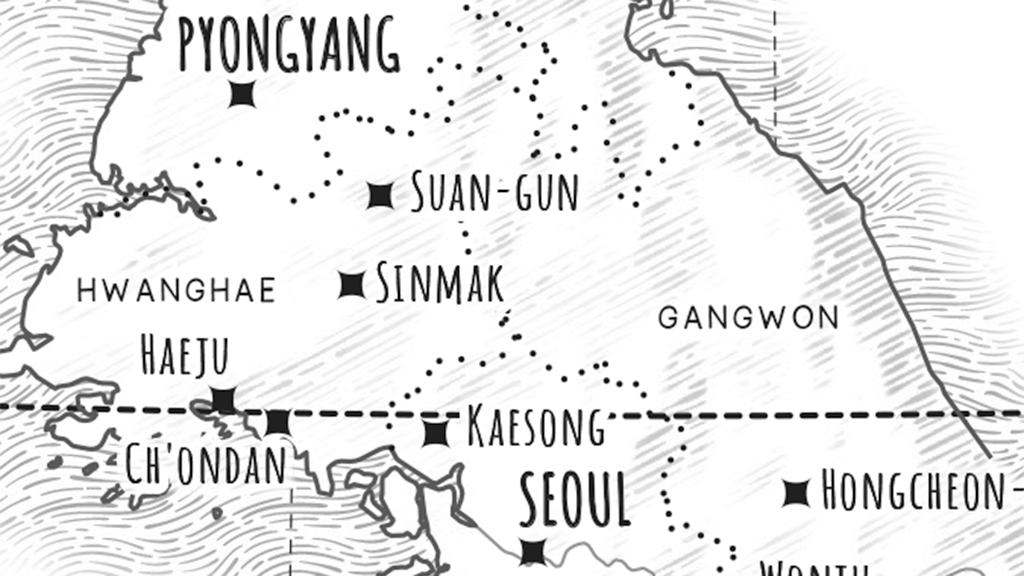
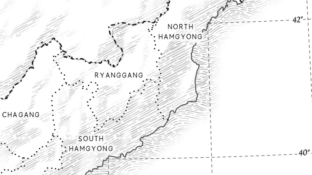
I’ve been lucky enough to work on some fabulous cartographic projects and work with some great people over my cartographic journey. As Hema Maps began to expand, in 1998 they had a vision to map the centre of Australia like never before. Sending out field teams to map the roads and features of our vast continent, they asked me to compile six maps covering about two thirds of Australia. This was a daunting task. Open data was just being thought of and Geoscience Australia, to their credit, had made available their 1:250,000 dataset of Australia. As was soon discovered, data in remote and rural areas was unreliable and many years out of date. MAPublisher was used to create this first series of maps, importing 1:250,000 data into Adobe Illustrator and combining it with GPX routes that had been collected by the on-ground team. Comprehensive field notes were used to add “meat to the bone” of the map, with many unique and culturally significant details added that had never before appeared on published maps.

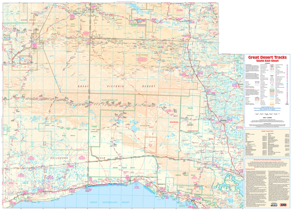
Entitled Great Desert Tracks, the series of six maps at a scale of 1:1,250,000 enabled the new generation of 4×4 explorers to safely travel in Australia’s outback. The series is now into its 9th edition.

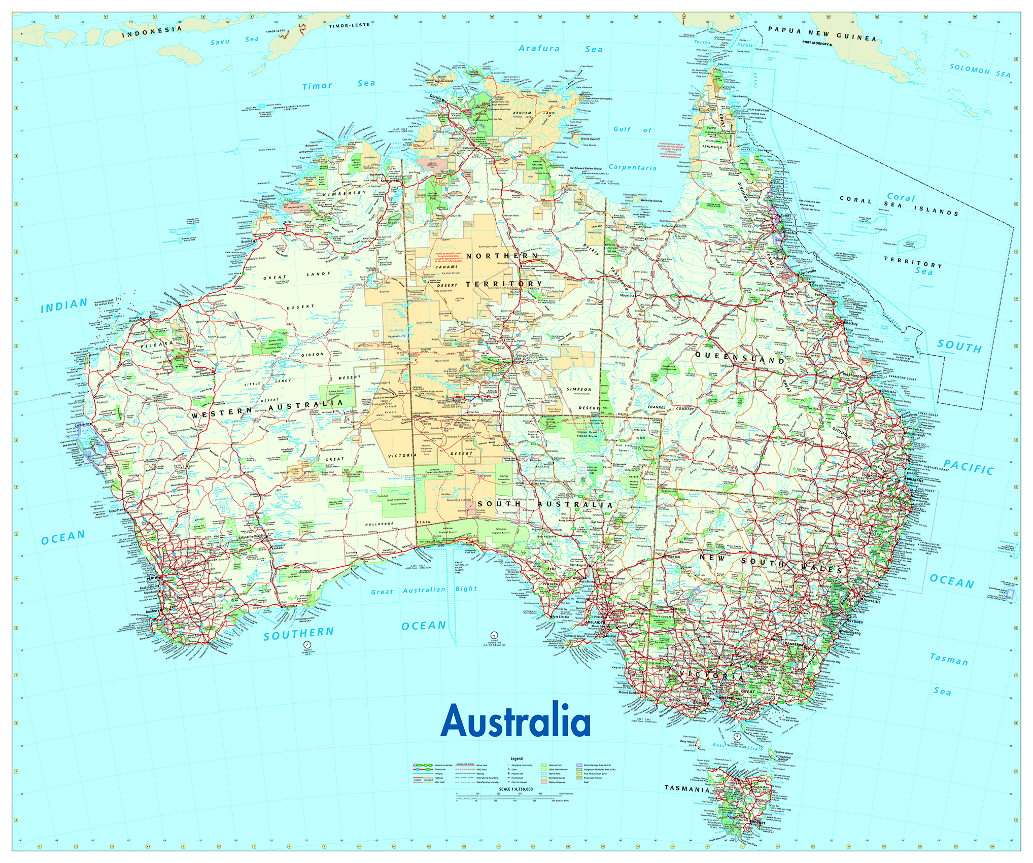
A key relationship I made early on was with the senior cartographer at Australian Geographic (AG) magazine, Will Pringle. Will became a long-standing friend and mentor, who sadly passed away in November 2024. He had a profound impact on my career and was generous with his knowledge and wisdom. Will asked me to update AG’s Australia for Adventurers and Dreamers map for the magazine. This became a staple product for many years and ended up on many a child’s bedroom wall.

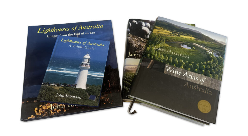
I’ve enjoyed commissions for small and large jobs, from a simple map for a brochure to large atlas projects with maps numbering in the hundreds. One project that I was particularly pleased to contribute to was the Jacaranda School Atlas, published by John Wiley and Sons. As a secondary school geography student I used an early edition of this atlas and it has been a mainstay in Australian secondary schools ever since. I was lucky enough to be asked to work on the 7th, 8th and 9th editions of the atlas and to revise the design to a more contemporary style. Originally the atlas plates were created using ArcGIS, as this was felt that it would be easier to update and index the atlas, however over time we realised that this was not the case and a production approach using MAPublisher was simpler and indexing was easier. Other atlas commissions included editions of the James Halliday’s Wine Atlas for Hardie Grant Publishing and various titles for Lighthouses of Australia.

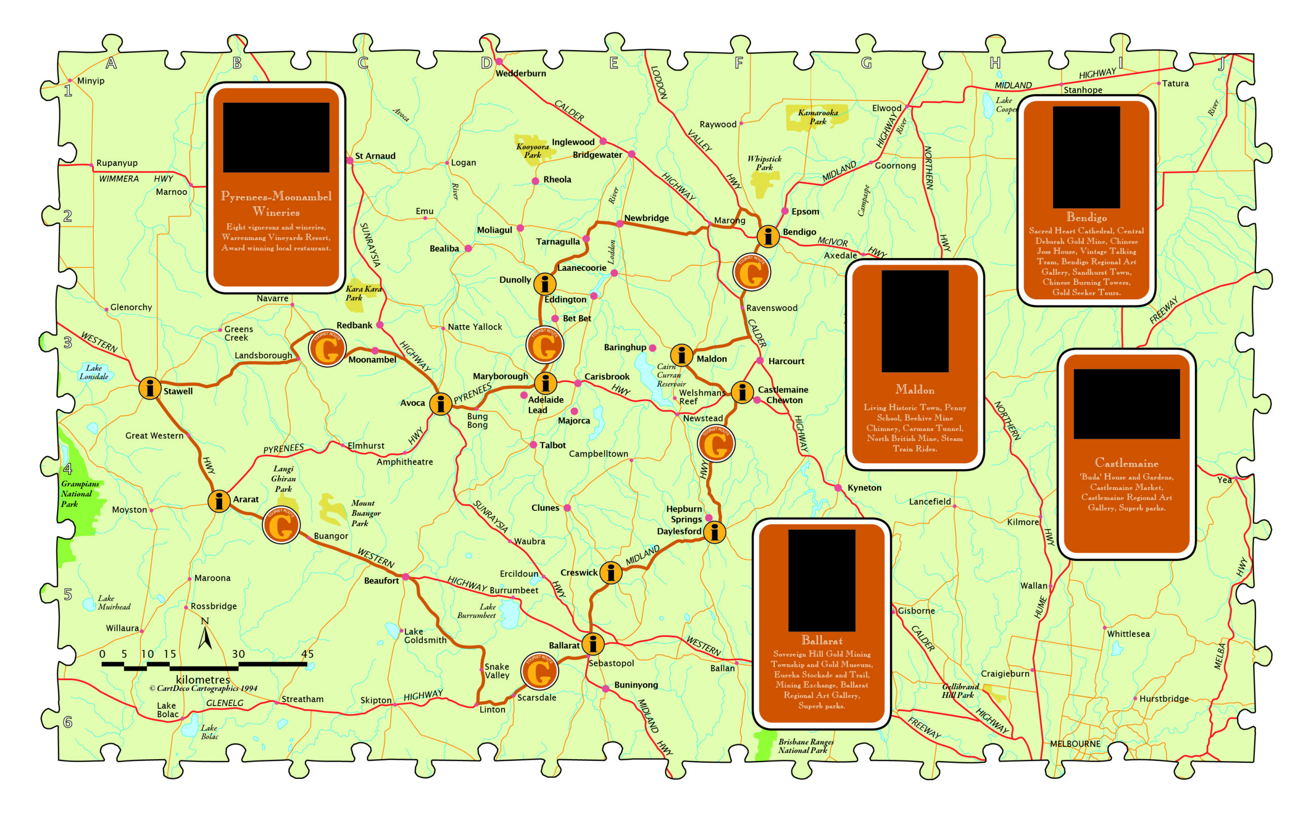
Whilst it’s nice to design and produce maps for clients, it’s especially nice to design, produce and publish your own maps, and over the past five years I’ve been creating large wall maps for use in either the classroom or as a collectible piece of art for the living room or office.

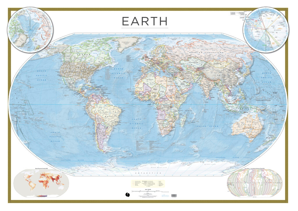
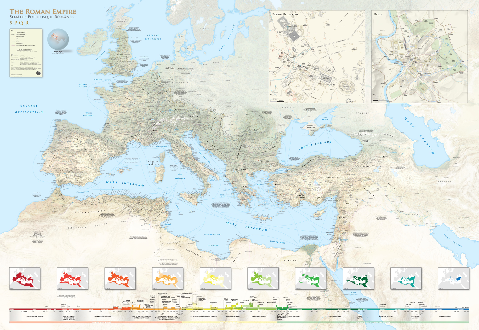
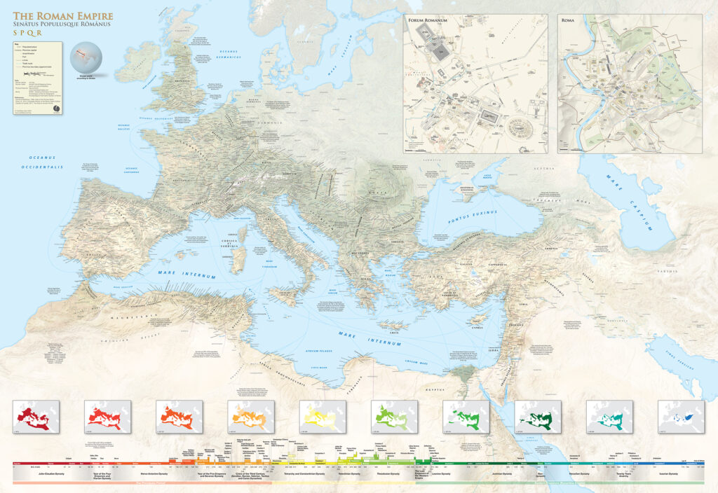
The Earth Wall Map has been a passion project combining the latest global datasets (including Natural Earth Data) to present a view of our world like no other. My interest in all things Roman has led to the creation of the Roman Empire wall map (which won the second runner-up prize in the 2024 Avenza Map Contest). After ten years of research and production it has finally seen the light of day. Measuring in at 1600 x 1100 mm the map is a valuable tool for researchers and educators.

Cartographic Methods

Technology has impacted our profession immeasurably. As new software tools have come along, and computing power has increased, we have been able to make new and improved cartographic design choices. The provision of detailed open digital elevation data and satellite data, along with improvements to 2D and 3D imaging tools, has improved the types of maps we produce.

My typical workflow is to use PostgreSQL for data storage, QGIS for data manipulation and editing, with the finishing of artwork in Adobe Illustrator and Photoshop. I also use tools like Natural Scene Designer Pro and Eduard for creating relief, and Avenza Geographic Imager for reprojecting imagery and relief. I do like experimenting with other tools as they come along, like Blender for example, and I’m dabbling in the use of drones to collect detailed base imagery and using WebODM to stitch images and create surface models. 

You’re never too old to learn new methods using new tools, however there are fundamental cartographic principles that still apply when compiling a map. I’m not a big fan of maps created out of GIS applications that use auto styles and auto labelling. Whilst this has improved in recent years they are still easy to spot and lack the craftsmanship of a well designed map.

The Avenza suite of applications has proven itself over the years to be fit-for-purpose in map production. I’ve used Esri ArcGIS and QGIS for map production, however these don’t really suit my creative needs. For clients in the publishing industry, there is a need to provide artwork in Adobe Illustrator or pdf format. Being able to maintain geographic referencing and layers in the final output is critical. I enjoy the seamless integration between Illustrator/MAPublisher and Photoshop/Geographic Imager when working with projections.

Recently I have been producing a series of walking maps solely for the Avenza Maps app. Using open data sources like OpenStreetMap and Sentinel imagery, a walking map can be quickly produced for any area on the planet. Additionally the Avenza Maps app is used for field checking the map prior to publication. The whole Avenza Map Store ecosystem works well for me, from publishing, promoting and accounting of sales.

What’s Next?

History is an interest of mine and combining this with cartography I see an opportunity to create more maps like the Roman Empire wall map on specific themes. My next map in production is a wall map of the conquests of Alexander the Great.

My indigenous heritage gives me a deep connection to place. My ancestors have been on this continent (Australia) for at least 40,000 years. In Australia it’s been a challenging few years getting the broader non-Aboriginal population to give the Traditional Owners a Voice to parliament. What that exercise has shown me is that there’s much education to be done around our long-standing history and connection to the continent we now call Australia. Geographic place naming is one area where countries like Australia, with a very brief colonial history, can embrace the rich stories that connect us to place. Stories that go back over a thousand generations have been used to connect us to features in the landscape. The stories are ever-evolving and provide a multi-layered view of place. Place is described through song, dance, art and story. Rather than name features after recent arrivals, battles or long-dead members of the British aristocracy, we have an opportunity to promote unique culture through language and place naming. By imbuing data and maps with the rich cultural heritage of place we give everyone a deeper connection to place.

Insight for Aspiring and New Cartographers

Our industry is a very niche one, and what I’ve discovered over my cartographic journey is just how friendly and helpful everyone is. Other cartographers genuinely care about your success and are happy to assist you with either helpful technical advice or putting you in touch with the right people. If you’re starting out on your cartographic journey, reach out to those whose work you admire. Their enthusiasm and care may surprise you. Feel free to contact me any time if you have technical questions (I can’t guarantee I can answer the tricky ones) or just need advice on how to get your passion converted into a small business. My email is craigmolyneux@mac.com.

Check out our other Cartographer Chronicles blogs here!

Map Spotlight: Heavens by Matthew Chwastyk

In this Map Spotlight, we are showcasing the Grand Prize winner of the 2024 Avenza Map Contest—Heavens: Majesty of the Night Sky by Matthew Chwastyk of National Geographic, with additional contributions from Patricia Healy, Heidi Schultz, Eve Conant, Caroline Braun, Scott Zillmer, and Sandi Owatverot-Nuzzo. This particular map was created for inclusion as a poster in the special space issue of National Geographic Magazine, using the most recent NASA data on star locations, constellation boundaries, asterisms, and deep-sky objects.

Matthew plotted stars of magnitude 5 and brighter, which marks the threshold for naked-eye visibility. Star magnitudes and variable stars are represented by graduated symbols, with brighter stars appearing larger. The stars are plotted on a supplemental set of hemispheres featuring the latest whole-sky survey projected into the map view to display how the sky appears in infrared, including a glowing representation of the Milky Way galaxy. Stars are labeled in both their traditional names and in Greek letters using the Bayer system. Matthew further enhanced the visual appeal of the map with a key containing representative images of deep-sky objects on the bottom left side.

Connect with Matt on X (Twitter) @mapchwastyk.

Select the images below to see a detailed look at Matthew’s map

Making the Map

One of the most eye-catching visual elements of this map is the sky imagery on which the star data is displayed. Matthew prepared this imagery to be used for the map by reprojecting it in Geographic Imager using the Transform tool. This is how the hemispheres of the two main maps were created, after which they were imported into MAPublisher.

In MAPublisher, Matthew used the MAP View Editor tool to create a workspace that utilized a hemispherical-shaped coordinate system, such as the stereographic projection. The MAP Point Plotter tool was used to place selected deep-sky objects on the map using estimated coordinates.

The MAP Themes tool was essential in allowing Matthew to approach the styling of the stars in a hierarchical format by categorizing them based on magnitude, ensuring the most prominent stars stood out the most. Stars were then labeled using the MAPublisher LabelPro add-on, with manual adjustments minimized by the intuitive nature of the tool.

Matthew used the Create Knockouts tool to improve label legibility by creating a mask around text in busy areas of the map. Map legibility was also improved by using the Simplify Art tool to generalize the detail on constellation lines. The Join Lines tool was used to group lines constituting asterisms together, making them easier to manage and style.

Read our other Map Spotlight blogs here, and check out the other winners of the Avenza Map Contest 2024 here!

Announcing the Avenza Map Contest 2024 Winners

We are thrilled to announce that the 2024 Avenza Map Contest has officially wrapped up! This year, cartographers from around the world submitted their finest work, showcasing remarkable creativity and skilled cartographic design. Our entrants demonstrated how they harness the capabilities of Avenza software to create impactful and visually appealing cartographic products. With the judging, discussion, and review process now concluded, the Avenza team proudly congratulates this year’s prize winners!

In the coming months, stayed tuned for our Map Spotlight blog series, where we’ll highlight the winning entries and some honourable mentions of the 2024 Avenza Map Contest. Each article will dive deeper into how the winning maps were crafted, featuring insights from their creators, and an exploration of the tools and techniques behind their award-winning designs.

Grand Prize Winner


Heavens: Majesty of the Night Sky
Matthew Chwastyk
National Geographic

Connect with Matt on X (Twitter) @mapchwastyk. Additional contributors to the map are Patricia Healy, Heidi Schultz, Eve Conant, Caroline Braun, Scott Zillmer, and Sandi Owatverot-Nuzzo.

Runner-Up Prize Winner


South Shetland Islands and the Northern Antarctic Peninsula
Tom Patterson
US National Park Service (Retired)

Learn more about this map and check out Tom’s other maps on his website. You can also download it from the Avenza Map Store for free! connect with Tom on X (Twitter) @mtnmapper.

Second Runner-Up Prize Winner


The Roman Empire
Craig Molyneux
CartDeco

This map can be purchased as a 1600 x 1100 mm print on the CartDeco website.

Congratulations again to this year’s winners!

Map Spotlight: Yedoma Permafrost Coverage by Sebastian Laboor, Jens Strauss, and Guido Grosse

In this Map Spotlight, we are showcasing an honourable mention of the 2021 Avenza Map Contest: Yedoma Permafrost Coverage by Sebastian Laboor, Jens Strauss, and Guido Grosse of the Alfred Wegener Institute Helmholtz Centre for Polar and Marine Research (AWI). This map shows the extents of the world’s most ice-rich and climate-sensitive type of permafrost: Yedoma permafrost. This permafrost has been permanently frozen since the last Ice Age, when mammoths still roamed the Arctic tundra, and covers parts of Siberia, Alaska, and Yukon. The team at AWI worked with an international research team from various countries to determine the distribution of Yedoma permafrost, which resulted in this map—the first-ever Arctic-wide Yedoma map.

Creating this map was a tremendous journey, bringing together more than 25 researchers and their decades of permafrost expertise. It is an important step towards understanding how Yedoma permafrost and the massive organic content it has preserved since the last ice age may contribute to future greenhouse gas concentrations in the atmosphere once the area begins to thaw. This map is importantly filling a critical research gap, being used as an important input dataset for new climate models that predict the trajectory of permafrost carbon and its future environmental impacts.

This map and the geospatial dataset are open access and freely available to the public.

Select the images below to see a detailed look at their map

Making the Map

To create the Yedoma permafrost dataset used for this map, Sebastian utilized Adobe Illustrator and MAPublisher as a manual vectorization and attribution tool. Scanned and georeferenced Russian Quaternary geology maps were vectorized using native Illustrator tools, such as the pen and pathfinder tools, and then the MAP Attributes panel was used to assign attributes to these features, and also edit them as necessary later.

The Import tool was essential in allowing them to bring in their supplementary geospatial data to build out the rest of the map. The MAP Views panel and the MAP View Editor were important tools for defining projections, scales, and positions of their map layers. The point data for field sites was added to the map using the MAP Point Plotter tool.

Sebastian used the MAP Vector Crop tool to crop many different layers at once to the map’s extent, allowing for a clean and organized workspace. He also used the MAP Selections and MAP Themes panels to create classes for the data.

The initial positioning of labels was conducted using the MAPublisher LabelPro add-on, with manual adjustments made as needed. Finally, Sebastian added a grid and graticule as well as a North Arrow to complete the finishing touches to the map.

Check out our other Map Spotlight blogs here!

Map Spotlight: Tuscan Archipelago by Enrico Casolari

For the September Map Spotlight, we are showcasing an honourable mention of the 2021 Avenza Map Contest by Enrico Casolari. This is one of seven maps created for Arcipelago Toscano National Park in Italy, with this map in particular focusing on Giglio Island. It illustrates forest roads and trekking paths that span the island, as well as topographic information to visualize its impressive terrain. Enrico used natural tones to create an eye-catching cartographic piece that serves as both a functional reference aid and a visually engaging artwork.

Select the images below to see a detailed look at Enrico’s map

Making the Map

Enrico employed both Geographic Imager and MAPublisher to create this map. He used Geographic Imager in Adobe Photoshop to create the shaded relief images for the land portion of the map. The Terrain Shader tool is a simple but effect method to create a shaded relief using a Digital Elevation Model (DEM) file. The Mosaic and GeoCrop tools were used to ensure the DEM only included the necessary area required for the map. The shaded relief image could then be imported into MAPublisher and used for the final map design.

Next, Enrico imported his vector data on top of the shaded relief image into MAPublisher. He used MAP Stylesheet Themes to visualize the vector data as desired, including roads, trails, and sea depth. The Label Features tool was used to automatically place labels at important locations on the map, with the option to modify them manually once placed. This tool serves as a great substitute for the LabelPro add-on if intensive labeling is not required.

Enrico then used the Create Knockouts tool to ensure that more important labels and features were not obscured or intersecting with contour lines. Finally, he used the North Arrow tool to easily add the finishing touches to his map, importing a custom symbol to use for his north arrow.

Learn more and enter the 2024 Avenza Map Contest here, and check out our other Map Spotlight blogs here!

Map Spotlight: Russell Fjord Wilderness by Aaron Taveras

For our monthly Map Spotlight of July, we are displaying another superb honourable mention of the 2021 Avenza Map Contest: Russell Fjord Wilderness by Aaron Taveras of Cartografix. This outdoor recreation map was created to help visitors navigate the Russell Fjord Wilderness area and find the few trails that exist around the Yakutat region of Alaska. The map consists of two pages which illustrate the beautiful glaciers and rocky moraines, both of which make the area a popular destination for backcountry travel. Aaron combined essential topographic detail with recreational points of interest which resulted in a visually stunning yet useful cartographic product.

A fun fact: this map was selected to be used in the main software graphics for MAPublisher 11. It is available for purchase as a bundle digitally on the Avenza Maps Store.

Select the images below to see a detailed look at Aaron’s map

Making the Map

Aaron used both Geographic Imager and MAPublisher in the creation of this map. Geographic Imager was used in Adobe Photoshop to build the shaded relief images for the background of the map. The Terrain Shader makes it quick and easy to create a shaded relief by simply inputting a Digital Elevation Model (DEM). After this, the shaded relief image could be imported into MAPublisher and used as the background for the map.

Aaron imported his vector data and his shaded relief image into MAPublisher. MAP Stylesheet Themes were used to stylize the vector data such as the glaciers, land cover and water features. The Create Halo tool was used to create the thick and slightly transparent borders of the various parks and preserves in the region.

One of the standout features of Aaron’s map is the contour lines illustrating the terrain of the Russell Fjord Wilderness. The lines can be smoothed out using the Simplify Art tool to make them more visually appealing. The MAP Contour Tagger tool could then be used to manually create elevation labels for the contour lines, which allowed Aaron to select their exact placement in a visually appealing and uncrowded manner. Another important aspect of contour lines is that the text labels are readable, since they are usually obscured by the contour line itself. The Create Knockouts tool is perfect for ensuring that any text or features obscured by other features can be visible. Create Knockouts was used to create a gap in the contour lines where the contour labels (and other labels such as glacier names) exist.

The Grids & Graticules tool was essential in Aaron’s addition of such features to the map, with a UTM grid of 3000 meters being visible across the entirety of the map. Finally, Aaron used the Scale Bar and North Arrow features to easily ensure his finishing touches were placed correctly. Check out his north arrow that shows both true north and magnetic north and the difference between the two!

Learn more and enter the 2024 Avenza Map Contest here, and check out our other Map Spotlight blogs here!

Map Spotlight: Winter Trails of Methow Valley by Matt Dressler

In this month’s Map Spotlight we are showcasing an honourable mention of the 2021 Avenza Map Contest: Winter Trails of Methow Valley, WA by Matt Dressler. This map was created to provide visitors to the region with all the information needed to plan, explore and navigate within the Methow Valley of Washington, the largest Nordic ski trail system in North America. The map provides users with valuable trail information including difficulty, trailheads, distances for each segment, elevation, parking, restrooms, ski waxing huts, warming huts, and usage restrictions. It also features detailed inset maps of the most popular areas of the trail system, including Mazama, Winthrop, and the Sun Mountain Complex. The map maximizes legibility for users through a strong visual hierarchy, minimalist color scheme, muted basemap, and horizontal labels juxtaposed with curving line features.

The map is available throughout the valley as a double-sided, wallet-sized map card (16″ x 25″ when unfolded) and also digitally on the Avenza Maps Store.

Select the images below to see a detailed look at Matt’s map

Making the Map

Matt worked in both Geographic Imager and MAPublisher to create this map. Geographic Imager was used in Adobe Photoshop to spatially reference and refine the shaded relief basemap. From there, the basemap was imported into MAPublisher and provided the foundation to construct the remainder of the map.

Matt used MAPublisher to import his vector data as well as his basemap image. Since his map contains multiple inset maps, he used the Copy MAP Objects From tool to copy his data to another temporary workspace document and crop it to the area for each inset map. He then used the Copy MAP Objects From tool again to bring each of his cropped maps back to the main document as an inset map (check out this blog to see this process in detail). In addition to the MAP Vector Crop tool, Matt also used the Simplify Art tool to smooth ultra-detailed trail lines to be more visually appealing.

Matt also used cartographic tools in MAPublisher to improve his map’s appearance. The Create Halo tool was used to create outlines for the trail lines to make them more legible. Adding halos to elements of a map is a quick and easy way to provide contrast for readers. Matt also used the Create Knockouts tool to create spaces in vector data where text overlapped in an undesirable way.

The MAPublisher LabelPro add-on was essential in Matt’s ability to expedite feature labeling, and allowed him to control and finetune the placement of his labels. Finally, due to the nature of his map being tilted by 12 degrees from North, Matt used the Scale Bar and North Arrow features to easily ensure his finishing touches were oriented correctly.

Learn more about the Avenza Map Contest here, and check out our other Map Spotlight blogs here!

Map Spotlight: Africa’s Evolving Energy Landscape by Ginny Mason

Africa's Evolving Energy Landscape by Ginny Mason second runner-up of the Avenza Map Contest 2023

This Map Spotlight highlights the second runner-up of the 2023 Avenza Map Contest: Africa’s Evolving Energy Landscape by Ginny Mason with extra contributions from her team at S&P Global Commodity Insights including Melenie Yuen, Justin Cochrane, Roderick Bruce, Josephine Sajbel, Jennifer Tschopp, and Enrico Pedica. This infographic was shown at the African Energy Week conference, which took place in Cape Town, South Africa from October 16th to 20th in 2023. It was created with the versatility that it could function as a small handout as well as a large, wall-mounted map. The handout versions of the map also included a QR code which linked to an interactive online PDF. According to Ginny, this map is “the culmination of Commodity Insights’ midstream and upstream geospatial data, and several other products that we provide to decision makers in this field.”

Select the images below to see a detailed look at Ginny’s map

Making the Map

All map elements of Ginny’s infographic were created with the help of MAPublisher tools. After pre-processing her data using other software, she imported it into MAPublisher and then re-projected it as required. The Copy MAP Objects From tool was also used to quickly grab elements from other maps Ginny had already created.

Since there are several different map elements to this infographic showing various types of energy data, the MAP Attributes panel came in particularly handy for Ginny, allowing her to easily calculate, edit and append data to her attribute tables. Once her data was prepared, she could use the Merge Layers tool and the Split Layers tool to further organize her spatial data layers systematically according to their attributes.

Ginny used the Find Places tool to search for and plot relevant point data on her maps, such as energy plants, gas wells, and oil fields. The MAPublisher LabelPro add-on was used to easily generate labels for all of her data as required. She also used the Simplify Art tool to smooth the edges of excessively detailed lines and area data. Ginny added finishing touches to her map by adding supplemental elements such as a Scale Bar.

See the winners announcement for the 2023 Avenza Map Contest here, and check out our other Map Spotlight blogs here!

Cartographer Chronicles: Christina Shintani

In this edition of Cartographer Chronicles, we interviewed Christina Shintani, the creator behind the winning map of the 2023 Avenza Map Contest! Christina is a talented cartographer with particular experience in creating maps that highlight environmental issues. Her interest in cartography began while studying fluvial geomorphology in graduate school and has been growing ever since. Christina uses cartography to make a difference in the world and raise awareness about how climate change is affecting it, with her maps appearing in National Geographic, Rolling Stone, and the Atlas of Design. In this edition, Christina is sharing her cartographic journey with us in her own words.

***

Career Journey in Cartography

My journey in cartography started with a string of lucky choices and following my interests. As a freshman at William and Mary, I signed up for an Introduction to Physical Geography class to fulfill a general science requirement. I found myself fascinated with every topic and lecture. Eventually, I realized I wanted to keep learning about geography, so I created my own major because my college didn’t offer it. After graduating, I continued on to get my master’s in geography at the University of Oregon. I started grad school with the intention of studying fluvial geomorphology, and while I did continue to study rivers, I left grad school wanting to become a cartographer. This changed when I signed up for the advanced cartography course for no reason other than liking maps, and it changed what I wanted to do in my career.

After graduating with my MS, I moved to Portland, Oregon. After a string of short-term jobs, I got a job as a cartographer and data analyst at a public transit consulting firm, where I made transit maps for cities across the country. After a few years there building my portfolio, I was offered a position at National Geographic, where I made maps for the magazine and website, covering a range of topics from conservation and animals to climate change. This is where I was first introduced to Avenza products, MAPublisher and Geographic Imager. Every map I made (while at NatGeo and since) has been made using Avenza products, and it’s hard to imagine going back.

After a few more years, I joined Woodwell Climate Research Center as a cartographer, where I still work today. I make maps to communicate climate science for research papers, communities wanting to understand how climate change currently impacts them and how it will impact them in the future, policymakers in Congress and the Senate, and the general public.

Cartographic Highlights

One important map project is the Arctic carbon monitoring network map which I won the Avenza award for. This map highlights how Woodwell’s tower network is critical to understanding how carbon feedbacks are accelerating warming in the Arctic and impacting global weather. We often use maps to communicate climate science in order to change policy. Most recently, it was brought to the Conference of the Parties (COP) and used to communicate our work to Senators Murkowski and Markey.

A large mapping project I worked on this past summer at Woodwell was in collaboration with the Center for Climate and Security. I created two story maps detailing how worsening climate change will contribute to security challenges in Iran and Türkiye. These maps were presented to politicians on Capitol Hill, where it was attended by congressional staffers across the political spectrum.

While we don’t always have the capacity to respond to current climate events, the wildfires in Canada this past summer were historic. I worked quickly to analyze, map, and chart the historically burned areas in Canada to illustrate how this summer’s wildfires were exponentially larger and occurred very early in the wildfire season in comparison to previous years.

I make maps with Adobe Illustrator and Photoshop every day and therefore use MAPublisher and Geographic Imager daily. MAPublisher makes it so easy to start a map, and later completely change everything about it without starting over or going back to GIS. The features I use most often are the import tool (sometimes with spatial or layer filter), applying Map Themes, scale bar, and label features. I often have to convert a map from print to digital or vice versa, so I use the Map Views to change the scale of the map.

Advice to Aspiring Cartographers

My advice to early career folks/people wanting to get into cartography: even if your current job doesn’t include map making, build your portfolio in your free time with maps that interest you and that you feel excited about making, and create a website to showcase them.

Check out our Map Spotlight on Christina’s winning entry of the 2023 Avenza Map Contest here!

Map Spotlight: Korea Between the Wars by Nat Case

This Map Spotlight will be showcasing the runner-up of the 2023 Avenza Map Contest: Korea Between the Wars by Nat Case. This map was part of a series of five maps created by Nat to be published in the memoir Beyond the Border: A Korean’s Journey Between the North and South by Tae-hyok Kim and Nicole Kim Rogers, which follows Tae-hyok’s life in war-ridden mid-century Korea. This particular map is used to set the stage for the beginning of his story when North and South Korea were divided by the 38th parallel post-World War II. Hand-drawn map elements and handwriting-style labels are used to highlight relevant cities, provinces and other features of the Korean peninsula and surrounding regions.

Check out the other maps in the series on Nat’s website, and find Beyond the Border: A Korean’s Journey Between the North and South here.

Select the images below to see a detailed look at Nat’s map

Making the Map

Nat used both MAPublisher and Geographic Imager tools in the creation of this map. In MAPublisher, coastline and political boundaries as well as points were imported and then projected and rescaled. Transforming the projection of the data upon import allowed him to set up the map scale and projection of the document without needing to use the MAP View Editor after import. The coastline data was then exported as a TIFF to be used in the process of creating the textured shaded relief.

In Geographic Imager, a Prisma shaded relief was imported and transformed to the desired projection. It was then cropped and exported to a TIFF as well, to also be used in the process of creating the textured shaded relief.

Both TIFF files were then imported into the Illustrator map file. Nat used the grayscale of the Prisma relief as a mask in Illustrator to create the textured relief around the coastlines and land formations. The hand-drawn texture were created using textures from the Adobe Stock library.

Nat selected handwriting fonts when creating the labels using the Label tool to place them initially. He then adjusted the labels manually as desired.

See the winners announcement for the 2023 Avenza Map Contest here, and check out our other Map Spotlight blogs here!

News Archive