My Account     Contact Us     Cart

Styling Your Map in Adobe Illustrator: Objects vs Layers

One of Adobe Illustrator’s powerful yet occasionally confusing features is the ability to apply fills, strokes and Graphic Styles to art at either the Object level or the Layer level. This is extremely useful because you can effectively use Layers to set up symbology templates so that any art that is drawn on a Layer inherits its appearance from that Layer. Confusion often arises when users combine art styles at both the Layer and Object levels, and cannot figure out why their map does not look how they expect it to look. Most of the examples here are going to be based around using the Appearance panel to apply strokes and fills.


Selecting Objects or Selecting Layers

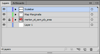
The first decision you have to make is how you select your art. You can either select the layer that the art is on or directly select the art itself. This determines where the changes you make get applied. In order to select the layer, click the circle to the right of a layer name in the Layers panel. You will see that the layer is selected (also known as targeted) by the addition of another circle around the first circle.
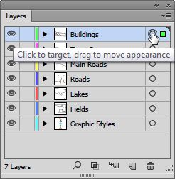
Selected Layer.

To select all the art on a layer you can either click in the space to the right of the circle, or Alt-click the layer name.
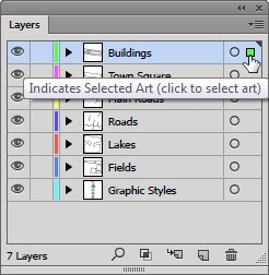
Selected Art.

If you expand the layer you can see that the art is targeted rather than the layer.
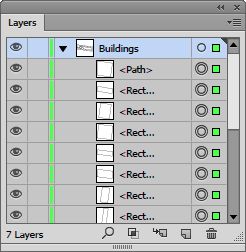
Targeted Art.

Whichever method you use, you will see the art on the canvas appear as selected.
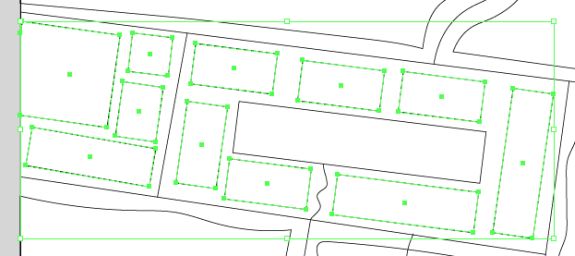
Selected Buildings.

Of course you can select individual art using the Selection tool or clicking to the right of the circle next to the object name in the Layer panel.


Changing Strokes and Fills

One advantage of selecting art at the layer level over selecting art directly is the access to the strokes and fills in the Appearance panel.
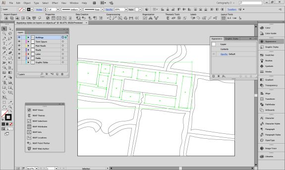
Selected Layer’s Stroke and Fill are unavailable.

If you select the layer, you do not get direct access to the art’s strokes or fills, however if you select the art you do.

Selected Art’s Stroke and Fill are available.

You can add more strokes or fills in the Appearance panel, but if you want to add strokes or fills at the layer level, they are additional to the strokes or fills that are defined at the object level. We can see this if we style the fields individually with different fills, perhaps representing different crop types. We could also add a stroke to each object, or we can add the stroke to the layer. Adding strokes or fills like this is useful when you want to ensure that all art on that layer shares the same symbology.
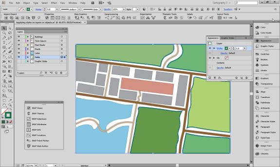
Object level Fill and Layer level Stroke.

Directly changing the appearance of objects is reflected both in the Appearance panel and the object thumbnails in the Layers panel.
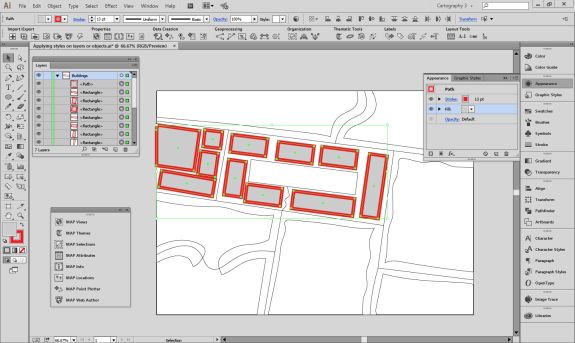
Object appearance is shown in thumbnails.

However, if you add extra strokes or fills at the layer level, these are not shown in the objects thumbnails.
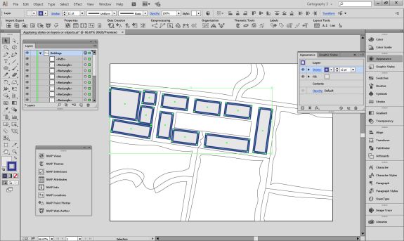
Layer appearance is not shown in thumbnails.

One important consideration is that it is not possible to use the Appearance panel to adjust several pieces of art with different fills or strokes that are applied at the object level. For example, suppose we have changed the colours of several building outlines, and now want to change them back to black. If we select them all, we will see that the stroke option is not available in the Appearance panel, rather it says Mixed Appearances. The fill is still available to be changed as it is the same for all objects.
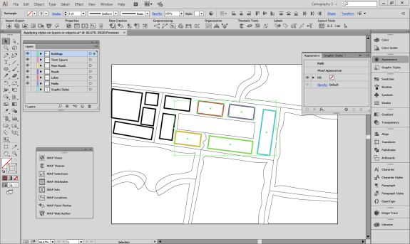
Objects with mixed appearances.

Altering appearances can have different results if applied to objects or layers. A good example is a street style that is created with two strokes. If this is applied at the object level, each object is considered separate and you end up with overlapping paths.
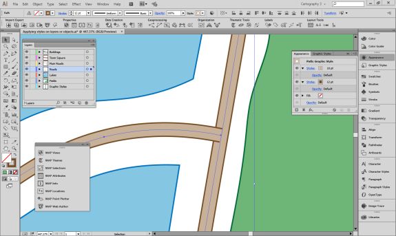
Overlapping stroke styles.

However, if this style is applied at the layer level, the paths are styled at the same time and appear to be merged.
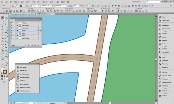
Merged stroke styles.


Applying Graphic Styles

Graphic Styles are great to easily add combinations of strokes, fills and effects to art, and these can also act differently when applied to objects or layers. In the Graphic Styles panel we have a Graphic Style with null fill and stroke, but a drop shadow added. If we try to add this directly to the building art, the null fill and stroke will cause the buildings to disappear.
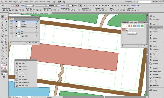
Object disappears when this style is applied.

However we can add it to the Buildings layer and the effect is successfully combined with the object level appearance.
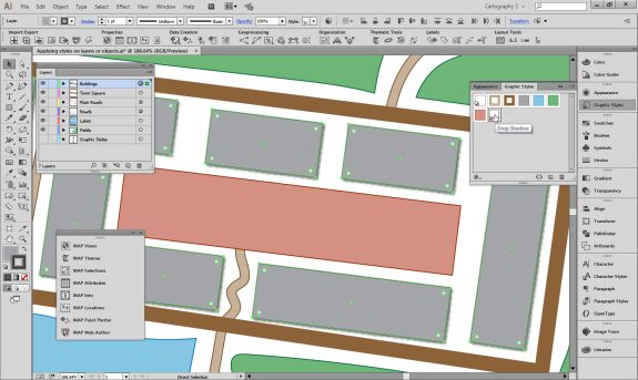
Graphic style applied to the layer.


Resolving Appearance Confusion

As mentioned earlier, it is possible to combine object level and layer level appearances. This can get complicated if you have different objects on the same layer with different appearances as well as appearance modifications at the layer level. Trying to work out why you cannot adjust the style of your paths because you are getting Mixed Appearance in the Appearance panel can be frustrating.

The easiest method to fix this is to use the Clear appearance button in the Appearance panel. Keep in mind that this will totally remove any appearance formatting that you have applied to your layers or objects, so it is worth creating Graphic Styles of the appearances you want to retain. Just like changing appearances, this button works at both the object and layer levels.
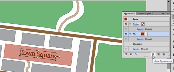
The Clear appearance button is a useful way to remove appearance properties.

An example of how layer and object appearances can get confused is multiple white strokes applied to different text objects in different ways. The user has created several text objects labelling fields and added strokes to them in various different ways. However, he’d like to remove the strokes from all the text now. You can see that the different labels all have black fills and white strokes, but are subtly different.

The first thing to do is check the Layers panel. We can see that the target indicator for the Field Labels layer is raised. This indicates that an appearance has been applied to this layer.
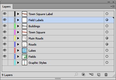
The embossed circle (or meatball) shows an appearance has been added.

Once we click on this we can use the Appearance panel to remove it with the “Clear Appearance” button.
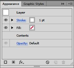
The Clear appearance button is a useful way to remove appearance properties.

That has removed the stroke from the layer and one of the text objects now has no stroke, but some of them still do.
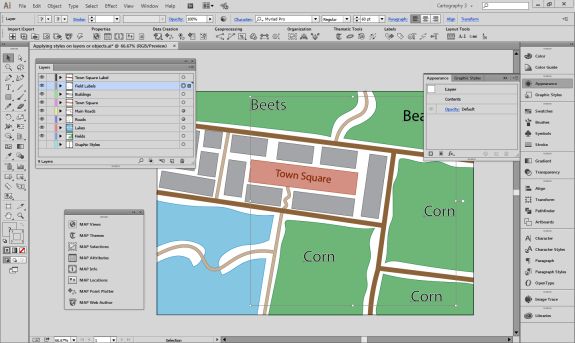
The layer strokes have been removed.

If you expand the Field Labels layer in the layers panel you will see that some of the objects on the layer also have appearances applied directly to them.
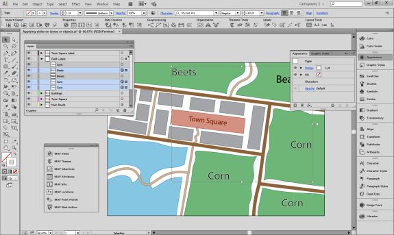
Some of the text objects have modified appearances.

You can select these objects and use the Appearance panel to remove its strokes as well by clicking the Clear Appearance button.
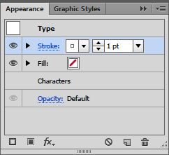
Clicking on the clear appearance button will remove the stroke.

This leaves us with one final label down in the bottom right corner that still has a stroke, but has not had its appearance modified via the Appearance panel.
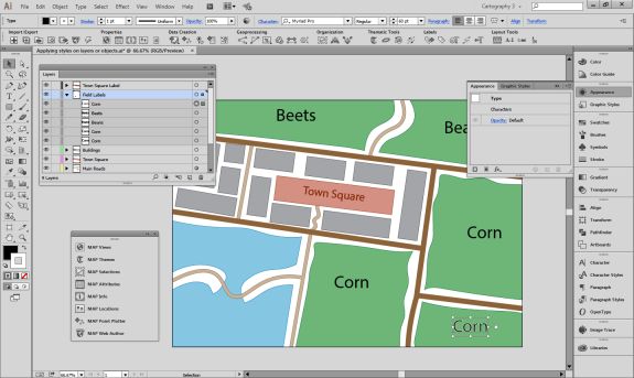
Some of the text objects have modified appearances.

The easiest way to remove the stroke from this object is just to make sure the stroke is in front of the fill at the bottom of the main toolbar and click on the “None” option. Now all our field labels have a simple style.
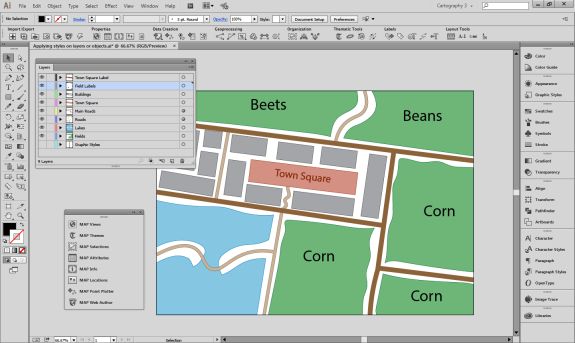
All of the text objects have a simple appearance.

How MAPublisher works

MAPublisher styling tools all work on an object level. This is because MAPublisher has the ability to independently style objects by attributes they possess. For example you can create a new MAP Theme for the Fields layer based on an attribute called “crop”. This will style each field differently using depending upon its crop type.
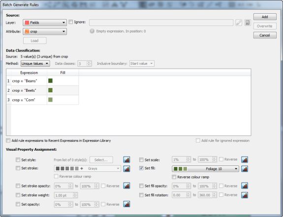
Area Stylesheet theme.

Objects will be styled using standard fills and strokes, rather than using the Appearance panel.
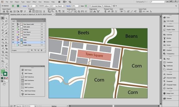
Applied theme.

Using MAPublisher FME Auto to Load Raster Layers into Adobe Illustrator

The MAPublisher FME Auto add-on connects the analysis and processing capabilities of Safe Software’s FME Desktop with the cartographic design and publishing environment of MAPublisherand Adobe Illustrator. Since MAPublisher 9.5, it has been possible to import georeferenced raster layers as well as vector data. This adds an extra layer of power and convenience to the FME and MAPublisher integration. The ETL (Extract, Transform, Load) power of FME can be used to pre-process raster images and load them into MAPublisher where they can be overlaid with cartographically styled vector layers.

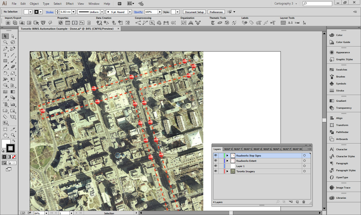
Raster Layer in Adobe Illustrator

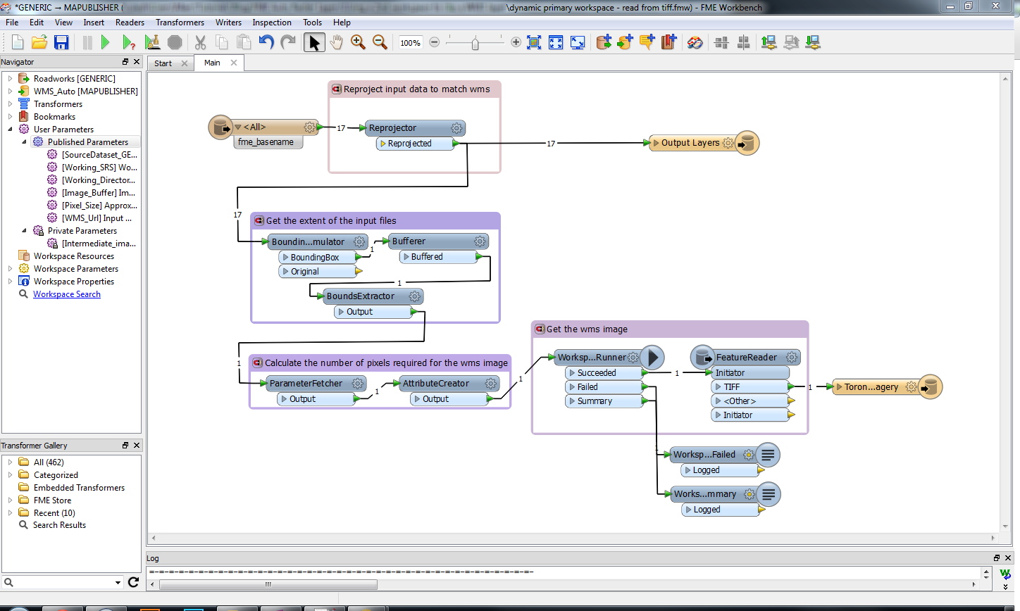
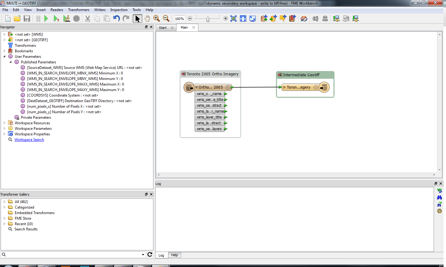
Several components are needed to load a raster from FME into Adobe Illustrator. This example uses a generic reader for the input features. It then gets the bounding box coordinates and sends them to a second workspace that connects to a Web Map Service (WMS) and downloads Toronto imagery. The information necessary to run the second workspace is stored as attributes that are passed to published parameters in the second workspace. This imagery is stored in an intermediate GeoTIFF, which is then read by the first workspace and sent to the MAPublisher writer along with the original data. The WMS source and working coordinate system are already set, but can be modified if the study area is in a different location.

Primary FME Workspace

Secondary FME Workspace

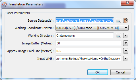
Several of the key parameters for executing the workspace are exposed as published parameters to make running the workspace easier. The user can set the desired pixel size and the pixel dimensions for the WMS request are automatically calculated. The bounding box can be buffered if required to provide extra imagery around the input data.

Published Parameters

MAPublisher MAP Themes are stored in an Adobe Illustrator file that the MAPublisher writer uses as a template. In this case, these MAP Themes are linked to the names of the layers stored in the input data. More flexible themes could be created that bases its symbology on geometry or attribute values.

The example FME workspaces, input data and template illustrator document are attached below in the useful resources section.


Useful Resources

WMS provided by the City of Toronto here
Primary FME Workspace: Download
Secondary FME Workspace: Download
Input Data: Download
Template Illustrator Document: Download
Example completed Illustrator Document: Download

Updating Multiple MAPublisher Templates with FME Auto

Drawing inspiration from this Safe software blog post we have developed an FME workflow that allows the user to update multiple MAPublisher templates with additional layers using two workspaces and a workspacerunner transformer.

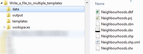
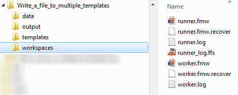
The folder structure for the project follows one possible standard arrangement. A data folder contains the shapefile that is being added to the existing .ai files. An output folder gathers the intermediate .ffs files generated by FME that pass the data to MAPublisher. The templates folder contains the .ai files that will have the layer added to them. Finally the workspaces folder contains the two workspaces required for the transformation.

Folder Structure
Data Files
Output Files
Templates Files
Workspaces Files

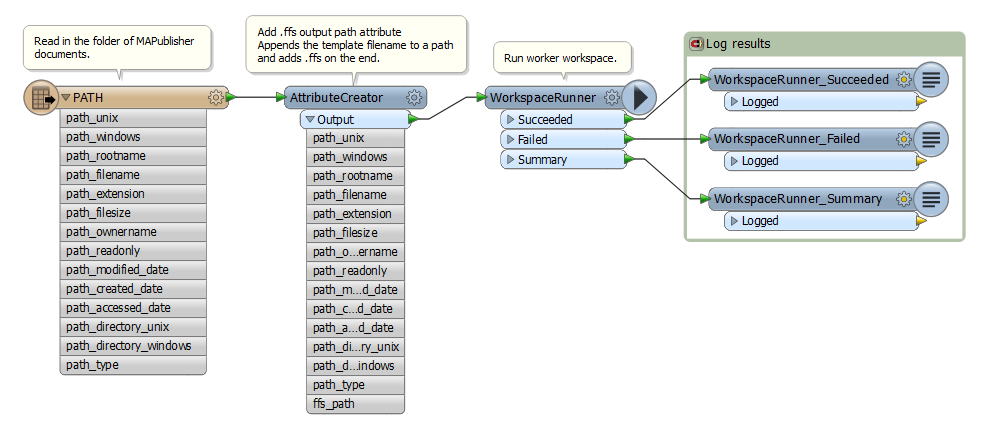
The runner workspace uses a path reader to get the filenames and paths of the .ai files. A filter is applied to make sure only files with the extension “.ai” are read. After the path reader an attribute creator adds the path for the output .ffs files as an attribute. This is dynamically calculated based on the filenames of the input .ai files.

Runner Workspace
(Click for larger version)
Attribute Creator
(Click for larger version)

The full paths to the template files and the paths to the output ffs files are passed as published parameters to the worker workspace. Two published parameters have been created in the worker workspace and linked to parameters in the MAPublisher writer. This allows the writer to take the values passed from the runner workspace. The worker workspace is run once for every file that is in the folder of ai files, and these published parameters update dynamically for each one.

Published Parameters in the Worker Workspace
Workspacerunner Parameters
(Click for larger version)

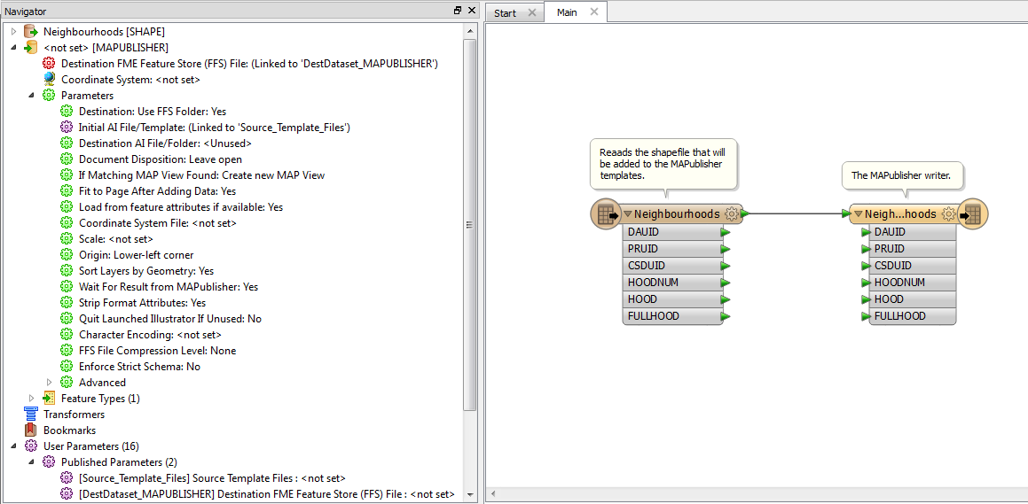
The worker workspace has a shapefile reader that reads in the layer that is going to be added to each template. At this point multiple readers or other transformers could be added to increase the complexity of the transformation.

Worker Workspace
(Click for larger version)

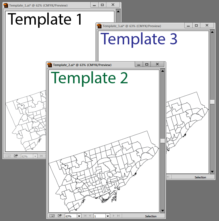
When the runner workspace is launched each template is opened up, the shapefile is read and added to a new MAPView in the MAPublisher document. Equally it could be added to an existing MAPView with a matching coordinate system. These documents can be left open as shown here, or with the addition of another published parameter new output .ai files could also be specified.

Output AI Files
(Click for larger version)

Useful Resources

Example files (Adobe Illustrator CC2104 and FME Desktop 2015)

Using MAP Themes to Automatically Style CanVec+ Data on Import in MAPublisher

Creating multiple maps that share cartographic styling is a common requirement for MAPublisher users. The most effective way to accomplish this is the use of MAP Themes. MAP Themes are a collection of thematic cartography tools designed to increase productivity by automating how styles and symbols are applied. Creating a number of MAP Themes based on regularly used layers with standard attribute schemas can greatly reduce the amount of time spent styling maps.

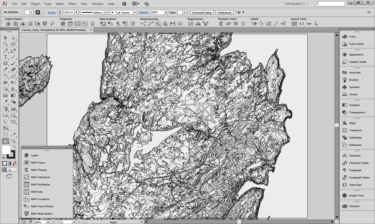
This guide will walk through creating and setting up MAP Themes to automatically apply to the appropriate layers upon import. If done correctly, rather than seeing this:


Unstyled CanVec+ layers


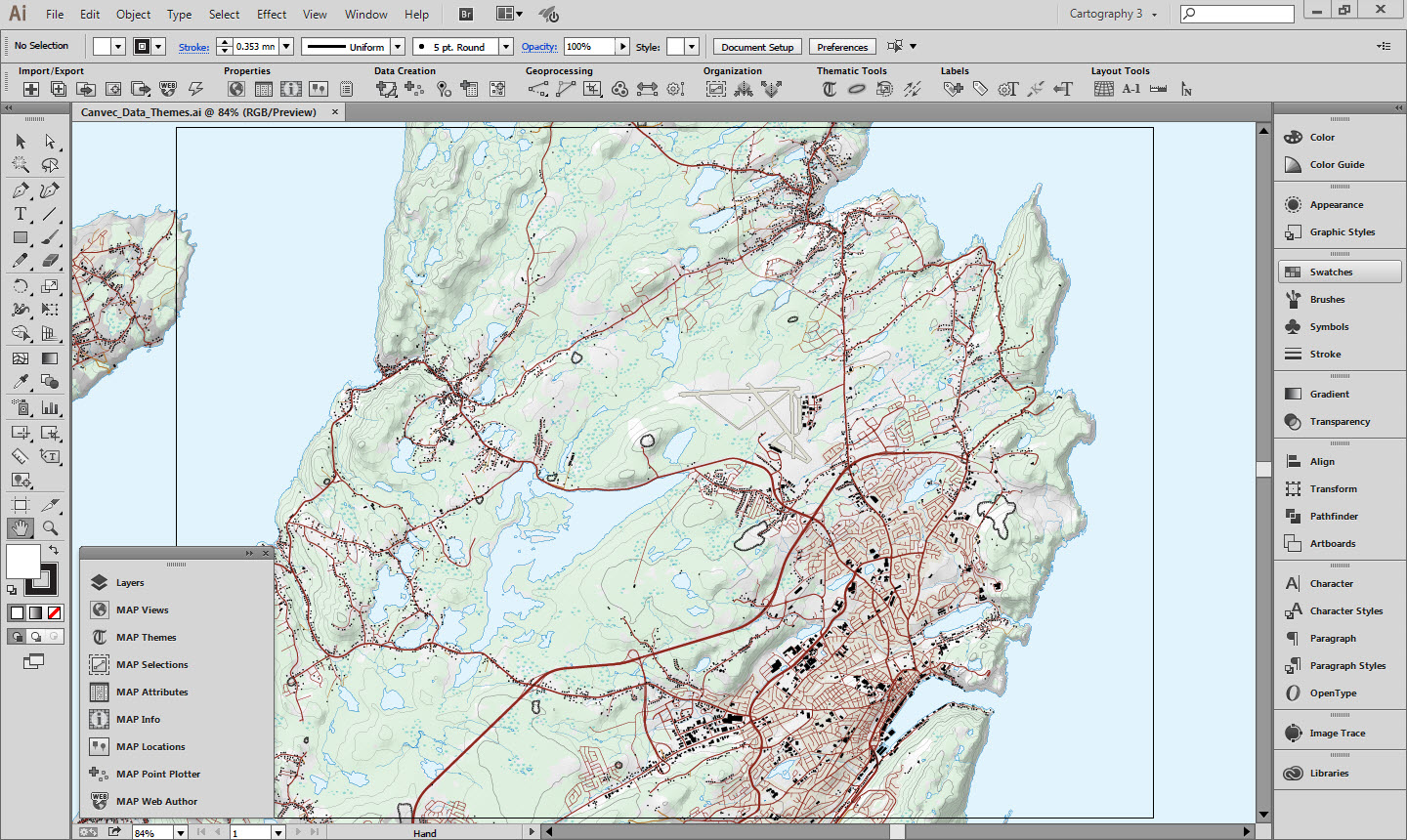
You will see this when importing data to MAPublisher:

Styled CanVec+ layers

1. Data Source

The data used in this guide comes from the publically available CanVec+ topographic database. CanVec+ contains a comprehensive set of layers optimized for display at 1:50,000 that are perfect for topographic mapping. In fact, many of these layers are used in the construction of the CanTopo Topographic mapping series available here.

The layers you receive from the CanVec+ download service will vary depending on what features are present in the extent chosen. The Geogratis Geospatial Data Extraction tool is the most convenient method to retrieve CanVec+ data. This guide uses a selection of CanVec+ layers styled similarly to the CanTopo maps.

All vector data was downloaded in an unprojected geodetic coordinate system and projected into a UTM projection MAP View.

The map shown above contains 12 vector layers and one raster layer, but we will only discuss the styling and configuration of three layers as the process is similar for the rest. You can download the Adobe Illustrator file at the bottom of the page if you want to examine the different layers, their graphic styles and MAP Themes.

MAP Themes are the primary method for applying attribute based cartographic symbology. A powerful feature is the ability to automatically do this on layer import based on geometry type or file name. By defining one or many graphic styles and a MAP Theme for each layer the layers can be automatically styled on import.

CanVec+ themes have a consistent naming scheme that makes them especially suitable for this sort of automated styling. Because each style is always named the same, it is simple to set up the MAP Themes to automatically apply when the layers are imported. The theme names are consistent but somewhat obscure, as are some of the attribute names and values. Luckily there is a specifications document that provides a guide to the various themes, datasets and attributes that are available. A link is provided in the useful resources section below. While the style guide is helpful, it can be difficult to navigate, so it has also been translated into a more easily readable Excel spreadsheet, which also available in the useful resources.

A CanTopo symbology guide is available for download and was used to help define the styles for the different layers used in this map. A link is available in the useful resources section at the bottom. The University of Toronto also hosts an old specifications guide, but as it is almost 14 years old it should not be assumed to be accurate. If you are looking for inspiration though, it is useful.


2. Example A: Building point locations

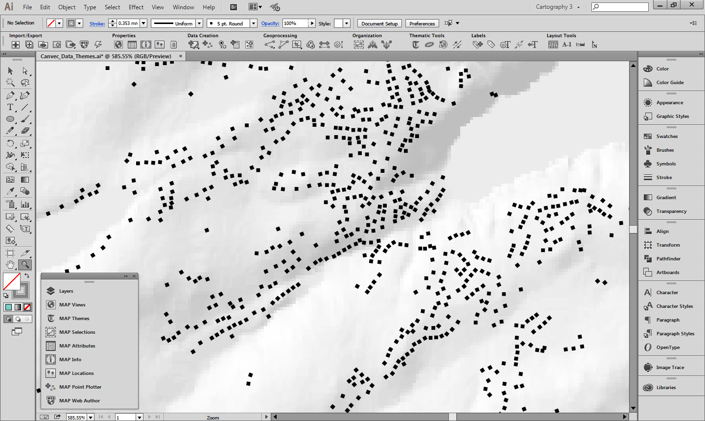
Building Symbols

2a. Building Point Symbol

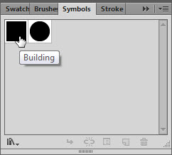
The Graphic style for the building symbols is a black square rotated to match the value in an orientation attribute. Using the CanTopo symbology guide a correctly sized square was created and then added to the symbol library.

Buildings Symbol

2b. MAP Theme

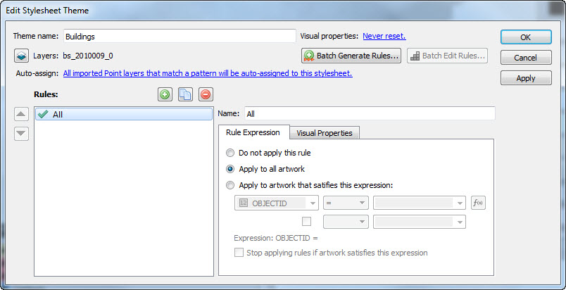
A new Point Stylesheet MAP Theme was created called Buildings. The appropriate layer “bs_2010009_0” was added to the Theme and a rule was created named “All” as it will apply to all the building point locations. The Rule Expression is set to apply the Theme to all artwork as we want all the building points to look the same.

Buildings Rule Expression tab

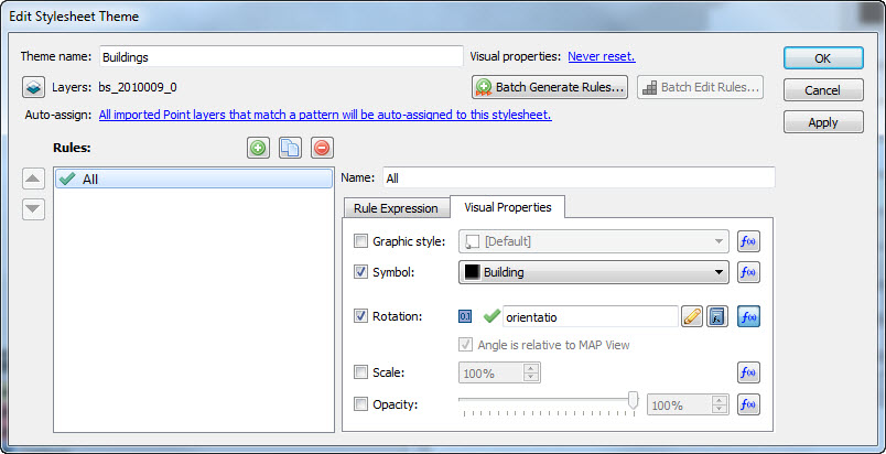
The Visual Properties tab was used to determine how the buildings would appear. The Symbol property was set to use the Building black square symbol created and added to the Symbol library earlier. The Rotation property was set to use the “orientatio” attribute. This ensures the buildings are oriented correctly.

Buildings Visual Properties tab

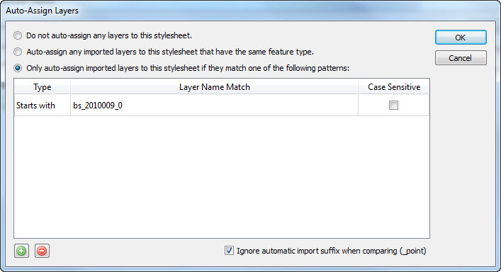
Finally, and most importantly for the MAP Theme automation, the Auto-assign option was set so that any layer that matches the filename of the imported shapefile would automatically be styled using this theme.

Buildings Auto-assign setting


3. Example B: Contours

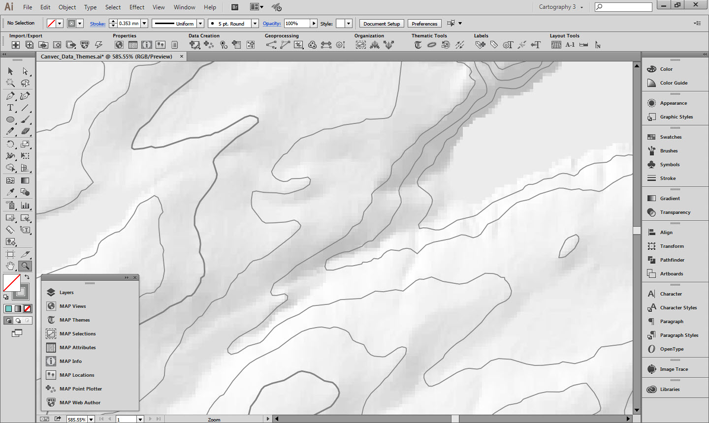
Contours

3a. Contours Graphic Style

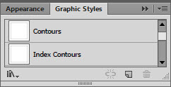
Two Graphic styles were created for the contours: one for the regular contours and one for the index contours at intervals of 100m. Both are grey, with the index contours slightly thicker (although it is hard to tell in the Graphic Styles panel.)

Contours Graphic Styles

3b. MAP Theme

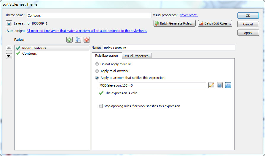
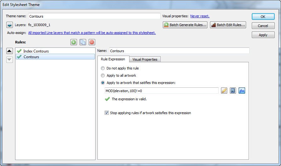
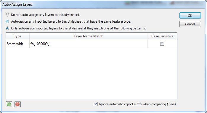
A Line Stylesheet MAP Theme was created called Contours. The layer “fo_1030009_1” was assigned to the MAP Theme. Two rules were created, one for index contours and one for regular contours. For the index contours, the Advanced Rule Expression builder is used to select any contour where the elevation is a multiple of 100, and the converse for the regular contours.

Index Contours Rule Expression

The Modulo (MOD) function makes this simple. For the index contours, the expression built as: “MOD(elevation,100)=0”. For the regular contours, the expression is “MOD(elevation,100)!=0”. The != operator means not equal to.

Contours Rule Expression

The Modulo function will be available with a future release of MAPublisher. If you are using an earlier version of MAPublisher, the same result for index contours can be had with this expression:

(elevation/100)-ROUNDDOWN(elevation/100,0)=0

If you do try and apply this MAP Theme with an earlier version of MAPublisher without changing the equations, it will not work and you will get errors.

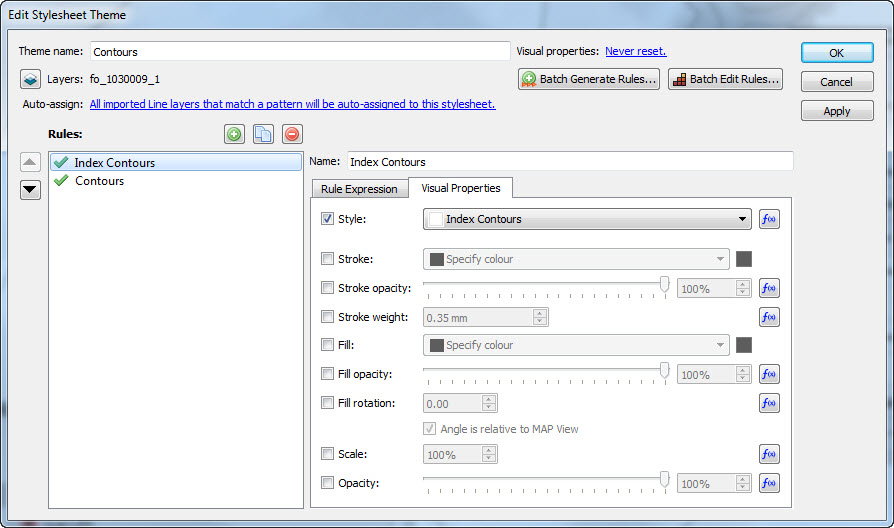
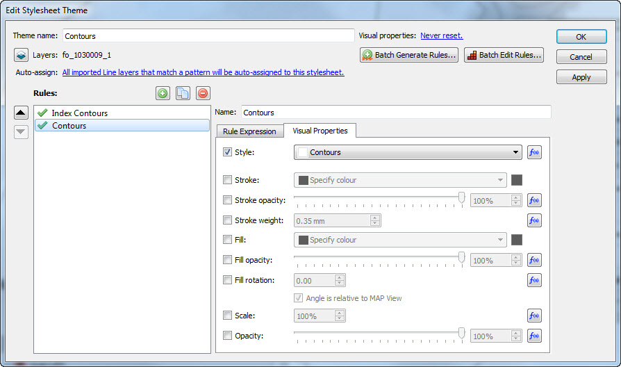
Each rule is assigned the appropriate graphic style applied in the Visual Properties. Creating Graphic Styles in advance is much easier than trying to remember specific stroke/colour combinations and makes them re-usable.

Index Contours Visual Properties

It is worthwhile organizing them in the Graphic Styles panel and naming the Graphic Styles appropriately so you can easily remember which is which later.

Contours Visual Properties

The layer is then set as auto-assigned so that when it is imported in the future this MAP Theme will automatically be applied.

Contours Auto-assign setting


4. Example C: Roads

Roads

4a. Graphic Style

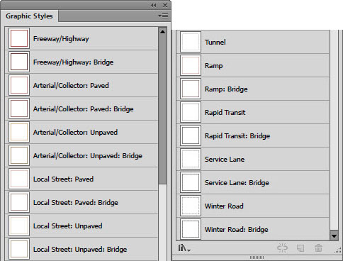
The Roads layer is the most complex as there are multiple different classes of roads, that are then broken down into sealed and unsealed surfaces, and can be at grade, tunnels or bridges. Several of the road classes are assigned the same Graphic Style, so each style was named after a representative road class and assigned to several MAP Theme Rules.

Roads Graphic Styles

4b. MAP Theme

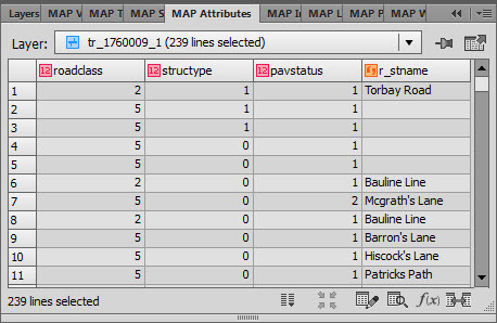
There are defined styles of roads in the CanTopo specifications, but these do not map directly to the attributes that are present in the CanVec roads dataset. There are several attributes that hold information about the composition of the road, but the ones that were used to define the MAP Theme Rules were:

  1. roadclass: a heirachy of road types
  2. structype: defines if the road is a road, a bridge or a tunnels
  3. pavstatus: contains information on the road surface, if it is paved or unpaved.
Roads Attributes (many others are hidden)

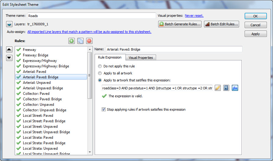
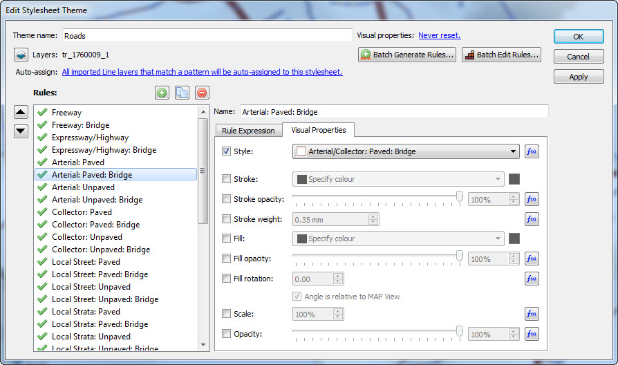
A Line Stylesheet Theme was created called Roads. The layer tr_1760009_1 was assigned to this Theme. Each road class has its own rule. The rule expression determine what class of road it is, if it is a bridge or a tunnel, and if it is paved or unpaved. An example of this is “Arterial: Paved: Bridge” with the expression:

roadclass=3 AND pavstatus=1 AND (structype =1 OR structype =2 OR structype =3 OR structype =4)

which simply says select art that is an Arterial Road (roadclass=3) is paved (pavstatus=1) and one of four different types of bridge (structype 1 through 4).

Roads Rule Expression

As in previous examples, each rule is assigned a Graphic Style in the Visual Properties tab.

Roads Visual Properties

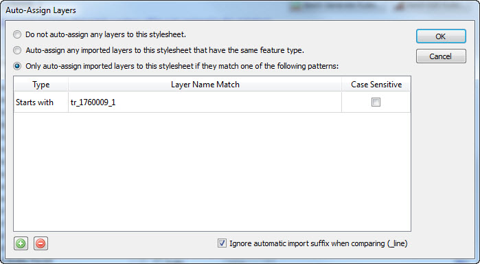
The layer is set to auto apply on import.

Roads Auto-assign setting

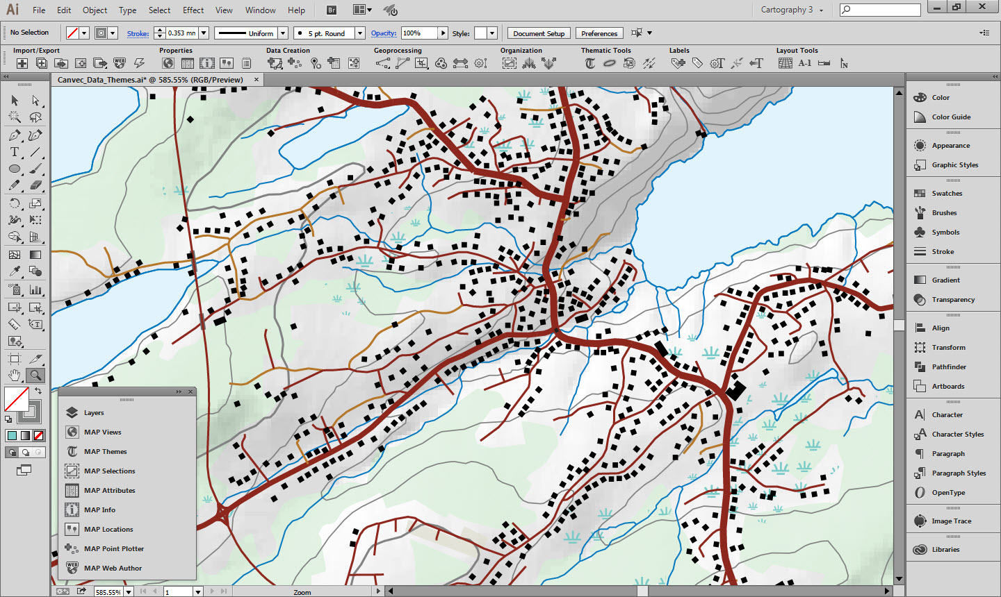
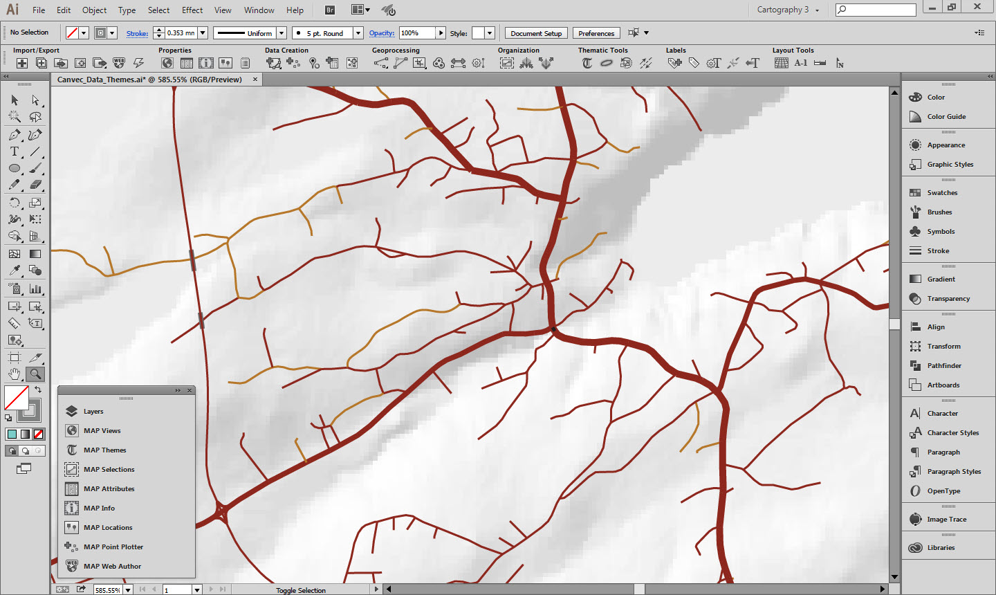
Once rules are created and applied to all the imported layers the end result looks like this:

Styled Layers overlaid on hillshade


5. Hillshade

In addition to vector data, the GeoGratis portal has raster terrain data available for download. There are digital elevation models, digital surface models, and a variety of derived products such as slope and aspect. For this map we downloaded a hillshade and adjusted the opacity so it would blend with the map style. The forest cover layer and the built up areas layer also had their blending modes adjusted so the hillshade would show through.

The hillshade was downloaded in an unprojected geodetic coordinate system and Geographic Imager was used to transform it into the UTM projection used for this map.


6. Final words

In order for the defined MAP Themes to be automatically applied to any imported data, the imported layer filenames must match those defined in the MAP Theme Rules as discussed above. If you would like to try it out with your own CanVec data extract, do the following:

  1. Download the “Canvec_Data_Themes.ai” file linked below for the version of Illustrator you are using. Have a look at the data structure, layer names and MAP View properties of this document.
  2. Also download the appropriate “Canvec_Data_Themes_Empty.ai” file to use as a template.
  3. Download an extract of CanVec data as shapefiles.
  4. Use the Advanced Import functionality to import the shapefiles into the empty document. Reproject the map if desired.
  5. The imported data have the styles applied automatically. However, you will probably have a few layers that have no style. Use the methods detailed above to create new styles for those layers.


7. Useful resources

CanVec Demo. (Created with MAPublisher 9.5.3, AI CC2014) – File Download
CanVec Demo – No Layers. (Created with MAPublisher 9.5.3, AI CC2014) – File Download
CanVec Demo. (Created with MAPublisher 9.5.3, AI CS6) – File Download
CanVec Demo – No Layers. (Created with MAPublisher 9.5.3, AI CS6) – File Download
GeoGratis Website
GeoGratis FAQ’s
CanVec Style Guide for Adobe Illustrator – File Download
CanVec Feature Catalog
CanVec feature Catalog Spreadsheet (Unofficial, non-maintained. For information only.) – File Download
University of Toronto Topographic Cartographic Symbols Archive

Making a Map Without Knowing What the Final Extent or Scale Will Be

Ever have the problem that you want to make a map and you are waiting on the final extent or scale, but you want to get started adding data and working on the layout? Here are a couple of tips to make your life easier.


1. Move artboards around without moving your data

Geographic features in Adobe Illustrator are generally referenced to a known coordinate system. This coordinate system is mapped to Adobe Illustrator’s “Global Coordinate System” which has its origin at the top-left corner of the first artboard in a document. What this implies is that artboards can be moved around within this reference system in order to show different geographic data on the page. However, by default, moving an artboard moves any art that overlaps it as well. Obviously moving any referenced data around is going to ruin its spatial accuracy so this is something we want to avoid. Luckily there are two ways of doing this.

The first is to select the Artboard tool and click the Move/Copy artwork with artboard button to the right of the artboard name in the control panel above the document window.

Active artboard tool at the top left.
Deactivated Move/Copy artwork with artboard button at right.

With this option turned off, you are free to move the artboard around without disturbing any of the geographic data.

There is one downside to this though: you may have map elements such as titles, legends, grids, masks etc. that you want to stay locked in place on the artboard while you move it around the geographic data. The easiest way to do this is to simply lock any layers that contain geographic features, unlock the map elements, and activate the Move/Copy art with artboard option.

Non-map layers are unlocked while the layer that contains geographic data is locked.
Activated Move/Copy artwork with artboard button at right.

When the artboard is repositioned, your data will stay in the correct geographic location and your map elements will move with the artboard, keeping the same relative position.

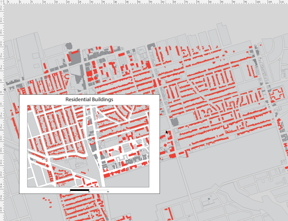
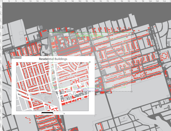
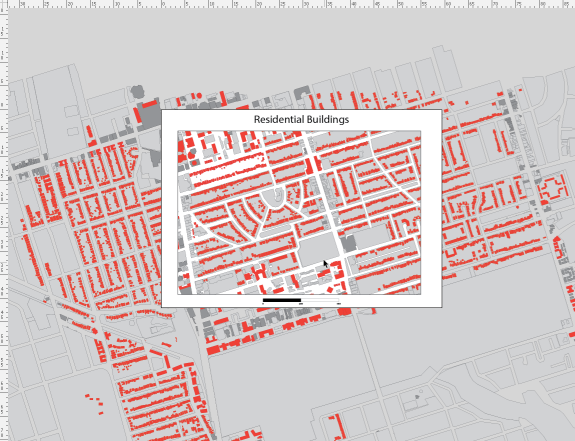
Three images showing an artboard moving while the geographic data stays put.

2. Set up a clipping mask in conjunction with a grid

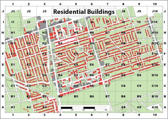
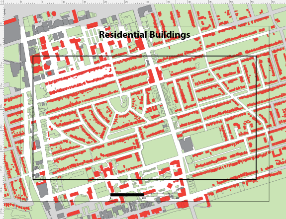
The previous example used a white polygon with a hole in the middle as a mask to provide whitespace around the edge of the map. Another way to achieve this is to use a clipping mask to hide geographic features outside the extent of the mask. This works well by itself, or when combined with a grid or graticule layer.

We have taken the previous example, deleted the mask and adjusted the colour of the background polygons slightly. We have also added an AOI polygon that will serve as the clipping mask extent.

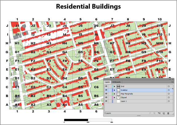
Artboard extents are visible along with some data, a title, a scalebar and the clipping polygon.

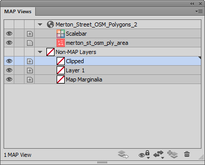
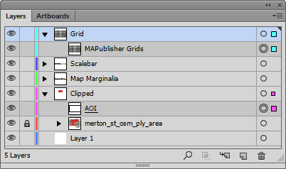
To create a clipping mask, the first thing we’ll make a new layer called Clipped. Make sure that it is a non-MAP layer (verify this in the MAP View panel).

The new Clipped layer can be seen in both the Layers panel and the MAP Views panel.
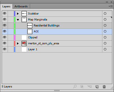
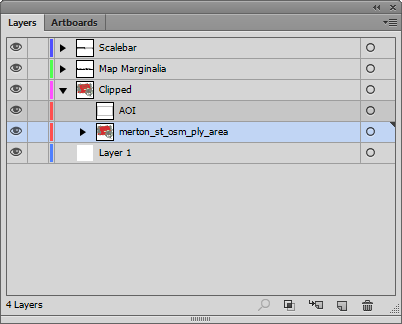
Next, drag both the AOI layer and layers that contain geographic data into the Clipped layer making sure that the AOI rectangle is above the layer holding the geographic features.

The AOI layer and the MAP Layer are added to the Clipped layer.

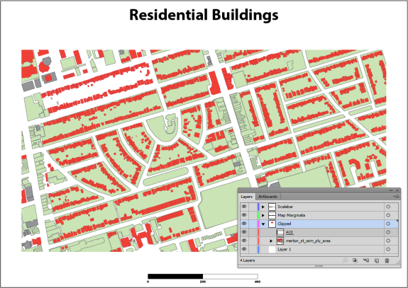
Now if we select the Clipped layer and click on the Make/Release Clipping Mask button (Second from the left at the bottom of the panel) we should see the AOI rectangle become invisible and the MAP layer is visible within the extent of this path.

The clipping path gets underlined in the Layers panel and the geographic features are clipped to its shape.

We can now add a grid over the top of the clipped area using the Grids & Graticules tool. You will find that the default extent of the grid is the same as the spatial data. You will need to resize the grid to match the clipping mask.

Index/reference grid overlaid on the map.

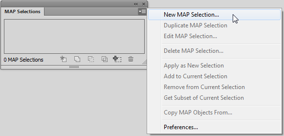
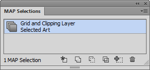
If you want to change the spatial extent of the map you have to adjust both the clipping polygon and the grid. It would be nice to group them and resize it together, but Adobe Illustrator doesn’t allow groups to span multiple layers. One way around this is to use a saved selection. To do this, select the clipping mask and the MAPublisher Grids, then choose Select | Save Selection. Give the selection a name like Grids and Clipping Mask.

Grid and Clipping Mask selected.
New MAP Selection
Art Selection

Now if you need to adjust the spatial extent of the map you can quickly choose the saved selection and resize the clipping mask and grid or move them both around the artboard simultaneously.

The saved selection can be applied by clicking the Apply as New Selection button on the left.
Map grid and clipping mask have been enlarged together. The scale has also been made smaller.

Improve Mosaic By Resampling Images in Geographic Imager

The Mosaic function in Geographic Imager merges multiple georeferenced images together to create a single composite georeferenced image. Though the goal of the mosaic is to create a single and seamless composite image, combining images with the Mosaic tool will often result in a slight shift of the imagery due to differences in the original pixel registration grid. This means that even when images are in the same coordinate system with the same spatial resolution, error can still be introduced because of a difference in the pixel alignment. Due to this, mosaicking processes in general tend to produce results that may be very close, but not exact. With this in mind, the results of your mosaic may be improved by resampling your images beforehand to the smallest unit of the resolution.

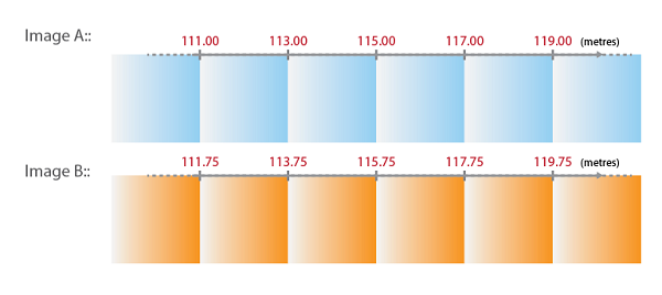
As an example, let’s say we have an image where the pixel size is 2.00 metres. When plotting the X coordinates of every pixel in this image (using the top left corner of the pixel), the X coordinate value will be incremented by the number/distance of the pixel size. For example, if the X coordinate values were to start at 111.00, then the next pixel would be 113.00, 115.00, 117.00, and so on. It’s important to note that these coordinate values are discrete, which means that the values could not be 113.22 or 115.77 because the origin of the coordinate in this case starts at 111.00 metres.

Now, we have another image that we want to mosaic with the first image. In this instance, the first image will be “Image A” and the second image will be “Image B”. Image B has the same coordinate system as well as the same pixel size as Image A.

Take a look at the X coordinates in Image A and Image B below:

We can see that the X coordinate in the top-left corner is different between these two images, and as previously mentioned, we know that the X coordinate values are discrete. When mosaicking Image B to Image A, the X coordinate cannot be 111.75 or 113.75. The coordinates must be 111.00, 113.00, 115.00, and so on, following the pattern of the pixel grid values in Image A.

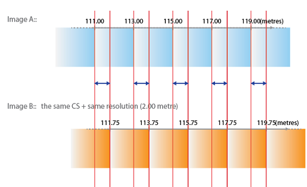
This means that Image B will need to be “shifted” or “snapped” to the closest coordinates when the mosaic is performed, see below:

As a result, the X coordinate of Image B will be shifted by 0.75 metres (less than half a pixel). The pixel with X coordinate 111.75 is now placed at 111.00 and the next pixel with X coordinate of 113.75 will now be placed at 113.00, and so on.

With this in mind, the results of your mosaic may be improved by resampling your images to the “smallest unit of the resolution”. The smallest unit of the resolution can be determined from the difference in the coordinates (spatial alignment difference) between the two images.

Looking back at our example, we can see that the smallest unit of the resolution (represented by the blue arrow) in this case is 0.75 metres – this is the value we will use to resample our images.

Once the images have been resampled to 0.75 metres, we may go ahead with our mosaic.

The above example demonstrates the possibility of a pixel shift after a mosaic for two images with a different pixel alignment. It should be noted that this example explains the problem in one-dimension (looking at only the X coordinate) when the image in reality is in two-dimension (looking at both X and Y coordinates). The basic principal of the pixel shift in 2D is the same, but it would include the direction of the shift when mosaicking images. In addition, it’s important to keep in mind that although resampling your images to the smallest unit of the resolution will improve the final mosaic, this is not always an efficient process when mosaicking with more than two images. Another thing to remember is that resampling your images will make your file size much larger. However, in cases where high precision is desired, resampling the images beforehand is a process that should be considered.

Defining the Projection or Projecting the Data?

Have you ever imported data that doesn’t quite line up how you’d expect? It may be that you’ve fallen victim to a common workflow error when importing GIS data. Some file types such as CSV can be used for GIS data but don’t contain coordinate system information. When you are importing data from this format, you first have to define the correct coordinate system.

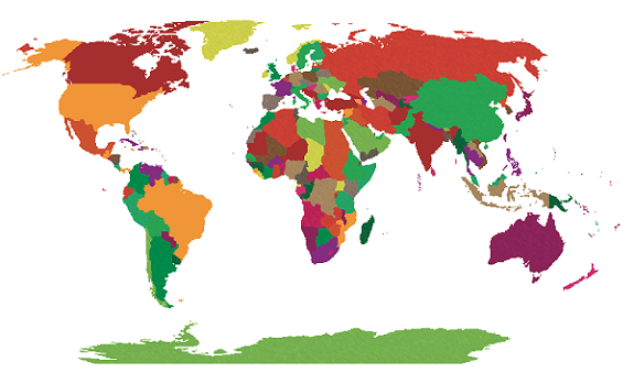
In this example, we’re going to look at the common mistakes people make and how to avoid them. We’ll start with a world map in the Robinson projection.

Robinson mapWe have a CSV file containing points for large cities that we’d like to add to the map. We know from our data source that the CSV uses the WGS84 coordinate system. After selecting the file for import, the MAPublisher Import dialog box helpfully notifies us that some required settings are missing. We’ll click the blue ‘Required settings are missing’ link to continue.

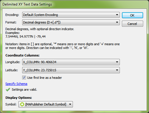
required settingsSetting up the import, the coordinate column settings are easy since we have an X_COLUMN and a Y_COLUMN, but we can’t forget to check that the format is correct. The default is Projected units, but we know the file uses WGS84, and can tell by the numbers in the column that the coordinates are in decimal degrees, so we’ll change the format to reflect this information and click OK.

csv correct settingsBack at the import window, we see the message ‘Data loaded successfully’. Great! Let’s click OK and add the large cities to the map.

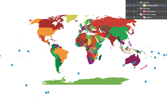
csv settings are okThe data has been imported but the result isn’t what we expected. The new layer has been added to a new MAP View, so let’s try dragging it into the Robinson MAP View with the world map.

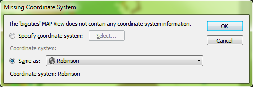
import incorrectWe get a prompt saying that there isn’t any coordinate system information. We want it to be in Robinson like the rest of the map so we’re going to leave the default setting of Same as: Robinson.

coordinate system undefinedThe data has moved, but it still doesn’t look like we were expecting. Where did we go wrong here?

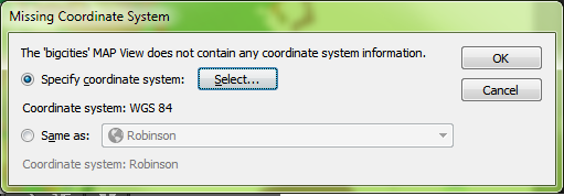
transformation incorrectThere are actually two places in the workflow where we could have avoided this common mistake. When we dragged the point layer into the Robinson MAP View, the pop-up dialog box prompted that a coordinate system wasn’t specified. We specified Same as: Robinson, thinking this was the correct choice, but we had already determined during import that the CSV was in WGS84. What we should have done here was to specify the coordinate system as WGS84.

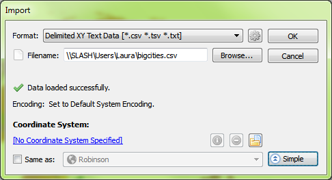
missing coordinates correctThe other place where we could have avoided this error was right after setting up the CSV file for import. In MAPublisher 9.4, there’s a new button on the Import dialog box that allows you to see more detailed information about files being imported. By clicking the Advanced button in the Import dialog box, we would have noticed that there was no coordinate system specified.

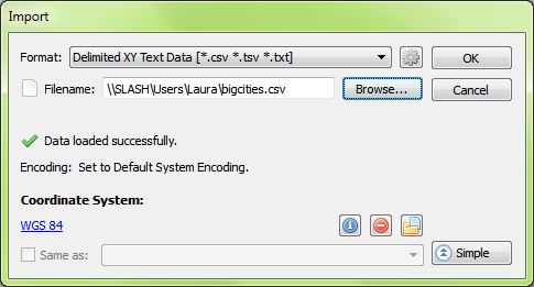
advanced import windowEven here, it might have been tempting to choose Same as: Robinson to add it to the Robinson MAP View, but this would import the points exactly the same as before – all in one location in the middle of the map. Instead, what we want to do is click the blue ‘No Coordinate System Specified’ link and choose WGS84. After this is set up, we’ll click OK to add the data to the map.

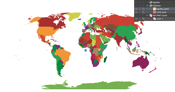
correct import settingsThe data still isn’t quite right – it looks the same as when we first imported it. But again we notice that it has been imported into a new MAP View, so we’re going to drag the layer into the Robinson MAP View and see what happens.

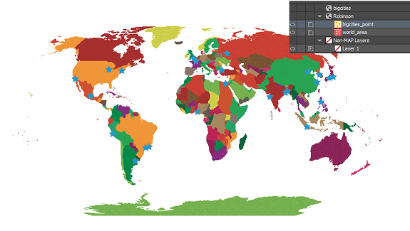
import incorrectPerfect! By assigning the correct coordinate system to the data during import, the points have been imported correctly!

correct map with pointsMistakes during data import are common amongst GIS users, especially those who are just starting out. In the first scenario, when we imported the CSV and added the data directly to the Robinson MAP View, we thought we were telling MAPublisher that we’d like it to match up with the map. What we really did was tell MAPublisher that the data was already in the Robinson projection, even though we knew it was in WGS84. What we should have done first was to define the projection by telling MAPublisher what coordinate system the data is already using. Once MAPublisher knows what system the data is starting in, we can then ask it to project or transform the data into the coordinate system that we’d like to use.

When working with data that doesn’t have coordinate systems already defined, it is very important to follow the workflow in the correct order to avoid frustration when the data doesn’t line up as expected. Always check your sources when using data that isn’t defined, and make sure you’re assigning the correct coordinate system before performing any transformations or projections.

New Image Data Type Available in MAPublisher

Do you have pictures and images you want to insert as an attribute in MAPublisher?

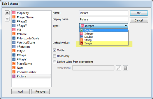
MAPublisher 9.4 introduces a new data type called Image. To work with the Image data type, you’ll have to take a look in the MAP Attributes panel. The Image data type can be used in the same way as the other data types in the MAP Attributes panel. Use the Edit Schema dialog box to edit or create the Image data type as an attribute.
For this example, we have a point layer called “Point of Interests”. Let’s create a new attribute column with Image data type called “Picture”.

Edit Schema with a new data type "Image Data Type

We added a fourth attribute to this point layer (existing attributes were PlaceName, Note, and PhoneNumber).

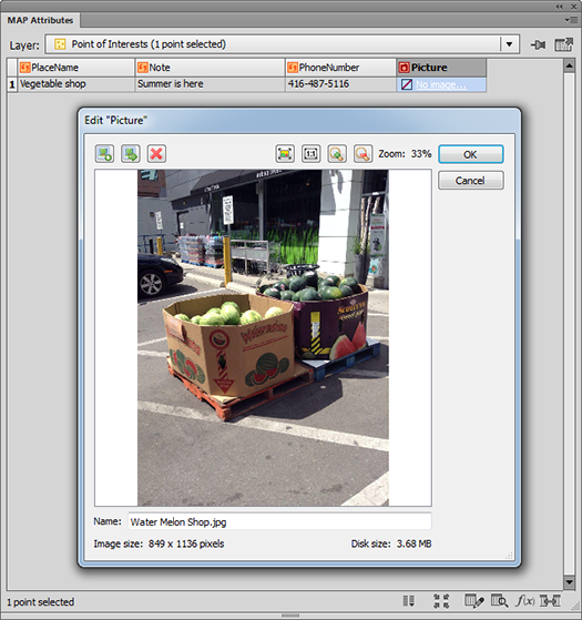
Let’s insert an image into the attribute cell. Click the “No image…” hyperlink in the attribute cell. It will open the Edit Picture dialog box. Click Let's insert an image file to an attribute cell to browse for an image to add to the attribute cell. Once the image is added, a preview of the image will be visible in the Edit Picture dialog box.
Inserting a photo as an attribute value

There are other controls in this dialog box.

Edit Image Attribute Window: button for Select an image Select and insert an image to the attribute cell. Use this button to replace the existing image to something else. You can insert jpg or png file.
Edit Image Attribute Window: button for Export image attribute as jpg or png Export image as jpg or png
Edit Image Attribute Window: button for removing image from the attribute cell Remove image from the attribute cell
Edit Image Attribute Window: button for navigation control (zoom to fit) Navigation control – zoom to fit
Edit Image Attribute Window: button for navigation control (zoom to actual size) Navigation control – zoom to actual size
Edit Image Attribute Window: button for navigation control (zoom in) Navigation control – zoom in
Edit Image Attribute Window: button for navigation control (zoom out) Navigation control – zoom out
Edit Image Attribute Window: Textbox to change the name of the imageChange the name of the image


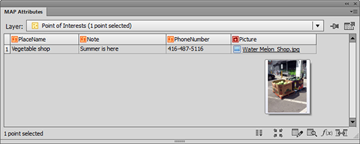
After clicking OK, the image will be listed in the attribute cell. The cell shows the file name of the image (it will be the file name of the image by default but you can change the name of the image to anything else). Also, hovering the mouse pointer over the image name in the attribute cell will show a quick preview of it.

An image file is inserted to an attribute cell as image data

The Image attribute type also supports images exported from PDF Maps (in KML format) and images exported to Google (in KML format).


What is the difference between Grid Bounds vs Grid Constraints?

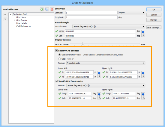
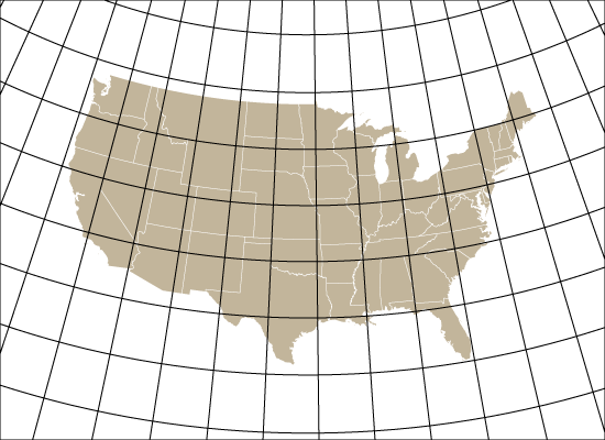
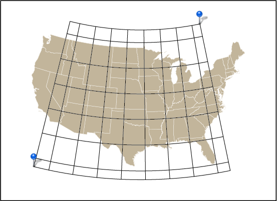
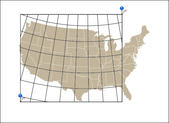
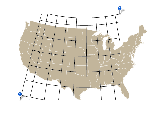
In MAPublisher, the grid bound is the visual extent of the grid or graticule. The grid constraint is the geographic extent of the grid or graticule. It may be a little confusing since both grid bound and grid constraint are defined by coordinate values. In terms of hierarchy, think of the grid bound as the overall container of the grid and the constraint as being contained within the bound.

MAPublisher Grids & Graticules dialog box

These examples may help you better understand it.

1. In this example, the grid bounds are specified as the lower-left and upper-right of the artboard corners. Notice that the graticule extends all the way to the edge of the artboard (as specified). This is a very typical way to use a grid or graticule.

Grid bound extent set to artboard corners

2. Here, the grid bounds are still the lower-left and upper-right of the artboard. The grid constraint is based on the minimum and maximum longitude and latitude values of the specified MAP Locations. Notice that the rectangular black border of the grid bound is at the edge of the artboard. This is also a common way to use a grid or graticule, especially for larger scale maps.

Grid constraints set to MAP Locations

3. In this example, the grid constraints were disabled and, instead, the two MAP Locations are used to define the grid bounds. Notice that the rectangular black border of the grid bound is defined by two MAP Locations.

Grid bound extent set to MAP Locations

4. When both grid bound and grid constraint are set to the same coordinates (in this case, MAP Locations) you can see the result here. The grid bounds are clipping the grid constraints. This would not be an ideal situation to use grid constraints, but it is definitely possible to use it in this fashion.

Both grid bound and grid constraints set to MAP Locations

MAPublisher Grids & Graticules are highly customizable and we’ll be blogging more about its features.

Data Collection: Getting Elevation Information with MAPublisher

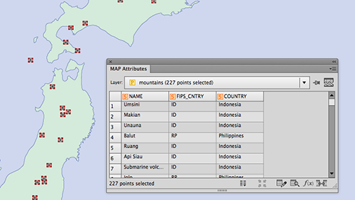
Mountain Information with no Elevation Data

Have you ever had a point dataset where you wanted to obtain the elevation information for every point?

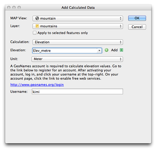
Instead of looking up another dataset to join elevation values or worse, looking them up by hand, MAPublisher 9.3 introduced a new feature to determine the elevation value for every point in a MAP Point layer using the “Add Calculate Data” tool. MAPublisher 9.3.: Add Calculated Data Tool Icon. This is based on using a GeoName account (more on this below).

To use it, simply have a MAP Point layer imported to the artboard and open the Add Calculate Data dialog box. In this example, we’re trying to gather elevation points for mountains in Japan. In the Calculation drop-down list, choose Elevation. You can choose the units for the elevation value from the drop-down list. For this example, we are choosing “meter”. If you do not have the GeoName account yet, click the hyperlink and obtain one (for free). After you’ve registered for a GeoName account, enter your username and click “OK”.

MAPublisher: Add Calculate Data Tool Window

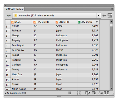
A new column “Elev_metre” is populated as specified in the Add Calculated Data dialog window and every point has the elevation information in meters.

Your data now have the elevation information

This is a handy tool that may help when you have point data along hiking trails, ski courses, waypoints collected with PDF Maps (etc.) or when you need to find elevation data for any type of points.

If you use this feature, please send us your feedback and tell us how you like it!

News Archive