My Account     Contact Us     Cart

Cartographer Chronicles: Robert Simmon

Rob Simmon for Avenza Systems

The visual portrayal of quantitative and qualitative data is a process that requires the right tools. You want your audience to be able to make sense of the data you are sharing and be able to weave that data into a compelling and inspiring story. Here is how Avenza MAPublisher and Geographic Imager assisted Robert Simmon, Senior Data Visualization Engineer at Planet.

Robert isn’t your typical data visualization engineer who had formal training in scientific graphic design or cartography. His passion and interest in computer graphics and a master’s degree in materials science gave him the technical skills to start turning numbers into pictures that eventually helped him communicate with research scientists in his professional career.

Robert’s stepping stone into the fields of cartography, design, and data visualization happened during his work at NASA, where one of his first projects was creating a CD-ROM that would allow students and the interested public to explore a global ozone dataset. During his work there, he began to realize that the graphics published and used by NASA were made more for other scientists than for a broad audience. He also realized that good design was a powerful tool to improve communication. So, he tried to re-create scientific graphics in a more user-friendly form, with mixed success. “It wasn’t until I attended a talk by a popular lecturer on visualization that I learned there was a theory behind good design, and a big lightbulb went off in my head,” says Robert. “I began to read everything I could get my hands on about design, data visualization, and cartography—particularly map projections and the use of colour to encode information, since so much visualization at NASA revolved around satellite remote sensing data, which is quantitative and inherently geospatial.”

Eventually, Robert went on to found the Earth Observatory to share the breadth of NASA’s Earth science research with the interested public. After more than a decade with NASA, he received the chance to join the exciting startup—Planet—and work with an unprecedented, high-resolution, global dataset.

Robert developed a fairly unconventional workflow centred around Adobe design tools rather than GIS or scientific visualization software. This is where the Geographic Imager plugin for Adobe Photoshop and MAPublisher plugin for Adobe Illustrator proved invaluable to bridge the gap between data and visualization.

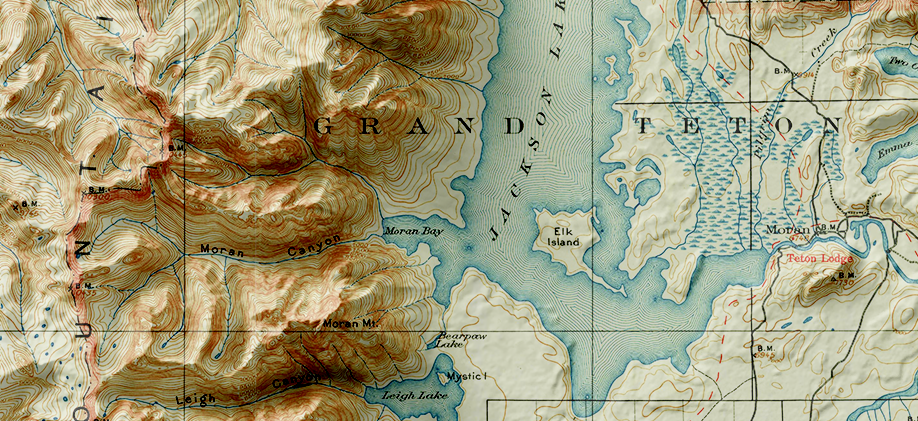
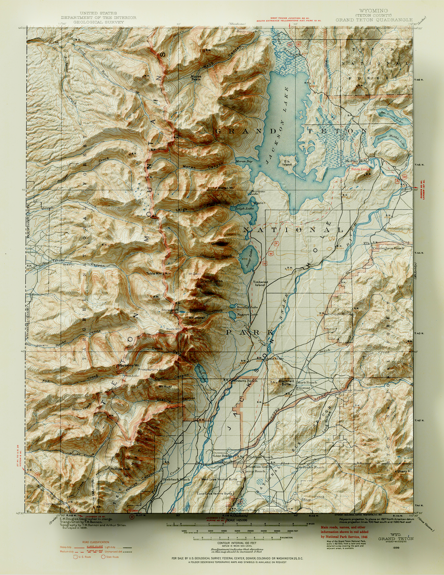
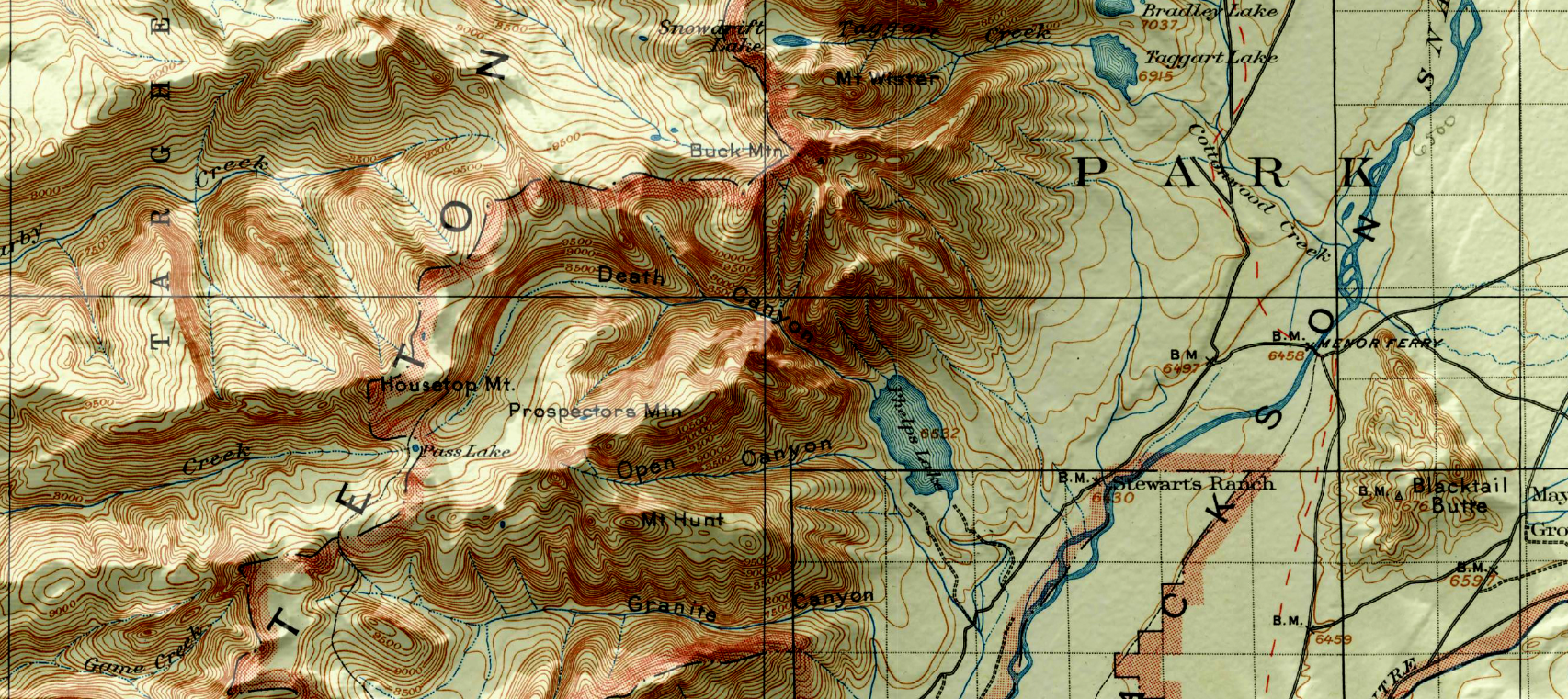
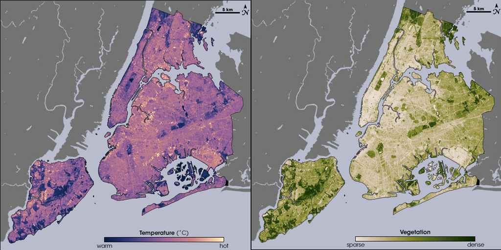
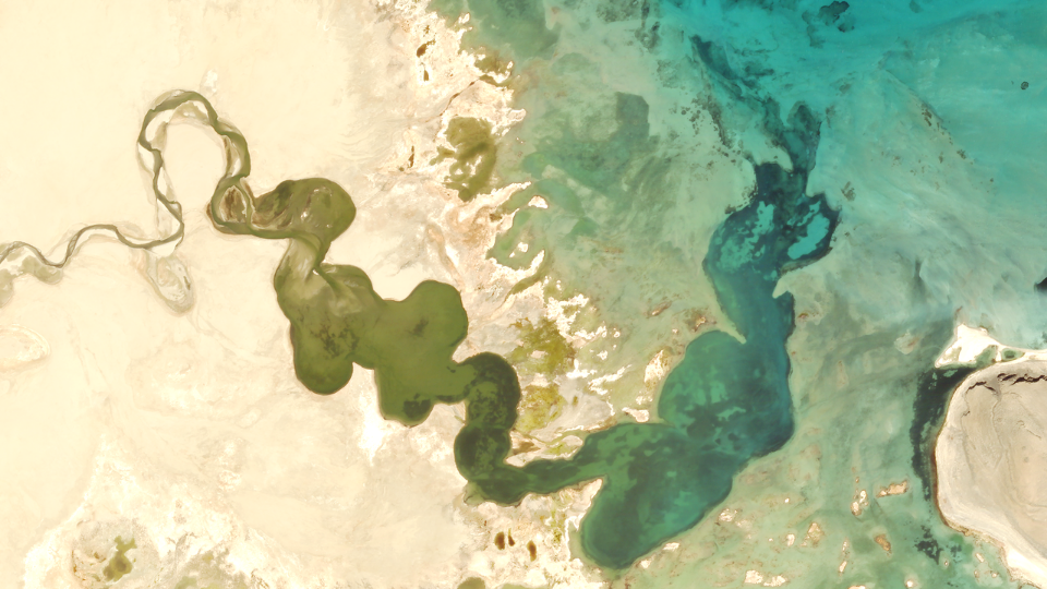
Map created using MAPublisher and Geographic Imager by Robert Simmon

Today, Robert’s day-to-day work largely revolves around processing visible and near-infrared imagery. Every image he works with gets imported into Photoshop with Geographic Imager. Creating maps in Adobe has proven to be effective and highly efficient as software like Adobe Photoshop possess powerful colour-correction tools, fast previews, layers, high bit-depth support, and undo history options.

This aids highly competent visualizers to work seamlessly and flexibly until an image is made perfect. Robert uses Geographic Imager to merge multiple adjacent image scenes or align a time series to make an animation (even if they’re in different projections), all with a single “import” step. He then exports the file as a GeoTIFF, so the image can later be combined with other, complementary data.

Robert Simmon uses Avenza Plugins

Although Robert enjoys working with imagery, he has had the most fun combining multiple data sources, especially raster and vector. Delving into his design workflow a bit deeper, he involves both Adobe Photoshop and Illustrator together. In Adobe Photoshop/Geographic Imager he works on the initial colour work and crops his desired map extents, then imports it into Illustrator/MAPublisher to overlay with vector data and create masks. “It’s particularly useful to be able to crop the imported vector data to match the area of interest, rather than having to manually select and delete objects that lie outside the Illustrator artboard,” says Robert. After setting up his vector layers, he then exports them as a layered Photoshop file and re-combines them with the original raster imagery, to ensure pixel-perfect accuracy.

Data Visualization with Avenza Systems

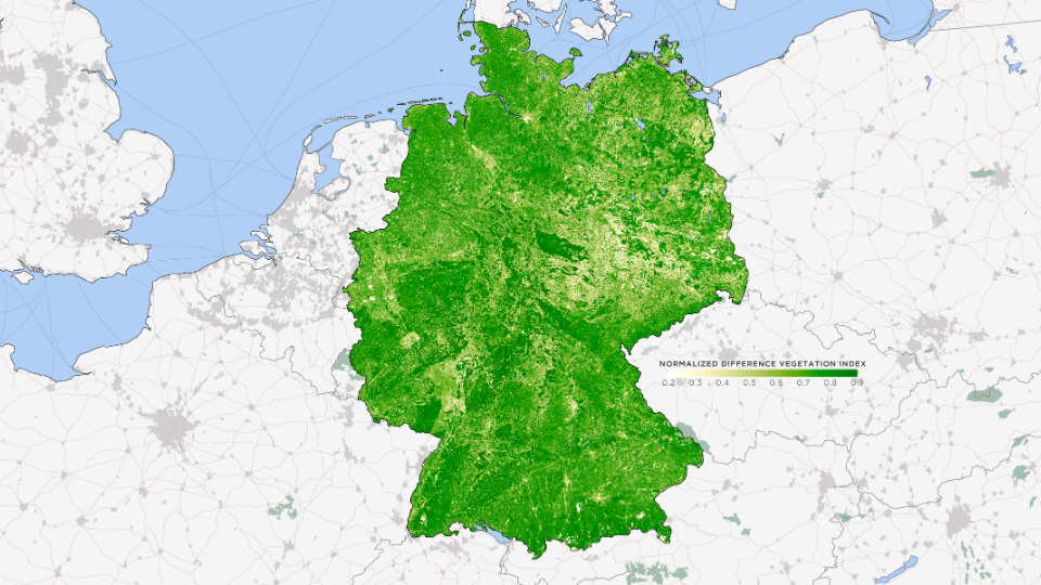
Robert’s love for MAPublisher goes back to 2006 when he first used it to make maps with Landsat data. He used MAPublisher to create a water mask with ZIP code data, which was the only data source he could find with high enough resolution to accurately capture the jutting piers of lower Manhattan. Robert also used MAPublisher to create a map of Amazonia (one of his personal favourites from his portfolio) with the help of MAPublisher’s powerful attribute tools, which allowed him to select and merge data vector data of Amazon biome, distinct from the Political Amazon, for which data is readily available. He continued to create variations on this theme at Planet, including a map of the vegetation of Germany. It was derived from a Planet Surface Reflectance Basemap and given context with Natural Earth boundary, urban area, and transportation data.

Robert continues to tweak his colour palette for his vegetation maps since just being ‘good enough’ has never really been his forte.

_______

In collaboration with Robert Simmon, Senior Data Visualization Engineer at Planet.

Avenza Releases Geographic Imager 6.2 for Adobe Photoshop

Toronto, ON, October 21, 2020 – Avenza Systems Inc., producers of the Avenza Maps® app for mobile devices and geospatial plugins for Adobe Creative Cloud®, including MAPublisher® for Adobe Illustrator®, is pleased to announce the release of Geographic Imager® 6.2. This latest version is powered by Adobe’s new Unified Extensibility Platform (UXP), which provides tremendous performance and user interface improvements to the Geographic Imager plugin for Adobe Photoshop.

“Geographic Imager has become a product many organizations trust and depend on to quickly edit and process spatial imagery,” said Ted Florence, President of Avenza Systems. “With increased performance and even more opportunities to develop new tools and experiences with UXP, the possibilities are endless.”

Powering the Geospatial Imagery Editing Process

Geographic Imager for Adobe Photoshop® delivers an all-encompassing solution to import, edit, and export geospatial images such as aerial and satellite imagery. Work with digital elevation models, GeoTIFFs, and other popular GIS image formats while using Adobe Photoshop® features such as transparencies, filters, cropping and image adjustments; all while maintaining georeferencing and support for hundreds of coordinate systems and projections.

New features of the Geographic Imager 6.2 plugin for Adobe Photoshop® include:

  • Compatibility: Fully compatible with Adobe Photoshop® 2021 on both Windows and Mac, powered by Adobe’s new Unified Extensibility Platform (UXP)
  • Exporting: Vector map data is now able to export to many industry geospatial formats
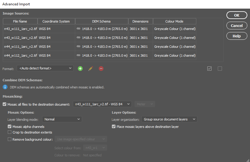
  • Advanced Importing: Ability to remove backgrounds from images during import


Geographic Imager is immediately available and free of charge to all current Geographic Imager Maintenance Program members and starts at US$319 for non-maintenance upgrades. New fixed licenses start at US$699. Geographic Imager Basic Edition licenses start at US$99. Academic, floating and volume license pricing is also available.
For more information, visit www.avenza.com/geographic-imager.

More about Avenza Systems Inc.

Avenza Systems Inc. is an award-winning, privately held corporation that provides cartographers and GIS professionals with powerful software tools to make better maps. In addition to desktop mapping software, Avenza offers the mobile Avenza Maps app to sell, purchase, distribute, and use maps on iOS and Android devices. For more information, visit www.avenza.com.

For further information contact: 416-487-5116 – info@avenza.com – www.avenza.com

Where to begin when you don’t have any data

Unless you are a GIS professional or a professional cartographer, finding the raw data to make a map may seem like a rather large barrier to success. However, there is plenty of publically available free map data out there to be used by graphic designers, and any cartographer that doesn’t have the means to generate their own data. Free map data is a great place to start when making a map, using MAPublisher and Adobe Illustrator to make it your own.    

First, You Have to Find It

Depending on what kind of map you want to make, and for what region or country, finding map data can be easy. There are plenty of governments and other agencies that make their geospatial data available for free. You just have to know where to look for it. Here is a list of the five that, in our opinion, are among the most useful.   

USGS Earth Explorer

The USGS Earth Explorer is an amazing resource for free satellite and aerial imagery. You can download imagery simply by creating a free account. The available imagery covers most of the globe and is often updated. The Earth Explorer user interface is relatively user-friendly so you can find what you need without too much effort. Among other sources, Earth Explorer includes high-quality Landsat and Sentinel 2 imagery.   

FreeGISData

By far the most complete compilation of free map data, FreeGISData contains links to over 500 data sets, categorized for easy browsing by data type and country. The list is maintained by Dr. Robin Wilson, an expert in remote sensing and GIS. This website is a great place to start if you don’t know exactly what you need or want to see what options are available to you in a particular region.  

Open Street Maps

Open Street Maps (OSM) is a crowdsourcing platform for GIS data meaning that all of the data is created by the public, so the accuracy can vary based on who created it and how. However, as with most crowdsourcing efforts, the quality is generally pretty good for most use cases, and the amount of data available is impressive. 

Natural Earth Data

Natural Earth Data offers vector and raster datasets that are in the public domain so you can modify them, use them and distribute them in any way you want without worrying about infringing copyrights or attribution. This is a great place to look if you simply want a base map to start your project. The available data spans the globe and includes the key cultural and physical data you may need for your map. The raster datasets also provide hillshade relief for aesthetically pleasing maps. 

NASA’s Socioeconomic Data and Applications Center (SEDAC)

SEDAC is a data center in NASA’s Earth Observing System Data and Information System (EOSDIS). Its mission is to support the integration of socioeconomic and earth science data and to serve as an ‘Information Gateway’ between earth sciences and social sciences. In addition to the gallery of downloadable maps, which includes a gridded population of the world, SEDAC offers a variety of data sets of socioeconomic data. You can search the available data sets by theme such as agriculture, climate, infrastructure, population, poverty, etc., or choose to data sets that include historical data, reaching back to the 18th century and that look ahead to a century from now. Neat! 

Join Data Sets to Make Your Map

Often cartographers and GIS analysts use open-source or publically available map data as a starting point then add some other data or additional insight. For example, you downloaded population data obtained from SEDAC but you want to add in some national sales data generated by your company. It’s possible to do it when all datasets are in the same format. GIS platforms like qGIS or use a conversion tool like this one can do the trick. 

Import Data Into Illustrator Using MAPublisher

Once you have your data is in order, it is time to get down to the business of making your map! Import the data into Adobe Illustrator to manipulate the design elements that will make the map interesting and informative. MAPublisher makes it possible to import map data in almost any format into Illustrator, and also enables a plethora of cartography specific tools right in the Illustrator environment. With all of your data arranged in layers in Illustrator, it is easy to work with, turning on and off the data you don’t want. 

Pro Tip: MAPublisher uses import filters to limit the amount of data that you bring into Illustrator to a manageable amount before you start working with it.   

Design Your Map Without Losing Geospatial Integrity

You now have layers and layers of lovely map data in Adobe Illustrator but it doesn’t yet look the way you want it to. MAPublisher’s cartography tools can change all that!  

    • Reproject or change the coordinate systems to change the appearance of the map
    • Crop or edit the data on the artboard
    • Add/remove layers
    • Style features by creating rules for the attributes
    • Add more data as new layers
    • Add labels and symbols based on rules
    • Create North Arrows and accurate scale bars with just a few clicks.

Each of these could be the subject of its own blog, however, lots of helpful resources on how to use MAPublisher tools including tutorials and how-to videos are available on our website and YouTube channel

Make Your Vision Come to Life

One of the best things about the MAPublisher plug-in for Adobe Illustrator is that it supports hundreds of data formats, allowing you to import almost any map data you can find into Adobe Illustrator. Happily, there is plenty of publically available, open-source map data available on the internet. Whether you are a professional cartographer, a hobbyist, or a graphic designer under the gun to design a map, you can use free map data as a starting point for your own map. Download a trial of MAPublisher today and find a data set to experiment with and make something amazing!  

Cartographer Chronicles: Kim Beckmann

Cartographer Chronicles - Avenza Systems

Kim Beckmann is a storyteller above all else. As a graphic designer and Associate Professor of Design & Visual Communication at the University of Wisconsin-Milwaukee (UWM), Beckmann
uses visual media to do just that. More recently, she dipped her toes into the world of cartography (another story-telling medium) then fell right into the deep waters.

It all started when researchers from the university’s School of Freshwater Science came to her for help with creating supporting materials for a research project. The team’s ambitious project set out to map several miles of the Milwaukee harbor coastline, studying the effects of urban development on the harbor habitats. The research team had already created highly detailed technical maps but reached out to the Peck School of the Arts for a faculty member who could help put together the material in a way that could be more easily digested by the public and told the a story about the impact of people on the habitats that exist in the harbor.

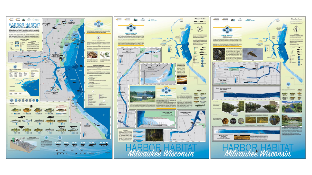
“I also represent a part of the general public who would be interacting with the maps; individuals that want the maps to tell them a story. I recall at the first team meeting where we discussed research findings and what to present on the maps, I had many questions. What type of fish live in the harbor and rivers? What do they eat? Where do they live? Does water temperature effect where and when we might find them? Interestingly, the questions I raised led to incorporating additional habitat information into the maps,” said Beckmann. “What started as a concept for a single map quickly evolved to a set of five maps due to the amount to information we needed to share, the largest being 3 ft by 4 ft!”

Harbor Habitat - MAPublisher

As a graphic designer, Beckmann had made maps before, including simple, vector-based topographic maps, and maps for wayfinding. But this was her first time working on a larger map project and her first time working with raw geospatial data to create bathymetric maps to illustrate water depth. “I am extremely comfortable with Adobe Illustrator so when I discovered that there was a cartography plug-in for it, called MAPublisher, that could be used to manage GIS data to create maps, I knew that it would be faster and easier than learning an independent cartography software tool.”

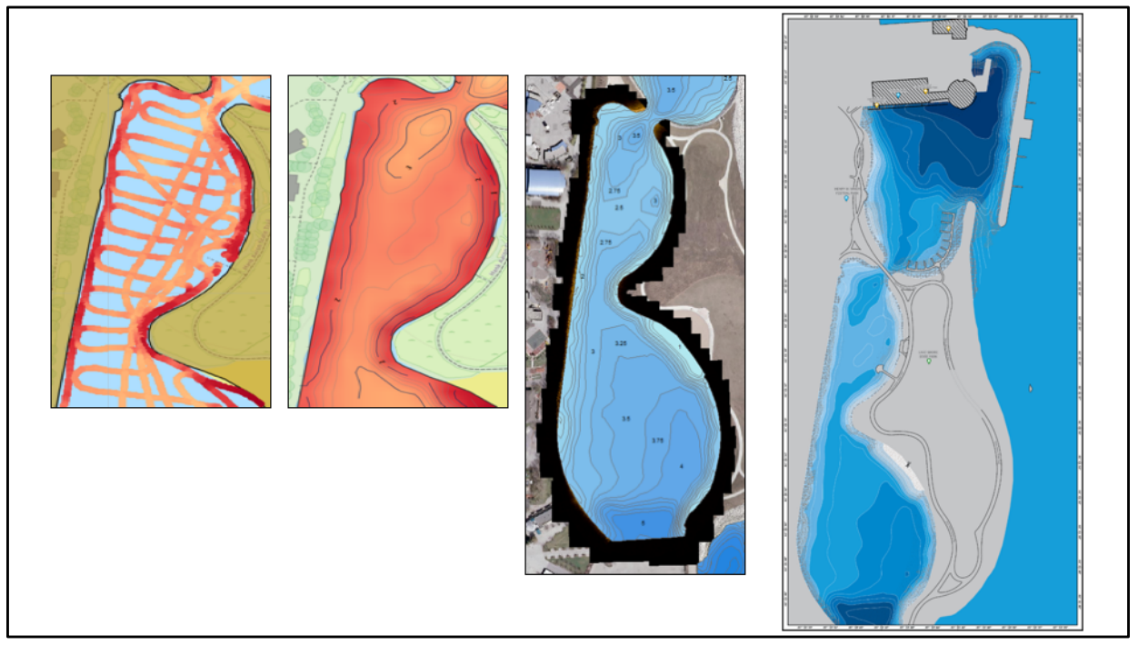
The School of Freshwater Science research team carried out data collection for the project using side-scan sonar devices. With technical support from the Avenza Systems team, Beckmann was able to get the data into a shapefile format and import it into Adobe Illustrator using MAPublisher. “I registered for a training course offered by Avenza Systems, on how to use MAPublisher with Illustrator,” said Beckmann. “That led to a meeting with Jeff who was able to provide helpful direction on how to transform the raw map data into the maps I wanted to make.”

Data Progression - MAPublisher

Jeff Cable is the Desktop Product QA Lead at Avenza Systems. In addition to his work with the MAPublisher development team, he is also responsible for providing training to new MAPublisher users. “I met Kim in 2016 at one of our in-class training sessions in Chicago,” said Cable. “She had a very clear vision of what she wanted to create, but after some more discussion and reviewing the data, I realized that it would require advanced GIS workflows in order to get the data to an appropriate level before it was ready for mapping.” Seeing the value in the research project, he offered to assist Kim rather than have her seek out a GIS professional on her own. Once the data was prepared, she took what she learned from the MAPublisher training course and was able to apply visualization techniques to her maps. Cable corresponded several times as the project progressed and provided guidance. “Kim would ask if MAPublisher could do this or that, and in most cases, my answer was You bet it can!” he added. In addition to providing tips and best practices, he showed her many of the useful tools in MAPublisher that made her workflow more streamlined such as copying MAP Objects, working with MAP Stylesheets, and creating insets. “When I saw the finished product, I was blown away by what Kim had created. It was also gratifying as a training instructor to see how far she had come since our first meeting.”

Beckmann has since spoken about her work on the Milwaukee Harbor habitat maps project to the American Geographical Society, cartography clubs, and presented an artist talk as part of the Peck School of the Arts Artist Now! Lecture Series. The series of five maps have been printed on canvas and distributed to local and regional schools and turned into metal signage to be installed along the shores of the harbor to help share important research conducted by Janssen Labs with the public.

Fish Maps by Kim Beckmann using MAPublisher

The first of five maps installed at Harbor View Plaza Park.

Two of the maps installed in the active learning classroom as Discovery World.

Disovery World is located in Milwaukee, Wisconsin.

Beckmann’s maps also currently hang in the Avenza Systems offices and we are proud to have them as a reminder of the amazing things visual artists and cartographers can do with the tools we provide.

Learn more about the project and how the maps were made on the UWM website https://uwm.edu/harbormaps/

__________________

In collaboration with Kim Beckmann, Associate Professor of Design & Visual Communication at the University of Wisconsin-Milwaukee.


What’s New? Geographic Imager 6.1

Geographic Imager 6.1 is available now and in addition to full compatibility with Adobe Photoshop 2020, here are the other exciting new features to make working with spatial imagery in Photoshop even easier:

Vector Import from databases

Geographic Imager allows you to import a number of GIS vector formats directly on to your images in Photoshop. Whether performing a check to ensure accurate georeferencing, QA/QC or simply including supplemental data, this functionality allows you to improve the efficiency of your workflow. For a while, it was only possible to import vector data from your own files however we have added the capability to import from databases including PostGIS Spatial Database, and ESRI File and Personal Databases (.gdb and .mdb). Note that importing vector data from databases is only available in the full version of Geographic Imager.

Improved Mosaic Layer organization

When mosaicking documents in Photoshop with Geographic Imager’s Mosaic tools, you previously had the option to either group the layers from each document into folders or merge all layers into one single layer. In this new release, we’ve added a new option to merge source document layers which will flatten each source document into a single layer, but also keep each document separated in the destination, without the use of folders. This helps to keep the individual images separate while minimizing the number of layers and folders you need to deal with.

Improved mosaic layer

Geographic Imager 6.1 Improved mosaic layer

7 GIS terms To Know: Map Making for Designers

Many of our MAPublisher clients are cartographers and GIS professionals, but a growing number are graphic designers who are tired of the tedious work of making maps without specialized tools. Making a map is part art and part science and while we help bridge the gap between Geographic Information Systems (the science) and graphic design (the art), as a graphic designer, you may not be familiar with the wonderful world of GIS.

So on this GIS Day, we have compiled the definitions to a few common GIS terms that you may encounter; GIS Day, celebrated each year, in November to help educate non-GIS professionals about the importance of geospatial information systems and the benefits that GIS brings to our lives.

1. Spatial Analysis

Any good and useful design involves analysis. This process of stacking layers, inspecting and interpreting model results seeks to solve complex location-oriented problems. This can be used for predictive analysis, estimating the level of suitability and for further understanding of the geographic location. 

spatial analysis

2. Layer 

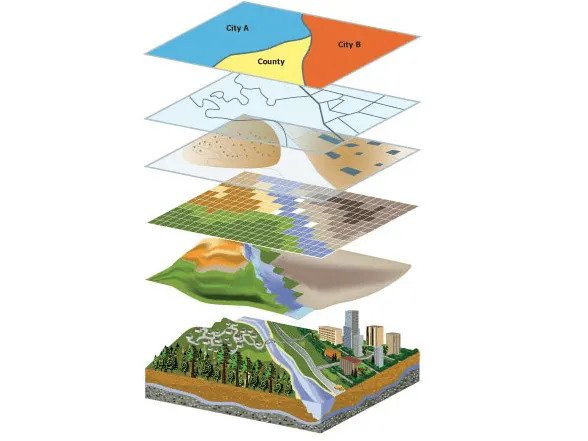
Maps contain several layers, each representing a set of spatial features. Layers are laid atop one another for viewing or spatial analysis. This lends itself to working with the map layers in Illustrator, as they can be treated similarly to a layer containing artwork.  

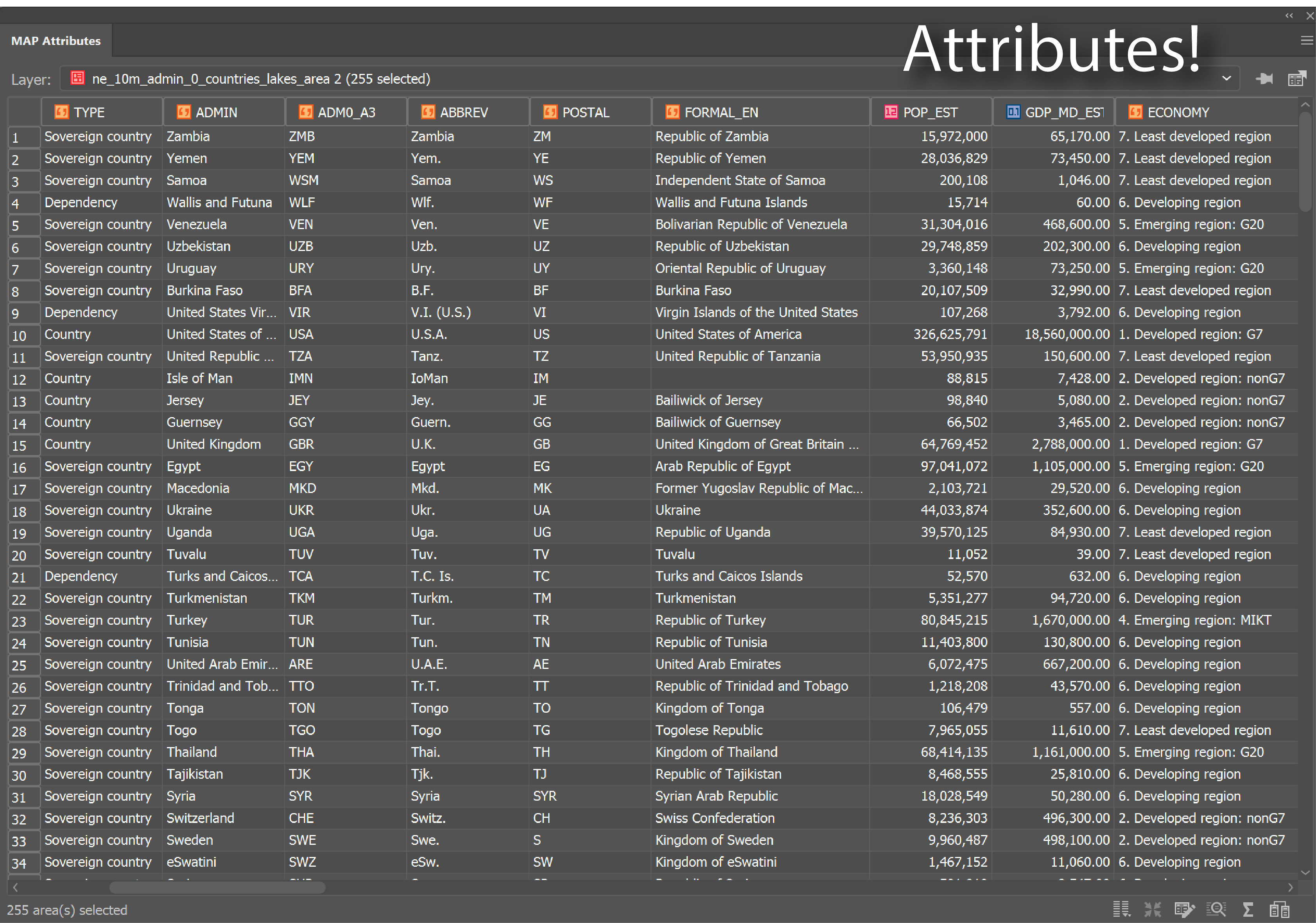
3. Attributes

Attributes denote a geographic feature on a map. The information is typically stored in a tabular format that is linked to the feature. For instance, the attributes of a well-represented point along a river may include the name, the course of the river/ length, sediment load, etc. 

When you are familiar with the attributes associated with the map data, you can do things like applying rules to style your map according to attributes in the table.

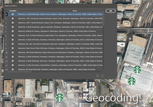
4. Geocoding

Geocoding

The process identifies a location by its geographic coordinates (latitude and longitude). This is used to position places and features on a map as well as to reference the map itself. 

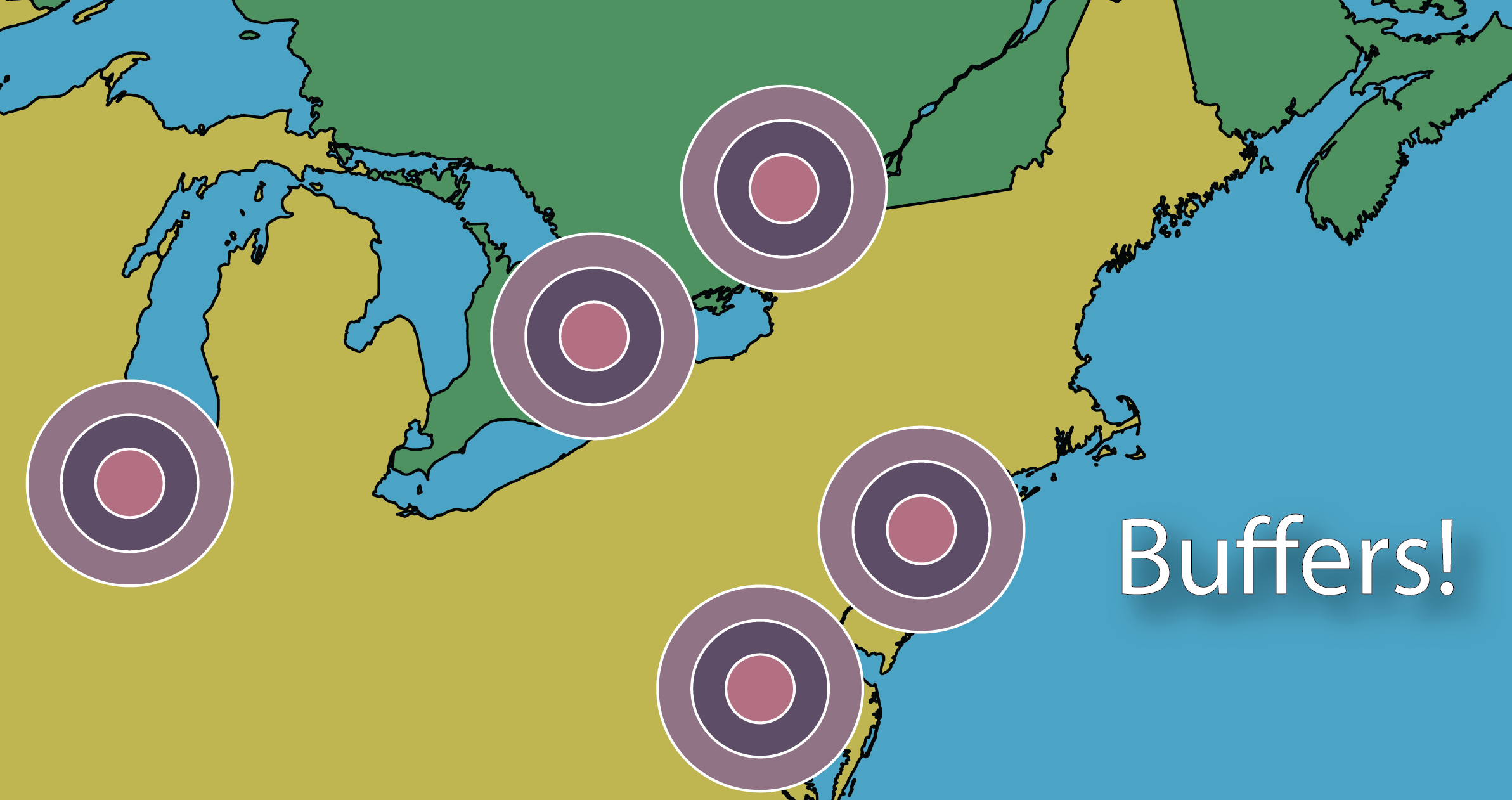
5. Buffers

Buffer

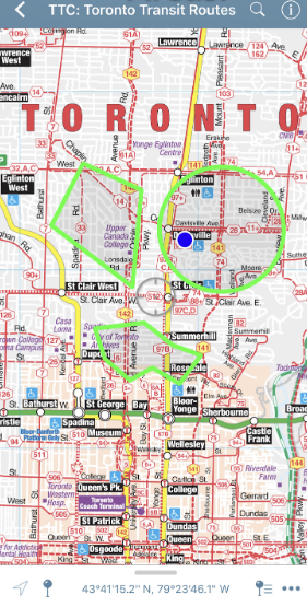
A buffer is a zone around a specific map feature, that is measured in units of time or distance. A buffer is useful for proximity analysis or visualizing the areas that are within a certain distance from another feature (i.e. within school zones, or floodplains) 

6. Polygons/Areas

Areas / Polygons on a map

Enclosed Polygons on a map are often referred to as areas. Polygons can have attributes associated with them to represent a particular real-world entity such as postal code, economic identifiers, population demographics, environmental factors, or social behaviors.

The image above depicts areas on a map.

7. Coordinate systems

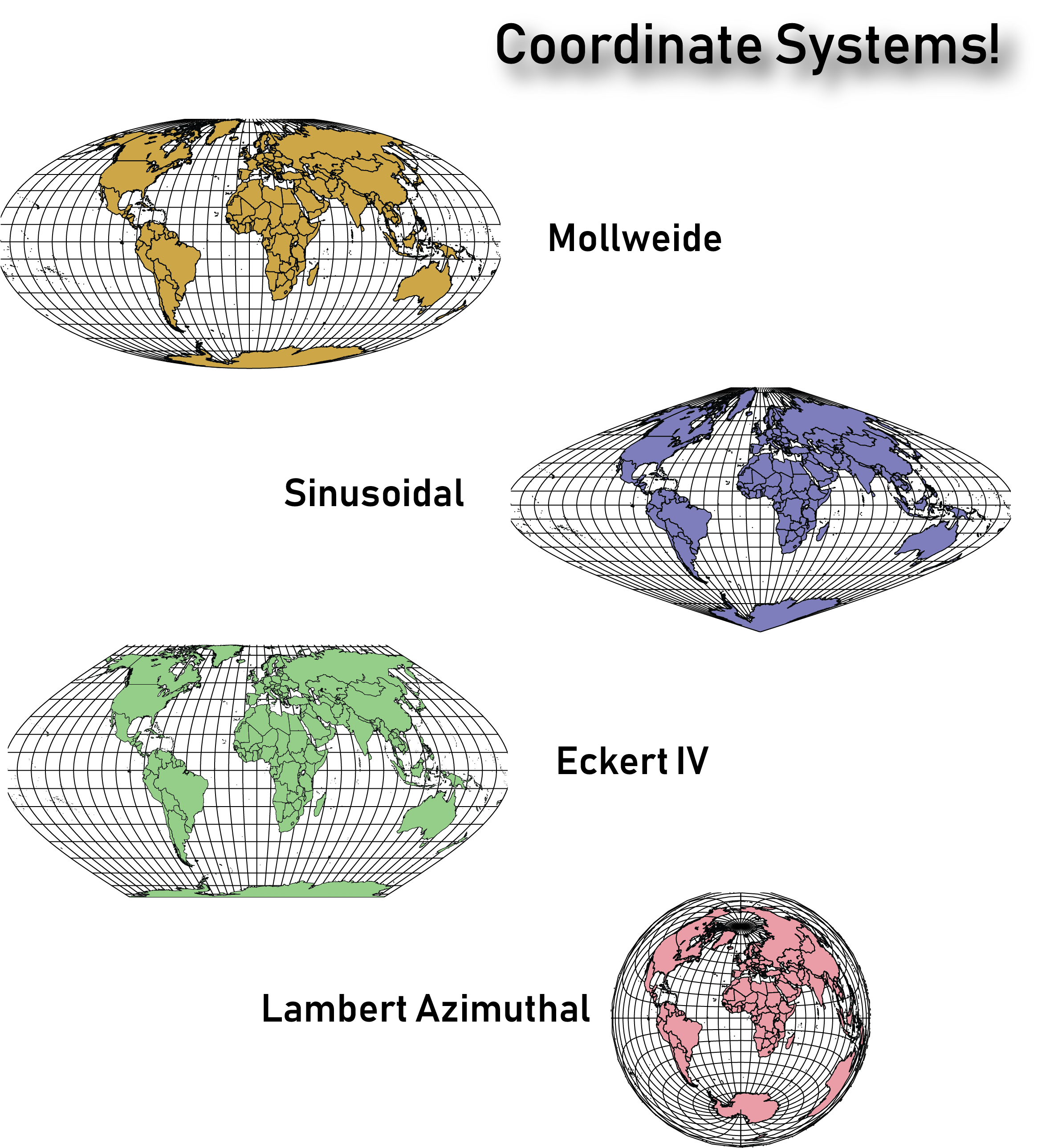
The planet is not flat, however, we routinely try to represent it in 2 dimensions on paper and screens. The Coordinate systems act as a reference framework that helps position features in order to make a map more useful for the purpose desired.

Coordinate Systems

It is important to note that there are thousands of coordinate systems, so it’s important to take the time to figure out which would work best for the type of map you intend on creating. Sometimes you’ll need to change the coordinate system from the one defined in the underlying map data, to help the map make more sense to the end-user. 

They say an artist is one who gives people something they didn’t know they were missing. If you happen to be an artist or know an artist (graphic designer) who seeks to give people direction – literally ‘direction’ – you’ve landed in the right place. Go ahead and share this article with like-minded map enthusiasts to begin learning and delivering high-quality maps the easy way. 

Sources:

https://researchguides.dartmouth.edu/gis/spatialanalysis

https://en.wikipedia.org/wiki/Buffer_(GIS)

Updating and Enhancing Maps with Landsat 8

This guest blog post was written by Tom Patterson — one of the creators of the Equal Earth Projection, and Natural Earth Data, (you can read more about Tom here). Learn how he used Geographic Imager for Adobe Photoshop to create two maps from Landsat 8 imagery.

I am a big fan of Landsat 8 satellite images as a resource when making maps. Typically, I use these free images taken every 16 days for verifying and updating other geospatial datasets. I also transfer Landsat textures to shaded relief art in order to better evoke a sense of the physical environment.

The examples that follow demonstrate how I have used Landsat imagery to enhance two maps. The first example is Prince William Sound, Alaska, a map that I am presently working on. The second example is a Landsat mosaic of the Big Island of Hawaii. Both of my examples will give you a general idea on how to integrate Landsat images into your cartographic workflow—using Avenza’s GIS plugins for Adobe Photoshop and Illustrator—with a few technical tips thrown in for good measure. For in-depth information about using Landsat in Photoshop, refer to this tutorial.

Prince William Sound, Alaska

Prince William Sound, in south-central Alaska, is a spectacular place to map. Its sheltered waters are bounded by the lofty Chugach Mountains, indented by deep fjords with tidewater glaciers, and dotted by forest-cloaked islands. The problem I am facing is out-of-date geospatial data because of the rapidly melting of glaciers. For example, the positions of glaciers, lakes, rivers, and coastlines available in the National Hydro Dataset (NHD) have changed considerably since these data were collected between 2008 and 2012. In order to make an accurate map—if only for this year—I have had to re-digitize these vector elements using Landsat images as a reference.

For this task, I used “LandsatLook Images with Geographic Reference” downloaded from the Earth Explorer website. These quasi-natural color images, which come pre-made from bands 7, 5, and 3, clearly depict water bodies, vegetation, bare earth, and glaciers. They were perfect for mapping the changing landscape of Prince William Sound.
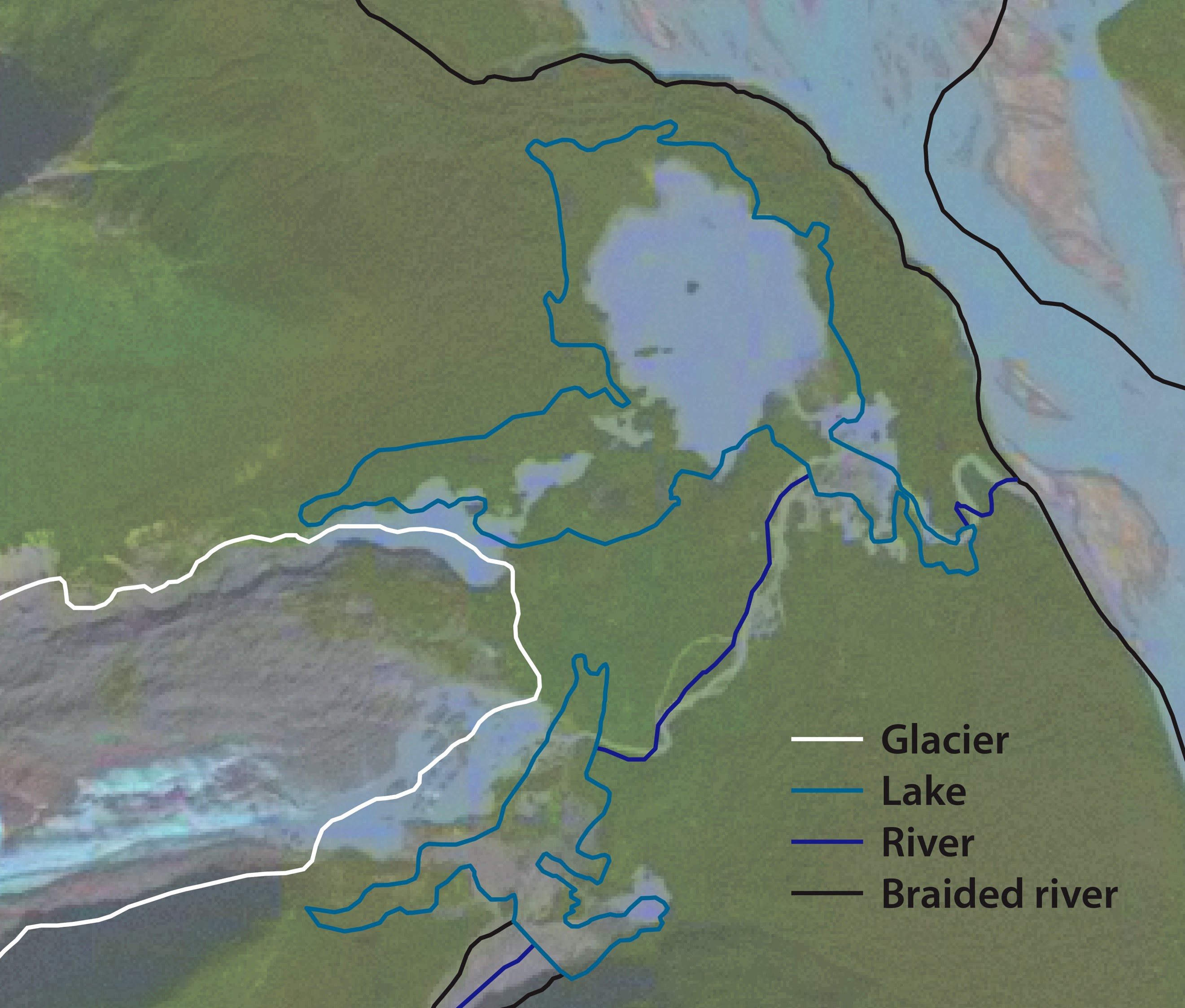
Tom Patterson Geographic ImagerNational Hydro Dataset lines overlaid on a LandsatLook image in Adobe Illustrator.
The lines do not match physical features on the more recent satellite image.

For reference, I used images taken on September 29, 2018, about the time when glacier melting ceases before the onset of winter. Images taken later in the fall are hampered by fresh snow cover and deep mountain shadows due to lower sun angles.

Because the LandsatLook images were in the same projection as my map, I could directly place and then register the images in the Adobe Illustrator file with MAPublisher. Had the projections been different, I first would have had to transform the LandsatLook images using the Geographic Imager plugin in Adobe Photoshop. Finally, I moved the LandsatLook images to a bottom layer and dimmed them for editing the lines with Illustrator’s Pencil tool. Using a Wacom tablet and stylus for editing lines greatly improved my drawing speed and accuracy.

If a 30-meter LandsatLook image lacks enough detail, you can increase the apparent resolution to 15 meters by applying panchromatic sharpening. Doing this will involve downloading all data bands that comprise the Landsat scene (a Zipped archive about 1 GB in size). Within this archive is Band 8, a grayscale image showing the same area as the LandsatLook image, but with double the resolution.
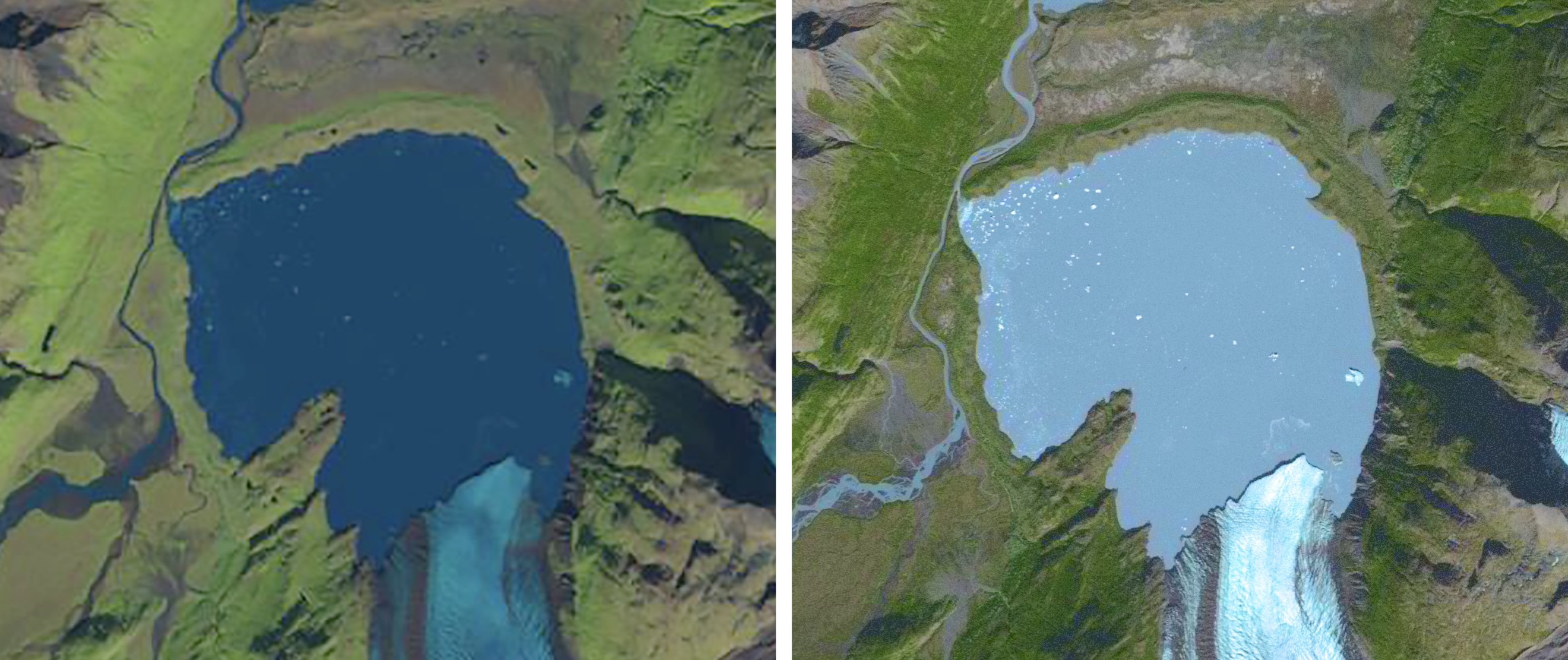
Tom Patterson Geographic ImagerComing into focus. A LandsatLook image before (left) and after (right) panchromatic sharpening.
Besides increasing detail, panchromatic sharpening also shifts colors.

Once Band 8 is downloaded, the first step is to enlarge the size of the LandsatLook image by 200 percent in Photoshop (Image/Image Size). Resample it using the Preserve Details (enlargement) option. Next, copy and paste Band 8 on top of the LandsatLook image. Then, in the Layers window, change the blending mode of the Band 8 layer from Normal to Luminosity. Finally, apply Curves adjustments to both layers until the tonal range of the combined image is to your liking. The pan-sharpened LandsatLook image will keep its georeferencing thanks to the Geographic Imager plugin.
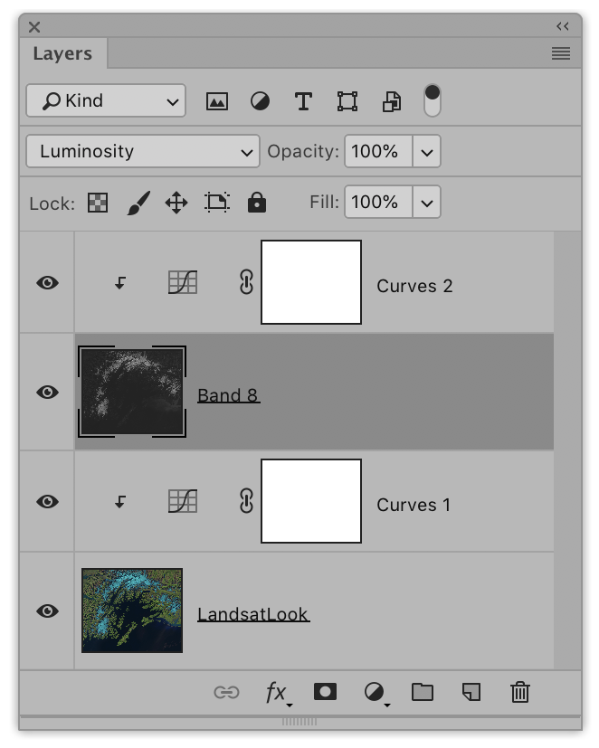
Tom Patterson Geographic Imager Landsat8Use the Layers window in Photoshop to apply panchromatic sharpening. 
Selecting Luminosity blending mode for the Band 8 layer is key.

The Big Island, Hawaii

In 2017, I created a Landsat mosaic of the Big Island as a starting point for making two National Park Service maps: Ala Kahakai National Historic Trail and Hawaii Volcanoes National Park. I used the Landsat mosaic as a source for land cover textures—forest cover and historic lava flows (those that formed since 1800)—depicted on these maps. Compared to the Landsat mosaic, the map textures print very lightly in the interest of visual cleanliness.

Tom Patterson Geographic ImagerBig Island Landsat mosaic (left) and the maps of Ala Kahakai National Historic Trail (middle) and Hawaii Volcanoes National Park (right) derived from it. Click here to see a larger version of the Ala Kahakai map (5 MB) and here for the Hawaii Volcanoes map (6.4 MB).

The first step in creating a Landsat mosaic was downloading the appropriate image data. In a perfect world, a mosaic of the Big Island would only require four 185-kilometer-wide Landsat images. However, because of persistent cloudiness on the windward side of the island, ten images were needed to complete a nearly cloud-free mosaic. Using images taken in previous years was a necessity. When selecting older images with fewer clouds, I looked for those taken at about the same time of year to keep the lighting consistent. I then used the Clone Stamp and Spot Healing Brush tools in Photoshop to carefully delete any unavoidable clouds and their shadows from the mosaic. Fortunately, the few clouds that remained were in remote areas far from the main focus of the final maps.
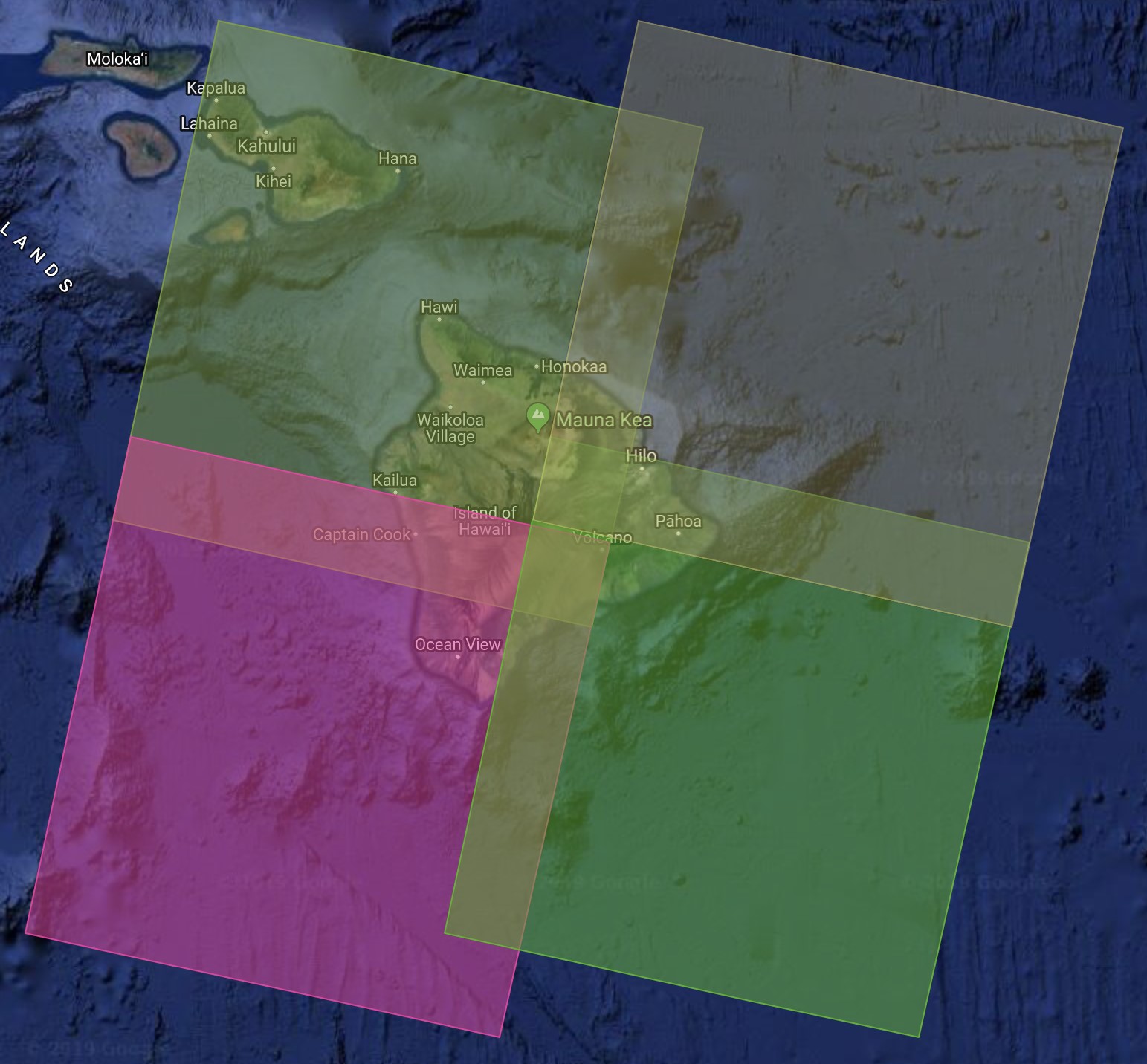
Tom Patterson Geographic ImagerThe Big Island is covered by four overlapping Landsat images.
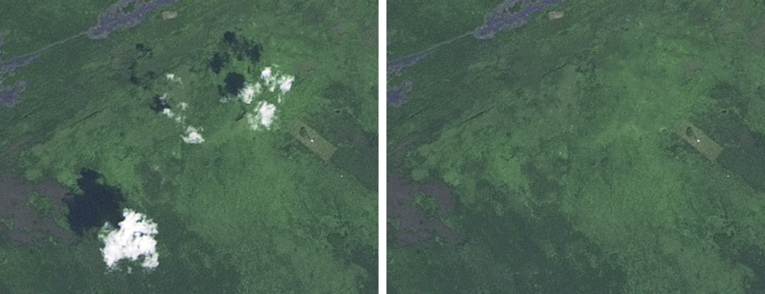
Tom Patterson Geographic Imager Landsat 8Clouds be gone. The Landsat mosaic before (left) and after (right) editing.

The Landsat mosaic was assembled in Photoshop using Geographic Imager (File/Automate/GI: Mosaic). In the Mosaic window, I selected the Maintain Layers option to ensure that each Landsat image was placed on a separate layer. I then added layer masks to each image layer to piece together the ten images with the goal of avoiding clouds. Although the masks themselves with feathered edges looked like a messy jig-saw puzzle, they combined to produce a seamless Landsat satellite image mosaic.
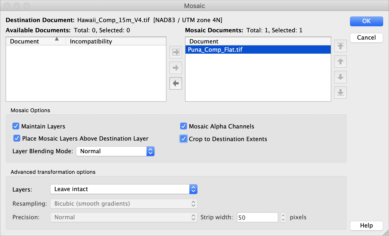
Tom Patterson Geographic Imager MosaicGeographic Imager’s Mosaic window.

I created the Big Island mosaic in natural color by compositing Bands 4, 3, and 2 as red, green, and blue channels, respectively, in Photoshop. I also brightened the forested areas with LandsatLook mosaic placed on the topmost Photoshop layer and with the layer opacity reduced (in normal blending mode). The natural color procedure is explained in detail here.

With a Landsat mosaic of the Big Island completed, my next task was extracting the forest and lava textures and applying them to the Ala Kahakai and Hawaii Volcanoes maps. But that was an involved procedure that will have to wait for another blog.

One more thing …

Since making the Big Island mosaic in 2017, the Puna district experienced volcanic activity in 2018 that covered a large area in lava and reconfigured the shoreline. Although Puna is the cloudiest area on the Big Island, I was lucky to find a recent cloud-free Landsat image that I then used to update the mosaic. You can download a GeoTIFF of the updated mosaic here (120 MB). It is in the public domain.
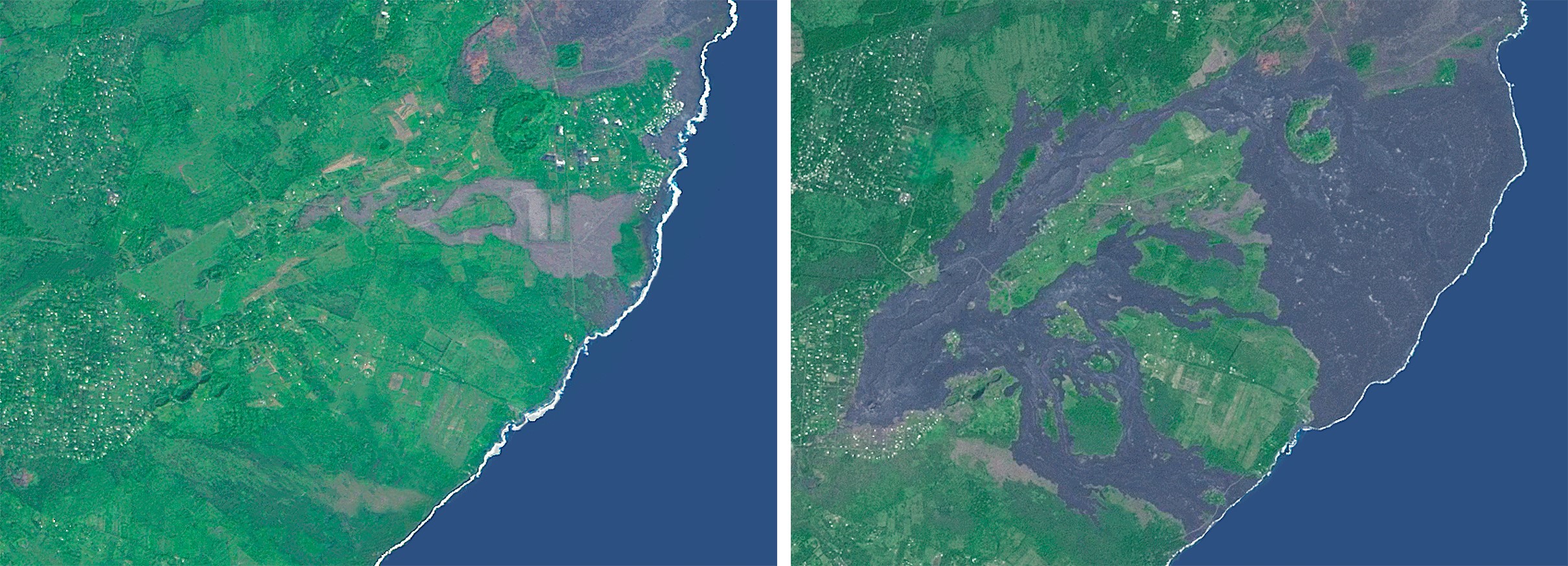
Tom Patterson Geographic ImagerPuna District, Hawaii, before (left) and after (right) the volcanic eruptions of 2018.
Cartographer Chronicles: Tom Patterson

The process of making maps can vary greatly depending on the cartographer and the purpose of the map. Tom Patterson, one of the cartographers behind the public domain data set Natural Earth and the popular website Shaded Relief, regards cartography as a creative process. He sees geospatial data as an artist would see paint on their palette. “They are raw materials from which the map is made,” says Patterson. “For me, the map making process starts with an online scavenger hunt for geospatial data, and ends with a visual depiction of the results of that scavenger hunt, a map.”

Patterson recently retired after 26 years with the U.S. National Park Service at the Harpers Ferry Center, located in West Virginia. Harpers Ferry Center is the media hub for the U.S. National Park Service, where most of the maps, exhibits, and publications for public consumption are produced.

Patterson is well-known for making maps with beautiful shaded relief effects, a technique that he has focused on for his entire career. It’s something he has a passion for and is a feature that he believes makes his maps unique. “When making a shaded relief, I go to great pains to portray the natural world in a beautiful and idealized manner, by combining shaded relief with land cover data, drop shadows, gradients and vignettes, with control and restraint,” says Patterson. “I ultimately want to create a shaded relief that readers will find attractive and which will blend harmoniously with the vector elements above.” Patterson prefers light, luminous colours for depicting terrain, and also tell a story. “A map is more than just a combination of points, lines, polygons, type and pixels. To me, a really good map is one that becomes much more than the sum of these parts,” he says. “Maps are an important form of communication, and they should effectively share the ideas of the cartographer to the map reader.”

When making graphically creative maps, you want to use tools that provide you with the most control. With MAPublisher, you can easily access and manipulate geospatial data using Adobe software. “MAPublisher and Geographic Imager bridge the gulf between graphical and GIS worlds.”

Patterson was an early-adopter of MAPublisher, a plug-in for Adobe Illustrator after learning about it in 1996 at the annual North American Cartographic Information Society (NACIS) conference. If you’ve ever used the Natural Earth data, you might be interested to know that most of the vector elements were created with MAPublisher and Adobe Illustrator.

He was also integral in the development of Geographic Imager when during a presentation about manipulating Digital Raster Elevation Model (DEM) data he commented that having a MAPublisher-like software for Adobe Photoshop would be useful. “My suggestion was heard by the President of Avenza, Ted Florence, who was in the audience. He put me in touch with the software development team at Avenza to brainstorm ideas about a GIS plug-in for Adobe Photoshop. Geographic Imager was the eventual result of our discussions.”

Along with his many contributions to the cartographic community, Patterson has held some important positions as the former president and current Executive Director of NACIS. Patterson has created accessible, open source data for global use (Natural Earth), he recently contributed to a new map projection that is taking the cartography and GIS world by storm; Equal Earth. “This equal-area pseudo-cylindrical projection has gained traction rapidly—it seems that cartographers and map users alike have had an unfilled need for world maps depicting countries at true size and presented in a pleasing manner,” he quips.

As an accomplished and respected veteran of the field, we asked that what advice Patterson would give to new cartographers, finding their way? “Seek out advice,” he states. “Map design and production is mostly a solitary task, and any map you create will seem easy-to-understand and logical to you since you are the one who made it. But, your readers may not see it that way,” says Patterson. “The easiest way to avoid these potential ‘failures to communicate’ is by showing drafts of your maps to people that are not family and close friends.”

Another tip that Patterson has for fledgeling cartographers, is to give readers a reason to slow down and read your map. “The trick in today’s media-saturated environment is to design a map that will catch your reader’s eye, ignite their curiosity, and draw them in. Give the most emphasis to the information you want them to remember long after they put down your map.”

Carto-Jargon 201: Cartography Terms Defined

In a previous blog post, we defined a few common cartography terms that you might be likely to encounter while using MAPublisher and Geographic Imager; however, that was just the tip of the iceberg when it comes to cartography and GIS jargon. Here, in no particular order, are several additional terms used by cartographers, GIS professionals and people who work with spatial imagery.

Topology

Topology is a key principle in GIS for data management and integrity, ensuring the data quality of spatial relationships is maintained. In general, a topological data model defines how spatial objects (point, line, and area features) are represented, and defines and enforces data integrity rules (for example, there should be no gaps between polygons).

Azimuth

The horizontal angle, measured in degrees, between a baseline drawn from a center point and another line drawn from the same point. Normally, the baseline points true north and the angle is measured clockwise from the baseline.

Neatline

All 2-dimensionally rendered maps have to compromise somewhat on accuracy, even if only just a little by moving or scaling features to improve readability. However, the neatline is never adjusted, making it the most accurate element on a map.

The neatline is the border defining the extent of geographic data on a map and separating the body of the map from the map margin. It demarcates map units such as meridians and parallels, and depending on the map projection and the units selected, the neatline may not have 90-degree corners.  

Geodatabase

A Geodatabase, a database or file structure used primarily to store, query, and manipulate spatial data, stores geometry, a spatial reference system, attributes, and behavioral rules for data. An advantage of geodatabases over shapefiles is that various types of geographic datasets can be collected within a geodatabase, including feature classes, attribute tables, raster datasets, network datasets, topologies, and many others.

Geoprocessing

Geoprocessing is an operation used to manipulate a GIS data resulting in a new set of data. Common geoprocessing operations include geographic feature overlay, feature selection and analysis, topology processing, raster processing, and data conversion. Geoprocessing allows for the definition, management, and analysis of information used to make decisions based on patterns within the GIS data.

Shapefile

An Esri Shapefile is a vector data storage format for storing the location, shape, and attributes of geographic features. A shapefile is stored as a set of related files and contains one feature class. An alternative to using shapefiles to store GIS data is a geodatabase, however, shapefiles have some advantages in terms of relative simplicity and wide-ranging compatibility with many applications. Related files contain additional information that is read by the shapefile when opening/importing in GIS applications, as long as these related files have the same name and reside in the same directory – the *.dbf (database) file contains attribute information, and the *.prj (projection) file contains coordinate system information. Shapefiles also have limitations such as the inability to support raster files, and large file sizes.

Buffer

A zone around a map feature measured in units of distance or time is called a buffer. Buffers are useful for proximity analysis.

Geodesy

Geodesy is the science concerned with the measurement and mathematical description of the size and shape of the earth and its gravitational fields. Geodesy includes the large-scale, extended surveys for determining positions and elevations of points, in which the size and shape of the earth must be taken into account to achieve accuracy.

Vector vs Raster

The terms vector and raster are encountered often in cartography though they are not often defined. In a nutshell,

Raster data is made up of pixels (sometimes referred to as grid cells). Each pixel can have a range of values used to represent data points. For example, in a satellite image, every pixel has a red, green and blue value.  

Vector data is not made up of a grid of pixels. Instead, vector graphics are comprised of vertices and paths where the vertices are x,y coordinates. In GIS systems, they are a latitude and longitude with a spatial reference frame.

Mosaic

A Mosaic is a single raster dataset composed of two or more merged raster datasets—for example, one image can be created by assembling multiple aerial photographs whose edges usually have been torn or cut selectively and matched to the imagery on adjoining images to form a continuous representation of a portion of the Earth’s surface.

Orthorectification

The process of correcting the geometry of an image so that it appears as though each pixel were acquired from directly overhead. Orthorectification is used to correct terrain distortion in aerial or satellite imagery.

Sources

http://wiki.gis.com/wiki/index.php/GIS_Glossary/
https://legacy.lib.utexas.edu/maps/glossary.html
https://gisgeography.com/spatial-data-types-vector-raster/

Carto-Jargon 101: Cartography Terms Defined

The field of cartography is filled with jargon and terminology that can pose a challenge for newcomers learning to use mapping software such as MAPublisher to make beautiful maps, and those who don’t have a formal background in cartography. It also doesn’t make it easier when different software packages have their own variations on certain terms. To help the cause, we have compiled a short list of common cartography terms or “carto-jargon” that you may encounter while using MAPublisher or Geographic Imager.

Basemap

A basemap is a background image which can include aerial imagery, topography, terrain and streets and other fundamental layers and is used as a starting point to create a new map. The basemap is georeferenced and is usually the most accurate source of spatial information within the data system that makes up the finished map. Additional layers of data such as labels, symbols and paths are then added to the basemap to create the final product.  

Feature

Any real-world object that is represented on a map is a feature. Features can encompass large areas of a map, such as bodies of water and mountain ranges, or they can be discreet objects like parking areas, public washrooms or fire hydrants.

Attribute

Attribute data is information about spatial features and is stored in tables. It is also the information that specifies the appearance and labeling of features on a map. For example, the graphic attributes of a river might include the thickness of the line, line length, color, and the name used for labeling.

Control Point

A control point is a location on the map with known pixel (x,y) coordinates. Control points are used in georeferencing to allow for extrapolation of the relative location of other points whose exact coordinates may not be known.

Coordinate System

A coordinate system is a reference system used to represent the locations of geographic features on a map. It provides the basis for identifying locations on the earth’s surface. There are thousands of different coordinate systems, most of which are limited in use to highly specialized purposes.

Projection

The earth is not flat and so imagining that it is for the purpose of putting it on a 2-dimensional map results in some distortion. A projection is a method by which the curved surface of the earth is portrayed on a flat surface and is based on a mathematical transformation of the earth’s lines of longitude and latitude onto a plane. There are many different projections, each of which distorts distance, area, shape, and direction is some way, therefore no projection can result in a perfectly accurate flat map. Check out the Avenza Projections Guide for a more detailed information.

Georeferencing

Georeferencing involves aligning geographic data to a known coordinate system so it can be viewed, queried, and analyzed relative to other geographic data on the same map. Georeferencing may involve shifting, rotating, scaling, skewing, and in some cases warping, rubber sheeting, or orthorectifying the data to improve accuracy.

Graticules and grids

Graticules are the network of longitude and latitude lines on a map or chart that relates points on a map to their true locations on the earth. You can think of this a grid system – in fact, the terms are sometimes used interchangeably, but there is a subtle difference. Graticules are derived from 3-dimensional ellipsoidal shape of the earth and are formed by the the lines of latitude (parallel lines circling the earth), and lines of longitude (non-parallel lines converging at the earth’s poles). A grid system is comprised of a set of parallel and perpendicular lines that are superimposed on a flat projection of the earth, creating an x,y coordinate system. An example of a grid system is the Universal Transverse Mercator (UTM) system.

Themes

In MAPublisher, MAP Themes are a collection of thematic cartography tools designed to automate how styles and symbols are applied, charts are produced, and data is plotted. There are three themes which you can be customized to suit your needs: Stylesheet, Chart, and Dot Density. MAP Themes offer a lot of flexibility as they can be edited, applied, duplicated, automated, exported, and cleared without affecting the spatial referencing of map features.

This is just a small sampling of the more robust glossary of terms available in the our MAPublisher and Geographic Imager documentation packages.

Sources
https://avenza.com/help/mapublisher/10.1/index.html?whats_new_in_mapublisher.htm
https://avenza.com/help/geographic-imager/5.3/index.html?glossary.htm
https://www.gislounge.com/gis-dictionary/
http://geography.name/gridgraticule/

News Archive