Whether you’re new to MAPublisher®, an experienced user, or simply thinking about a purchase, Avenza software training is a worthwhile experience. Get hands-on training from Avenza product specialists at one of our training courses around North America or virtually from anywhere.
Archives
MAPublisher Virtual Training: February 19-21, 2025
Whether you’re new to MAPublisher®, an experienced user, or simply thinking about a purchase, Avenza software training is a worthwhile experience. Get hands-on training from Avenza product specialists at one of our training courses around North America or virtually from anywhere.
MAPublisher Virtual Training: March 18-20, 2025
Whether you’re new to MAPublisher®, an experienced user, or simply thinking about a purchase, Avenza software training is a worthwhile experience. Get hands-on training from Avenza product specialists at one of our training courses around North America or virtually from anywhere.
Formation en ligne inter-entreprise sur MAPublisher: 19-23 mai 2025
Que vous soyez un professionnel des SIG ou que vous débutiez tout juste dans le domaine, cette formation vous propose de prendre en main MAPublisher® de manière approfondie! Rejoignez nos amis de Géom@tique du 19 au 23 mai pour cette formation en ligne! Les inscriptions et plus d’informations sont disponibles sur leur site web.
Whether you’re new to GIS or an experienced user, this course will give you an in-depth introduction to MAPublisher® in French! Join our friends at Géom@tique from May 19th to 23rd for this online training! Sign ups and more information are available on their website.

Map Gallery Spotlight: Roger Smith
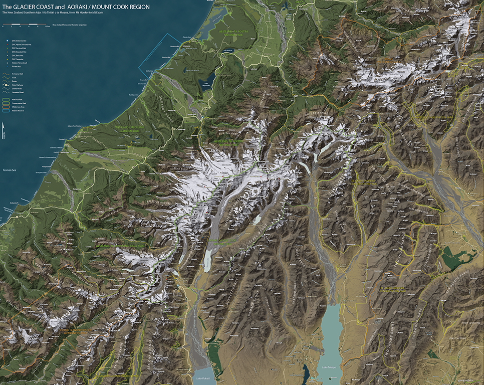
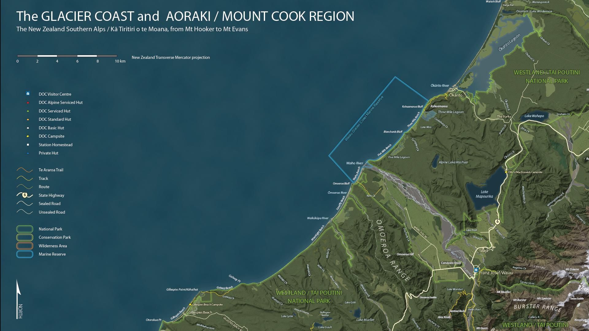
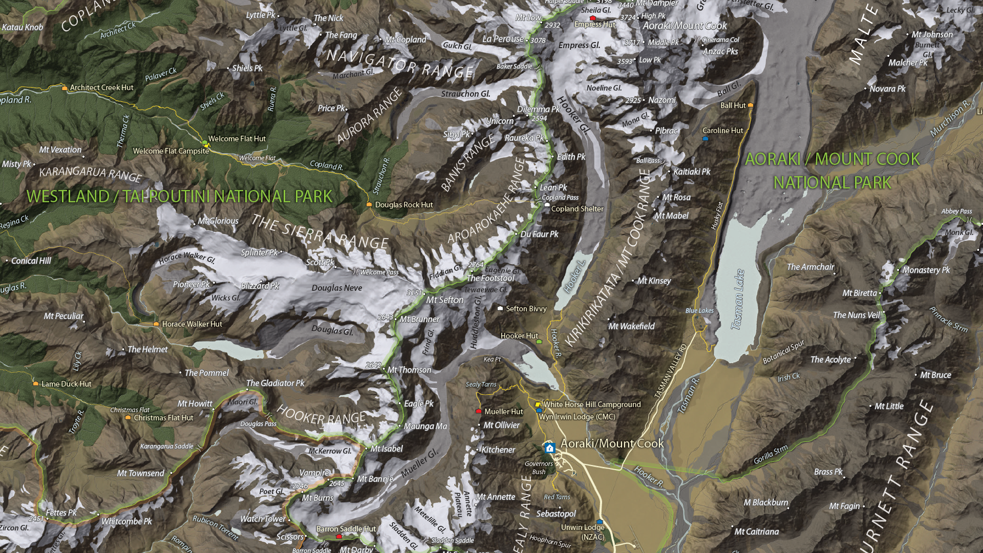
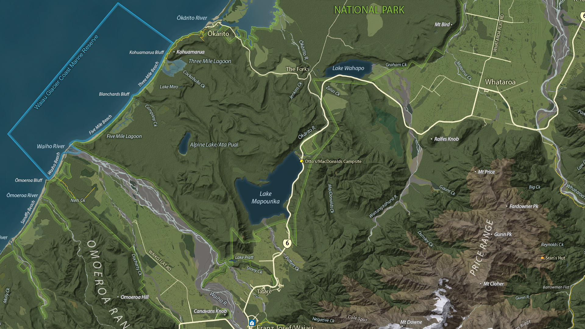
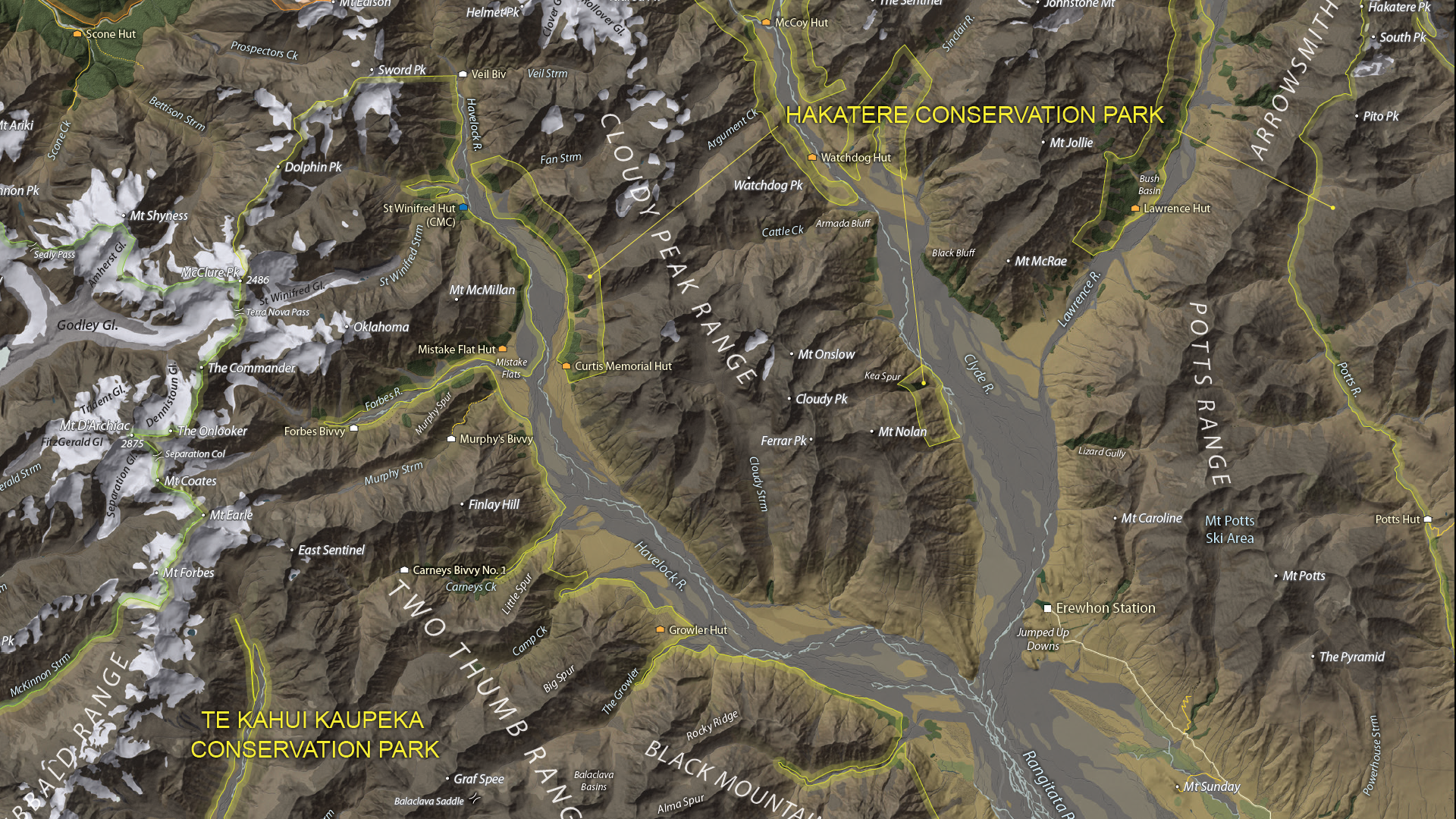
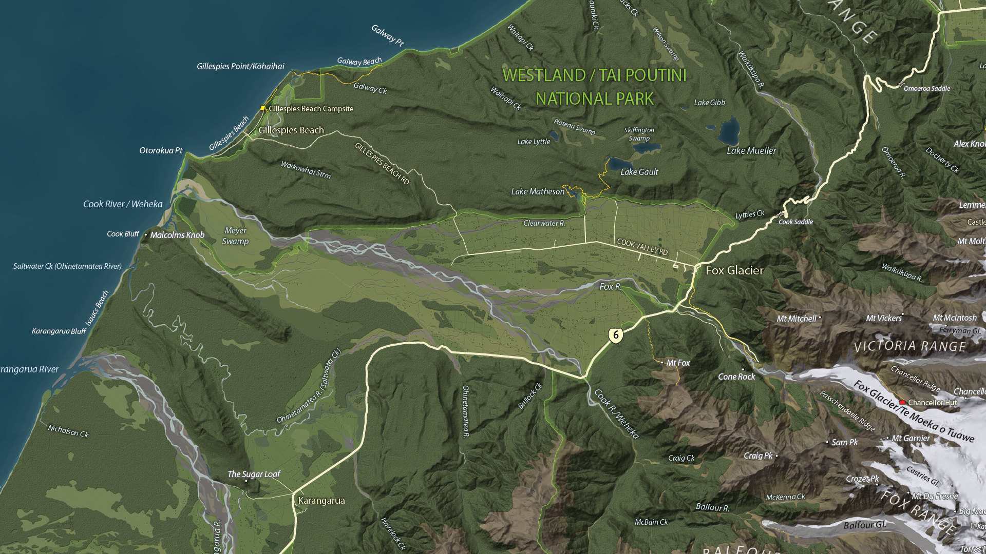
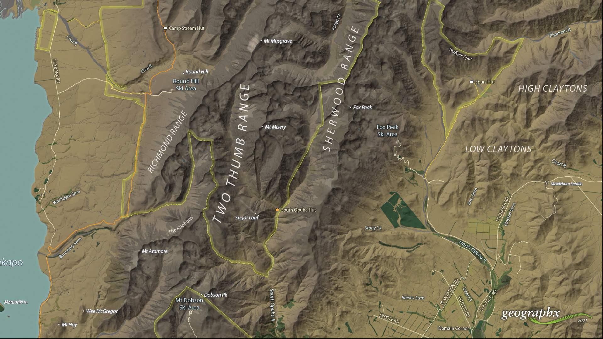
We are showcasing the Open-category winner of the 2021 Avenza Map Competition. This fantastic entry was created by Roger Smith, expert cartographer and owner of Geographx in Wellington, New Zealand. Roger’s grand-prize winning entry is a truly remarkable display of map craftsmanship. The map provides a detailed look at the topography and trail coverage surrounding one of New Zealand’s most beautiful wilderness areas. His expert usage of natural colour basemaps and shaded relief creates a truly stunning result.
This topographic map focuses on the area covered by Westland Tai Poutini National Park, Aoraki/Mount Cook National Park, and the adjacent conservation parks and designated wilderness areas. It presents park boundaries, back-country walking trails, and the many camping shelters that are scattered throughout the area. The map itself is designed for print as a wall map and utilizes a natural colour basemap to create an eye-catching visual guide for the region.
The map can be used to familiarize park visitors with the area and assist recreational visitors with trip-planning in the rugged back-country trails of the area. The natural colour basemap is designed to maximize viewer understanding and appreciation of the physical environment while providing a pleasing backdrop that highlights important points, trails and places on the map.
Select the images below to see a detailed look at Roger’s map
Making the Map
The cartographic design elements and vector art creation utilized a wide range of tools in MAPublisher. Some of the vector data that went into the map were obtained through the New Zealand Department of Conservation, and the Land Information Department, while others were custom-crafted by Roger and his team at Geographx. Notably, the Geographx team custom-built the natural colour basemap and DEM-derived hillshade that gives the map its unique look and feel.
MAPublisher allowed Roger to import his data layers into an Adobe Illustrator environment that was conducive to flexible cartographic design work. Using the MAP Views panel, he could easily adjust and modify the projection and scaling of his map. Where necessary, Roger leveraged the many MAPublisher Geoprocessing and Data Editing tools to manipulate or simplify vector art layers for better representation on the final map.
As MAPublisher maintains spatial referencing for each data layer, he could place and register his custom natural colour, and raster hillshade layers to create his basemap. Fine-tuning would ensure his vector layers (including roads, campsites, trails, and place markers) would all be accurately placed and aligned with their real-world locations.
Roger created unique labels for the hundreds of different placemarks and trail lines on the maps. Using MAP Attribute data that are retained for each data layer, Roger used the Label Features tool to efficiently create and place labels for each layer. With Label Features, Roger could define custom rules that ensure each label stands apart from the other. For important place markers and points of interest, Roger used the Create Halos tool to make certain labels stand out more prominently.
Needless to say, this spectacular piece of work represents the culmination of countless hours of design effort and dedication. Roger has added this map to the impressive collection of cartographic works produced by Geographx. To learn more about other fantastic map products available from Geographx, visit their website.

What’s New in MAPublisher 11.0 for Adobe Illustrator?

We are very excited to announce the release of MAPublisher 11, the latest version of our MAPublisher extension for Adobe Illustrator.
With MAPublisher 11, we are bringing forward full compatibility with the Apple Silicon processor, enhancements to the MAP Attributes panel, a revamped welcome screen, the ability to import OpenStreetMap file formats, a brand new set of MAP Erase tools, and several performance and bug fixes.
Here’s what you can expect with the latest MAPublisher 11 release:
Compatibility with the Apple Silicon Processor
We want to ensure our users enjoy a truly seamless experience whether they are using a PC or Mac computer. Our team has worked to ensure that MAPublisher 11 is fully compatible with the Apple Silicon chip, and as such we can declare that MAPublisher is officially supporting this processor.
MAP Attributes Panel Enhancements
An exciting feature for MAPublisher 11 is a number of enhancements made to the MAP Attributes panel. Users are no longer required to select all objects on a layer for them to appear in the MAP Attribute panel. Instead, all features appear by default, and users can toggle between showing all features or just their selected features at the bottom left corner of the panel. When all features are shown, selected features will appear highlighted in the attribute table.
Welcome Screen Revamp
MAPublisher 11 comes with a brand new welcome screen that appears upon opening the program. This window is equipped with visually appealing refreshed graphics, while maintaining access to the License Management window. It also features several new sections that increase discoverability for you, such as new features, help and tutorials, and other Avenza news or events. There is also a Get Inspired section to help inspire you as a mapmaker, which features articles from our website which highlight the excellent maps and stories of some of our most proficient users.
Importing OpenStreetMap File Formats
We are thrilled to announce that importing OpenStreetMap (OSM) file formats is now a possibility with MAPublisher 11! Whether you are importing a single file, or using the Multiple Data Import tool you can now select OSM and PBF file formats from the list of supported formats. The rest of the import process remains unchanged from the other file formats users are familiar working with in MAPublisher.
MAP Erase Tools
Many of our users have requested the ability to quickly erase unwanted or sensitive data from their maps. Thus, we are happy to introduce the new MAP Vector Erase and MAP Erase by Shape tools that come along with MAPublisher 11!
MAP Vector Erase Tool
With the new release of MAPublisher 11 comes a new tool known as the MAP Vector Erase tool. Functioning as an inverse version of the MAP Vector Crop tool, the Erase tool removes all data within a specified rectangle or ellipse shape.
MAP Erase by Shape Tool
The new MAP Erase by Shape tool functions similarly to the MAP Vector Erase tool, but it allows users to easily erase portions of MAP Layers using shapes other than rectangles and ellipses. Users can simply select the shape object they wish to use as the erase boundaries, and then select the MAP Erase by Shape tool from the MAP Toolbar.
Both tools share the same customizable settings and advanced options. Like the MAP Crop tools, the MAP Erase tools can be applied to all layers within the document, all layers within a single MAP View, or just a single layer.
If you would like to learn more about the new MAPublisher 11 features or have any questions, please check out our Support Centre.
MAPublisher 11 is immediately available today, free of charge to all current MAPublisher users with active maintenance subscriptions and as an upgrade for non-maintenance users.
Avenza Releases MAPublisher 11.0 for Adobe Illustrator
Toronto, ON, August 31, 2022 – Avenza Systems Inc., producers of the Avenza Maps® app for mobile devices and geospatial extensions for Adobe Creative Cloud®, including Geographic Imager® for Adobe Photoshop®, is pleased to announce the release of MAPublisher® 11.0 for Adobe Illustrator®. This version offers full compatibility with the Apple Silicon processor, enhancements to the MAP Attributes panel, a revamped welcome screen, the ability to import OpenStreetMap file formats, a brand new set of MAP Erase tools, and several performance improvements and bug fixes.
MAPublisher cartography software seamlessly integrates more than seventy GIS mapping tools into Adobe Illustrator to help you create beautiful maps from geospatial data. Import industry-standard GIS data formats and make crisp, clean maps with all attributes and georeferencing intact using the Adobe Illustrator design environment.
New major features of the MAPublisher 11.0 extension for Adobe Illustrator include:
- Apple Silicon Processor compatibility
- MAP Attributes Panel enhancements: Users no longer need to select all attributes for them to appear by default in the features list, with show all/show only selected features toggle buttons
- Welcome Screen revamp: Improved discoverability for users with more content to aid in getting started or inspired with MAPublisher
- OpenStreetMap file format support: Import OpenStreetMap OSM and PBF file formats
- MAP Erase tools: Quickly remove sensitive or unwanted data from maps with the MAP Vector Erase or MAP Erase by Shape tools
Users require a valid Adobe Creative Cloud subscription and a compatible operating system to utilize the improvements and enhancements offered in MAPublisher 11.0. For questions and information on how compatibility requirements may affect your organization, please contact our Support Centre.
MAPublisher 11.0 is immediately available free of charge to all current MAPublisher users with active maintenance and as an upgrade for non-maintenance users starting at US$649. New licenses are available from US$1499. MAPublisher FME-Auto and MAPublisher LabelPro are also available as add-ons starting at US$499. Academic, floating, and volume licenses are also available. Prices include one year of full maintenance. Read more about MAPublisher 11.0 in the release blog, or visit www.avenza.com/mapublisher for more details.
More about Avenza Systems Inc.
Avenza Systems Inc. is an award-winning, privately held corporation that provides cartographers and GIS professionals with powerful software tools to make better maps. Avenza also offers the mobile Avenza Maps app to sell, purchase, distribute, and use maps on iOS and Android devices.
For further information contact: 416-487-5116 – info@avenza.com – www.avenza.com
Avenza Releases MAPublisher 10.9 for Adobe Illustrator
Toronto, ON, November 9, 2021 – Avenza Systems Inc., producers of the Avenza Maps® app for mobile devices and geospatial extensions for Adobe Creative Cloud®, including Geographic Imager® for Adobe Photoshop®, is pleased to announce the release of MAPublisher® 10.9 for Adobe Illustrator®. This version offers compatibility with Adobe Illustrator 2022, Windows 11, and macOS 12. It also provides a variety of feature updates including the widely requested support for the vector GeoPackage and TopoJSON data formats, new Geodesic options for the Buffer Art tool, default filter on import and style on import options, and several performance improvements and bug fixes.
MAPublisher cartography software seamlessly integrates more than seventy GIS mapping tools into Adobe Illustrator to help you create beautiful maps from geospatial data. Import industry-standard GIS data formats and make crisp, clean maps with all attributes and georeferencing intact using the Adobe Illustrator design environment.
New major features of the MAPublisher 10.9 extension for Adobe Illustrator include:
- Adobe Illustrator 2022 compatibility
- Windows 11 and macOS 12 Monterey compatibility
- TopoJSON support: Import TopoJSON data
- GeoPackage support: Import and export vector GeoPackage data
- Geodesic Buffer settings: Provides more accurate distance buffers on point data when working on features distant from lines of true scale
- Default import filters and styles: Specify default options for filtering and displaying data that is imported into MAPublisher
Avenza announces that compatibility support is changing for its desktop mapping software. Starting with MAPublisher 10.9, both Windows 7 and Adobe CS6 will no longer be supported. Users will require a valid Adobe Creative Cloud subscription and a compatible operating system to utilize the improvements and enhancements offered in MAPublisher 10.9. For questions and more information on how these changes around compatibility may affect your organization, please contact our Support Centre.
MAPublisher 10.9 is immediately available free of charge to all current MAPublisher users with active maintenance and as an upgrade for non-maintenance users starting at US$649. New licenses are available from US$1499. MAPublisher FME-Auto and MAPublisher LabelPro are also available as add-ons starting at US$499. Academic, floating, and volume licenses are also available. Prices include one year of full maintenance. Read more about MAPublisher 10.9 in the release blog, or visit www.avenza.com/mapublisher for more details.
More about Avenza Systems Inc.
Avenza Systems Inc. is an award-winning, privately held corporation that provides cartographers and GIS professionals with powerful software tools to make better maps. Avenza also offers the mobile Avenza Maps app to sell, purchase, distribute, and use maps on iOS and Android devices.
For further information contact: 416-487-5116 – info@avenza.com – www.avenza.com
Cartographer Chronicles: Hans van der Maarel
Hans van der Maarel has been a passionate cartographer for over 20 years. He works out of Zevenbergen, Netherlands where he operates his company, Red Geographics. To Hans, cartography is a passion that extends beyond the office, becoming more than just a career path. Through this passion, Hans has developed a level of expertise found only in the most dedicated of map-making professionals. As an expert MAPublisher user, Hans has been a frequent contributor to the Avenza Resources Blog. You can see some of his latest work through his Georeferencing Techniques Video tutorials released as part of Avenza’s Mapping Class blog series. To read more about Red Geographics, and see more of Hans’s work, visit redgeographics.com.
From a young age, Hans always had a keen interest in maps. His found himself drawn to old atlasses, spending hours looking at old maps, and geography was always his favourite subject in school. This interest persisted into high school, where at a job fair he found out you could actually study map-making as a career.
Continuing his studies, Hans pursued a program in Geo-Informatics at Hogeschool Utrecht (a four-year bachelor’s level course offering a mix of geodesy, GIS, and cartography). There he was introduced to various kinds of mapping and surveying, learning the techniques necessary to plan and design meaningful effective maps. During an internship at the National Spatial Planning Agency, he was first introduced to the MAPublisher plug-in for Adobe Illustrator. After graduation he started working for his local Avenza partner, doing tech support, training, consultancy, and commercial map production processes. This is also where he was introduced to Safe Software and their product for data transformation, also known as Feature Manipulation Engine (FME).
Hans developed a niche within the Dutch cartographic community that leveraged FME to prepare raw source data before using MAPublisher to visualize and create the final high-quality map products. This type of workflow, combining a mix of both FME and MAPublisher functionalities is now fully realized by the FME Auto add-on for MAPublisher.
“I was doing my first internship and was tasked to produce a poster-sized map of The Netherlands in Adobe Illustrator, but all the base data was in Shapefiles or ArcInfo coverages. Gathering base data and generalizing it was done in a traditional GIS, but getting that data into Illustrator and making a finished map required MAPublisher.”
In September 2004, Hans decided to continue on his own and founded Red Geographics. Working largely with Avenza products, two years later, he became an official Avenza partner and reseller. As his customer base expanded and more projects came in, Red Geographics developed a reputation of being “the one for the difficult projects”. Reflecting on the early years of Red Geographic’s operation, Hans mentioned some of his more memorable, fun, and eye-catching projects.

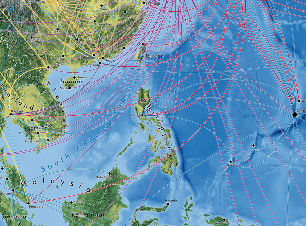
“There was the Oolaalaa Globe, a 5 ft diameter “beanbag” globe with beautiful maps printed on spandex. We received several custom orders of the globe map from other clients, including ones for Air France-KLM with the complete route networks of all their partners, and another from National Geographic Benelux and the City of Amsterdam, with a map of the city projected onto the globe.”
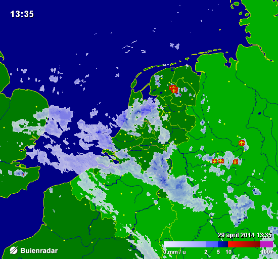
Also eye-catching, but for a completely different reason, were a series of simple basemaps created for Buienradar, the most popular Dutch weather website, and app. Millions of people have seen Hans’s maps when they checked the weather.
In the early years of Red Geographics, Hans became involved with the Cartotalk forum, first as an enthusiastic user, later on as a moderator, and finally an admin. Through Cartotalk, he also got involved with NACIS, the North American Cartographic Information Society. He attended their meeting in Salt Lake City in 2005 and he’s been to every meeting since. When NACIS took over Cartotalk, Hans became an ex-officio board member for several years before being formally elected a board member at large. He still serves on the board to this day and is currently in his 2nd term as secretary. Through NACIS, Hans was able to expand his network of international contacts, allowing him to contribute to several large-scale mapping and atlas projects. He created island maps that can be found in the Millennium House “Earth” atlas and more recently, several full-page maps for the 11th Edition National Geographic World Atlas released in 2019.
Building on the success of his earlier globe projects, Hans then created a new map whose design is displayed prominently on a new product called BalancePlanet, a globe-themed, fully functional yoga-ball that Hans considers a spiritual successor to the Oolaalaa globe bean bag chair.

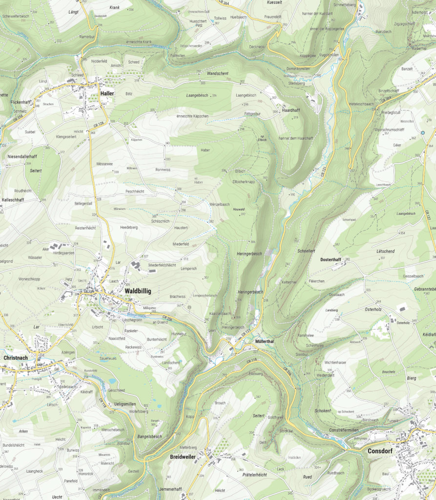
In 2019, Hans expanded his team, adding two members to become a team of three. With more resources now available, Hans and his team can now tackle larger, more complex (mapping) projects. His team took on the momentous task of producing a nationwide 1:20,000 scale topographic base map of the entire country of Luxembourg. The finished results were used as a cartographic base for tourist maps showing hiking and cycling routes all over the country.
“The Avenza products have been a major factor in my development as a cartographer, as well as the development of my company,” says Hans. Many of his projects use a combination of FME and MAPublisher, and Hans has utilized the interoperability between these two programs to implement significant workflow automation. With a single base dataset, multiple maps can be made with the same style, and automating this process means he can produce a high volume of maps in just seconds, without needing to manually configure shared thematic elements.
“With automating some of the map production processes, I now only have to focus on the parts where my cartographic skills are most needed. MAPublisher allows me to do that. I want to find the right balance between quality and speed when it comes to producing maps, and with automating the data processes I have found just that.”
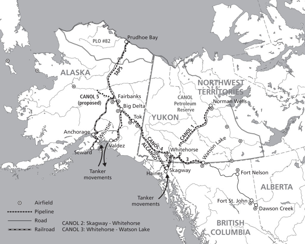
Aside from the traditional mapping products Hans has become known for, he enjoys working on smaller projects with interesting stories around them. “The maps I get the most joy out of these days are, interestingly enough, not those big ones. Over the past ten years or so I’ve been asked to produce greyscale maps for several academic publications, a lot of them focusing on the Arctic and Antarctic regions. Limited in terms of visual variables and often a need to show a lot of information on a small surface area, these kinds of maps are a very interesting challenge. One thing led to another, word-of-mouth is a great promotion tool, and we now find ourselves in the middle of producing about 30 maps for an upcoming publication by Cambridge University Press, chronicling the state of research in those areas. Wonderfully esoteric subjects which often lead me down a Wikipedia rabbit hole!”
Hans continues to use his cartography skill set to explore new ways of making maps more prominent in everyday life. Hans began introducing his colleague, Inge van Daelen, to the concepts of satellite imagery and Photoshop (using Tom Patterson’s great tutorial on how to process Landsat data). Branching off of this, they founded Blue Geographics, which originally started as a fun side-project but quickly grew into a full-fledged business. Through Blue Geographics, Hans designs and produces a range of sportswear and lifestyle items displaying beautiful satellite images derived from Landsat and Sentinel data.

“Looking ahead, I just want to make beautiful things,” says Hans, “One of my hobbies is photography, specifically cycling and cosplay. A few years ago, when I did a photoshoot with two cosplayers, I saw a sticker with that text in their workshop and it struck a chord with me. I’ve long had ‘doing awesome work for people I like’ as one of my goals and I want to keep on doing that. I also want to keep on challenging myself by trying out new techniques and new ways to map things. There’s still a lot to learn and I am very happy to know a lot of people in the cartographic community who are happy to share their knowledge and experiences.”

Avenza Releases MAPublisher 10.8 for Adobe Illustrator
Toronto, ON, April 27th, 2021 – Avenza Systems Inc., producers of the Avenza Maps® app for mobile devices and geospatial plugins for Adobe Creative Cloud®, including Geographic Imager® for Adobe Photoshop®, is pleased to announce the release of MAPublisher® 10.8 for Adobe Illustrator®. This latest version provides user interface and usability enhancements for several tools, an updated coordinate systems library, raster ECW format support, and other mapping engine enhancements.
MAPublisher cartography software seamlessly integrates more than seventy GIS mapping tools into Adobe Illustrator to help you create beautiful maps from GIS data. Import industry-standard GIS data formats and make crisp, clean maps with all attributes and georeferencing intact using the Adobe Illustrator design environment.
New features of the MAPublisher 10.8 plugin for Adobe Illustrator include:
- User Interface and Tool Improvements:
- Multi-select attribute columns to batch modify attribute properties
- Line Plotter allows multi-select MAP locations
- MAP Themes now includes overprint options
- Document Summary panels will now provide MAPublisher “last saved with” version information
- Scale Bar, Create Legend, and Elevation Profile preview panel can now display background colours
- Raster ECW Support: Import and work with Enhanced Compression Wavelet files
- Updated Coordinate Systems: Engine enhancements including an updated coordinate system library
MAPublisher 10.8 is immediately available free of charge to all current MAPublisher users with active maintenance and as an upgrade for non-maintenance users starting at US$649. New licenses are available from US$1499. MAPublisher FME-Auto and MAPublisher LabelPro are also available as add-ons starting at US$499. Academic, floating, and volume licences are also available. Prices include one year of full maintenance. Read more about MAPublisher 10.8 in our release blog, or visit www.avenza.com/mapublisher for more details.
More about Avenza Systems Inc.
Avenza Systems Inc. is an award-winning, privately held corporation that provides cartographers and GIS professionals with powerful software tools to make better maps. Avenza also offers the mobile Avenza Maps app to sell, purchase, distribute, and use maps on iOS and Android devices. For more information, visit www.avenza.com.
For further information contact: 416-487-5116 – info@avenza.com – www.avenza.com

