We’ve recently added a deliciously useful feature to MAPublisher: waffle charts!
Waffle charts are grid-based visualizations where each cell represents a fixed quantity of data. They offer a clear, easy-to-read alternative to traditional pie charts, especially when comparing multiple categories or displaying categories with small percentages. Whether you’re working with population figures, economic data, or any other dataset, waffle charts can help your map users quickly compare proportions or observe patterns.
In our newest video, we walk you through the process of creating waffle charts in MAPublisher 11.6, starting in the MAP Themes panel. Our demonstration compares exports between Canada and the United States across nine different categories, from oil and minerals to food and transportation products.
The video contains a brief overview for creating a waffle chart, using the Edit Chart Theme window to specify your settings (including some new options specific to waffle charts), and how to set up a legend to assist users in interpreting your charts.
With editable styling options that allow full customization of the appearance of your waffle charts, this new chart type is a fantastic way to enhance the visual storytelling power of your maps. Waffle charts can even be styled using native Illustrator graphic styles or custom swatches you’ve created yourself!
Ready to get started? Watch the full demonstration below to find out just how easy it is to bring your data to life in a new way with waffle charts in MAPublisher 11.6.
For more information on waffle charts, check out our Support Page for Chart Themes.
Toronto, ON, March 25, 2025 – Avenza Systems Inc., producer of the Avenza Maps app for mobile devices and geospatial extensions for Adobe Creative Cloud, including Geographic Imager for Adobe Photoshop, is pleased to announce the release of MAPublisher version 11.6 for Adobe Illustrator. This version introduces waffle charts to the MAP Themes chart types, adds a Point Scaling option to the Add Calculated Data tool, and offers other performance enhancements and bug fixes.
MAPublisher cartography software seamlessly integrates more than seventy GIS mapping tools into Adobe Illustrator to help users create beautiful maps from geospatial data. Import industry-standard GIS data formats and make crisp, clean maps with all attributes and georeferencing intact using the Adobe Illustrator design environment.
New features of MAPublisher 11.6 for Adobe Illustrator include:
Introduction of waffle charts to MAP Themes chart types: Waffle charts can now be created in MAPublisher by opening the MAP Themes panel, creating a Chart Theme, and selecting “Waffle chart” from the Type drop-down menu.
Addition of a Point Scaling option to the Add Calculated Data tool: The Add Calculated Data tool now features a Calculation type of “Point Scaling,” which creates an attribute for point scaling values derived from an existing attribute in a dataset.
Additional performance enhancements and bug fixes
To utilize the improvements and enhancements offered in MAPublisher 11.6, users require a valid Adobe Creative Cloud subscription and a compatible operating system. For questions and information on how compatibility requirements may affect your organization, please contact our Support Centre.
MAPublisher 11.6 is immediately available free of charge to all current MAPublisher users with active maintenance and as an upgrade for non-maintenance users starting at US$999. New licenses are available from US$1,749. MAPublisher FME Auto and MAPublisher LabelPro are also available as add-ons starting at US$599. Academic, floating, and volume licenses are also available. Prices include one year of full maintenance. Visit www.avenza.com/mapublisher for more details.
More about Avenza Systems Inc.
Avenza Systems Inc. is an award-winning, privately held corporation that provides cartographers and GIS professionals with powerful software tools to make better maps. Avenza also offers the mobile Avenza Maps app to sell, purchase, distribute, and use maps on iOS and Android devices. For further information contact: 416-487-5116 – info@avenza.com – www.avenza.com
We are excited to announce the release of MAPublisher version 11.6, the latest update to our MAPublisher extension for Adobe Illustrator.
MAPublisher 11.6 introduces waffle charts to the MAP Themes chart types, a Point Scaling option to the Add Calculated Data tool, and other performance enhancements and bug fixes.
Here’s what you can expect with the latest MAPublisher 11.6 release:
Waffle chart option added to MAP Themes
The MAP Themes panel welcomes a brand new chart type to MAPublisher 11.6: waffle charts! A waffle chart is a grid composed of equally sized cells, each coloured to depict different categories or segments. It is useful for comparing categories and displaying proportions. Waffle charts are typically used as an alternative to pie charts, making it easier to compare areas, visualize categories with small percentages, and generally make charts more readable.
To create waffle charts in MAPublisher 11.6, open the MAP Themes panel and create a Chart Theme as you usually would. When you open the Edit Chart Theme window, you will notice the brand new “Waffle chart” option in the Type drop-down menu.
As seen in the above image, configuring a waffle chart is very similar to configuring the other chart types with the usual option tabs such as Source Data, Chart Options, General Options, and Title available for customization. The Chart Options tab features a few new options specific to creating waffle charts, including a Calculate Default Scale button to help select a suitable value for the data represented in each cell.
To learn more about creating waffle charts in MAPublisher, check out the support page for Chart Themes.
Add Calculated Data now features a point scaling option
The Add Calculated Data tool—found in the Data Creation section of the MAP Toolbar—gains a new calculation option in MAPublisher 11.6. When the selected Layer is a point layer, the brand new “Point Scaling” option will become available in the Calculation drop-down menu.
The Point Scaling option adds a field to your attributes containing a calculation for point scaling sourced from an existing numeric attribute. The “Automatically Apply Point Scaling to Layer” checkbox allows you to immediately resize your points according to the selected scaling settings upon clicking “OK” to close the window instead of creating a new attribute. There are four Scale Methods to choose from, each calculating the scale slightly differently depending on which factors are important to you. For example, selecting the Flannery method applies a correction factor to account for natural human bias that causes us to underestimate the size of larger symbols. In contrast, choosing the Exponential method increases the size of symbols exponentially relative to their data values to emphasize differences, especially among larger values.
MAPublisher 11.6 is available now!
If you want to learn more about the new MAPublisher 11.6 features or have any questions, please check out our Support Centre. MAPublisher 11.6 is immediately available today. It is free to all current MAPublisher users with active maintenance subscriptions and available as an upgrade for non-maintenance users.
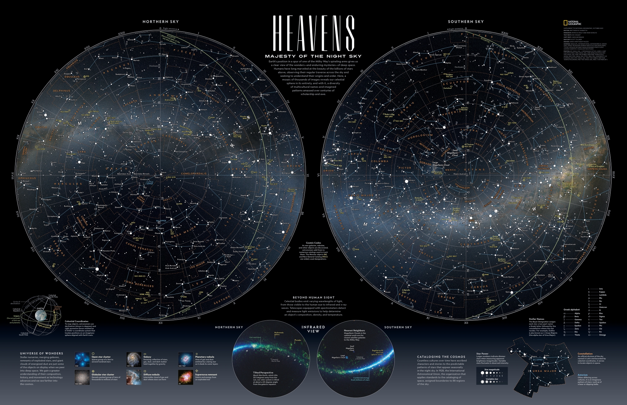
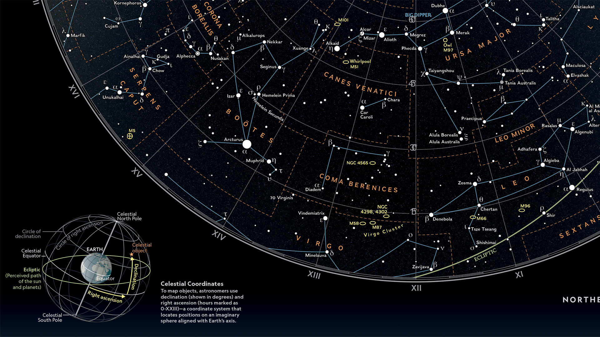
In this Map Spotlight, we are showcasing the Grand Prize winner of the 2024 Avenza Map Contest—Heavens: Majesty of the Night Sky by Matthew Chwastyk of National Geographic, with additional contributions from Patricia Healy, Heidi Schultz, Eve Conant, Caroline Braun, Scott Zillmer, and Sandi Owatverot-Nuzzo. This particular map was created for inclusion as a poster in the special space issue of National Geographic Magazine, using the most recent NASA data on star locations, constellation boundaries, asterisms, and deep-sky objects.
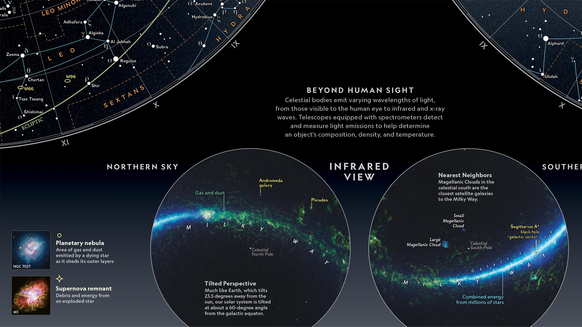
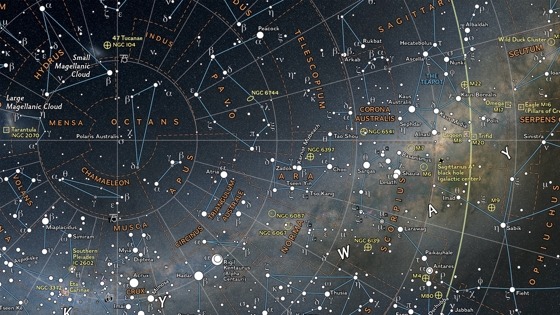
Matthew plotted stars of magnitude 5 and brighter, which marks the threshold for naked-eye visibility. Star magnitudes and variable stars are represented by graduated symbols, with brighter stars appearing larger. The stars are plotted on a supplemental set of hemispheres featuring the latest whole-sky survey projected into the map view to display how the sky appears in infrared, including a glowing representation of the Milky Way galaxy. Stars are labeled in both their traditional names and in Greek letters using the Bayer system. Matthew further enhanced the visual appeal of the map with a key containing representative images of deep-sky objects on the bottom left side.
Select the images below to see a detailed look at Matthew’s map
Making the Map
One of the most eye-catching visual elements of this map is the sky imagery on which the star data is displayed. Matthew prepared this imagery to be used for the map by reprojecting it in Geographic Imager using the Transform tool. This is how the hemispheres of the two main maps were created, after which they were imported into MAPublisher.
In MAPublisher, Matthew used the MAP View Editor tool to create a workspace that utilized a hemispherical-shaped coordinate system, such as the stereographic projection. The MAP Point Plotter tool was used to place selected deep-sky objects on the map using estimated coordinates.
The MAP Themes tool was essential in allowing Matthew to approach the styling of the stars in a hierarchical format by categorizing them based on magnitude, ensuring the most prominent stars stood out the most. Stars were then labeled using the MAPublisher LabelPro add-on, with manual adjustments minimized by the intuitive nature of the tool.
Matthew used the Create Knockouts tool to improve label legibility by creating a mask around text in busy areas of the map. Map legibility was also improved by using the Simplify Art tool to generalize the detail on constellation lines. The Join Lines tool was used to group lines constituting asterisms together, making them easier to manage and style.
Read our other Map Spotlight blogs here, and check out the other winners of the Avenza Map Contest 2024 here!
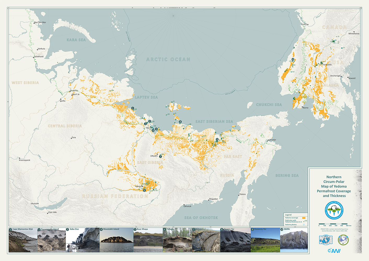
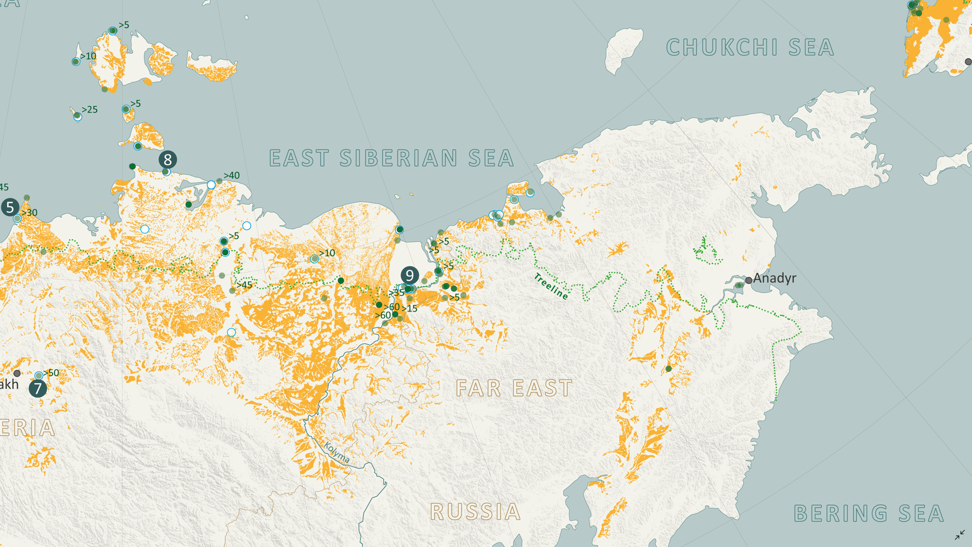
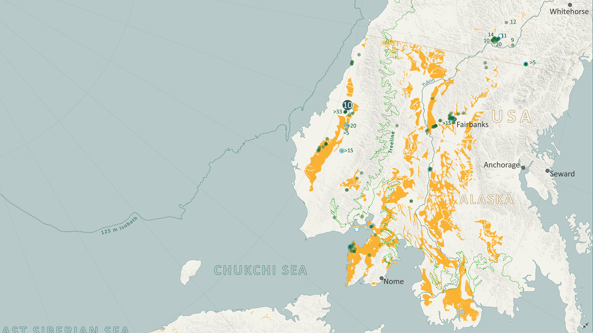
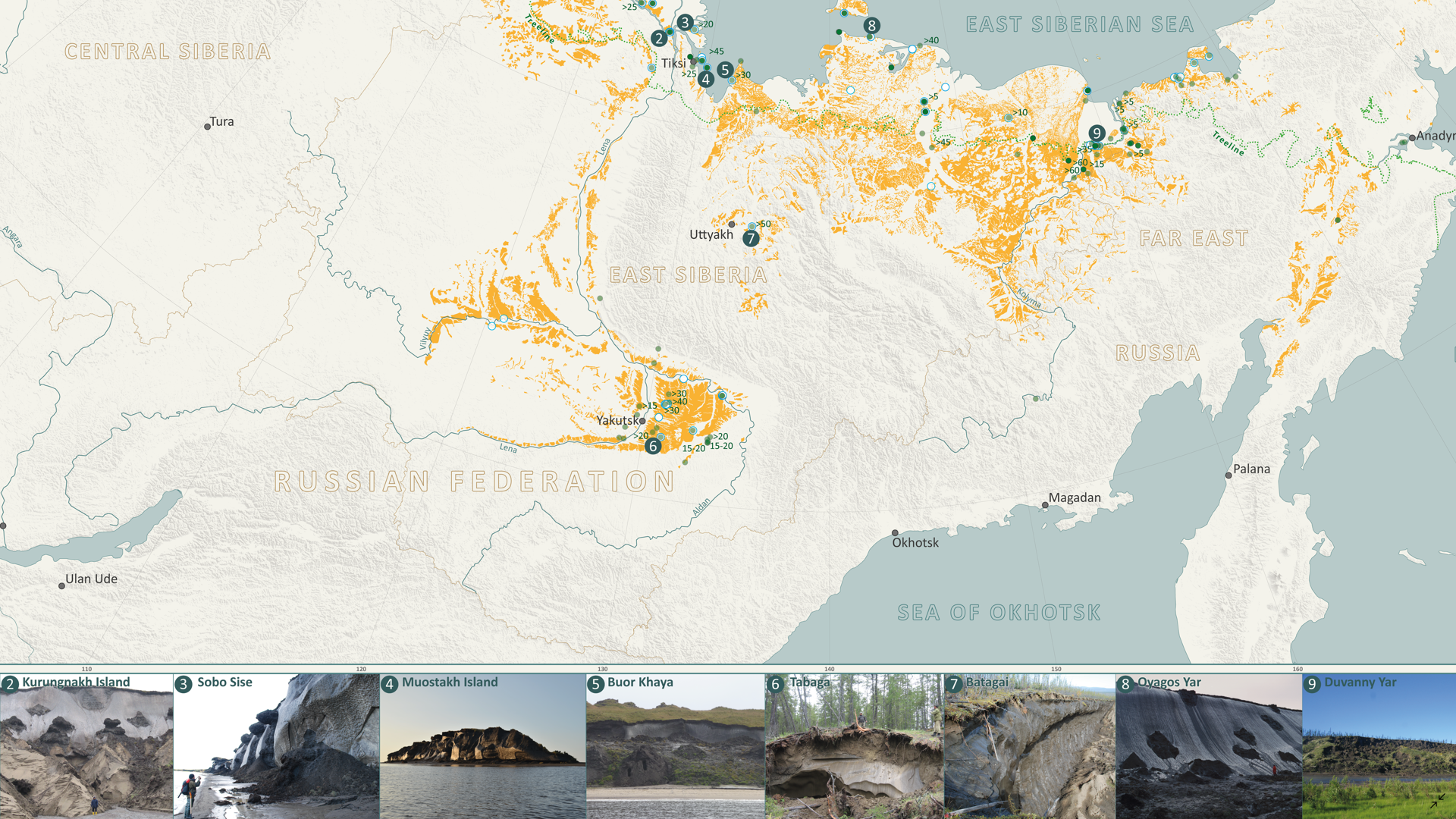
In this Map Spotlight, we are showcasing an honourable mention of the 2021 Avenza Map Contest: Yedoma Permafrost Coverage by Sebastian Laboor, Jens Strauss, and Guido Grosse of the Alfred Wegener Institute Helmholtz Centre for Polar and Marine Research (AWI). This map shows the extents of the world’s most ice-rich and climate-sensitive type of permafrost: Yedoma permafrost. This permafrost has been permanently frozen since the last Ice Age, when mammoths still roamed the Arctic tundra, and covers parts of Siberia, Alaska, and Yukon. The team at AWI worked with an international research team from various countries to determine the distribution of Yedoma permafrost, which resulted in this map—the first-ever Arctic-wide Yedoma map.
Creating this map was a tremendous journey, bringing together more than 25 researchers and their decades of permafrost expertise. It is an important step towards understanding how Yedoma permafrost and the massive organic content it has preserved since the last ice age may contribute to future greenhouse gas concentrations in the atmosphere once the area begins to thaw. This map is importantly filling a critical research gap, being used as an important input dataset for new climate models that predict the trajectory of permafrost carbon and its future environmental impacts.
This map and the geospatial dataset are open access and freely available to the public.
Select the images below to see a detailed look at their map
Making the Map
To create the Yedoma permafrost dataset used for this map, Sebastian utilized Adobe Illustrator and MAPublisher as a manual vectorization and attribution tool. Scanned and georeferenced Russian Quaternary geology maps were vectorized using native Illustrator tools, such as the pen and pathfinder tools, and then the MAP Attributes panel was used to assign attributes to these features, and also edit them as necessary later.
The Import tool was essential in allowing them to bring in their supplementary geospatial data to build out the rest of the map. The MAP Views panel and the MAP View Editor were important tools for defining projections, scales, and positions of their map layers. The point data for field sites was added to the map using the MAP Point Plotter tool.
Sebastian used the MAP Vector Crop tool to crop many different layers at once to the map’s extent, allowing for a clean and organized workspace. He also used the MAP Selections and MAP Themes panels to create classes for the data.
The initial positioning of labels was conducted using the MAPublisher LabelPro add-on, with manual adjustments made as needed. Finally, Sebastian added a grid and graticule as well as a North Arrow to complete the finishing touches to the map.
Toronto, ON, November 5, 2024 – Avenza Systems Inc., producer of the Avenza Maps® app for mobile devices and geospatial extensions for Adobe Creative Cloud®, including Geographic Imager® for Adobe Photoshop®, is pleased to announce the release of MAPublisher® version 11.5 for Adobe Illustrator®. This version introduces several compatibility updates, importing Vector Basemaps from custom tile sources, the ability to use the Join Table feature with existing MAP Layers, a new Split Line path utility, and several performance enhancements and bug fixes.
MAPublisher cartography software seamlessly integrates more than seventy GIS mapping tools into Adobe Illustrator to help users create beautiful maps from geospatial data. Import industry-standard GIS data formats and make crisp, clean maps with all attributes and georeferencing intact using the Adobe Illustrator design environment.
New features of MAPublisher v11.5 for Adobe Illustrator include:
Adobe Creative Cloud 2025 compatibility: MAPublisher now supports Adobe Illustrator 2025 (version 29.0) on both Mac and Windows
macOS Sequoia compatibility: MAPublisher also officially supports the new macOS Sequoia (version 15) update
FME Form 2024 compatibility: MAPublisher now supports the recent FME 2024.1 update when using the FME Auto add-on
Importing Vector Basemaps from custom tile sources: Vector Basemap data can now be imported from custom tile sources such as Mapbox, Esri and OpenStreetMap. Data can be imported unstyled and later configured with the brand new “MAP Basemap Styling” panel, which can be found under the Thematic Tools section of the MAPublisher Toolbar.
Join Table from existing MAP Layer: Users can now use the Join Table feature in the MAP Attributes panel to join tables from existing MAP Layers using the “Source Type” drop-down list. These layers may be contained within the active document or any other currently open document.
Split Line action added to Path Utilities menu: The Split Line utility splits a selection of lines into two separate segments at a certain specified length, which can be either relative (i.e. as a percentage of the total line length) or absolute (i.e. at a specified distance in selected units).
Performance enhancements: MAPublisher v11.5 has improved performance when working with files containing a large number of features and attributes. Users can expect improved performance in multiple areas including coordinate system reprojection, applying stylesheets, deleting art, moving art between layers, and splitting layers.
Additional performance improvements and bug fixes
Users require a valid Adobe Creative Cloud subscription and a compatible operating system to utilize the improvements and enhancements offered in MAPublisher v11.5. For questions and information on how compatibility requirements may affect your organization, please contact our Support Centre.
MAPublisher v11.5 is immediately available free of charge to all current MAPublisher users with active maintenance and as an upgrade for non-maintenance users starting at US$739. New licenses are available from US$1,699. MAPublisher FME Auto and MAPublisher LabelPro are also available as add-ons starting at US$569. Academic, floating, and volume licenses are also available. Prices include one year of full maintenance. Visit www.avenza.com/mapublisher for more details.
More about Avenza Systems Inc.
Avenza Systems Inc. is an award-winning, privately held corporation that provides cartographers and GIS professionals with powerful software tools to make better maps. Avenza also offers the mobile Avenza Maps app to sell, purchase, distribute, and use maps on iOS and Android devices. For further information contact: 416-487-5116 – info@avenza.com – www.avenza.com
We are excited to announce the release of MAPublisher version 11.5, the latest update to our MAPublisher extension for Adobe Illustrator.
MAPublisher v11.5 introduces several compatibility upgrades, support for importing vector basemaps from custom tile sources, new functionality for using the Join Table feature with existing MAP Layers, a new Split Line path utility, and other performance improvements and bug fixes.
Here’s what you can expect with the latest MAPublisher v11.5 release:
Compatibility upgrades
We’ve been hard at work this fall, and we’re delighted to share that MAPublisher 11.5 is fully compatible with Adobe Illustrator 2025 (version 29), which was released this October. MAPublisher 11.5 also supports the newly launched macOS Sequoia (version 15) and FME Form 2024 (version 2024.1).
Import Vector Basemaps from custom tile sources
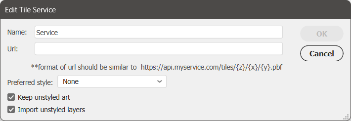
We’ve heard your requests and are thrilled to announce that MAPublisher now supports importing Vector Basemaps from PBF file-based custom tile sources like Mapbox, Esri, and OpenStreetMap! You can access this feature under the “Service” option within the Import Vector Basemaps dialog box. You can add your service by clicking the green plus/+ button next to the drop-down list. This will open up a new window called “Edit Tile Service” where you can give your service a name, provide its URL, set a preferred style if desired, and select whether or not you wish to import unstyled art.
You might also notice that the Configure Vector Basemaps option has moved from the Vector Basemaps button on the MAP Toolbar to its own dedicated button, “MAP Basemap Styling,” located under Thematic Tools.
Visit our Vector Basemaps support page for more detailed information on importing vector basemaps from custom tile sources, including URL formatting!
Join Table now supports tables from existing MAP Layers
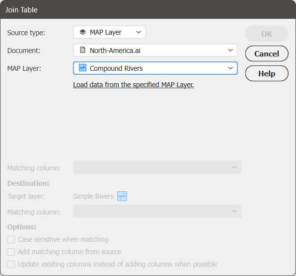
The Join Table tool—available from the MAP Attributes panel—has also been enhanced with new functionality in MAPublisher 11.5. The “Source type” option now lets you select either an external file or the new “MAP Layer” option, enabling you to join tables directly from an existing MAP Layer. This layer can be sourced from within your active document or any other currently open document in Illustrator.
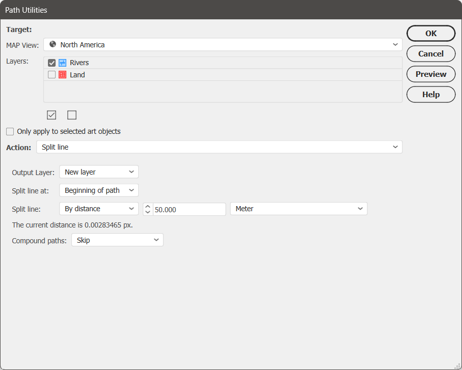
Split Line action added to Path Utilities
Split Line is a new option added to the Action menu of the Path Utilities tool. This action splits a selection of lines into two separate segments at a specified length. This length can be measured from either end of the line and can be set as either relative (i.e. as a percentage of the total line length) or absolute (i.e. at a specified distance in selected units).
The Split Line action is an ideal solution for tapering only the endpoints of lines, such as at river mouths. This circumvents the limitation of Illustrator’s native Stroke properties, which automatically taper paths evenly from start to end. With this utility, you also have the option to store the output in a New Layer, allowing for easy selection and batch styling of all end segments.
Other performance improvements
Lastly, you can expect to see improved performance in the following areas:
Improved order of operations on import
In MAPublisher 11.5, we have fixed an issue where data was being simplified before any spatial filtering was applied. Now, the spatial filter is applied first, and art is only simplified if the remaining data exceeds Illustrator’s limit of 32,000 points per path.
Attribute table and projection performance improvements
You should also look for smoother and quicker software performance when working with files containing a large number of features and attributes. These enhancements can be seen in multiple areas, including coordinate system reprojection, applying stylesheets, deleting art, moving art between layers, and splitting layers!
MAPublisher 11.5 is Available Now!
If you would like to learn more about the new MAPublisher v11.5 features or have any questions, please check out our Support Centre.
MAPublisher v11.5 is immediately available today, free of charge to all current MAPublisher users with active maintenance subscriptions and as an upgrade for non-maintenance users. Download here.
With over 20 years of GIS experience, Marikka Williams is well-versed in spatial data and the mapping technologies used to visualize it. Last summer, she applied these skills while exploring Canoe Lake in Algonquin Provincial Park on a stand up paddle board (SUP), using the Avenza Maps app to track her offline adventure. Later, she imported her data into MAPublisher to create a custom memory map of her excursion. She shared her process at this year’s Avenza User Conference.
In her presentation, Marikka walked us through each step of her map-making process. She began by collecting points of interest during her journey, adding placemarks along her route using the Avenza Maps app. Afterward, she exported the data as a KML file, then imported it into MAPublisher for further enhancement. Marikka showcased various MAPublisher tools, such as the MAP View Editor, Stylesheet Themes, and the MAPublisher LabelPro add-on, which she used to bring her map to life. She further enriched her work with Geographic Imager, using recent Landsat imagery to add depth and accuracy to her map, verifying her vector data against real-world details. At the end of her presentation, Marikka shared her final cartographic product with us!
The Avenza User Conference is an opportunity to discover exciting new developments with Avenza’s GIS and cartographic solutions and to connect with peers and Avenza team members. Avenza users and staffers from around the globe meet virtually each May to learn what’s new with Avenza Maps, MAPublisher, Geographic Imager, and the Avenza Map Store, and see how they are being used to map our world.
The Avenza User Conference is an free annual event that grows each year with incredible speakers and participants. Get inspired by mapping and industry professionals by joining us for #AvenzaUC2025. Find more information here about next year’s conference taking place on May 8th, 2025.
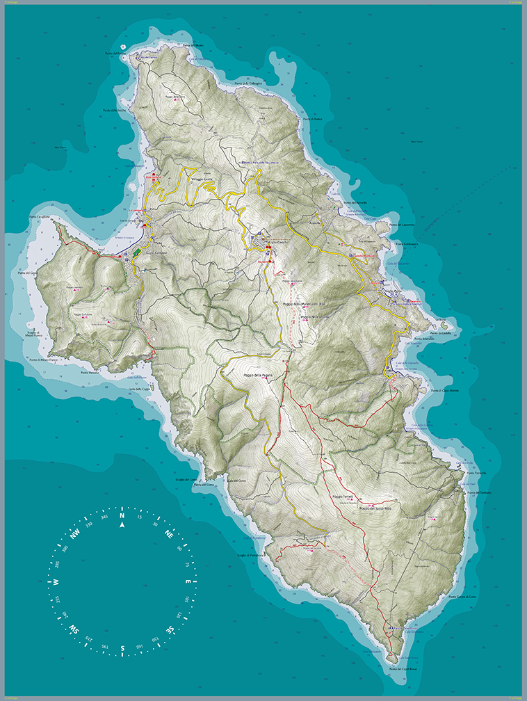
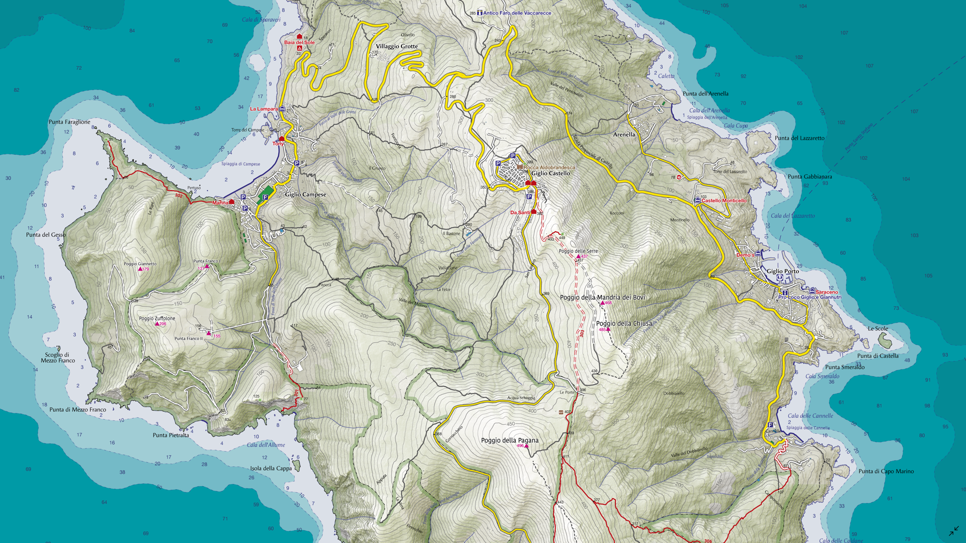
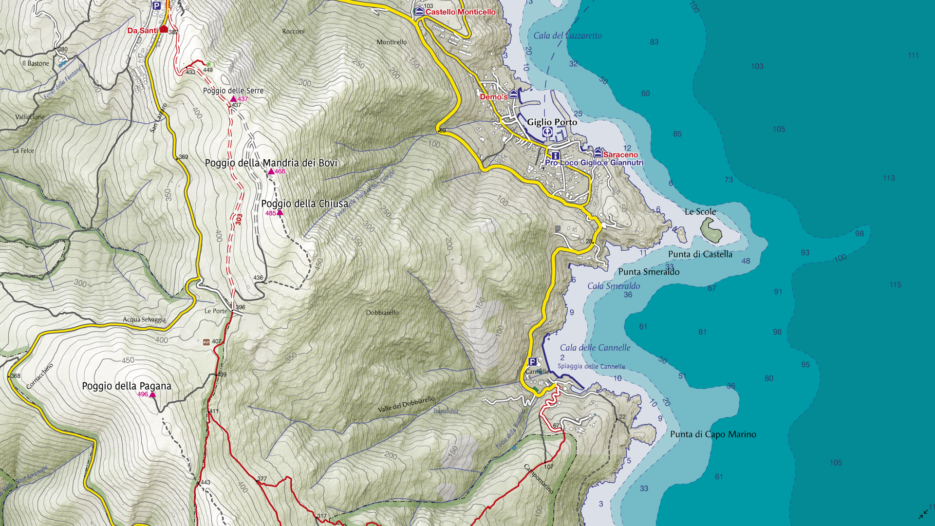
For the September Map Spotlight, we are showcasing an honourable mention of the 2021 Avenza Map Contest by Enrico Casolari. This is one of seven maps created for Arcipelago Toscano National Park in Italy, with this map in particular focusing on Giglio Island. It illustrates forest roads and trekking paths that span the island, as well as topographic information to visualize its impressive terrain. Enrico used natural tones to create an eye-catching cartographic piece that serves as both a functional reference aid and a visually engaging artwork.
Select the images below to see a detailed look at Enrico’s map
Making the Map
Enrico employed both Geographic Imager and MAPublisher to create this map. He used Geographic Imager in Adobe Photoshop to create the shaded relief images for the land portion of the map. The Terrain Shader tool is a simple but effect method to create a shaded relief using a Digital Elevation Model (DEM) file. The Mosaic and GeoCrop tools were used to ensure the DEM only included the necessary area required for the map. The shaded relief image could then be imported into MAPublisher and used for the final map design.
Next, Enrico imported his vector data on top of the shaded relief image into MAPublisher. He used MAP Stylesheet Themes to visualize the vector data as desired, including roads, trails, and sea depth. The Label Features tool was used to automatically place labels at important locations on the map, with the option to modify them manually once placed. This tool serves as a great substitute for the LabelPro add-on if intensive labeling is not required.
Enrico then used the Create Knockouts tool to ensure that more important labels and features were not obscured or intersecting with contour lines. Finally, he used the North Arrow tool to easily add the finishing touches to his map, importing a custom symbol to use for his north arrow.
Learn more and enter the 2024 Avenza Map Contest here, and check out our other Map Spotlight blogs here!
Colour plays a fundamental role in cartography, helping convey both quantitative and qualitative information, differentiating features, and guiding users through visual hierarchies. However, for individuals with colour blindness, interpreting maps can be challenging if they are not designed with accessibility in mind. By understanding how colour blindness interacts with cartography, we are able to leverage the tools available in MAPublisher and Adobe Illustrator to create more inclusive, colour blind-friendly maps.
Understanding Colour Blindness
Colour blindness, or colour vision deficiency, affects an estimated 8% of men and 0.5% of women globally. Most colour blind people are affected by congenital red-green colour blindness, which means they have decreased colour discrimination ability on the red-green axis. There are two main types of red-green colour blindness:
Protanopia: a lack of red cones, affecting the ability to perceive red light
Deuteranopia: a lack of green cones, affecting the ability to perceive green light
These types of colour blindness vary in severity, but both affect the user’s ability to distinguish between red and green hues. Fortunately, Adobe Illustrator offers soft colour proofing features that simulate these conditions, helping us design maps that work for everyone.
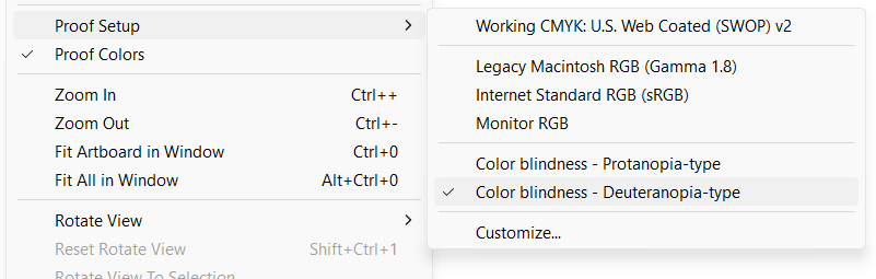
Using Colour Proofing in Adobe Illustrator
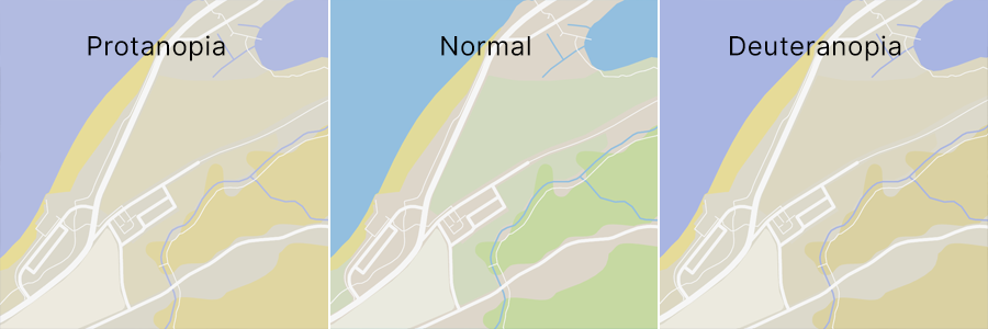
Adobe Illustrator’s “Proof setup” feature, also known as colour proofing, is a valuable tool for designing colour blind-friendly maps. This feature allows you to simulate how your maps will appear in different viewing conditions, including for people who are affected by red-green colour blindness. Proof setup has options for previewing your artwork in protanopia and deuteranopia modes.
Enabling colour proofing in Illustrator is very simple:
Open your map file in Adobe Illustrator.
Navigate to View > Proof Setup > Color Blindness.
Here you can select between protanopia-type and deuteranopia-type proofing.
Toggle the “Proof Colors” option below “Proof Setup” to switch the simulation on and off as required.
Simulating what colour vision-deficient users see enables you to adjust your maps to ensure they are understandable and effective for all users. These adjustments may take the form of simply changing the colour of particular objects or using other indicators such as labels or varying patterns, textures, and line types to differentiate between features.
Designing Accessible Maps
When designing maps for accessibility, consider these three colour attributes:
Hue, often used interchangeably with colour, refers to the actual colour wavelengths one perceives (problematic for colour blind individuals).
Value refers to how dark or light a colour is, with a lower value being closer to black and a higher value being closer to white.
Saturation refers to the intensity or purity of a colour, with a higher saturation being very intense and a lower saturation being duller, or closer to grey.
Since hue can be challenging for those with colour blindness, we can leverage value and saturation to help provide better differentiation. Here are a few colour-related tips to consider when creating a map for users with red-green colour blindness:
Use orange-red instead of pure red, as it’s easier to identify.
Opt for bluish-green over yellowish-green.
Keep in mind that grey may be confused with pale or emerald gree, and lighter shades of pink.
Avoid using the following combinations to differentiate features wherever possible:
red and green
yellow and bright green
light blue and pink
dark blue and violet
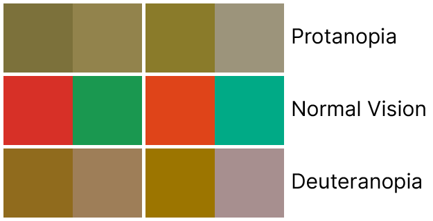
The image above makes it easy to envision why it is not advised to use red and green as differentiating colours on a map. However, if we take the darkest red and green of each side and use some of our tips above to adjust them, we can already see an improvement:
Even with the slight adjustments of adding orange to the red and blue to the green, a greater difference can be observed. These can be enhanced even more by changing the value or saturation of the colours as well.
ColorBrewer, created by Cynthia Brewer, is a great resource for selecting colour swatches pre-designed for colour blind users. Here, you can toggle the option to view only colour blind-safe palettes. All of the ColorBrewer swatches are available in MAPublisher through the Swatches panel by selecting Open Swatch Library > MAP Swatches > ColorBrewer.
The image above shows the 9-colour Red Blue ColorBrewer swatch, which is just one of its several options for symbolizing your data in a colour blind-friendly way.
Differentiation Beyond Colour
When colour isn’t enough, here are some other methods you can try to make a map more accessible:
Patterns and textures: Utilize different patterns or hatching to distinguish features, even when they are the same colour.
Labels and annotations: Clear, legible labels or annotations can ensure that users do not solely rely on colour to understand map features.
Alternative formats: Offer grayscale or high-contrast versions of your map where possible.
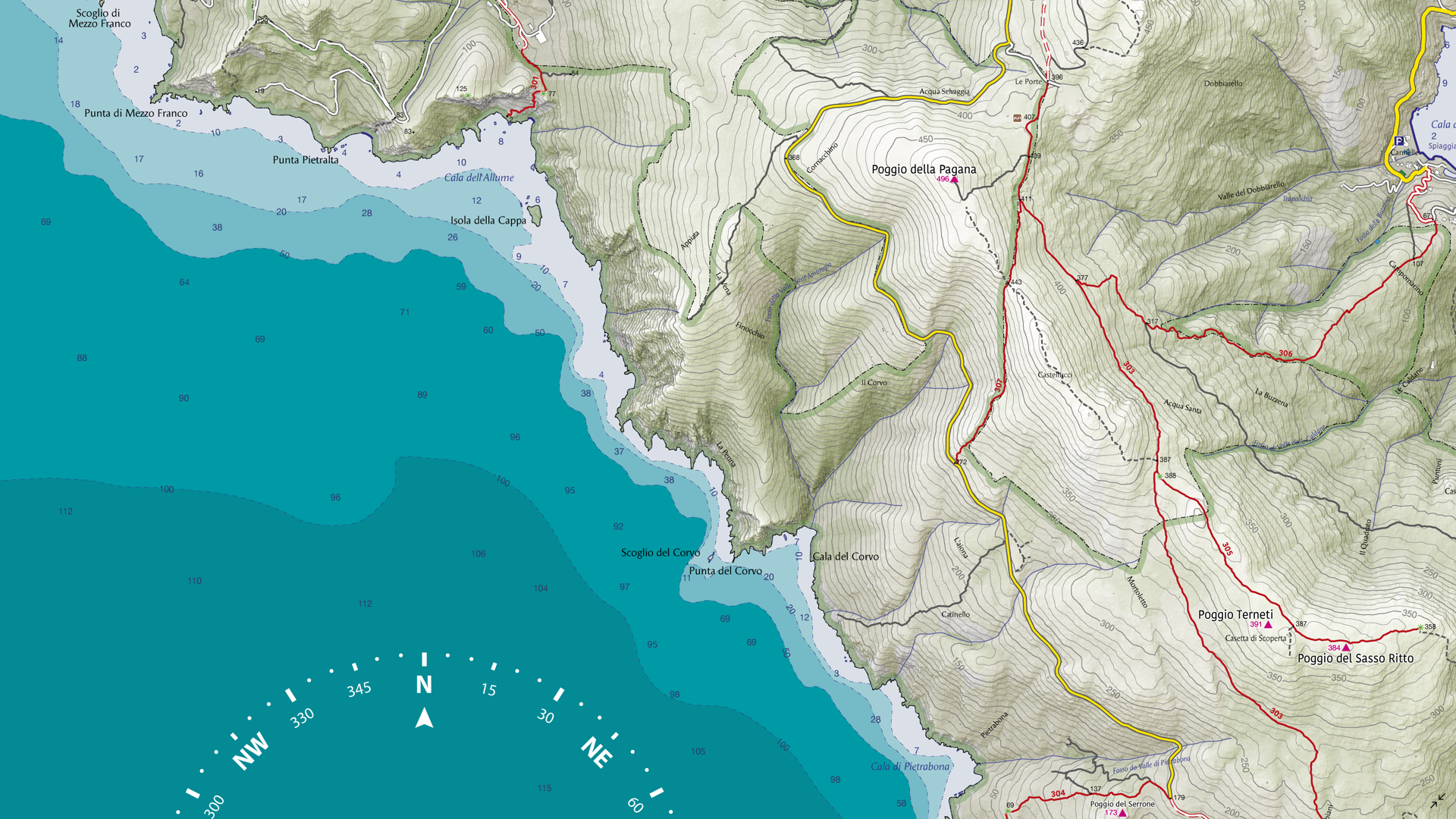
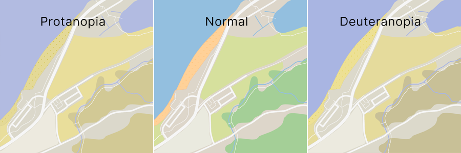
Practical Example
On the above map, the greens, browns, and yellows representing different land use types might be difficult for someone with red-green colour blindness to discern. We can adjust some of the greens to be more bluish to make them more differentiable from each other and the brown background of the map. I can also use different patterns to tell them apart if necessary. For example, adding a grainy pattern and making the pale yellow colour used here to depict sand a little more orangey helped it stand out more on the map when proofing for colour blindness.
With just a few small changes, the map becomes much easier to read and more accessible to people with colour blindness.
Colour blindness presents unique challenges in cartography. Since our maps often convey essential (and sometimes even vital) information, we must ensure they are clear and accessible to anyone who relies on them. By practicing mindful design and using tools like Proof Setup, these challenges can easily be mitigated to create a map that everyone can understand.
Check out Adobe’s help article on colour proofing for accessibility in Illustrator for more help.