Happy Valentine’s Day! What better way to celebrate than with new maps (and creating infographics) about love? This year we’ve hunted for romantic data for Canada and the United States and visualized it all for you using MAPublisher 10.3 and Adobe Illustrator.
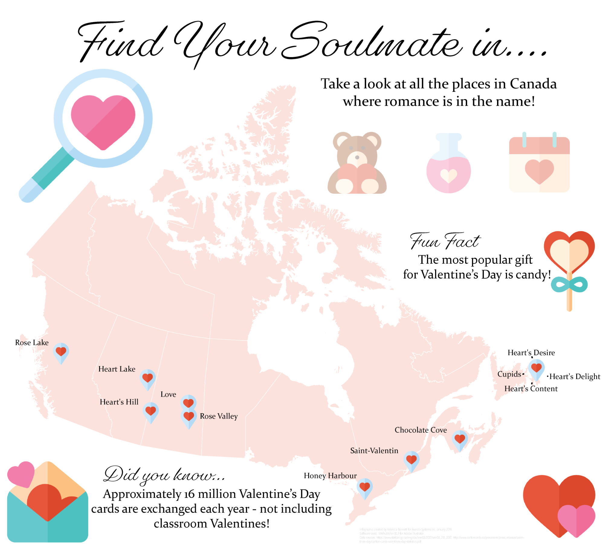
The first map shows all the most romantic locations (at least as their names suggest) in Canada. This information was provided by Stats Canada. Using the MAPublisher Point Plotter, it was easy to plot all of the locations!
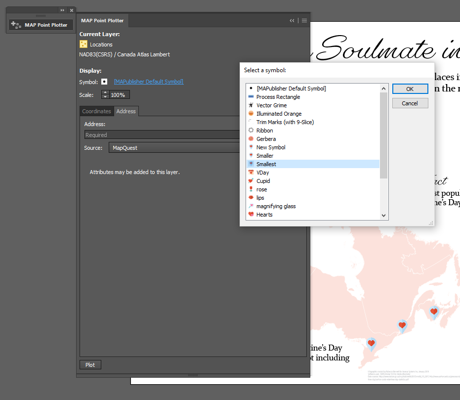
The best part about using the Point Plotter is you can choose any symbol available in your symbol library to mark the points. I chose the symbol that I wanted (a Valentine’s map marker–how adorable!) and then plotted each location simply by using the town’s name and province.
After adding some text and symbols in keeping with the theme, the map was ready to go! You can check out the PDF below, or, you can download the georeferenced version from the Avenza Map Store, for use in the Avenza Maps app.
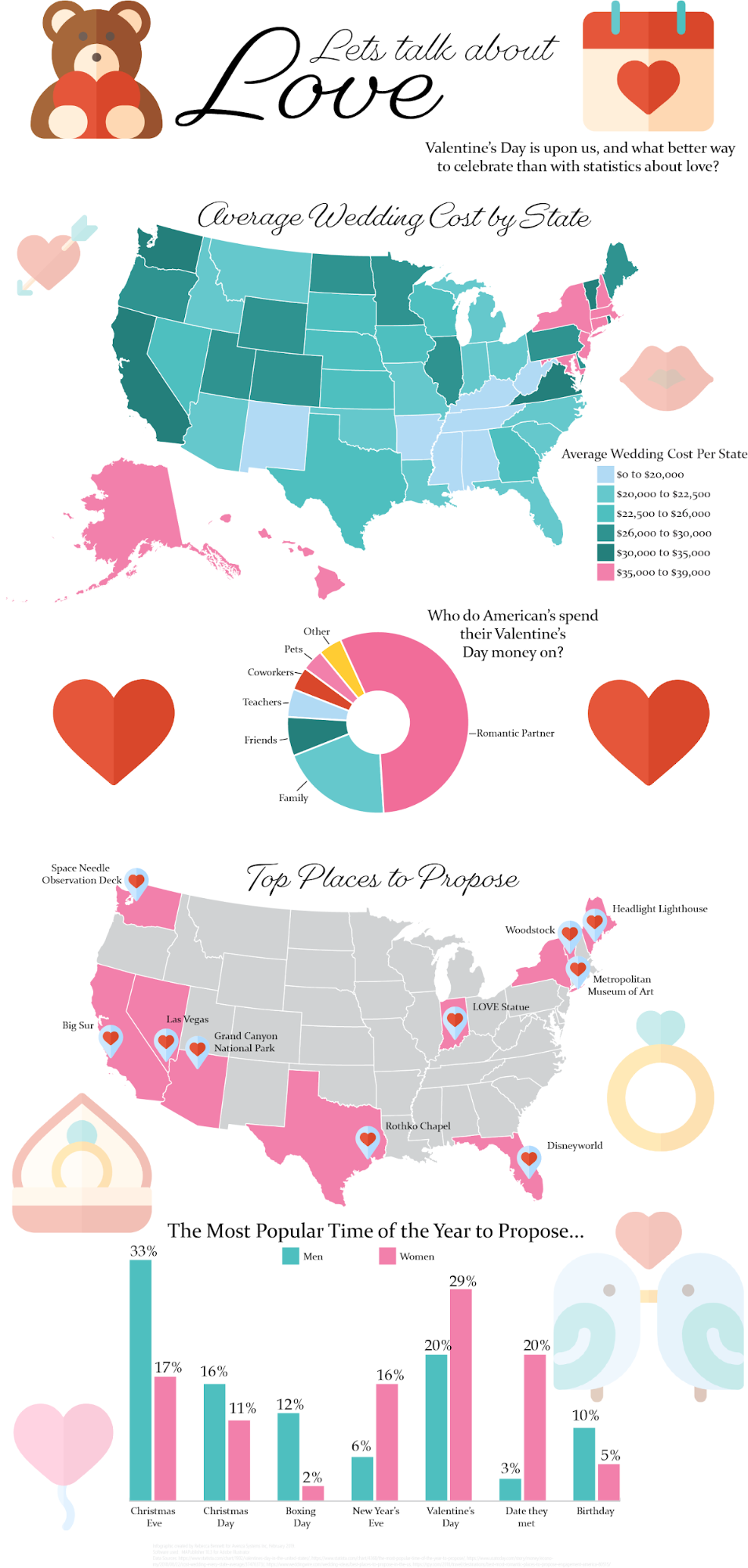
Moving on to my infographic – which is a popular and engaging way to illustrate statistics and small amounts of data that might otherwise be overlooked. I found data from the United States covering a variety of Valentine’s Day topics. The plan is for my infographic to include two maps and two additional charts. The first map illustrates the average wedding cost by state, and the second map shows popular proposal locations.
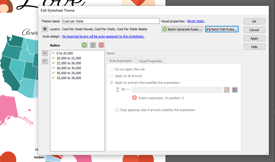
For the average wedding cost per state map, I used a MAP Theme to colour all the states appropriately (and quickly!). The benefit of using a MAP Theme is that you can apply a theme to multiple layers at once. Since Hawaii and Alaska were projected separately from the mainland of the United States, they exist in different layers on the artboard. Using a MAP Theme made it easy to include them in the colour scheme of the map.
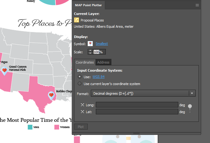
On the second map, I want to map the most popular proposal locations in the country. I used the MAP Point Plotter tool again, but, this time, I used the latitude and longitude to plot the points because some of the locations could not be plotted by name alone. It’s very beneficial to be able to swap between the two options!
My maps are complete, and after adding two graphs (made using the graphing tools in Illustrator) containing even more fun Valentine’s day data, and some love-ly symbols, the entire infographic was finished. You can check out the completed infographic below!
About the Author
Rebecca Bennett is a member of the Marketing Team at Avenza Systems and loves making creative and visually appealing maps.


