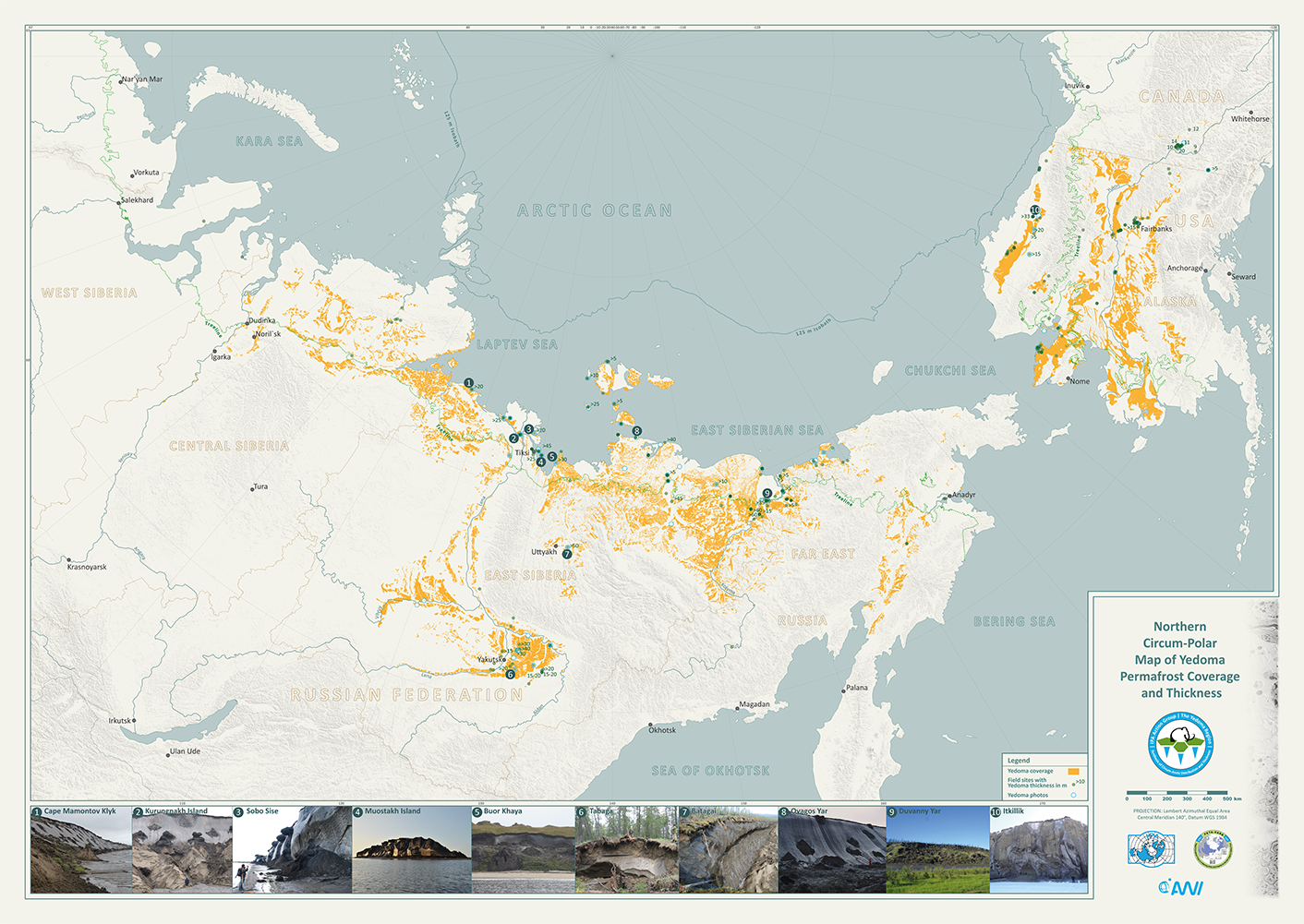
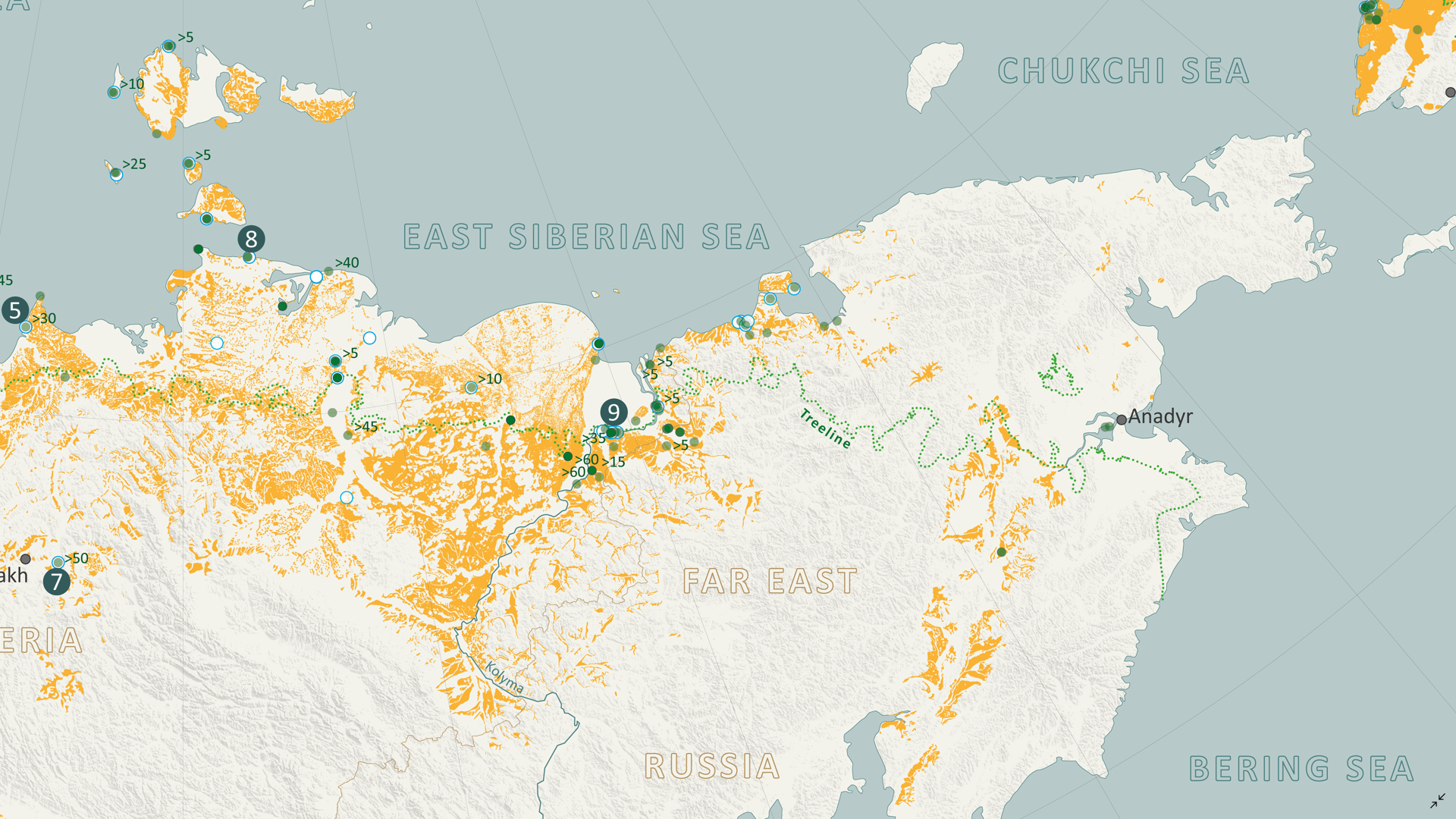
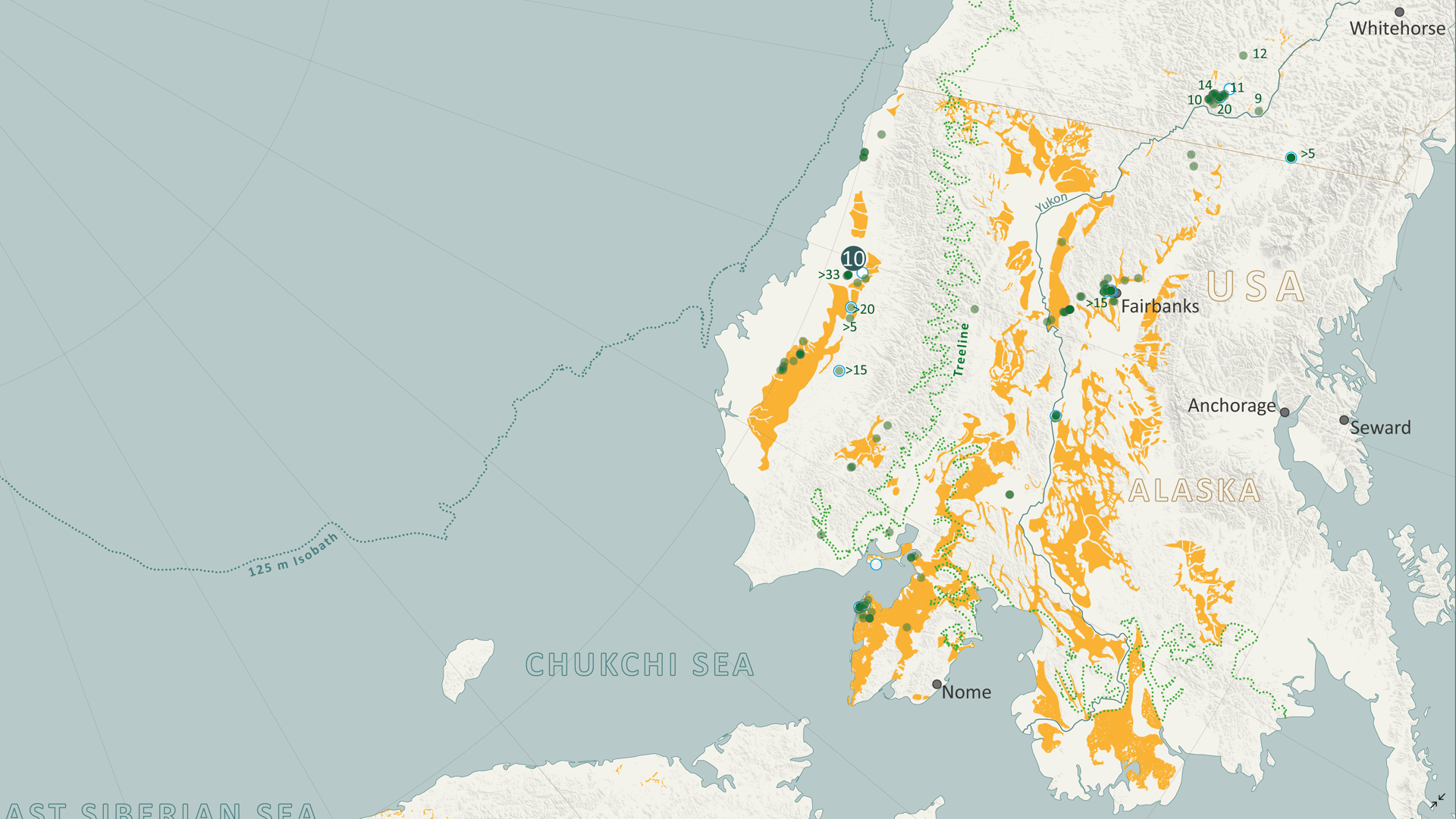
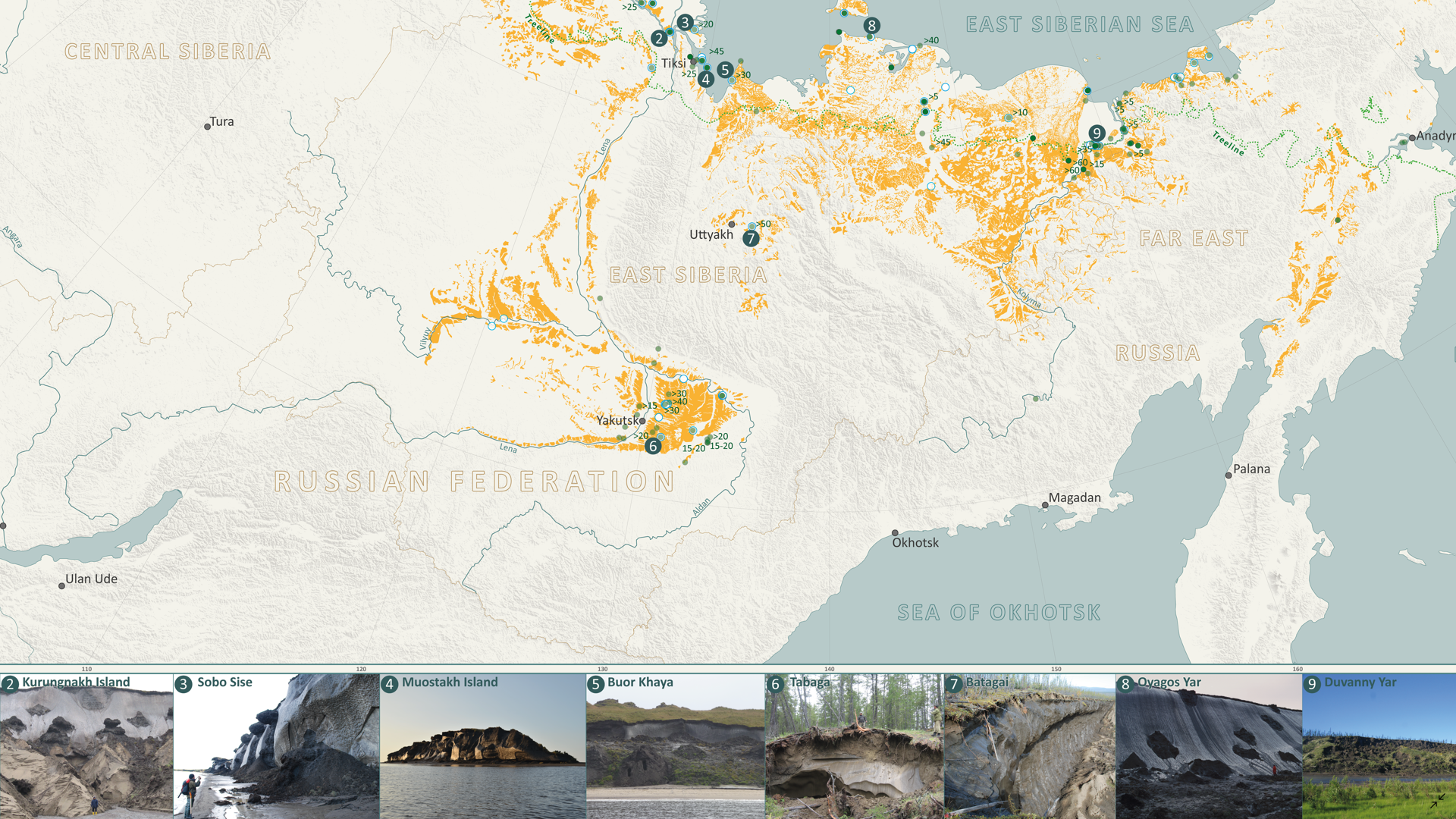
In this Map Spotlight, we are showcasing an honourable mention of the 2021 Avenza Map Contest: Yedoma Permafrost Coverage by Sebastian Laboor, Jens Strauss, and Guido Grosse of the Alfred Wegener Institute Helmholtz Centre for Polar and Marine Research (AWI). This map shows the extents of the world’s most ice-rich and climate-sensitive type of permafrost: Yedoma permafrost. This permafrost has been permanently frozen since the last Ice Age, when mammoths still roamed the Arctic tundra, and covers parts of Siberia, Alaska, and Yukon. The team at AWI worked with an international research team from various countries to determine the distribution of Yedoma permafrost, which resulted in this map—the first-ever Arctic-wide Yedoma map.
Creating this map was a tremendous journey, bringing together more than 25 researchers and their decades of permafrost expertise. It is an important step towards understanding how Yedoma permafrost and the massive organic content it has preserved since the last ice age may contribute to future greenhouse gas concentrations in the atmosphere once the area begins to thaw. This map is importantly filling a critical research gap, being used as an important input dataset for new climate models that predict the trajectory of permafrost carbon and its future environmental impacts.
This map and the geospatial dataset are open access and freely available to the public.
Select the images below to see a detailed look at their map
Making the Map
To create the Yedoma permafrost dataset used for this map, Sebastian utilized Adobe Illustrator and MAPublisher as a manual vectorization and attribution tool. Scanned and georeferenced Russian Quaternary geology maps were vectorized using native Illustrator tools, such as the pen and pathfinder tools, and then the MAP Attributes panel was used to assign attributes to these features, and also edit them as necessary later.
The Import tool was essential in allowing them to bring in their supplementary geospatial data to build out the rest of the map. The MAP Views panel and the MAP View Editor were important tools for defining projections, scales, and positions of their map layers. The point data for field sites was added to the map using the MAP Point Plotter tool.
Sebastian used the MAP Vector Crop tool to crop many different layers at once to the map’s extent, allowing for a clean and organized workspace. He also used the MAP Selections and MAP Themes panels to create classes for the data.
The initial positioning of labels was conducted using the MAPublisher LabelPro add-on, with manual adjustments made as needed. Finally, Sebastian added a grid and graticule as well as a North Arrow to complete the finishing touches to the map.
Check out our other Map Spotlight blogs here!


