In this edition of Cartographer Chronicles, we welcome Gene Thorp. Gene is a renowned, award-winning cartographer who has become a staple of the map-making community. Gene displays an expertise in map design honed through nearly 30 years of experience. Gene skillfully applies his craft by using maps to tell fascinating stories and communicate important information about history, geopolitics, and the world around us. In this issue of Cartographer Chronicles, Gene is telling his own story, sharing with us how he came into map-making as a career and his interesting journey through the world of cartography.
***
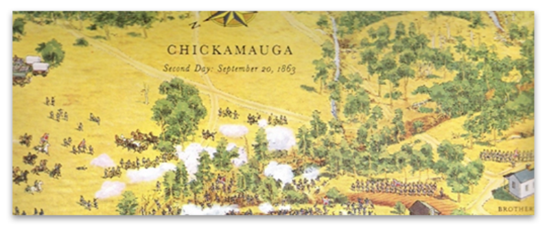
The cartography bug bit me when I was very young, before I could even read. I know this because I was captivated by artist David Greenspan’s illustrated maps, dozens of which I found in my grandfather’s American Heritage Pictorial History of the Civil War. Each map contained hundreds of little hand-drawn soldiers fighting across all types of terrain. I spent hours studying every little detail and harassing my poor older brothers to read what the cryptic numbered captions said. When I got older, I realized many of those battlefields were only a day’s drive from where I lived, so I persuaded my parents to visit one on a family trip. Greenspan’s illustrations were so effective that I was able to easily visualize what had happened there. It was almost like I had already visited the battlefield before. I was hooked on maps, but at that young age, I never dreamed I would have a career-making them.
Fast forward fifteen years, and I was early into college pursuing a history degree at the University of Maryland Baltimore County (UMBC). I had to pay for my school so I worked part-time at a Hechinger hardware store. One of my coworkers there knew I had an interest in maps and told me UMBC had one of the best cartography programs in the country and suggested that I check it out. I took Cartography 101 the next semester and realized this was the career path for me. Under the mentorship of Professors Joe School and Tom Rabenhorst I was part of the last class that was taught photometric techniques using scribe coat and linotype, and the first class to design and produce maps solely using computers. In a school internship program, I was lucky to be chosen as the project editor on what was likely the first-ever digitally produced U.S. atlas for a company called Military Living.
Three years later with a degree in geography, a degree in history, and a much-valued certificate in cartography, I teamed up with a friend from school and we ventured out into the real world to try our hands at commercial mapping. Sadly, our timing was off. Our business was launched immediately after the breakup of the Soviet Union. The once robust defense industry suddenly downsized and the country entered a recession. Our cartography business was essentially shuttered after only one year. Good cartography positions were hard to come by, so I expanded my horizons and jumped into graphic design which at that time had many more job openings.
Starting from the bottom, over the next eight years I worked at prominent graphic design firms in the Washington, D.C. area designing and producing magazines, logos, brochures, websites, and illustrations. It turned out to be a great experience where I learned page layout, cover design, image manipulation, illustration, and other publication techniques from some extremely capable artists and designers. They taught me the importance of typography and that good design did more than make a layout look attractive, more importantly, it effectively communicated information. These were lessons I took with me for the rest of my career.
During that time, I never abandoned cartography. I picked up small mapping freelance projects wherever I could find them hoping maybe one day I could get back into the field full-time. My big break came in 2000 when I was brought onto The Washington Post staff as a cartographer by the talented Art Director Michael Keegan and the extremely gifted Chief Cartographer Richard Furno, a former National Geographic cartographer who was a principal designer of the iconic 1969 moon map. He also developed a custom CAD-based mapping application called Azimuth, which, in conjunction with Macromedia Freehand, Adobe Photoshop, and ArcInfo, were the primary programs we initially used to create maps for the newspaper. Geographic points, lines, polygons, and raster data were brought into Azimuth or ArcInfo to be projected then exported. Raster data was further manipulated in Photoshop. Everything was then imported into Freehand where the map was designed, styled, and labeled. Each type of feature like roads, rivers, and urban areas had been color-coded in Azimuth or ArcInfo so they could be easily selected, stylized, and labeled in Freehand.
Over the next 15 years, I created thousands of maps, from simple locators to full double-truck spreads on every topic imaginable. One of the map projects I was most proud of was the Presidential election result maps published the day after the election which displayed each candidate’s margin of victory by county.
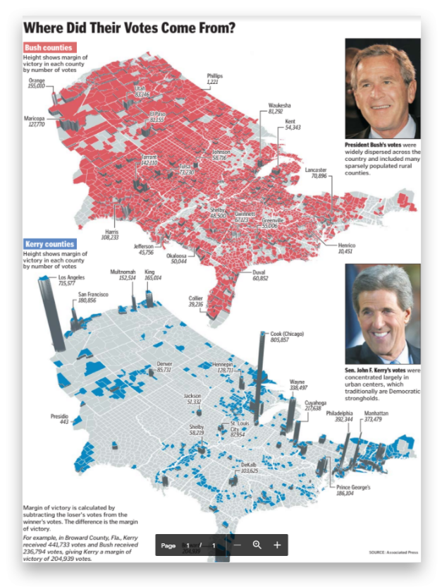
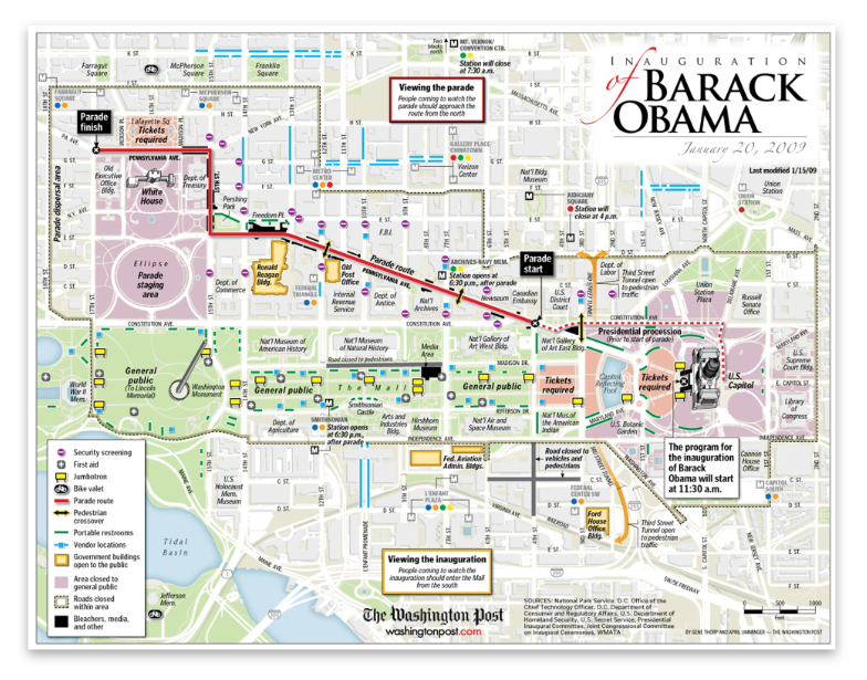
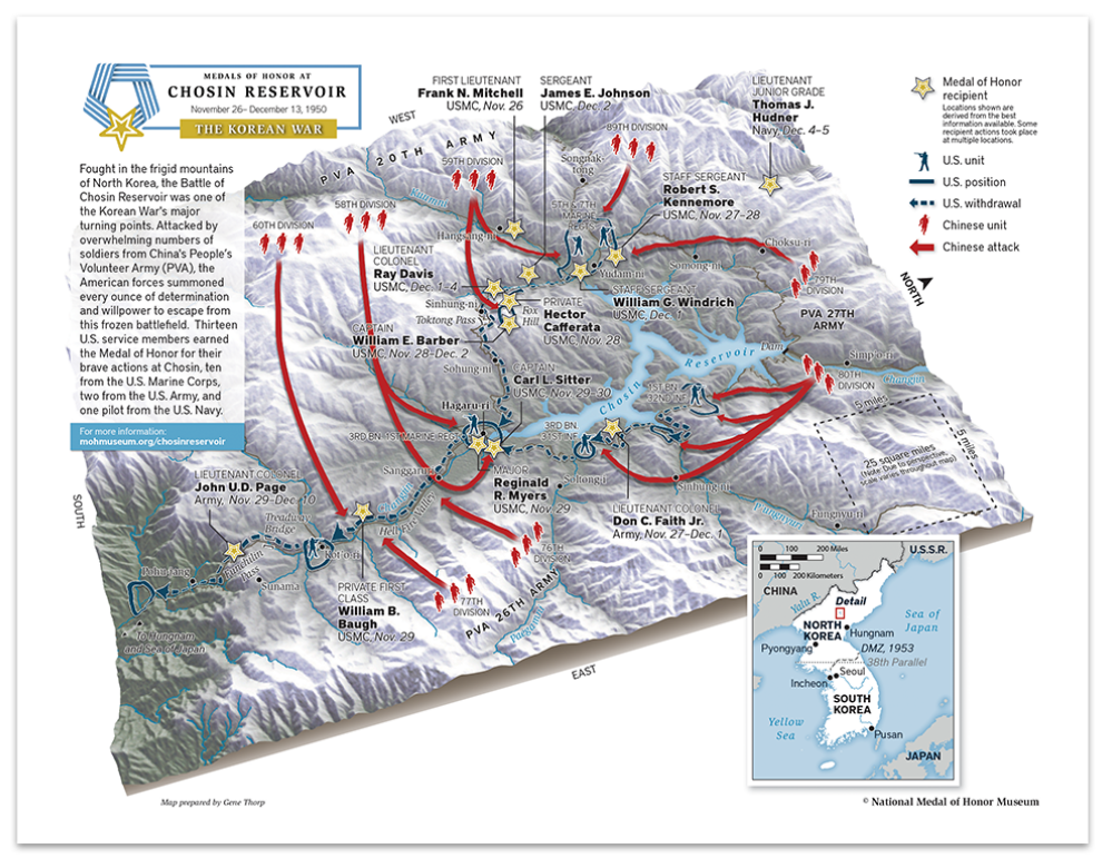
The maps were designed in perspective to clearly emphasize how much weight small and densely populated counties contributed to the overall election result. Another favorite was the Obama Inauguration map showing attendees the parade route, jumbotrons, vendors, first aid stations, and the all-important locations of portable restrooms! It was fun to walk through the crowd and see so many people using it.
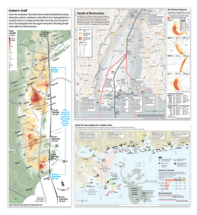
Environmental disasters such as hurricanes, earthquakes, and oil spills were all too common topics to be mapped. When one occurred, all other projects were immediately sidelined to provide weeks-long detailed cartographic coverage. This included hurricanes Katrina, Rita, and Irene, earthquakes like those in Indonesia, Japan, or Haiti, and man-made disasters like the Deepwater Horizon oil spill whose massive oil slick spread for weeks across the Gulf of Mexico.
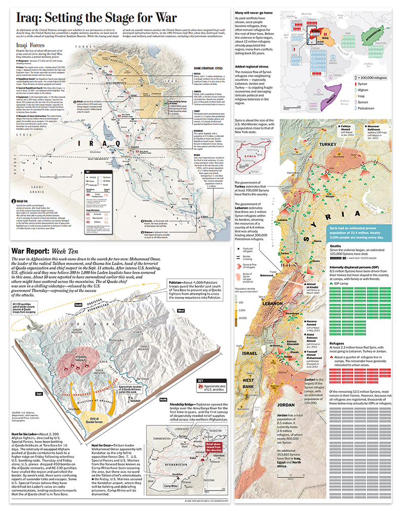
With September 11th happening less than one year after I was hired, covering terrorism and military actions across the globe was another major part of my duties at the newspaper. I made what seems like countless static and interactive maps of the hunt for Osama Bin Laden, the invasions of Afghanistan and Iraq, the rise of ISIS, the civil war in Syria, and the Russia-Ukraine conflict.
But mapping at the Post wasn’t always serious. I was able to fit in extra time to support travel stories, illustrate a few Kid’s Post graphics, and contribute research and cartography to a 10 part illustrated series on the history of Washington, D.C. (which won gold at the international Malofiej awards).
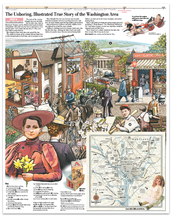
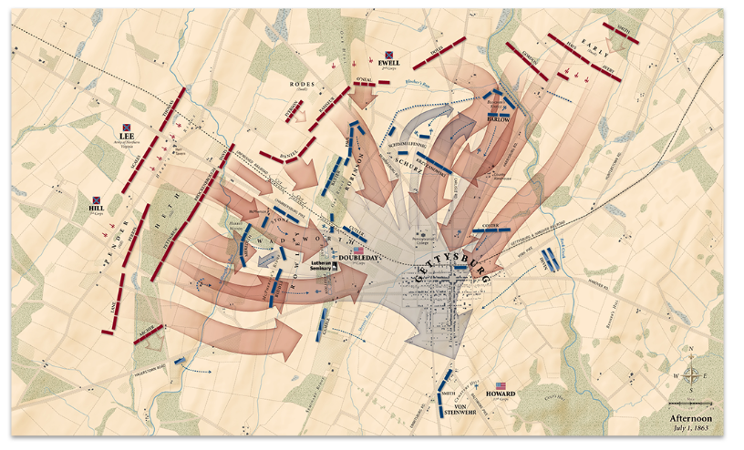
Among my favorite responsibilities was a five-year project of timelines, articles, and interactive maps to commemorate the sesquicentennial of the American Civil War.
All the while, I created custom maps on the side for numerous bestselling books like those in Rick Atkinson’s World War Two Liberation Trilogy series (which won a Pulitzer Prize) and oversize maps for exhibitions at museums like the Smithsonian Institution, the Museum of the Bible, and The Seminary Museum in Gettysburg and many others.
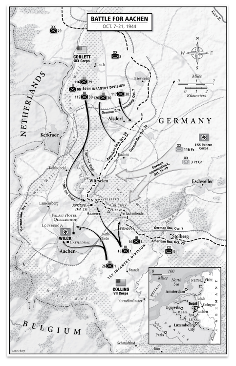
After working 15 years in the news industry, I accepted a job in the federal government as a senior cartographer at the U.S. Department of State, where for the last six years have I operated under the direction of Lee Schwartz in the Office of the Geographer and Global Issues (GGI), within the Bureau of Intelligence and Research (INR).
In this capacity, I work with an extremely knowledgeable group of geographers, scientists, and other subject-matter experts to support the full spectrum of the Department’s foreign policy missions. Working closely with my fellow cartographers in the Geographic Information Unit (GIU) and Humanitarian Information Unit (HIU), we produce hundreds of maps each year that help visualize and explain a wide range of topics and issues; such as the Department’s efforts to defeat international terrorist groups; illustrate the maritime claims of countries in places like the South China Sea, the eastern Mediterranean, and the Arctic; map the government’s policy on disputed international boundaries along the China-India border, and highlight the buildup of Russian forces near Ukraine.
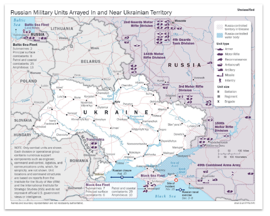
I also work on the international boundary and sovereignty team that regularly advises policymakers on the geography and history of territorial disputes and produces the publicly available Large-Scale International Boundaries (LSIB) dataset, a set of digital lines used by cartographers and other geospatial professionals as the source for the world’s international boundaries reflecting the foreign policy of the United States.
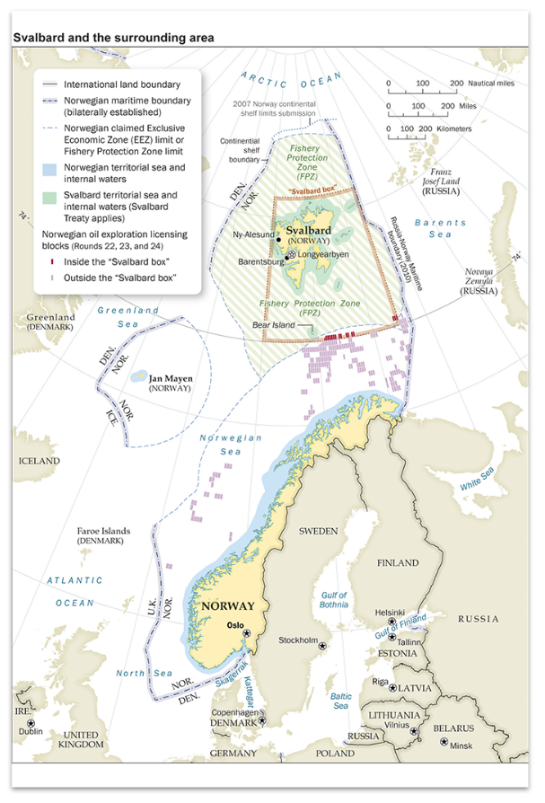
I have been very lucky to rub elbows with some of the most amazing cartographers, designers, illustrators, writers, analysts, policymakers, editors, developers, photographers, and programmers of our time. The work has been fast-paced and challenging, but also extremely rewarding. It’s incredible to see how much technology has altered the landscape over the last 30 years. In the old days, I traced government base maps with a scribe tool and used peel coat, or digitized data on the “high-speed” 8MB RAM and 100MB hard drive computers. When I started at The Washington Post the mapping process was all digital, but the data we used was mostly what we created ourselves. When shapefiles or spreadsheets were available, we used Azimuth or other products to select and organize what we needed, before projecting and exporting the data. But when the files were imported into Adobe Illustrator for design and labeling (Illustrator replaced Freehand in 2005), the data lost all its attributes. Mapping expanded rapidly into 3D and I utilized programs such as Bryce 3D and Google Earth to create a vast assortment of perspective maps on tight deadlines.
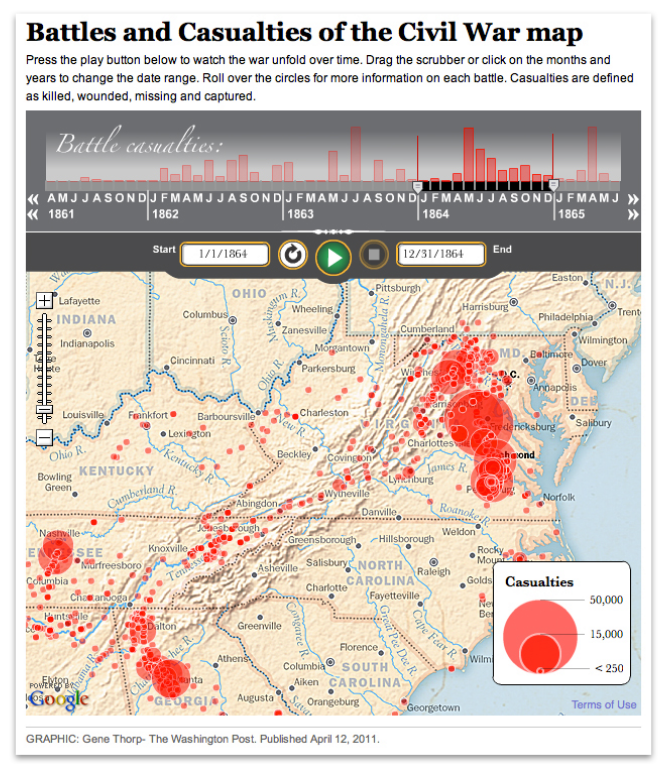
Cartography also increasingly became accessible on the internet. At first, I made static locator maps and created custom map tiles for interactive traffic applications, but soon advanced to writing the actual applications, one of which was a multipurpose timeline that interfaced with Google maps that could play data ranges overtime on top of zoomable custom tilesets.
Midway through my career at the newspaper, Richard Furno retired, and by 2011 all support for Azimuth ended. I needed an affordable replacement mapping application that could custom project data and still interface with Illustrator. This is when I discovered MAPublisher. I had known about it for many years and had heard good things about it from colleagues, but up to that time Azimuth had always worked for my purposes. When I finally dug into MAPublisher’s capabilities I was instantly impressed. Not only could MAPublisher import and project a large array of data types, it maintained the data georeferencing and attributes within Illustrator, all the while allowing me to still perform analysis on it. I could now add or remove attribute fields, make calculations, join spreadsheets, create proportional circles and custom style points, lines, and polygons, all based on the data attributes. Making last-minute map scale changes was also much easier because labels maintained their size and association with their associated features whenever the map was enlarged or reduced. Creating custom data became easier too. I could register a base map or satellite image on existing data, trace the information I needed, then move it to a MAPublisher layer where it instantly became georeferenced. I could add and fill out custom attribute fields, then export the entire layer of new information to virtually any geospatial format for use in all the mainstream GIS applications. Another useful feature was that I could import only a small section of a large dataset. Had I started using MAPublisher earlier I could very easily be able to pull data from my older projects into the new ones. MAPublisher continues to be my core mapping application.
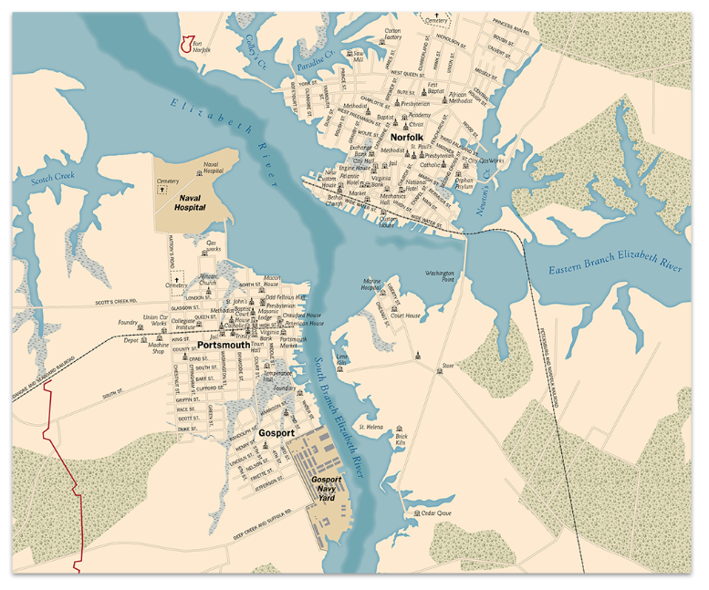
Returning to my roots in history, I’ve recently been using MAPublisher to create a detailed and accurate database of the mid-Atlantic region as it would have appeared during the American Civil War, 1861–1865. First I have stripped away modern features like roads, reservoirs, and manmade shorelines, and, using a variety of historical maps, restored historical features such as long since disappeared roads, rivers, shorelines, fords, railroads, bridges, and towns. An accurate base of geospatial data allows for the correct placement of the plethora of temporal data available from primary sources such as troop movements, refugee movements, weather events, and personal experiences that are tied to a specific historical location. All of this information is either used directly in MAPublisher to create maps, or exported and used in any application that can read geospatial information. I may never be able to mimic the historical map illustrations of David Greenspan that engrossed me as a child so long ago, but perhaps I’ll be able to recreate the world of that time in such a way that will captivate and educate generations of history buffs for years to come.
For those entering or considering the field of cartography and GIS, the future seems brighter and broader than ever before. My experience has been that most people find custom maps greatly enhance their products. The internet is increasingly awash with new data that individuals, companies, non-profits, and governments need to process and visualize to be understood. Even if cartography is not your primary role, adding attractive, accurate, and informative maps can be greatly beneficial to communicating the message of whatever organization you are working for. Good luck mapping!
