Welcome to the latest edition of Mapping Class! The Mapping Class tutorial series curates demonstrations and workflows created by professional cartographers and expert Avenza software users. In this month’s edition, we welcome Tom Patterson, a map-maker extraordinaire and a true household name in the cartography world. Today Tom is sharing with us a demonstration showing how he works with Sentinel-2 Imagery Data using Geographic Imager and Adobe Photoshop. Tom uses a new dataset that that represents a “pretty difficult” image to process and offers an excellent look at how to create beautiful natural colour images from satellite data.
Part One of this exciting walkthrough covers the techniques Tom uses for accessing and importing satellite imagery data, as well as his approach to colour correction using some of the powerful built-in image editing tools in Adobe Photoshop. Tom has produced video notes below to help you follow along! Look out for Part Two, coming in next months edition of Mapping Class!
***
Work with Sentinel-2 Imagery in Geographic Imager: Part One by Tom Patterson (Video notes adapted from original)
This tutorial explains how to process Sentinel-2 satellite data, released by the European Space Agency for free, into natural colour images. Beautification is the goal—nature often can use a little help when using satellite images for maps and graphical presentations.
To do this tutorial you will need Adobe Photoshop and Avenza Geographic Imager. Trial versions for geographic imager can be found here. For this tutorial, you should also have intermediate Photoshop skills, a good internet connection, and a computer with plenty of RAM.
Getting the data
The US Geological Survey distributes Sentinel-2 data on the EarthExplorer data portal. You can also download Sentinel-2 on the Copernicus Open Access Hub, although I find EarthExplorer easier to use.
1) Downloading data from EarthExplorer requires that you first sign in as a registered user.
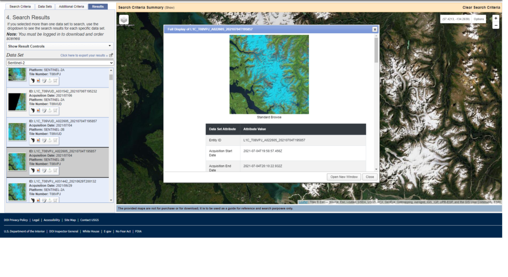
2) After you sign in, use the “Search Criteria” tab in the upper left to specify a point of interest. You can also draw a polygon on the map to specify a larger search area.
3) Click the “Data Sets” tab next. From the long list of data types, select “Sentinel-2.”
4) The EarthExplorer portal offers useful tools for narrowing your search. For example, you can filter by acquisition date and cloud cover. Sentinel-2 image extents are viewable as transparent map overlays.
5) Click the “Results” tab to peruse the available images. Then click the image thumbnails to see larger image previews in false color. Scrolling down from the image previews reveals additional metadata
To download a scene from the search results list, click the “Download Options” icon. You will then see these two download options:
● L1C Tile in JPEG2000 format (XX MB)
● Full Resolution Browse in GeoTIFF format (XX MB)
Download both.
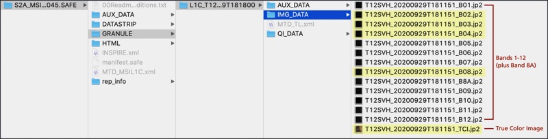
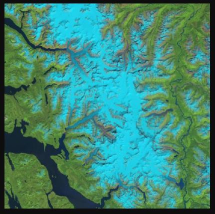
7) The Full Resolution Browse in GeoTIFF format is a false-color image (bands 11, 8A, and 4) at 20-meter resolution.
8) Decompress the L1C Tile in JPEG2000 format archive. It contains the raw Sentinel-2 bands and a true-color image. You will need to drill through multiple folders to get to these data
Importing the data
Because Photoshop does not natively import JPEG2000 files, you will need to use a Geographic Imager to import the Sentinel-2 data. The advantage of Geographic Imager over other plugins is that it preserves georeferencing and allows you to export manipulated Sentinel-2 images as GeoTIFFs.
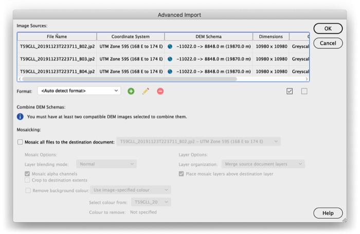
1) In the Photoshop drop menu, go to File/Import/GI: Advanced Import…
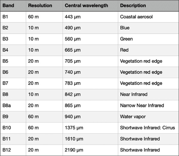
2) Select one or more Sentinel-2 bands to import (in this case, we want Bands 4, 3, and 2 which correspond to our Red, Green, and Blue bands) and click OK. Importing could take a minute or two to complete. Each Sentinel-2 band will open as a separate Photoshop file. That’s it.
Colour Correction
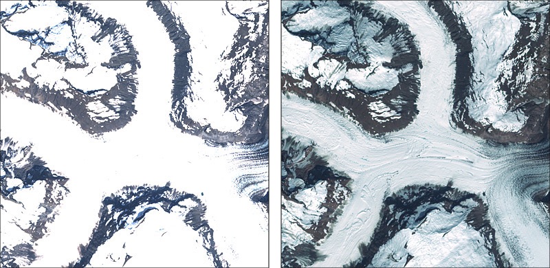
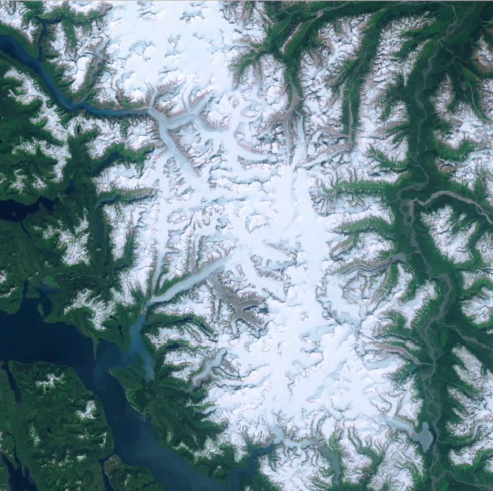
The premade True Color Images are convenient to obtain, and you can easily adjust them to create acceptable results. However, they have an Achilles heel: snow- and ice-covered landscapes. Automated processing removes the very lightest tones, rendering them as empty white (below, left). In order to depict subtle details in snowy terrain, one must build the satellite image from scratch using the raw data in bands 4, 3, and 2 (below, right).
1) Use Geographic Imager to open bands 4, 3, and 2 (File/Import/GI: Advanced Import…). The import will take a couple of minutes to complete, and the three bands will open as separate Photoshop files.
2) With one of the Photoshop files active, go to the flyout menu in the upper right corner of the Channels window. Select Merge Channels…
3) In the Merge Channels window, change the mode to RGB Color and specify 3 channels.
4) Another window will pop up. Make sure that band 4 is the red channel, band 3 is the green channel, and band 2 is the blue channel. Then click okay.
5) Photoshop will then ask whether you want to save each of the three bands. Don’t save them. You will then see the merged 16-bit RGB image, which is mostly gray
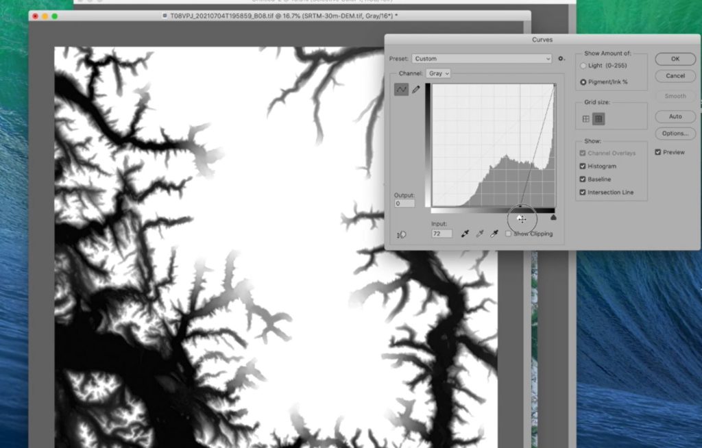
Using Curves
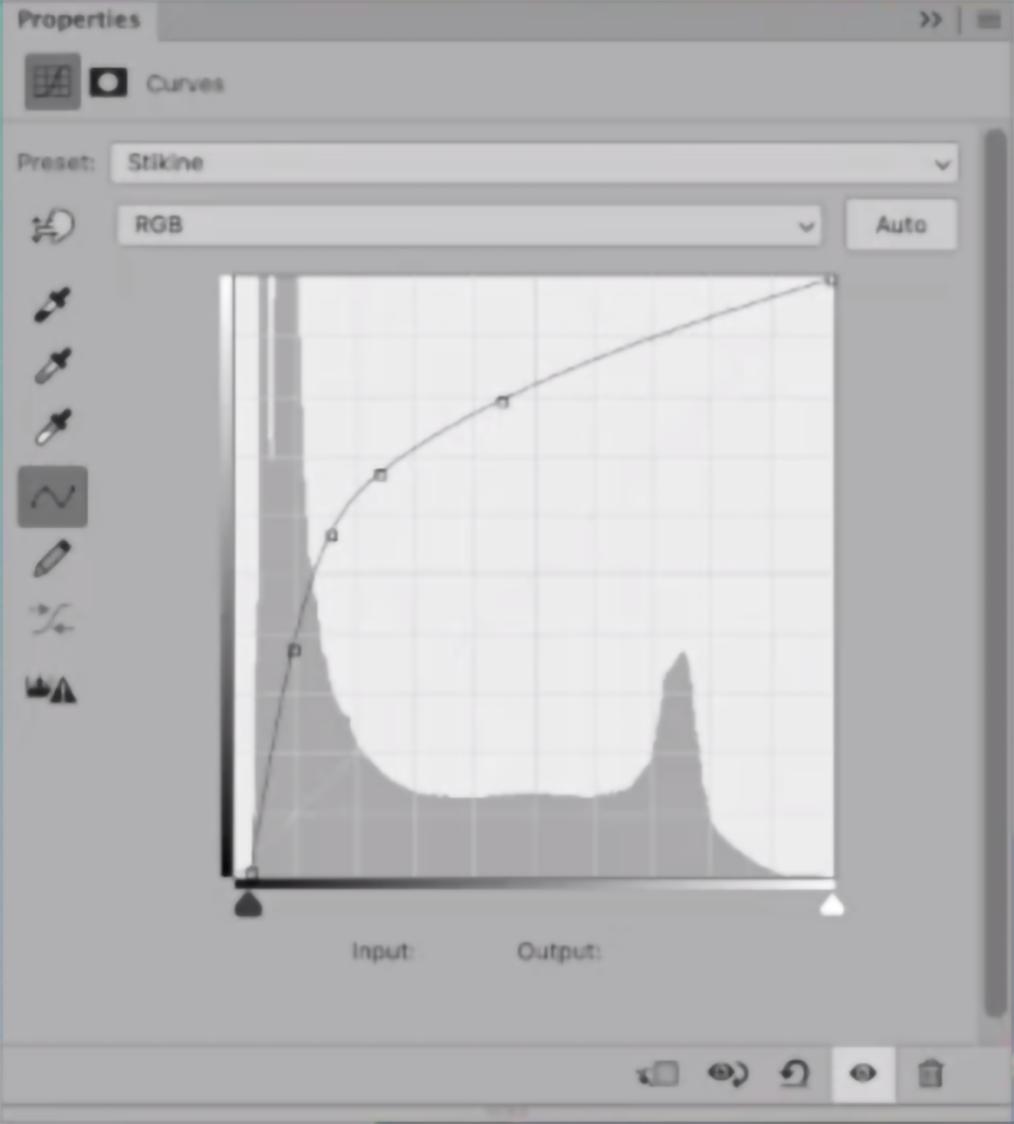
Now the fun begins. Compared to Levels adjustments that are linear, Curves adjustments are non-linear, giving you more control over discrete portions of the tonal range in an image. They are a little tricky to use at first, but the precise results that you can achieve with this command make learning it very worthwhile.
1) Apply a Curves adjustment layer and adjust the tonal range of the image taking care to leave some value in the snow patches. I often apply two or more Curves adjustment layers, one on top of the other, to fine-tune the tonal balance. With 16-bit images, you can stretch the tonal range without worrying about banding artifacts.
2) Save your applied curves as adjustment layers so you can save and re-use them for later. This is especially important when you start mosaicing imagery data (coming in part two!) and need to ensure curves are applied consistently across multiple images.
Below is the curve that I used to adjust the image. The histogram shows the distribution of light and dark values. Moving the lower-left end of the curve to the right lightened dark trees. Moving the top-right end down added a slight amount of tone to the white snow. Both of these moves decreased overall contrast.
Touch-up with the False Colour Image
We want to add a bit more eye-catching vibrance to our image. We can do that by utilizing the included false colour imagery and using the colour properties and blending tools to really make the mountainous terrain pop.
1) Since we need the false colour imagery to match the resolution of our RGB image, we need to upscale it. This can be done using the image sizing properties and resampling using the “Preserve Details” setting.
2) Overlay this upscaled false colour image over top of the RGB layer. You can then adjust the blending modes to create a nice vibrant image. In this case, I use the “Soft Light” blending mode, which is great for making the alpine terrain really stand out.
3) Create a selective colour adjustment layer to touch out individual colour tones in the image. For example, I try to remove much of the yellow tones in the image, as yellow tones are atypical for the “cold” alpine-like terrain we find in this image.
Coming up in Part Two:
The land areas in this image now stand out quite well. They look quite a bit more vibrant than the raw data and offer a bit better tonality than what we find in the automatically generated true-colour image included in the download. What we can do next is work on making the water areas stand out as well. I’ll show you how you can use the mosaic tool in Geographic Imager to work with elevation data to create layer masks that make adjusting water areas easy.
***
About the Author
Tom Patterson worked as a cartographer at the U.S. National Park Service, Harpers Ferry Center until retiring in 2018. He has an M.A. in Geography from the University of Hawai‘i at Mānoa. Presenting terrain on maps is Tom’s passion. He publishes his work on ShadedRelief.com and is the co-developer of the Natural Earth dataset and the Equal Earth projection. Tom has served as President and Executive Director of the NACIS. He is now Vice-Chair of the International Cartographic Association, Commission on Mountain Cartography.
When it comes to map-making, Dan Cole is a true master. A passionate academic, Dan has designed maps for research and academia for over 40 years. As the GIS Coordinator and Chief Cartographer of the Smithsonian Institution in Washington, DC., Dan has created maps and cartographic pieces for museum exhibits enjoyed by hundreds of thousands of visitors every year. As a researcher, Dan has authored scholarly publications in several renowned academic journals, and co-edited the book “Mapping Native America: Cartographic Interactions between Indigenous Peoples, Government, and Academia.”
For Dan, his interest in maps began when he was a child. He often enjoyed being the “navigator” on family vacations and building off a natural fondness for exploration he developed hiking trails as a Boy Scout. In his freshman year at the University at Albany – State University of New York, Dan first became interested in a career in cartography while studying under esteemed cartographer Dr. Michael Dobson. The opportunity to turn a genuine interest into a full-fledged career was too good to pass up, and Dan soon found himself enrolling in every cartography, geography, and remote sensing course he could. In the final year of his Bachelor of Geography degree, Dan became a cartography teaching assistant, providing him his first opportunity to act in a teaching role.
Immediately after graduating, Dan was recruited to an assistantship position at Michigan State University (MSU). Here he published his first research paper, which was co-authored alongside Richard Groop, now a professor emeritus in Geography at MSU. Completing a Masters degree in Geography in 1979, Dan moved to Oregon State University (OSU) and began collaborating with cartography professor Jon Kimerling, first as a TA, and later to run the Cartographic Lab there.
Leaving OSU in 1981, Dan took on a variety of roles at several recognizable institutions across the country. Some of these roles included; leading the Cartographic Lab at the University of Maryland, working as a cartographic technician for the National Oceanic and Atmospheric Administration (NOAA), contract cartography work for the Woods Hole Oceanographic Institute, and taking on a course instructor position at Montgomery College. In 1986, Dan began working at the Smithsonian Institution (SI) and was able to pursue his passion for research full-time. Some of his earliest mapping pieces with SI became an integral part of the “Handbook of North American Indians”, a series of scholarly reference volumes documenting the culture, language, and history of all indigenous peoples in North America. Through a cooperative arrangement, he was also responsible for researching the changes to the Bureau of Indian Affair’s “Indian Land Areas”map in 1987 and 1989.
“My first five years there mostly involved cartographic research, doing both manual and computer-based mapping for the Handbook of North American Indians—at the time we used Adobe Illustrator 88!”
Later, Dan moved to a role as the GIS Coordinator with the Smithsonian’s IT Department. There, he was exposed to the entire breadth of cartographic projects spanning the Smithsonian’s impressive list of research disciplines. He worked on projects related to biodiversity and species ranges, created maps documenting climate change, and contributed to interactive map exhibits showing the impacts humans have on the environment. From volcanology and mineralogy to prehistoric studies and even the study of dinosaurs, Dan became involved in most of the Smithsonian’s major subject areas. Several of Dan’s map creations even feature in the permanent exhibits at the Smithsonian National Museum of Natural History.
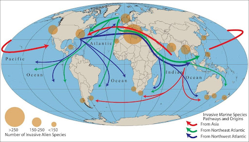
Pathways and origins of invasive marine species, one of 40 maps created for the Ocean Hall exhibit at the Smithsonian National Museum of Natural History
Although each unique exhibit and area of study came with its own specific objectives, from a cartographic standpoint, he found that most still shared a few key concerns. He noted that one of the biggest challenges for almost all museum researchers is to geo-reference the vast number of artifacts and biological specimens that are contained in the museum’s collections. Such a process is crucial to analyze where specimens were found in the past and to provide insights on where they could be found in the future based on changes to the environment.
“Collections for nearly all museums around the world, including the Smithsonian, have environmental characteristics documented with the collection site. But most, by far, do not have coordinate locations for artifacts and specimens collected before the GPS era; rather, the majority of their collections have descriptive locations. So we must use Natural Language Processing—a computer science-based technique—to process coordinates from the written descriptions.”
By the mid-1990s, digital mapping processes had become an integral component of map creation. Dan became one of the first adopters of MAPublisher, using the first version of the software to work with maps and geographic data in the Adobe Illustrator environment. Today, MAPublisher continues to play a crucial role in map production at SI, and Dan still uses MAPublisher to produce maps for some of the museum’s most popular exhibits.
“Since obtaining MAPublisher in the 1990s, I have been involved with over 20 different exhibits and multiple publications. All of these required importing shapefiles to Adobe Illustrator, PDF, or EPS formats so that publishers or exhibit staff could work with them. While other digital mapping software has improved over the years, I find the placement of typography is still handled more elegantly with MAPublisher.”
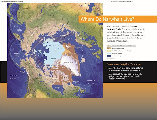
One of five maps that form part of the “Narwhals: Revealing an Arctic Legend” exhibit at the Smithsonian National Museum of Natural History (now a travelling exhibit!)
The museum environment presents some unique challenges for a cartographer. In a museum setting, maps need to be designed to communicate with the general public, synthesizing and presenting complex information for an audience that may be unfamiliar with the subject matter. This differs from research-focused work, which typically requires static printed maps that adhere to the strict guidelines of academic journal and book publications, and is typically viewed by experts in that particular field of study. For museum exhibits, cartographers need to employ careful design techniques to make maps informative and engaging to diverse audiences of all ages. These techniques result in maps that vary widely in format, from traditional static poster maps to animated and interactive maps that tell dramatic stories or serve as learning tools. Commenting on some of the unique challenges in today’s “pandemic era”, Dan notes that virtual online exhibits have made the use of web-mapping and interactive maps more commonplace.
“For the immediate and long-range future, I see greater use of static, animated and interactive maps online for public education on a variety of topics, with less interactivity in-person.”
Dan continues to oversee GIS support and teaching for staff at SI. He greatly enjoys the opportunity to work on diverse projects from a variety of interesting areas of study. As the GIS Coordinator at SI, he now covers over 400 GIS and satellite image processing users, plus over 500 story map writers and developers, including staff with very little knowledge of geography, cartography, or GIS. His passion for map-making remains to this day, and his maps continue to be enjoyed by visitors from around the world. An educator at heart, Dan has some parting advice for any students or young professionals seeking to break into the wonderful world of cartography;
“The advice that I give to nearly everyone interested in a cartography or GIS career is: while you’re still in school, plan to get a minor or double major in the field that interests you. Get a broad-based education that enables you to serve your clients in any field and join professional and academic organizations to expose yourself to others’ work. Most importantly, even once you are employed, never stop learning!”
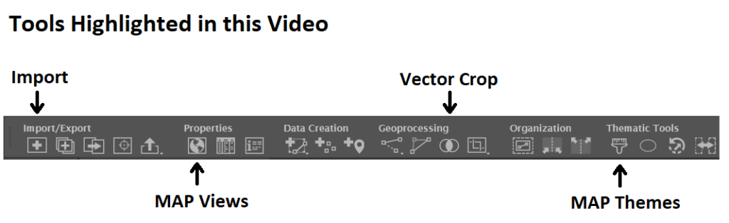
Welcome back to another edition of Mapping Class! The Mapping Class tutorial series curates demonstrations and workflows created by professional cartographers and expert Avenza software users. Today we have Steve Spindler, a longtime MAPublisher user, and expert cartographer. Steve has put together a 15-minute masterclass on creating maps from start to finish using templates and stylesheets. This video is jam-packed with useful tips and tricks that show how Steve uses templates, stylesheets, and a host of MAPublisher tools to design a beautiful map in minutes.
Steve has produced a video to show the complete, un-cut, map-making process. The Avenza team has produced video notes (below) to help you follow along.
***
Efficient Map-making using Templates and Stylesheets by Steve Spindler (video notes by the Avenza team)
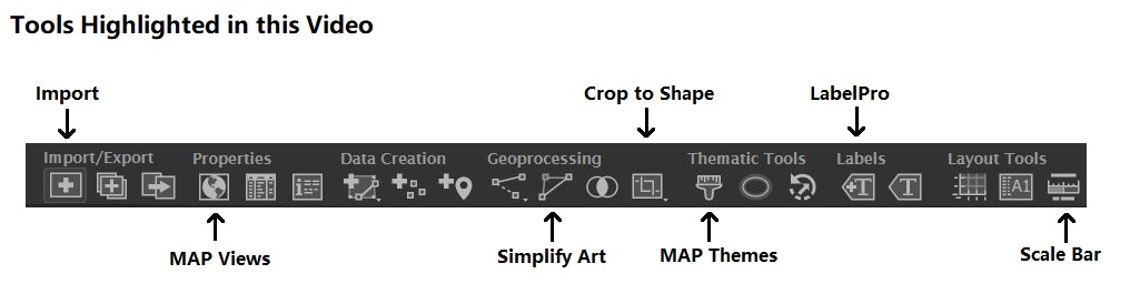
Today, Steve is doing something a little different. Instead of focusing on a specific tool or technique, he has put together a complete 15-minute masterclass showing how he creates a map from start to finish. In this uncut demonstration, Steve discusses his tips for importing data, using MAP views, applying stylesheets, and even labelling. Steve shows how using templates and preconfigured MAP themes can make map creation a breeze.
Using a Template
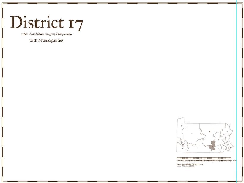
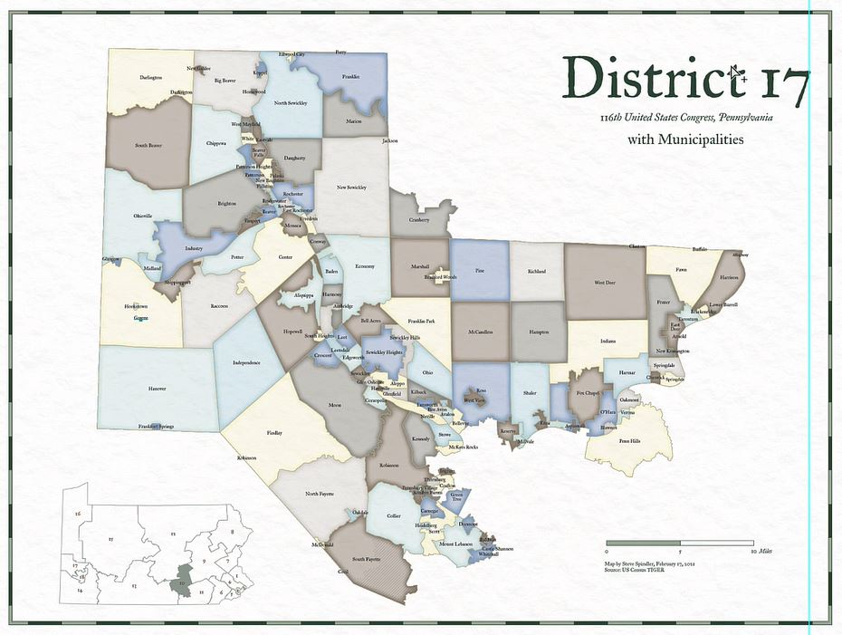
In this demonstration, Steve will be creating a congressional district map showing the municipalities of Pennsylvania District 17. Steve discusses how using a template to create your map can significantly improve the speed of map creation. Templates can be used to configure standardized design elements that can be recycled across several different map projects. Templates are especially useful in situations where different maps form part of a series with shared design components and colour schemes.
For this tutorial, Steve uses a template that includes some basic stylistic elements he typically includes in all his congressional district maps. The template comes preloaded with custom borders, Titles, subtitles, an inset map, and a scale bar. His template is already configured with custom fonts and colours that will give some uniformity across his different map projects.
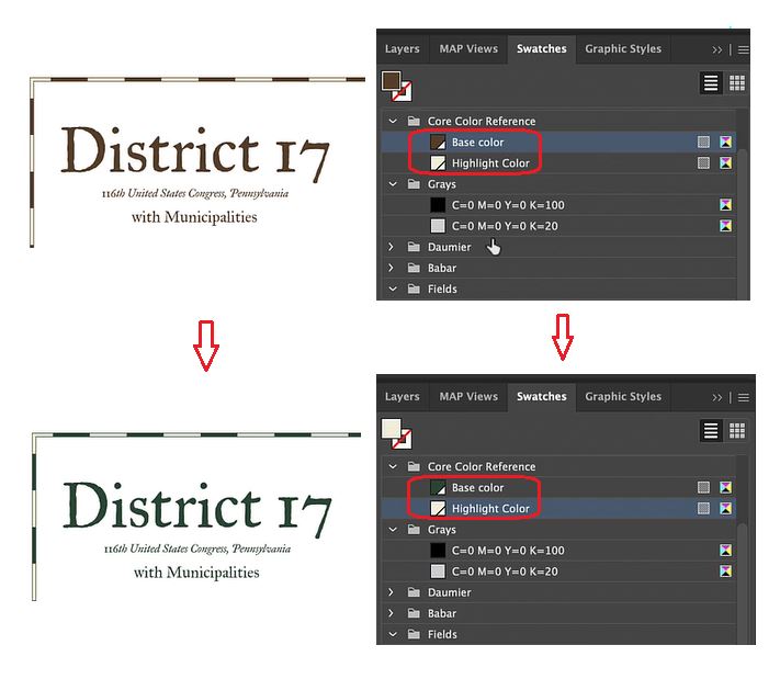
Steve has also set up swatch groups for his template. This ensures each map created with the template uses the same colour groups. Setting up swatches in the template also makes it easy to swap out or change the colour of different map elements. As an example, Steve uses the drag and drop functionality of the swatch panel to automatically adjust the “core colours” of his map template (text, border, and scale bar colours) from brown to green.
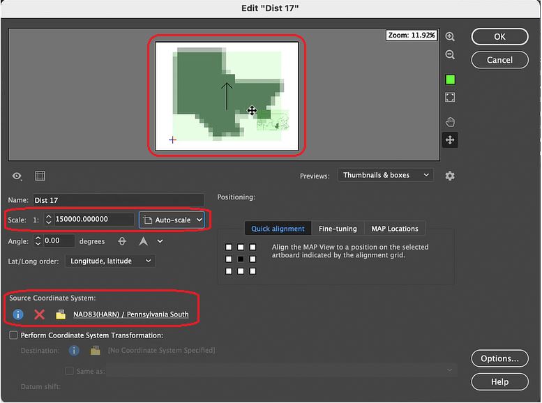
Steve’s template comes preloaded with an inset map containing all the congressional district boundaries for Pennsylvania. Using the drag-and-drop functionality of MAP Views, he can place a “District 17” data layer into a new MAP View that will contain the main body of his map project. Using the MAP View editor, Steve can assign a custom scale and choose an appropriate projection. This will ensure any new data layers he brings into the MAP view will be correctly aligned and accurately projected.
Import and Prepare the Map Data
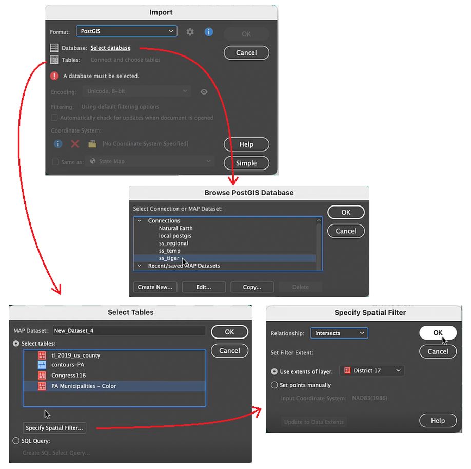
With his template configured, Steve now brings in some new data. He wants to access municipal boundary polygon data found on a PostGIS database stored locally. You can specify the specific data table within the database he wishes to add using the Import tool. More importantly, shows how he uses spatial filtering options to specify the region of interest. The spatial filter means that only the data relevant to the map extent is loaded in (very useful when using large datasets).
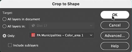
Using the Crop to Shape tool, Steve cleans up the imported data layer by removing any polygons that fall outside his district boundaries. Next, he uses the Simplify tool to remove extraneous vertices, with that his data is ready for stylization!
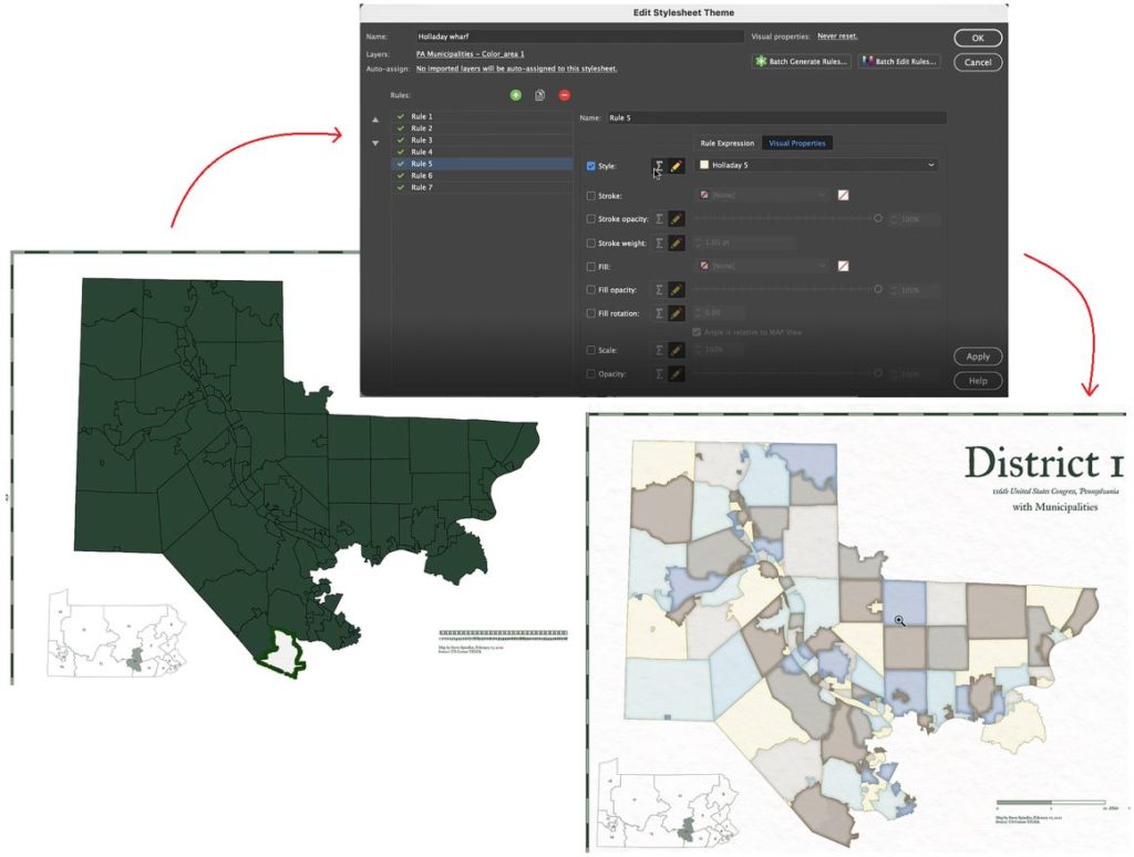
Apply Styles with MAP Themes
MAP themes are one of the most powerful tools in the MAPublisher toolset. MAP Themes allow you to configure rules-based stylesheets that work with attribute information stored in map data layers. Using pre-coded attribute values in his municipal boundary layer, Steve can assign colour fills to each municipality. Using colour in this way is a bit more eye-catching than using generic boundary lines, and makes it easy to see the shapes of each municipality.
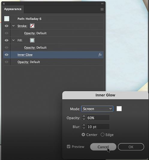
MAP Themes can not only set the stroke and fill for each polygon, but also apply graphic style effects such as “inner glow” to give each shape a more defined appearance. Since MAP Themes are entirely rules-based, it’s easy to modify and apply styles across the entire map without needing to adjust appearance settings for each vector layer individually.
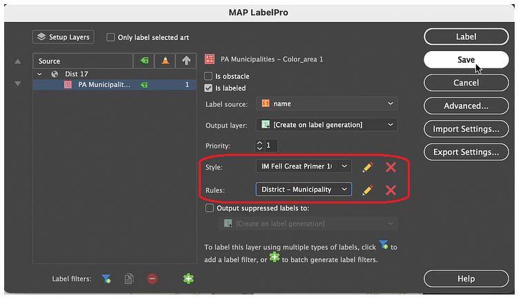
Labels and Details
With his MAP Themes applied, Steve needs to finalize the scale bar that appears in the bottom right corner of the map. Since the template he uses comes pre-configured with a MAPublisher cale bar, it’s only a matter of dragging and dropping the scale bar layer into the appropriate MAP View. If you recall from earlier, Steve set up this new map-view with its own map scale and projection, meaning the scale bar will automatically be adjusted to fit the map data once it is placed in the new MAP view, creating an accurate and informative scale for viewers.
Lastly, Steve uses the MAPublisher LabelPro add-on to apply labels to each of the municipalities in his map. Similar to MAP Themes, the LabelPro tool allows Steve to configure rules-based label layers that manage label placement and style. The labelling engine ensures that labels are placed to avoid collisions, eliminate label overlap, and reduce label clutter. Finishing the map with a few minor touch-ups and voila!, Steve has finished his Pennsylvania District 17 Map in less than 15 minutes!
***
About the Author
Steve Spindler has been designing compelling cartographic pieces for over 20 years. His company, Steve Spindler Cartography, has developed map products for governments, city planning organizations, and non-profits from across the country. He also manages wikimapping.com, a public engagement tool that allows city planners to connect and receive input from their community using maps. To learn more about Steve Spindler’s spectacular cartography work, visit his personal website. To view Steve’s other mapping demonstrations, visit cartographyclass.com
Welcome back to this month’s edition of Mapping Class. The Mapping Class tutorial series curates video tutorials and workflows created by experienced cartographers and Avenza software users. Joining us once again is Steve Spindler, a longtime MAPublisher user, and expert cartographer. Steve is here to show you a quick tip for using the attribute expression builder within MAPublisher to quickly perform batch edits of labels.
Steve has produced a short video to demonstrate how he uses the expression builder to quickly edit street names. The Avenza team has produced video notes (below) to help you follow along.
***
Label efficiently using Attribute Expression Builder by Steve Spindler (video notes by the Avenza team)
With MAPublisher, labeling your maps is a breeze. With powerful tools such as LabelPro, labeling is only a matter of selecting the data you want to label, and configuring a robust set of rules that control how each label is placed and styled. But before you can start labeling, you must have high-quality, accurate attribute information for your map data. Since labels are typically generated by displaying text values contained in an attribute column, it is important that attributes are not only accurate but are also formatted in a way that is optimized for display on a map. In many cases, cartographers need to spend time reformatting or editing attribute information before they can generate labels, a process that can become quite time-consuming. Nowhere else is this problem more common than when dealing with street names and road network data.
When labeling streets, cartographers often spend time correcting, or even generating brand new attribute information that can be used to create more concise, effective street labels. This typically involves changing street prefixes and suffixes to a condensed short form (i.e “North Cherry Boulevard” becomes “N Cherry Blvd”). For smaller projects, this can be done by manually editing the individual attribute values directly within the MAP Attribute panel. For large projects, especially those dealing with hundreds or even thousands of map features, manual editing would be very time-consuming.
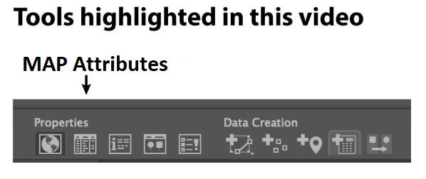
For a more efficient approach, Steve shows how you can use the Expression Builder to easily modify large selections of attribute values. The first step is to open the MAP attribute table, which displays all the attribute information contained within a specific map layer. Steve identifies the attribute column that contains the text street names and will use this to build out a new attribute column to create his labels.
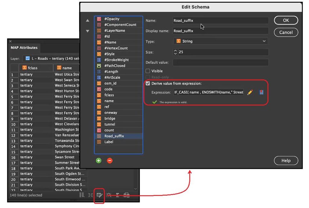
Next, Steve opens the Edit Schema window of the attribute table. Here, you can access column information such as the data type, default value, field visibility, and most importantly; the expression builder.
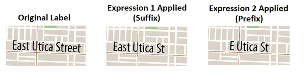
The expression builder may seem intimidating at first, but with a little bit of effort, it can be an incredibly powerful tool for calculating attribute values and performing batch-edits on your data. The tool uses built-in operators and items in the objects list (attribute names and values, constants, functions) to calculate custom attribute information based on a specified set of expressions. In this case, Steve first creates an expression set that modifies the suffix values in the Street name field (i.e “Boulevard”) and substitutes them with the appropriate short form (“Blvd”). The expression is used to populate a new attribute column called “Road_suffix”. The end result means attribute values such as “East Utica Street” will be passed to a new attribute value of “East Utica St”.
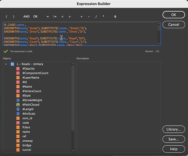
IF_CASE(name,
ENDSWITH(name, “ Street“),SUBSTITUTE( name , “Street”, “St”),
ENDSWITH(name, “ Drive“),SUBSTITUTE( name , “Drive”, “Dr”),
ENDSWITH(name, “ Road“),SUBSTITUTE( name , “Road”, “Rd”),
ENDSWITH(name, “ Court“),SUBSTITUTE( name , “Court”, “Ct”),
ENDSWITH(name, “ Way“),SUBSTITUTE( name , “Way”, “Wy”),
ENDSWITH(name, “ Lane“),SUBSTITUTE( name , “Lane”, “La”),
ENDSWITH(name, “ Route“),SUBSTITUTE( name , “Route”, “Rt”),
ENDSWITH(name, “ Boulevard“),SUBSTITUTE( name , “Boulevard”, “Blvd”),
ENDSWITH(name, “ Turnpike“),SUBSTITUTE( name , “Turnpike”, “Tpke”),
ENDSWITH(name, “ Avenue“),SUBSTITUTE( name , “Avenue”, “Ave”),
ENDSWITH(name, “ Place“),SUBSTITUTE( name , “Place”, “Pl”),
ENDSWITH(name, “ Circle“),SUBSTITUTE( name , “Court”, “Cr”),
ENDSWITH(name, “ Highway“),SUBSTITUTE( name , “Highway”, “Hwy”),
ENDSWITH(name, “ Expressway“),SUBSTITUTE( name , “Expressway”, “Exp”)
)
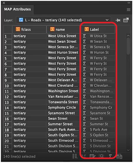
Next, Steve creates a second set of expressions that will further adjust his Road_suffix attribute column to substitute any street name prefixes (North, East, South, West) with their corresponding short-form (N, E, S, W). This second expression (see code block below) is used to populate another new attribute column called “Label”, which will ultimately be used to generate the final formatted label layer.
Note that these expressions are specific to the dataset and map area Steve is using for his project. When using expression builders for your own maps, pay careful attention to the attribute values specific to your area of interest. The best part about expression sets is that they are highly flexible, meaning you can build upon and modify existing expressions, save them to your library, and even use them across multiple different mapping projects!
With his newly created “Label” attribute column, it’s simply a matter of configuring the LabelPro tool to display these formatted label values. With a bit of configuration, the end result is a clean, uncluttered, collision-free label layer. The labels now use all the correct prefixes and suffixes Steve required. By saving his expression sets to his library folder, Steve can now quickly and easily repeat the exact same batch-editing process for new maps with only a few clicks!
***
About the Author
Steve Spindler has been designing compelling cartographic pieces for over 20 years. His company, Steve Spindler Cartography, has developed map products for governments, city planning organizations, and non-profits from across the country. He also manages wikimapping.com, a public engagement tool that allows city planners to connect and receive input from their community using maps. To learn more about Steve Spindler’s spectacular cartography work, visit his personal website. To view Steve’s other mapping demonstrations, visit cartographyclass.com
Hans van der Maarel has been a passionate cartographer for over 20 years. He works out of Zevenbergen, Netherlands where he operates his company, Red Geographics. To Hans, cartography is a passion that extends beyond the office, becoming more than just a career path. Through this passion, Hans has developed a level of expertise found only in the most dedicated of map-making professionals. As an expert MAPublisher user, Hans has been a frequent contributor to the Avenza Resources Blog. You can see some of his latest work through his Georeferencing Techniques Video tutorials released as part of Avenza’s Mapping Class blog series. To read more about Red Geographics, and see more of Hans’s work, visit redgeographics.com.
From a young age, Hans always had a keen interest in maps. His found himself drawn to old atlasses, spending hours looking at old maps, and geography was always his favourite subject in school. This interest persisted into high school, where at a job fair he found out you could actually study map-making as a career.
Continuing his studies, Hans pursued a program in Geo-Informatics at Hogeschool Utrecht (a four-year bachelor’s level course offering a mix of geodesy, GIS, and cartography). There he was introduced to various kinds of mapping and surveying, learning the techniques necessary to plan and design meaningful effective maps. During an internship at the National Spatial Planning Agency, he was first introduced to the MAPublisher plug-in for Adobe Illustrator. After graduation he started working for his local Avenza partner, doing tech support, training, consultancy, and commercial map production processes. This is also where he was introduced to Safe Software and their product for data transformation, also known as Feature Manipulation Engine (FME).
Hans developed a niche within the Dutch cartographic community that leveraged FME to prepare raw source data before using MAPublisher to visualize and create the final high-quality map products. This type of workflow, combining a mix of both FME and MAPublisher functionalities is now fully realized by the FME Auto add-on for MAPublisher.
“I was doing my first internship and was tasked to produce a poster-sized map of The Netherlands in Adobe Illustrator, but all the base data was in Shapefiles or ArcInfo coverages. Gathering base data and generalizing it was done in a traditional GIS, but getting that data into Illustrator and making a finished map required MAPublisher.”
In September 2004, Hans decided to continue on his own and founded Red Geographics. Working largely with Avenza products, two years later, he became an official Avenza partner and reseller. As his customer base expanded and more projects came in, Red Geographics developed a reputation of being “the one for the difficult projects”. Reflecting on the early years of Red Geographic’s operation, Hans mentioned some of his more memorable, fun, and eye-catching projects.
“There was the Oolaalaa Globe, a 5 ft diameter “beanbag” globe with beautiful maps printed on spandex. We received several custom orders of the globe map from other clients, including ones for Air France-KLM with the complete route networks of all their partners, and another from National Geographic Benelux and the City of Amsterdam, with a map of the city projected onto the globe.”
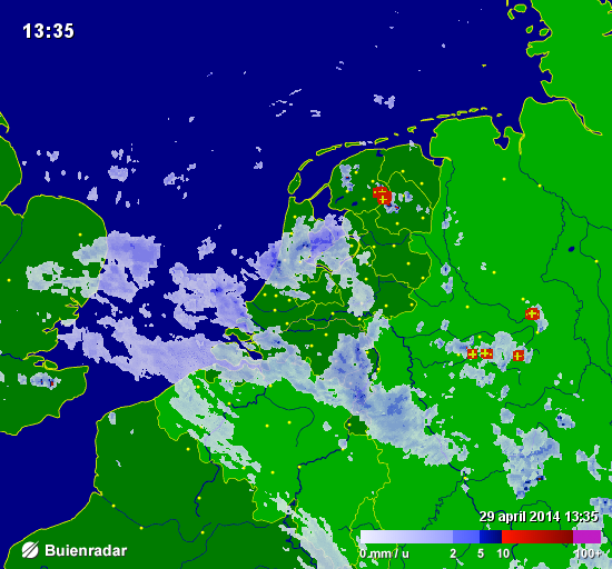
Also eye-catching, but for a completely different reason, were a series of simple basemaps created for Buienradar, the most popular Dutch weather website, and app. Millions of people have seen Hans’s maps when they checked the weather.
In the early years of Red Geographics, Hans became involved with the Cartotalk forum, first as an enthusiastic user, later on as a moderator, and finally an admin. Through Cartotalk, he also got involved with NACIS, the North American Cartographic Information Society. He attended their meeting in Salt Lake City in 2005 and he’s been to every meeting since. When NACIS took over Cartotalk, Hans became an ex-officio board member for several years before being formally elected a board member at large. He still serves on the board to this day and is currently in his 2nd term as secretary. Through NACIS, Hans was able to expand his network of international contacts, allowing him to contribute to several large-scale mapping and atlas projects. He created island maps that can be found in the Millennium House “Earth” atlas and more recently, several full-page maps for the 11th Edition National Geographic World Atlas released in 2019.
Building on the success of his earlier globe projects, Hans then created a new map whose design is displayed prominently on a new product called BalancePlanet, a globe-themed, fully functional yoga-ball that Hans considers a spiritual successor to the Oolaalaa globe bean bag chair.
In 2019, Hans expanded his team, adding two members to become a team of three. With more resources now available, Hans and his team can now tackle larger, more complex (mapping) projects. His team took on the momentous task of producing a nationwide 1:20,000 scale topographic base map of the entire country of Luxembourg. The finished results were used as a cartographic base for tourist maps showing hiking and cycling routes all over the country.
“The Avenza products have been a major factor in my development as a cartographer, as well as the development of my company,” says Hans. Many of his projects use a combination of FME and MAPublisher, and Hans has utilized the interoperability between these two programs to implement significant workflow automation. With a single base dataset, multiple maps can be made with the same style, and automating this process means he can produce a high volume of maps in just seconds, without needing to manually configure shared thematic elements.
“With automating some of the map production processes, I now only have to focus on the parts where my cartographic skills are most needed. MAPublisher allows me to do that. I want to find the right balance between quality and speed when it comes to producing maps, and with automating the data processes I have found just that.”
Aside from the traditional mapping products Hans has become known for, he enjoys working on smaller projects with interesting stories around them. “The maps I get the most joy out of these days are, interestingly enough, not those big ones. Over the past ten years or so I’ve been asked to produce greyscale maps for several academic publications, a lot of them focusing on the Arctic and Antarctic regions. Limited in terms of visual variables and often a need to show a lot of information on a small surface area, these kinds of maps are a very interesting challenge. One thing led to another, word-of-mouth is a great promotion tool, and we now find ourselves in the middle of producing about 30 maps for an upcoming publication by Cambridge University Press, chronicling the state of research in those areas. Wonderfully esoteric subjects which often lead me down a Wikipedia rabbit hole!”
Hans continues to use his cartography skill set to explore new ways of making maps more prominent in everyday life. Hans began introducing his colleague, Inge van Daelen, to the concepts of satellite imagery and Photoshop (using Tom Patterson’s great tutorial on how to process Landsat data). Branching off of this, they founded Blue Geographics, which originally started as a fun side-project but quickly grew into a full-fledged business. Through Blue Geographics, Hans designs and produces a range of sportswear and lifestyle items displaying beautiful satellite images derived from Landsat and Sentinel data.
“Looking ahead, I just want to make beautiful things,” says Hans, “One of my hobbies is photography, specifically cycling and cosplay. A few years ago, when I did a photoshoot with two cosplayers, I saw a sticker with that text in their workshop and it struck a chord with me. I’ve long had ‘doing awesome work for people I like’ as one of my goals and I want to keep on doing that. I also want to keep on challenging myself by trying out new techniques and new ways to map things. There’s still a lot to learn and I am very happy to know a lot of people in the cartographic community who are happy to share their knowledge and experiences.”
Welcome back to another exciting edition of Mapping Class, a video-blog series where we curate tutorials and workflows created by expert cartographers and Avenza power users from around the world. Today we release Part Two of our Georeferencing Techniques tutorial with Hans van der Maarel, owner of Red Geographics. In Part Two, Hans demonstrates some techniques he has developed for working with more challenging georeferencing tasks, including dealing with unknown projection information and working with scanned maps. If you missed Part One, in which Hans covers the basics of Georeferencing in MAPublisher, check it out here.
Hans has produced a jam-packed video walkthrough detailing his georeferencing process. The Avenza team has produced video notes (below) to help you follow along.
***
Georeferencing Techniques Part Two: Working with Scanned Maps by Hans van der Maarel (video notes by the Avenza team)
As we discussed in last month’s Mapping Class, georeferencing is the process of taking imagery or map data that lacks geographic location information and associating it with specific coordinates on Earth. Previously, Hans showed us how MAPublisher provides a few tools that make georeferencing simple vector map data a painless process (Check out part one here!). Best of all, using the built-in georeferencing tools, this can be done entirely within the Adobe Illustrator environment.
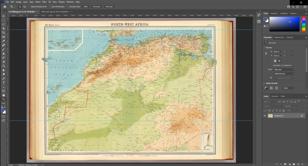
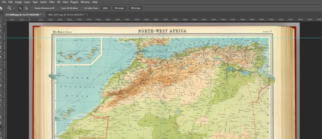
However, what can you do if you are working with historical maps or scanned images that lack spatial referencing or detailed projection information? This can present a challenge for many cartographers, as the projection information is necessary to create an effective cartographic product that will minimize distortion and maximize the spatial accuracy of the final result. To tackle this problem, Hans shares a series of tips and tricks that he uses for working with scanned historical maps. He uses a beautiful historical map of Northwest Africa to demonstrate his approach.
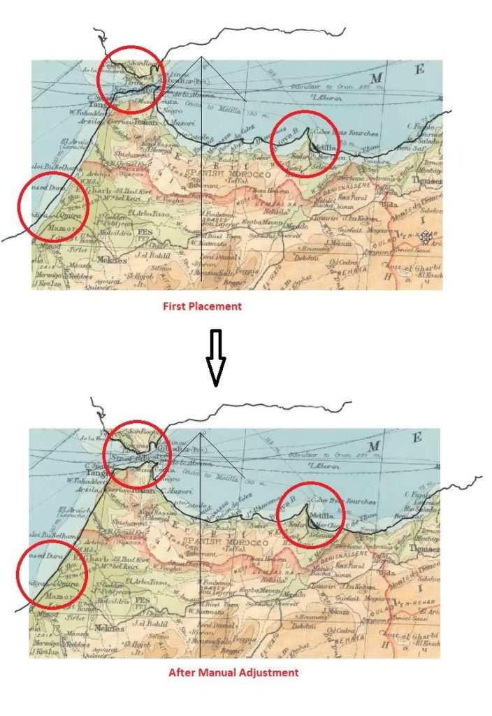
Right away, Hans identifies a few obstacles. First, he notices that the scan is not a perfect copy of the original map. Due to natural curves and bends in the physical paper version of the map, there is minor distortion in the digital image that arose when the map was scanned. This could create problems for georeferencing the image, as the “fitting” process can be susceptible to image distortions, even when a suitable projection is determined. Thus it is always a good idea to examine your scanned map prior to beginning the georeferencing process. Becoming aware of potential issues with the scanned map data can help inform decisions on the data’s suitability for a particular mapping task. Acknowledging that the distortion is relatively minor in this scanned map, Hans chooses to proceed with the georeferencing process.
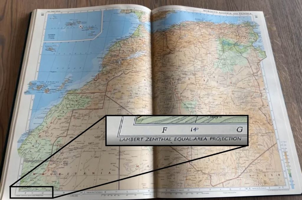
Hans notices that the scanned map image does not provide any details on the original projection information. Instead, Hans must make an “educated guess” on which projection was being used. With a bit of research, he discovers another map from roughly the same era and displaying a similar region. Recognizing the similarities between this map, and his scanned map, Hans decides to implement a Lambert Zenithal (Azimuthal) Equal Area Projection.
Hans discovered this map from 1968, which displays approximately the same area. He chooses to use the projection information from this map to help with the georeferencing process of his scanned map.
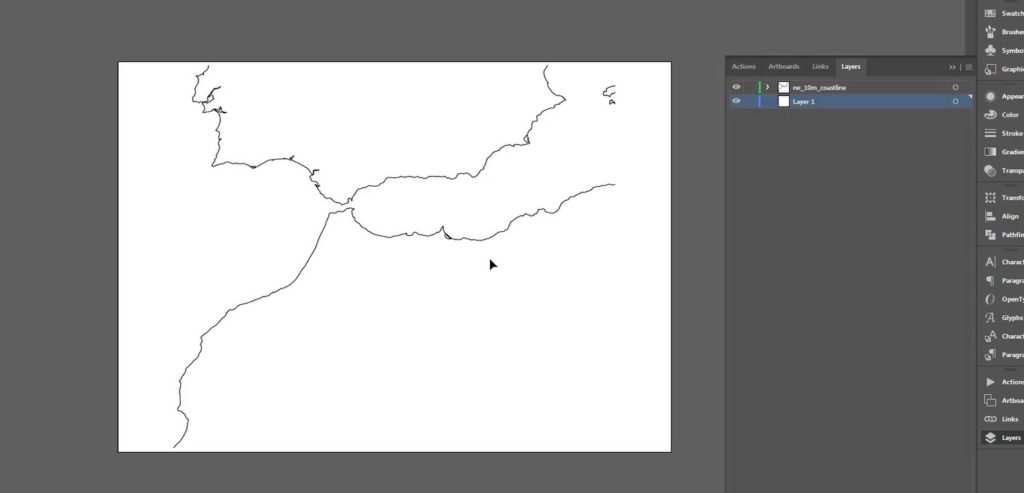
Hans can begin his georeferencing process by first setting up a new MAP View with the Lambert Azimuthal Equal Area Projection, a conical projection used in many atlas-style maps. To help with the georeferencing process, Hans has used the Import tool to display a vector line layer of coastlines using Natural Earth Data. He can use this coastline data as a guide to help align his scanned map during the georeferencing process.
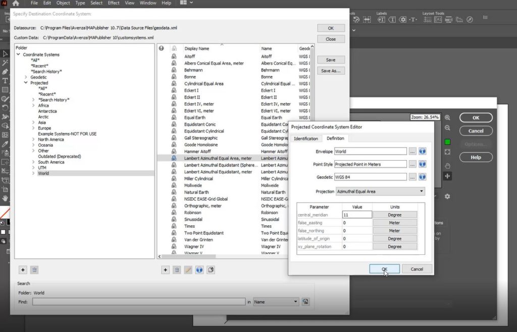
Before moving on, Hans brings up two important things one must consider when working with conical projections: the central meridian and the latitude of origin. When working with scanned maps that include graticule lines, a quick and easy way to help identify the central meridian is to look for the meridian line that closest approximates a straight line. Using the graticules on the scanned map, Hans can approximate a central meridian of about 11 Degrees. In the MAP View Editor, a user can open the projected Coordinate System Editor and modify the definition for the lambert azimuthal equal-area projection to have a central meridian that matches his estimation.
Placing the scanned map layer onto his newly modified MAP view, Hans can then begin the process of manually aligning the map image to match his projected coastline data. One of the easiest ways to support this process is to configure the MAP View editor panel to display layer thumbnails. With this configured, a user can begin manually adjusting the MAP layers until they are suitably aligned.
Hans reiterates that this process is not an exact science. He has made several assumptions on the projection parameters, and the overall accuracy of the original map. He indicates that a user should spend some time trying to get the best possible result, however it will be difficult to achieve a perfect match (especially given the distortions that can occur when a map is scanned from a physical copy). This process can take anywhere from minutes to hours, and requires a lot of manual adjustment, trial and error, and most importantly, patience! The result, however, is that the finalized scanned map layer is correctly projected and georeferenced into a MAP view. From here, adding data layers, annotations, labels, or tracing vector layers from the scanned map can all be completed in a spatially aware mapping environment.
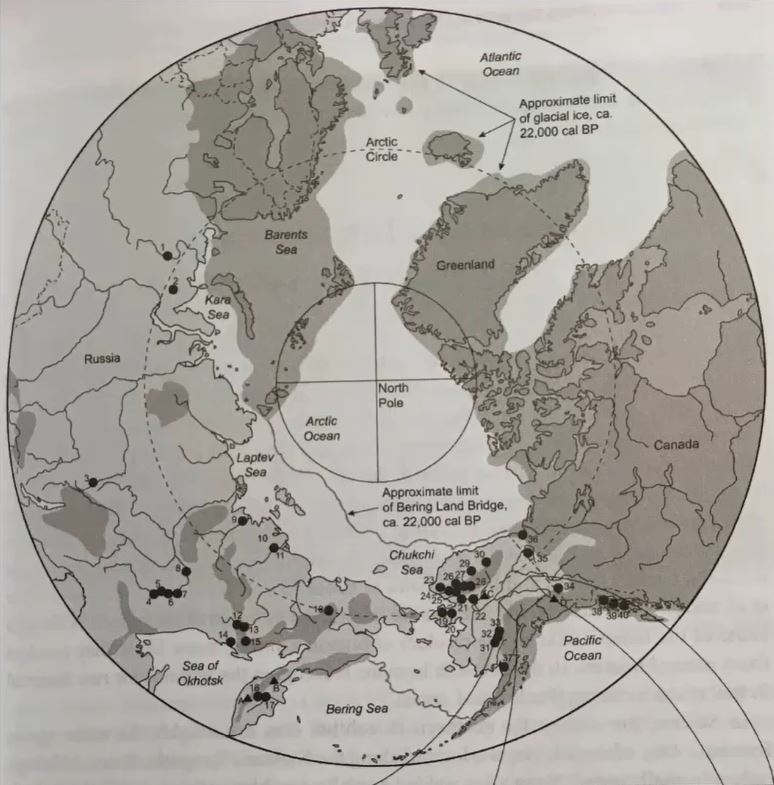
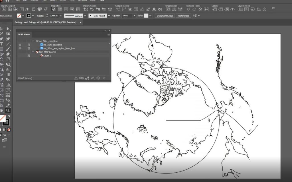
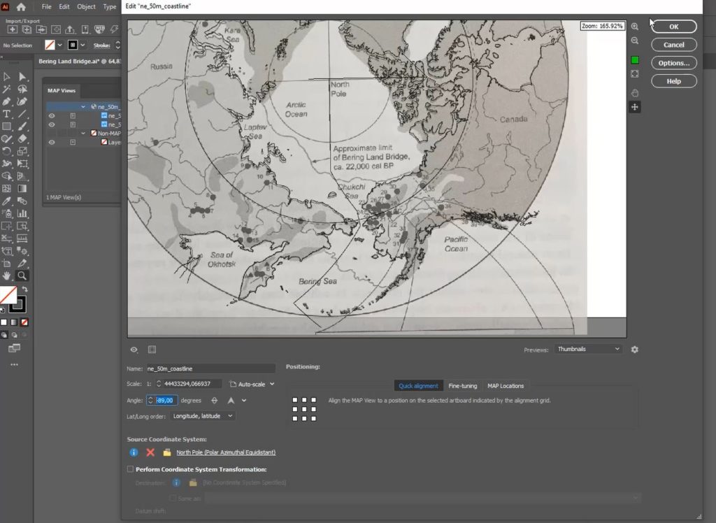
Providing a second example using a slightly different approach, this time Hans uses a map of the Arctic Region. He indicates that although he has been provided with a map of the entire polar region, the client is only interested in the area surrounding the Bering Strait (between Russia and Alaska). As with the previous example, the first step is to identify the best projection to use. Hans correctly guesses that the map provided likely uses the Polar Azimuthal Equidistant Projection based on visual inspection. However, it should be noted that there is room for trial and error here, and users should not be afraid to explore the large coordinate system and projections library included with MAPublisher to try out and test different projections to help narrow down one that fits best.
The first thing Hans notices is that the scanned map image is rotated about -90 Degrees from what is displayed in his reference coastline data. Once again, by visiting the MAP View Editor, Hans can rotate his Map layers without breaking the spatial referencing information of his original map data. By doing this, Hans assures that his map layers are aligned on the same rotational angle, and can then begin to focus on scaling the layers.
Hans uses the MAP view editor panel to apply manual adjustments to the map layers. He notes that a cartographer should always consider the area of the map they are most interested in. For example, although his map covers the entire polar region, Hans indicates the final product will only display the regions surrounding the Bering Strait. Given this, the georeferencing process should be primarily concerned with accurate alignment in the Bering Strait area, while distortion in other areas is seen as acceptable. In the example below, you can see how Hans has achieved a suitable level of georeferencing accuracy in his primary area of interest, despite the non-important areas (i.e the Canadian Polar region, eastern Siberia, Greenland) having relatively low georeferencing accuracy.
With his newly georeferenced scanned map layers. A cartographer can now use the information contained within these scans to supplement a larger cartographic process. For example, Hans can now use the scanned maps to digitize boundaries, or geographic features that may not be present in modern digital datasets (for example, historical boundaries for different countries, or terrain features that are no longer present)
***
About the Author
Hans van der Maarel is the owner of Red Geographics, located in Zevenbergen, Netherlands. Red Geographics is a long-time partner of Avenza and Hans is a well-known power user of both MAPublisher and Geographic Imager. He uses the products for a wide range of cartographic projects for several international organizations and offers training courses and consultancy expertise aimed at developing workflows for clients. In addition to that, he is currently a board member of NACIS. To find out more about Red Geographics, and to see more work by Hans, visit redgeographics.com
The Cartography and Geographic Information Society (CaGIS) promotes interest in map design and significant design advances in cartography. Avenza Systems sponsors several awards for the Student Entries at the Annual Map Design Competition which is open to all map makers in Canada and the United States. Students are highly encouraged to apply to this competition
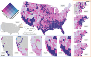
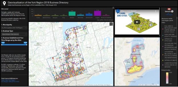
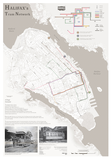
The winners of the Annual Map Design Competition 2020 include aspiring map makers from many schools throughout North America. Avenza is proud to announce that the winners of the David Woodward Digital Map Award are Yu Lan and Sridhar Lam for their maps titled ‘The Animated Bivariate Map of COVID-19’ and ‘Geovisualization of the York Region 2018 Business Directory’, respectively. In addition, Avenza is proud to announce that the winners of the Arthur Robinson Print Map Award are Kevin Chen and Nicholas Weatherbee for their maps titled Victoria and the Halifax Tram Network, respectively.
“We used the bivariate map to represent the daily relative risk and the number of days that a county has been in a cluster. In this product, users are able to discover the space-time pattern by watching and playing with the animated and interactive map.“ – Yu Lan, Ph.D. Student, UNC Charlotte
The Animated Bivariate Map of COVID-19 by Yu Lan
“Overall, the dashboard provides an effective geovisualization with a spatial context and location detail of the York Region’s 2018 businesses. The dashboard design offers a dark theme interface maintaining a visual hierarchy of the different map elements such as the map title, legend, colour scheme, colour combinations ensuring contrast and balance, font face selection and size, background and map contrast, choice of hues, saturation, emphasis etc.” – Sridhar Lam, Master of Spatial Analysis, Ryerson.
Geovisualization of the York Region 2018 Business Directory by Sridhar Lam
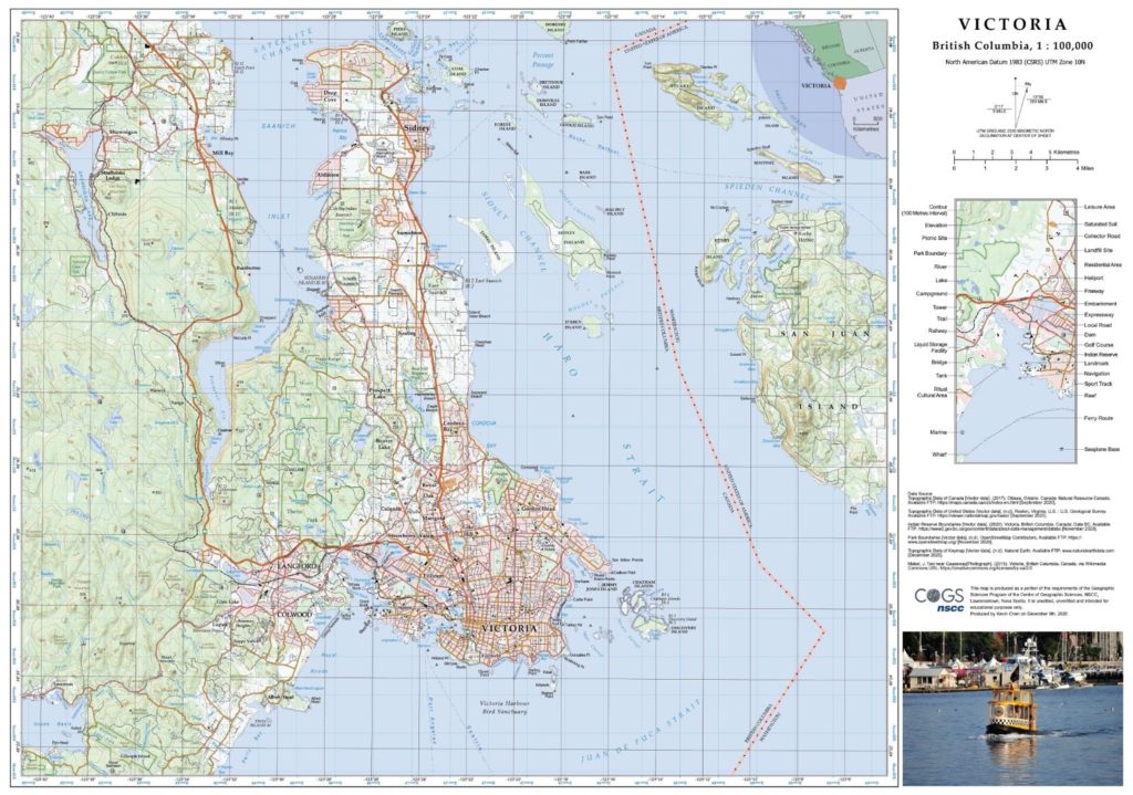
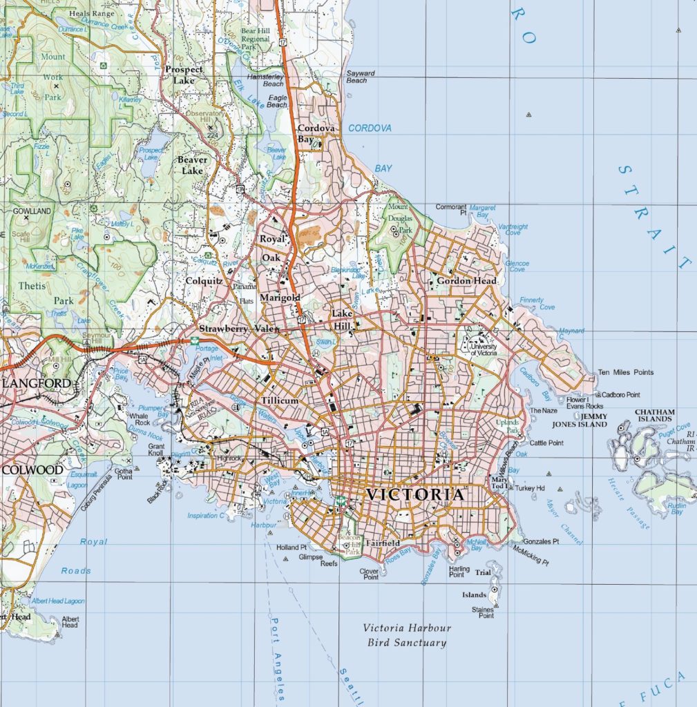
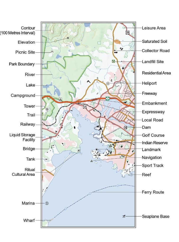
“This map aims to produce a detailed, accurate, and visually appealing topographic map of Victoria, British Columbia. It was generalized using data from two different scales to a final scale of 1:100,000. Hillshades were created to enhance the terrain visualization. My goal is to start a meaningful career in cartography and GIS” – Kevin Chen, Nova Scotia Community College
Victoria Map, created using Avenza MAPublisher, by Kevin Chen
Welcome back to another exciting edition of Mapping Class, a new video-blog series where we curate tutorials and workflows created by expert cartographers and Avenza power users from around the world. For this article, we are excited to introduce Hans van der Maarel, owner of Red Geographics, and expert cartographer. Joining us from Netherlands, Hans has put together a video tutorial showcasing tips and tricks for tackling Georeferencing in a variety of different mapping scenarios. In this first part, Hans goes over the basics of georeferencing in MAPublisher, using a neat city map of Zevenbergen. Tune in for Part Two, coming soon, which will reveal how Hans approaches more challenging georeferencing tasks, including dealing with unknown projection information and working with historical maps.
Hans has produced a short video walkthrough detailing part one of his georeferencing process. The Avenza team has produced video notes (below) to help you follow along.
***
Georeferencing Techniques Part One: The Basics by Hans van der Maarel (video notes by the Avenza team)
Georeferencing is the process of taking imagery or map data that lacks geographic location information and associating it with specific coordinates on Earth. Georeferencing is a very common, but sometimes challenging step that is necessary for producing accurate, meaningful cartographic products. By georeferencing map data, cartographers can ensure that the features on their maps are located correctly, and in a way that accurately represents the real world. Georeferencing also makes it easy to add and update maps with new data layers, as location information stored within the new map layers will be accurately overlaid in the correct position on older map projects. The process for georeferencing maps can be complicated, but Hans has outlined some easy-to-follow steps for quickly performing and validating simple georeferencing tasks with vector map data.
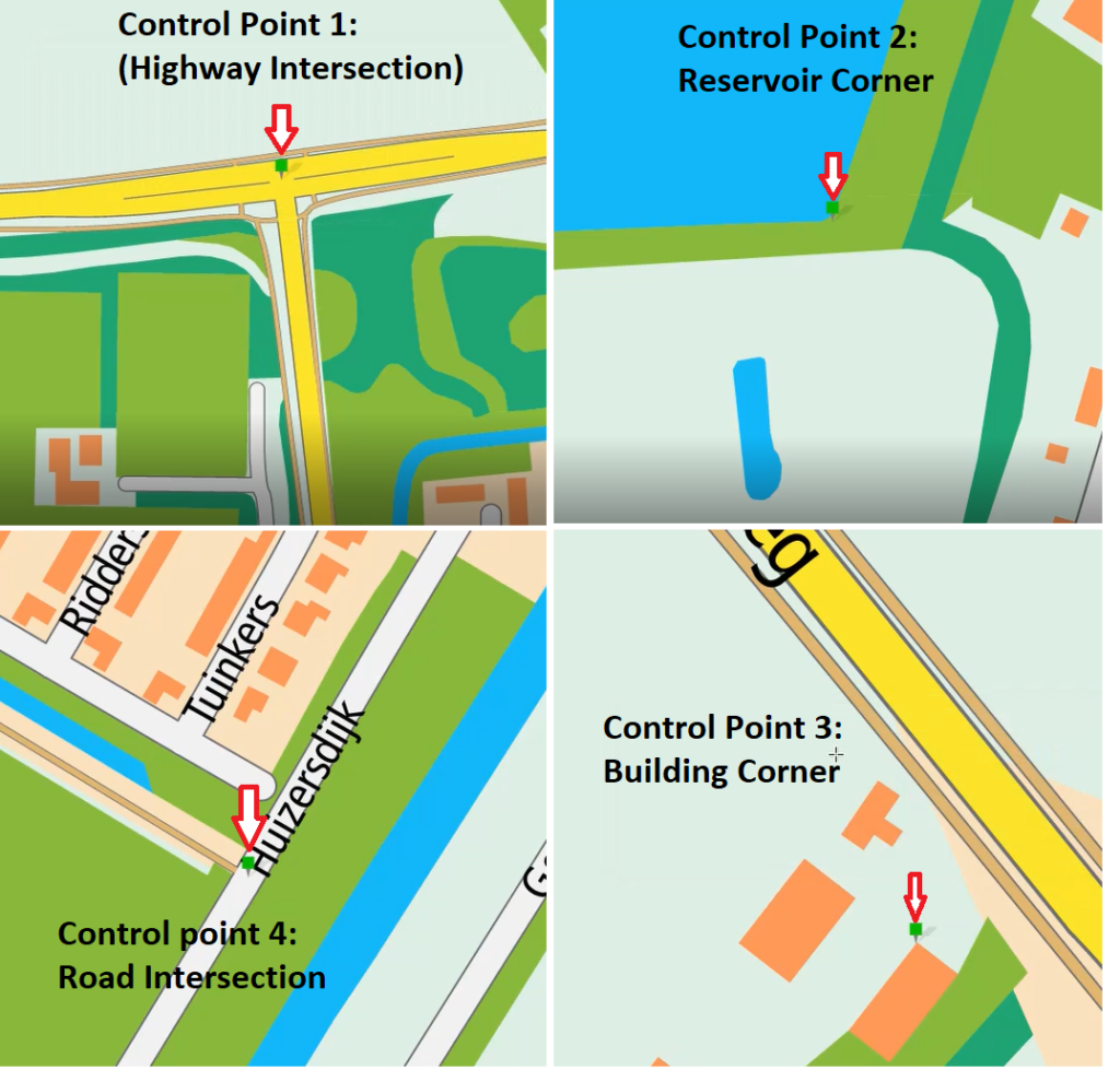
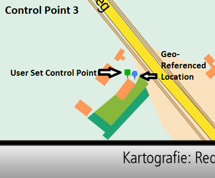
In general, effective georeferencing needs to include at minimum three known control points. In this example, Hans has included an additional fourth control point to provide additional accuracy.
When locating control points, it is a good idea to choose points that roughly approximate the four corners (quadrants) of your map area. Doing so can ensure the georeferencing result is accurate for the entire coverage of the map area and minimizes distortion/shearing effects as the map layers are matched to the final coordinate system. Cartographers should take time to ensure the chosen control points are as accurate as possible, as errors in control point placement will propagate across all locations in the map. Poor control point placement can lead to overall poor georeferencing accuracy.
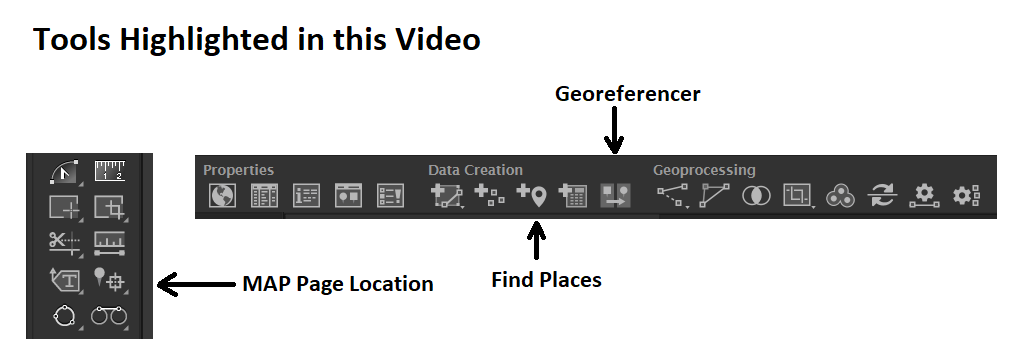
Using the MAP Page location tool, place four control points at known, easily identifiable locations. Hans recommends placing control points at recognizable map features that can be easily seen on the reference imagery. For this example, Hans chose to use the corners and edges of major structures (i.e larger buildings/reservoirs) or the centers of well-known major road intersections. When using road features as reference control points, Hans recommends using the center of the feature rather than the edge. This can compensate for variation in road edge placement that can occur when the vector line layer does not completely match the true road/lane width in the imagery.
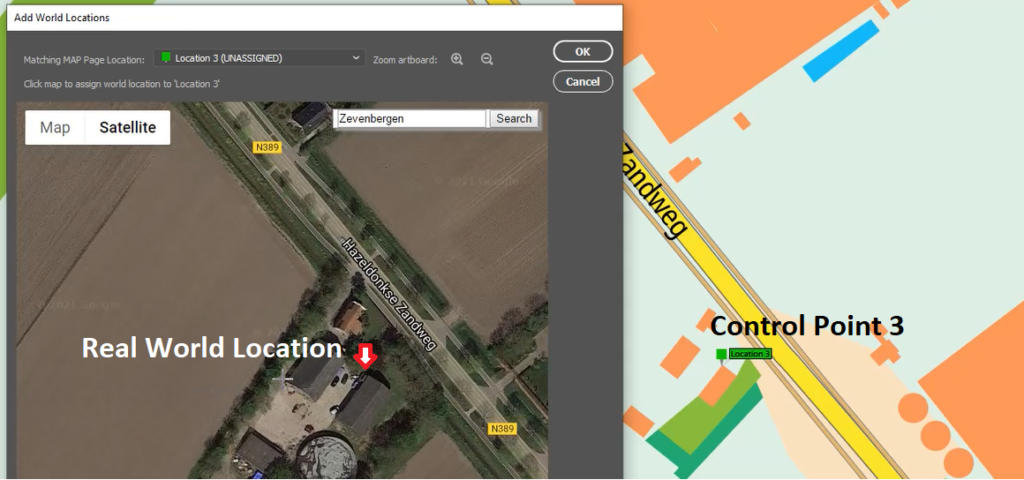
Next, open the Georeferencing tool and select the “Add World Locations” option. From here, use the built-in web map to calculate latitude/longitude coordinates for each of your known control points. Using the satellite imagery view can make this process easier, especially when dealing with physical features on the map (i.e building corners). Repeat this for each of the four control points.
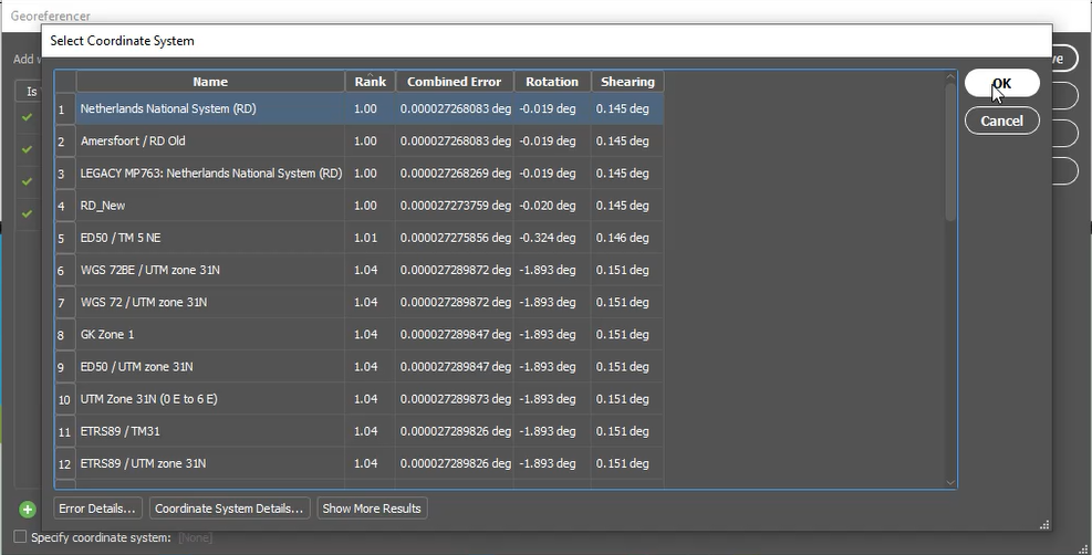
The resulting table will show a list of set coordinates for each of these control points. From here, if you already know the projection the map data is already in, you may set this coordinate system at this stage. If you are unsure, the georeferencer tool will automatically provide a suggested list of coordinate systems that match the control points you have set. These “best” matches are provided based on measuring the error between your user set coordinates and the real-world locations on the web map. Ideally, you want the lowest combined error value. In general, the suggested coordinate systems at the top of the list are often the best choice.
Once you select the desired coordinate system, the tool will automatically create a new MAP View where you can house your newly georeferenced map data. You will notice that the MAP Page Locations you created earlier will be displayed alongside the newly georeference control points. This is a great way to help validate your georeferencing as you will be able to observe the accuracy (or inaccuracy) of your placed control points.
Finally, it is a good idea to use the Find Places tool to validate your georeferencing results. Try searching for identifiable landmarks or major features on your map (i.e. train stations). Simply search for a location using the Find Places tool, and compare this to the georeferenced locations on your map.
This concludes Part One of “Georeferencing Techniques with Hans van der Maarel“. Now that you have covered the basics of Georeferencing in MAPublisher, tune in for part two in the next edition of Mapping Class. There you will see how Hans tackles more complex georeferencing projects, including what to do when you have small-scale maps that come from scanned or printed images, or where projection or referencing information is unavailable. Hans will be using a beautiful historical map of northwest Africa to demonstrate this problem. Look for it in the Avenza Resources Blog next month.
***
About the Author
Hans van der Maarel is the owner of Red Geographics, located in Zevenbergen, Netherlands. Red Geographics is a long-time partner of Avenza and Hans is a well-known power user of both MAPublisher and Geographic Imager. He uses the products for a wide range of cartographic projects for several international organizations and offers training courses and consultancy expertise aimed at developing workflows for clients. In addition to that, he is currently a board member of NACIS. To find out more about Red Geographics, and to see more work by Hans, visit redgeographics.com
Steve Spindler has cultivated a passion for cartography that has continued for more than 25 years. He operates Steve Spindler Cartography, which develops custom-designed cartographic pieces that can be seen in map products utilized by governments, city planning organizations, and nonprofits from across the country. He also manages wikimapping.com, a public engagement tool that allows city planners to connect and receive input from their community using digital maps. A passionate cartographer at heart, Steve considers map-making both a hobby and career. He strives to share his ideas, techniques, and truly captivating cartographic style with others, either through his previous teaching at Temple University or through his tutorials hosted on his personal website cartographyclass.com
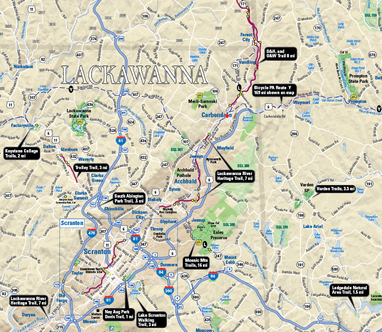
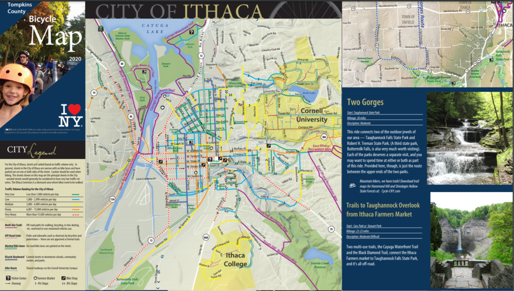
Steve first began designing maps in the early 1990’s while at Temple University for graduate school. Pursuing a Master’s degree in Urban Studies, Steve found that the cartography lab at Temple was his favourite place to be. Before the widespread accessibility of digital maps, Steve recalls spending time at the Philadelphia Library, exploring map catalogues and manually tracing topographic maps before faxing them to his own computer. Later into his graduate studies, Steve joined a mailing list for digital cartography enthusiasts, and this is where he first learned about Avenza and MAPublisher for Adobe Illustrator. He quickly adopted the software into his map-making process, leveraging its suite of cartography tools to easily create maps within a design-focused environment. He continues to use MAPublisher for much of his work, and some examples, such as the Northeastern Pennsylvania trail system map shown below, are even available digitally on the Avenza Map Store for use in the Avenza Maps app.
After graduating, Steve combined his passion for cycling with his love of map-making. He started designing maps that promoted bicycle transportation. His list of clients grew, and so too did his reputation in the cartography community. Soon his maps were published and shared over a wide range of platforms across the country.
“It was nice to see my maps posted in public places – in office cubicles, in a Congressional office, being waved around by a US Secretary of Transportation, in a Mac OS X keynote, in the subway, on TV shows, in newspapers – I was using MAPublisher to help create them all.”
After several years of high-paced freelance cartography work, Steve chose to revise his business approach to allow him to be more selective in how he engaged with potential projects. “I created an archetype that I wanted to serve, and put energy into solutions that would help this archetype”. Steve mentioned how he prefers to let a client place a value on what they want, first spending time with the client to conceptualize a problem and then delivering a proposed solution, only sending an invoice once it is appropriate. In his words, this requires a knowledgeable client that really understands what they need.
Some years later, he returned to Temple University, this time as an instructor. He taught cartography to students within Temple’s Professional Masters of GIS program and stressed the importance of creating a balance between teaching concepts and teaching software.
“Cartography is really about communicating with an audience, it’s not just about specific software. I think that teaching cartography using a single program (Illustrator with MAPublisher) would allow me to focus more on design concepts and communication. MAPublisher can still access large data sets, and the data is ultimately contained within the Illustrator file.”
His passion for teaching has continued beyond the classroom as well. In the last year, he has taken up a mentorship role for an up-and-coming cartographer. He provides direction and feedback on real-world map projects in what he describes as “learning with purpose”.
Steve also believes it is important to take learning into one’s own hands. To help him evaluate and improve his mapping processes, he often records his work sessions, carefully documenting and annotating many hours of recorded work such that he can revisit and recall specific mapping steps later on. Many of these sessions are edited down into videos that Steve posts on cartographyclass.com, a personal website for sharing his thoughts, ideas, and techniques on creating maps. He regularly shares maps that he creates for fun in his spare time, drawing inspiration from nature, photography, and artwork to create elegant visually engaging map pieces that exemplify the balance of art and science that is cartography. His recent work has explored the use of graphic styles and MAP Themes to create artistic map pieces that mimic the effect of watercolour paintings. Other posts show his use of the elevation profile tool to create unique maps of recent cycling trips.
In addition to the many MAPublisher focused tutorials hosted on his personal website, Steve is also an active contributor to the Mapping Class tutorial video series hosted on the Avenza Resource Blog. His contributions demonstrate unique and innovative workflows that leverage a wide range of MAPublisher tools.
These days Steve continues to take on map-related projects. His approach has allowed him to develop a career that leverages a personal passion and directs it into a successful business. He continues to learn and explore new techniques in cartography in his free time, sharing his thoughts and processes with readers of his blog. After more than 25 years of freelance cartography work, Steve feels his perspective on mapping and business has changed, “Cartography and business are not the same things for me. I want to make maps and don’t need a contract to do this. It’s just a matter of practicing daily. When the right client comes along, I can help out. I like to be helpful.”
We are back with another exciting addition to our Mapping Class tutorial series. The Mapping Class tutorial series curates demonstrations and workflows created by cartographers and Avenza software users. For this article, we are welcoming back Steve Spindler, a longtime MAPublisher user, and expert cartographer. He has shared with us an excellent tutorial on creating a map from scratch using openly available geographic data from OpenStreetMap, and accessed through Overpass turbo. Steve shows how you can create query statements to filter and export the data, and demonstrates how you can import the data into MAPublisher before using a selection of cartographic styling tools to create a visually appealing map.
Steve has produced a short video walkthrough detailing his map-making process. The Avenza team has produced video notes (below) to help you follow along.
***
Importing OpenStreetMap data using Overpass Turbo by Steve Spindler (video notes by the Avenza team)
Finding and accessing good quality data is often the first challenge for any cartography project. OpenStreetMap (OSM) can be an excellent source of open vector data describing land cover features (roads, parks, rivers, buildings, trails, infrastructure, boundaries). Once collected, cartographers can use OSM data to create highly detailed maps using the MAPublisher plug-in for Adobe Illustrator. Steve will demonstrate his process of collecting raw data from OSM and using it to craft a beautiful map of the Niagara Falls Area. The following video notes summarize Steve’s approach.
First, you will need to extract some data from the OSM database. Since OSM is a massive repository of geographic data, you’ll need a way to filter through and extract only the data needed for your specific map project. Overpass turbo is a web-based data mining tool that can make querying and exporting OpenStreetMap datasets easy. The tool allows users to apply query statements that filter the OSM database based on attribute and location information. Using the Overpass turbo “Wizard”, a user can enter simple queries (i.e. “water”) and automatically filter and select all features that match the query statement, making it easy to export specific data for your map.
Steve uses a simple query to obtain all map features that are considered “water”. This includes both natural and man-made features
The tool allows the user to export the filtered datasets into geoJSON format, an open standard format for storing and representing geographic data and attributes.
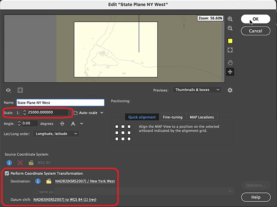
The geoJSON datasets collected from Overpass turbo can then be imported directly into MAPublisher for styling into a finished map. Use the Import tool to load the data onto an Adobe Illustrator artboard. From here, you can open the MAP View editor to adjust the scale and projection information for each map data layer. For this map, reproject the data into State Plane NAD 83 to preserve an accurate spatial scale. Set the scale option to 25,000 and customize the position of the map data on the artboard.
If needed, use the Vector Crop tool to trim the map data down to a specific area of interest, and simplify the layer to create smoother lines by removing excess vertices.
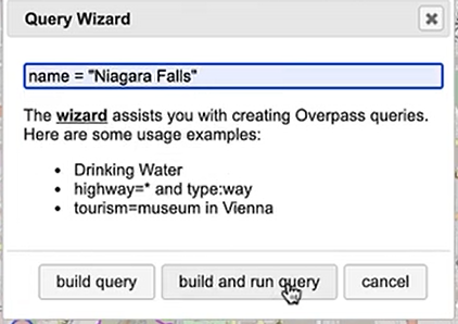
Back in Overpass turbo, you can build more specific query statements to extract individual features from larger data categories. Use the statement: name = “Niagara Falls”, to select polygon features specific to the waterfalls in that area.
Import this new data into MAPublisher, and drag and drop it into the same MAP View as the water layer. The data will be automatically scaled and projected to align with the water layer. Apply a graphic style fill for the water bodies and waterfall area.
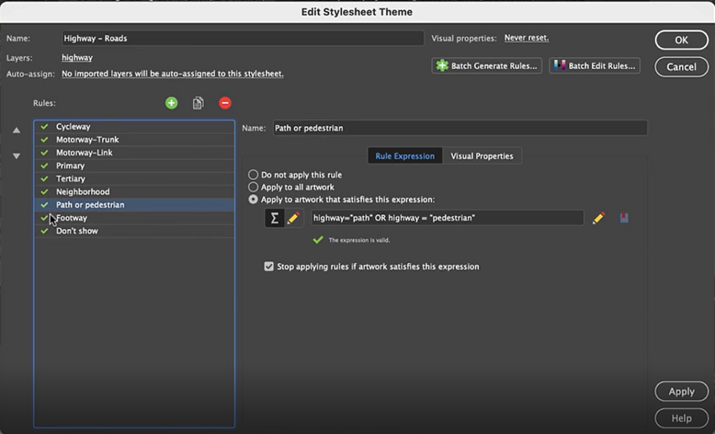
Next, we can go back to Overpass Turbo and extract road and highway data. You can build out more complex query statements using basic database operators (i.e. and/or). For longer, complex query statements it helps to create saved queries that you can re-use. This map uses a saved query statement called “selected roads with residential” to extract line features covering most road types:
(highway=primary or highway=secondary or highway=cycleway or highway=path or
 highway=motorway or highway=trunk or highway=tertiary or
 highway=neighborhood or highway=footway or highway=service)
Import the roads data into the same MAP View as the other datasets. If you look at the MAP attributes you can see the road data is split into several different types. Steve use’s MAP Themes to create rules-based stylesheets to visualize the different road lines based on their road-type attributes. Steve designed a rule-set that made minor roads more subtle in appearance, while major roads and highways became more prominent. He also used colour to distinguish between pedestrian and vehicle network links.
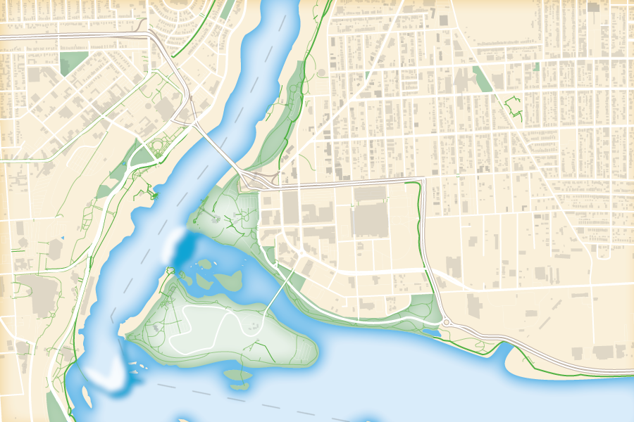
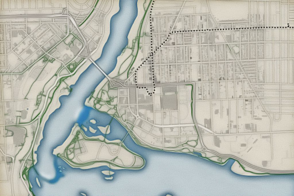
Repeat this process with a building footprint layer and crop all layers in the final map to the artboard extent. The finished product is shown below (top). Some final touch-ups in photo editing software can be used to create a more stylized appearance (bottom).
Exported map from Illustrator
Stylized version modified with Photo editing software
***
About the Author
Steve Spindler has been designing compelling cartographic pieces for over 20 years. His company, Steve Spindler Cartography, has developed map products for governments, city planning organizations, and non-profits from across the country. He also manages wikimapping.com, a public engagement tool that allows city planners to connect and receive input from their community using maps. To learn more about Steve Spindler’s spectacular cartography work, visit his personal website. To view Steve’s other mapping demonstrations, visit cartographyclass.com