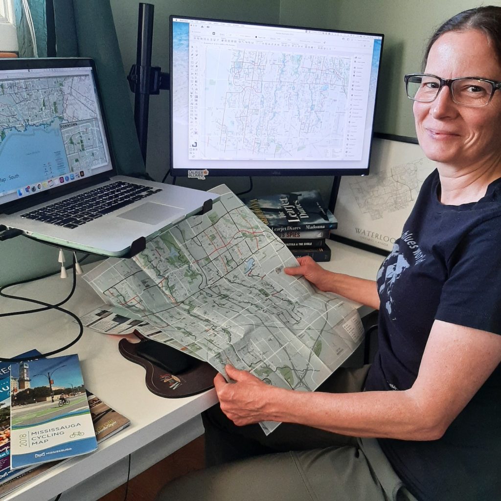
Julie Witmer’s road to cartography has not always taken the most conventional route, but in the past decade she’s already made her mark on the industry. As the owner of Julie Witmer Custom Map Design based in Kitchener, Ontario, Julie creates maps for a variety of client types, including municipalities, publications, and tourism. She applies her skills both in cartography and her previous fields of expertise to approach map-making in a way that encourages people to explore and connect with their communities. In this edition of Cartographer Chronicles we explore Julie’s story largely in her own words, including her journey to discovering a career in cartography, her experience with crafting maps so far, and how she envisions her business moving forward.
Cartography became Julie’s third career path after a decade as an archaeologist and nearly 15 years in IT.
“I’ve always loved maps – collecting them during my travels – but it never occurred to me that it was something you could do for a living. After I was laid off from BlackBerry in 2011, I decided to go back to school. And when I saw that Fleming College offered a GIS Cartography program, it was like a light turned on.”
After graduating from Fleming’s Cartographic Specialist program, Julie worked to build her cartography career the way she envisioned it.
“At Fleming when we talked about the kind of work we wanted to do, I kept saying ‘I just want to make pretty maps.’ I knew that I didn’t want to work in a cubicle farm or for a large company again, but I did work for almost a year for an archaeology company in London, Ontario, making a dozen maps a day for reports. It was hectic but I loved that it combined my interests.”
“I still wanted to work for myself and decided to be a freelancer. It was tough going for the first few years, but in the past 2-3 years (with a temporary slowdown for the first wave of the pandemic), my business has grown to what I envisioned.”
Julie has designed maps for a plethora of local and international clients spanning many different types of organizations, and she tailors her approach to fit each of them uniquely.
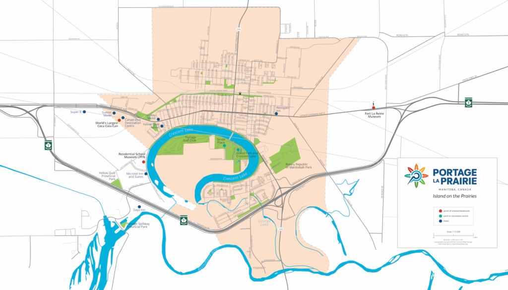
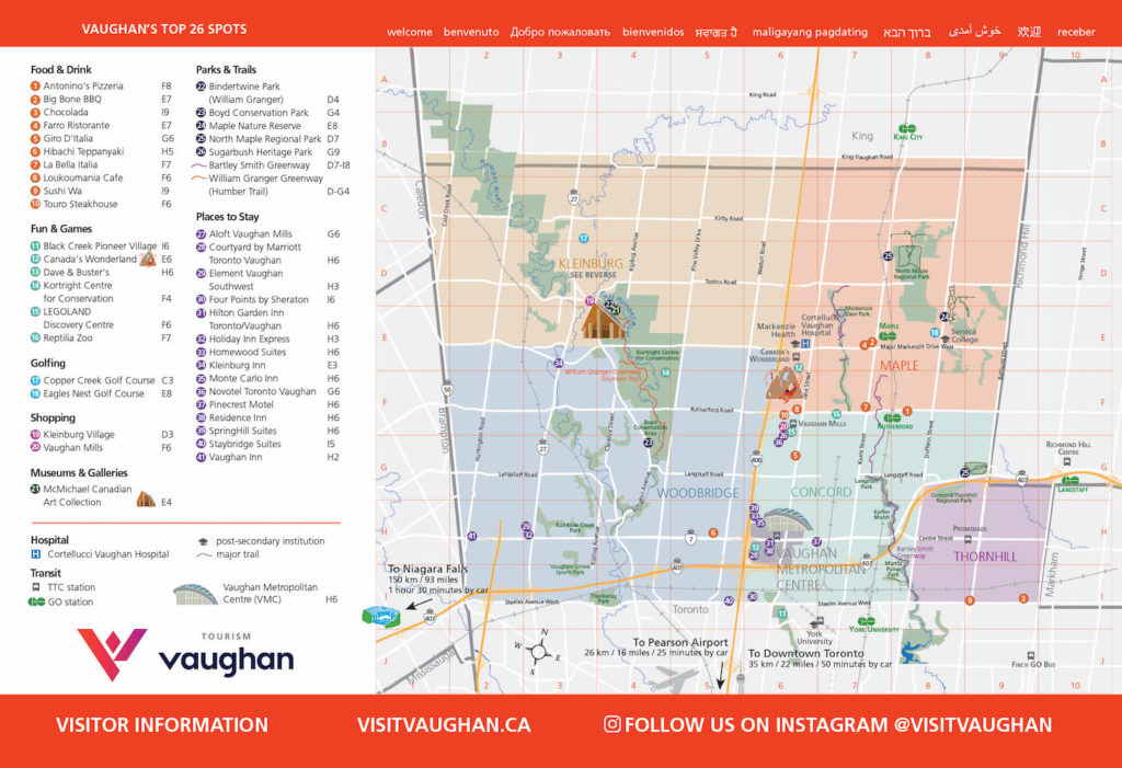
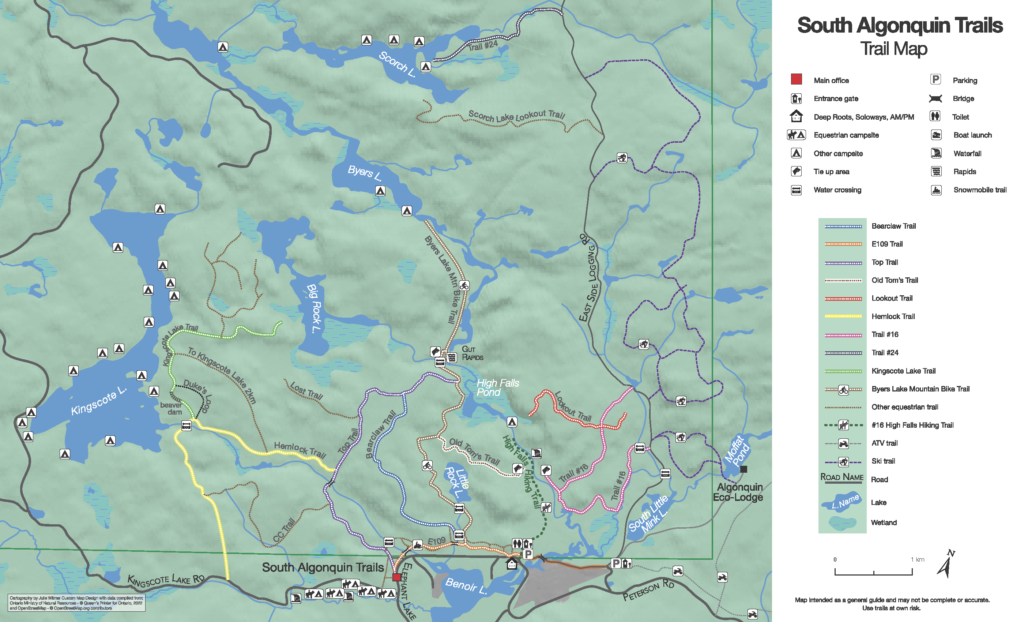
“Over the years I’ve worked on cycling maps for municipalities, tourism and trail maps for visitor guides and tourism-focused businesses, maps for non-profit organizations for planning and education, and a LOT of book maps.”
“When people contact me about making a custom map, I’ll arrange a project consultation to get more information about their project – content, style, size, media, timeline, the purpose of the map and its intended audience.”
Many of Julie’s clients, especially municipalities, often come to her with their own datasets for her to use. If not, she’s a fan of Natural Earth or OpenStreetMap data.
“For [OSM data] I use QGIS and the QuickOSM plugin to download data for the coverage area. For everything else (Natural Earth, WFS or WMS services), I’ll grab the data in MAPublisher and spatially filter it to my map view.”
“I create a very simple layout map to establish the coverage area and scale, and then work on the first design draft. Sometimes we have a few revisions with minor style or content tweaks. When my client has approved the final draft, I send them the print-ready image files.”
Julie is an avid and experienced MAPublisher user, as it plays a role in all of her projects. Her history with the program goes back to her time at Fleming.
“I first used MAPublisher at Fleming and I loved it! The archaeology company was an ESRI shop, but when I started my own business I went back to MAPublisher. I love that it’s a local company (well, almost local to me – in Toronto, just down the road from Kitchener). Avenza’s support is amazing, and they are constantly adding new features and incorporating feature requests from customers like me.”
“MAPublisher is the tool that I use most often, pretty much every day. Even if I use other tools to acquire and clip vector data, or manipulate raster images, everything ends up in MAPublisher where I do all the design work.”
She has begun using Avenza Maps in her work, both for collecting and recording data and offering her maps using the Avenza Map Store.
“I recently started creating local park facilities maps and adding them to Avenza Maps. I use the app to track my route while exploring these parks, because often the municipal or OSM datasets don’t include all the trails. I’ve encouraged my clients to use Avenza Maps, too. So far I’ve added a few cycling and tourism client maps to my vendor page, which provides a great value-add for end users.”
When asked about her favourite map that she has created, Julie finds it hard to answer that question with just one map!
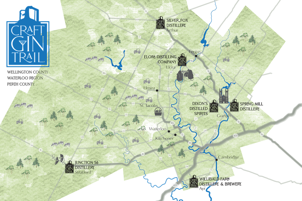
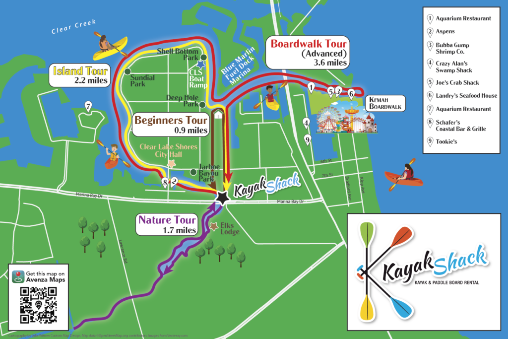
“It’s hard to pick a favourite map – it’s usually the one I’m working on. I’ve had fun creating a map of a motorcycle tour across the southwest US, a book map showing the route and shipwreck of a Dutch merchant ship, maps of the Roman Empire, a large poster map of Micronesia, a tour map for a kayak rental business, and a series of maps for a documentary film about an Indigenous nation in British Columbia. And so many others! I love when my clients give me free rein to come up with a design. But on the other hand, if my clients have a clear picture in their head, it’s very rewarding to bring that picture to life.”
Julie was kind enough to share with us some of the map projects we can expect to see from her in the near future, and other tasks she’s engaged in to streamline her map design process.
“Last year I worked on dozens of maps for an atlas of American history (coming soon), as well as quite a few projects for books, cycling and tourism maps, and more. Right now I’m working on a map of the eastern seaboard Fall Line; a map of the Gibraltar Nature Reserve for their website and brochure; city maps for Sharon, Pennsylvania; and several book map projects – military histories, historical fiction, maps of the Mediterranean and England, and the US midwest.”
“I’m [also] currently learning how to add FME to my workflow to help streamline some parts of the map creation process, and would like to play more with terrain imagery in Natural Scene Designer.”
Finally, Julie finished off our interview by providing advice for anyone wishing to pursue a career in freelance cartography like her.
“If you want to start your own cartography business, I would first recommend starting it part-time as a side hustle and building a portfolio and learning about marketing and everything else that goes with running your own business. I did it the hard way and there were many times that I thought about getting a salaried job, but I love what I do and I definitely didn’t want to end up back in a cubicle! For many years it felt like I had to keep my foot on the gas, working insane hours, but it’s finally paying off. It’s still harder than working for someone else, in some respects, but the rewards are worth it. I love being able to provide my clients with custom maps that show what’s important to them. And my boss lets me take more than 2 weeks of vacation!”
Learn about more about Julie by visiting her website!
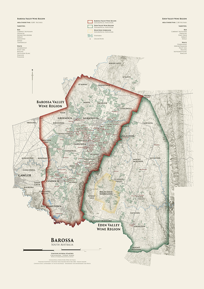
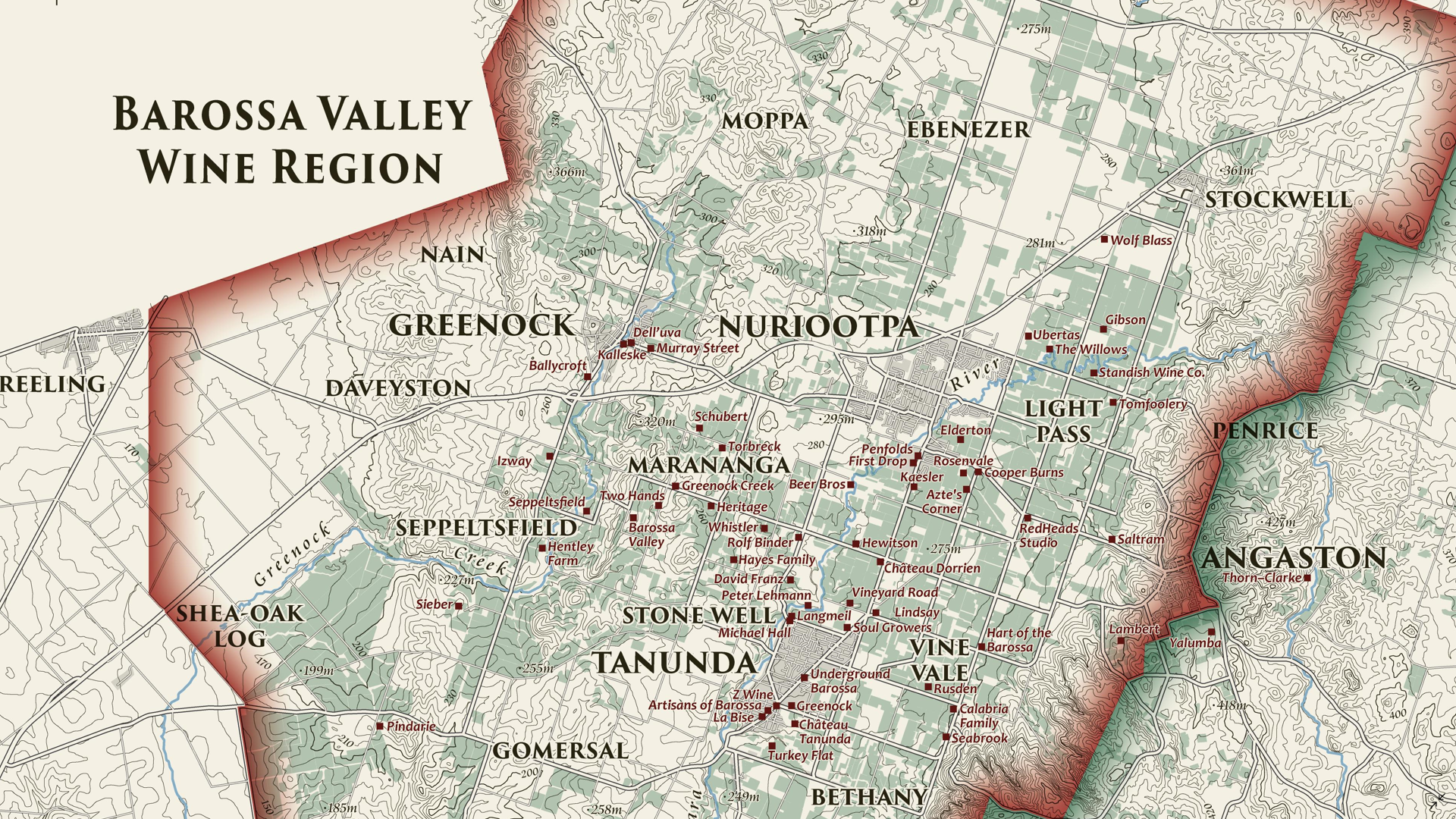
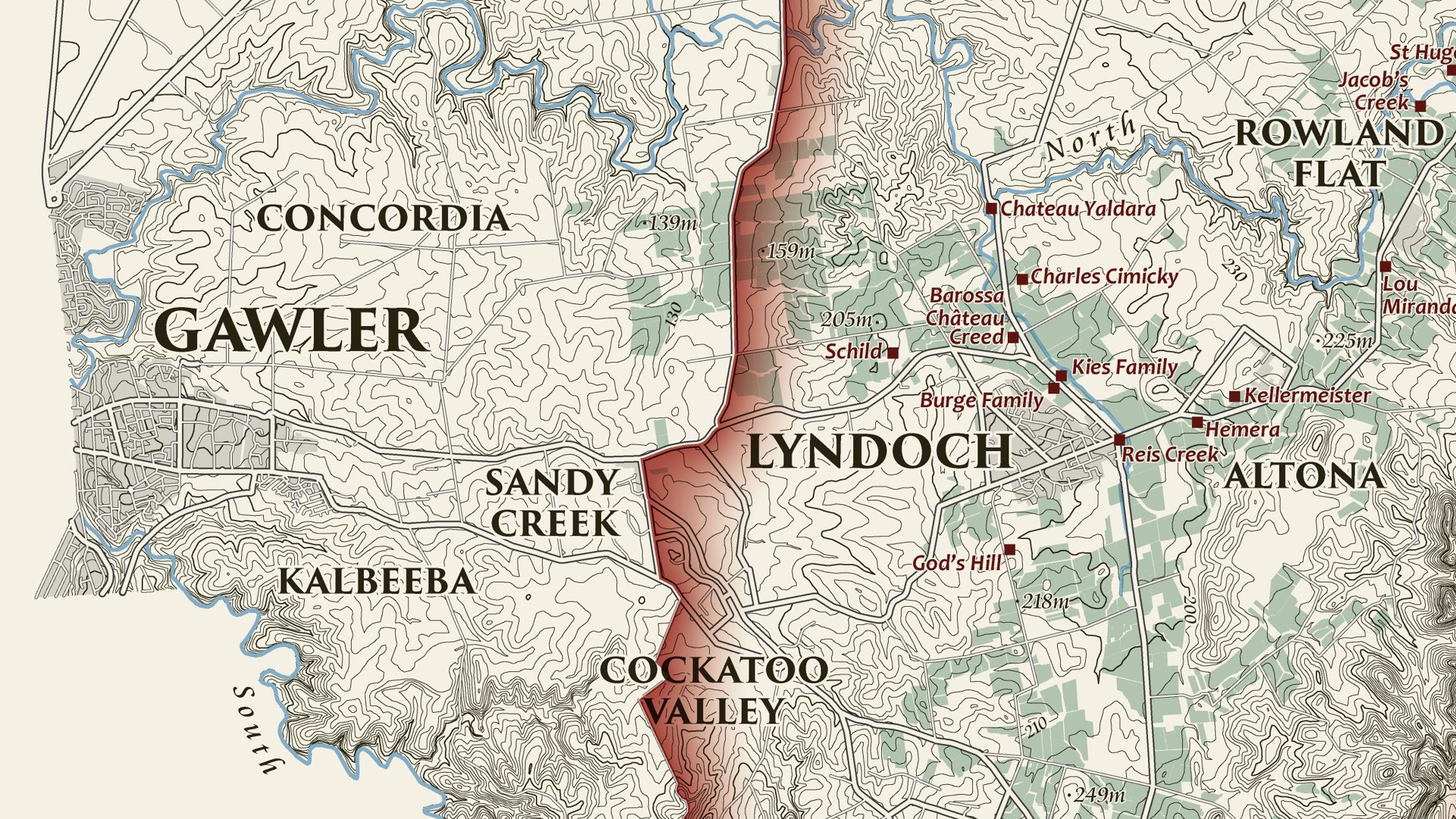
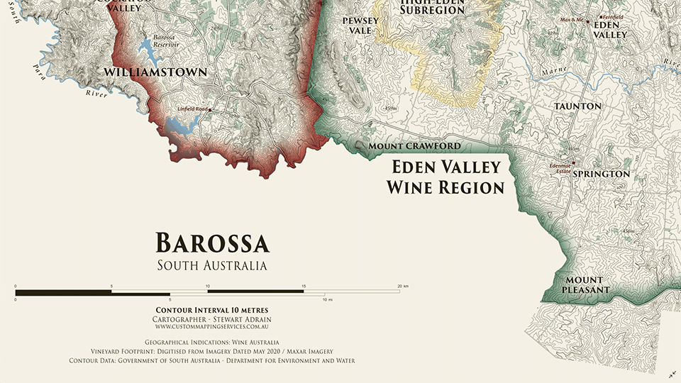
We are showcasing another great submission from the 2021 Avenza Map Competition. This heritage-style decorative map of the Barossa Region of South Australia was created by Stewart Adrain of Custom Mapping Services. The map shows the wine regions, vineyards, cellar doors, and topography of the area. It is the final map in a series of heritage-style cellar wall maps Adrain has created of the wine-growing regions of South Australia. The Barossa Valley wine region is particularly notable for its Shiraz variety.
Adrain’s map uses 10-meter contours to display the topography of the Barossa region. Regional wineries are named and indicated on the map, with their locations shown by a point representing their cellar doors. The various localities of the Barossa region are also labelled, and the two main wine regions as well as the High Eden Subregion are displayed using colourful borders. The supplemental text of the map features the total area of vineyards in each wine region, as well as the wine varieties they produce. This map as well as the others in Adrain’s Cellar Wall map series can be purchased for print from Meridian Maps.
Select the images below to see a detailed look at Stewart’s map
Making the Map
Adrain completed his data processing with QGIS and then used the Avenza MAPublisher plugin for Adobe Illustrator as a finishing tool to design the final map product. He used the Multiple Data Import tool to easily get all of his data into MAPublisher with a single import process. MAPublisher maintains the georeferencing of the data imported from other GIS software, so he could quickly turn his focus to the map’s stylization rather than data placement. Adrain used MAP Themes to easily achieve his stylization, which allowed him to automate much of the design process of the map, keeping the theme of this map in line with the other maps in the series.
Adrain simplified his labelling process by using our MAPublisher LabelPro add-on. This allowed him to create label themes based on the layer they were being applied to. Since this map was the last in the series, these themes were already created so he could simply import his settings from his previous maps to save time. The LabelPro feature is convenient for both time-saving purposes and ensuring consistency across maps in a series.
Finally, Adrain added a scale bar using MAPublisher and completed the finishing touches to his map with native Adobe Illustrator tools.
For more information on using the MAPublisher LabelPro add-on, please visit our Support Centre section for this tool.Check out our other Map Gallery Spotlight blogs here!
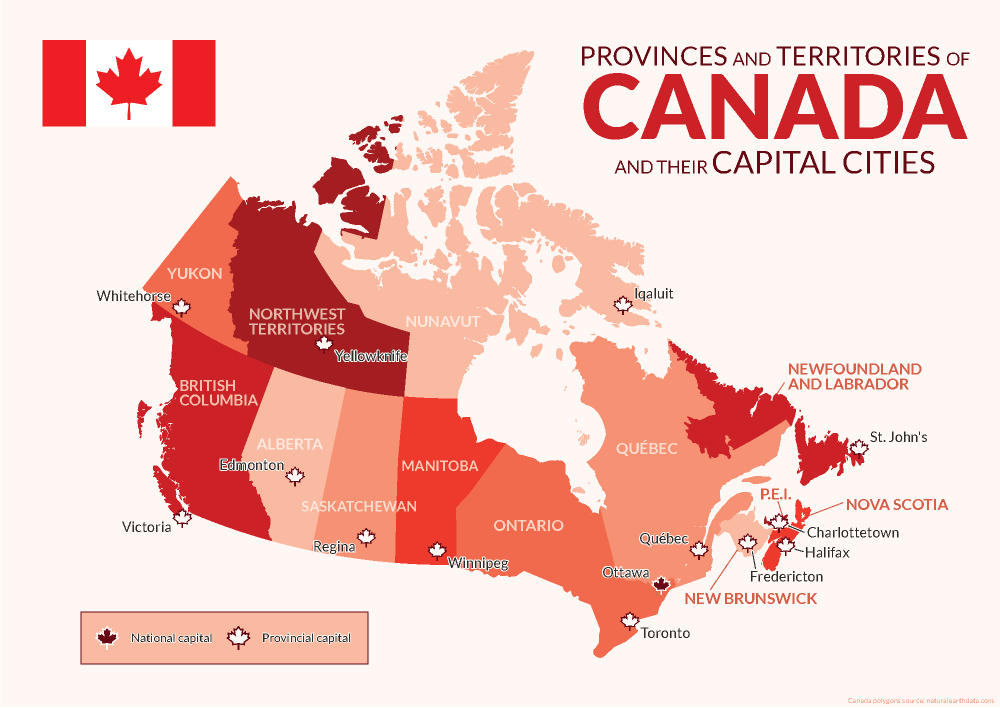
Avenza was founded and headquartered in Toronto, and as such, we pride ourselves on being a Canadian company with a global reach. This year we have celebrated by creating a map highlighting the names and capital cities of each province and territory of Canada using MAPublisher.
Using the MAP Point Plotter Tool to Plot Canadian Capital Cities
This blog will detail how we quickly and easily plotted points to represent the capital cities of Canada and its provinces and territories using the MAP Point Plotter tool. Firstly, a MAP Point layer must be created and selected before opening the MAP Point Plotter tool. This is the only layer type that can be used with this tool, for obvious reasons.
There are several different ways in which addresses and coordinates can be entered into the MAP Point Plotter tool. This blog will highlight a few of the common techniques.
Using a Point’s Address
The simplest way to plot a point is by entering its address, following a specific-to-general granularity format as seen in the examples below. After opening the tool, the Address tab was selected and the following cities were plotted using MapQuest to locate these addresses:
Victoria: 1 Centennial Square, Victoria, BC V8W 1P6
Edmonton: Edmonton, AB T5J 0R2
Regina: 2476 Victoria Ave, Regina, SK
Winnipeg: 510 Main Street, Winnipeg
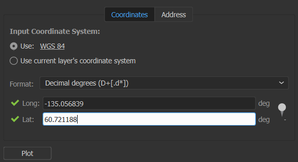
Using a Point’s Coordinates in Decimal Degrees
Another way to plot points is to use coordinates, by selecting the Coordinates tab. There are several different coordinate formats accepted by the MAP Point Plotter tool. We entered simple decimal degrees by selecting Decimal degrees as the format and using these coordinates:
Whitehorse: Long: -135.056839, Lat: 60.721188
Yellowknife: Long: -114.371788, Lat: 62.453972
Iqaluit: Long: -68.519722, Lat: 63.748611
Decimal degrees with a compass direction can be entered similarly to the previous step by using negative or positive numbers to indicate the hemisphere of the point or the compass direction can be indicated by using a letter. The follow cities were added to the map in this manner:
Toronto: 43.6532° N, 79.3832° W → Long: -79.3832, Lat: 43.6532
Québec: 46.8139° N, 71.2080° W → Long: -71.2080, Lat: 46.8139
St. John’s: 47.5615° N, 52.7126° W → Long: 52.7126W, Lat: 47.5615N
Using a Point’s Coordinates in Degrees Minutes Seconds
Coordinates that are formatted as Degrees Minutes Seconds, can be added using various delimiters, such as spaces, dashes, underscores, colons, or d (degree), single quote (minute), double quote (second). We entered the last 3 provincial capital cities using these formats:
Points can also be plotted from previously created MAP Locations (to learn about this tool, visit the MAP Locations page in our Support Centre). This is how we plotted a MAP Location for Ottawa on our map. In the MAP Point Plotter tool window, we selected the hamburger menu and selected Plot MAP Locations. Then we selected our MAP Location for Ottawa and set the Destination Layer to Existing… and added it to the Capitals MAP Point Layer. After clicking OK the point was added to our map!
Finally, we used other MAPublisher finishing tools to stylize and complete our map so it would be ready to post on this blog just in time for Canada Day!
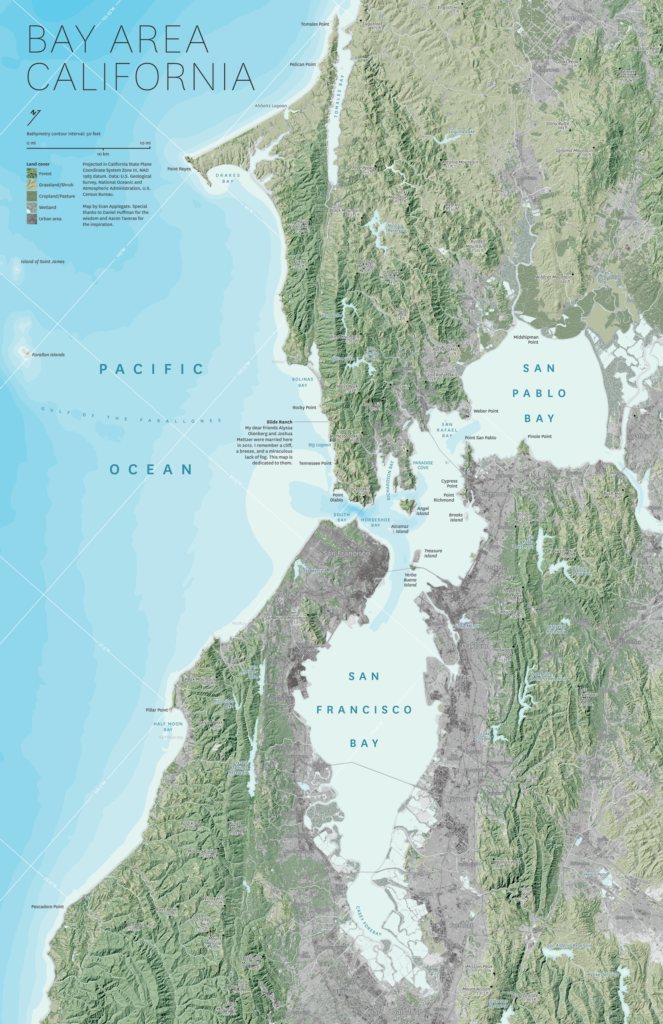
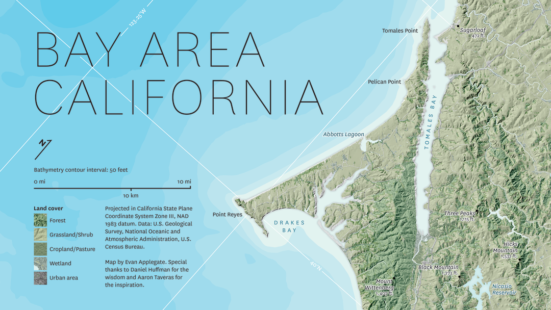
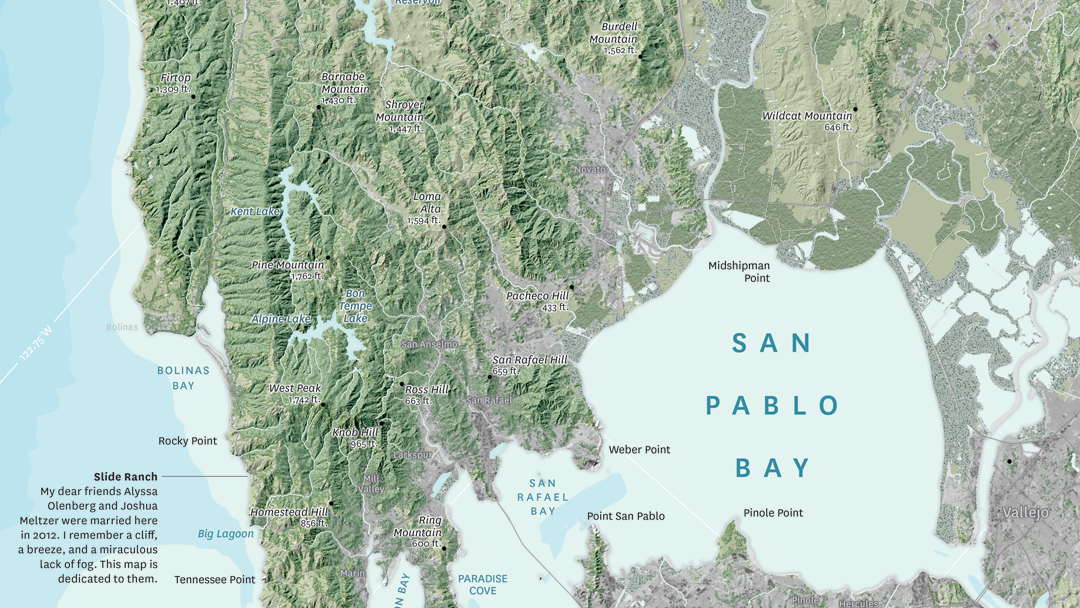
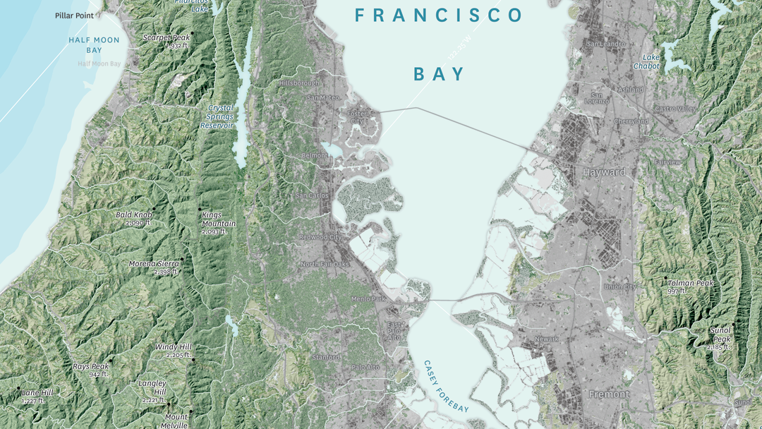
In this month’s Map Gallery Spotlight, we are showcasing an honourable mention of the 2021 Avenza Map Competition. This relief and land cover map of the San Francisco Bay Area was created by Evan Applegate of The Map Consultancy. The map shows the lakes, rivers, forests, grasslands, croplands, wetlands, and urban areas of the Bay Area. Applegate created the map as a dedication for two of his friends who were married on a beautiful cliffside north of the city. The North Bay Area is known for being the least urbanized part of the Bay Area, and housing the Napa and Sonoma wine regions.
The map highlights various natural features throughout the San Francisco Bay Area, such as elevation peaks, water features, and some landmarks. It also includes 50-meter bathymetry contours. The shaded relief details the varying elevation of the region, colour-coded to display the borders between forests, grassland, farmland, and urban land. The location of Applegate’s friends’ wedding, Slide Ranch, is identified on the map.
Select the images below to see a detailed look at Evan’s map
Making the Map
Applegate pre-processed his data in QGIS, GDAL, and Adobe Photoshop, and then used the Avenza MAPublisher plugin for Adobe Illustrator to composite it all together. This is made easy by the way MAPublisher retains the georeferencing of the data imported from other GIS software. Data that does not have any georeferencing when it is imported, can also easily be georeferenced using MAPublisher’s Georeferencer tool.
The finishing touches were also added to the map using MAPublisher. The Label Features tool was heavily used in the placement of labels, saving Applegate several hours of manual labeling. Using this tool, label settings can be applied and multiple layers of data can be labeled at once if desired. Finally, labels are added to the map under one Text layer, to ensure organization.
Stylistic elements of the map were touched up using native Adobe Illustrator tools, MAP Layout tools, and a graticule was added.
Check out our other Map Gallery Spotlight blogs here!
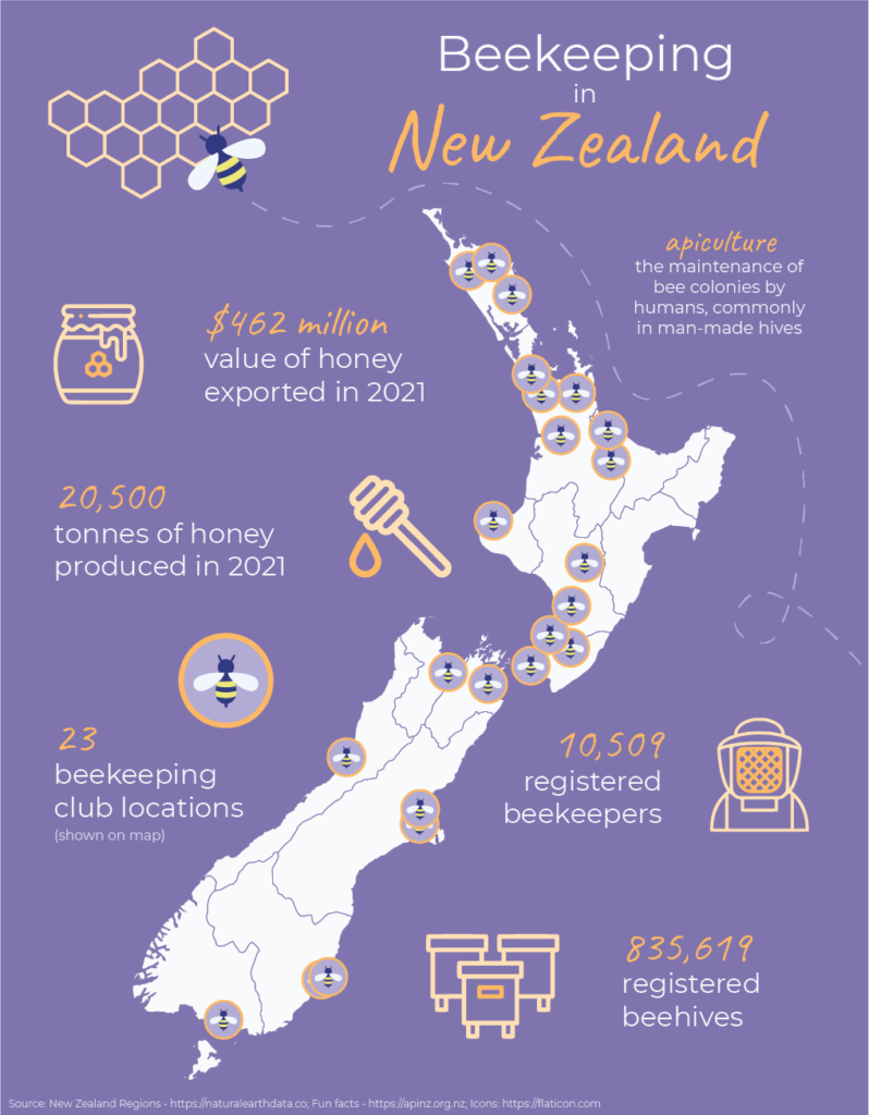
Today is May 20th, which means that it is World Bee Day! This year we will be celebrating with an infographic map detailing the prevalence of beekeeping in the nation of New Zealand. The map has been compiled and designed using the Avenza MAPublisher extension for Adobe Illustrator.
What is Beekeeping?
Beekeeping, also known as apiculture, is the maintenance of bee colonies by humans, commonly in man-made hives. Beekeeping results in the creation of many products in our lives such as beeswax, royal jelly, and many different types of honey.
Why do we celebrate World Bee Day?
World Bee Day was first celebrated in 2018, after being proposed by Slovenia to the United Nations in prior years. May 20th is the birthdate of the pioneer of beekeeping Anton Janša, who was born in Carniola in 1734, which was a region that falls within present-day Slovenia.
The purpose of World Bee Day is to celebrate the importance of bees and other pollinators to many aspects of the world’s ecosystems and economies. They are responsible for the pollination of many crops, with nearly ⅓ of every spoonful of food we eat depending upon pollinators. This makes bees a very important part of the agricultural industries, and therefore the economies of many countries.
With many pesticides and other chemicals negatively contributing to the health of the world bee populations, it is crucial to raise awareness and promote care when creating agricultural and other environmental policies and processes.
Beekeeping in New Zealand
New Zealand is one of the top 20 countries ranked by total number of beehives, with over 835,000 registered beehives. The organization Apiculture New Zealand, or ApiNZ, was created in 2016 to support, advocate for and benefit the apiculture industry of the country. Membership is voluntary and consists of about 2500 beekeepers.
New Zealand produces many different types of honey, including population variations such as mānuka honey. The story map we have created using MAPublisher locates the 23 known beekeeping clubs across New Zealand, as well as highlights some interesting facts about beekeeping in the island nation. All in all, beekeeping is an important part of the New Zealand economy and agriculture industry.
Fun Facts About Bees
Here are a couple fun facts you might not know about bees and how important it is to continue protecting them:
Did you know that nearly 90% of wild plants and 75% of leading global crops depend on pollination from bees and other pollinators? It’s true! Crops that are dependent on pollination are five times more valuable than those that are not.
If you find a bee that appears to be struggling, you can gently place it on a bee-friendly flower. If there are none around, you can provide it with energy by giving it a couple drops of a 1:1 solution of white sugar and water.
India is the country with the most registered beehives, with over 12.2 million beehives as of 2020!
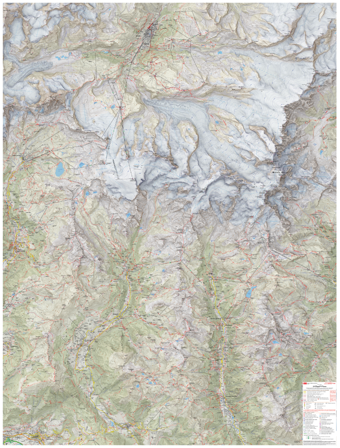
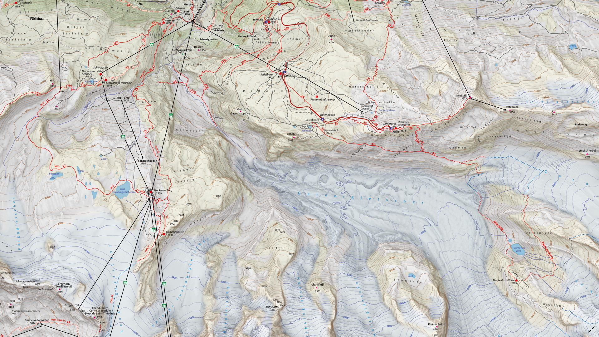
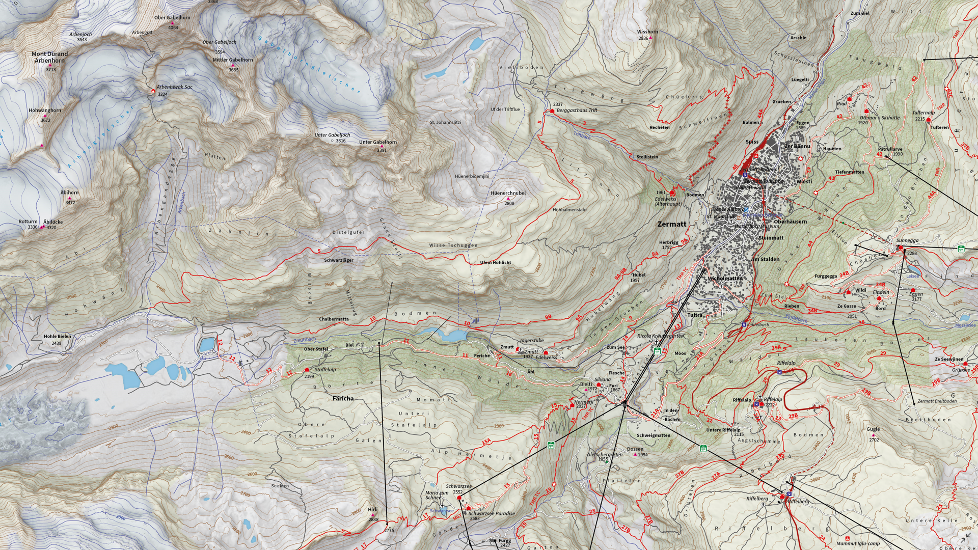
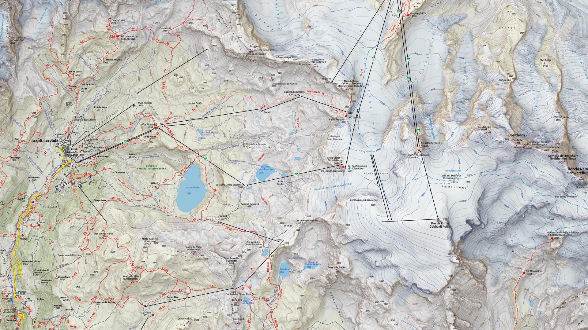
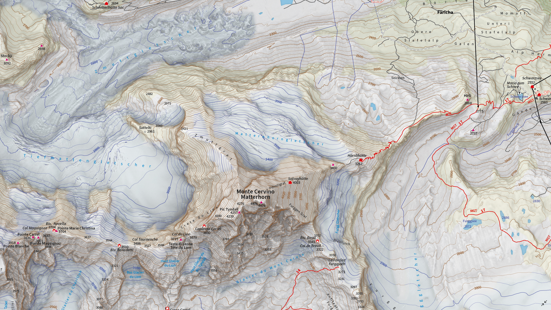
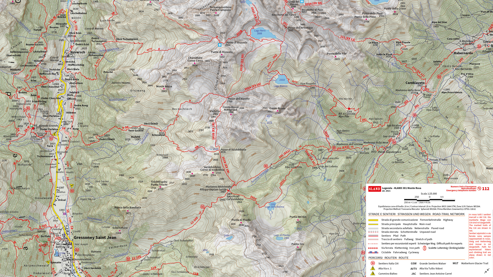
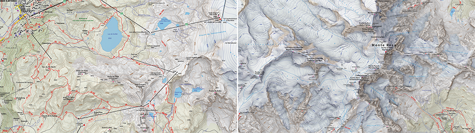
We are showcasing the Runner-Up of the 2021 Avenza Map Competition. This impressive topographic reference map of the Monte Rosa area was a collaborative effort between Remo Nardini, Founder and Chief Technical Officer, and the whole 4LAND team. The map is centered on two of the most renowned mountains of the Alps: Monte Rosa and Monte Cervino (commonly referred to as the Matterhorn). The map encompasses a massive and diverse area. From the glaciers and valleys crossed by the Alta Via n.1 highway in the Aosta valley to the panoramic snow-capped peaks that the Alps are known for. The high valleys of the Monte Rosa area emanate a particular charm, with its woods and pastures making it stand out among other areas in the Aosta Valley.
Remo and his team manually collected trail information and point-of-interest data directly in the field with the Avenza Maps App and combined this with carefully crafted shaded relief techniques to bring the mountainous terrain of this rugged area to life. The map itself is designed for print at 1:25000 scale and is meant to offer a high-quality, waterproof, and tearproof map for use on the trails. The map provides an abundance of useful information for hiking, camping, mountain biking, and a host of other summer and winter outdoor activities. Smart label placement means this map is not only impressive to look at but highly functional when out on the trails.
Select the images below to see a detailed look at 4LAND’s map
Making the Map
The 4LAND team is known for ground-truthing and manually collecting the data that goes into their map products. Trails, placemarks, and other important data were collected directly on the ground using the Avenza Maps App. Supplementing this with pre-existing and custom-developed cartographic datasets meant the map could provide a substantial amount of valuable information to its users.
Using the Geographic Imager Plugin for Adobe Photoshop, the team could elaborate on a custom elevation product to create the enhanced shaded relief basemap that gives the map its gorgeous look. They then crafted the details of the map in Illustrator using MAPublisher. After importing all map datasets, the team used MAP views to align, scale, and project map data layers onto an Illustrator artboard. The team made use of the Vector Crop and MAP Selection tools to filter and process the data down to their specific area of interest.
The 4LAND team applied a custom stylesheet using MAP Themes to create the beautiful textures and colours that make each part of the map stand out. MAP Themes applies rule-based styles that are based on MAP Attribute data contained in each map data layer. This careful work ensures each region is distinct and eye-catching. Every glacier crevasse and serac is carefully shaded to create depth, and woodlands are textured to reflect the irregular patterns of foliage.
One of the most impressive features of this map is the wonderfully detailed labels. This was achieved using the LabelPro add-on, and enabled Remo and his team to perform rules-based, collision-free label placement using a comprehensive suite of user-defined labelling parameters. With LabelPro, they could specify how each label should be stylized (to give each label type a unique look and feel) and also define how the labeling engine would handle label placement to avoid overlap, crowding, or mislabelling.
Lastly, stylistic elements of the map were touched up using native Illustrator tools, MAP Layout tools, and grids and graticules. The map itself is available in digital form for use with the Avenza Maps app. Visit the Avenza Map Store to see other fantastic maps by 4LAND or check out their website to learn more about their other high-quality mapping products.
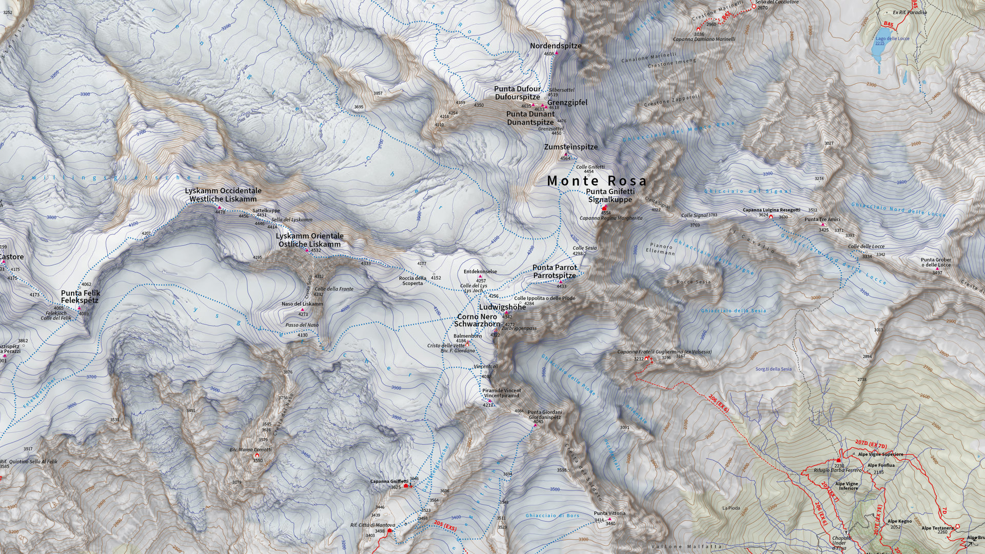
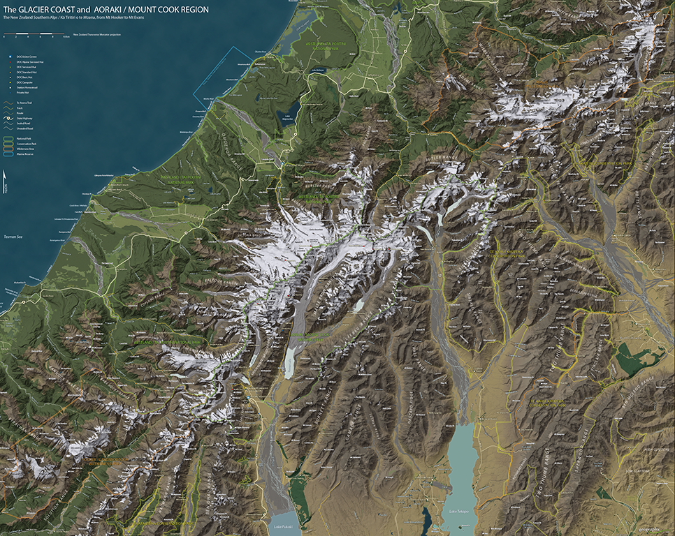
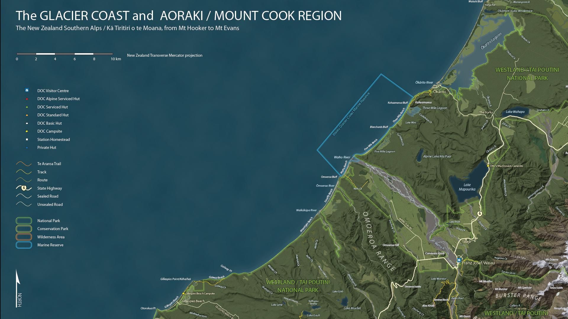
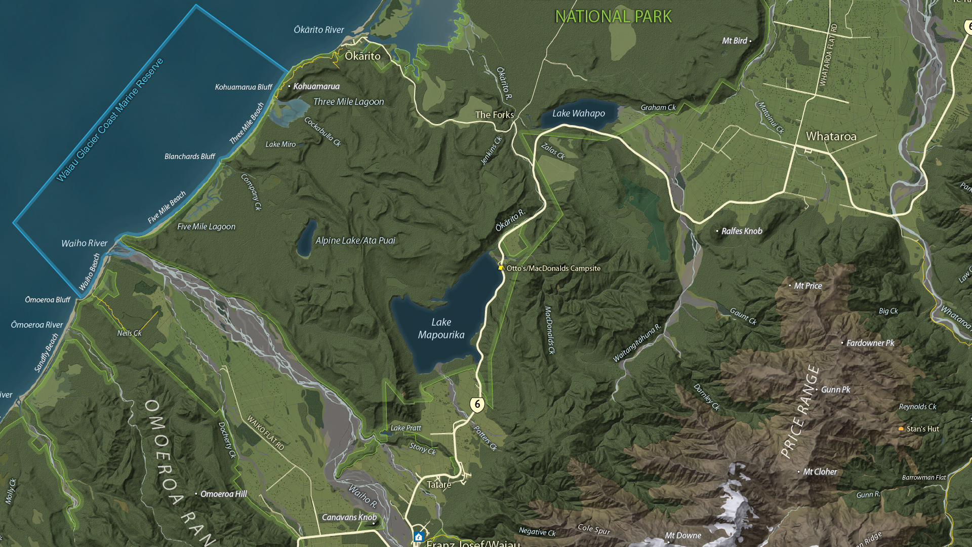
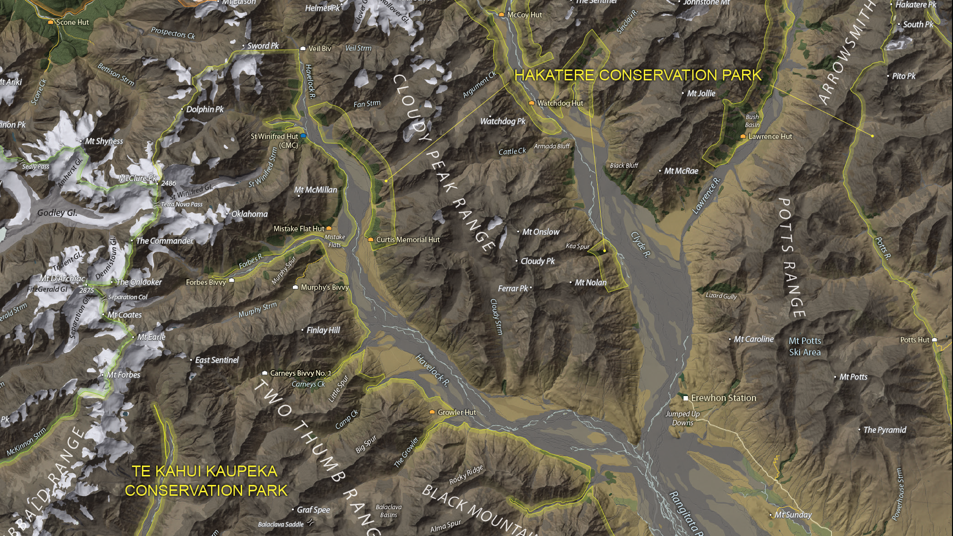
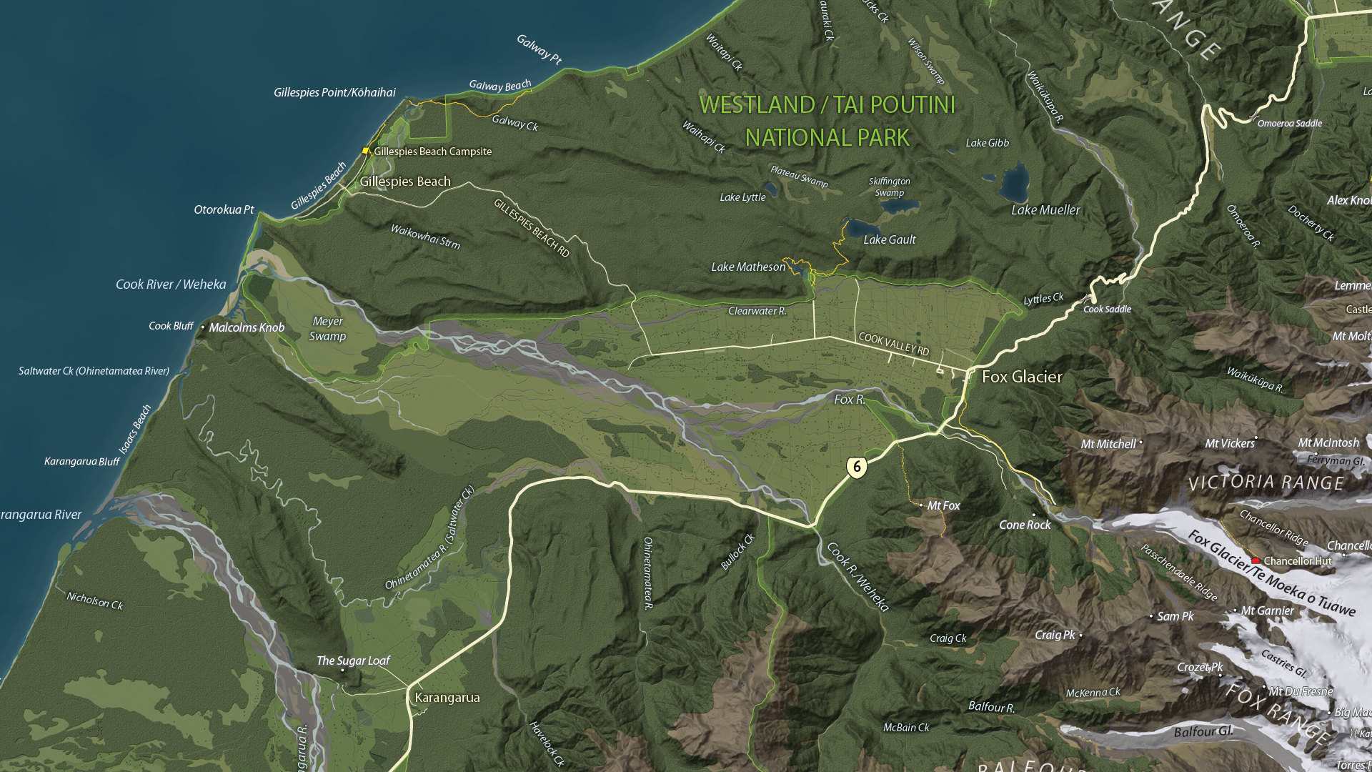
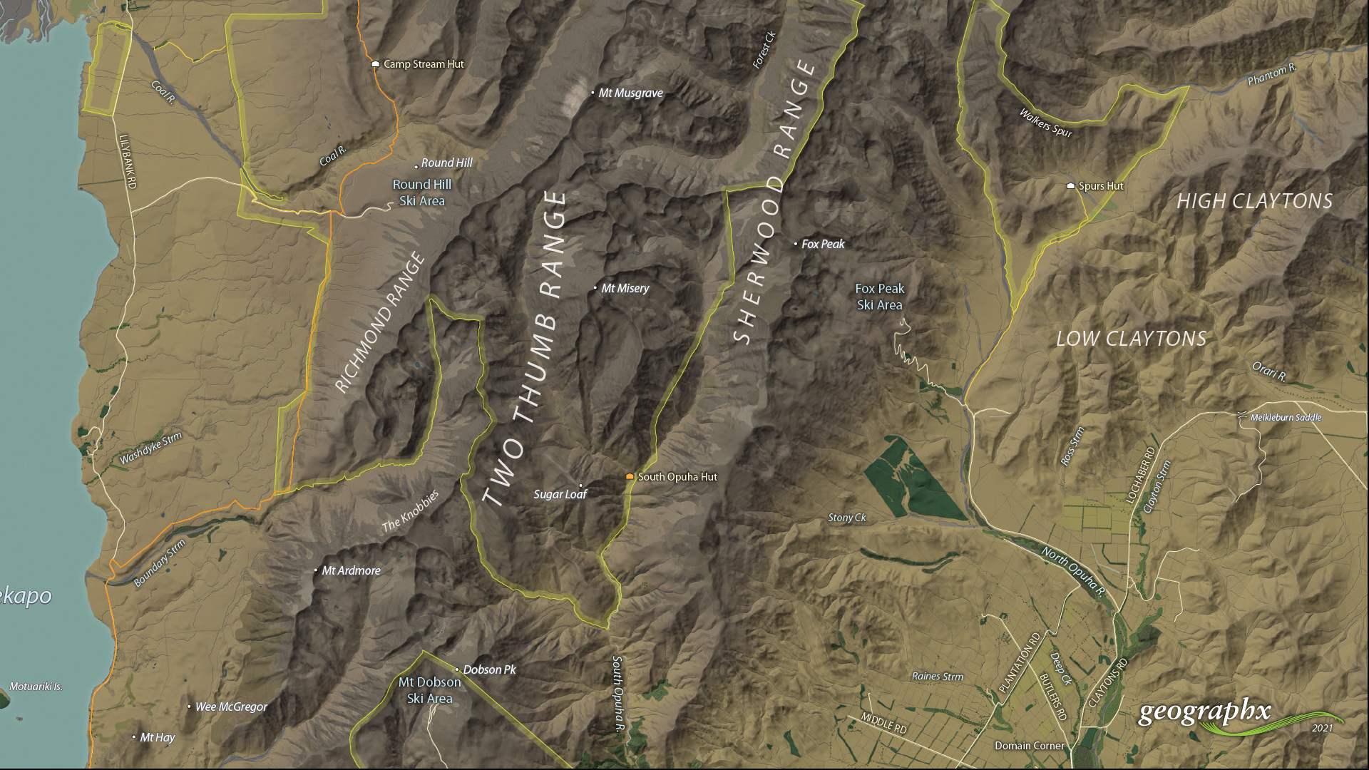
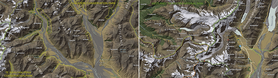
We are showcasing the Open-category winner of the 2021 Avenza Map Competition. This fantastic entry was created by Roger Smith, expert cartographer and owner of Geographx in Wellington, New Zealand. Roger’s grand-prize winning entry is a truly remarkable display of map craftsmanship. The map provides a detailed look at the topography and trail coverage surrounding one of New Zealand’s most beautiful wilderness areas. His expert usage of natural colour basemaps and shaded relief creates a truly stunning result.
This topographic map focuses on the area covered by Westland Tai Poutini National Park, Aoraki/Mount Cook National Park, and the adjacent conservation parks and designated wilderness areas. It presents park boundaries, back-country walking trails, and the many camping shelters that are scattered throughout the area. The map itself is designed for print as a wall map and utilizes a natural colour basemap to create an eye-catching visual guide for the region.
The map can be used to familiarize park visitors with the area and assist recreational visitors with trip-planning in the rugged back-country trails of the area. The natural colour basemap is designed to maximize viewer understanding and appreciation of the physical environment while providing a pleasing backdrop that highlights important points, trails and places on the map.
Select the images below to see a detailed look at Roger’s map
Making the Map
The cartographic design elements and vector art creation utilized a wide range of tools in MAPublisher. Some of the vector data that went into the map were obtained through the New Zealand Department of Conservation, and the Land Information Department, while others were custom-crafted by Roger and his team at Geographx. Notably, the Geographx team custom-built the natural colour basemap and DEM-derived hillshade that gives the map its unique look and feel.
MAPublisher allowed Roger to import his data layers into an Adobe Illustrator environment that was conducive to flexible cartographic design work. Using the MAP Views panel, he could easily adjust and modify the projection and scaling of his map. Where necessary, Roger leveraged the many MAPublisher Geoprocessing and Data Editing tools to manipulate or simplify vector art layers for better representation on the final map.
As MAPublisher maintains spatial referencing for each data layer, he could place and register his custom natural colour, and raster hillshade layers to create his basemap. Fine-tuning would ensure his vector layers (including roads, campsites, trails, and place markers) would all be accurately placed and aligned with their real-world locations.
Roger created unique labels for the hundreds of different placemarks and trail lines on the maps. Using MAP Attribute data that are retained for each data layer, Roger used the Label Features tool to efficiently create and place labels for each layer. With Label Features, Roger could define custom rules that ensure each label stands apart from the other. For important place markers and points of interest, Roger used the Create Halos tool to make certain labels stand out more prominently.
Needless to say, this spectacular piece of work represents the culmination of countless hours of design effort and dedication. Roger has added this map to the impressive collection of cartographic works produced by Geographx. To learn more about other fantastic map products available from Geographx, visit their website.
We’re excited to announce that the 2021 Avenza Map Competition has now concluded. This past year’s competition saw map-makers and cartographers from around the world submit their best and most impressive work. We had some truly impressive displays of cartographic design this year, with competitors demonstrating how they use Avenza mapping software to make eye-catching and impactful cartographic products. After multiple rounds of judging, discussions, and time spent reviewing our scorecards, the Avenza team would like to congratulate this year’s prize winners!
Over the next few weeks, keep an eye out for our Winner’s Spotlight articles. Each article will provide an in-depth look at the winning map entries, with insights from their creators, and an overview of tools and techniques used to develop their prize-winning maps.
The winner’s maps and a selection of honourable mentions will also be showcased in the new Map Gallery, coming soon!
Grand Prize Winner (Open Category)
The Glacier Coast and Aoraki/Mount Cook Region Roger Smith Geographx Wellington, New Zealand
The judges would also like to offer special recognition to a number of other incredible entries. A selection of winners, honourable mentions, and notable map entries will be showcased on the upcoming Map Gallery page.
We are very excited to announce the release of MAPublisher 11, the latest version of our MAPublisher extension for Adobe Illustrator.
With MAPublisher 11, we are bringing forward full compatibility with the Apple Silicon processor, enhancements to the MAP Attributes panel, a revamped welcome screen, the ability to import OpenStreetMap file formats, a brand new set of MAP Erase tools, and several performance and bug fixes.
Here’s what you can expect with the latest MAPublisher 11 release:
Compatibility with the Apple Silicon Processor
We want to ensure our users enjoy a truly seamless experience whether they are using a PC or Mac computer. Our team has worked to ensure that MAPublisher 11 is fully compatible with the Apple Silicon chip, and as such we can declare that MAPublisher is officially supporting this processor.
MAP Attributes Panel Enhancements
An exciting feature for MAPublisher 11 is a number of enhancements made to the MAP Attributes panel. Users are no longer required to select all objects on a layer for them to appear in the MAP Attribute panel. Instead, all features appear by default, and users can toggle between showing all features or just their selected features at the bottom left corner of the panel. When all features are shown, selected features will appear highlighted in the attribute table.
Welcome Screen Revamp
MAPublisher 11 comes with a brand new welcome screen that appears upon opening the program. This window is equipped with visually appealing refreshed graphics, while maintaining access to the License Management window. It also features several new sections that increase discoverability for you, such as new features, help and tutorials, and other Avenza news or events. There is also a Get Inspired section to help inspire you as a mapmaker, which features articles from our website which highlight the excellent maps and stories of some of our most proficient users.
Importing OpenStreetMap File Formats
We are thrilled to announce that importing OpenStreetMap (OSM) file formats is now a possibility with MAPublisher 11! Whether you are importing a single file, or using the Multiple Data Import tool you can now select OSM and PBF file formats from the list of supported formats. The rest of the import process remains unchanged from the other file formats users are familiar working with in MAPublisher.
MAP Erase Tools
Many of our users have requested the ability to quickly erase unwanted or sensitive data from their maps. Thus, we are happy to introduce the new MAP Vector Erase and MAP Erase by Shape tools that come along with MAPublisher 11!
MAP Vector Erase Tool
With the new release of MAPublisher 11 comes a new tool known as the MAP Vector Erase tool. Functioning as an inverse version of the MAP Vector Crop tool, the Erase tool removes all data within a specified rectangle or ellipse shape.
MAP Erase by Shape Tool
The new MAP Erase by Shape tool functions similarly to the MAP Vector Erase tool, but it allows users to easily erase portions of MAP Layers using shapes other than rectangles and ellipses. Users can simply select the shape object they wish to use as the erase boundaries, and then select the MAP Erase by Shape tool from the MAP Toolbar.
Both tools share the same customizable settings and advanced options. Like the MAP Crop tools, the MAP Erase tools can be applied to all layers within the document, all layers within a single MAP View, or just a single layer.
If you would like to learn more about the new MAPublisher 11 features or have any questions, please check out our Support Centre.
MAPublisher 11 is immediately available today, free of charge to all current MAPublisher users with active maintenance subscriptions and as an upgrade for non-maintenance users.
When it comes to map-making for beginners, one of the most challenging aspects is finding the right data in the first place. You start out with this fantastic idea for mapping the annual airplay frequency of Mariah Carey on traditional radio… only to find the data behind a paywall. What’s with that?
Turns out, it’s very common. Data is commonly referred to as the most valuable resource on the planet for a reason. Companies make a lot of money by collecting data and selling it or selling indirect access to it. So, before you get too excited about an idea, take a step back and think about the data.
Where to Find Data
There are a lot of reasons why paying for data may not be an option for you and we’re not here to judge, so moving along.
When you’re not able to pay for data, you’ll need to be less choosy about what you’re creating. This type of data hunting is a more broad search, find some data, then let it speak to you! You may need to be a bit more creative, but free data is out there and if you’re willing to dig you can still create wonderful maps with it!
Think Where
The first thing to consider with how to find data is where in the world are you looking for it. Developed countries often give public access to census data or other government-funded research. This can often be the most reliable data as well. Something to consider when thinking about the data you’re looking for.
Think How Big
The size of your project scope can also have a big impact on where you try and find data. If you’re looking for data only on one country, that will be a lot easier to find (in general) than the same data for every country in the world.
You can often find high-level data (think population) at a national global level, but if you go more granular (think language spoken) it could get more difficult to find. There also would be a lot more variables if you chose language spoken globally, this could affect how you ultimately portray the data.
Think When
Another consideration is from which point in time you want to collect data. Depending on when in history you’re looking, it can be either very difficult or very easy to find data. Keep in mind that this changes when you look at different countries around the world.
In general, anything in the 1900s forward in developed countries should have some data. But depending on when specifically and what you’re looking for there could be a lot of range.
This ultimately goes back to the point made above about letting the data guide you. You may not be able to create the exact map you thought you were going to create when you started thinking about the project. Often you’ll find you come up with something even better!
Helpful Links
Still don’t know where to start? Try some of these helpful links for easily accessible data!
Wherever you find it, Use Avenza Systems to Create It!
Whatever Adobe environment you prefer to work in, Avenza has a solution for you!
Avenza MAPublisher is cartography software that seamlessly integrates more than fifty GIS mapping tools into Adobe Illustrator to help you create beautiful maps. Whereas Avenza Geographic Imager mapping software enhances Adobe Photoshop to make working with spatial imagery quick and efficient.