In this edition of Cartographer Chronicles, we hear from Glen Pawelski. Glen is a skilled cartographer with particular expertise in creating maps for the educational, travel and trade industries. With an interest in other subjects related to cartography, such as geology, he has explored and researched both professionally and personally throughout his career. Glen has been a North American Cartographic Information Society (NACIS) member for over thirty years, including two terms on the Board of Directors. In this edition, Glen is sharing his journey through his career so far in his own words, beginning with his interest in maps since his youth all the way to his current projects.
***
Career Overview
I’ve been enchanted with maps since an early age. In elementary school, I would grab NatGeo magazines from the library, place paper over the maps and trace them. Besides maps, it was apparent that I had an interest in other scientific fields, such as astronomy and geology.
This eventually led me to study geography and cartography at the University of Wisconsin-Milwaukee, where I studied with Dr. Sona Andrews, who really fueled my interest in cartography. While at UWM I took undergrad courses in cartography, GIS, human and physical geography, archaeology, anthropology, astronomy, and geomorphology. I also worked creating maps and graphics at the Cartography Lab within the Geography Department.
I gained a wealth of experience and knowledge while working at the lab. This led to internship opportunities: one semester at the Bureau of Land Management and another at a local GIS firm. It was also at this time that Dr. Andrews recruited me to work at my first NACIS conference in Milwaukee in 1991.
My education continued into my Master’s program at UWM where, after one year, I was whisked away to the professional world of map-making. A chance connection at an AAG conference in 1993 led to an on-site interview which resulted in landing my first job as a ‘Digital Cartography Coordinator’ at The H.M. Gousha Company in Texas.
After Rand McNally acquired the company and closed its doors, I moved to NovoPrint USA in Milwaukee and XNR Productions/Terra Carta in Madison. I have called Mapping Specialists home for the past 13 years, and there you will find me happily working away on any of dozens of active projects.
I’ve been involved with NACIS since that student ‘volunteer’ time in 1991. I served two separate terms on the Board of Directors and also served as Local Arrangements Co-Organizer. Every year the NACIS conference acts as a driving force in my own professional development and a mechanism for fostering the many long-term friendships I’ve been so fortunate to make.
Cartographic Highlights
I must say what an honour it was to be a part of the 1996 Olympic Games effort. Gousha produced a series of maps for the Olympics, and I travelled to Atlanta to meet representatives from The Atlanta Committee for the Games of the XXVI Olympiad. Quite the experience!
The exact year escapes me, but I recall working with Avenza while at Gousha performing some very early testing for the MAPublisher set of tools for Adobe Illustrator.
Since then, MAPublisher has become an integral part of everything I create, from textbook maps to historical maps in books such as The Guns of August by Barbara Tuchman, The Compleat Victory by Kevin Weddle, and The Earth is Weeping by Peter Cozzens.
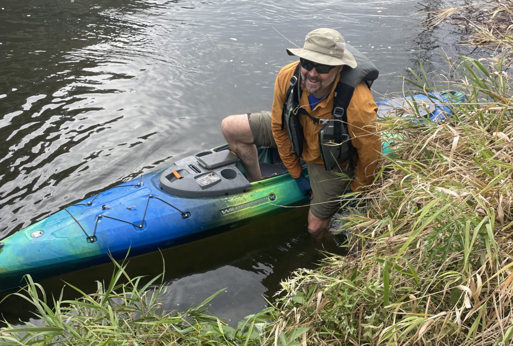
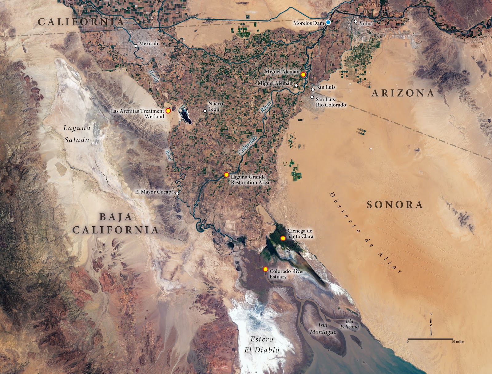
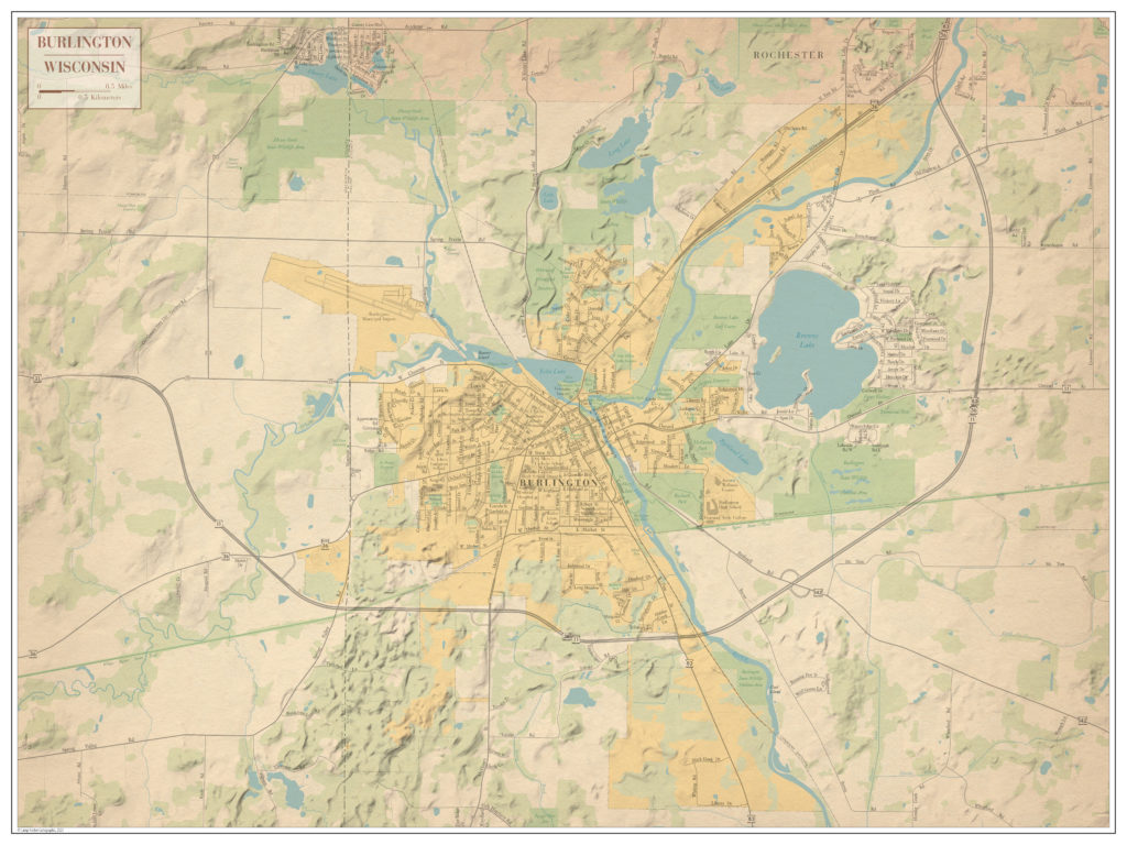
MAPublisher also provided essential tools for my workflow on other professional projects, as well as some personal ones. For example, I was honored to be a part of the documentary film, and subsequent book, The Colorado. In addition to the incredible imagery and story behind the film, the maps that I made provided the necessary context for the different discussions throughout the story, and honestly, that felt pretty good. It was humbling to see the film screening in multiple cities, including at The Kennedy Center in DC. Personal projects allow me to tinker around more with MAPublisher and other designs when I’m not at work, and I have a few examples of these here.
What’s Next?
I would say that I fit comfortably within what we used to call, “traditional cartography.” I entered the field just as the digital transition of map production was taking hold. I started with tools such as Atlas*GIS, CorelDraw!, Freehand, and the early, no-layering-Illustrator. Nowadays, I incorporate many more tools into the process. I am always looking at new approaches, new methods, and new tools to better tell the story the map was intended to tell, whether that’s incorporating Esri StoryMaps, using Blender or Eduard, or exploring other areas such as R and Python.
Have you ever thought about using Avenza Maps and MAPublisher together? Perhaps you’ve wanted to record the details of your trip, and use MAPublisher to create a map of your own. In this blog, we’ll walk you through how to do just that.
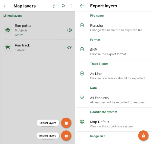
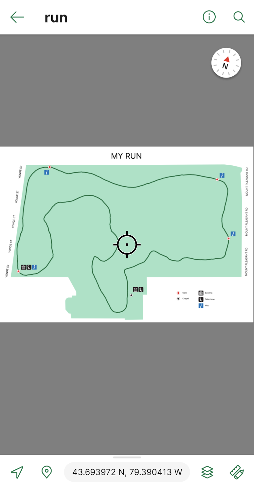
Every day after work I go for a 3km run on the same trails near the Avenza office. To track this I can download a map of Toronto from the Avenza Map Store. After opening the map, I can use the Tracking tool to begin tracking the course of my run. I also would like to collect points of some important locations throughout the park. This layer contains an attribute schema regarding information about the points: whether they have a gate, have a building, have a map, and/or have a telephone.
I would now like to export my layers from Avenza Maps to a file format that I can use in MAPublisher to create a map. From the Layers tab, I can use the export button to export my track and point layers to a shapefile and save it to my Google Drive account.
On my computer, I can download the zipped file with my shapefiles in it and extract it. I can then import my data and begin working on my map. I want my map to be simple and easy to read. It is only for personal use so it will not be exceptionally detailed beyond information I might need in case of an emergency during my run.
After finishing my map, I can use the MAPublisher Export tool to save it as a Geospatial PDF file. I can then import it on the Avenza Maps app and use it during my next run. Now I’ve just created my own map using the data I’ve collected from the Avenza Maps app!
Download Avenza Maps Today
Start recording your next walk, run, or hike by using the tracking tool in the Avenza Maps app, and then you can export this data into MAPublisher to create your very own map for next time.
Download the Avenza Maps app today, available on iOS or Android!
We are very pleased to announce the release of Geographic Imager version 6.6, the latest version of our Geographic Imager® extension for Adobe Photoshop®.
With Geographic Imager v6.6, we are announcing official support for all Apple Silicon processors, compatibility with Adobe Photoshop 2023 (version 24) and macOS Ventura (version 13), a brand new welcome screen design, and several performance enhancements and bug fixes.
Here’s what you can expect with the latest Geographic Imager v6.6 release:
Apple Silicon Processor Support
Our team has worked to ensure that Geographic Imager v6.6 runs smoothly with computers using any Apple Silicon chip, and as such, we can declare that Geographic Imager is now joining MAPublisher in officially supporting these processors.
Compatibility Updates for Adobe Photoshop and macOS
We want our users to enjoy a truly seamless integration with the Adobe Photoshop workspace. We are therefore happy to announce that Geographic Imager v6.6 is fully compatible with the new Adobe Photoshop 2023 (version 24) update on both Mac and Windows.
Geographic Imager v6.6 is also fully compatible with the recently released macOS Ventura (version 13).
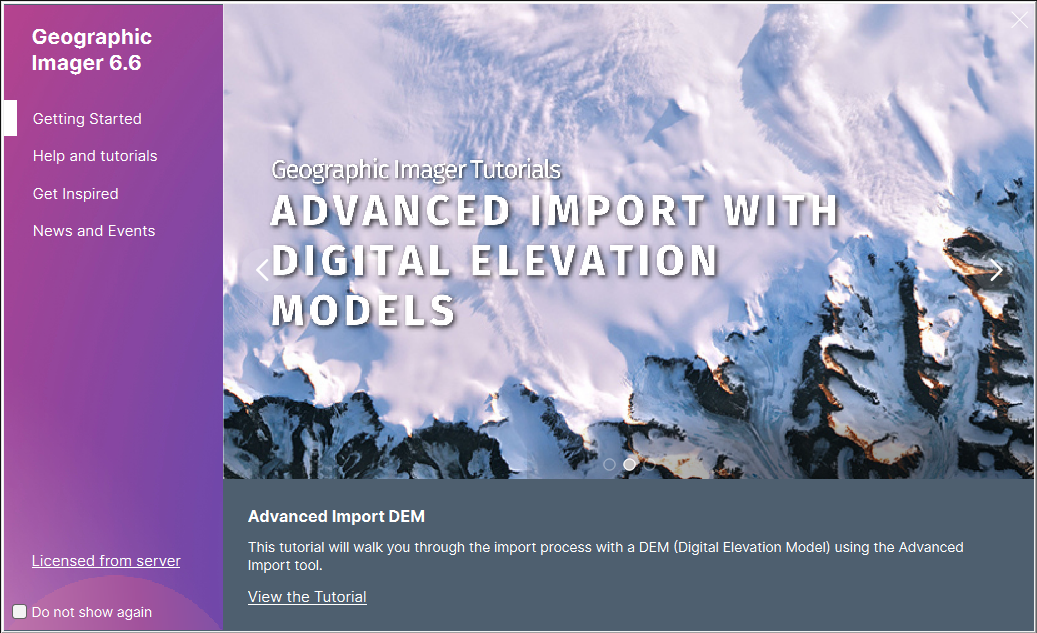
New Welcome Screen Design
Geographic Imager v6.6 introduces a brand new welcome screen that appears upon opening the application. This window is equipped with visually appealing refreshed graphics while maintaining easy access to the License Management window. It also features several new sections that increase discoverability, such as getting started, help and tutorials, and other Avenza news or event information. There is also a Get Inspired section to provide inspiration for you, which features articles from our blog that highlights the excellent stories and tips from some of our most proficient users.
If you would like to learn more about the new Geographic Imager 6.6 features or have any questions, please check out our Support Centre.
Geographic Imager v6.6 is immediately available today, free of charge to all current Geographic Imager users with active maintenance subscriptions and as an upgrade for non-maintenance users.
The Day 13 theme of the #30DayMapChallenge was more of a question: can you create a map in 5 minutes? Well, we were up for the challenge! Here at Avenza, we used this as an opportunity to teach our marketing team (with limited GIS experience) the basics of cartography. In the weeks leading up to this day, we taught them how to perform a few simple tasks in MAPublisher to create a basic map of South America.
Simplified Steps for Creating a Map
We broke down the process of making this map into five general steps for the purpose of simplicity.
Import Data
The first step was to import country area data using the Import button on the MAP Toolbar. After import, the Artboard tool was used to adjust map boundaries to the desired position. The MAP View Editor could also be used to fine-tune the movement of the data.
Stylize Data
The second step was to add a stylesheet to the countries using the MAP Themes button. From here a stylesheet was created by clicking the Add button and creating an area stylesheet. The stylesheet editor was then opened, and the style was assigned to the country layer. The Batch Generate Rules… button was very helpful in quickly creating categories for the data based on the desired attribute. For example, one map was created using the Population Density attribute. The categories were assigned a style based on a pre-selected colour ramp. Finally, a rule was created to create a grey style for the part of North America that attaches to South America.
Add a Legend
Using the hamburger menu button in the MAP Themes panel, step three included creating a legend for the map. Removing Rule 1 from the list and adding a title (if desired) were the only extra steps necessary here.
Add Labels
In step four, the goal was to add a label for the country names. We used LabelPro for this to make it quick and simple. We enabled leader lines to ensure all countries were labeled even if the label was too large.
Add Finishing Touches
Finally, we added a title and supplemental text and objects to the map. All of these elements were added to the document using native Adobe Illustrator tools.
Our process of creating a map in 5 minutes was recorded and condensed into a 30-second video. See it, and the other resulting maps, below!
A few weeks ago, between October 19th and 22nd, we had the pleasure of attending the 42nd North American Cartographic Information Society (NACIS) Annual Meeting in Minneapolis. NACIS provides a casual and friendly atmosphere for map-lovers from all over the world to come together and share their passion for cartography. Avenza usually conducts our presentation at NACIS as a part of Practical Cartography Day (PCD), using the opportunity to give a sneak peek at what’s to come in the upcoming year for our products, and demonstrate some of the cool functionalities of MAPublisher.
During PCD we had the chance to share the latest and greatest tools in MAPublisher and Geographic Imager, and we also got to demo some of our favourite tools within MAPublisher. This year our presentation was headed by Nick Burchell, our Director of Quality Assurance here at Avenza, and Rebecca Bennett, our Publisher Success Coordinator. Nick highlighted the new and exciting features within our software this year, such as the new attribute viewer and erase tools in MAPublisher and georeferencing storage in PSD files in Geographic Imager. Rebecca closed out the presentation with a demonstration that focused on highlighting the usage of MAPublisher tools in creating a fantasy postal map of Toronto! Check out the presentation below:
After returning from Minneapolis, we had the opportunity to get a comment from Rebecca about her first time at NACIS:
“There were so many amazing and unique presentations this year, and it was really enjoyable and inspiring to be around so many talented cartographers and GIS professionals. Everyone has their own techniques and special flair with their maps and it was evident in their presentations, and also in the Map Gallery.”
“Overall NACIS is a wonderful place to meet like minded people and share your love of maps!”
Tomorrow is November 1st, which means it’s time to start another year of the #30DayMapChallenge! The challenge is a Twitter-based daily map challenge which involves posting a map that suits the daily theme each day and tagging it with the hashtag #30DayMapChallenge. It was first started by Topi Tjukanov in 2019 and has been growing in popularity ever since. In 2021, the challenge ended up with over 9,000 submitted maps!
The daily themes for the challenge are posted in early October each year, giving participants about a month to get a head start on planning some of their maps. Some examples of daily themes include maps that show colours, hexagons, fantasy, or islands. Some of the themes also function as a challenge, such as creating a “bad” map, the 5 minute map challenge, as well as a map that is created using new tools outside of your comfort zone.
This year, we’ll be sharing some of our own maps created by Avenza employees, and highlighting some on-theme maps from the Avenza Map Store! We’re looking forward to seeing all of the interesting and innovative maps floating around the #30DayMapChallenge hashtag on Twitter. Remember, participants can post as many or as few maps as they wish. At the end of the day, it comes down to engaging in the ever growing community of cartography-lovers.
We’ll see you on Twitter tomorrow for the Day 1 theme: points! Happy mapping!
For more information about the #30DayMapChallenge – including the 2022 daily themes, visit the official website or check out the GitHub repository!
Today we are shifting the spotlight to Geographic Imager, our plugin for Adobe Photoshop. This blog features the usage of the Terrain Shader tool, which was featured in our promotional video at the Adobe MAX conference last week!
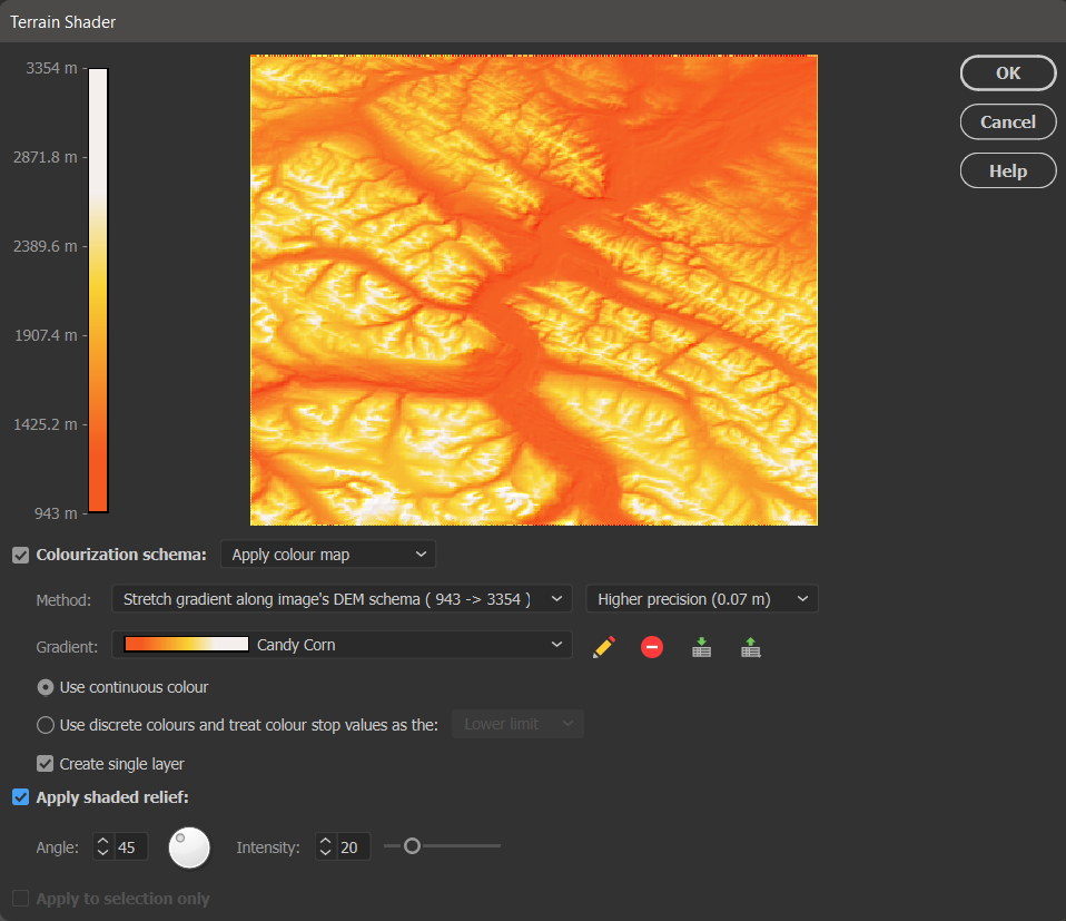
Terrain Shader is great for adding dimension to your maps. It is commonly used to perform shaded relief, a method for representing topography on maps in a natural and intuitive way. The tool provides options to apply colourization schema and shaded relief to supported elevation data formats, such as DEM or SRTM files. Terrain Shader has several different settings that users can customize to create a shaded relief that best suits their needs.
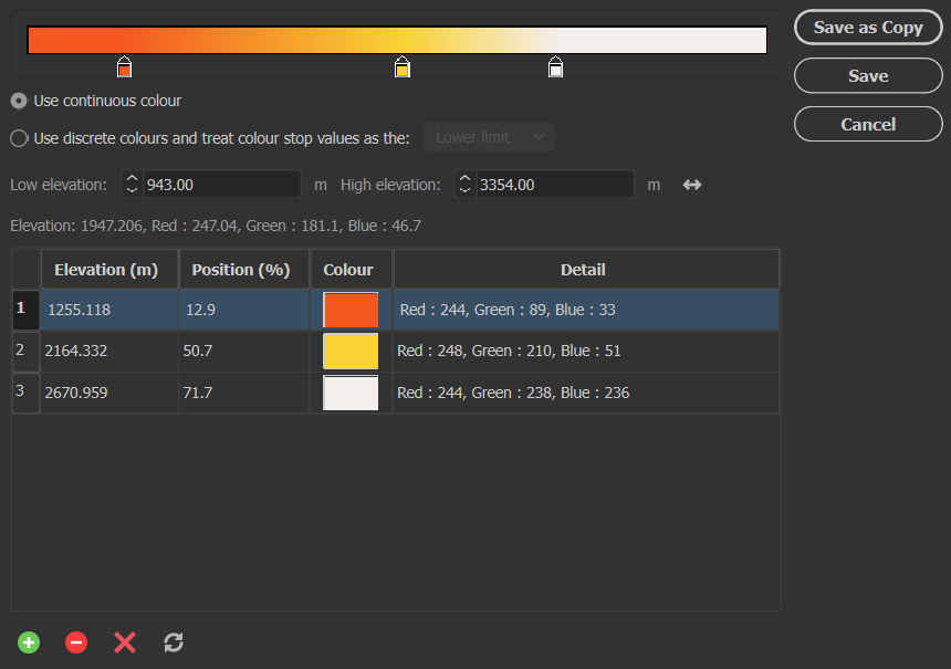
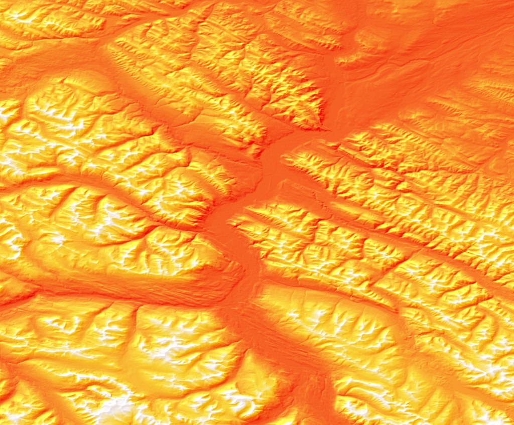
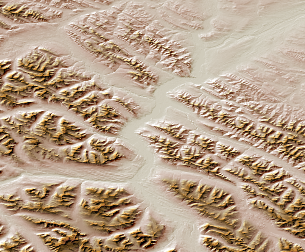
In the spirit of Halloween, we’ve decided to show off the Terrain Shader tool by creating a fun shaded relief using a colourization schema that resembles candy corn!
I’m starting with a DEM file covering a portion of Jasper National Park in Alberta. DEMs are imported by default using a black-white gradient, with black representing the lowest elevation and white representing the highest.
Next, you can open the Geographic Imager panel and select the Terrain Shader button.
There are many different settings available in the Terrain Shader tool to customize your design. First, ensure the Colourization schema option is checked and set to “Apply colour map” which enables you to apply colour to your DEM. You can also choose the Method to stretch the colour map over a preset group of values or simply apply your colour ramp from the highest and lowest point on the DEM.
Next, you want to select any Gradient from the list and press the pencil icon to open the Colour Map editor window. From this window, you can set and adjust three different colour stops to represent the three candy corn colours you wish to apply to your map.
When you are finished, be sure to click Save and save it as a new colour map, titled appropriately (in my case, it was “Candy Corn”).
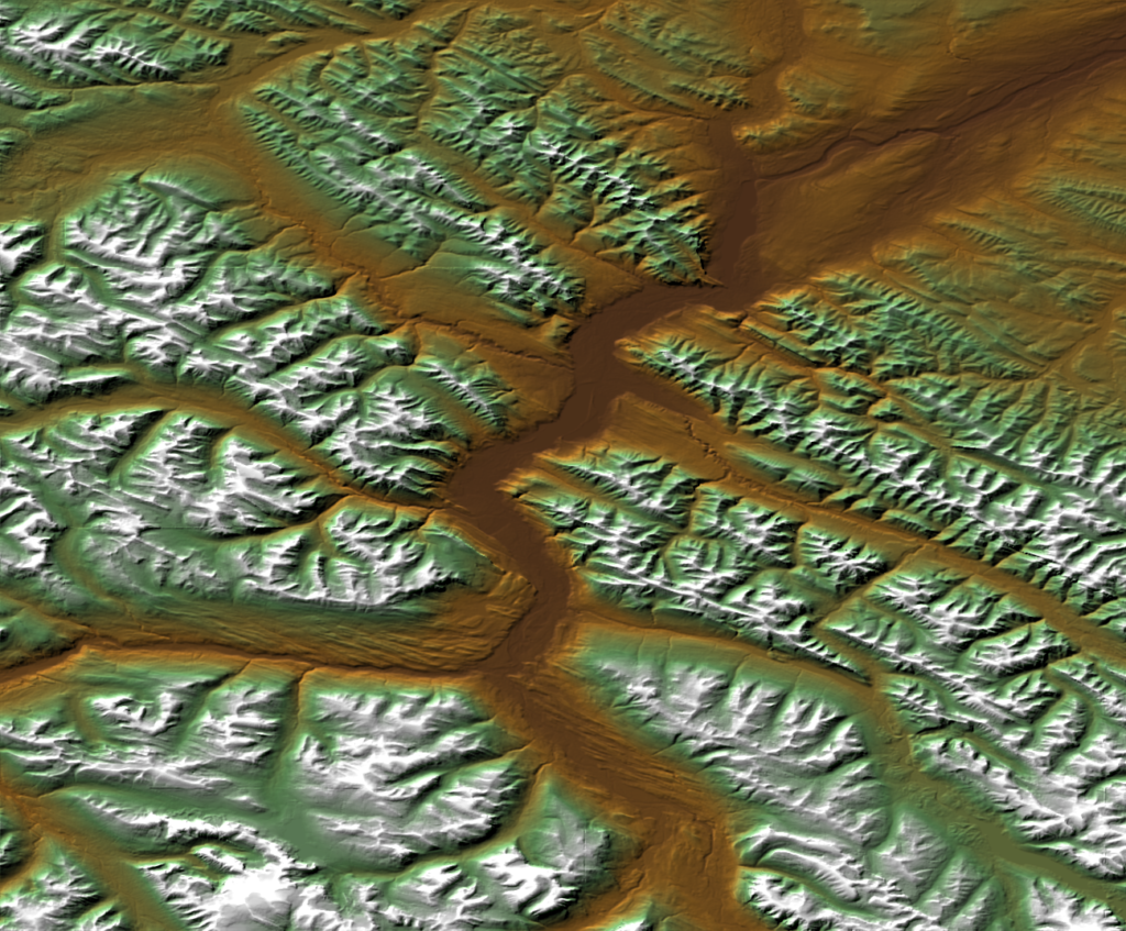
Finally, select Apply shaded relief and adjust the light source angle and intensity if desired. Shaded relief is what adds texture to your DEM to make it look like terrain.
Click OK, and you have successfully created your very own candy corn mountains! This is just one fun way to make use of the terrain shader to add a personal touch to your map. See the final result below, as well as a few other examples of colourization schemas that can be used to add a more realistic feel to your terrain.
For more information about the Terrain Shader tool, check out our related Support Centre articles and tutorial!
With the recent release of MAPublisher 11.0, the plugin now comes with a new set of three MAP Erase tools in its arsenal. In this blog, we would like to highlight how these tools work and differentiate between each of them.
Much like the MAP Crop tools, there are three slightly differing tools in the MAP Erase toolset: MAP Vector Erase Tool, MAP Vector Erase, and MAP Erase by Shape. The advanced settings for the MAP Erase tools are shared with the MAP Crop tools, and can be accessed in the MAPublisher Preferences window under “MAP Crop Tool”.
Also like the MAP Crop tools, there are limitations to the types of artwork that can be erased using these tools. The purpose of MAP Vector Erase is to cut and remove vector data (points, lines, and polygons), however some Adobe Illustrator-specific objects may not be erased properly using this tool:
Blend and Live Paint objects
Any art using effects that have been rasterized
Custom art such as scale bars, grids/graticules, north arrows (this art must be expanded to crop)
Compound shapes
Legacy and overflowing text
Locked objects (command box: either treat locked layers as unlocked or skip locked layers)
Hidden layers (command box: either crop hidden layers or skip hidden layers)
Images
MAP Vector Erase Tool
The MAP Vector Erase Tool can be selected from the Illustrator menu. You can draw a rectangle or ellipse shape on the portion of the map you would like to erase.
You can also click anywhere on the artboard which will open the MAP Vector Erase dialog box and specify crop options. Which leads us to the next Erase tool…
MAP Vector Erase
MAP Vector Erase can be accessed from the MAP Toolbar in the Geoprocessing section under the Crop menu as well. This will also result in the MAP Vector Erase dialog box opening. There are a few options you can use to customize how you want your erase shape to be created, as shown below. In my case, I have created a bounding box to perform my erase with, and I would like to apply it to all layers in my document.
You can also click the Advanced… button for further options, which is useful for deciding how your labels are affected by the MAP Erase tools.
The final result is very similar to the previous step, however the MAP Vector Erase dialog box allows for much more customization and specificity.
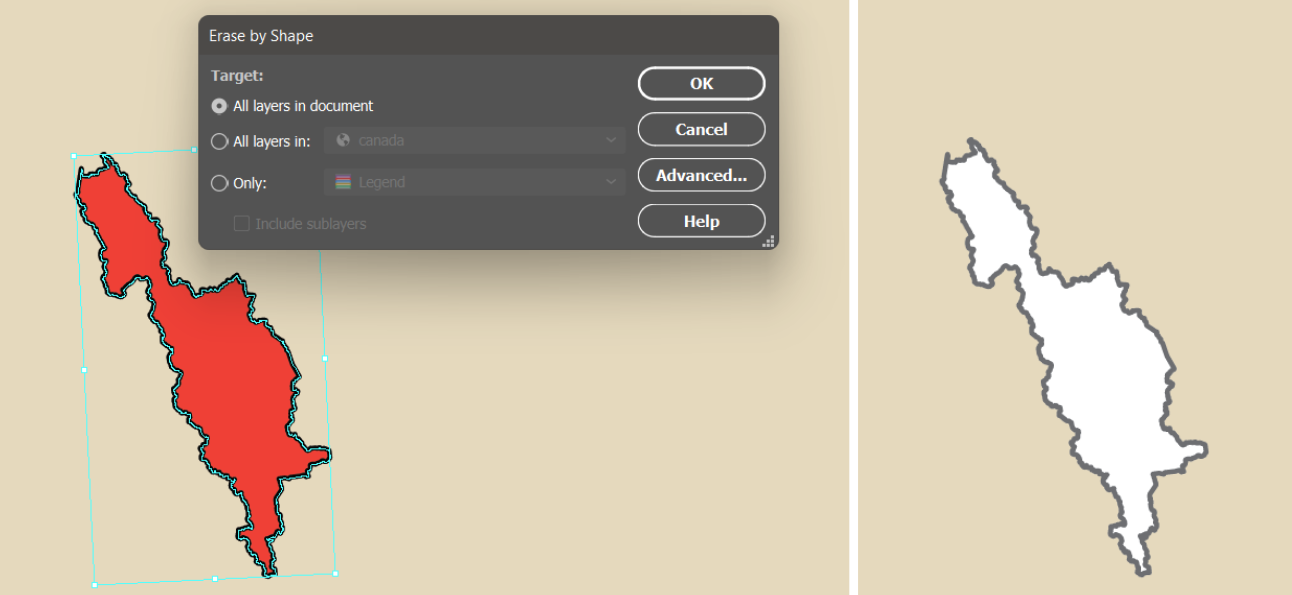
MAP Erase by Shape
The final tool in the Erase series is the MAP Erase by Shape tool, which is also located in the Crop menu of the Geoprocessing section of the MAP Toolbar. This tool can only be opened when there is a single polygon selected on the document, which will be the bounds for the erasure. The MAP Erase by Shape tool is useful when you wish to erase an area that is not a rectangular or elliptical shape. For example, in this example, I used the shape of Banff National Park to erase this portion of my map.
For more information about MAPublisher’s new MAP Erase tools, please visit our Support Centre.
We’re excited to announce that the 2023 Avenza Student Map Contest has now concluded. Submissions for the contest were accepted from December 1st, 2022 to April 30th, 2023. Over the last month we have selected the winner. As such, congratulations are in order for the grand prize winner!
Grand Prize Winner
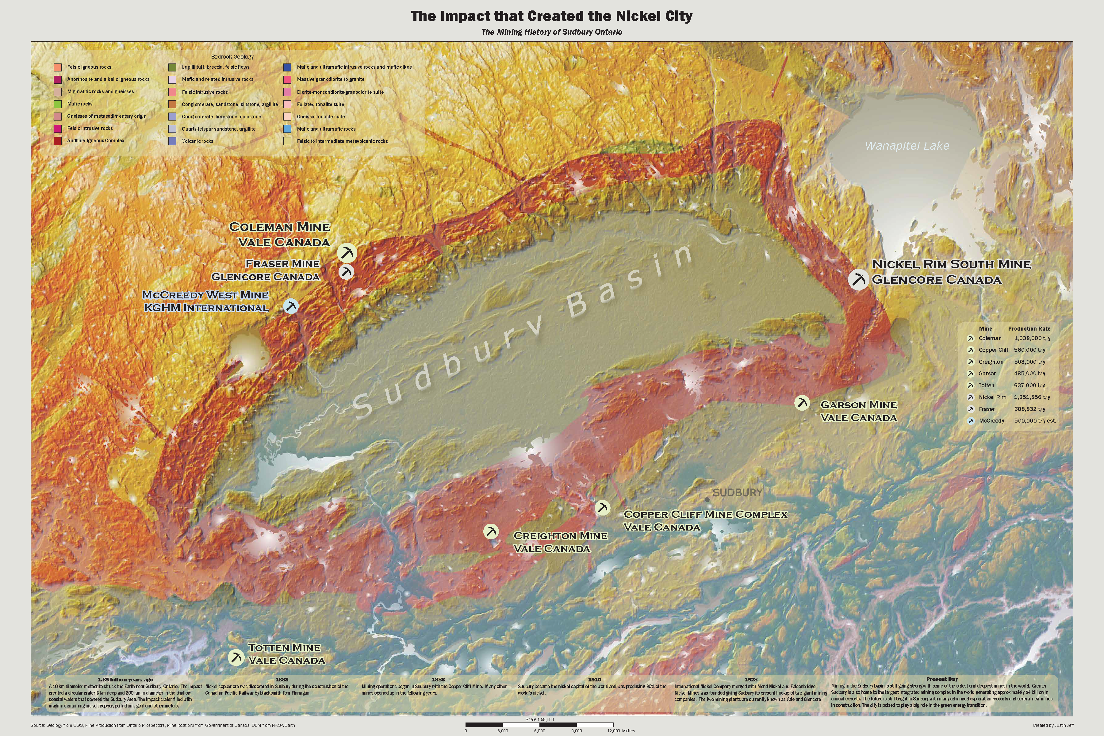
The Impact that Created the Nickel City Justin Jeff Fleming College
From the creator: “My map displays the terrain and geology around the Sudbury Basin that was created by a meteorite impact. Furthermore, it shows the active mines around the Sudbury Basin using a proportional dot technique based on the mines production. Also it shows a timeline of the mining history in the Sudbury area. It will be used to gain insight and understand the significance of the Sudbury Basin.”
Justin used the MAPublisher import tools to import prepared data from other sources for the terrain and mine locations. The MAP Themes tool was used to create proportional dot symbols for the active mines and the MAP LabelPro add-on was used to label and style the active mines. Finally, Justin used the Layout tools to add and style the scale bar.
Congratulations again to Justin! Stayed tuned for the open version of the Avenza Map Contest starting soon…
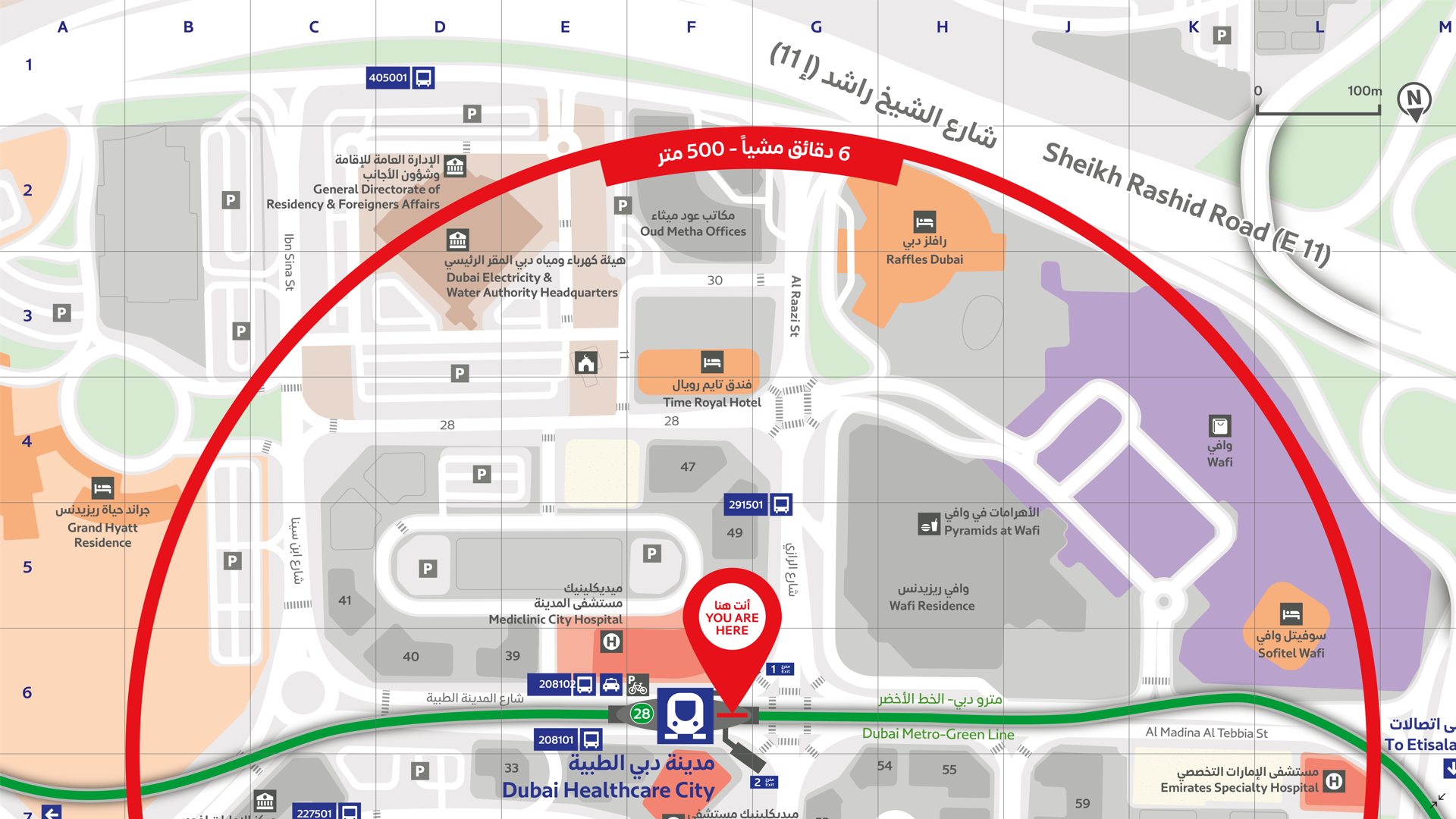
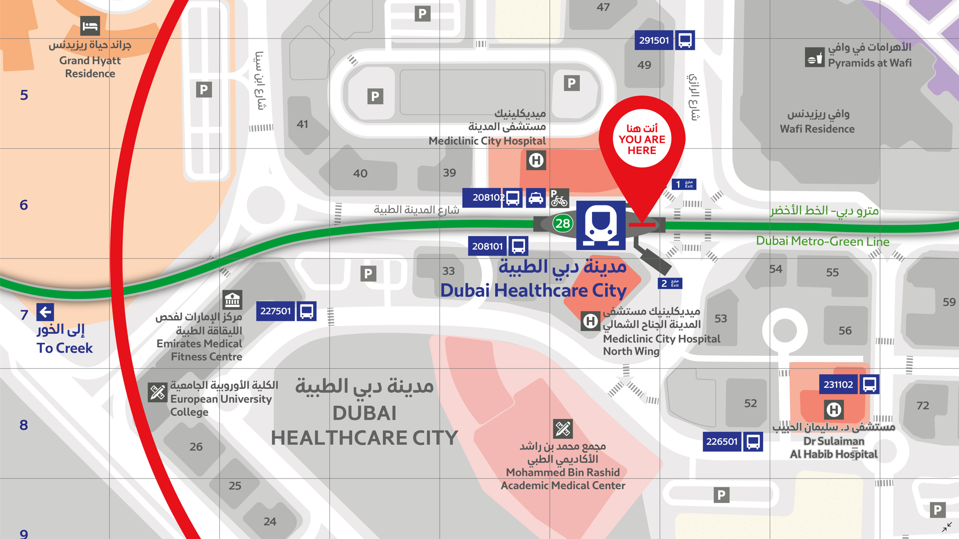
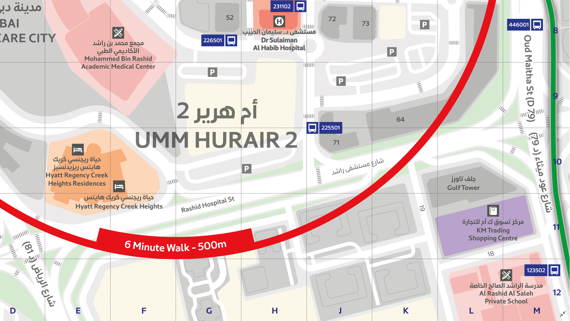
In this Map Gallery Spotlight, we are highlighting another submission from the 2021 Avenza Map Competition. This bilingual map of the area around the Dubai Healthcare City Metro Station was created by Zain Madathil for Explorer Publishing. It is one of nearly 4,000 individual maps he has created for the Dubai Public Transport Map project.
The map is easy-to-use and informative, providing information in both English and Arabic, and is accompanied by a detailed map index to categorize and highlight important points of interest and nearby attractions surrounding the station. The map utilizes careful design elements to make interpretation easy, including colour-coded icons and building footprints, platform-based direction markers, and a 500m radius walking distance indicator.
Select the images below to see a detailed look at Zain’s map
Making the Map
Madathil received data from his client in the form of points, lines, and polygons, and used the Avenza MAPublisher plugin for Adobe Illustrator to design the map. He used the Multiple Data Import tool to easily get all of his data into MAPublisher with a single import process. MAPublisher maintains the georeferencing of the data imported from almost any source, which allowed Madathil to focus on customization rather than data placement.
With nearly 4,000 maps in the series, the MAP Themes tool was important for Madathil to maintain consistent labelling across all maps in the series. After creating a custom branding MAP Theme stylization, Madathil was able to apply this to each map in the series as necessary. He also used the Map Attributes Panel to aid with customization of the attribute data associated with his map features.
Madathil simplified his labelling process by using our MAPublisher LabelPro add-on, which also allowed him to ensure consistency across the map series. LabelPro allowed Madathil to customize the style of his labels and apply rules to ensure they did not overlap important features or other labels. It also eased his application of both Arabic and English labels on the map.Finally, Adrain added an Index Grid and created an index and legend to complete the reference guide for the map using the Layout Tools.
For more information on using the MAPublisher LabelPro add-on, please visit our Support Centre section for this tool.Check out our other Map Gallery Spotlight blogs here!