Sometimes we know enough about an image to georeference it in a faster manner than other images. In Geographic Imager, we call this type of georeferencing a Quick Georeference.
Quick Georeference is a method of georeferencing images that requires two conditions to be met:
The image is not rotated; in other words, true north is oriented at the top of the page
Two control points on the image are known, however these points cannot be aligned on either the X or Y axis
This article will show an example of quick georeferencing. The image used in this demonstration is called Americas_4.tif, and can be found in the Tutorial Data folder which is included with every installation of Geographic Imager.
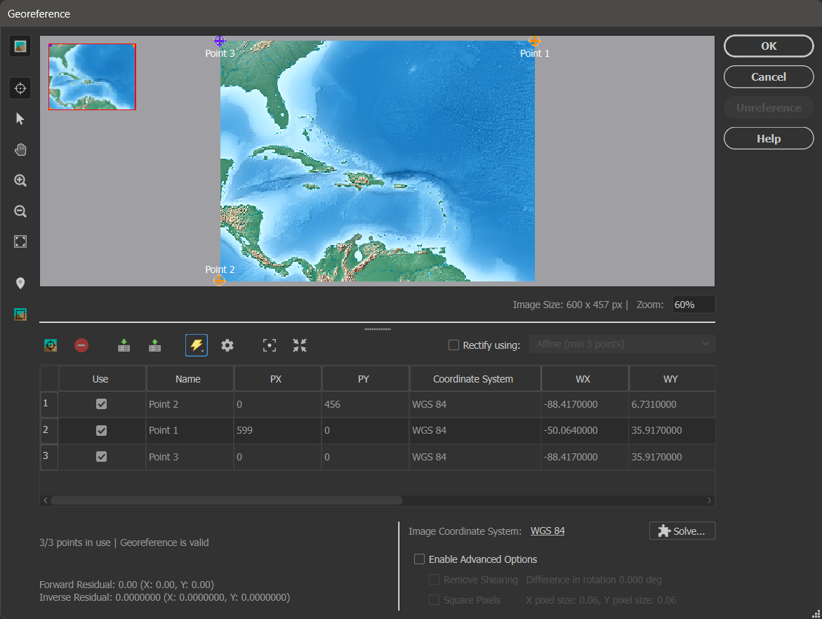
After opening the image in Geographic Imager, you can confirm that it is aligned with true north. Then click the Georeference button on the Geographic Imager panel.
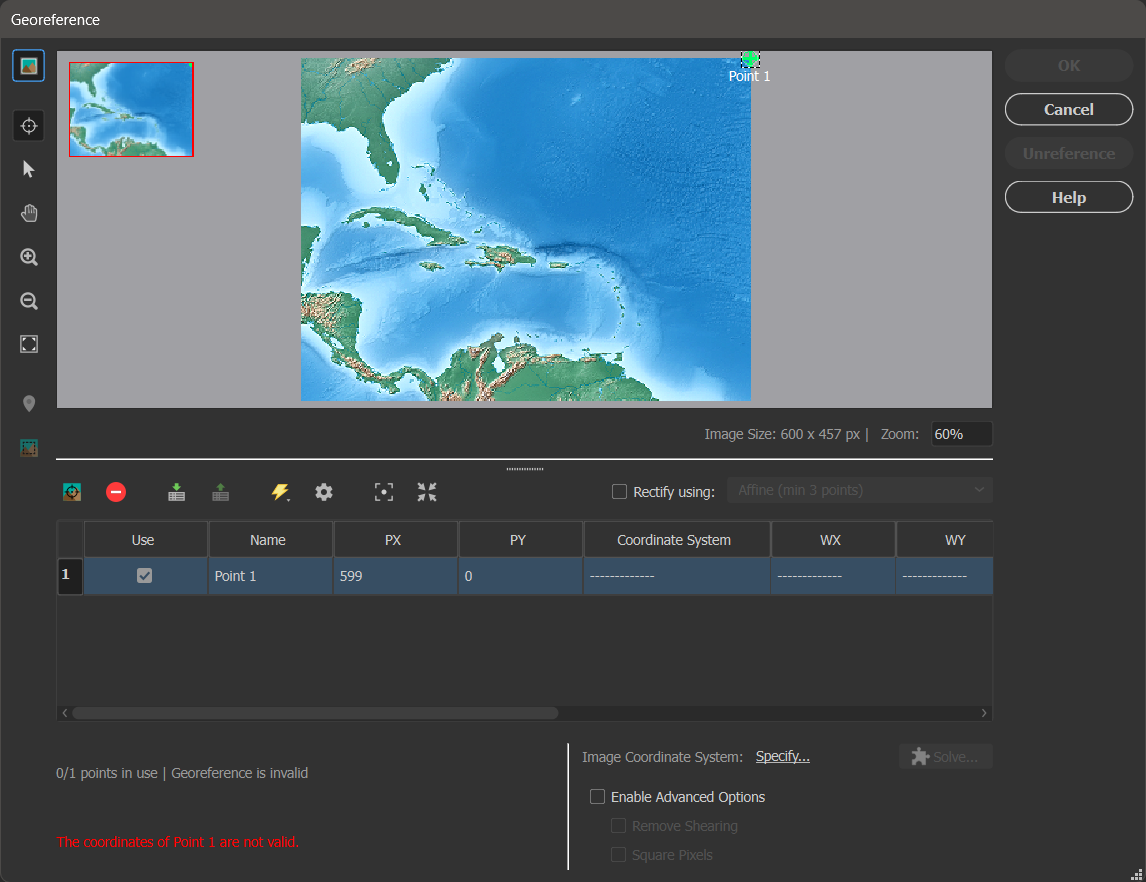
In the Georeference dialog box, you can click the Add Control Point button to do as such. Click anywhere on the image viewer to add a point. Point 1 will be added to the control point list. You can then adjust the pixel coordinates (PX and PY); these are the coordinates for the points on the image. Type 599 in the PX box and 0 in the PY box.
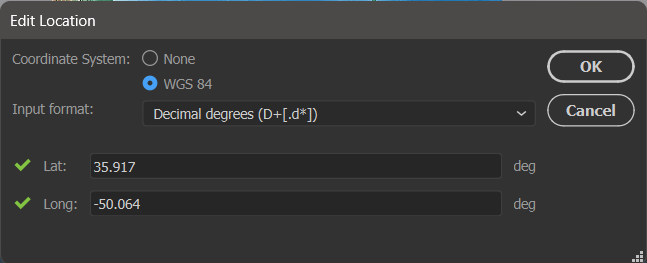
Next, you want to set the world coordinates that correspond to the pixel coordinates you just entered. You can double-click in the WX, WY or Coordinate System boxes to open the Edit Location dialog box. Here you want to select the WGS 84 coordinate system, and enter a Lat value of 35.917 and Long value of -50.064. After clicking OK, you will see that the world coordinates have been updated in the control point list.
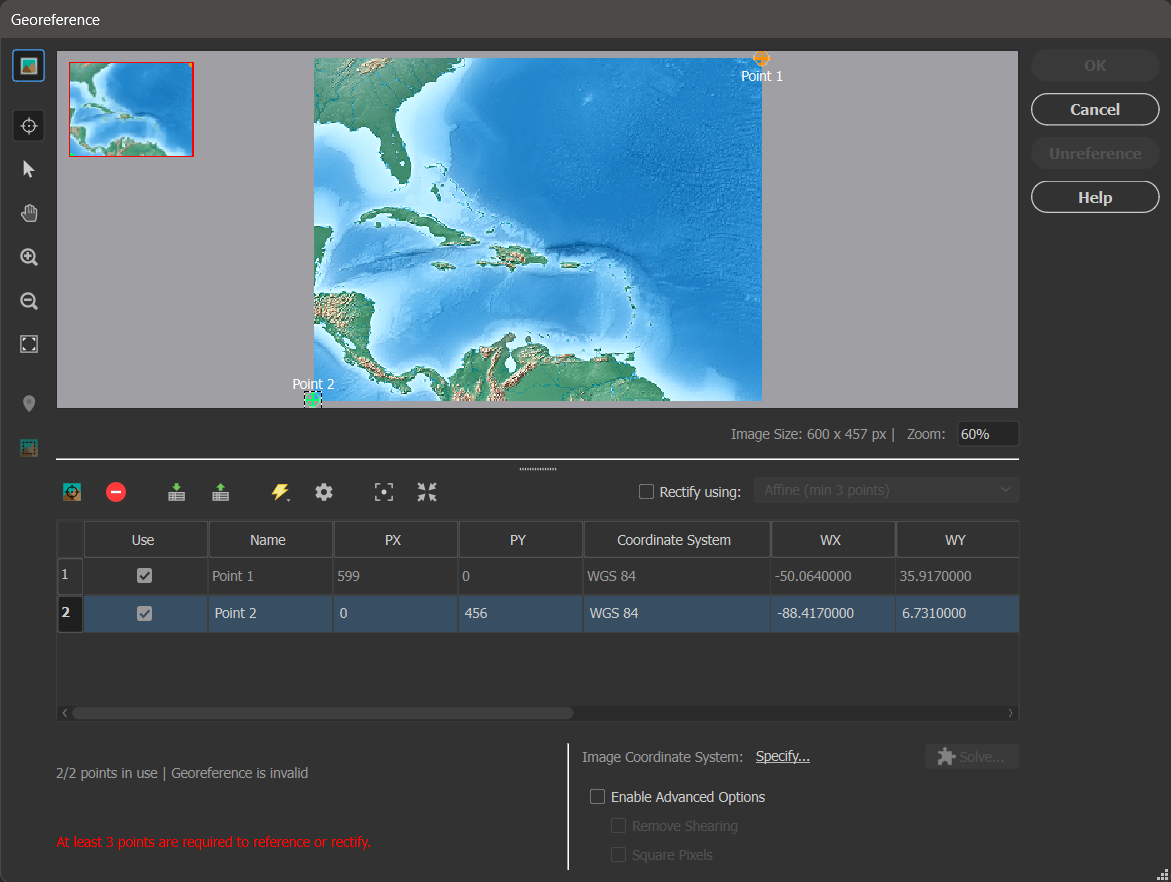
You now want to add your second control point at the location with pixel coordinates of PX = 0 and PY = 456. Following the above steps again, give this point the world coordinates of Lat = 6.731 and Long = -88.417.
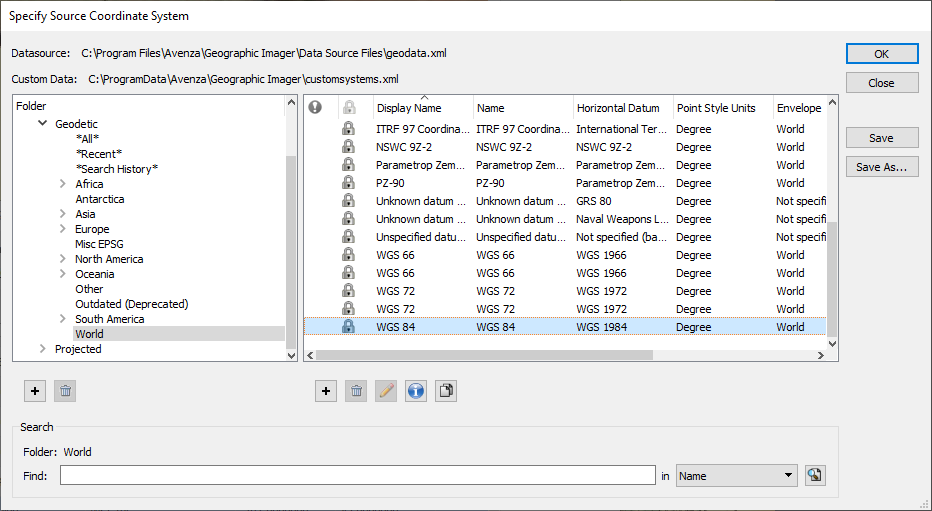
Now that you have added your two necessary control points to the image, you are ready to Quick Georeference your image. Next to the Image Coordinate System label, select the Specify… link. In the Choose Coordinate System dialog box, select the [No Coordinate System Specified] link. This opens the Specify Coordinate System dialog box, where you can select the Geodetic > World category, select the “WGS 84” coordinate system and click OK.
Back in the Georeference dialog box, select the Quick Georeference button (lightning bolt icon), and select By Two Reference Points (North/South aligned). You will notice that an additional control point is automatically added to the control point list and image view. Its world coordinates were calculated based on the existing two control point pairs. This occurs because a minimum of three control points are required to reference an image. It is also why the two control points you selected must not align.
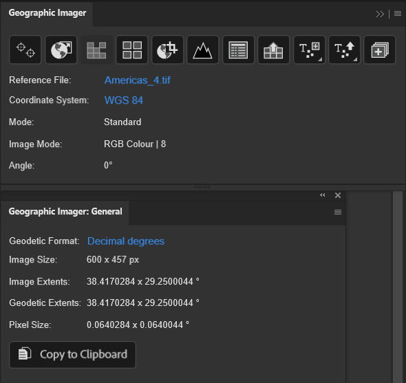
To complete your Quick Georeference, simply click OK. Voilà! You will see the reference information appear in the Geographic Imager panel, and further details can be found in the Geographic Imager: General panel.
You can also check out our video tutorial for Quick Georeferencing on YouTube:
To view the step-by-step instructions that constituted the material in this blog post, check out the Quick Georeference tutorial in our Support Centre!
We are very excited to announce the release of MAPublisher version 11.3, the latest version of our MAPublisher® extension for Adobe Illustrator®.
With MAPublisher v11.3, we are introducing several compatibility updates! It also includes numerous performance enhancements and bug fixes.
Here’s what you can expect with the latest MAPublisher v11.3 release:
Compatibility with Adobe Creative Cloud 2024 and macOS Sonoma
We have committed ourselves to providing our users with a MAPublisher update that supports new Adobe releases as quickly as possible. We are happy to announce that MAPublisher v11.3 is fully compatible with the recently released Adobe Illustrator 2024 (also known as version 28.0).
In addition to Adobe CC 2024, MAPublisher is also fully compatible with the new macOS Sonoma (version 14).
FME Auto Update with FME 2023 Support
MAPublisher FME Auto is a Windows-only powerful add-on that connects the GIS data processing environment of FME Form to the cartographic design and publishing environment of MAPublisher and Adobe Illustrator. MAPublisher v11.3 is the first version of MAPublisher to provide support for the recent FME 2023.1 update.
MAPublisher 11.3 is Available Now!
If you would like to learn more about the new MAPublisher v11.3 update or have any questions, please check out our Support Centre.
MAPublisher v11.3 is immediately available today, free of charge to all current MAPublisher users with active maintenance subscriptions and as an upgrade for non-maintenance users.
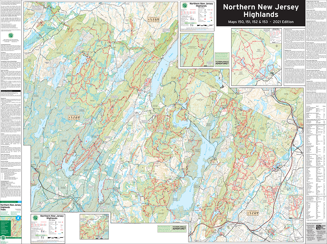
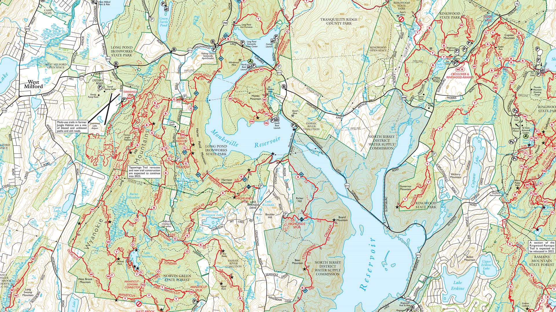
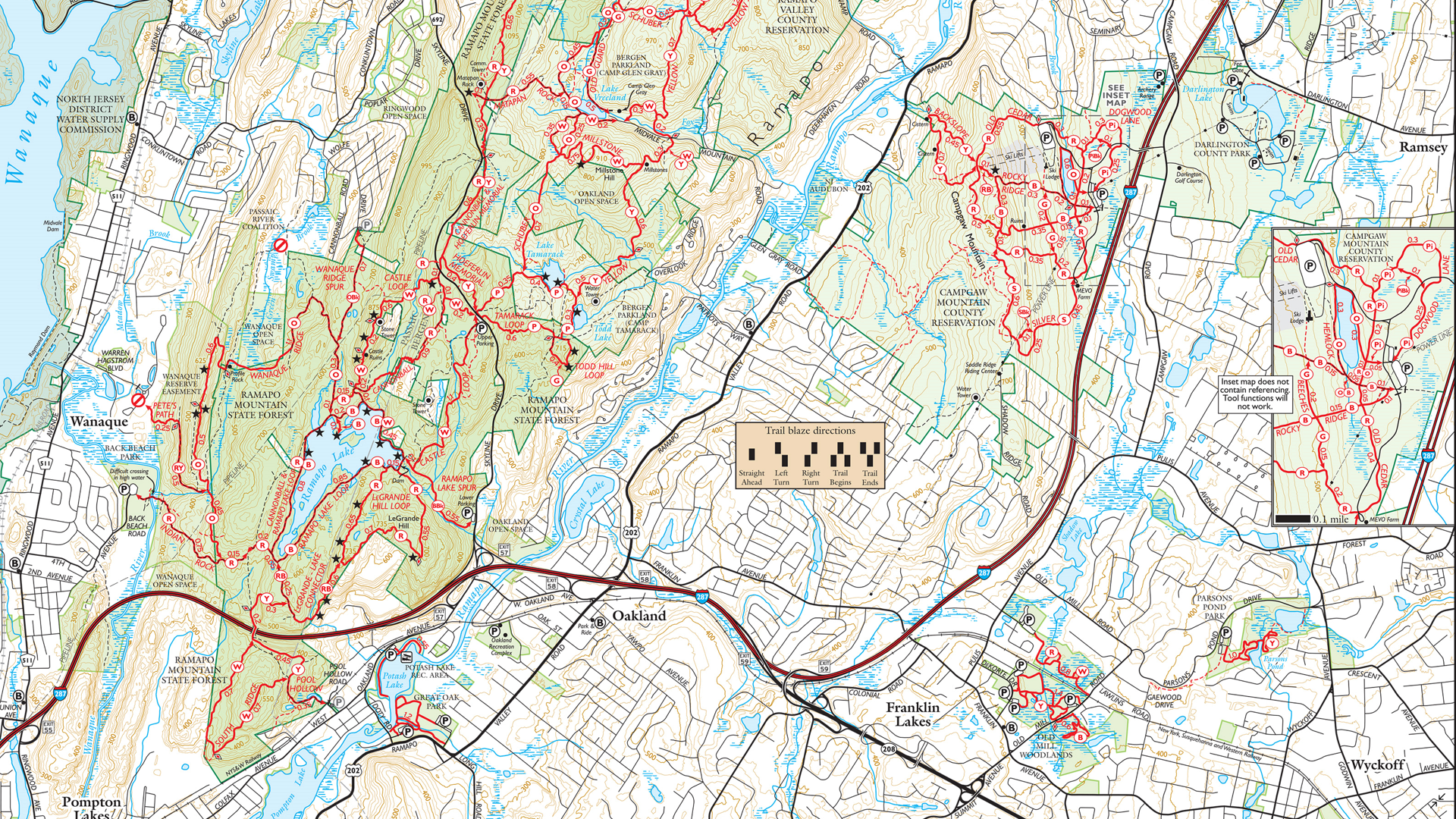
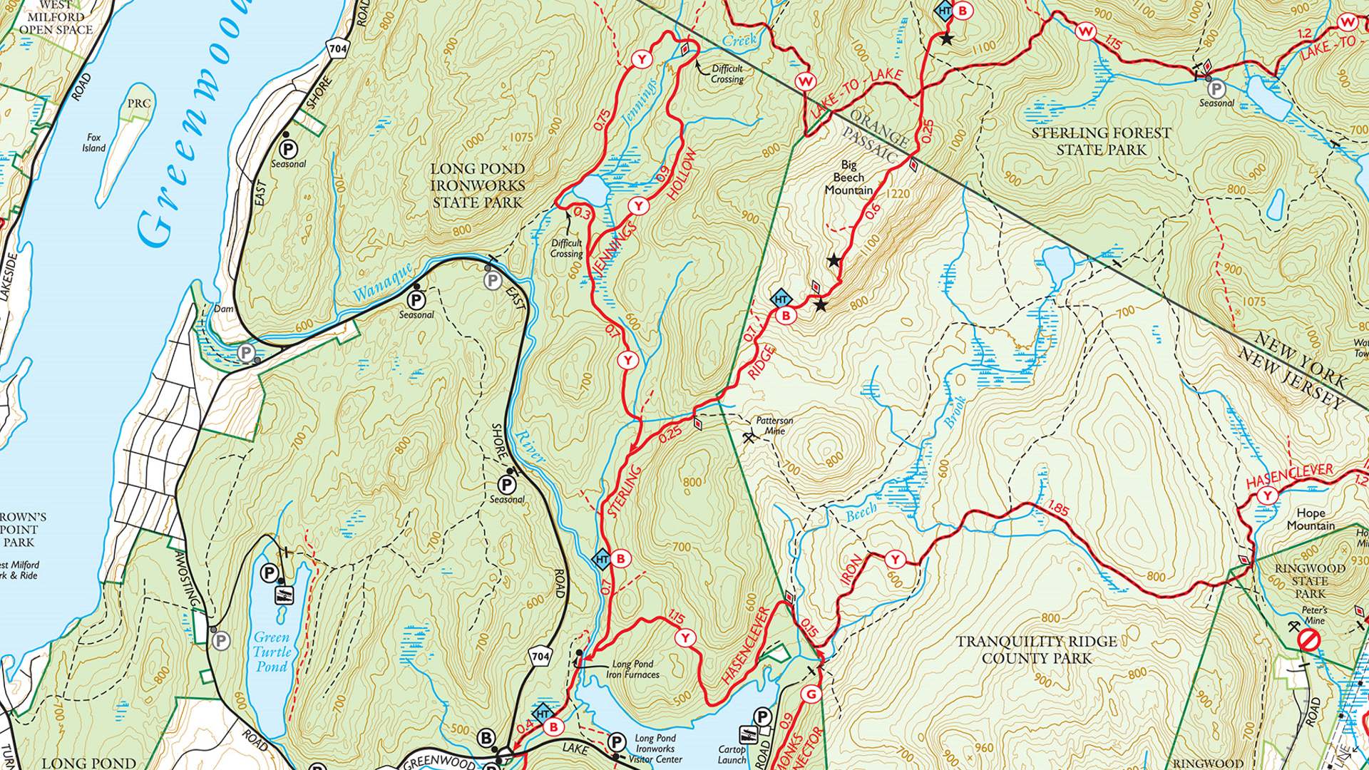
In this Map Spotlight, we are highlighting a submission from the 2021 Avenza Map Contest: Northern New Jersey Highlands Trails by Jeremy Apgar, with additional contributions from Daniel Chazin. This map features more than 360 miles of marked trails and over 40 parks and preserves in the northern Highlands regions of New Jersey. As the region is located less than a one-hour drive or transit ride from New York City, these trails are very popular. Recent changes and additions to the trails have required accurately updated maps to be created, with this particular map being recreated from scratch and scaled up by 33% from the original.
The map now includes many new features absent in the previous versions, including junction-to-junction trail mileage numbers, a completely rebuilt basemap with new detailed contour lines, revised park boundaries, and more than 5,000 manually-placed text labels and symbols. It also includes several inset maps to cover complex areas, a complete trail index, and park contact information, history, and regulations. On the importance of these maps, Jeremy stated: “During a time when there is a wealth of ‘free but largely unreliable’ trail information online and in popular apps, it is even more important than ever that we provide comprehensive, accurate, and up-to-date trail maps for the parks and trails in our region in a variety of formats.”
This map is available to be purchased from the Avenza Map Store for use in the Avenza Maps mobile app. Physical copies can also be purchased on the New York-New Jersey Trail Conference website, or found at the trailhead kiosks located throughout the region.
Select the images below to see a detailed look at Jeremy’s map
Making the Map
Several MAPublisher tools and functions were used to create this map. Jeremy used the Multiple Data Import tool to aggregate several data formats at once, such as GDB, SHP, and GPX files. Following import, he used the MAP Views panel and editor for setting up the map scale and projection of the document, and also reprojecting data layers in different coordinate systems. The MAP Attributes panel as well as the MAP Selections tool were used to further filter and easily organize imported data.
Jeremy also utilized some of MAPublisher’s Geoprocessing tools in the creation of this very detailed map. The Flip Lines tool was used for some finer linework styling, and the Simplify Art tool was helpful for creating visually appealing contour lines. Finally, Jeremy used the MAP Vector Crop tool to remove any art that was beyond the boundaries of the map.
Jeremy additionally used the Label Features tool, and Layout Tools to create preliminary labels and a scale bar, which were later replaced by manually placed labels and custom graphics.
Getting started with MAPublisher can be a daunting task, especially if you don’t have a background in cartography. Unfortunately, that’s exactly what the staff at SafariBookings, the largest marketplace for African safaris, was facing. But with the help of Red Geographics they were able to quickly learn how to use MAPublisher to create their own maps. At the Avenza User Conference in May of this year, Hans van der Maarel, the owner of Red Geographics presented to us how this amazing feat was achieved. Hans is a long-time partner of Avenza and user of MAPublisher and Geographic Imager. He uses the products for a wide range of cartographic projects for international clients and offers training courses and consultancy projects aimed at developing workflows for clients. In addition to that, he is currently a board member of NACIS.
By using MAPublisher together with open data, Hans and his team were able to swiftly get SafariBookings up and running and producing their very own maps. They worked with two members of the SafariBookings team, both of whom had previous graphic design and Adobe Creative Cloud experience, but were not experienced with GIS or cartography. Red Geographics offered them a personal training plan and helped them source data allowing them to start producing high-quality maps in less than a month.
The Avenza User Conference is an annual free virtual conference for map makers, GIS enthusiasts, and geospatial professionals worldwide who share a common interest in Avenza mapping technology. The conference includes a combination of virtual sessions led by experts who will share their experiences with Avenza mapping products.
The Avenza User Conference is an annual event that grows each year with incredible speakers and participants. Get inspired by mapping and industry professionals by joining us for #AvenzaUC2024. Register here for next year’s conference taking place on May 9th, 2024.
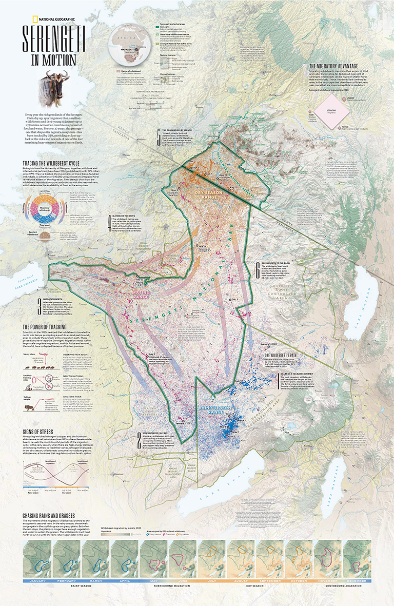
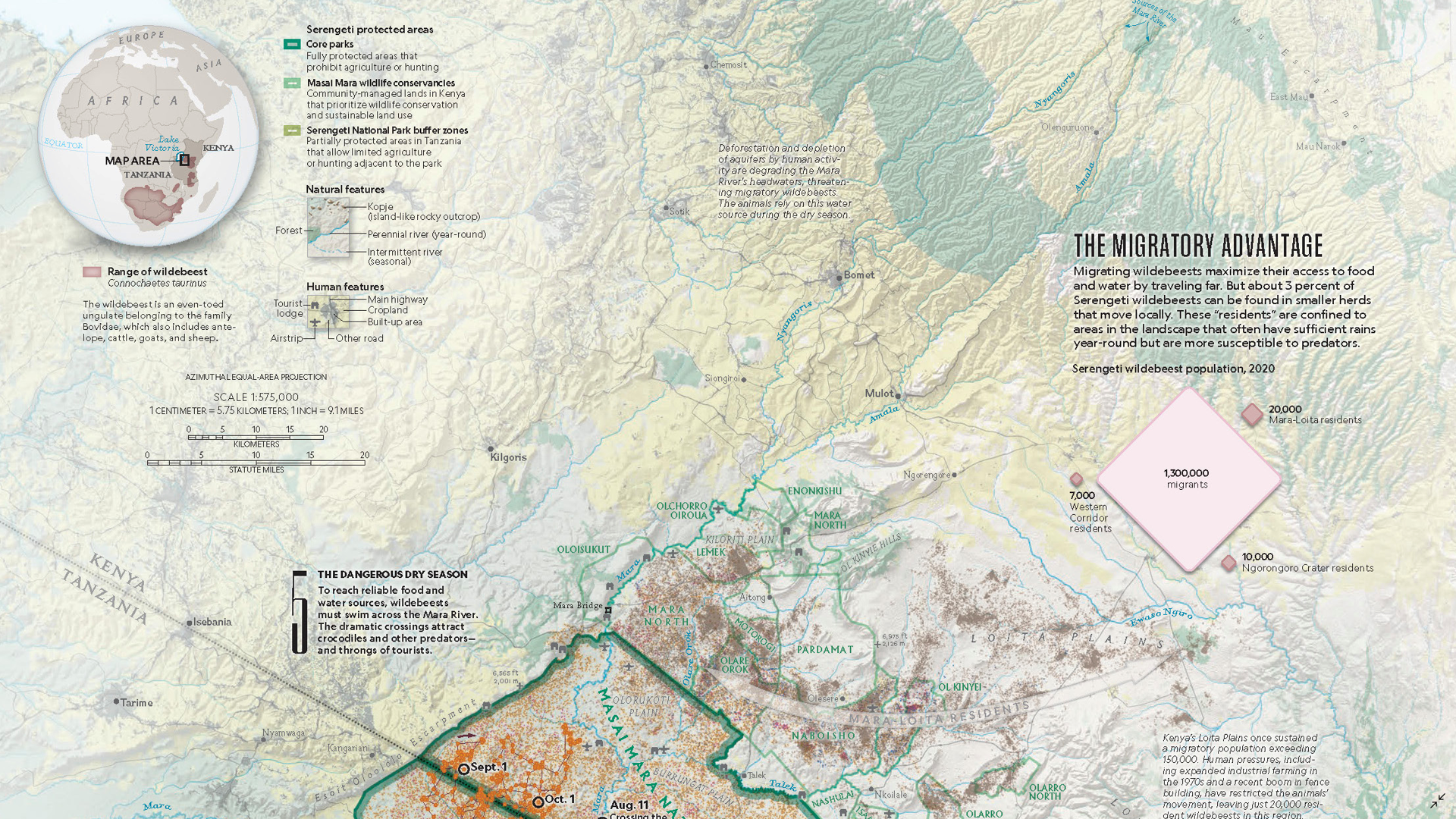
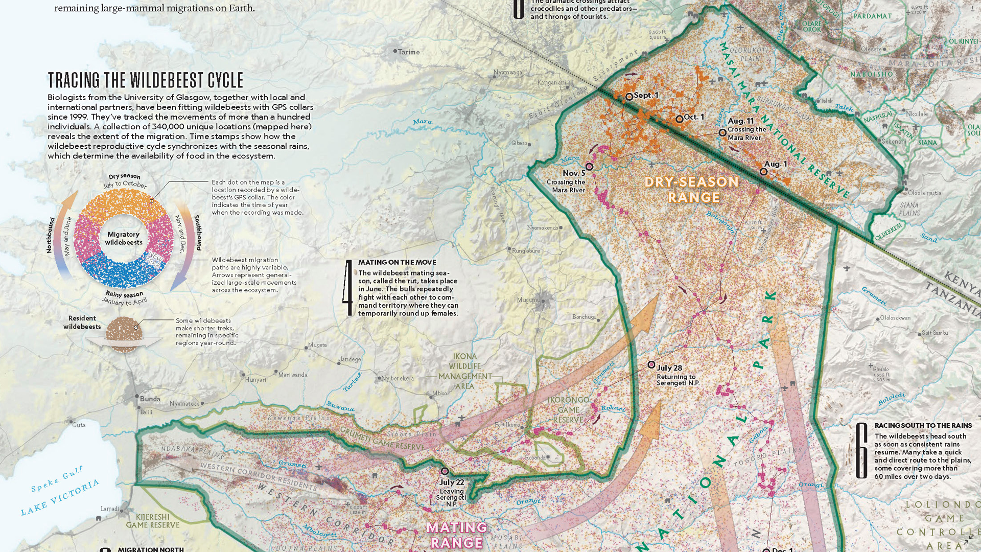
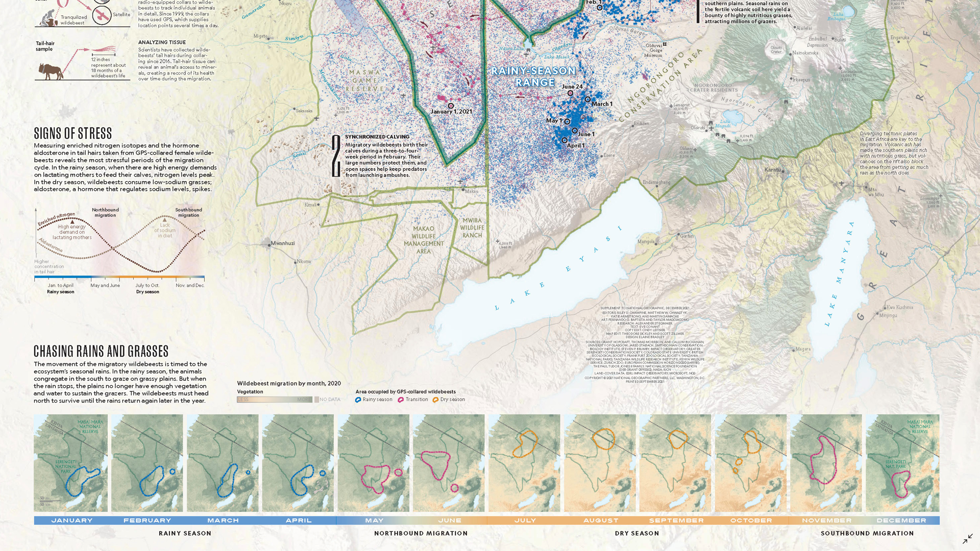
In the Map Spotlight this time, we are highlighting a submission from the 2021 Avenza Map Contest. Serengeti in Motion by Riley Champine was a supplement to the December 2021 issue of National Geographic magazine, which featured several stories about the Serengeti and its wildlife. The map depicts the annual great migration of wildebeests, one of Earth’s last remaining large-mammal migrations. It also depicts the natural features of the landscape as well as the boundaries of several protected areas in the Serengeti region.
Each year over one million wildebeest (and other mammals such as gazelles and zebras) participate in a circular migration which starts in the southern Serengeti in Tanzania, loops through Serengeti National Park, and advances north toward the Masai Mara National Reserve in Kenya. Seasonal rains drive migration patterns as the wildebeest search for more grass to graze on. On this map, the migration has been illustrated using 340,000 points collected by an ongoing 20+ year biological study that uses GPS collars worn by wildebeest to track their location. The map also details the path of a single female wildebeest as she crossed multiple habitats, several rivers, and an international boundary (twice!) over the course of one year.
Select the images below to see a detailed look at Riley’s map
Making the Map
To create the terrain of the map, Riley used Geographic Imager to reproject and then mosaic aerial imagery of the Serengeti region. This terrain imagery could then be saved and imported into MAPublisher to constitute the background for the map. Some of the data was prepared in other programs such as Microsoft Excel, QGIS and Natural Scene Designer, and then easily imported into MAPublisher.
Riley used the MAP Selections tool to select location points by their date attribute, and group them into three main categories: rainy season (January to April), dry season (July to October), and migration periods (May to June and November to December). He also employed the use of MAP Stylesheet Themes to symbolize these points as well as other data on the map.
The MAP Point Plotter came in handy for Riley while creating the path travelled by the single female wildebeest on the map. The Simplify Art tool was also helpful in decreasing the detail in some line and area features, which helps in software performance when dealing with a large amount of data in one document.
Riley added the finishing touches to his map using his Stylesheet Themes to create legends as well as using the LabelPro add-on to easily place labels by attribute.
Learn more about the Avenza Map Contest and submit your entry here, and check out our other Map Spotlight blogs here!
We are very excited to announce the release of MAPublisher version 11.2, the latest version of our MAPublisher® extension for Adobe Illustrator®.
With MAPublisher v11.2, we are introducing our brand new Vector Basemaps tool! The update also includes several performance enhancements and bug fixes.
Here’s what you can expect with the latest MAPublisher v11.2 release:
Vector Basemaps are Here!
Sometimes in mapping projects we have all of our important datasets, but when it comes to putting together a map we need some surrounding context such as land use or water bodies. This is where the brand-new Vector Basemaps tool for MAPublisher comes in.
This exciting new tool gives you the ability to import georeferenced vector data to your maps from an online server. Imported data is autostyled based on the zoom level and attribute information, but can also be configured or imported by users to create savable custom styles.
Importing Vector Basemaps to Your Project
There are two ways to import vector basemap data into your document. You can choose to Select Data For MAPView, which requires an existing MAPView to pull boundaries from, or Select Data For Artboard, which allows you to specify the coordinates of a bounding box either by typing them in manually or selecting them on an online map.
After selecting your area, you can edit the zoom level (which is automatically calculated based on the size of your extents and artboard) and choose a style. The Vector Basemaps tool comes with one default style, which can later be edited and saved for reuse.
Configuring Vector Basemaps
If our default vector basemap style is not exactly what you need for your project, fear not! Once you have imported your vector basemap data, the Configure Vector Basemaps dialog box allows you to fully customize any aspect of your style.
The Edit action allows you to make changes to any of the various stylesheets that are used to visualize your vector basemap data. The vector basemap stylesheets are edited in the same way as regular MAP Stylesheet Themes are.
The Save action allows you to save your customized basemap styles to your MAPublisher library for later use. To apply a saved basemap style, you can simply use the Apply New Basemap Stylesheets action and select your saved style from the dropdown menu. This is exceptionally helpful if you are creating a series of maps that require uniformity across their design!
Get started with Vector Basemaps by downloading our latest MAPublisher v11.2 update, and check out our support articles for Importing and Configuring Vector Basemaps to help acquaint yourself with this new tool!
MAPublisher 11.2 is Available Now!
If you would like to learn more about the new MAPublisher v11.2 features or have any questions, please check out our Support Centre.
MAPublisher v11.2 is immediately available today, free of charge to all current MAPublisher users with active maintenance subscriptions and as an upgrade for non-maintenance users.
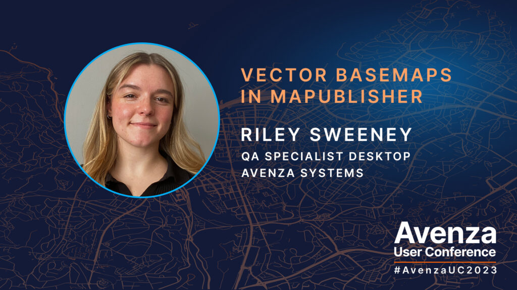
At the annual Avenza User Conference a few months ago, one of our very own Avenza team members Riley Sweeney gave us a preview of the new Vector Basemaps tool for MAPublisher. As a member of the quality assurance team, Riley’s expertise was instrumental in the development of Vector Basemaps.
In this presentation, Riley gives us a sneak peek into the exciting future of MAPublisher. Her presentation sparks new ideas of how a map can be started, created, or even finished with the Vector Basemaps tool. Riley leads us through a demonstration of the functionality and workflow possibilities this new feature holds. The special thing about the Vector Basemaps tool is that you don’t need to be an experienced GIS user or cartographer to quickly get the hang of it. It is the perfect tool for those with Illustrator experience who are looking to get into the art of cartography. Hang tight, Vector Basemaps are coming very soon to MAPublisher!
The Avenza User Conference is an annual free virtual conference for map makers, GIS enthusiasts, and geospatial professionals worldwide who share a common interest in Avenza mapping technology. The conference includes a combination of virtual sessions led by experts who will share their experiences with Avenza mapping products.
The Avenza User Conference is an annual event that grows each year with incredible speakers and participants. Get inspired by mapping and industry professionals by joining us for #AvenzaUC2024. Register here for next year’s conference taking place on May 9th, 2024.
An important component of any map that contains roads is the stylization of such roads, and ensuring that the end user can understand the way they are displayed. To go even further, it may also be important for the user to be able to differentiate between the various road classifications they are viewing.
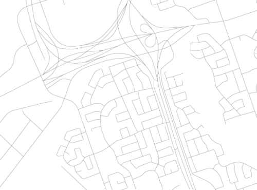
When a line layer containing road data is first imported into MAPublisher, all roads appear with the same appearance regardless of their class or type. However, with the help of MAPublisher and some native Illustrator tools, you can easily turn your roads from this:
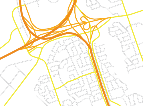
…into this:
Getting Started
As stated above, this workflow uses tools from both Adobe Illustrator’s native toolbar as well as the MAPublisher extension. More specifically, MAP Stylesheet Themes and MAP Selections along with the Graphic Styles and Appearance panels.
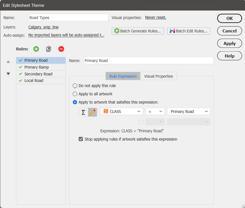
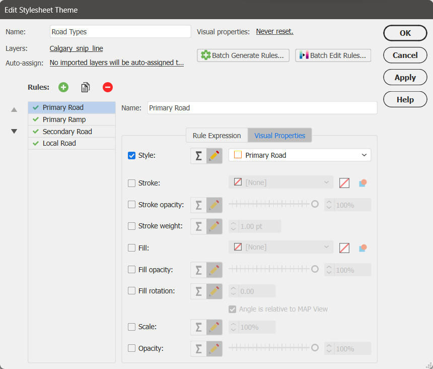
This process will only work if your road data contains an attribute on which you can base classification rules. For example, my road data has an attribute column named “CLASS” with four categories: Primary Road, Primary Ramp, Secondary Road, and Local Road. I have previously created a graphic style for each road type and saved them in a template document titled RoadStyles.ai. In my current document, I have simply imported these styles to the Graphic Styles panel by using the menu option for “Open Graphic Style Library”. For more information about the Graphic Styles panel, check out its Adobe help page.
Controlled Access Highway:
Controlled Access Ramp:
Major Road:
Minor Road:
These styles have all been created using the Appearance panel to overlay a stroke with a smaller weight over a stroke with a larger weight of a different colour. These road styles are usually referred to as cased roads. For information about the Appearance panel, check out its Adobe help page.
Now that the graphic styles have been created/imported, I can apply a MAP Stylesheet Theme I have created based on the road types.
Cleaning Up with Groups
Now that the main styles have been applied to each road class, we must perform a few more steps to perfect the appearance of our roads. If you zoom in closely on the roads you may notice that intersecting roads do not appear as seamless as you would like. Don’t worry; there is a way to transform your roads from looking like this:
…to this:
Why does this happen?
This occurs because MAP Stylesheet Themes apply the graphic styles at the path level. To look like intersections, each road classification must become one object, whether by being grouped or by turning the various paths into a compound path. Grouping is the preferred method for managing these objects since a compound path will delete the attributes of all paths that are being compounded. For example, if I turned my road types into compound paths, the street names would be turned blank. This would make automatic labeling with MAPublisher LabelPro impossible. Regardless, using groups instead of compound paths will avoid this issue, as grouped objects retain their original attributes.
Grouping Road Classes
In order to group our road classes we will have to select the road paths belonging to each class. We can use MAP Selections to individually select each of our road classes. The expressions we created when defining our MAP Stylesheet Theme rules can be saved as Named Expressions to be used again through the Expression Library. Once selected the street classes can be grouped using CTRL+G on your keyboard, right-clicking and selecting “Group” or selecting Object > Group from the menu. The final step is to re-apply the graphic style appropriate to each group using the Adobe Graphic Style panel.
If we want to get technical here regarding what has happened to our artwork, using the Appearance panel we can see that each of the paths we initially imported now has a graphic style applied to it on two levels: at the path level (done through MAP Stylesheets) and at the group level (done by grouping and applying a graphic style to the group). It is possible to symbolize our artwork even further, at the layer level, by selecting the target icon for our roads layer. If desired we could apply a transparency at the layer level that would supersede all graphic styles used on objects in the layer.
Our artwork now has symbolization that suggests intersections, giving our road map a much neater appearance.
Finishing Touches
Now that our roads are grouped together, they are much easier to manage in the Illustrator layers panel.
Groups can be easily arranged using the Layers panel. Many cartographers prefer to arrange their roads with major highways at the top and descending to reach local roads at the bottom of the hierarchy. Groups also make it easier to move objects between groups if necessary: simply select the path in the Layers panel and drag it to another group.
With our groups, we can now apply some tweaks to finish off their appearance. There will be many instances where we will need to override the intersection appearances that result from grouping. For example, in the image below we have ramps that definitely do not intersect as suggested by their grouping.
To correct this error, we can select the road lines that will pass over the others and, using the Layers panel, drag the paths from their group. This will eliminate the implication on the map that these roads actually intersect.
The ungrouped roads can now be arranged relative to the other paths until we find a layout that is the truest representation of the road network.
Using MAP Stylesheet Themes to Create a Legend
So why do we use MAP Stylesheet Themes if we must manually group the objects again after use? For a few reasons: it keeps us organized, it allows us to add the Named Expressions to the Expression Library, and most importantly, we can use these MAP Stylesheet Themes to automatically generate a Legend for us that reflects our Stylesheet rule names.
A deeper understanding of the Adobe Illustrator toolbox can go a long way in helping you use MAPublisher to leverage the full potential of your GIS datasets to create customized road styles. Happy mapping!
Be sure to check out our tutorial for Creating Line Stylesheet Themes as well as the video tutorial. This tutorial also includes the instructions for creating cased roads!
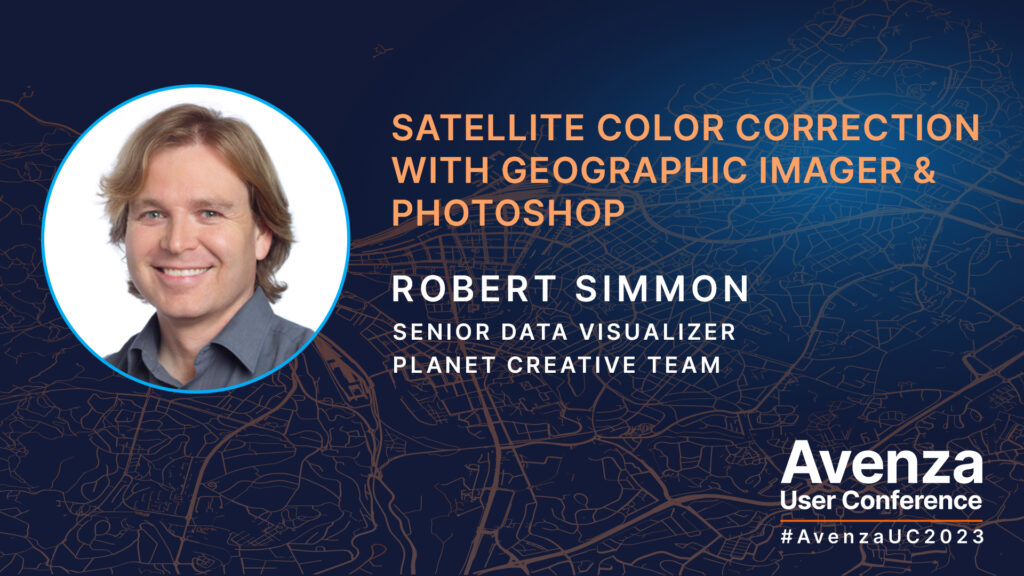
Last month at the annual Avenza User Conference, we had the pleasure of hearing from Robert Simmon, a renowned cartographer and science communicator who specializes in visualizing imagery from satellites. Robert is currently approaching a decade working for Planet Labs, where he helps create near-daily medium-resolution imagery of the Earth, maps Planetary Variables and designs bespoke graphics for media. Prior to his work at Planet Labs, he co-created the NASA Earth Observatory, a website dedicated to communicating Earth and remote sensing science. His work has appeared in newspapers, magazines, and websites, including the front page of the New York Times and the cover of National Geographic. He is also known for crafting the Blue Marble featured on the original Apple iPhone.
In this presentation, Robert demonstrates his workflow to import high-bit-depth scientific data into Adobe Photoshop and transform it into accessible & readily displayable imagery. These techniques rely on Geographic Imager‘s unique capabilities to exploit the georeferencing embedded in common data formats. This unlocks Photoshop’s powerful image processing tools which can produce higher-quality output than typical GIS and image processing software, all while maintaining the precise location of every pixel. The presentation touches on processes such as reordering bands, blending scenes, color correction with curves, vibrance enhancement, and sharpening.
The Avenza User Conference is an annual free virtual conference for map makers, GIS enthusiasts, and geospatial professionals worldwide who share a common interest in Avenza mapping technology. The conference includes a combination of virtual sessions led by experts who will share their experiences with Avenza mapping products.
The Avenza User Conference is an annual event that grows each year with incredible speakers and participants. Get inspired by mapping and industry professionals by joining us for #AvenzaUC2024. Register here for next year’s conference taking place on May 9th, 2024.
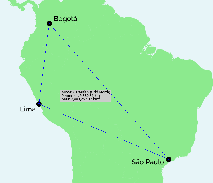
In this blog, we’ll be highlighting a very useful tool that may fly under the radar to the average MAPublisher user: the MAP Measurement tool! This tool is great for measuring the distance between two or more points, azimuths, and even the perimeter and area of closed paths. It is a great addition to your arsenal of regular MAPublisher tools because it can be customized to suit a variety of measuring methods, units, and shapes.
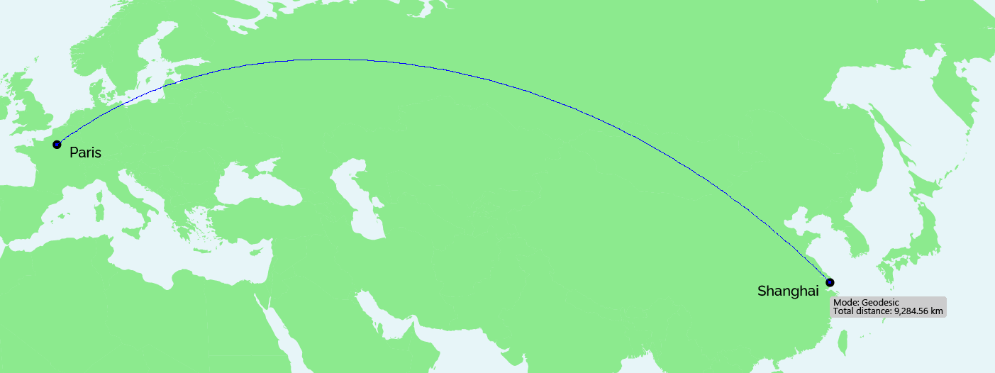
The MAP Measurement tool can be used to calculate the Euclidean distance between any two or more points on a map. This can be done using one of three calculation methods: geodesic (based on datum), cartesian (based on map projection) or Rhumb line. In the example below, I have calculated the distance between Paris and Shanghai using a geodesic method, which is why the line appears rounded rather than straight in the current Natural Earth projection.
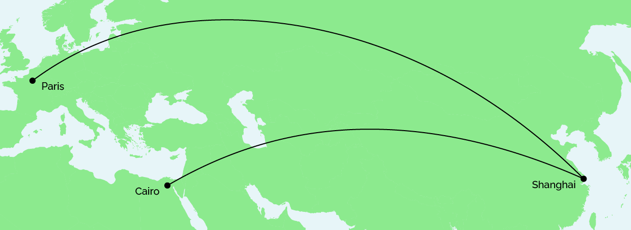
I can incorporate multiple points in my calculation, and the total distance will continue to increase. You can also hold the Alt/Option key while drawing to display the length of each line segment in your trip. In my example, I have decided to add a point in Cairo to follow Shanghai, as seen below.
Once I have finished adding points to my map, I have the option to convert the measurement line to art in my currently selected layer. This is a great way to quickly and accurately draw lines between points on certain types of maps that require it, such as a flow map or flight map.
The MAP Measurement tool can also be used to measure perimeter and area of polygons. In the example below, I have calculated the perimeter and area of a triangle drawn between the points of Bogotá, Lima and São Paulo.
This blog only outlines a few of the use cases of the MAP Measurement tool, however there are countless other ways that you can apply this tool to your cartographic designs. The possibilities are virtually endless!
For more information about the MAP Measurement tool, check out our Support Centre article.