We are excited to announce the release of MAPublisher 11.8 for Adobe Illustrator and Geographic Imager 7.1 for Adobe Photoshop, the latest updates to our geospatial extensions for Adobe Creative Cloud.
With these updates, we are announcing official compatibility with Adobe Creative Cloud 2026 and macOS Tahoe 26, as well as several other performance enhancements and bug fixes.
Here’s what you can expect with the latest MAPublisher 11.8 and Geographic Imager 7.1 releases:
Compatibility updates for Adobe Creative Cloud 2026
We are continuing to keep up with Adobe’s yearly updates, with Adobe Creative Cloud 2026 newly released in October. As such, MAPublisher 11.8 is compatible with Adobe Illustrator 2026 (version 30), and Geographic Imager 7.1 is compatible with Adobe Photoshop 2026 (version 27).
Compatibility updates for macOS Tahoe
We know our users have been waiting patiently since September for this one! Both MAPublisher 11.8 and Geographic Imager 7.1 are compatible with the recent upgrades seen in macOS Tahoe (version 26).
We hope that the aforementioned compatibility upgrades are helpful in keeping your mapping and geospatial imagery workflows running smoothly!
MAPublisher 11.8 and Geographic Imager 7.1 are available now!
If you want to learn more about the new MAPublisher 11.8 features or have any questions, please check out its documentation in our Support Centre.
If you want to learn more about the new Geographic Imager 7.1 features or have any questions, please check out its documentation in our Support Centre.
MAPublisher 11.8 and Geographic Imager 7.1 are immediately available today. They are free to all current MAPublisher or Geographic Imager users with active maintenance subscriptions and available as upgrades for non-maintenance users.
We hope that our products continue to deliver the tools you need to bridge the gap between geospatial precision and creative design!
We are excited to announce the release of Geographic Imager version 7.0, the latest version of our Geographic Imager extension for Adobe Photoshop.
With Geographic Imager 7.0, we are introducing several updates to the Terrain Shader tool, including a new relief option called texture shading, 11 new colour maps, and a toggle button for the relief preview, as well as other performance enhancements and bug fixes.
Here’s what you can expect with the latest Geographic Imager 7.0 release:
Terrain Shader improvements
Texture Shading
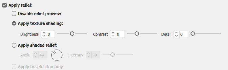
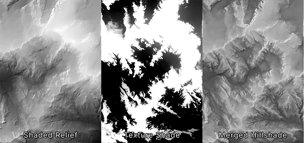
With this Geographic Imager release comes many improvements to the Terrain Shader, starting with a new relief option called texture shading. This option utilizes an algorithm developed by Leland Brown to generate a texture shade, which offers a more natural representation of terrain than a standard shaded relief with a single light source. While a texture shade is more successful at depicting the subtle differences in terrain, it is not the type of terrain we are used to seeing on maps—especially when there is a high contrast between the dark valleys and light ridges of a particular DEM. This can be mitigated by merging a texture shade with a shaded relief to achieve a hillshade that combines the best of both worlds!
Using the Terrain Shader with “Apply relief” enabled, you can now choose to apply texture shading or shaded relief to your DEM. The texture shading option allows you to control the brightness, contrast, and detail of your texture shade to ensure that you can finetune the visualization of your map’s hillshade. After outputting your texture shade, you can merge this image with your shaded relief image in Photoshop to create the ideal custom hillshade for your map.
New colour maps
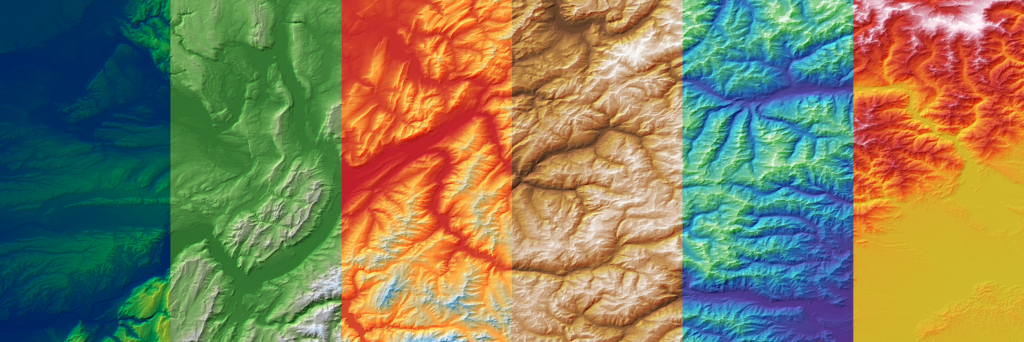
Geographic Imager 7.0 introduces a complete overhaul of the default colour maps available in Terrain Shader, with eleven brand new colour maps to choose from! The new gradients feature more practical colourization and were designed with usability in mind. Whether you are looking for a more natural-looking colour map or something a little more artificial or scientific, these new defaults have you covered. As always, the default colour maps are 100% editable to ensure you can create something that suits your map’s aesthetic!
Disable relief preview toggle
Terrain Shader also now features a “Disable relief preview” checkbox, which allows you to toggle the relief preview on and off as needed. This is a small but useful tool when working with large DEMs, which can slow down the software when generating previews for reliefs. This button is located under the “Apply relief” checkbox.
Geographic Imager 7.0 is Available Now!
If you want to learn more about the new Geographic Imager 7.0 features or have any questions, please check out our Support Centre.
Geographic Imager 7.0 is available immediately, free of charge, to all current Geographic Imager users with active maintenance subscriptions and as an upgrade for non-maintenance users.
We are thrilled to announce the release of MAPublisher version 11.7, the latest update to our MAPublisher extension for Adobe Illustrator.
MAPublisher 11.7 introduces support for database connections in the Manage Data Links tool, compatibility with FME Form 2025, as well as other performance enhancements and bug fixes.
Here’s what you can expect with the latest MAPublisher 11.7 release:
Manage Data Links with database connections
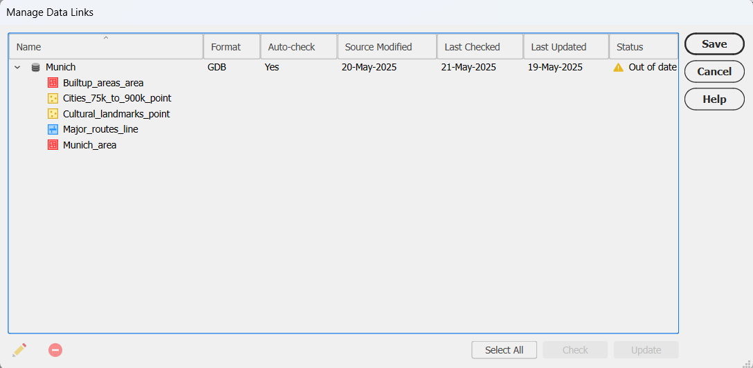
Are you tired of re-importing your databases every time you make changes to them? Well we have great news for you! We are excited to report that with MAPublisher 11.7, the Manage Data Links tool now supports connections with database formats such as PostGIS databases and Esri Geodatabases!
Visual cues for out-of-date datasets
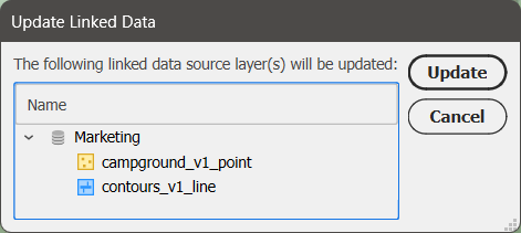
Linked databases can now be managed and updated using the Manage Data Links dialog box, which can be accessed from the MAP Views panel. Database formats such as MDB or GDB will display a yellow warning icon in the status column to notify you that the source database is out of date. Simply click the Update button in the bottom right corner of the dialog box to sync your data changes!
Linking your databases to MAPublisher is also a great way to quickly sync and update the data on your maps without having to re-style the data. MAP Themes are automatically applied to new data added to a previously styled MAP Layer.
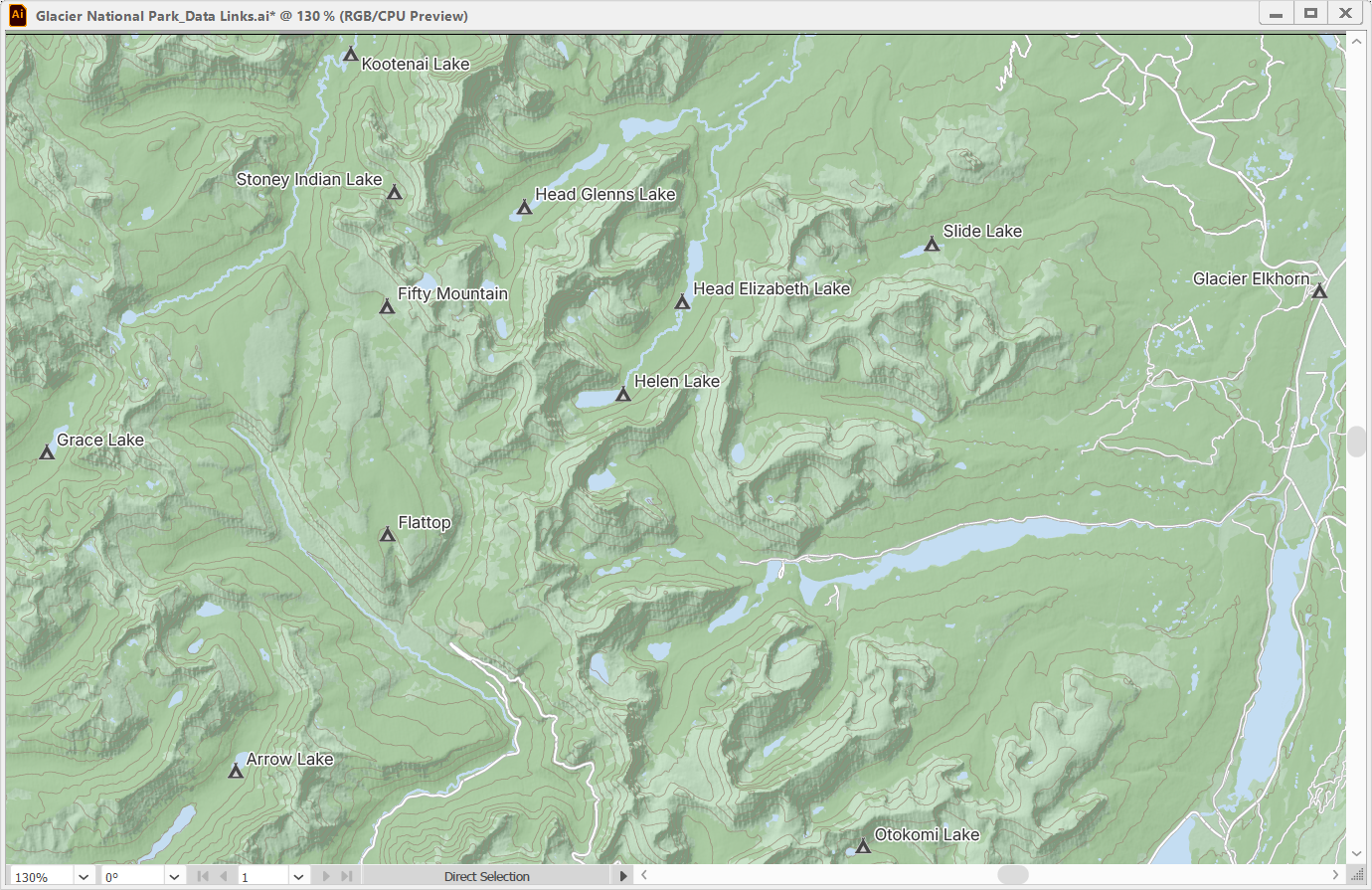
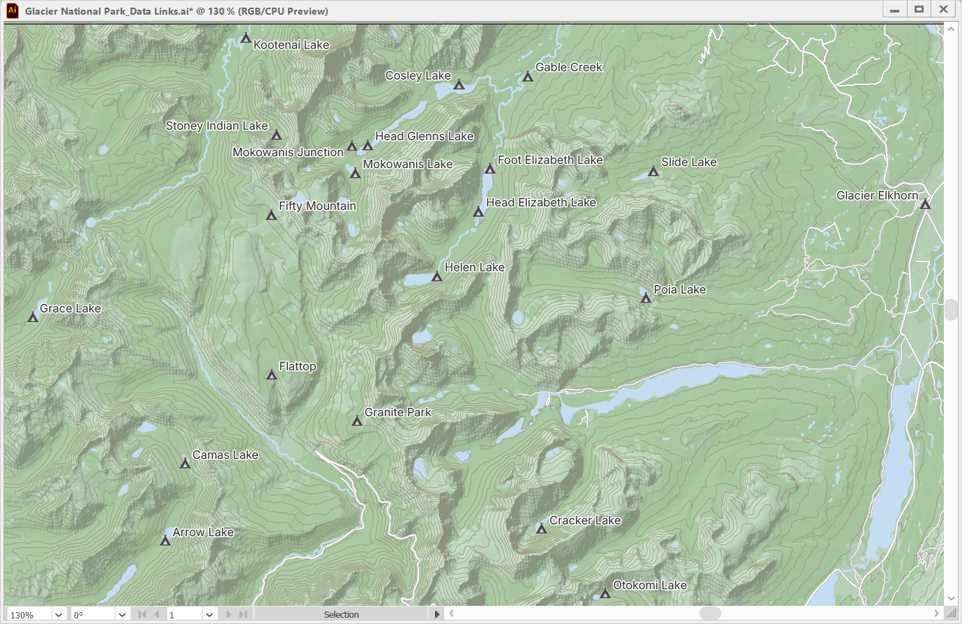
In the example below, a map showing campsites within Glacier National Park has campsite point data and contour line data stored in a PostGIS database.
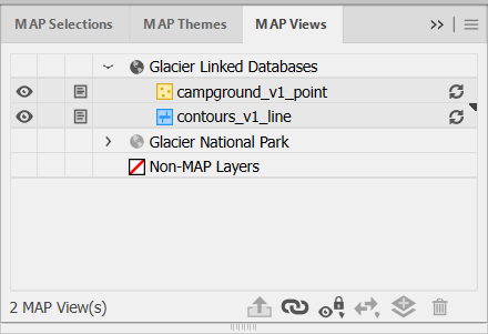
Opening the Manage Data Links window is not the only way to update your linked databases. The MAP Views panel also features visual cues that warn users whether their datasets connected from linked databases are out of date or available to be updated. These will appear as yellow symbols for file-based databases such as GDB and MDB.
Unlike file-based databases, which store data as files with detectable modification timestamps, PostGIS databases are server-based and do not provide a reliable way to track changes. As a result, MAPublisher cannot automatically detect updates in PostGIS datasets. Instead, PostGIS datasets will display a grey update icon next to them, allowing you to pull possible updates at any time.
Clicking this icon will open a prompt where you can confirm which MAP Layers you would like to be updated.
After updating, you can see that new campsites and more detailed contour lines have been added to the map and styled accordingly. With a quick run of the LabelPro tool, the labels for the new campsites have been added and the map is fully updated in just a few minutes!
User interface improvements for databases
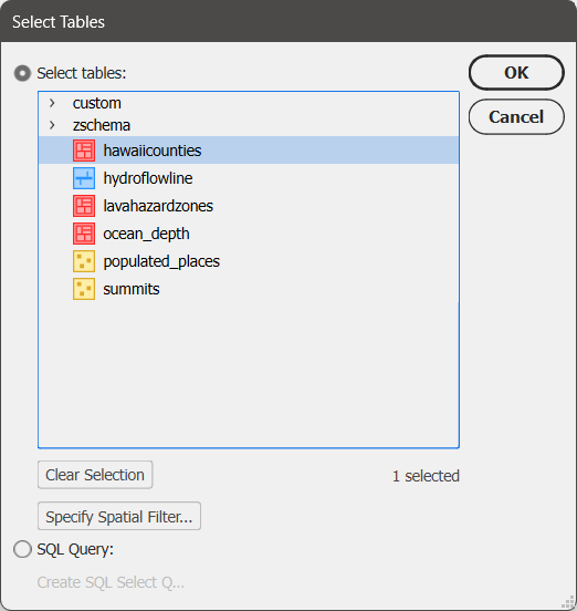
The Import dialog box for database formats now features a few upgrades to the user interface to make the import process clearer. The Select Tables window now has the option to select all or clear your selections at the bottom, and also shows the number of currently selected tables.
To learn more about the Manage Data Links tool, check out its support article.
Compatibility with FME Form 2025
MAPublisher FME Auto is a Windows-only powerful add-on that connects the GIS data processing environment of FME Form to the cartographic design and publishing environment of MAPublisher and Adobe Illustrator. MAPublisher 11.7 is the first version of MAPublisher to provide support for the recent FME Form 2025.0 update.
MAPublisher 11.7 is available now!
If you want to learn more about the new MAPublisher 11.7 features or have any questions, please check out our Support Centre. MAPublisher 11.7 is immediately available today. It is free to all current MAPublisher users with active maintenance subscriptions and available as an upgrade for non-maintenance users.
We are thrilled to offer a deeper dive into another helpful enhancement new to MAPublisher 11.6: Point Scaling, now a calculation option available in the Add Calculated Data tool.
Scaling points is a simple and easy-to-understand method to visually represent the differences in magnitude within a point dataset directly on your maps. Whether you’re mapping city population sizes, earthquake magnitudes, or any other quantitative data, point scaling makes it easy to convey differences in quantity at a glance directly through your map symbols.
In our most recent video, we take you through a basic workflow for setting up a Point Scaling calculation using the Add Calculated Data tool and then scaling your points based on the output of the calculation. Using a map of the Netherlands, the example in the video shows you how to scale city points based on population values.
The video contains an overview of how to set up a Point Scaling calculation, including the four scaling methods available in the tool—Area, Exponential, Flannery, and Radius—as well as selecting the proper Source variable, Target attribute field, and value range.
Once the Point Scaling calculation is run, the video also shows you how to use the newly created attribute with the Scale & Rotate by Attribute tool to resize your points. An even quicker option for scaling your points is to select the Automatically Apply Point Scaling to Layer checkbox before running the calculation!
The Point Scaling feature is ideal for users who want to make their maps more infortmative without manual resizing, complicated workflows, or cluttered supplemental text. With just a few clicks, you can transform your data into an intuitive visual representation!
Ready to try it out? Watch the full demonstration below to see how Point Scaling works in action, and how you can enhance your own maps with smarter symbol sizing in MAPublisher 11.6.
For more information on Point Scaling calculations and the four scaling methods, check out our Support Page for the Add Calculated Data tool.
We’ve recently added a deliciously useful feature to MAPublisher: waffle charts!
Waffle charts are grid-based visualizations where each cell represents a fixed quantity of data. They offer a clear, easy-to-read alternative to traditional pie charts, especially when comparing multiple categories or displaying categories with small percentages. Whether you’re working with population figures, economic data, or any other dataset, waffle charts can help your map users quickly compare proportions or observe patterns.
In our newest video, we walk you through the process of creating waffle charts in MAPublisher 11.6, starting in the MAP Themes panel. Our demonstration compares exports between Canada and the United States across nine different categories, from oil and minerals to food and transportation products.
The video contains a brief overview for creating a waffle chart, using the Edit Chart Theme window to specify your settings (including some new options specific to waffle charts), and how to set up a legend to assist users in interpreting your charts.
With editable styling options that allow full customization of the appearance of your waffle charts, this new chart type is a fantastic way to enhance the visual storytelling power of your maps. Waffle charts can even be styled using native Illustrator graphic styles or custom swatches you’ve created yourself!
Ready to get started? Watch the full demonstration below to find out just how easy it is to bring your data to life in a new way with waffle charts in MAPublisher 11.6.
For more information on waffle charts, check out our Support Page for Chart Themes.
We are excited to announce the release of MAPublisher version 11.6, the latest update to our MAPublisher extension for Adobe Illustrator.
MAPublisher 11.6 introduces waffle charts to the MAP Themes chart types, a Point Scaling option to the Add Calculated Data tool, and other performance enhancements and bug fixes.
Here’s what you can expect with the latest MAPublisher 11.6 release:
Waffle chart option added to MAP Themes
The MAP Themes panel welcomes a brand new chart type to MAPublisher 11.6: waffle charts! A waffle chart is a grid composed of equally sized cells, each coloured to depict different categories or segments. It is useful for comparing categories and displaying proportions. Waffle charts are typically used as an alternative to pie charts, making it easier to compare areas, visualize categories with small percentages, and generally make charts more readable.
To create waffle charts in MAPublisher 11.6, open the MAP Themes panel and create a Chart Theme as you usually would. When you open the Edit Chart Theme window, you will notice the brand new “Waffle chart” option in the Type drop-down menu.
As seen in the above image, configuring a waffle chart is very similar to configuring the other chart types with the usual option tabs such as Source Data, Chart Options, General Options, and Title available for customization. The Chart Options tab features a few new options specific to creating waffle charts, including a Calculate Default Scale button to help select a suitable value for the data represented in each cell.
To learn more about creating waffle charts in MAPublisher, check out the support page for Chart Themes.
Add Calculated Data now features a point scaling option
The Add Calculated Data tool—found in the Data Creation section of the MAP Toolbar—gains a new calculation option in MAPublisher 11.6. When the selected Layer is a point layer, the brand new “Point Scaling” option will become available in the Calculation drop-down menu.
The Point Scaling option adds a field to your attributes containing a calculation for point scaling sourced from an existing numeric attribute. The “Automatically Apply Point Scaling to Layer” checkbox allows you to immediately resize your points according to the selected scaling settings upon clicking “OK” to close the window instead of creating a new attribute. There are four Scale Methods to choose from, each calculating the scale slightly differently depending on which factors are important to you. For example, selecting the Flannery method applies a correction factor to account for natural human bias that causes us to underestimate the size of larger symbols. In contrast, choosing the Exponential method increases the size of symbols exponentially relative to their data values to emphasize differences, especially among larger values.
MAPublisher 11.6 is available now!
If you want to learn more about the new MAPublisher 11.6 features or have any questions, please check out our Support Centre. MAPublisher 11.6 is immediately available today. It is free to all current MAPublisher users with active maintenance subscriptions and available as an upgrade for non-maintenance users.
In this edition of Cartographer Chronicles, we interviewed Craig Molyneux, a veteran of the cartography industry and the winner of the second runner-up prize in the 2024 Avenza Map Contest! Craig’s journey in the world of cartography is a testament to the passion, adaptability, and ever-evolving landscape of mapmaking. Sparking from an interest in graphic design and a love for the outdoors, Craig found his calling in cartography, blending artistic skill with geographic precision. From hand-drawn maps to the early days of digital cartography, Craig has always been on the cutting edge of the industry. Through his company, CartDeco, he has worked with major publishers, created award-winning maps, and inspired the next generation of cartographers. Craig is sharing his cartographic journey with us in his own words.
***
Discovering and Navigating the World of Cartography
At secondary school I had a real interest in graphic design, and also was interested in the outdoors. Using map products became second nature to me as I would be out camping and hiking most weekends. I had a little inkling that I would end up in Cartography, but I quickly discovered that graphic design was super competitive and only the elite made it through to university. After completing high school, when searching for a likely university course, Cartography jumped out at me, and I quickly embraced it. Back in the 1980s there were only a couple of universities in Australia that offered Cartography as a degree, and I went to RMIT University in Melbourne.
Over 40 years my career has taken me through the private and public sector, however I feel most comfortable working for myself. I feel there’s more creative freedom when you can focus and concentrate on the jobs that give you pleasure.
CartDeco started as a side hustle in the 1990s. When the early Apple Macs hit the market I bought a second-hand one, and using the very first version of Adobe Illustrator I started doing computerised mapping. Things were pretty basic back then (compared with what we have now), however I felt I was at the cutting edge using a desktop computer to create maps. Prior to that all of my cartography had been done by hand, either using pen and ink or scribe, peel-coat and stick-down type.
After producing maps for the tourism industry I was beginning to get known within the local publishing industry and CartDeco took off. I made a connection with Henry Boegheim, who had started Hema Maps, a Brisbane-based mapping company, and Henry asked me to produce maps for him, so that’s when I concentrated full time on CartDeco. Working in a home office at the back of a shed, CartDeco continued to produce maps for Hema Maps then slowly expanded to other publishers, like Australian Geographic, the AA in the UK, Universal Publishers, Hardie Grant Publishing and many more. I did have young graduates work with me from time to time and it was a pleasure to be able to mentor the cartographers of the future.
Very quickly after starting desktop-based cartography it became apparent that scanning and tracing linework was not the most efficient production method. I stumbled upon Avenza’s MAPublisher in its very early days. I think I was one of the early adopters. Back then it could import a few geospatial datasets and that was about all, but now it’s grown to be a fully-formed production tool, essential in my cartographic workflow. Being one of the only Australians using the application I was approached by Ted Florence to be a local distributor for the software. I did this for a number of years, providing training and support for local users before handing over to Gavin James at Mapuccino.
Career Highlights
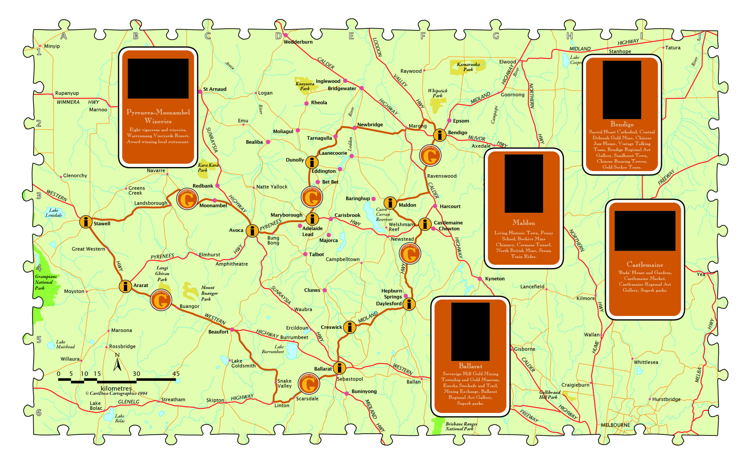
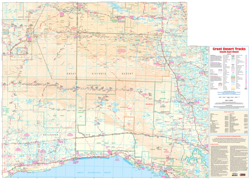
I’ve been lucky enough to work on some fabulous cartographic projects and work with some great people over my cartographic journey. As Hema Maps began to expand, in 1998 they had a vision to map the centre of Australia like never before. Sending out field teams to map the roads and features of our vast continent, they asked me to compile six maps covering about two thirds of Australia. This was a daunting task. Open data was just being thought of and Geoscience Australia, to their credit, had made available their 1:250,000 dataset of Australia. As was soon discovered, data in remote and rural areas was unreliable and many years out of date. MAPublisher was used to create this first series of maps, importing 1:250,000 data into Adobe Illustrator and combining it with GPX routes that had been collected by the on-ground team. Comprehensive field notes were used to add “meat to the bone” of the map, with many unique and culturally significant details added that had never before appeared on published maps.
Entitled Great Desert Tracks, the series of six maps at a scale of 1:1,250,000 enabled the new generation of 4×4 explorers to safely travel in Australia’s outback. The series is now into its 9th edition.
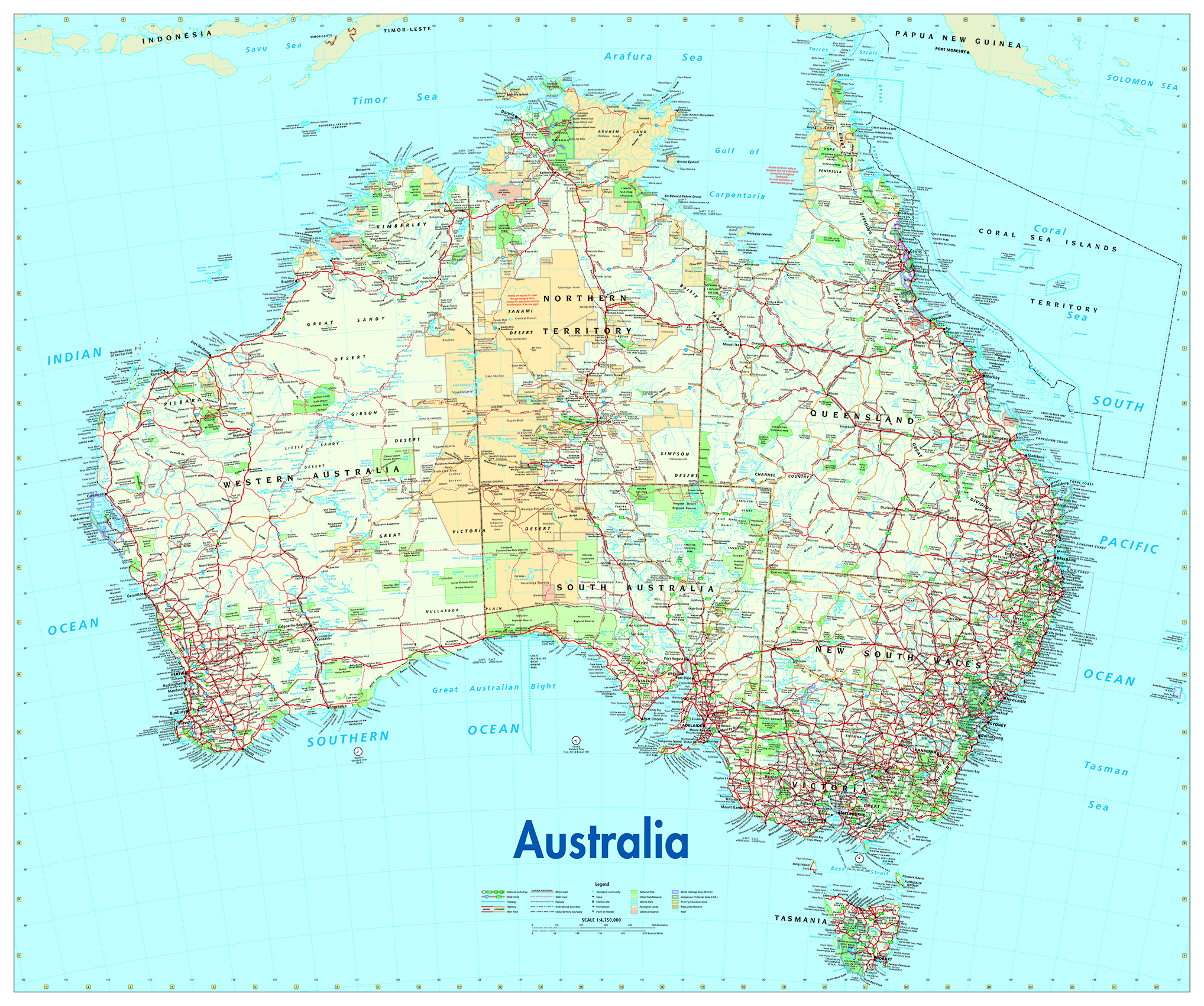
A key relationship I made early on was with the senior cartographer at Australian Geographic (AG) magazine, Will Pringle. Will became a long-standing friend and mentor, who sadly passed away in November 2024. He had a profound impact on my career and was generous with his knowledge and wisdom. Will asked me to update AG’s Australia for Adventurers and Dreamers map for the magazine. This became a staple product for many years and ended up on many a child’s bedroom wall.
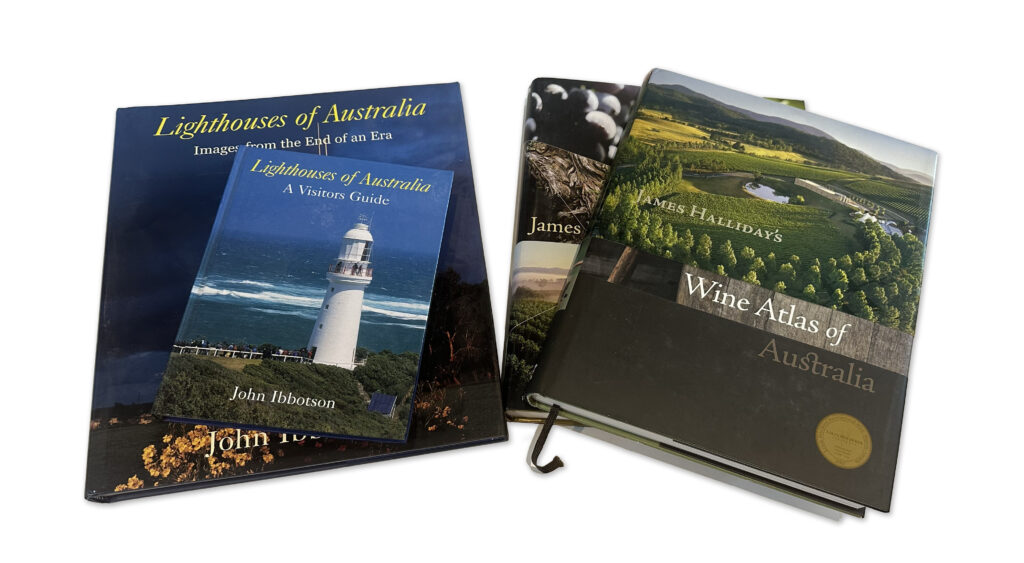
I’ve enjoyed commissions for small and large jobs, from a simple map for a brochure to large atlas projects with maps numbering in the hundreds. One project that I was particularly pleased to contribute to was the Jacaranda School Atlas, published by John Wiley and Sons. As a secondary school geography student I used an early edition of this atlas and it has been a mainstay in Australian secondary schools ever since. I was lucky enough to be asked to work on the 7th, 8th and 9th editions of the atlas and to revise the design to a more contemporary style. Originally the atlas plates were created using ArcGIS, as this was felt that it would be easier to update and index the atlas, however over time we realised that this was not the case and a production approach using MAPublisher was simpler and indexing was easier. Other atlas commissions included editions of the James Halliday’s Wine Atlas for Hardie Grant Publishing and various titles for Lighthouses of Australia.
Whilst it’s nice to design and produce maps for clients, it’s especially nice to design, produce and publish your own maps, and over the past five years I’ve been creating large wall maps for use in either the classroom or as a collectible piece of art for the living room or office.
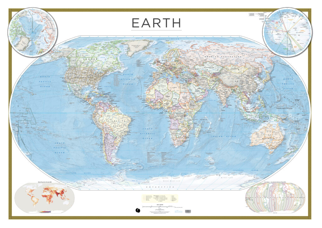
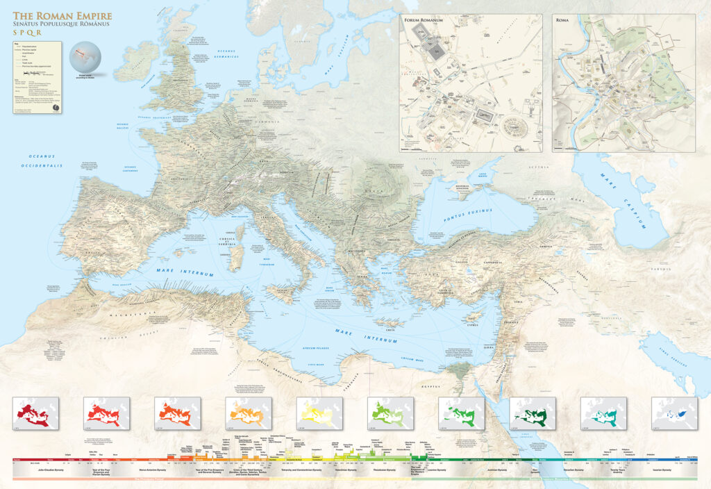
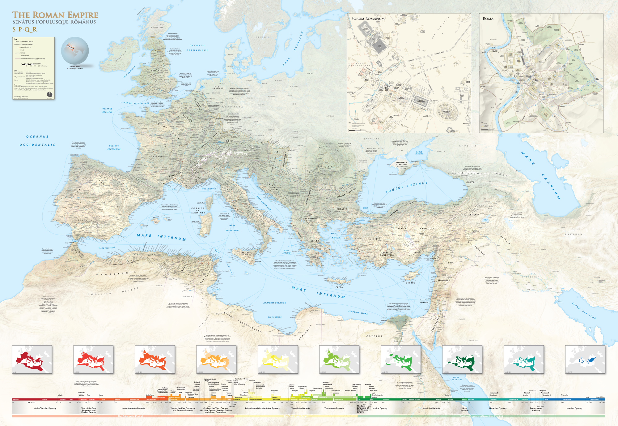
The Earth Wall Map has been a passion project combining the latest global datasets (including Natural Earth Data) to present a view of our world like no other. My interest in all things Roman has led to the creation of the Roman Empire wall map (which won the second runner-up prize in the 2024 Avenza Map Contest). After ten years of research and production it has finally seen the light of day. Measuring in at 1600 x 1100 mm the map is a valuable tool for researchers and educators.
Cartographic Methods
Technology has impacted our profession immeasurably. As new software tools have come along, and computing power has increased, we have been able to make new and improved cartographic design choices. The provision of detailed open digital elevation data and satellite data, along with improvements to 2D and 3D imaging tools, has improved the types of maps we produce.
My typical workflow is to use PostgreSQL for data storage, QGIS for data manipulation and editing, with the finishing of artwork in Adobe Illustrator and Photoshop. I also use tools like Natural Scene Designer Pro and Eduard for creating relief, and Avenza Geographic Imager for reprojecting imagery and relief. I do like experimenting with other tools as they come along, like Blender for example, and I’m dabbling in the use of drones to collect detailed base imagery and using WebODM to stitch images and create surface models.
You’re never too old to learn new methods using new tools, however there are fundamental cartographic principles that still apply when compiling a map. I’m not a big fan of maps created out of GIS applications that use auto styles and auto labelling. Whilst this has improved in recent years they are still easy to spot and lack the craftsmanship of a well designed map.
The Avenza suite of applications has proven itself over the years to be fit-for-purpose in map production. I’ve used Esri ArcGIS and QGIS for map production, however these don’t really suit my creative needs. For clients in the publishing industry, there is a need to provide artwork in Adobe Illustrator or pdf format. Being able to maintain geographic referencing and layers in the final output is critical. I enjoy the seamless integration between Illustrator/MAPublisher and Photoshop/Geographic Imager when working with projections.
Recently I have been producing a series of walking maps solely for the Avenza Maps app. Using open data sources like OpenStreetMap and Sentinel imagery, a walking map can be quickly produced for any area on the planet. Additionally the Avenza Maps app is used for field checking the map prior to publication. The whole Avenza Map Store ecosystem works well for me, from publishing, promoting and accounting of sales.
What’s Next?
History is an interest of mine and combining this with cartography I see an opportunity to create more maps like the Roman Empire wall map on specific themes. My next map in production is a wall map of the conquests of Alexander the Great.
My indigenous heritage gives me a deep connection to place. My ancestors have been on this continent (Australia) for at least 40,000 years. In Australia it’s been a challenging few years getting the broader non-Aboriginal population to give the Traditional Owners a Voice to parliament. What that exercise has shown me is that there’s much education to be done around our long-standing history and connection to the continent we now call Australia. Geographic place naming is one area where countries like Australia, with a very brief colonial history, can embrace the rich stories that connect us to place. Stories that go back over a thousand generations have been used to connect us to features in the landscape. The stories are ever-evolving and provide a multi-layered view of place. Place is described through song, dance, art and story. Rather than name features after recent arrivals, battles or long-dead members of the British aristocracy, we have an opportunity to promote unique culture through language and place naming. By imbuing data and maps with the rich cultural heritage of place we give everyone a deeper connection to place.
Insight for Aspiring and New Cartographers
Our industry is a very niche one, and what I’ve discovered over my cartographic journey is just how friendly and helpful everyone is. Other cartographers genuinely care about your success and are happy to assist you with either helpful technical advice or putting you in touch with the right people. If you’re starting out on your cartographic journey, reach out to those whose work you admire. Their enthusiasm and care may surprise you. Feel free to contact me any time if you have technical questions (I can’t guarantee I can answer the tricky ones) or just need advice on how to get your passion converted into a small business. My email is craigmolyneux@mac.com.
Check out our other Cartographer Chronicles blogs here!
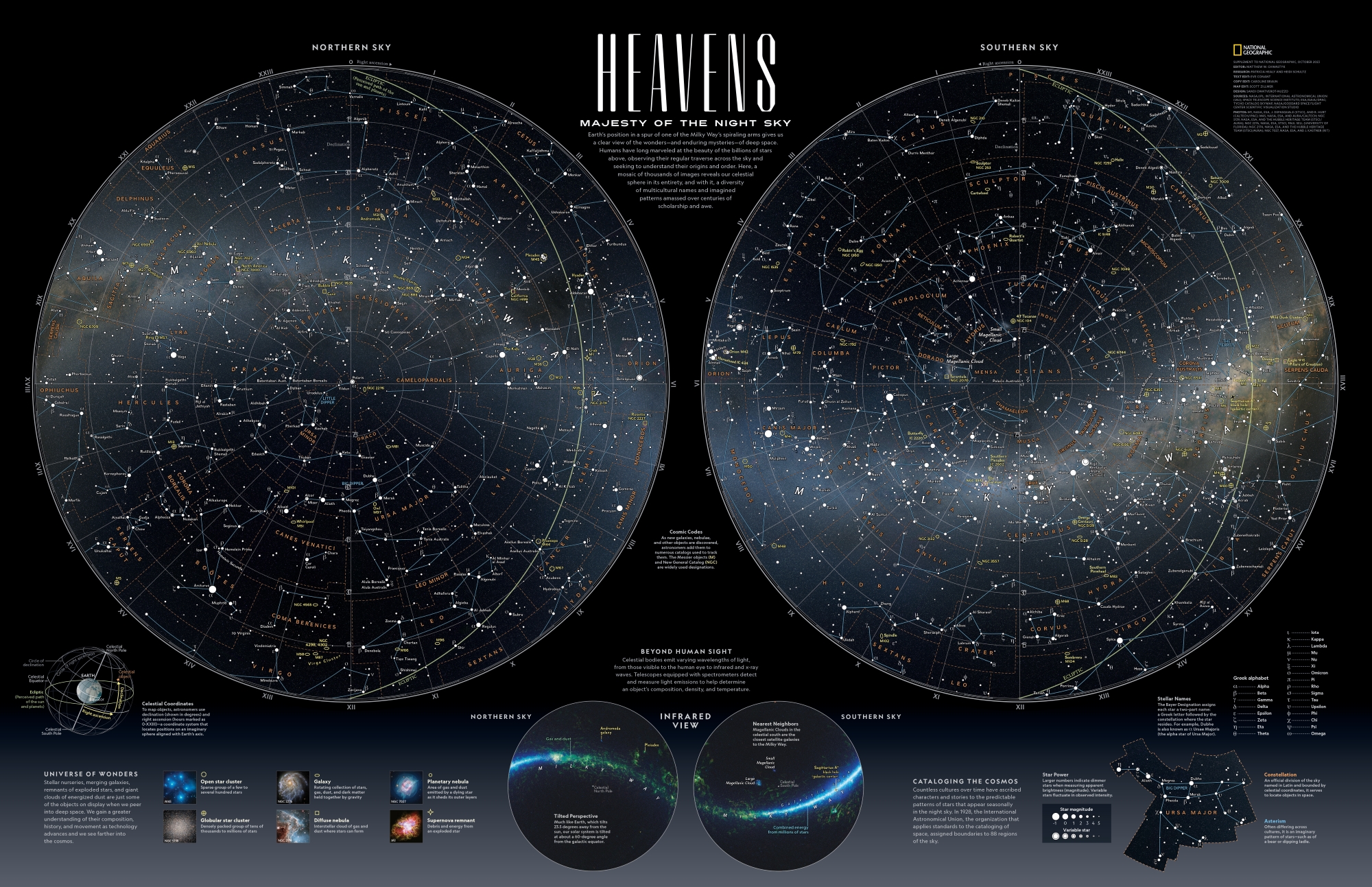
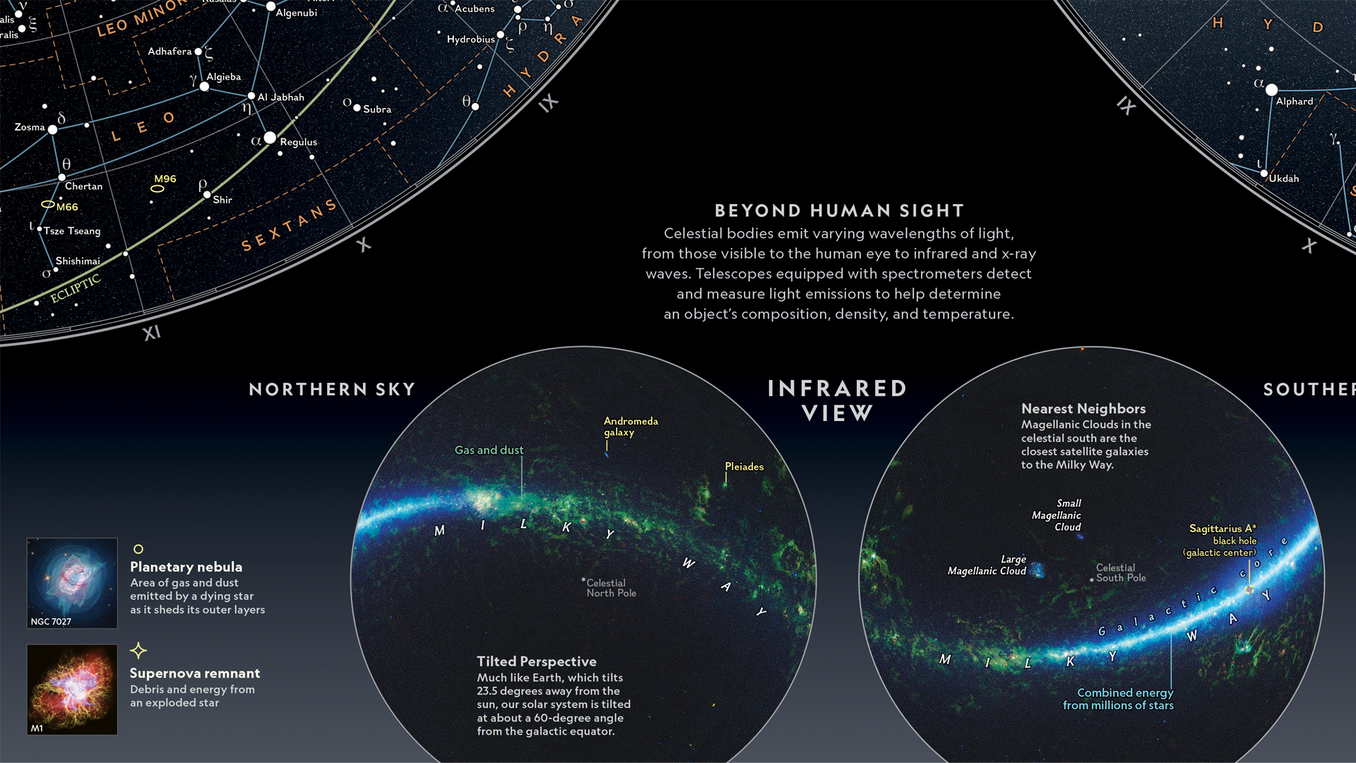
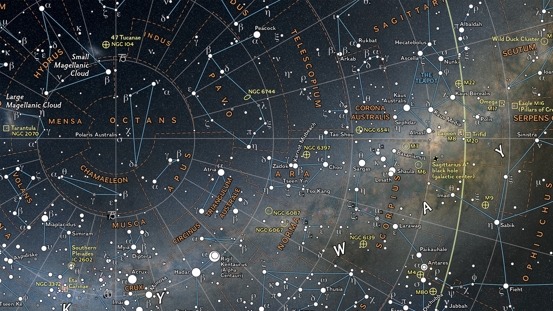
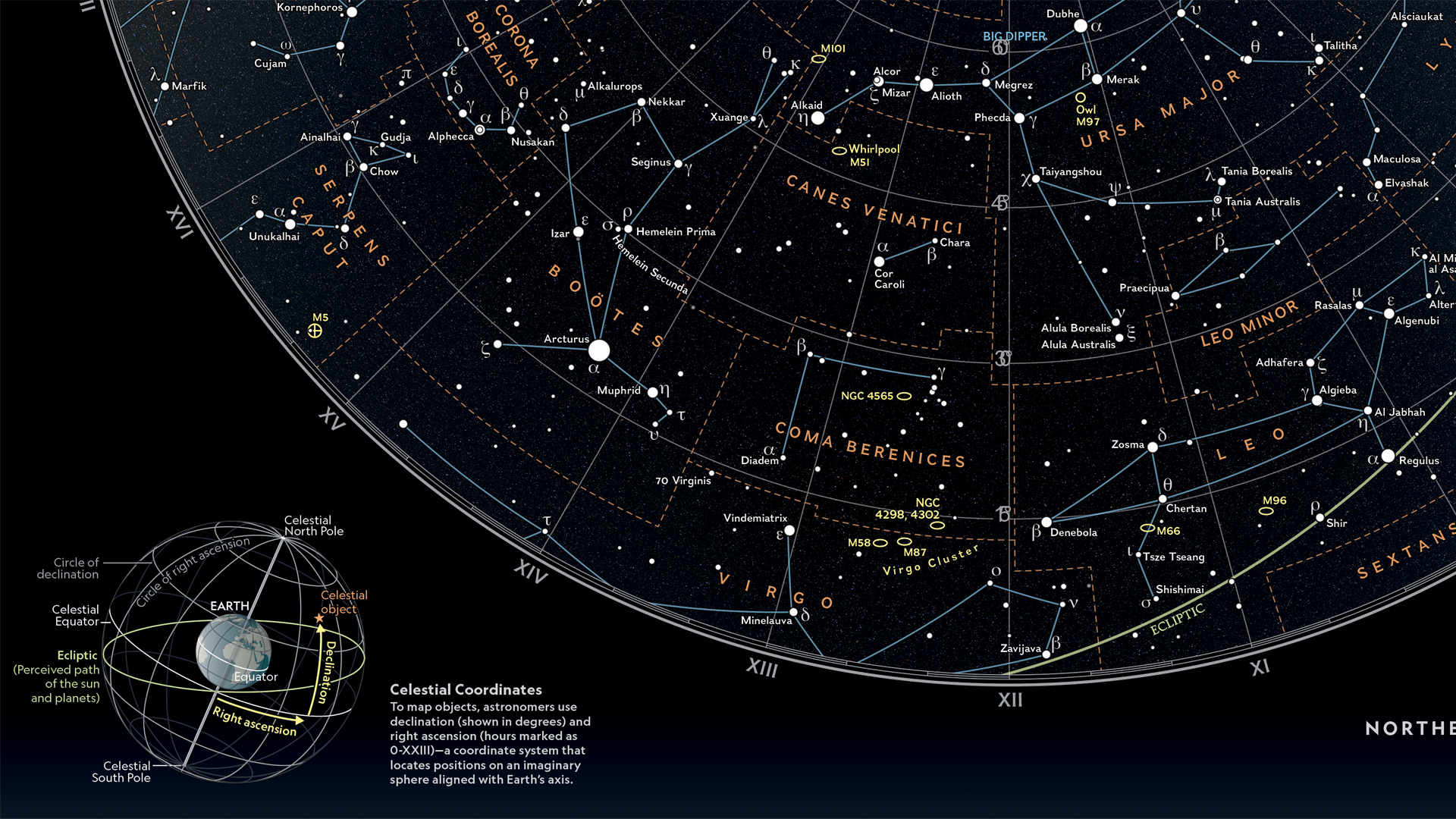
In this Map Spotlight, we are showcasing the Grand Prize winner of the 2024 Avenza Map Contest—Heavens: Majesty of the Night Sky by Matthew Chwastyk of National Geographic, with additional contributions from Patricia Healy, Heidi Schultz, Eve Conant, Caroline Braun, Scott Zillmer, and Sandi Owatverot-Nuzzo. This particular map was created for inclusion as a poster in the special space issue of National Geographic Magazine, using the most recent NASA data on star locations, constellation boundaries, asterisms, and deep-sky objects.
Matthew plotted stars of magnitude 5 and brighter, which marks the threshold for naked-eye visibility. Star magnitudes and variable stars are represented by graduated symbols, with brighter stars appearing larger. The stars are plotted on a supplemental set of hemispheres featuring the latest whole-sky survey projected into the map view to display how the sky appears in infrared, including a glowing representation of the Milky Way galaxy. Stars are labeled in both their traditional names and in Greek letters using the Bayer system. Matthew further enhanced the visual appeal of the map with a key containing representative images of deep-sky objects on the bottom left side.
Select the images below to see a detailed look at Matthew’s map
Making the Map
One of the most eye-catching visual elements of this map is the sky imagery on which the star data is displayed. Matthew prepared this imagery to be used for the map by reprojecting it in Geographic Imager using the Transform tool. This is how the hemispheres of the two main maps were created, after which they were imported into MAPublisher.
In MAPublisher, Matthew used the MAP View Editor tool to create a workspace that utilized a hemispherical-shaped coordinate system, such as the stereographic projection. The MAP Point Plotter tool was used to place selected deep-sky objects on the map using estimated coordinates.
The MAP Themes tool was essential in allowing Matthew to approach the styling of the stars in a hierarchical format by categorizing them based on magnitude, ensuring the most prominent stars stood out the most. Stars were then labeled using the MAPublisher LabelPro add-on, with manual adjustments minimized by the intuitive nature of the tool.
Matthew used the Create Knockouts tool to improve label legibility by creating a mask around text in busy areas of the map. Map legibility was also improved by using the Simplify Art tool to generalize the detail on constellation lines. The Join Lines tool was used to group lines constituting asterisms together, making them easier to manage and style.
Read our other Map Spotlight blogs here, and check out the other winners of the Avenza Map Contest 2024 here!
We are excited to announce the release of Geographic Imager version 6.9, the latest version of our Geographic Imager® extension for Adobe Photoshop®.
With Geographic Imager v6.9, we are announcing official compatibility with Adobe Photoshop 2025 and macOS Sequoia, WMS 1.3.0 import capabilities, support for NITF metadata, and other user interface and usability enhancements.
Here’s what you can expect with the latest Geographic Imager v6.9 release:
Compatibility upgrades
Following our extensive MAPublisher compatibility upgrades earlier this fall, we are happy to share that Geographic Imager 6.9 is fully compatible with Adobe Photoshop 2025 (version 26), which was released this October. Geographic Imager 6.9 also supports the recently released macOS Sequoia (version 15).
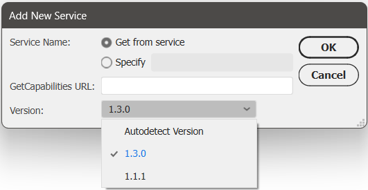
Import data from WMS 1.3.0
We have had many users request the ability to import data from Web Map Service (WMS) version 1.3.0, and we are happy to announce that this is now possible with Geographic Imager 6.9! This can be done by opening the Advanced Import window and following the usual steps to add a web map service. Select 1.3.0 from the new Version drop-down menu, or select the “Autodetect Version” option in this menu, which can detect the WMS version used by the URL provided.
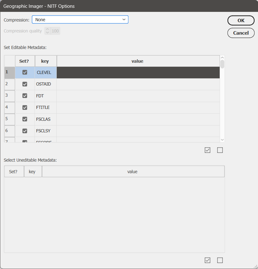
Support for NITF metadata
NITF metadata will now be maintained when you import NITF files into Geographic Imager. When you go to quick save a document to NITF file format, you will now be met with an “NITF Options” dialog box. Here you can specify image compression, edit certain metadata fields, and choose which metadata fields to include in your saved NITF file.
Geographic Imager 6.9 is Available Now!
If you would like to learn more about the new Geographic Imager 6.9 features or have any questions, please check out our Support Centre.
Geographic Imager v6.9 is available immediately, free of charge to all current Geographic Imager users with active maintenance subscriptions and as an upgrade for non-maintenance users.
We are thrilled to announce that the 2024 Avenza Map Contest has officially wrapped up! This year, cartographers from around the world submitted their finest work, showcasing remarkable creativity and skilled cartographic design. Our entrants demonstrated how they harness the capabilities of Avenza software to create impactful and visually appealing cartographic products. With the judging, discussion, and review process now concluded, the Avenza team proudly congratulates this year’s prize winners!
In the coming months, stayed tuned for our Map Spotlight blog series, where we’ll highlight the winning entries and some honourable mentions of the 2024 Avenza Map Contest. Each article will dive deeper into how the winning maps were crafted, featuring insights from their creators, and an exploration of the tools and techniques behind their award-winning designs.
Grand Prize Winner
Heavens: Majesty of the Night Sky Matthew Chwastyk National Geographic
Connect with Matt on X (Twitter) @mapchwastyk. Additional contributors to the map are Patricia Healy, Heidi Schultz, Eve Conant, Caroline Braun, Scott Zillmer, and Sandi Owatverot-Nuzzo.
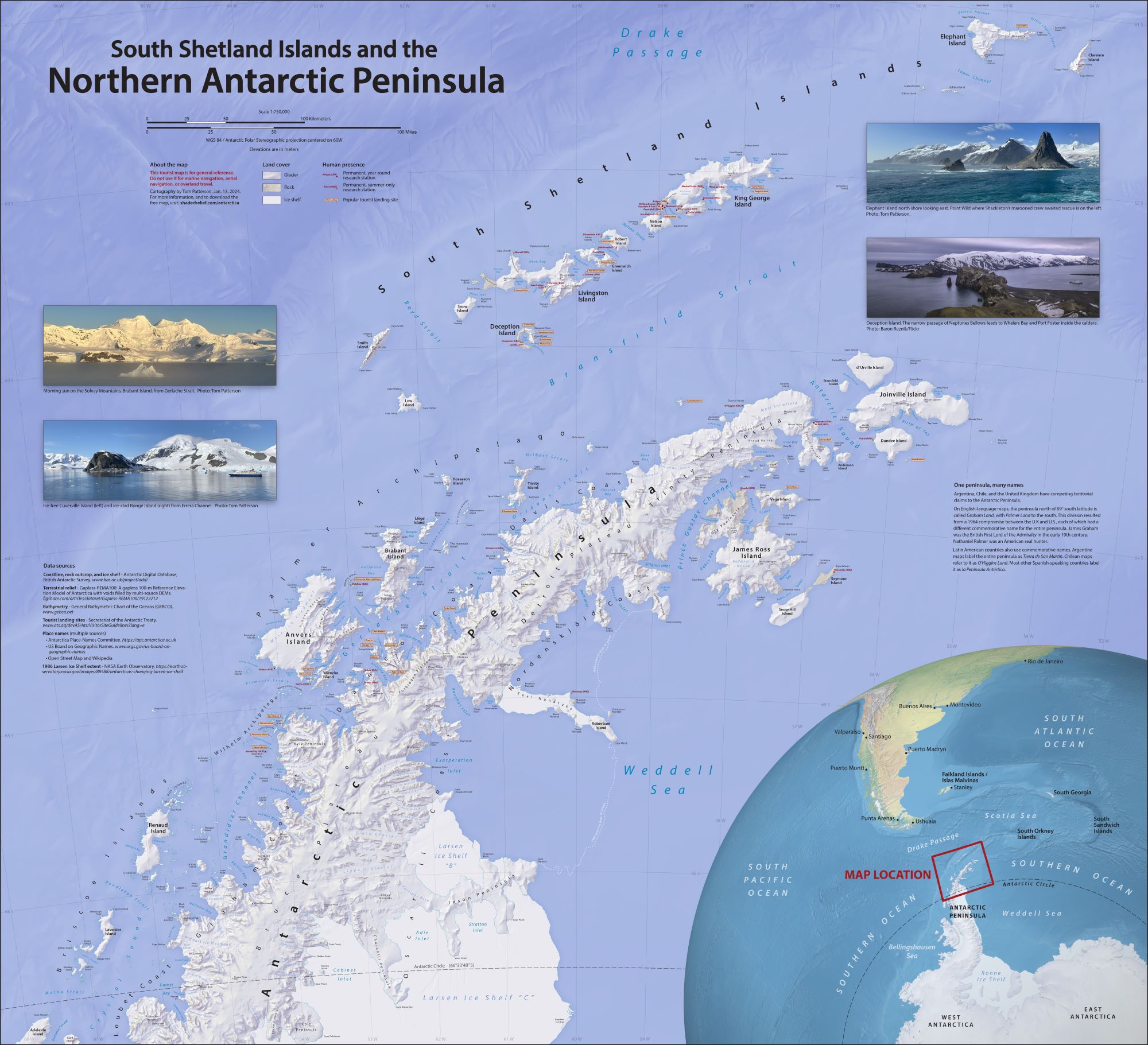
Runner-Up Prize Winner
South Shetland Islands and the Northern Antarctic Peninsula Tom Patterson US National Park Service (Retired)
Learn more about this map and check out Tom’s other maps on his website. You can also download it from the Avenza Map Store for free! connect with Tom on X (Twitter) @mtnmapper.
Second Runner-Up Prize Winner
The Roman Empire Craig Molyneux CartDeco
This map can be purchased as a 1600 x 1100 mm print on the CartDeco website.