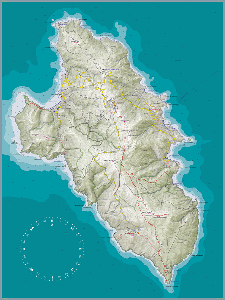
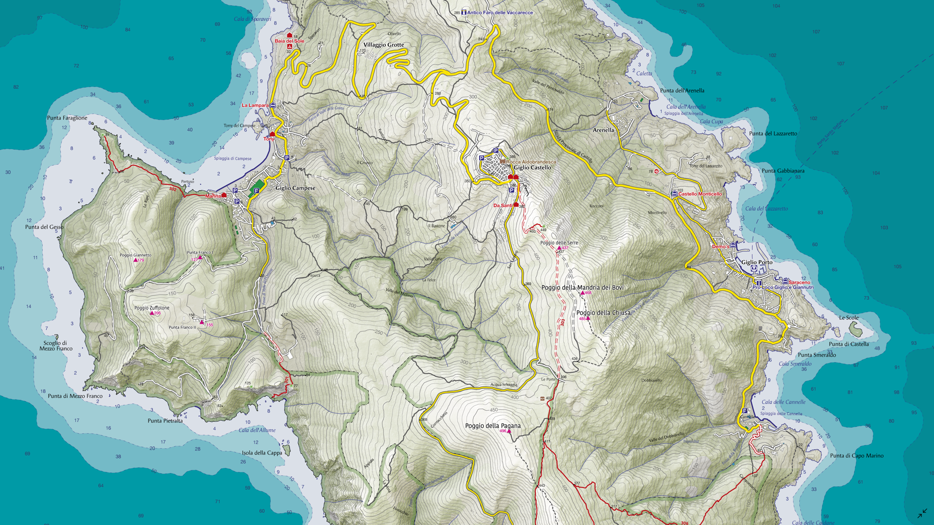
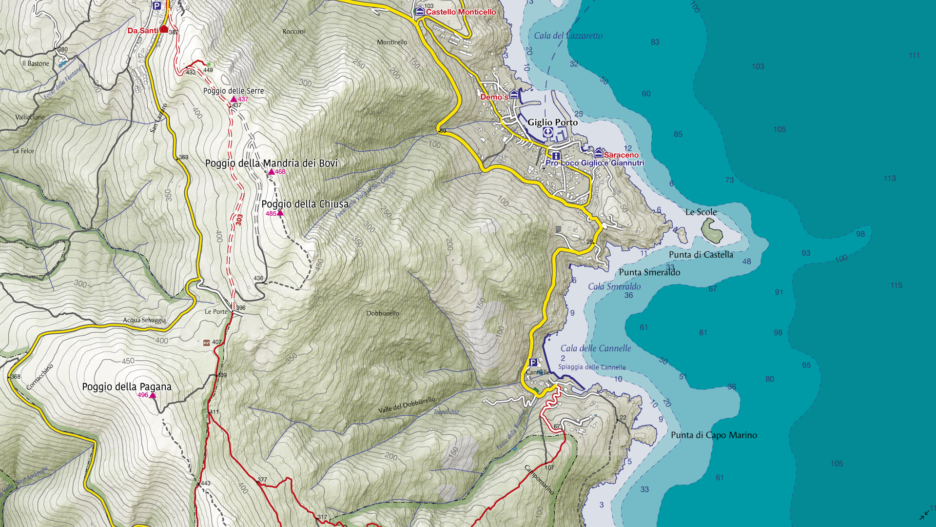
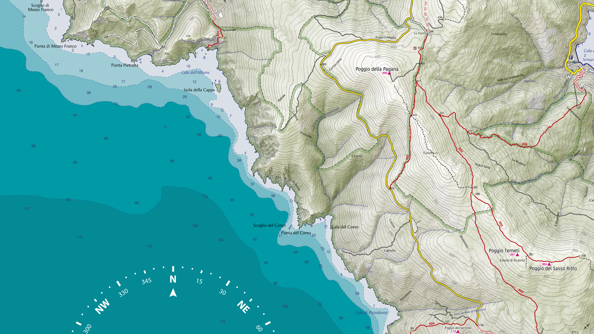
For the September Map Spotlight, we are showcasing an honourable mention of the 2021 Avenza Map Contest by Enrico Casolari. This is one of seven maps created for Arcipelago Toscano National Park in Italy, with this map in particular focusing on Giglio Island. It illustrates forest roads and trekking paths that span the island, as well as topographic information to visualize its impressive terrain. Enrico used natural tones to create an eye-catching cartographic piece that serves as both a functional reference aid and a visually engaging artwork.
Select the images below to see a detailed look at Enrico’s map
Making the Map
Enrico employed both Geographic Imager and MAPublisher to create this map. He used Geographic Imager in Adobe Photoshop to create the shaded relief images for the land portion of the map. The Terrain Shader tool is a simple but effect method to create a shaded relief using a Digital Elevation Model (DEM) file. The Mosaic and GeoCrop tools were used to ensure the DEM only included the necessary area required for the map. The shaded relief image could then be imported into MAPublisher and used for the final map design.
Next, Enrico imported his vector data on top of the shaded relief image into MAPublisher. He used MAP Stylesheet Themes to visualize the vector data as desired, including roads, trails, and sea depth. The Label Features tool was used to automatically place labels at important locations on the map, with the option to modify them manually once placed. This tool serves as a great substitute for the LabelPro add-on if intensive labeling is not required.
Enrico then used the Create Knockouts tool to ensure that more important labels and features were not obscured or intersecting with contour lines. Finally, he used the North Arrow tool to easily add the finishing touches to his map, importing a custom symbol to use for his north arrow.
Learn more and enter the 2024 Avenza Map Contest here, and check out our other Map Spotlight blogs here!
Colour plays a fundamental role in cartography, helping convey both quantitative and qualitative information, differentiating features, and guiding users through visual hierarchies. However, for individuals with colour blindness, interpreting maps can be challenging if they are not designed with accessibility in mind. By understanding how colour blindness interacts with cartography, we are able to leverage the tools available in MAPublisher and Adobe Illustrator to create more inclusive, colour blind-friendly maps.
Understanding Colour Blindness
Colour blindness, or colour vision deficiency, affects an estimated 8% of men and 0.5% of women globally. Most colour blind people are affected by congenital red-green colour blindness, which means they have decreased colour discrimination ability on the red-green axis. There are two main types of red-green colour blindness:
Protanopia: a lack of red cones, affecting the ability to perceive red light
Deuteranopia: a lack of green cones, affecting the ability to perceive green light
These types of colour blindness vary in severity, but both affect the user’s ability to distinguish between red and green hues. Fortunately, Adobe Illustrator offers soft colour proofing features that simulate these conditions, helping us design maps that work for everyone.
Using Colour Proofing in Adobe Illustrator
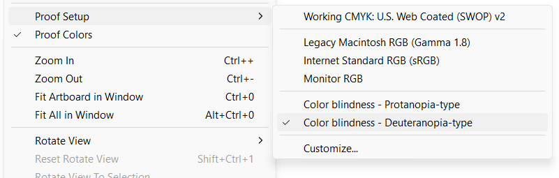
Adobe Illustrator’s “Proof setup” feature, also known as colour proofing, is a valuable tool for designing colour blind-friendly maps. This feature allows you to simulate how your maps will appear in different viewing conditions, including for people who are affected by red-green colour blindness. Proof setup has options for previewing your artwork in protanopia and deuteranopia modes.
Enabling colour proofing in Illustrator is very simple:
Open your map file in Adobe Illustrator.
Navigate to View > Proof Setup > Color Blindness.
Here you can select between protanopia-type and deuteranopia-type proofing.
Toggle the “Proof Colors” option below “Proof Setup” to switch the simulation on and off as required.
Simulating what colour vision-deficient users see enables you to adjust your maps to ensure they are understandable and effective for all users. These adjustments may take the form of simply changing the colour of particular objects or using other indicators such as labels or varying patterns, textures, and line types to differentiate between features.
Designing Accessible Maps
When designing maps for accessibility, consider these three colour attributes:
Hue, often used interchangeably with colour, refers to the actual colour wavelengths one perceives (problematic for colour blind individuals).
Value refers to how dark or light a colour is, with a lower value being closer to black and a higher value being closer to white.
Saturation refers to the intensity or purity of a colour, with a higher saturation being very intense and a lower saturation being duller, or closer to grey.
Since hue can be challenging for those with colour blindness, we can leverage value and saturation to help provide better differentiation. Here are a few colour-related tips to consider when creating a map for users with red-green colour blindness:
Use orange-red instead of pure red, as it’s easier to identify.
Opt for bluish-green over yellowish-green.
Keep in mind that grey may be confused with pale or emerald gree, and lighter shades of pink.
Avoid using the following combinations to differentiate features wherever possible:
red and green
yellow and bright green
light blue and pink
dark blue and violet
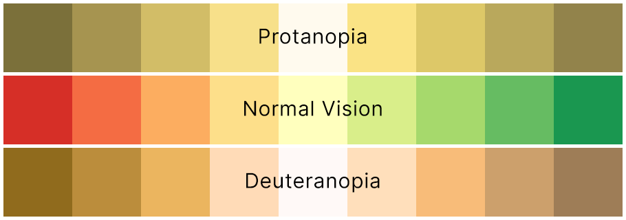
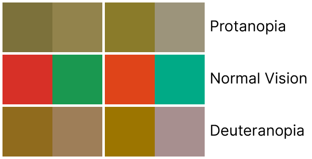
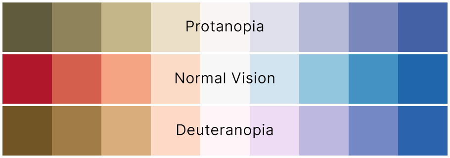
The image above makes it easy to envision why it is not advised to use red and green as differentiating colours on a map. However, if we take the darkest red and green of each side and use some of our tips above to adjust them, we can already see an improvement:
Even with the slight adjustments of adding orange to the red and blue to the green, a greater difference can be observed. These can be enhanced even more by changing the value or saturation of the colours as well.
ColorBrewer, created by Cynthia Brewer, is a great resource for selecting colour swatches pre-designed for colour blind users. Here, you can toggle the option to view only colour blind-safe palettes. All of the ColorBrewer swatches are available in MAPublisher through the Swatches panel by selecting Open Swatch Library > MAP Swatches > ColorBrewer.
The image above shows the 9-colour Red Blue ColorBrewer swatch, which is just one of its several options for symbolizing your data in a colour blind-friendly way.
Differentiation Beyond Colour
When colour isn’t enough, here are some other methods you can try to make a map more accessible:
Patterns and textures: Utilize different patterns or hatching to distinguish features, even when they are the same colour.
Labels and annotations: Clear, legible labels or annotations can ensure that users do not solely rely on colour to understand map features.
Alternative formats: Offer grayscale or high-contrast versions of your map where possible.
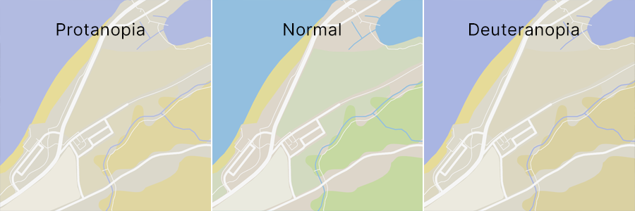
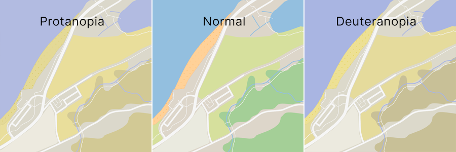
Practical Example
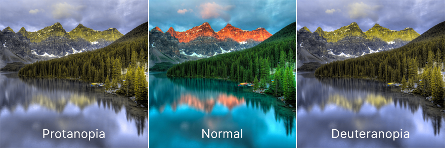
On the above map, the greens, browns, and yellows representing different land use types might be difficult for someone with red-green colour blindness to discern. We can adjust some of the greens to be more bluish to make them more differentiable from each other and the brown background of the map. I can also use different patterns to tell them apart if necessary. For example, adding a grainy pattern and making the pale yellow colour used here to depict sand a little more orangey helped it stand out more on the map when proofing for colour blindness.
With just a few small changes, the map becomes much easier to read and more accessible to people with colour blindness.
Colour blindness presents unique challenges in cartography. Since our maps often convey essential (and sometimes even vital) information, we must ensure they are clear and accessible to anyone who relies on them. By practicing mindful design and using tools like Proof Setup, these challenges can easily be mitigated to create a map that everyone can understand.
Check out Adobe’s help article on colour proofing for accessibility in Illustrator for more help.