My Account     Contact Us     Cart

Articles

Exploring Shaded Relief Techniques in Geographic Imager and Adobe Photoshop 3D

PLEASE NOTE: As of Photoshop 22.5, Adobe has discontinued support for the program’s 3D features. This may affect some or all elements of this blog. For more information, see Adobe’s FAQ page about this change and the Geographic Imager compatibility information page.
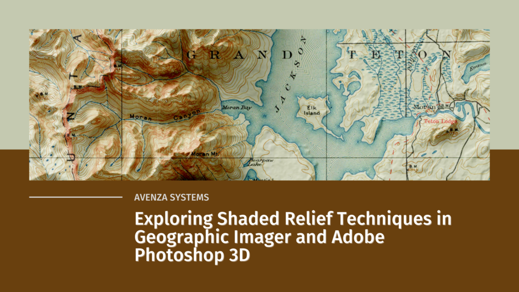
In the world of map-making, shaded relief refers to a visual technique that gives the illusion of three-dimensional terrain on an otherwise flat map. Cartographers use shaded relief to draw the viewer’s eye to prominent topographic features such as mountains, valleys and canyons. Using imaginary illumination sources and digital elevation data to cast directional light on a map, the cartographer can give the illusion of depth, casting shadows into valleys and lowlands, and highlighting ridgelines and peaks as if they are bathed in sunlight. 

Historically, this technique was achieved entirely by hand and was extremely labour intensive. Now, with modern graphical software and digital mapping technologies, relief shading can be accomplished right on the desktop. 

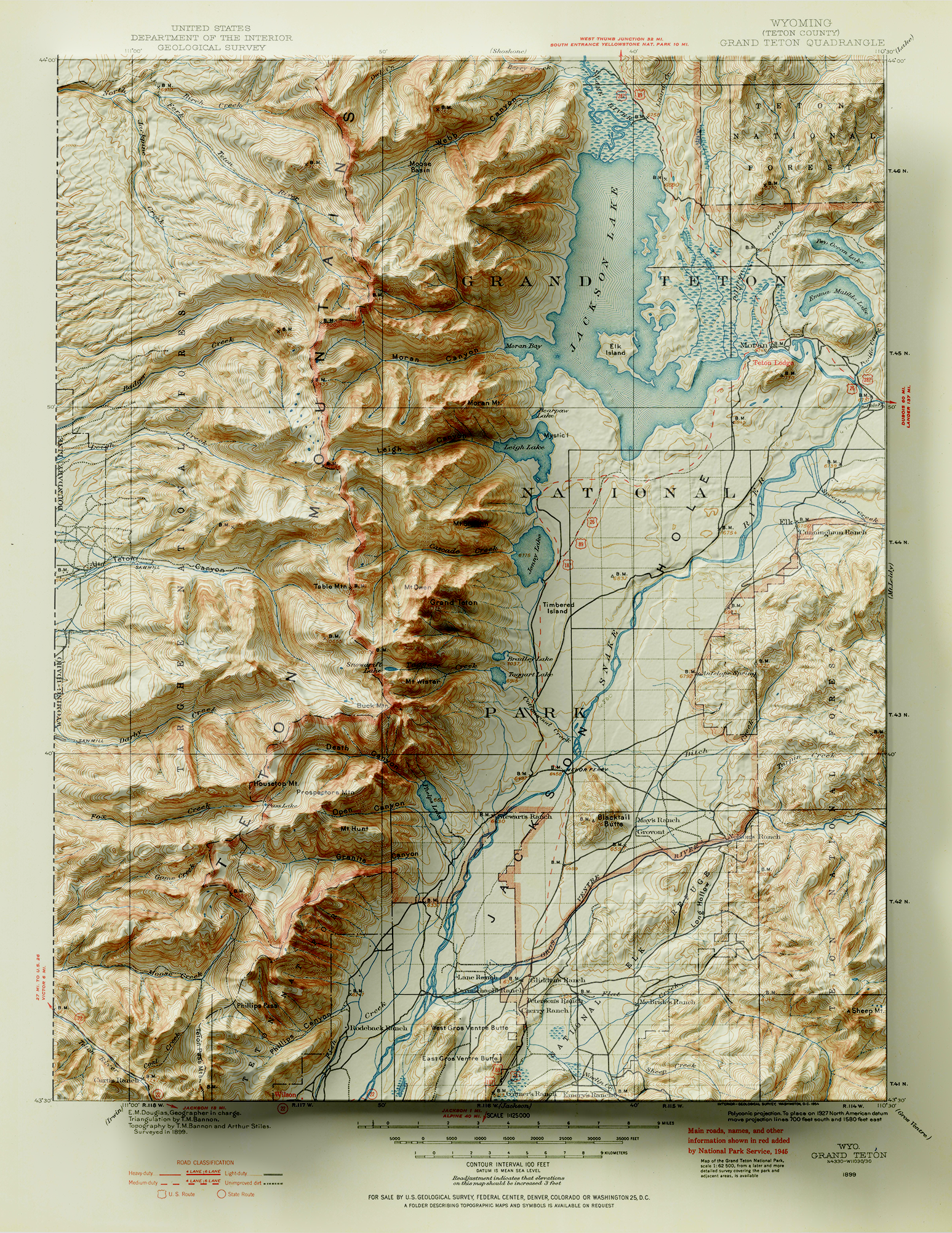
To demonstrate this, we are going to use the powerful spatial imagery tools and graphical design capabilities of the Geographic Imager plug-in for Adobe Photoshop to explore relief shading using a really interesting 19th-century historical map. Here is a sneak peek to show what the final product will look like.
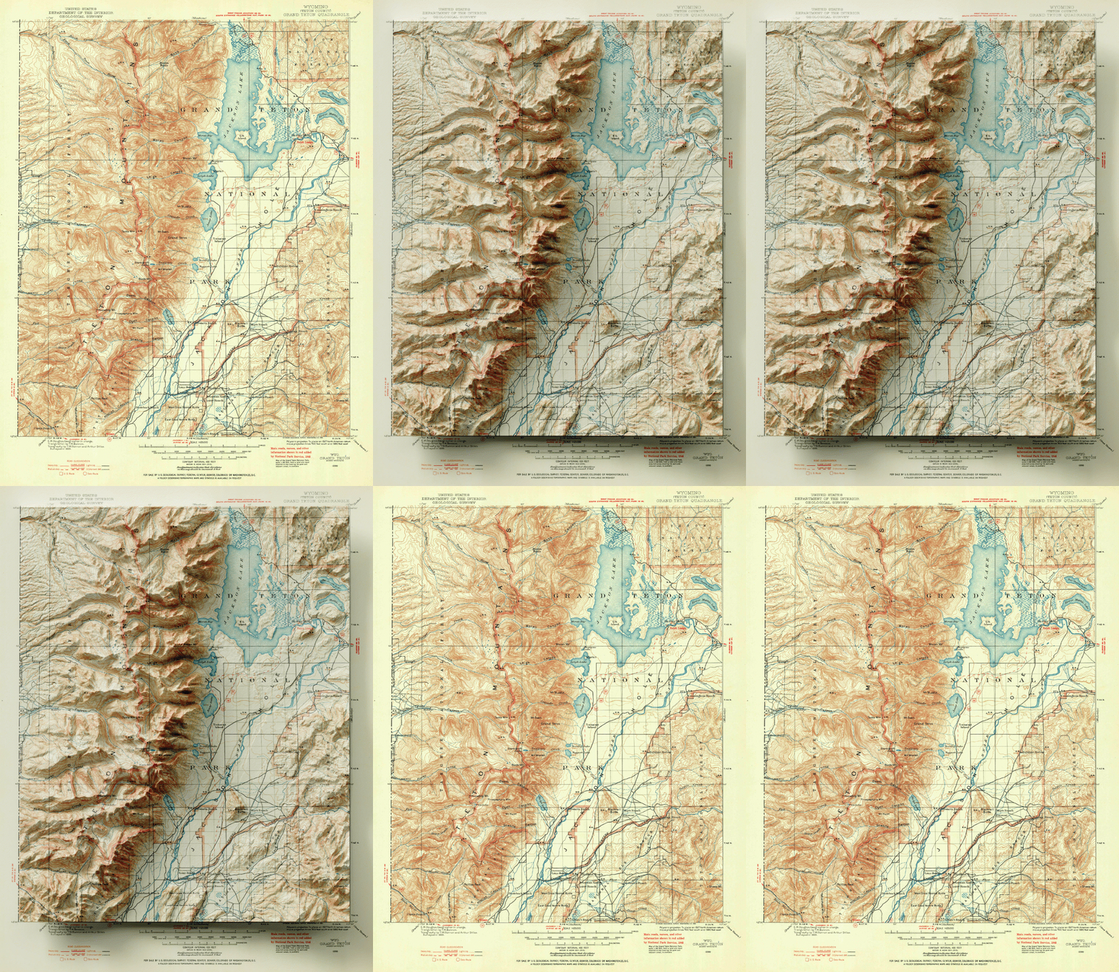
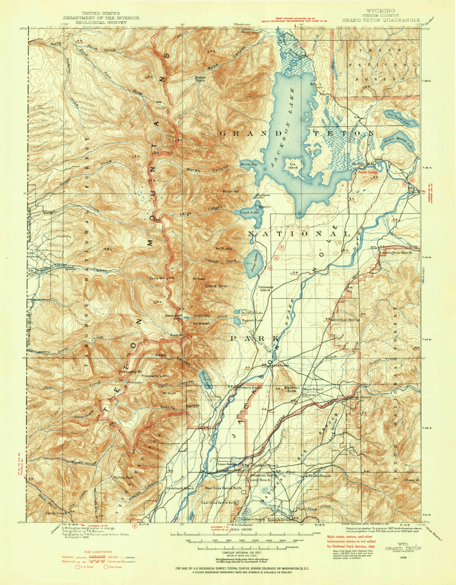
Let’s start with our original map. We have taken an absolutely stunning United States Geological Survey Map of the world-renowned Grand Teton National Park in Wyoming. Originally drafted by hand in the year 1899, the map features beautifully drawn contour lines and colour work showing the mountainous topography of the park and its surrounding area. The map, and thousands of others like it, are available in full-resolution on the USGS Historical Map Catalogue. Our goal will be to bring the map to life using three-dimensional (3D) relief shading techniques available with Geographic Imager and Adobe Photoshop.

First, we need to bring in some elevation data. Elevation data is critical for creating shaded relief, as it determines how light and shadows will behave in different parts of the map. We can obtain high-resolution digital elevation models (DEM) for our region from the USGS EarthExplorer.

Those of your familiar with spatial imagery data and DEMs will know that our first challenge will be working with tiled (discontinuous) imagery data products. In its raw form, DEMs are often stored as identically sized tiles, with each tile representing a specific indexed region of the earth’s surface. It is an unfortunate reality that many times the spatial extent of each DEM tile rarely matches the exact extent of the area you are interested in mapping. As a result, map-makers and spatial imagery specialists need to implement tools to import, merge, and crop these tiles to a more useful format and size.
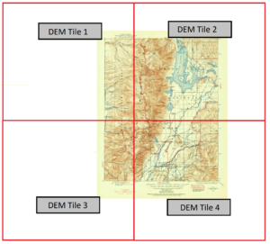
In our case, the elevation data for the area shown by the original 1899 topo-map is now represented by four separate DEM tiles, with roughly one tile for each quadrant of the map. To handle this problem, we can use the powerful Advanced Import tool within the Geographic Imager toolbar. The tool is a one-stop solution to easily import and mosaic our DEM datasets directly into Photoshop, all while retaining the spatial awareness we need to georeference or transform our data layers.
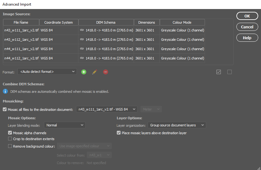
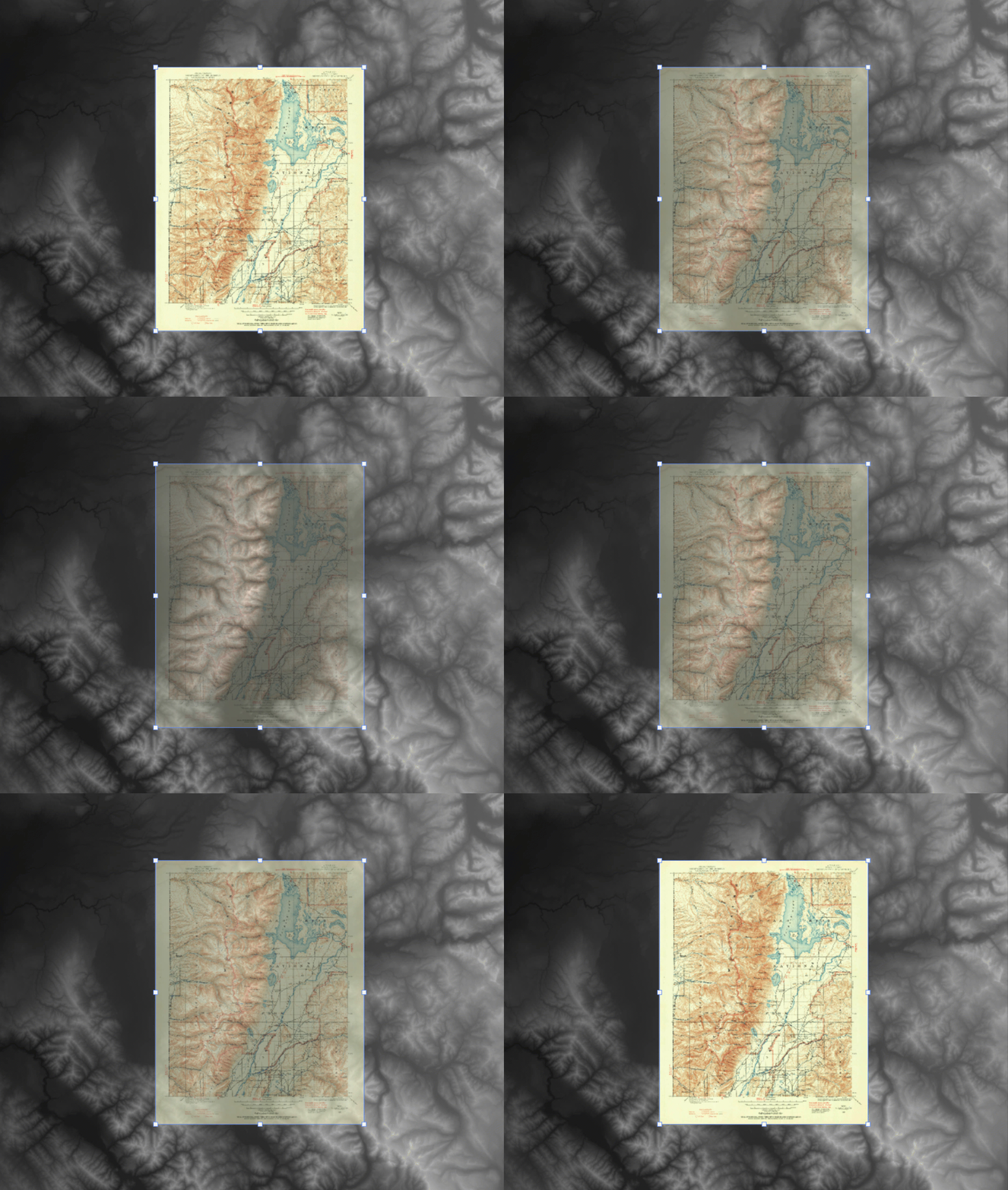
By combining each of the four raw DEM datasets, the tool will mosaic the tiles into a single merged, continuous, and geographically accurate elevation layer covering the entire extent of the map. Even more impressive is that Geographic Imager can use the spatial referencing information in the data to automatically align and overlay the original 1899 topo map onto the elevation layer, removing the need to perform manual georeferencing. (If the imagery data you are using does not have spatial referencing information already, don’t worry – our support team has crafted some excellent, easy to follow georeferencing in Geographic Imager tutorials).
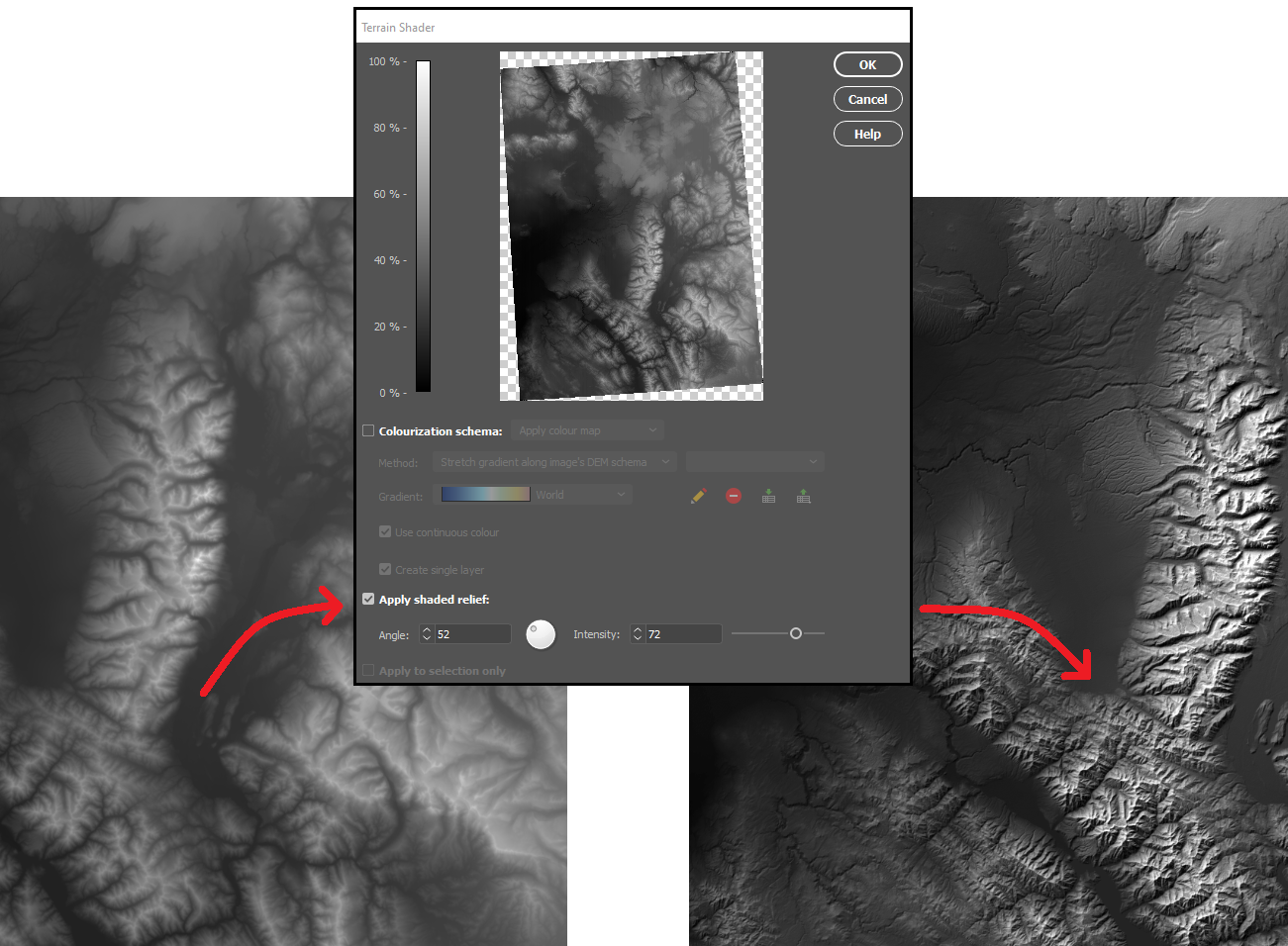
With our DEM data imported into Photoshop, we can start to explore different techniques for creating shaded relief. We will start by using the Terrain Shader tool located on the Geographic Imager toolbar. Terrain shader is a one-click technique to create simple shaded relief instantly. It allows you to configure the angle and intensity of the simulated illumination source to control the prominence and direction of casted shadows. Additionally, you can apply customized colour gradients to easily produce stylized elevation maps or apply hypsometric tints. 

In many situations, the Terrain Shader tool is an all-in-one, quick and easy way to create shaded relief. The output of the tool makes it easy to distinguish topographic features and can be used to quickly produce a shaded-relief backdrop for your map.
One of the greatest benefits of using Geographic Imager is that we retain all the imagery manipulation and spatial referencing capabilities of a GIS while still having access to the massive inventory of powerful image editing tools provided by Photoshop. This allows us to take our shaded relief technique up a notch by incorporating the advanced 3D rendering and lighting tools of Photoshop 3D to truly bring our 1899 Grand Teton survey map to life.

To start, we first need to trim the DEM layer down to our specific area of interest. We used the GeoCrop tool to crop our mosaiced DEM layer down to the exact extent of our topo map (it is important that both layers are the exact same extent – you’ll see why later). Next, we can open up the Photoshop 3D toolbar, and convert our flat DEM into an extruded 3D “Depth Map”. 

To enhance the shaded relief effect, we need to apply a vertical exaggeration to the model. In 3D mode, we can drag the z-axis scaling slider to exaggerate the prominence of the topographical features in our map. By creating vertical exaggeration, we can create more pronounced shaded relief, as canyons and lowlands will capture shadows more effectively.
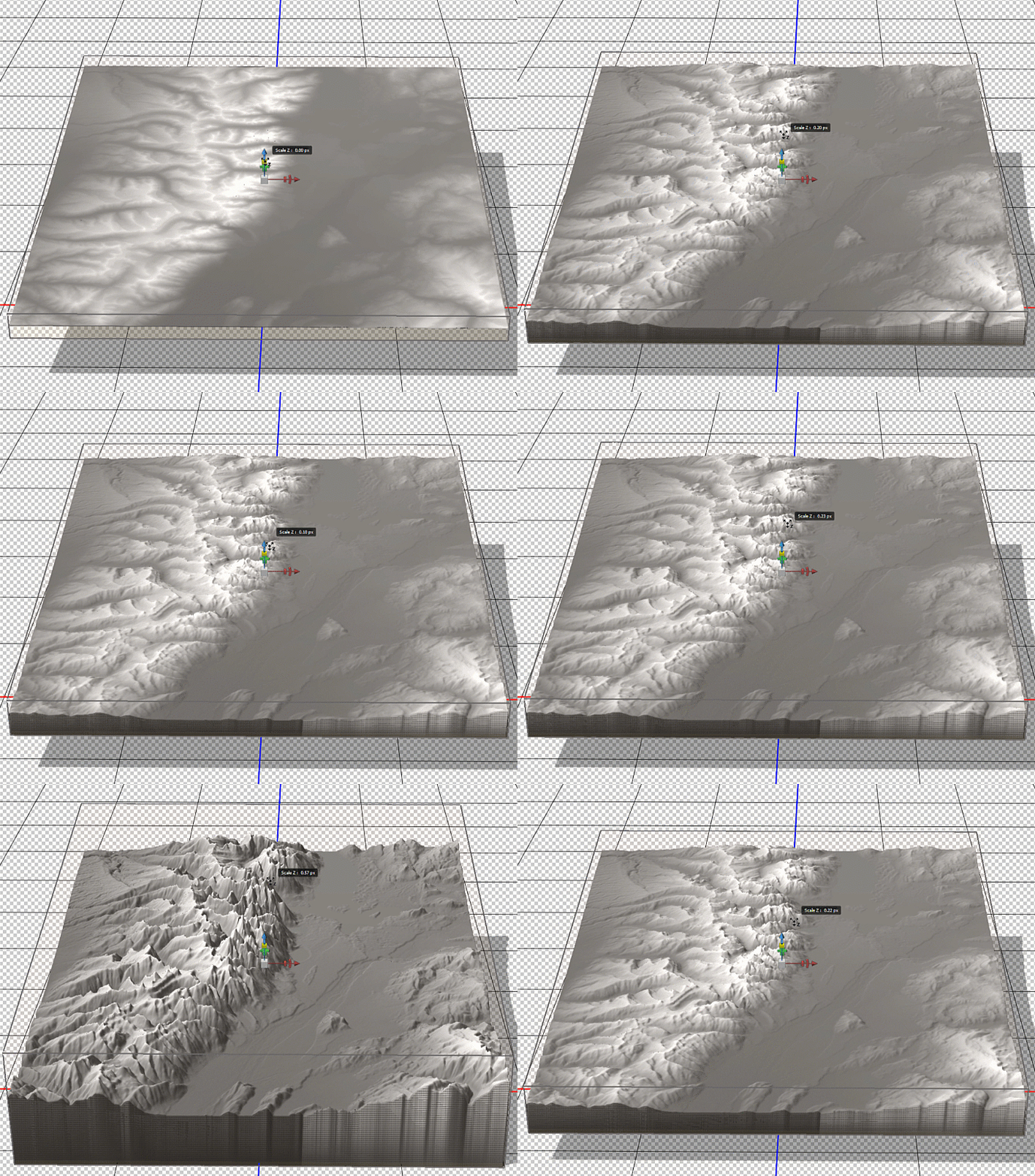
In 3D mode, we can use the mouse cursor to pan and rotate our “camera” to get different perspectives of our elevation model. This can be useful for creating orthographic or oblique perspective map styles.
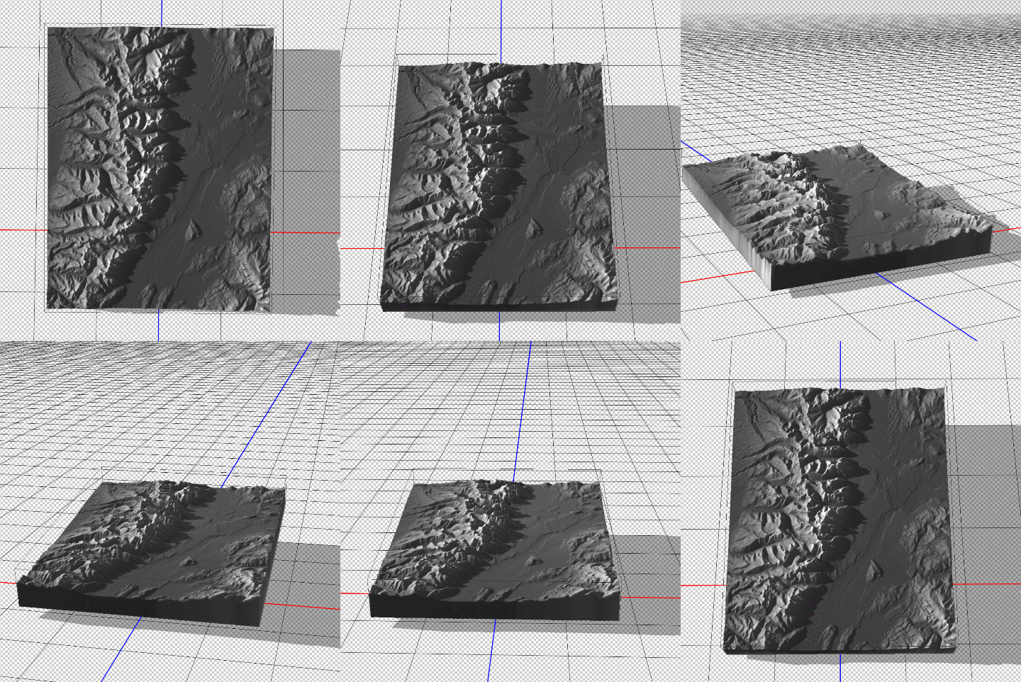
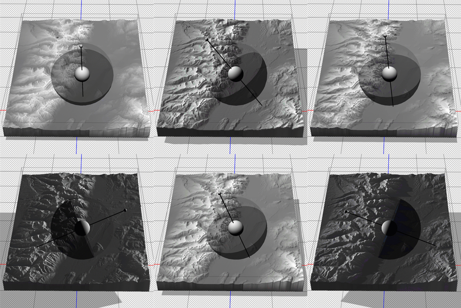
Now that we have a configured 3D model of our map area, we can apply our simulated illumination source. Much like the Terrain Shader tool, we can control the illumination intensity and angle of approach. Since we are working in a 3D environment however, we now have three different axes that control where our light is coming from. Notice how the angle is important for affecting the length and intensity of shadows in our relief map. This includes the prominent mountain silhouettes that can be created when we set the light source to approach from a low angle on the horizon.
Next, we can configure the surface properties and apply a texture overlay to our 3D model. Experimenting with these settings changes how light interacts with the surface and can be refined to produce different relief shading effects. Using these surface properties, we can also drape the original 1899 Topo map onto our surface model (this is why it is important for both the DEM and the topo-map to share the exact same extent, otherwise the topo map will be distorted once it is draped over the surface).
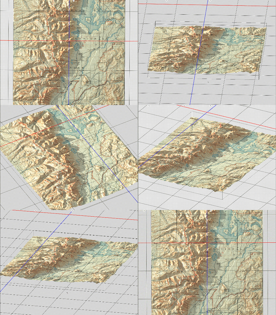
Fine-tuning the map at this stage can take some time and experimentation. We can add some additional light sources with different casting angles and intensity to help create a multi-directional hillshade effect. We can also configure the light settings to produce softer, less pronounced shadows that look more realistic. After spending some time adjusting the lighting and surface settings, as well as configuring the camera view angle,  we can hit the “render” button and sit back while it creates a full-resolution rendering of our 3D model (this part can be very computationally intensive, and may require a high-performance machine to process efficiently).

Since we are still creating our map entirely within the Photoshop environment, we can immediately fine-tune the brightness, contrast, and colour of our map before exporting the final product. 
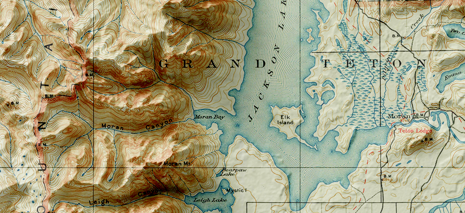
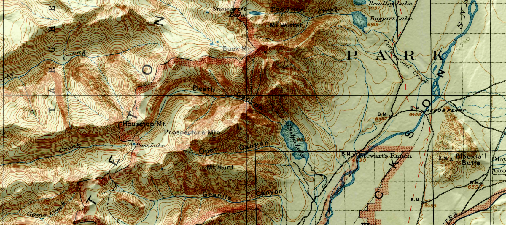
You can see some renders of the final map below. Thanks to the powerful spatial import and manipulation tools of Geographic Imager, and the ability to work entirely within the advanced image editing environment of Photoshop, we were able to create a dramatic 3D shaded relief effect that brings our 1899 USGS Grand Teton Survey map to life.
Mapping Class: Creating Orthographic Locator Maps with Steve Spindler


We are proud to announce the start of a new video-focused blog series called Mapping Class. This blog series will curate tutorials and workflows created by cartographers and Avenza software users from around the world. We begin with a mapping workflow from Steve Spindler, a longtime MAPublisher user, and expert cartographer. He has shared with us his own take on creating Orthographic locator maps by applying some neat design tricks and utilizing MAPublisher’s powerful projection tools to create a simple, yet effective map.

Steve has produced a short video walkthrough demonstrating his process and has summarized the technique in the written article below.

***

Creating Orthographic Locator Maps
by Steve Spindler

An orthographic map is like a view from space. It’s useful for directing attention to someplace on the planet.
This video shows how an orthographic locator map is made in Illustrator using MAPublisher. The template illustrator file I use in the video is here.


We’ll start off by locating Paris on the map using Find Places. We need the latitude and longitude to create two projections.
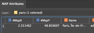
Next, get the Latitude and Longitude from Map Attributes. You’ll have to turn MapX and MapY fields on. MapX is longitude. MapY is Latitude.

In Map Views, click on the projection, (ne_110m_land), and then select “Perform Coordinate System Projection”.
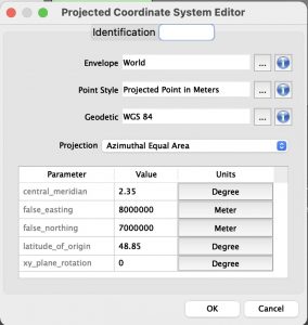
Select Projected Coordinate Systems and search for Azimuthal Equal Area. Duplicate, rename and set the definitions for the central meridian and the latitude of origin. There might be more than one. Pick one.

Select Projected Coordinate Systems and search for Orthographic. Duplicate, rename and set the definitions for the central meridian and the latitude of origin. There might be more than one. Pick one.

Select the new azimuthal projection, the one you created, and click OK to use it.
We use the azimuthal projection to crop data before creating the orthographic projection. Otherwise, there will be overlapping imagery. Next, create a buffer for the Paris point that is 10002.5 km around the point. This will be located on a new layer.

Use the path utilities tool to convert the bezier circle into polylines. Then reproject the map to the orthographic projection. Once completed, crop again with your circular buffer layer and delete the water layer. It will be replaced with a gradient.

Finally, add a radial gradient to the circular buffer layer and move the circle below the other layers.
Now you have an orthographic locator map that you can continue to style and label for your purposes.

***

About the Author

Steve Spindler has been designing compelling cartographic pieces for over 20 years. His company, Steve Spindler Cartography, has developed map products for governments, city planning organizations, and non-profits from across the country. He also manages wikimapping.com, a public engagement tool that allows city-planners to connect and receive input from their community using maps. To learn more about Steve Spindler’s spectacular cartography work, visit his personal website. To see the original tutorial article, or view Steve’s other mapping demonstrations, visit cartographyclass.com

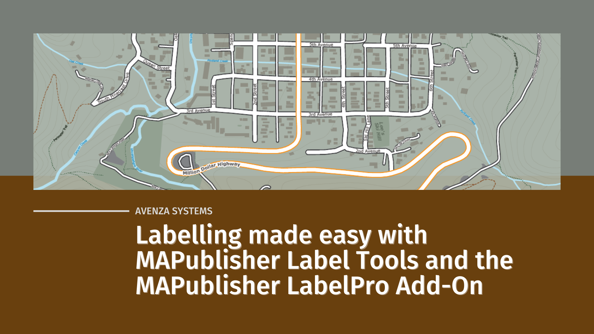
Labelling Made Easy with MAPublisher Label Tools and the MAPublisher LabelPro Add-on

Maps are a fusion of art and science, presenting complex geographical data in a way that is both visually appealing and informative. Cartographers use maps to convey a story, drawing attention to important information using carefully crafted design choices and curated map elements that engage the viewer. Although cartographers employ a variety of specialised techniques to present this meaningful information on a map, one of the simplest, yet most effective methods is through map labels.

Quite simply, map labels are symbols or texts strategically placed at specific locations on a map to identify important geographical features, locations, or areas of interest. To a map viewer, labels are a quick and easy way to know exactly what is shown on a map. To a map maker, however, the task of creating labels is not often quick and generally isn’t easy. This is especially true when there are a large number of labels that need to be placed, or when labels need to follow complex paths such as roadways, rivers, or trails. Map-makers must also consider the issue of label crowding and collisions, ensuring labels are not overlapping each other, covering or distracting from other important features of the map. Combined, these challenges can be a significant time-sink in the map-making process, requiring both time and effort on the part of the cartographer.

Labelling doesn’t have to be difficult though, and in this blog, we will show you how built-in MAPublisher label tools and the MAPublisher LabelPro add-on can make labelling simple.

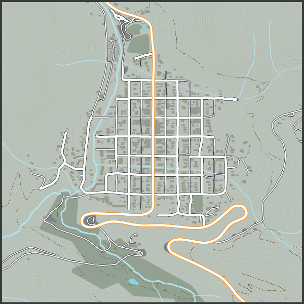
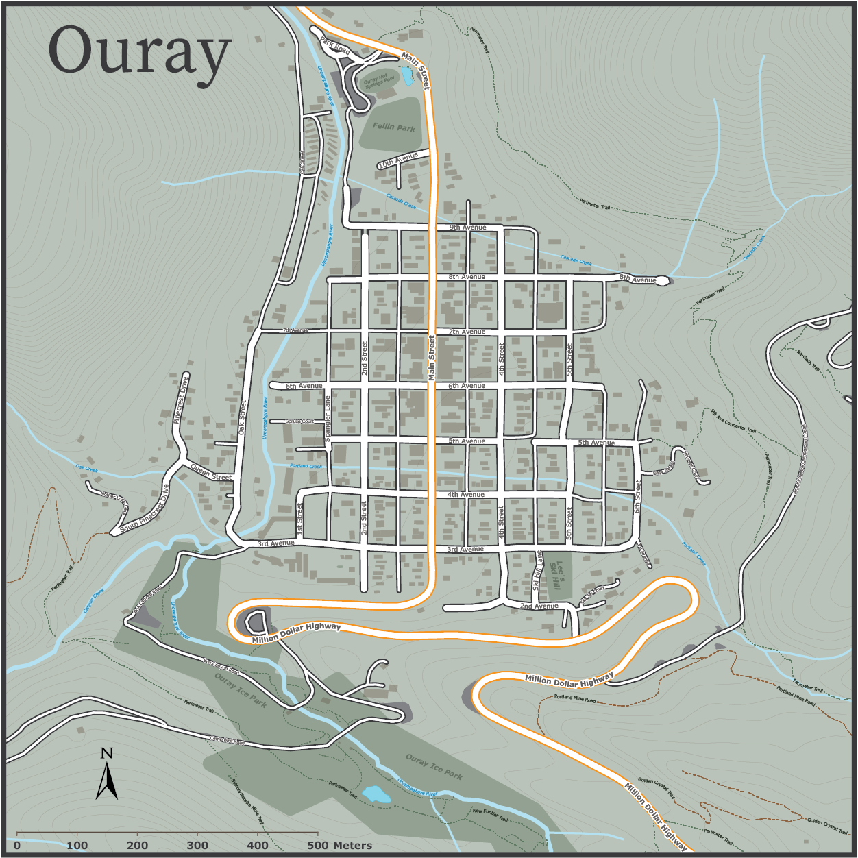
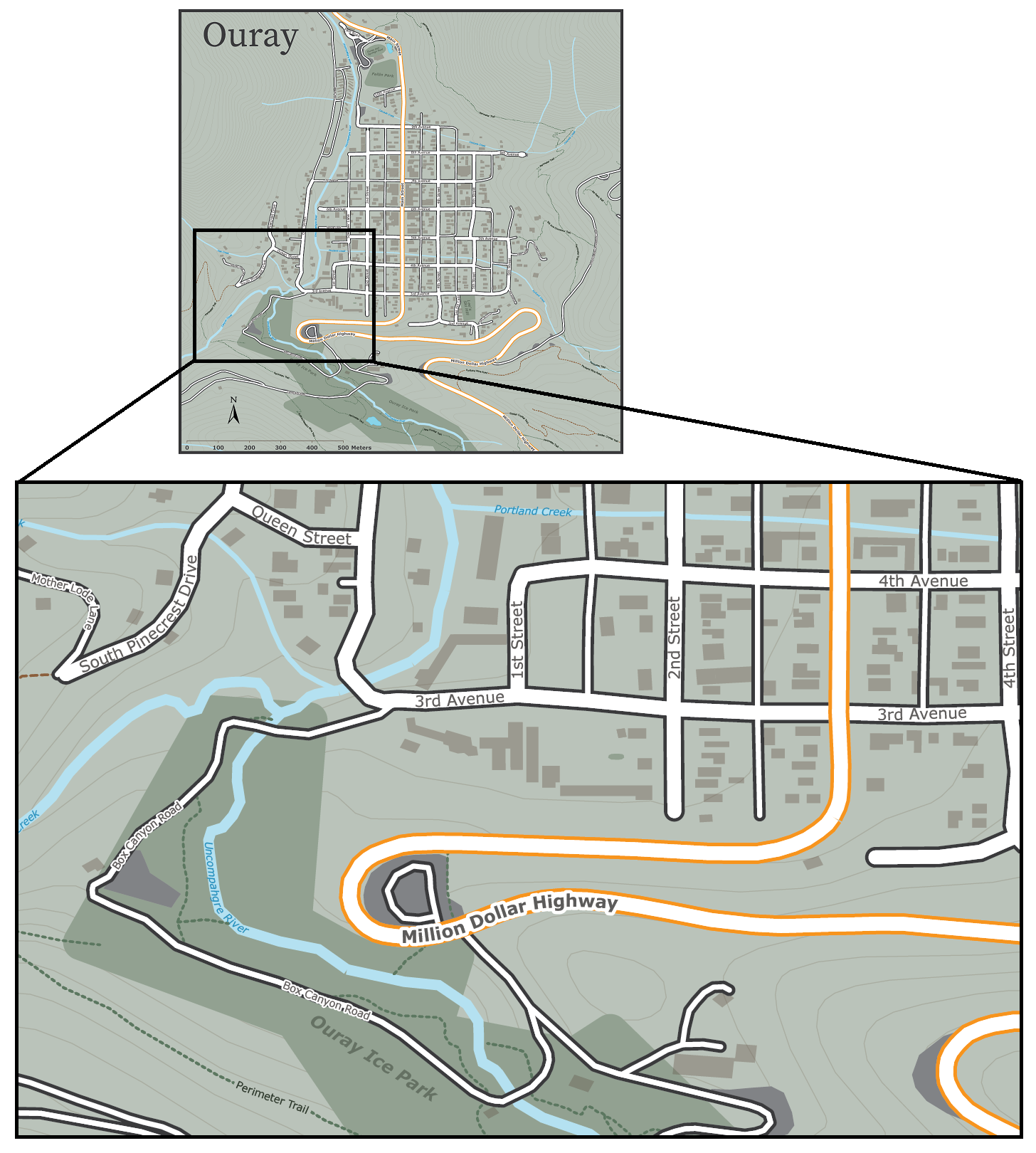
Let’s start with our unlabelled map. We have taken a collection of openly available geo-data depicting the small mountain town of Ouray, Colorado (home of National Geographic Cartographer and last month’s Avenza Cartographer Chronicles feature, Mike Boruta). We have stylized the data to show rivers, parks, streets and trails all throughout the town, but we feel labels would help a user to better understand the information being shown. We are going to approach the labelling process in a few different ways.

Manual Label Placement with the MAP Tagger Tool

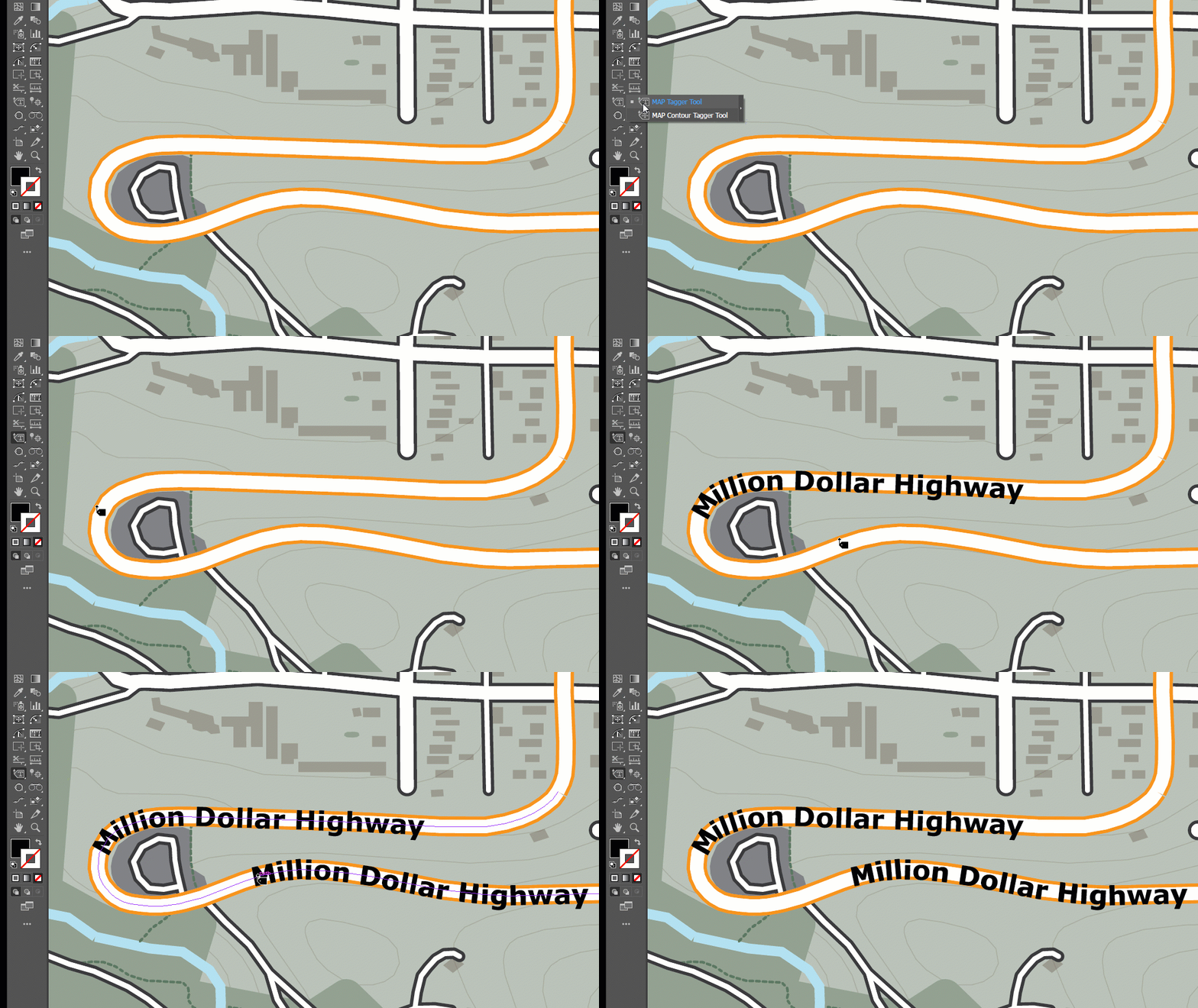
For small labelling tasks, where a map maker might need to place only a handful of precisely located labels, the MAP Tagger tool is perfect for the job. MAP Tagger allows us to configure a basic set of options that control the character style of our label as well as general label placement rules. From there, we can simply click on a map feature and have the tool automatically detect and apply a label from attribute information contained in the selected layer. As we have direct control over the placement of every individual label, we can be extremely precise in choosing label placements that work for our map. Best of all, the tool automatically detects and applies text pathing for line features, meaning text labels can follow the form of any road, river, trail in your map!

When working with a small number of map features, the MAP Tagger tool is often just what you need to add well-placed labels to your map. For larger labelling tasks, such as our Ouray map, where there are many layers and several different features to be labelled, a manual approach such as this would be very time-consuming. Instead, we need to implement a more automated, batch labelling technique to speed-up the map-making process.

Batch label placement with the Label Features Tool

When you are working with several map layers, or have a large number of geographic features that each need to be labelled, it can be more efficient to create your labels all at once. The Label Features tool comes built-in with MAPublisher, and can handle batch labelling of map features with only a few clicks. The tool is designed similarly to MAP tagger, and automatically populates the map with precise, path-aligned labels, while offering the flexibility to define unique character styles for each map layer.

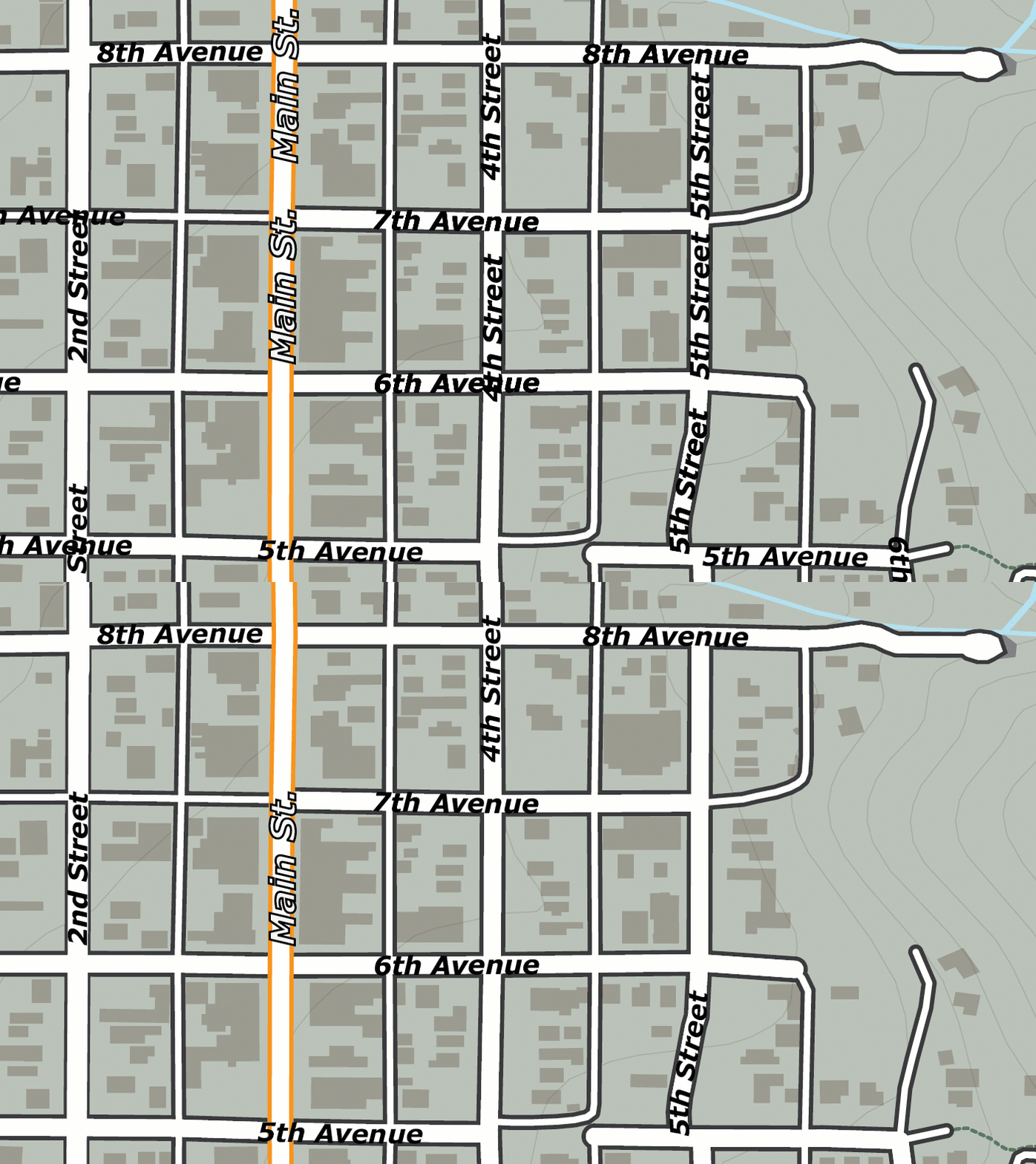
Taking a look at the tool, we were able to quickly generate over a hundred labels, for every road, trail, river, and park layer in our Ouray map. By nature, the tool will present you with a large number of labels for each feature, allowing us to examine and choose the labels we wish to retain and remove those that we don’t. With a little bit of clean-up to remove those extra or unwanted labels (see the animation below), we can already see our labelled map is coming together!

The Label Features tool is great for getting a head start on large labelling projects, but you might notice that the output of the labelling tool still requires some manual intervention to clean-up the output. For example, notice how “4th Street” and “5th Street” labels are repeated several times over the length of the street, with some labels colliding with others to create an overlap. This is a common problem in many labelling tasks and is due to the way our input data is structured. The dataset we obtained presents each road in the town as a line, but rather than present each road as a single continuous feature, it breaks up each street into several linked segments. Although this can be corrected with manual editing, it can still be time-consuming when working with a high number of labelled features. To avoid this, we need a method of achieving smarter batch label placement that can detect and reduce instances of label collision or redundancy. 

Fortunately, we have one last trick up our sleeves that makes even the most complex labelling tasks a breeze. We can use MAPublisher LabelPro for collision-free, rules-based label placement.

Better Labelling with MAPublisher LabelPro

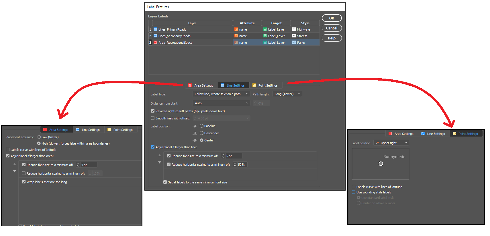
The MAPublisher LabelPro add-on allows the user to customize a wide variety of enhanced labelling options that result in smarter, more efficient label placement. LabelPro comes with a powerful purpose-built labelling engine that handles not only label placement, styling, and pathing, but also optimizes the grouping, fitting, and collision avoidance of labels to reduce crowding, avoid label overlap, and eliminate label redundancies. 

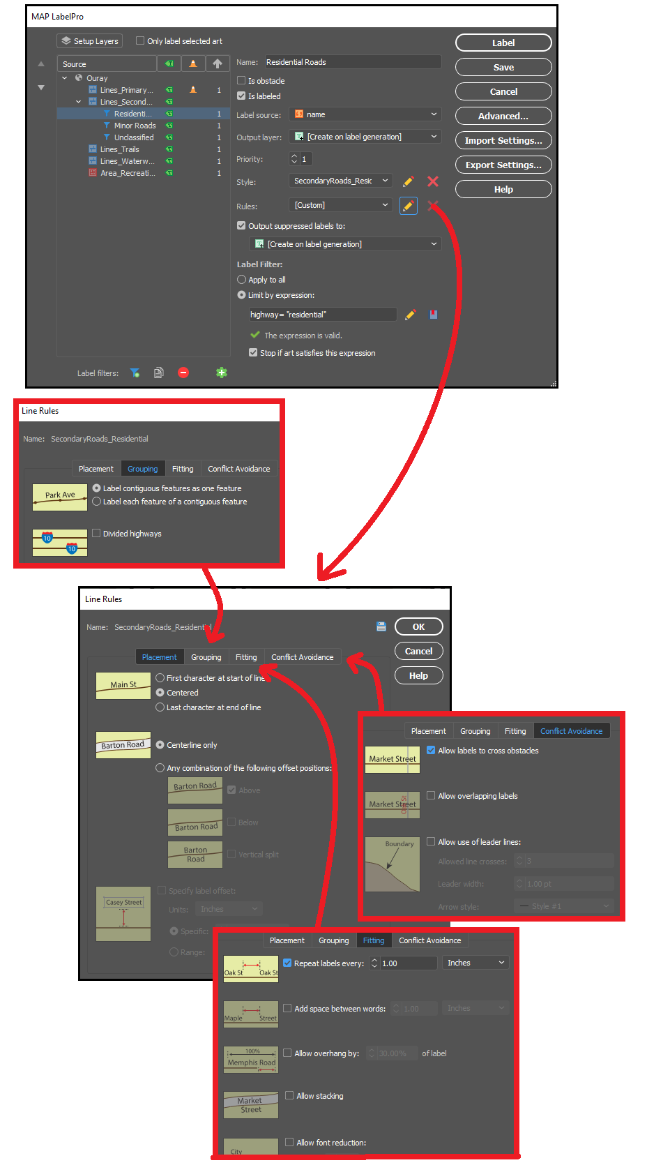
Remember those overlapping labels we ran into with the Ouray map? With LabelPro we can set rules that treat street segments as contiguous features in a single line, meaning the labelling engine will efficiently place labels that are representative of the entire street, rather than just for each segment. The intelligent collision and fitting rules mean we can also prevent labels from overlapping each other or crowding the map, saving us time and effort by letting the tool handle precise label placement with minimal clean-up. By setting layer priorities designating certain layers as obstacles we can make sure our important labels are unobstructed, and other labels do not cross other features in a way that would confuse the map viewer. 

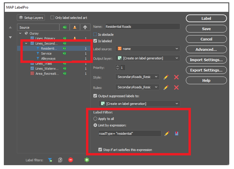
With LabelPro, we can also create expressions to apply conditional character styles and rules based on attribute values in the data. In our map, we created label filters for “Residential Roads”, “Service Roads”, and “Alleyways”, allowing us to label (or not label) certain road types differently, even though they are all contained in the same “secondary roads” map layer. These are only a few examples of the robust collection of configurable rules and smart labelling options available to tackle even the most complex labelling tasks.

With our rules set up and all character styles defined, in very short order we could automatically generate labels for all rivers, roads, highways, parks and trails in our Ouray map. The smart placement with LabelPro means we spend less time manually correcting label placement and allows us to produce maps more efficiently and easily. If you want to read a more in-depth, tutorial style article that shows you the exact steps we used to easily create our simple map of Ouray, check out this great workflow article produced by our support team – Here!


Data sources: All datasets were obtained from OpenStreetMap and the Ouray County Open Data portal.

News Archive

Blog Archive

December 2024 (2)
November 2024 (2)
October 2024 (1)
September 2024 (1)
August 2024 (2)
July 2024 (1)
September 2024 (1)
June 2024 (1)
July 2024 (1)
May 2024 (1)
April 2024 (2)
May 2024 (1)
March 2024 (2)
February 2024 (1)
January 2024 (1)
December 2023 (1)
November 2023 (2)
October 2023 (2)
September 2023 (1)
August 2023 (1)
July 2023 (3)
June 2023 (1)
February 2023 (1)
January 2023 (2)
December 2022 (1)
November 2022 (2)
October 2022 (2)
September 2022 (1)
May 2023 (1)
August 2022 (2)
July 2022 (1)
June 2022 (2)
May 2022 (1)
February 2022 (1)
January 2022 (2)
August 2022 (1)
December 2021 (3)
November 2021 (5)
October 2021 (1)
September 2021 (3)
August 2021 (2)
July 2021 (1)
June 2021 (2)
May 2021 (2)
April 2021 (2)
March 2021 (3)
April 2021 (1)
February 2021 (1)
January 2021 (1)
November 2020 (1)
October 2020 (1)
June 2020 (2)
May 2020 (1)
April 2020 (3)
March 2020 (2)
December 2019 (1)
November 2019 (2)
September 2019 (1)
August 2019 (1)
July 2019 (1)
June 2019 (3)
May 2019 (4)
April 2019 (2)
March 2019 (1)
February 2019 (2)
January 2019 (3)
December 2018 (2)
November 2018 (1)
October 2018 (1)
September 2018 (2)
August 2018 (4)
July 2018 (2)
June 2018 (1)
July 2018 (1)
June 2018 (4)
May 2018 (1)
April 2018 (2)
March 2018 (4)
February 2021 (1)
February 2018 (1)
January 2018 (1)
November 2017 (1)
October 2017 (2)
August 2017 (2)
July 2017 (1)
March 2017 (1)
February 2017 (2)
January 2017 (2)
November 2016 (1)
January 2017 (1)
November 2016 (1)
October 2016 (2)
May 2016 (1)
March 2018 (1)
April 2016 (2)
December 2015 (2)
June 2015 (1)
May 2015 (1)
April 2015 (2)
December 2014 (4)
October 2014 (2)
May 2014 (4)
February 2014 (1)
October 2013 (3)
April 2013 (1)
January 2013 (2)
August 2012 (1)
October 2012 (1)
July 2012 (3)
May 2012 (2)
January 2012 (2)
August 2011 (1)
July 2011 (2)
June 2011 (2)
May 2011 (2)
March 2011 (1)
February 2011 (1)
January 2011 (5)
December 2010 (1)
November 2010 (1)
December 2010 (1)
November 2010 (1)
October 2010 (1)
August 2010 (4)
July 2010 (2)
June 2010 (3)
May 2010 (2)
April 2010 (2)
March 2010 (2)