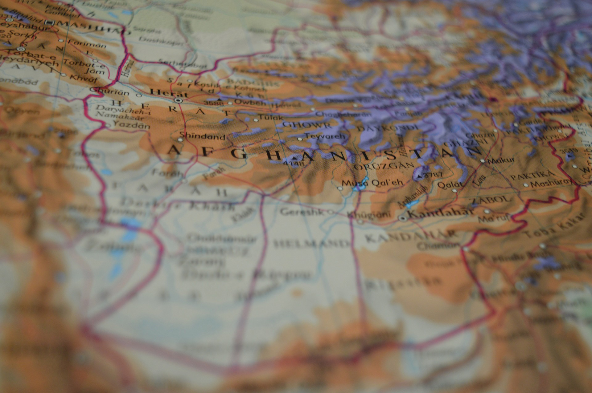
In a previous post, we shared ideas about key elements that make great maps according to our friends at Map the Xperience. They presented a webinar on the subject, so we poached their ideas for Part 1 of this blog discussing the importance of map quality and connecting with the user. In Part 2 we’ll expand on the other two elements, Presentation & Design, and Accuracy.
After identifying the target audience and deciding on the level of detail required, putting all of the relevant data on a map while keeping it readable is a challenge. Good maps document what the reader needs to know at a basic level to prevent getting lost. Great maps highlights what the reader needs to know to fully experience the mapped area. It all starts with map accuracy and the readability imparted by the presentation and design of the information.
Presentation & Design
A map quickly becomes cluttered as additional layers of data are added so how do you present all of that in a way that doesn’t make people’s eye’s pop out? It pays to have some knowledge of design, or get some advice from someone who does. Can you use colour to convey any of the information on the map, and is the colour scheme pleasing to look at? Do the symbols make sense to anyone but you? Are they simple and not open to interpretation? Can shading or patterns be used to highlight map features? Map The Xperience takes the design process very seriously and highlights their 3D hillshading as one of the features that make their maps unique.
An equally important part of the discussion about presentation includes thinking about how and where readers will use the map. Is it in paper format or digital? Will they be reading it thousands of feet in the air in a hot air balloon, at a table studying the map with a group, or on a tablet in the middle of a forest? Anticipating how a map will be used helps to make design decisions such font and symbol sizes, label placement, and the use of legends.
Accuracy
What’s the point of a map that isn’t accurate? This is obvious and yet still worth mentioning. While lots of lovely art is made by taking liberties with the accuracy of map elements (that’s another blog post) maps for specific activities need to be accurate – spatially and in the supporting information. This can mean field testing maps in the way that Mapsynergy tests its ski resort maps by actually skiing the hills, and New York-New Jersey Trail Conference constantly updates maps according to data collected by its members and staff. It can also mean augmenting physical data with local knowledge. Rhonda Lerner visits each of the businesses listed on her tourist map to verify that the the are tourist-friendly and current. Pixmap Cartografia Digital researches the local names for locations on their maps of Argentina and Chile, because in the end, who can knows a place better than the people who live there.
In summary, good maps are functional while great maps add to the experience of visiting a place by being, all at once, informative, accurate, easy-to-use and pretty to look at. It’s no easy feat to meet all of those criteria. Perhaps the pursuit of the perfect map is the reason why cartographers are so passionate and dedicated to their craft.


