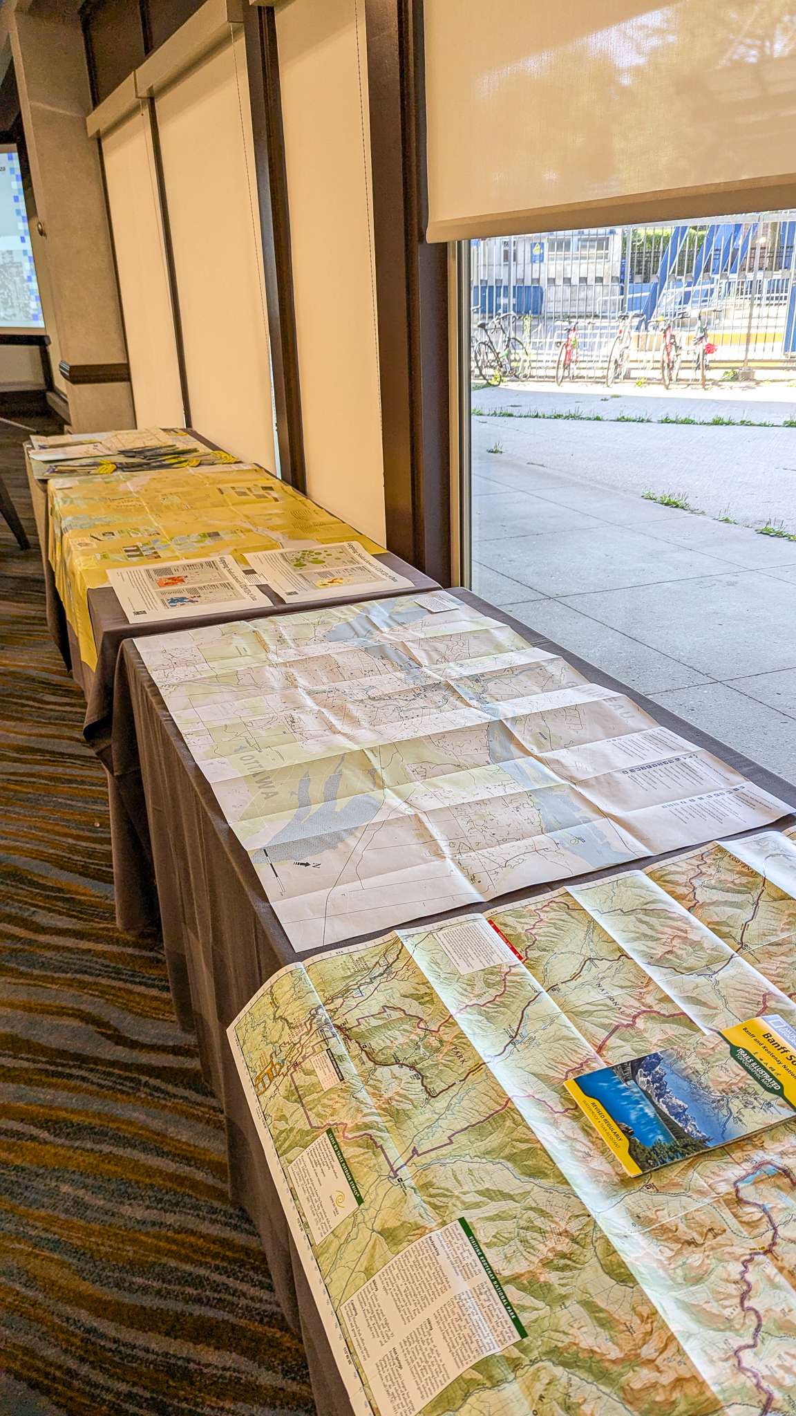
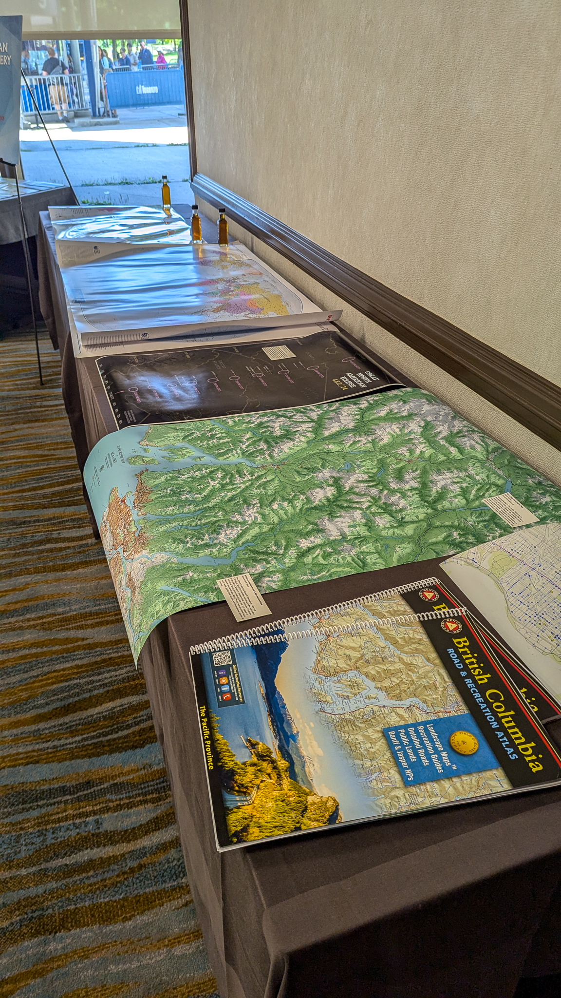
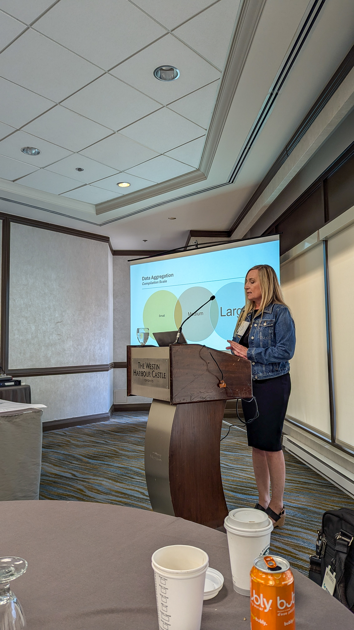
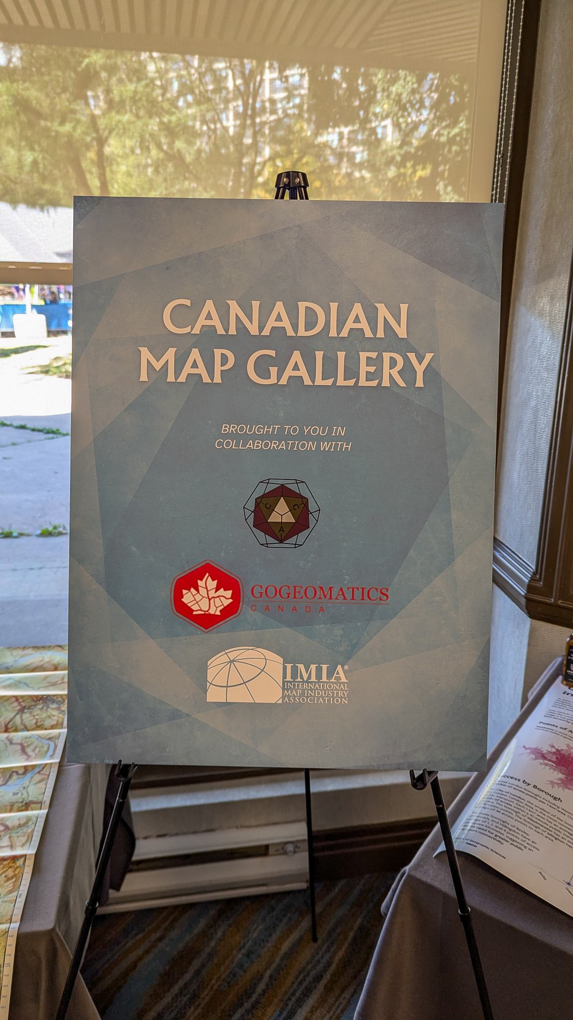
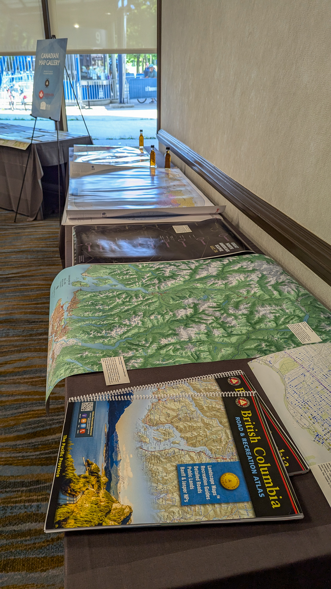
On August 22, 2024, Avenza Systems was the primary sponsor at Map Industry Summit: Toronto. This event brought together leading experts, professionals, and public and private sector stakeholders to discuss the latest advancements, challenges, and opportunities in Canada’s unique map industry.
The all-day summit combined educational presentations and networking sessions to build knowledge and foster collaboration among attendees and IMIA member companies.
Thank you to everyone who attended this fantastic event!
Toronto, ON, July 30, 2024 – Avenza Systems Inc., producers of the Avenza Maps® app for mobile devices and geospatial extensions for Adobe Creative Cloud®, including Geographic Imager® for Adobe Photoshop®, is pleased to announce the release of MAPublisher® version 11.4 for Adobe Illustrator®. This version introduces a newly reworked Create Knockouts tool, importing Vector Basemaps within a selected area, WMS 1.3.0 import support, a new Rotate Characters text utility, a preference to convert RGB black to 100K black in CMYK documents, setting a leader line offset with the MAP Tagger tool, and several performance updates and bug fixes.
MAPublisher cartography software seamlessly integrates more than seventy GIS mapping tools into Adobe Illustrator to help you create beautiful maps from geospatial data. Import industry-standard GIS data formats and make crisp, clean maps with all attributes and georeferencing intact using the Adobe Illustrator design environment.
New features of MAPublisher v11.4 for Adobe Illustrator include:
Reworked Create Knockouts tool: Create Knockouts tool features an improved architecture which introduces knockout settings saved as jobs and rules, which allow users to create knockouts for multiple layers simultaneously and easily transfer settings between documents
Importing Vector Basemaps within a selected area: Vector Basemap data can now be imported to a document in a selected area as long as it is a closed shape, does not overlap itself, and is within the current MAP View
WMS 1.3.0 import capabilities: MAPublisher now supports the import of data from Web Map Service (WMS) version 1.3.0, with an option to autodetect the WMS version added
Rotate Character action added to Text Utilities menu: Rotate Characters allows users to specify character rotation settings for point text located within their map document
Convert RGB Black to 100K Black preference: MAPublisher Preferences menu now features the option to convert RGB black to 100K black (rather than rich, or 4-colour black) for CMYK documents to prevent a printing issue known as “ghosting”; this option is enabled by default
Offset from Feature option for leader lines in MAP Tagger tool: MAP Tagger tool now features a new option in the Leader Lines Settings tab under the Rules section to set an “Offset from feature” distance to prevent leader lines from obscuring map features when labeling them
Additional performance improvements and bug fixes
Users require a valid Adobe Creative Cloud subscription and a compatible operating system to utilize the improvements and enhancements offered in MAPublisher v11.4. For questions and information on how compatibility requirements may affect your organization, please contact our Support Centre.
MAPublisher 11.4 is immediately available free of charge to all current MAPublisher users with active maintenance and as an upgrade for non-maintenance users starting at US$739. New licenses are available from US$1,699. MAPublisher FME Auto and MAPublisher LabelPro are also available as add-ons starting at US$569. Academic, floating, and volume licenses are also available. Prices include one year of full maintenance. Visit www.avenza.com/mapublisher for more details.
More about Avenza Systems Inc.
Avenza Systems Inc. is an award-winning, privately held corporation that provides cartographers and GIS professionals with powerful software tools to make better maps. Avenza also offers the mobile Avenza Maps app to sell, purchase, distribute, and use maps on iOS and Android devices. For further information contact: 416-487-5116 – info@avenza.com – www.avenza.com
We are thrilled to announce the release of MAPublisher version 11.4, the newest version of our MAPublisher extension for Adobe Illustrator.
MAPublisher v11.4 introduces a newly reworked Create Knockouts tool, importing Vector Basemaps within a selected area, WMS 1.3.0 import support, a new Rotate Characters text utility, a preference to convert RGB black to 100K black in CMYK documents, setting a leader line offset with the MAP Tagger tool, and several performance updates and bug fixes.
Here’s what you can expect with the latest MAPublisher v11.4 release:
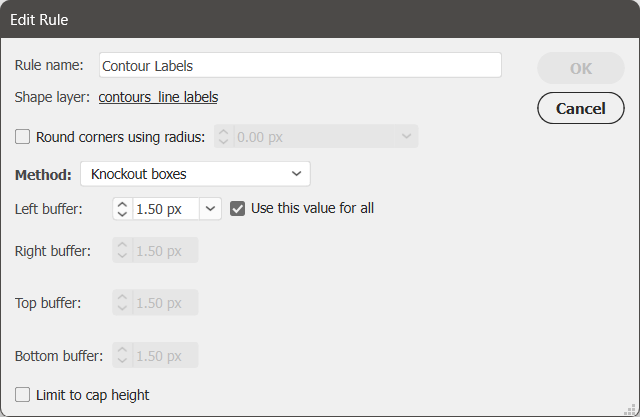
The Create Knockouts tool has a new design!
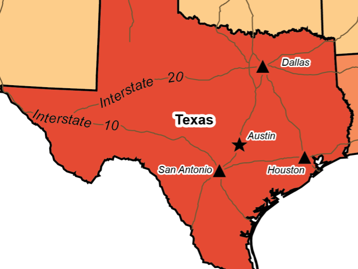
We are excited to introduce you to the new version of the Create Knockouts tool. Create Knockouts is a tool that allows you mask off parts of features that may be covered by things such as text or points. The aim of this tool is to increase the readability of your map, especially in areas where features may overlap or look cluttered.
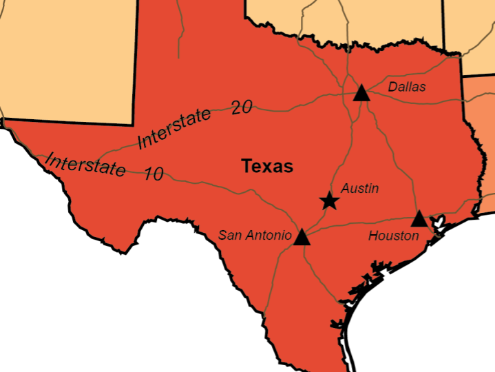
Without knockouts
With knockouts
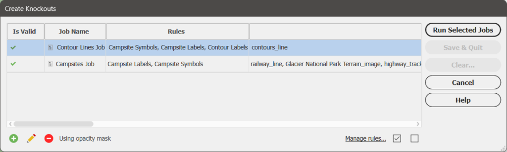
The previous version of the Create Knockouts tool only consisted of a single dialog box. This had the limitation of allowing knockouts to be created around only a single layer at a time, meaning that multiple iterations of the tool had to be run to create knockouts for several different layers. This also meant that correcting mistakes or modifying existing knockouts required the tool to be run again, which could be frustrating or time consuming.
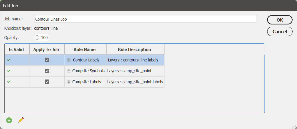
The new version of the Create Knockouts tool features an improved tool architecture which introduces knockout settings stored as jobs and rules. Jobs and rules allow knockouts to be created simultaneously for multiple layers.
A job defines which layers are being masked and consists of one or more rules that will be used to form the knockouts.
A rule defines the overall appearance of the knockouts and which layers the knockouts will be formed around.
One very useful thing about jobs and rules is that they are also transferable to your other map documents through the use of the Copy MAP Objects From tool.
The introduction of jobs and rules to the Create Knockouts tool makes it much easier for you to create multiple batches of knockouts at once while also being able to save their settings. This is very convenient if you come back later and wish to make modifications to your knockouts as your map evolves through its creation.
To learn more about how the new edition of the Create Knockouts tool works, check out its support page or watch the video below:
Import Vector Basemaps within a selected area
The Vector Basemaps tool is also receiving a small but significant update in MAPublisher v11.4: you can now import basemap data to your document only in a specific area! This option is available in the Import Vector Basemaps dialog box by way of selecting the “Only import data within the selected area” checkbox when you are selecting data for an existing MAP View. However, for this checkbox to be selectable it does require the following conditions to be met:
The selected area must be a single shape or compound path
The selected area must be closed
The selected area must not overlap itself
The selected area must be located within the current MAP View
This new option for the Vector Basemaps tool is perfect for the quick creation of interestingly shaped inset maps!
Import data from WMS 1.3.0
Many of our users have requested the ability to be able to import data from Web Map Service (WMS) version 1.3.0 and we are happy to announce that this is now possible in MAPublisher v11.4! Simply follow the usual steps to add a web map service and select 1.3.0 from the Version drop-down menu. We have also added an “Autodetect Version” option in this menu which can detect the WMS version used by the URL provided.
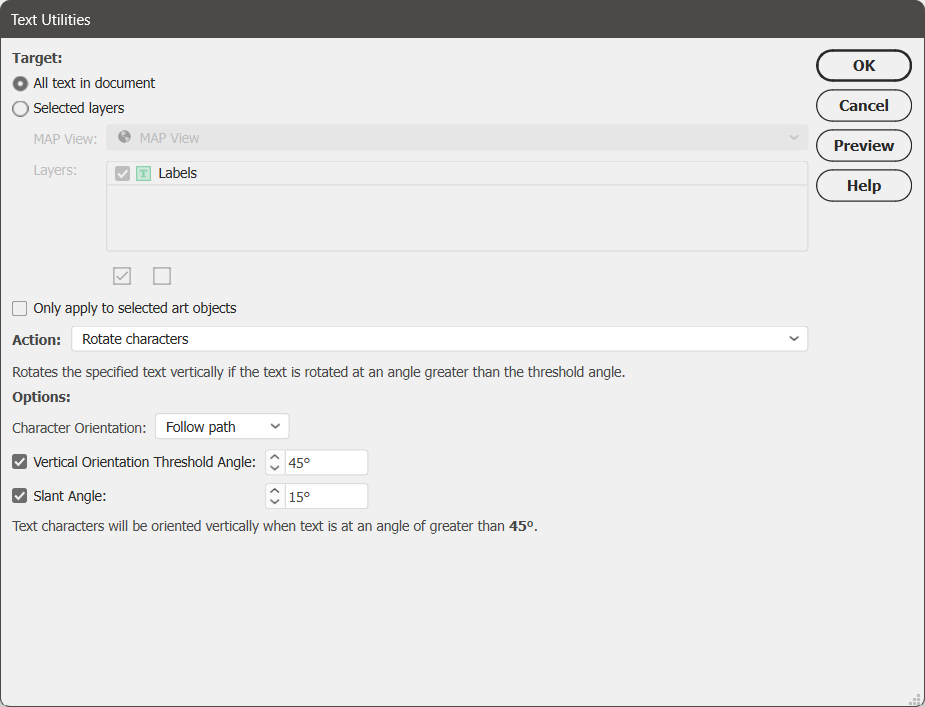
Rotate Characters action added to Text Utilities
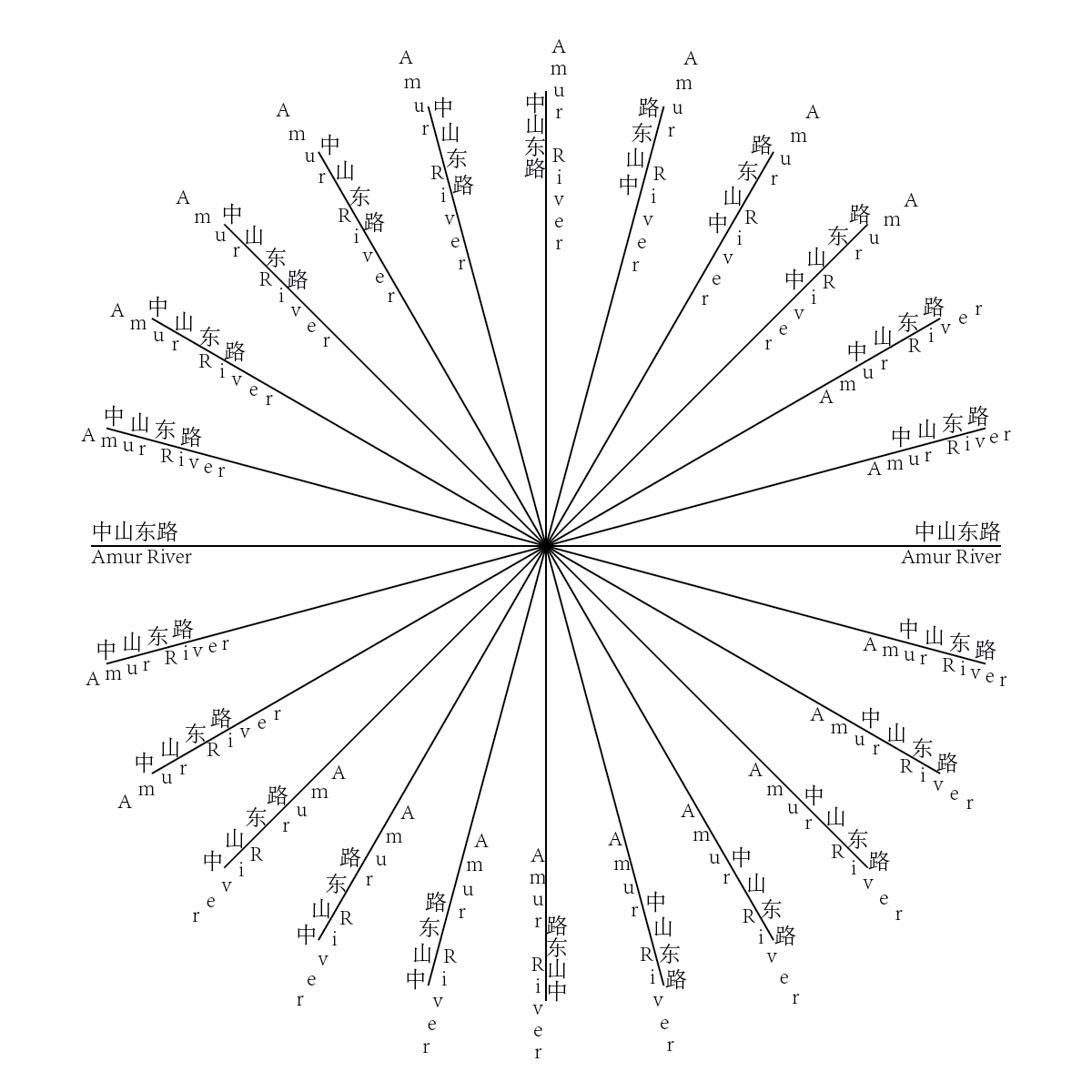
Rotate Characters is a new option that has been added to the Action menu of the Text Utilities tool. This action only applies to point text, not text-on-a-path. It introduces the option to select whether your characters are oriented to follow the direction of the path, or point upwards. It also gives users the option to set a vertical orientation threshold angle, which determines which text elements will be rotated vertically, and/or set a slant angle, which will rotate characters within a text element.
The Rotate Characters text utility action is a great way to increase readability of the text objects of a map and is especially useful for languages that require properly rotated characters to be more understandable, such as Chinese. Below is a basic illustration of the new feature.
Convert RGB black to 100K black upon import in CMYK mode
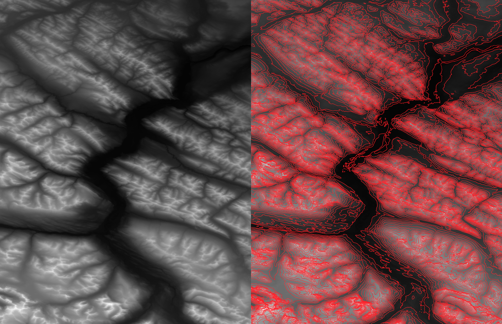
In CMYK documents, RGB black features are often converted to rich black (i.e. 4-colour black) instead of 100K black, which can cause an issue known as “ghosting” when printing features that require fine detail such as small text and lines. Ghosting is when tiny variations in the printing plate produce blurry remnants of the 4 colours around the edges, as seen below.
To help printed map-makers easily avoid ghosting, a new option has been added to MAPublisher Preferences in the Import Map Data section to “Convert RGB Black to 100K Black” for CMYK documents. This option will be enabled by default.
Specify a leader line offset when using MAP Tagger
When using the MAP Tagger tool, the option to specify an offset between the leader line and the feature has been added in the “Leader Line Settings” tab under the Rules section. Select the “Offset from feature” checkbox and set an offset distance. This can be used to ensure that the created leader line does not obscure the feature you are labeling.
MAPublisher 11.4 is Available Now!
If you would like to learn more about the new MAPublisher v11.4 features or have any questions, please check out our Support Centre.
MAPublisher v11.4 is immediately available today, free of charge to all current MAPublisher users with active maintenance subscriptions and as an upgrade for non-maintenance users.
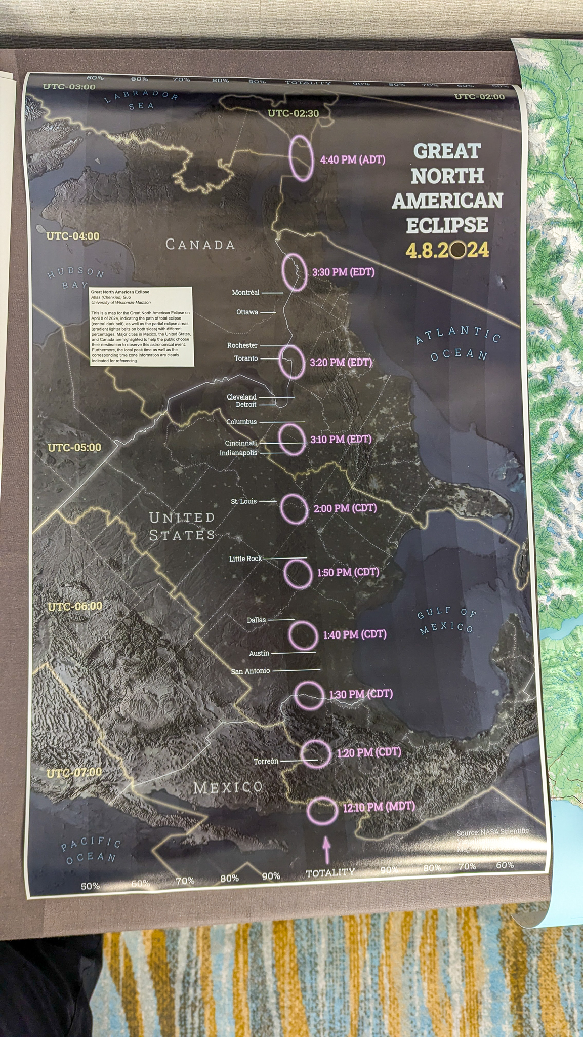
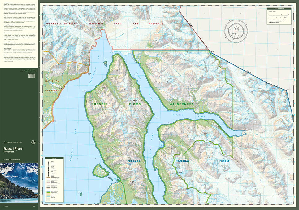
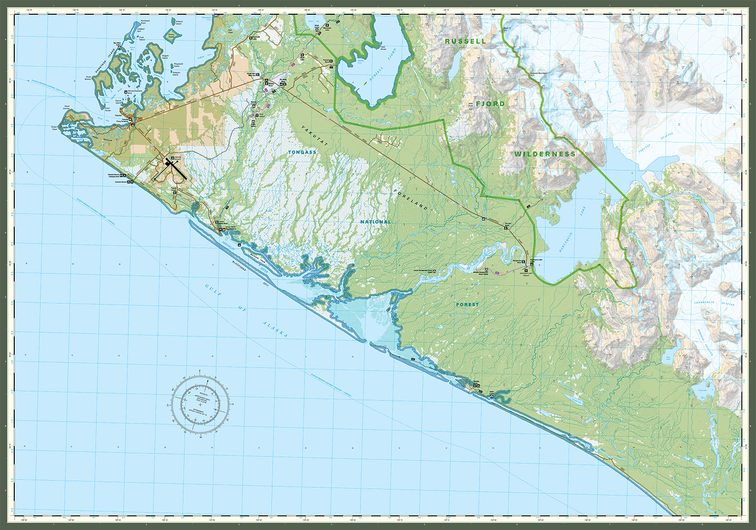
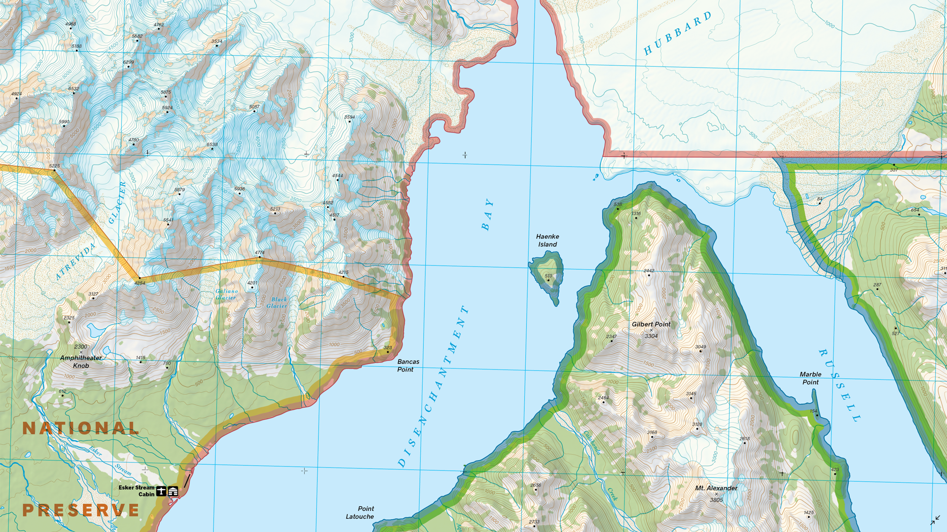
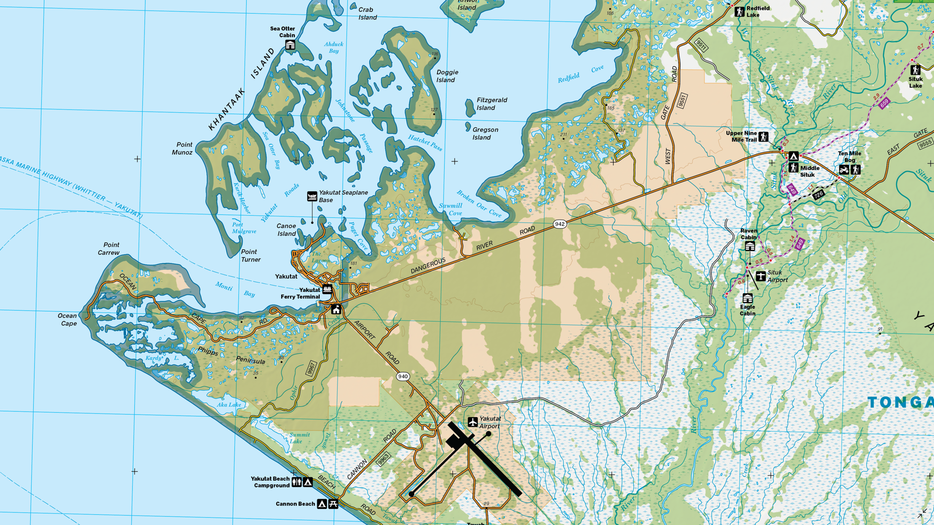
For our monthly Map Spotlight of July, we are displaying another superb honourable mention of the 2021 Avenza Map Contest: Russell Fjord Wilderness by Aaron Taveras of Cartografix. This outdoor recreation map was created to help visitors navigate the Russell Fjord Wilderness area and find the few trails that exist around the Yakutat region of Alaska. The map consists of two pages which illustrate the beautiful glaciers and rocky moraines, both of which make the area a popular destination for backcountry travel. Aaron combined essential topographic detail with recreational points of interest which resulted in a visually stunning yet useful cartographic product.
A fun fact: this map was selected to be used in the main software graphics for MAPublisher 11. It is available for purchase as a bundle digitally on the Avenza Maps Store.
Select the images below to see a detailed look at Aaron’s map
Making the Map
Aaron used both Geographic Imager and MAPublisher in the creation of this map. Geographic Imager was used in Adobe Photoshop to build the shaded relief images for the background of the map. The Terrain Shader makes it quick and easy to create a shaded relief by simply inputting a Digital Elevation Model (DEM). After this, the shaded relief image could be imported into MAPublisher and used as the background for the map.
Aaron imported his vector data and his shaded relief image into MAPublisher. MAP Stylesheet Themes were used to stylize the vector data such as the glaciers, land cover and water features. The Create Halo tool was used to create the thick and slightly transparent borders of the various parks and preserves in the region.
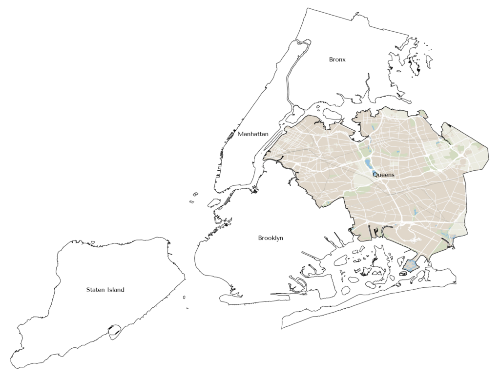
One of the standout features of Aaron’s map is the contour lines illustrating the terrain of the Russell Fjord Wilderness. The lines can be smoothed out using the Simplify Art tool to make them more visually appealing. The MAP Contour Tagger tool could then be used to manually create elevation labels for the contour lines, which allowed Aaron to select their exact placement in a visually appealing and uncrowded manner. Another important aspect of contour lines is that the text labels are readable, since they are usually obscured by the contour line itself. The Create Knockouts tool is perfect for ensuring that any text or features obscured by other features can be visible. Create Knockouts was used to create a gap in the contour lines where the contour labels (and other labels such as glacier names) exist.
The Grids & Graticules tool was essential in Aaron’s addition of such features to the map, with a UTM grid of 3000 meters being visible across the entirety of the map. Finally, Aaron used the Scale Bar and North Arrow features to easily ensure his finishing touches were placed correctly. Check out his north arrow that shows both true north and magnetic north and the difference between the two!
Learn more and enter the 2024 Avenza Map Contest here, and check out our other Map Spotlight blogs here!
As an avid disc golfer, Richard Rasch has been mapping disc golf courses since 2000, and with the help of MAPublisher since 2001. Richard uses LIDAR elevation in the creation of these large scale maps because of its high level of detail. Its for this reason that LIDAR data is considered revolutionary for many aspects of cartography.
In his presentation, Richard demonstrates how he incorporates LIDAR data into his workflow of making disc golf course maps and tee signs. He shows us how he uses QGIS with MAPublisher to create layers to achieve the correct view for multiple small-footprint course maps. Creating these maps often involves visiting the disc golf courses in person and collecting data for the locations of each tee and hole, as well as the distance and direction/path of each fairway. These types of maps are not always oriented with north at the top so adding base layers like hillshade involves a few extra steps.
The Avenza User Conference is an opportunity to discover exciting new developments with Avenza’s GIS and cartographic solutions and to connect with peers and Avenza team members. Avenza users and staffers from around the globe meet virtually each May to learn what’s new with Avenza Maps, MAPublisher, Geographic Imager, and the Avenza Map Store, and see how they are being used to map our world.
The Avenza User Conference is an free annual event that grows each year with incredible speakers and participants. Get inspired by mapping and industry professionals by joining us for #AvenzaUC2025. Find more information here about next year’s conference taking place on May 8th, 2025.
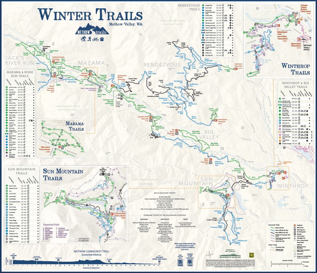
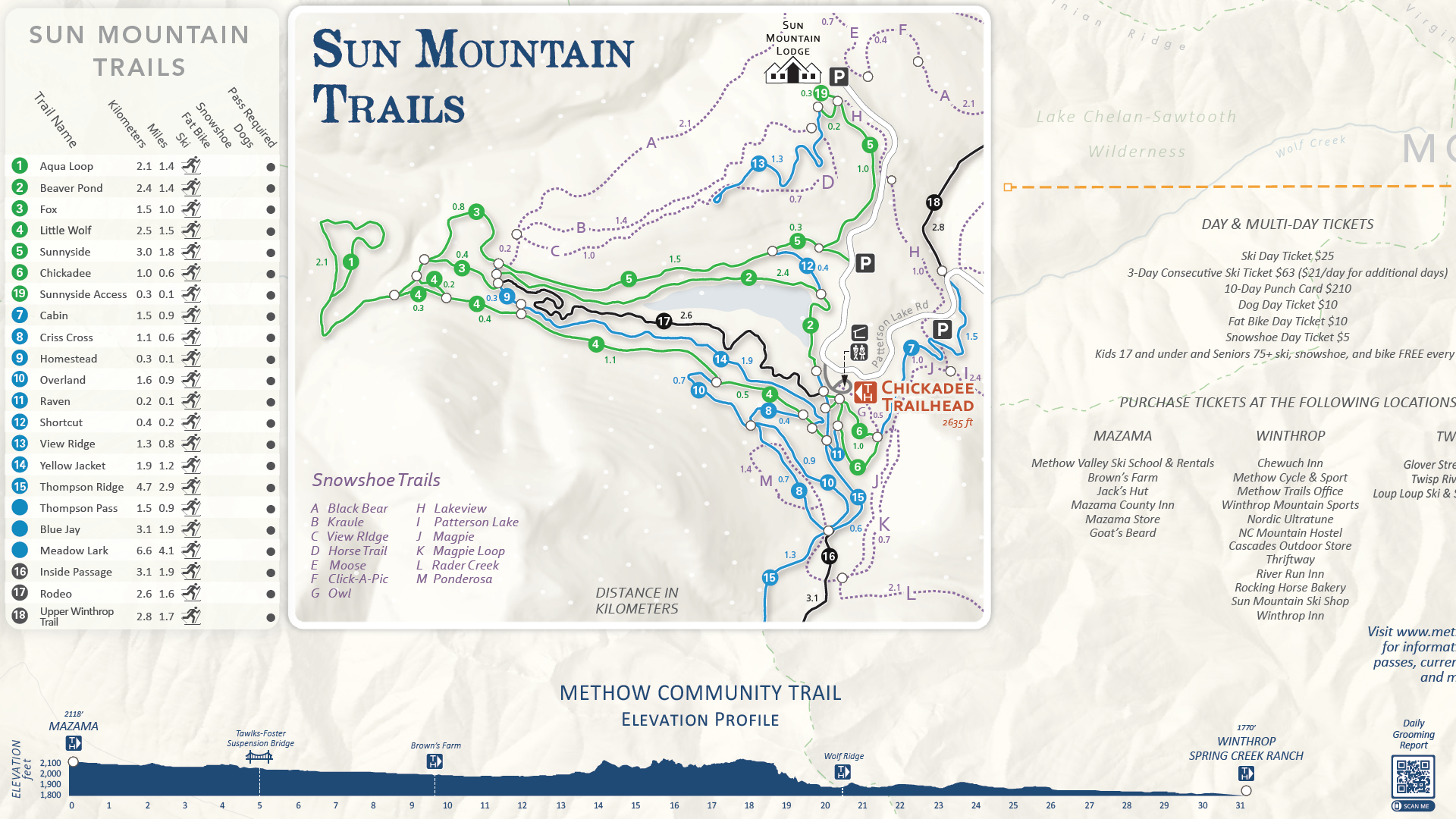
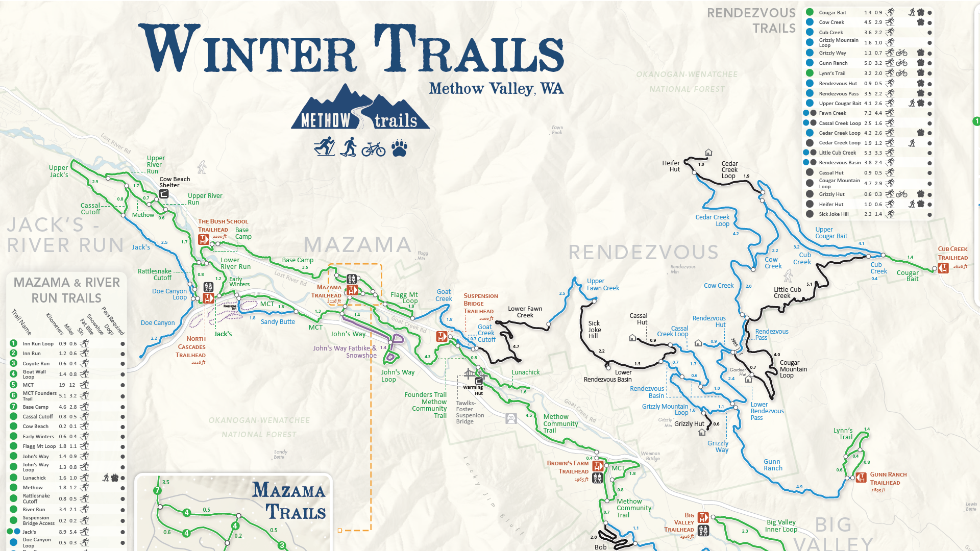
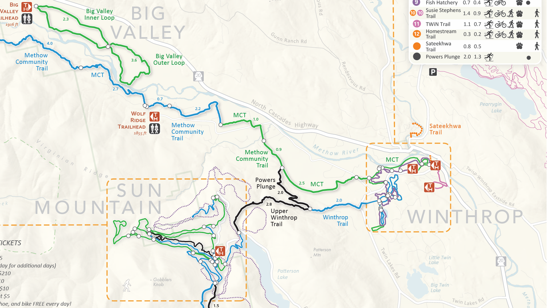
In this month’s Map Spotlight we are showcasing an honourable mention of the 2021 Avenza Map Contest: Winter Trails of Methow Valley, WA by Matt Dressler. This map was created to provide visitors to the region with all the information needed to plan, explore and navigate within the Methow Valley of Washington, the largest Nordic ski trail system in North America. The map provides users with valuable trail information including difficulty, trailheads, distances for each segment, elevation, parking, restrooms, ski waxing huts, warming huts, and usage restrictions. It also features detailed inset maps of the most popular areas of the trail system, including Mazama, Winthrop, and the Sun Mountain Complex. The map maximizes legibility for users through a strong visual hierarchy, minimalist color scheme, muted basemap, and horizontal labels juxtaposed with curving line features.
The map is available throughout the valley as a double-sided, wallet-sized map card (16″ x 25″ when unfolded) and also digitally on the Avenza Maps Store.
Select the images below to see a detailed look at Matt’s map
Making the Map
Matt worked in both Geographic Imager and MAPublisher to create this map. Geographic Imager was used in Adobe Photoshop to spatially reference and refine the shaded relief basemap. From there, the basemap was imported into MAPublisher and provided the foundation to construct the remainder of the map.
Matt used MAPublisher to import his vector data as well as his basemap image. Since his map contains multiple inset maps, he used the Copy MAP Objects From tool to copy his data to another temporary workspace document and crop it to the area for each inset map. He then used the Copy MAP Objects From tool again to bring each of his cropped maps back to the main document as an inset map (check out this blog to see this process in detail). In addition to the MAP Vector Crop tool, Matt also used the Simplify Art tool to smooth ultra-detailed trail lines to be more visually appealing.
Matt also used cartographic tools in MAPublisher to improve his map’s appearance. The Create Halo tool was used to create outlines for the trail lines to make them more legible. Adding halos to elements of a map is a quick and easy way to provide contrast for readers. Matt also used the Create Knockouts tool to create spaces in vector data where text overlapped in an undesirable way.
The MAPublisher LabelPro add-on was essential in Matt’s ability to expedite feature labeling, and allowed him to control and finetune the placement of his labels. Finally, due to the nature of his map being tilted by 12 degrees from North, Matt used the Scale Bar and North Arrow features to easily ensure his finishing touches were oriented correctly.
Learn more about the Avenza Map Contest here, and check out our other Map Spotlight blogs here!
Toronto, ON, May 15, 2024 – Avenza Systems Inc., producers of the Avenza Maps® app for mobile devices and geospatial extensions for Adobe Creative Cloud®, including MAPublisher® for Adobe Illustrator®, is pleased to announce the release of Geographic Imager® version 6.8 for Adobe Photoshop®. This version introduces the new Export Contours tool, official compatibility with macOS Sonoma (version 14), and also includes several performance enhancements and bug fixes.
Geographic Imager for Adobe Photoshop delivers an all-encompassing solution to import, edit, and export geospatial images such as aerial and satellite imagery. Work with digital elevation models, GeoTIFFs, and other popular GIS image formats, using Adobe Photoshop features such as transparencies, filters, cropping, and image adjustments, while maintaining georeferencing and support for hundreds of coordinate systems and projections.
New features for Geographic Imager v6.8 for Adobe Photoshop include:
Export Contours tool: The new Export Contours tool allows users to input raster elevation data to output vector contour lines that can be exported for use in MAPublisher.
macOS Sonoma compatibility: Geographic Imager officially supports the new macOS Sonoma (version 14) update.
Additional performance enhancements and bug fixes
Users require a valid Adobe Creative Cloud subscription and a compatible operating system to utilize the improvements and enhancements offered in Geographic Imager v6.8. For questions and information on how compatibility requirements may affect your organization, please contact our Support Centre.
Geographic Imager v6.8 is available immediately and free of charge to all current Geographic Imager Maintenance Program members and starts at US$399 for non-maintenance upgrades. New fixed licenses start at US$859. Geographic Imager Basic Edition licenses start at US$129. Academic, floating, and volume license pricing is also available. Visit www.avenza.com/geographic-imager for more information.
More about Avenza Systems Inc.
Avenza Systems Inc. is an award-winning, privately held corporation that provides cartographers and GIS professionals with powerful software tools to make better maps. Avenza also offers the mobile Avenza Maps app to sell, purchase, distribute, and use maps on iOS and Android devices. For further information contact: +1 416-487-5116 – info@avenza.com – www.avenza.com
The Avenza User Conference is a free virtual conference for cartographers, GIS enthusiasts, and geospatial professionals worldwide who share a common interest in Avenza mapping technology. This year’s conference will be held on Thursday, May 9, 2024.
We are very pleased to announce the release of Geographic Imager version 6.8, the latest version of our Geographic Imager® extension for Adobe Photoshop®.
With Geographic Imager v6.8, we are announcing the brand new Export Contours tool, official compatibility with macOS Sonoma (version 14), and several performance enhancements and bug fixes.
Here’s what you can expect with the latest Geographic Imager v6.8 release:
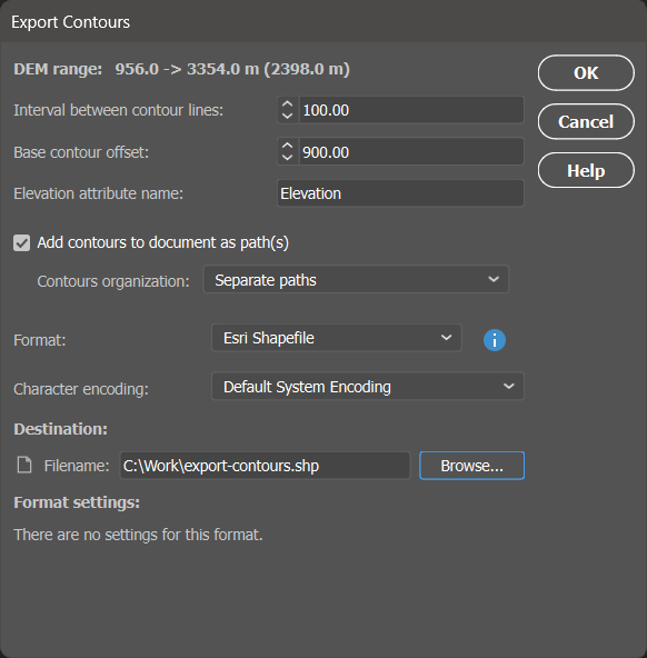
Export Contours Tool
Contour lines can be the perfect contextual element to add the finishing touches to your map. However, sometimes it can be difficult to find vector contour line data for your region or to find contour line data at the desired interval. Luckily, the new Export Contour tool in Geographic Imager is the perfect solution for this problem!
The Export Contour tool allows you to use imported elevation data in the form of a Digital Elevation Model (DEM) to create custom contour lines and export them as a vector file for use in MAPublisher. It is easily accessible from the Geographic Imager panel with its very own brand new button.
The Export Contours tool has several parameters that you can customize before exporting, such as interval between lines, base contour offset, and elevation attribute name. These options are easy to set and adjust in the Export Contour dialog box that appears when you click the button on the Geographic Imager panel.
Your contours can be exported in a variety of file formats, including shapefiles, KMZ files or GeoJSON files. If desired, you can add the contours to your current PSD document as paths. This is a convenient way to preview them and make changes if necessary before importing them into MAPublisher.
Once exported, your contours are ready for use in virtually any GIS software or application, such as MAPublisher!
Compatibility with macOS Sonoma
We want our users to enjoy fully optimized freedom with our products. As such, we are also happy to announce that Geographic Imager is now officially compatible with the most recent version of macOS Sonoma (version 14).
Geographic Imager 6.8 is Available Now!
If you would like to learn more about the new Geographic Imager 6.8 features or have any questions, please check out our Support Centre.
Geographic Imager v6.8 is available immediately, free of charge to all current Geographic Imager users with active maintenance subscriptions and as an upgrade for non-maintenance users.
For more information about the brand new Export Contours tool, please visit its support documentation page.
When purchasing Avenza desktop software, MAPublisher and Geographic Imager, you are able to choose between two main license types: a fixed license or a floating license. This blog will cover the primary differences between the two and hopefully help you determine which setup will work best for you!
Fixed License
Fixed licenses allow for the software to be used on only one computer. This is usually sufficient for most single users or small companies, even with just a few licenses. A fixed license is, as the name suggests, fixed to a specific computer. Consequently, this means that it generally cannot be moved freely to another machine, although Avenza does allow you to move your license occasionally. For example, if you have purchased a new computer or if your main computer is being repaired and you need to transfer your fixed license to another computer. This is called rehosting a license. A license rehost is free as long as you have active maintenance on your license, or can be done for a fee if your maintenance is not active or expired.
Floating License
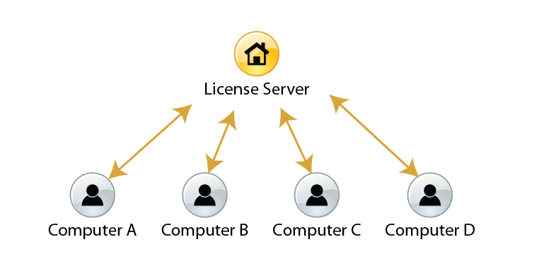
Floating licenses allow an organization to deploy a specific number of licenses that can be used and shared on any number of computers over a network. This is a great solution for any company that has multiple users of MAPublisher or Geographic Imager, especially if all users have their own machine. As such, this means that floating licenses do not need to be rehosted, however there must be a central server from which the licenses are provided to the users within the network. Hence, floating licenses can be further broken down into two categories: cloud floating licenses or local floating licenses.
Cloud Floating License
Cloud floating licenses connect users to their license through the internet. This does not require any additional setup on the organization’s side, and users can access and manage their licenses and servers through a cloud-based customer portal.
Local Floating License
Local floating licenses require a systems administrator at the organization to set up a local server on a computer which meets certain specifications. Only users connected to the local server will be able to check out these licenses on their client computers.
Floating licenses are often the chosen option when an organization would like to share a number of licenses between members. For example, if an organization’s license server holds two seats of MAPublisher licenses, when users on Computer A and Computer B have each checked out MAPublisher licenses, other users on the network are not able to check out a license until the borrowed licenses are checked back in.
Floating licenses also give users the ability to borrow a roaming license with their laptops. This is a good solution for users who want to temporarily use MAPublisher and Geographic Imager when they are not connected to the floating license server.
For more information about the licensing options for Avenza desktop products, please contact Avenza sales. For any technical questions about setting up a license server or any other licensing issues, please contact Avenza support.