When it comes to map-making for beginners, one of the most challenging aspects is finding the right data in the first place. You start out with this fantastic idea for mapping the annual airplay frequency of Mariah Carey on traditional radio… only to find the data behind a paywall. What’s with that?
Turns out, it’s very common. Data is commonly referred to as the most valuable resource on the planet for a reason. Companies make a lot of money by collecting data and selling it or selling indirect access to it. So, before you get too excited about an idea, take a step back and think about the data.
Where to Find Data
There are a lot of reasons why paying for data may not be an option for you and we’re not here to judge, so moving along.
When you’re not able to pay for data, you’ll need to be less choosy about what you’re creating. This type of data hunting is a more broad search, find some data, then let it speak to you! You may need to be a bit more creative, but free data is out there and if you’re willing to dig you can still create wonderful maps with it!
Think Where
The first thing to consider with how to find data is where in the world are you looking for it. Developed countries often give public access to census data or other government-funded research. This can often be the most reliable data as well. Something to consider when thinking about the data you’re looking for.
Think How Big
The size of your project scope can also have a big impact on where you try and find data. If you’re looking for data only on one country, that will be a lot easier to find (in general) than the same data for every country in the world.
You can often find high-level data (think population) at a national global level, but if you go more granular (think language spoken) it could get more difficult to find. There also would be a lot more variables if you chose language spoken globally, this could affect how you ultimately portray the data.
Think When
Another consideration is from which point in time you want to collect data. Depending on when in history you’re looking, it can be either very difficult or very easy to find data. Keep in mind that this changes when you look at different countries around the world.
In general, anything in the 1900s forward in developed countries should have some data. But depending on when specifically and what you’re looking for there could be a lot of range.
This ultimately goes back to the point made above about letting the data guide you. You may not be able to create the exact map you thought you were going to create when you started thinking about the project. Often you’ll find you come up with something even better!
Helpful Links
Still don’t know where to start? Try some of these helpful links for easily accessible data!
Wherever you find it, Use Avenza Systems to Create It!
Whatever Adobe environment you prefer to work in, Avenza has a solution for you!
Avenza MAPublisher is cartography software that seamlessly integrates more than fifty GIS mapping tools into Adobe Illustrator to help you create beautiful maps. Whereas Avenza Geographic Imager mapping software enhances Adobe Photoshop to make working with spatial imagery quick and efficient.
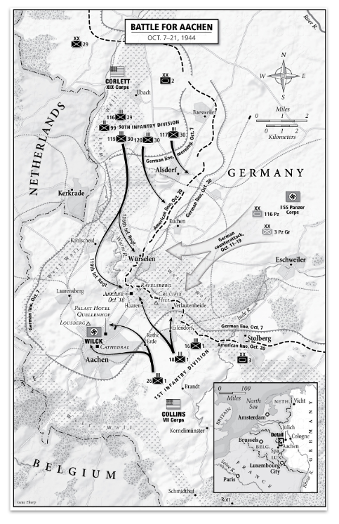
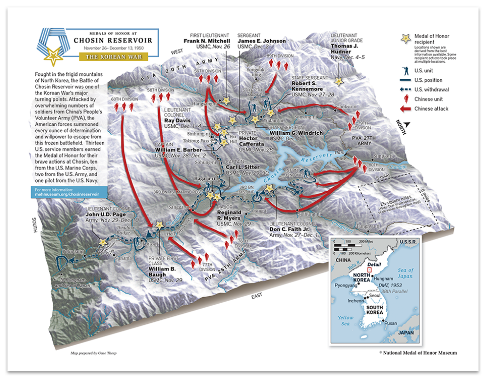
In this edition of Cartographer Chronicles, we welcome Gene Thorp. Gene is a renowned, award-winning cartographer who has become a staple of the map-making community. Gene displays an expertise in map design honed through nearly 30 years of experience. Gene skillfully applies his craft by using maps to tell fascinating stories and communicate important information about history, geopolitics, and the world around us. In this issue of Cartographer Chronicles, Gene is telling his own story, sharing with us how he came into map-making as a career and his interesting journey through the world of cartography.
***
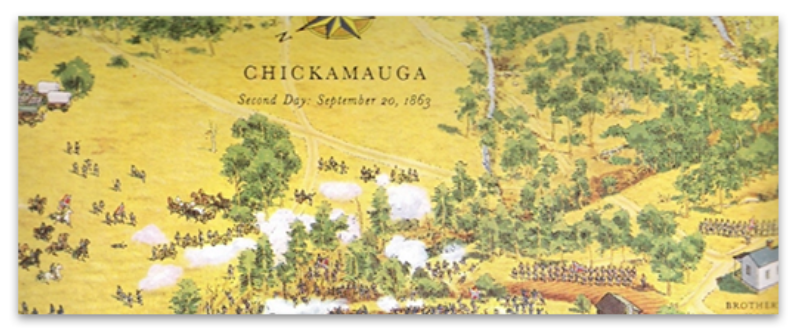
The cartography bug bit me when I was very young, before I could even read. I know this because I was captivated by artist David Greenspan’s illustrated maps, dozens of which I found in my grandfather’s American Heritage Pictorial History of the Civil War. Each map contained hundreds of little hand-drawn soldiers fighting across all types of terrain. I spent hours studying every little detail and harassing my poor older brothers to read what the cryptic numbered captions said. When I got older, I realized many of those battlefields were only a day’s drive from where I lived, so I persuaded my parents to visit one on a family trip. Greenspan’s illustrations were so effective that I was able to easily visualize what had happened there. It was almost like I had already visited the battlefield before. I was hooked on maps, but at that young age, I never dreamed I would have a career-making them.
Fast forward fifteen years, and I was early into college pursuing a history degree at the University of Maryland Baltimore County (UMBC). I had to pay for my school so I worked part-time at a Hechinger hardware store. One of my coworkers there knew I had an interest in maps and told me UMBC had one of the best cartography programs in the country and suggested that I check it out. I took Cartography 101 the next semester and realized this was the career path for me. Under the mentorship of Professors Joe School and Tom Rabenhorst I was part of the last class that was taught photometric techniques using scribe coat and linotype, and the first class to design and produce maps solely using computers. In a school internship program, I was lucky to be chosen as the project editor on what was likely the first-ever digitally produced U.S. atlas for a company called Military Living.
Three years later with a degree in geography, a degree in history, and a much-valued certificate in cartography, I teamed up with a friend from school and we ventured out into the real world to try our hands at commercial mapping. Sadly, our timing was off. Our business was launched immediately after the breakup of the Soviet Union. The once robust defense industry suddenly downsized and the country entered a recession. Our cartography business was essentially shuttered after only one year. Good cartography positions were hard to come by, so I expanded my horizons and jumped into graphic design which at that time had many more job openings.
Starting from the bottom, over the next eight years I worked at prominent graphic design firms in the Washington, D.C. area designing and producing magazines, logos, brochures, websites, and illustrations. It turned out to be a great experience where I learned page layout, cover design, image manipulation, illustration, and other publication techniques from some extremely capable artists and designers. They taught me the importance of typography and that good design did more than make a layout look attractive, more importantly, it effectively communicated information. These were lessons I took with me for the rest of my career.
During that time, I never abandoned cartography. I picked up small mapping freelance projects wherever I could find them hoping maybe one day I could get back into the field full-time. My big break came in 2000 when I was brought onto The Washington Post staff as a cartographer by the talented Art Director Michael Keegan and the extremely gifted Chief Cartographer Richard Furno, a former National Geographic cartographer who was a principal designer of the iconic 1969 moon map. He also developed a custom CAD-based mapping application called Azimuth, which, in conjunction with Macromedia Freehand, Adobe Photoshop, and ArcInfo, were the primary programs we initially used to create maps for the newspaper. Geographic points, lines, polygons, and raster data were brought into Azimuth or ArcInfo to be projected then exported. Raster data was further manipulated in Photoshop. Everything was then imported into Freehand where the map was designed, styled, and labeled. Each type of feature like roads, rivers, and urban areas had been color-coded in Azimuth or ArcInfo so they could be easily selected, stylized, and labeled in Freehand.
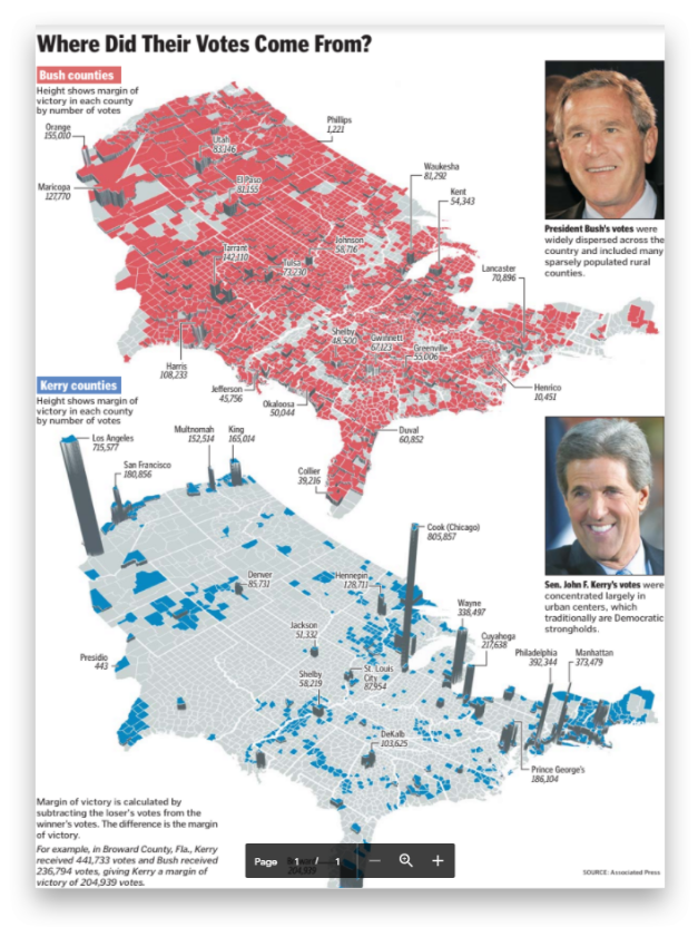
Over the next 15 years, I created thousands of maps, from simple locators to full double-truck spreads on every topic imaginable. One of the map projects I was most proud of was the Presidential election result maps published the day after the election which displayed each candidate’s margin of victory by county.
The maps were designed in perspective to clearly emphasize how much weight small and densely populated counties contributed to the overall election result. Another favorite was the Obama Inauguration map showing attendees the parade route, jumbotrons, vendors, first aid stations, and the all-important locations of portable restrooms! It was fun to walk through the crowd and see so many people using it.
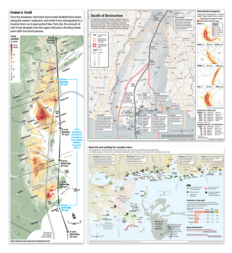
Environmental disasters such as hurricanes, earthquakes, and oil spills were all too common topics to be mapped. When one occurred, all other projects were immediately sidelined to provide weeks-long detailed cartographic coverage. This included hurricanes Katrina, Rita, and Irene, earthquakes like those in Indonesia, Japan, or Haiti, and man-made disasters like the Deepwater Horizon oil spill whose massive oil slick spread for weeks across the Gulf of Mexico.
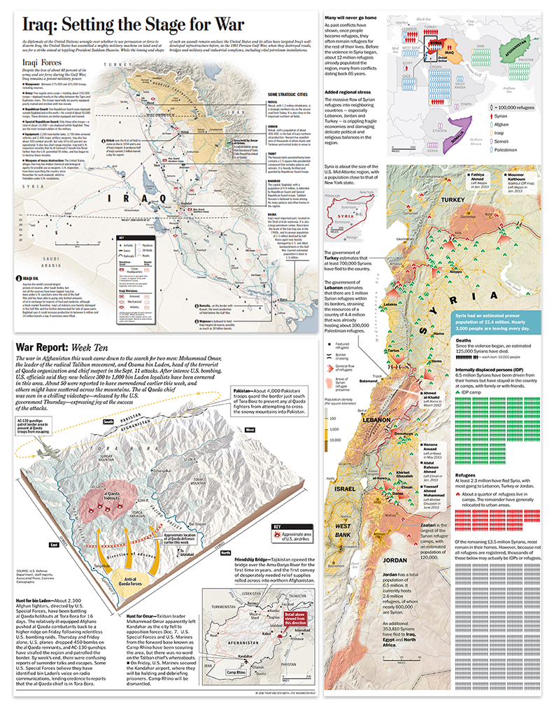
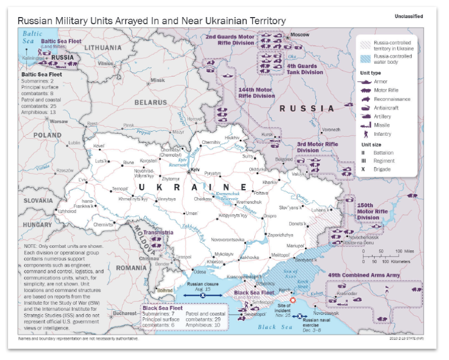
With September 11th happening less than one year after I was hired, covering terrorism and military actions across the globe was another major part of my duties at the newspaper. I made what seems like countless static and interactive maps of the hunt for Osama Bin Laden, the invasions of Afghanistan and Iraq, the rise of ISIS, the civil war in Syria, and the Russia-Ukraine conflict.
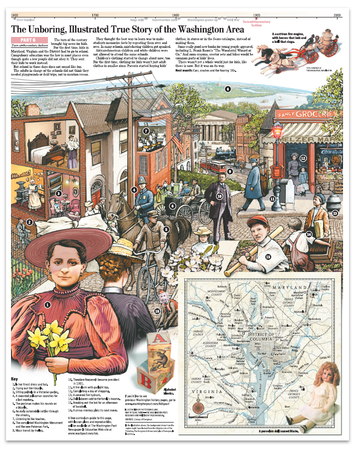
But mapping at the Post wasn’t always serious. I was able to fit in extra time to support travel stories, illustrate a few Kid’s Post graphics, and contribute research and cartography to a 10 part illustrated series on the history of Washington, D.C. (which won gold at the international Malofiej awards).
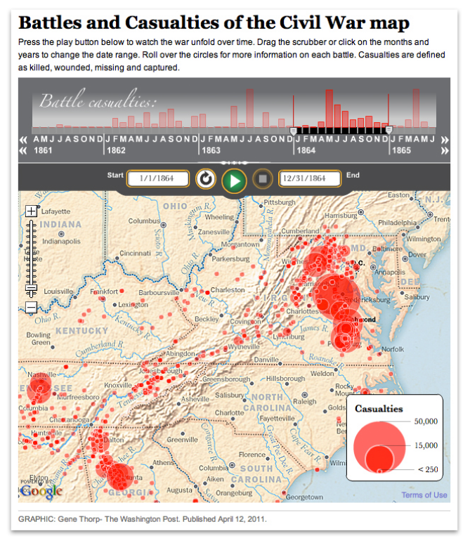
Among my favorite responsibilities was a five-year project of timelines, articles, and interactive maps to commemorate the sesquicentennial of the American Civil War.
All the while, I created custom maps on the side for numerous bestselling books like those in Rick Atkinson’s World War Two Liberation Trilogy series (which won a Pulitzer Prize) and oversize maps for exhibitions at museums like the Smithsonian Institution, the Museum of the Bible, and The Seminary Museum in Gettysburg and many others.
After working 15 years in the news industry, I accepted a job in the federal government as a senior cartographer at the U.S. Department of State, where for the last six years have I operated under the direction of Lee Schwartz in the Office of the Geographer and Global Issues (GGI), within the Bureau of Intelligence and Research (INR).
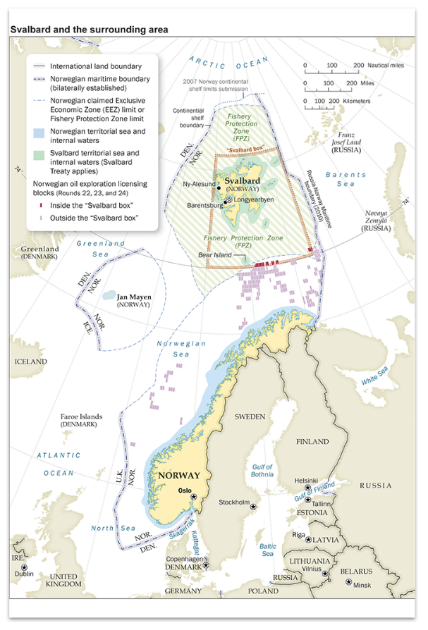
In this capacity, I work with an extremely knowledgeable group of geographers, scientists, and other subject-matter experts to support the full spectrum of the Department’s foreign policy missions. Working closely with my fellow cartographers in the Geographic Information Unit (GIU) and Humanitarian Information Unit (HIU), we produce hundreds of maps each year that help visualize and explain a wide range of topics and issues; such as the Department’s efforts to defeat international terrorist groups; illustrate the maritime claims of countries in places like the South China Sea, the eastern Mediterranean, and the Arctic; map the government’s policy on disputed international boundaries along the China-India border, and highlight the buildup of Russian forces near Ukraine.
I also work on the international boundary and sovereignty team that regularly advises policymakers on the geography and history of territorial disputes and produces the publicly available Large-Scale International Boundaries (LSIB) dataset, a set of digital lines used by cartographers and other geospatial professionals as the source for the world’s international boundaries reflecting the foreign policy of the United States.
I have been very lucky to rub elbows with some of the most amazing cartographers, designers, illustrators, writers, analysts, policymakers, editors, developers, photographers, and programmers of our time. The work has been fast-paced and challenging, but also extremely rewarding. It’s incredible to see how much technology has altered the landscape over the last 30 years. In the old days, I traced government base maps with a scribe tool and used peel coat, or digitized data on the “high-speed” 8MB RAM and 100MB hard drive computers. When I started at The Washington Post the mapping process was all digital, but the data we used was mostly what we created ourselves. When shapefiles or spreadsheets were available, we used Azimuth or other products to select and organize what we needed, before projecting and exporting the data. But when the files were imported into Adobe Illustrator for design and labeling (Illustrator replaced Freehand in 2005), the data lost all its attributes. Mapping expanded rapidly into 3D and I utilized programs such as Bryce 3D and Google Earth to create a vast assortment of perspective maps on tight deadlines.
Cartography also increasingly became accessible on the internet. At first, I made static locator maps and created custom map tiles for interactive traffic applications, but soon advanced to writing the actual applications, one of which was a multipurpose timeline that interfaced with Google maps that could play data ranges overtime on top of zoomable custom tilesets.
Midway through my career at the newspaper, Richard Furno retired, and by 2011 all support for Azimuth ended. I needed an affordable replacement mapping application that could custom project data and still interface with Illustrator. This is when I discovered MAPublisher. I had known about it for many years and had heard good things about it from colleagues, but up to that time Azimuth had always worked for my purposes. When I finally dug into MAPublisher’s capabilities I was instantly impressed. Not only could MAPublisher import and project a large array of data types, it maintained the data georeferencing and attributes within Illustrator, all the while allowing me to still perform analysis on it. I could now add or remove attribute fields, make calculations, join spreadsheets, create proportional circles and custom style points, lines, and polygons, all based on the data attributes. Making last-minute map scale changes was also much easier because labels maintained their size and association with their associated features whenever the map was enlarged or reduced. Creating custom data became easier too. I could register a base map or satellite image on existing data, trace the information I needed, then move it to a MAPublisher layer where it instantly became georeferenced. I could add and fill out custom attribute fields, then export the entire layer of new information to virtually any geospatial format for use in all the mainstream GIS applications. Another useful feature was that I could import only a small section of a large dataset. Had I started using MAPublisher earlier I could very easily be able to pull data from my older projects into the new ones. MAPublisher continues to be my core mapping application.
Returning to my roots in history, I’ve recently been using MAPublisher to create a detailed and accurate database of the mid-Atlantic region as it would have appeared during the American Civil War, 1861–1865. First I have stripped away modern features like roads, reservoirs, and manmade shorelines, and, using a variety of historical maps, restored historical features such as long since disappeared roads, rivers, shorelines, fords, railroads, bridges, and towns. An accurate base of geospatial data allows for the correct placement of the plethora of temporal data available from primary sources such as troop movements, refugee movements, weather events, and personal experiences that are tied to a specific historical location. All of this information is either used directly in MAPublisher to create maps, or exported and used in any application that can read geospatial information. I may never be able to mimic the historical map illustrations of David Greenspan that engrossed me as a child so long ago, but perhaps I’ll be able to recreate the world of that time in such a way that will captivate and educate generations of history buffs for years to come.
For those entering or considering the field of cartography and GIS, the future seems brighter and broader than ever before. My experience has been that most people find custom maps greatly enhance their products. The internet is increasingly awash with new data that individuals, companies, non-profits, and governments need to process and visualize to be understood. Even if cartography is not your primary role, adding attractive, accurate, and informative maps can be greatly beneficial to communicating the message of whatever organization you are working for. Good luck mapping!
We are very excited to announce the release of Geographic Imager 6.5, our latest version of the Geographic Imager extension for Adobe Photoshop.
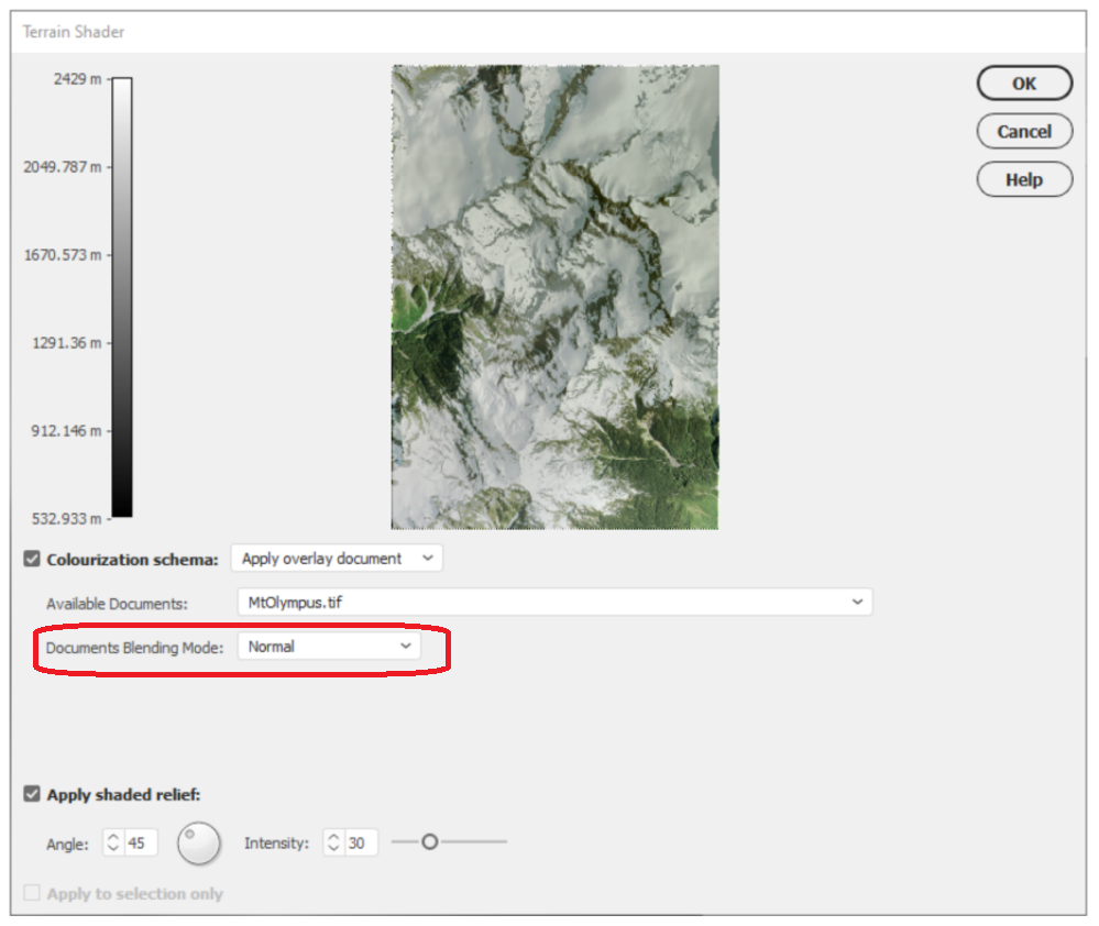
With Geographic Imager 6.5, we are bringing forward full compatibility with Adobe Photoshop 2022 (23.0.x), Windows 11 and macOS12, support for vector GeoPackages, improvements to the Terrain Shader tool, and several bug fixes.
Here’s what you can expect with the latest Geographic Imager 6.5 release:
Compatibility with Adobe Photoshop 2022 (23.0.x), Windows 11, and macOS 12
We want Geographic Imager users to experience truly seamless integration with the Adobe Photoshop workspace. We are pleased to announce that Geographic Imager 6.5 is now fully compatible with Adobe Photoshop 2022 (23.0.x).
Geographic Imager 6.5 is also fully compatible with the newly released Windows 11, as well as macOS 12 Monterey.
Terrain Shader Improvements
The Terrain Shader tool allows users to create dramatic shaded relief visualizations with elevation data. Combining hillshaded elevation datasets with imagery overlays can create striking topographic representations. With this latest release of Geographic Imager, we are improving the Terrain shader tool to include a document blending mode option. When the “Apply Overlay Image” option is now selected as a colourization schema, users can select from a range of native Photoshop blending modes that improve how imagery layers are overlayed with elevation data.
Import and Export Vector GeoPackages
Several users have requested the ability to import and export vector GeoPackage data. We are happy to announce the full support of vector GeoPackages is now offered with Geographic Imager 6.5. Vector GeoPackages are based on SQLite databases and offer an open-source, compact, lightweight, and flexible data format for easy and efficient storage or geoprocessing of spatial data.
Geographic Imager 6.5 is immediately available today, free of charge to all current Geographic Imager users with active maintenance subscriptions and as an upgrade for non-maintenance users.
Avenza Systems Partners with Leading Defense Contractor SAIC to Offer a Verified Secure Version of its Popular Offline Map App
Toronto, ON, Canada (December 20, 2021) – Avenza Systems Inc., producers of MAPublisher® cartographic software for Adobe® Illustrator® and Geographic Imager® geospatial tools for Adobe Photoshop®, is proud to announce that it has partnered with SAIC and launched Avenza Maps®: RA Edition as a cornerstone of SAIC’s new Rugged Apps™ platform.
“SAIC is very pleased to provide Avenza Maps through our Rugged Apps™ platform. Avenza’s app delivers enhanced mission value in a verified and secure manner, allowing use with confidence by users,” said Michael LaRouche, President of SAIC’s National Security and Space Sector.
SAIC’s new Rugged Apps™ platform provides government customers with highly-secured versions of their preferred mobile applications used to complete missions every day. Avenza Maps: RA Edition passes National Information Assurance Partnership (NIAP) compliant processes to ensure the app is safe and secure for government use in a wide range of applications including land management, forestry, military, and disaster response as well as sensitive commercial environments such as oil and gas, mining, forestry and healthcare.
“We recognize the utmost importance of increased and reliable cyber-security, especially when it comes to mobile computing, and we are delighted to work with SAIC to make Avenza Maps Pro available through the Rugged Apps platform. Rugged Apps is a much-needed way of ensuring that one’s mobile apps are safe and we encourage all government and private sector users seeking to protect their systems to obtain their apps via Rugged Apps,” said Ted Florence, President of Avenza.
In addition to being NIAP compliant, Avenza Maps: RA Edition also offers all the features of Avenza Maps Pro as well as unlimited access to all Avenza Map Store content, including paid maps, at no additional cost.
Avenza Maps: RA Edition is currently available for iOS devices. Availability on Android devices will be launched in the near future. Government customers are able to order through NASA SEWP (Solutions for Enterprise-Wide Procurement) or by contacting Avenza Sales directly by phone at 800-884-2555 (North America) or at 1-416-487-5116 or by email at sales@avenza.com. For more information, visit the Avenza Maps: RA Edition website at www.avenzamaps.com/ruggedapps or the SAIC Rugged Appswebsite at www.saic.com/rugged-apps.
About Avenza Maps Avenza Maps is an award-winning offline mapping app used by professionals on a daily basis for search and rescue, to support humanitarian efforts, to fight wildfires and industries operating in remote areas or where offline maps are a necessity. Avenza Maps is also used as a teaching tool in post-secondary education, and by a growing number of recreational users to navigate, and explore off the grid. The app is a one-stop map shop with nearly one million unique map titles available on-demand, no matter where you are in the world, through the Avenza Map Store. Map publishers can register as a vendor in the Avenza Map Store and generate revenue by pricing their maps and making them available for purchase. For more information, visit the Avenza Maps website at www.avenzamaps.com.
More about Avenza Systems Inc. Avenza Systems Inc. is an award-winning, privately held corporation that provides cartographers and GIS professionals with powerful software tools to make better maps. For more information, visit www.avenza.com.
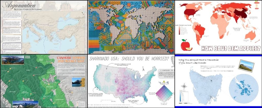
Since 2019, each November has been host to the annual #30DayMapChallenge. The challenge was started by Topi Tjukanov as a way to get the cartography and GIS communities to come together and share maps, exchange ideas, and start conversations about mapping and spatial data. Since then, this friendly competition has grown, with thousands of maps being made and shared by map-makers from all over the world, and from a wide range of experience levels.
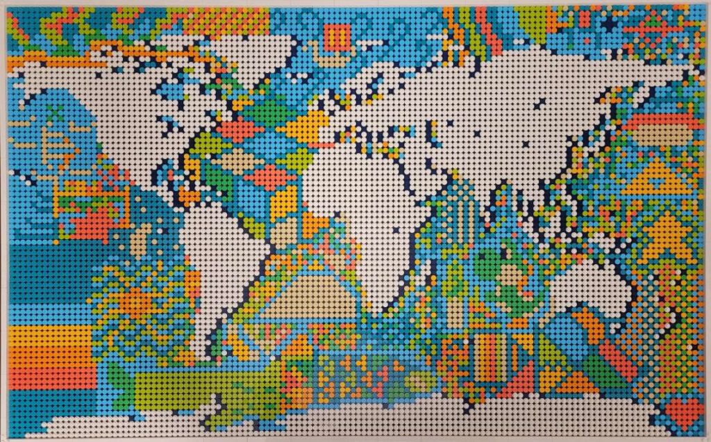
Kate B created this map entirely out of lego pieces (1500 total!) She shared this map on Day 15 – “Map made without using a computer”. See if you can spot the different shapes, symbols, and even video game characters that are hidden in the ocean sections of the piece.
The rules are simple: A specific theme is assigned to each day of November and the goal is to create a map each day that matches that day’s specific theme. Most important of all, this is a friendly challenge! The idea is to have fun, share maps with the carto-community, and hopefully learn something in the process! Here at Avenza, the challenge meant an opportunity to get together as a team and challenge ourselves to try something new. We have map-makers from all experience levels try their hand at making some maps, and we shared our favorites on the Avenza Twitter feed.
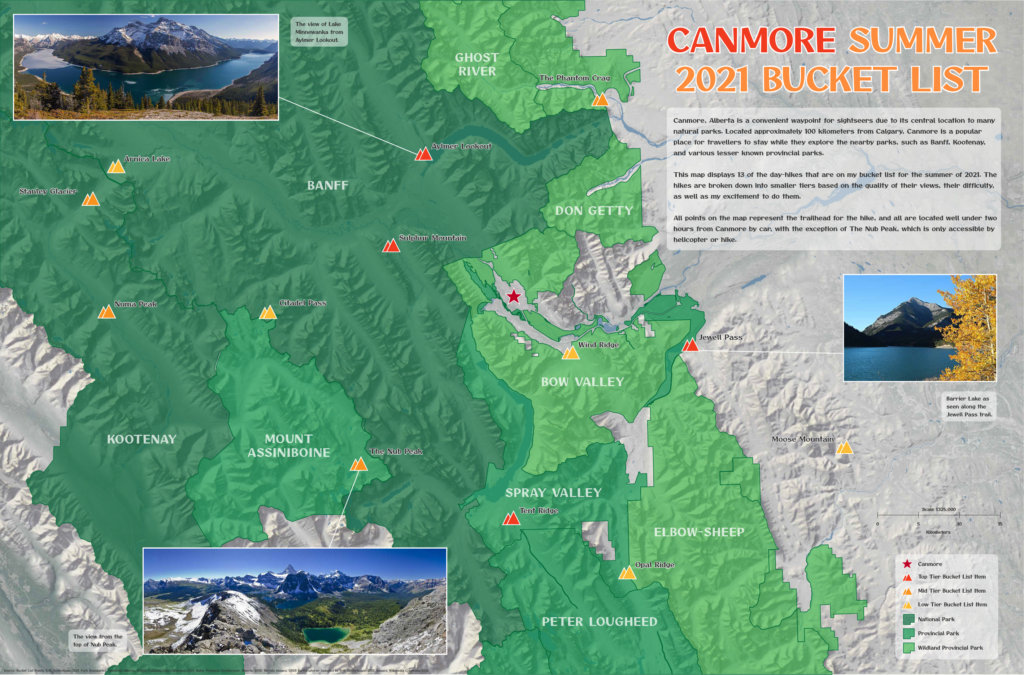
Erik shared this beautiful map of Mountains and parks he plans to visit on an upcoming trip to the Canadian Rockies. He shared this map for Day 21 – “Elevation”
Today marks Day 30, and the end of this year’s challenge. The theme for today is “Metamapping”, with the objective being to reflect on the overall experience and discuss what we mapped, what we enjoyed, and most importantly, what we learned. We’ve collected some thoughts from a few Avenza Team members who participated by asking them a simple question: “What did the #30DayMapChallenge mean to you?”
***
“An opportunity to get creative” – Rebecca B
I love making maps, and when the #30DayMapChallenge came around this year. I knew I had to participate in some way. I’ve spent a lot of time making maps with Avenza software, and some of my favorites were turned into tutorial articles on the Avenza Resources blog. You can see a handful of them here and here.
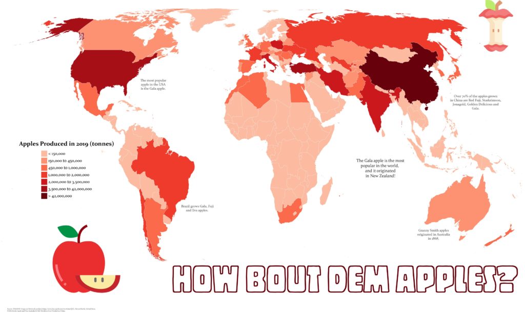
My first challenge was to create a map that fit the “red” theme. Of the three color-based themes in this year’s challenge, red spoke to me the most. Perhaps it’s because it’s a color not prevalent in nature (blue and green make me think of water and vegetation), meaning I could create something that stands out a bit more. For me at least, red immediately makes me think of apples, so I set out to create a map showing apple production worldwide. As is so common with map-making projects, oftentimes the hardest part is finding good-quality data. Luckily for me, the UN Food and Agriculture Organization houses some fantastic datasets on global food production. Using the Join Table tool in MAPublisher, I could link this tabular data to a polygon layer of countries I had imported into Adobe Illustrator. Finally, I used MAP Themes to create an appropriate red stylesheet to visualize my data, and just like that, I was done!
Rebecca B created this fantastic map showing global apple production for Day 6 – “Red”
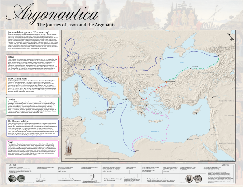
Next up, I took a shot at making a historical-themed map for Day 24 of the challenge. Now as a self-proclaimed history buff, I’ll never turn down an opportunity to do some research on the ancient world. For this theme, I chose to map out the mythical route of Jason and the Argonauts. If you’re from Toronto and you think “Argos” you probably think about the football team, but these are the original Argos. I actually started this map long ago for another project, but the #30DayMapChallenge got me inspired to revisit it and see it to completion. The route was all hand-drawn in Adobe Illustrator after meticulously cataloging and plotting the different locations in the legend. I was able to easily create map labels using MAPublisher LabelPro and overlaid the map layers onto a Natural Earth shaded relief base layer. While the map is physically the biggest part of the artboard, the story is what really drove me to create the map.
Looking back on this challenge, it’s a wonderful opportunity to get back into map-making. The #30DayMapChallenge is a great outlet to reignite that spark of love for cartography.
Rebecca B manually digitized the path of Jason and the Argonauts for her Day 24 – “Historical” map
***
“A chance to learn a new skill”– Chelsey
Not all of us at Avenza are experienced map-makers! In fact, even though I often use maps in my everyday life, I haven’t had many opportunities to make a map myself. For me, the #30DayMapChallenge was an opportunity to learn, try new things, and (hopefully) create my first map!
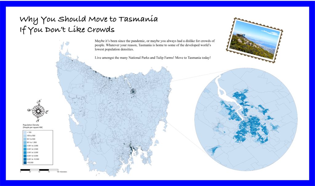
I was fortunate that the Avenza team included several experienced map-makers who were willing to sit down with me and teach me the basics of cartography. After a short crash course on “projections”, “coordinate systems” and the “fundamentals of working with spatial data”, I felt confident I could take my first steps in the world of cartography. Using some of the great tutorial workflows in the Avenza support center, I was able to get my first map dataset imported with MAPublisher. With a bit of help from my Avenza teammates, I was able to get a population dataset showing population counts for Tasmania. Something I quickly learned is that population data needs to be adjusted to account for variation in the size of each area of measure. I used the attribute expressions tutorial to create an expression that calculated the population density for each region rather than the raw population value. Finally, apply a MAP Theme to give the map some color, and add a few remaining stylistic elements with the native Adobe tools, and voila! My very first map is complete!
For me, the #30dayMapChallenge offered me a chance to learn some great new tools, and take a crack at making my very first map. I learned that making maps doesn’t have to be hard, and in fact can be quite fun! Being able to go from never made a map to “I made a real map!” in a matter of hours was incredible, and I can’t wait to try out these newfound skills on some other map projects!
Chelsey got a crash course in beginner map-making with MAPublisher, allowing her to create this neat map of population density in Tasmania for Day 12 – Population
***
“Not all maps have to be serious”– Spencer
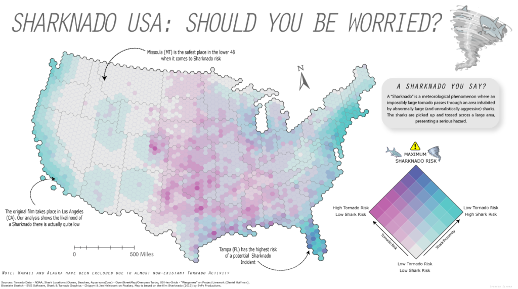
This year was my second time participating in the #30DayMapChallenge and once again, it was incredible to see the map-making community come together to share some really cool maps. I enjoy these types of challenges because they encourage new and experienced map-makers alike to try out new tools, learn some new techniques, and work on maps in a friendly, non-intimidating environment. For me at least, it was an opportunity to just have fun and try out some maps that were less serious in nature. Too often maps are only the result of intensive analytical processes or a product of complex data visualization. While these types of rigid workflows are still quite interesting to work on, it’s also good to step back and just have fun with the process instead of focusing on every detail in the workflow. For Day 4 – “Hexagons”, I did just that and put together a simple map documenting the “Sharknado Risk” across the US. I even wrote a tutorial blog about how I did it!
Spencer made this not-so-serious map of Sharknado risk by creating a custom Bivariate-risk index in MAPublisher. He shared this map for Day 4 – “Hexagons”
What I enjoy most about open-ended map challenges like #30DayMapChallenge is that they allow one to explore topics or datasets that they might not use in their normal day-to-day work. As many cartography and GIS folks know, the most challenging part of ‘making a map” often comes from deciding on a theme, and finding good data. This is especially true when you are restricted to a very specific mapping result or must adhere to strict design considerations. The #30DayMapChallenge removes some of these obstacles and provides an environment that encourages creativity and gets back to the real reason so many of us got into the industry – because we enjoy making maps.
***
Some of the Map created by the Avenza Team for #30DayMapChallenge
Welcome back to this month’s edition of Mapping Class. The Mapping Class tutorial series curates video tutorials and workflows created by experienced cartographers and Avenza software users. With us today is Steve Spindler, a MAPublisher expert, and professional cartographer. Steve is back with a quick demo showing how he uses MAPublisher path utility tools and a custom Adobe script produced by Nathaniel Kelso to create unique mile marker symbols. The Avenza team has produced video notes adapted from the original article found on Steve’s personal blog.
***
Create Distance Marker Symbols in MAPublisher using Scripts by Steve Spindler (Notes adapted from the original)
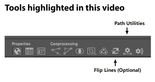
MAPublisher used within Adobe Illustrator enables us to create mile markers or other points along a line. I’m using this tool while working on the Genesee Valley Greenway map, and this video walks through the process.
Not shown in the video is how I set the direction of the line. Reversing the line direction is done using the MAPublisher Flip Lines tool. I just didn’t need to do this.
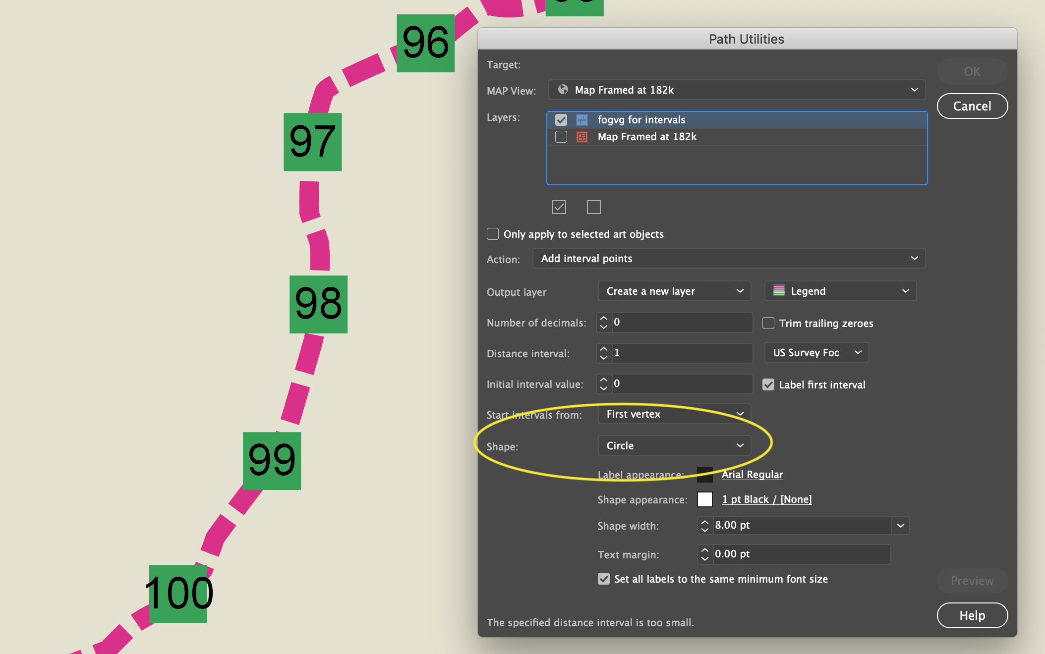
To set the mile marker preferences, we can use the Add Path Intervals in the Path Utilities tool.
This is pretty good, but if you want to customize the circle or square, it helps to convert the polygon objects into symbols.
Find and Replace Symbols Script
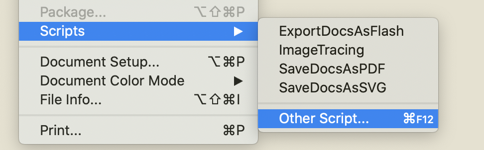
The script is called “Find and Replace Graphics” and can be found on Nathaniel Kelso’s website here. Save the script into the appropriate Adobe Illustrator Scripts folder. If you prefer, you can save the script elsewhere and navigate to the script manually using “File>Script>Other Script…”
Note: Save the script with the “.js” extension
To use it, I select all of the current objects that I want to replace and make sure they are on the same layer. I lock other layers. Then I add place a symbol on the same layer (ensure the symbol you want to use is the top-most object in the layer).
With the objects selected, run the script here.
All of the selected objects will be changed to the top-most object, which I set to be a symbol.
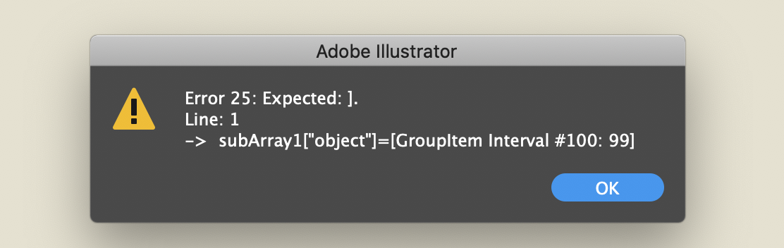
Select only the polygons, not the text. Otherwise, you will get this error.
***
About the Author
Steve Spindler has been designing compelling cartographic pieces for over 20 years. His company, Steve Spindler Cartography, has developed map products for governments, city planning organizations, and non-profits from across the country. He also manages wikimapping.com, a public engagement tool that allows city planners to connect and receive input from their community using maps. To learn more about Steve Spindler’s spectacular cartography work, visit his personal website. To view Steve’s other mapping demonstrations, visit cartographyclass.com
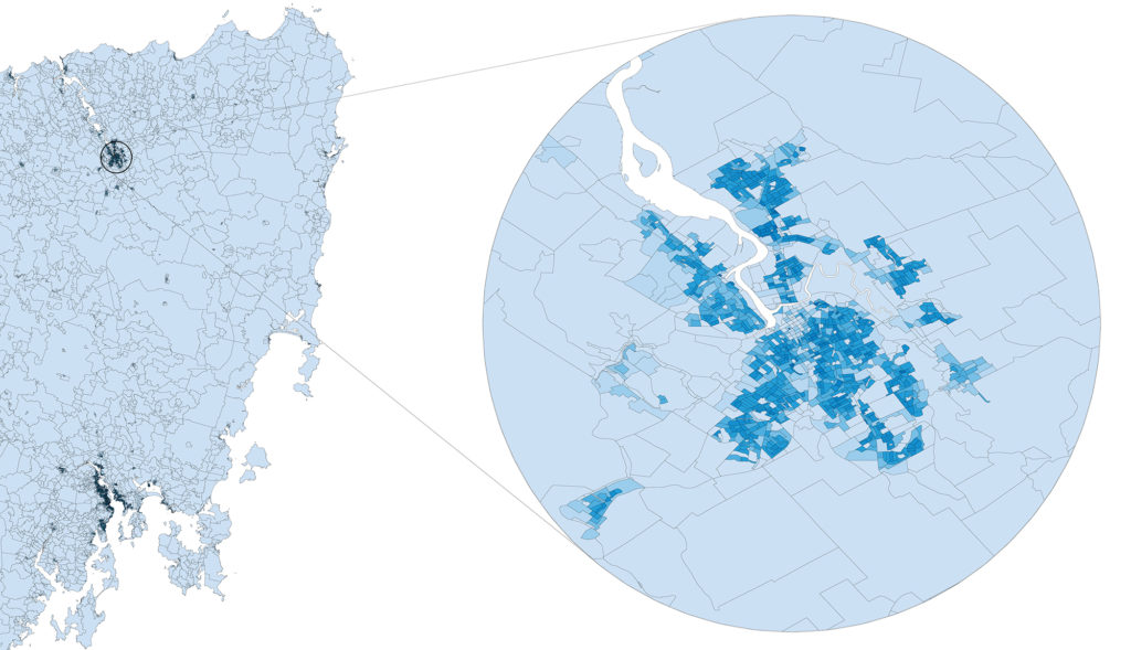
For Day 12 of the #30DayMapChallenge, the challenge topic is population. Our Teammate Chelsey from Marketing, a true beginner when it comes to map-making, steps up to the plate. With lots of help from cartography and gis experts, her focus was on finding simple population data and doing basic data manipulations to learn how to use Avenza MAPublisher.
Finding Data
This was one of the most difficult parts for a completely new map maker. Having absolutely no idea where to start Chelsey turned to her team. Here are a few of the tips she learned on how to source data.
Have an idea
Chelsey loves Australia and has always wanted to visit.
Google is your best friend
We started searching for data by searching broad terms “Population Data Australia”.
Open Street Maps
Sourcing Census Data is a good place to start
This data is often easier to access and is verified.
Break the data down
Data can be overwhelming, we decided to focus on Tasmania, a province of Australia.
Play around with data
Working with digital data is non destructive and doesn’t take too long. Don’t be afriad to try different data sets or play around with things.
Software
Having access to incredible map-making software like MAPublisher and Geographic Imager really made this next part simple.
With MAPublisher you’re able to open and manipulate spatially referenced data… RIGHT IN ADOBE ILLUSTRATOR! Chelsey was impressed with how easy it really was to open the data sets, set projections, and even create a legend in less than five clicks!
“It’s easy to get intimidated by all the rows and rows of data. MAPublisher put it all in the Adobe environment I’m already familier with, that helped make it all easier to understand and work with.”
Chelsey Harasym – Avenza Marketing
Fun Fact: Not all maps or infographics need to be serious, check out this great map about Sharknados!
Map Insets
Sometimes, like in our example shown above, you really need to zoom in to see the detail of a map. This is often down using Map Insets. Chelsey used a map inset to showcase the more populated areas of Tasmania. If you’re interested in learning how to create map insets with MAPublisher, learn how here.
Ready to Try?
Download your own free trial of either MAPublisher (Adobe Illustrator) or Geographic Imager (Adobe Photoshop) today to start making your very own beginner maps!
Toronto, ON, December 14, 2021 – Avenza Systems Inc., producers of the Avenza Maps® app for mobile devices and geospatial extensions for Adobe® Creative Cloud®, including MAPublisher® for Adobe Illustrator®, is pleased to announce the release of Geographic Imager® 6.5 for Adobe Photoshop®. This latest release offers full compatibility with the latest release of Adobe Photoshop 2022 (23.0.x), compatibility with Windows 11 and macOS 12, import and export support for vector GeoPackages, and enhancements to the Terrain Shader tool including a new “Document Blending Mode” for overlaying images on elevation data.
Powering the Geospatial Image Editing Process
Geographic Imager for Adobe Photoshop delivers an all-encompassing solution to import, edit, and export geospatial images such as aerial and satellite imagery. Work with digital elevation models, GeoTIFFs, and other popular GIS image formats, now including GeoPackages, while using Adobe Photoshop features such as transparencies, filters, cropping, and image adjustments; all while maintaining georeferencing and support for hundreds of coordinate systems and projections.
New features of the Geographic Imager 6.5 plugin for Adobe Photoshop include:
Photoshop Compatibility: Works with the newest Adobe Photoshop 2022 (23.0.x)
Compatibility with Windows 11 and macOS 12
GeoPackage Support: Import and export vector GeoPackages
Terrain Shader Enhancements: “Document blending mode” options for image overlays with Terrain Shader
Additional feature enhancements and bug fixes
Geographic Imager 6.5 is immediately available and free of charge to all current Geographic Imager Maintenance Program members and starts at US$349 for non-maintenance upgrades. New fixed licenses start at US$749. Geographic Imager Basic Edition licenses start at US$99. Academic, floating, and volume license pricing is also available. For more information, visit www.avenza.com/geographic-imager.
More about Avenza Systems Inc.
Avenza Systems Inc. is an award-winning, privately held corporation that provides cartographers and GIS professionals with powerful software tools to make better maps. In addition to desktop mapping software, Avenza offers the mobile Avenza Maps app to sell, purchase, distribute, and use maps on iOS and Android devices. For more information, visit www.avenza.com.
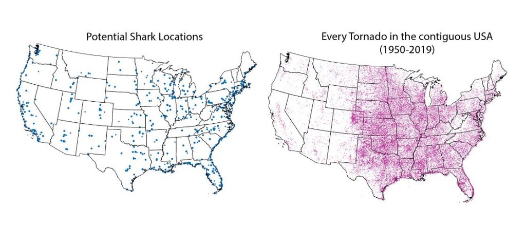
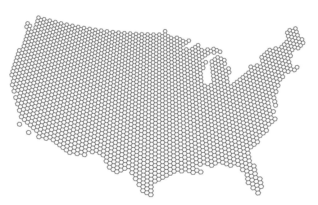
Yesterday was Day 4 of the #30DayMapChallenge, with the goal being to create a map using “Hexagons”. In the spirit of the challenge, we took a not-so-serious approach to create a fun map of “Sharknado Risk” based on the 2013 film “Sharknado” using MAPublisher tools and a really neat hexbin dataset for the United States. This map was in part created for NACIS 2021, and you can see how we created the map by watching the full video presentation included below. This blog also includes a few supplementary notes if you wish to follow along.
What exactly is a Sharknado?
A sharknado is a fictional meteorological phenomenon that occurs when a large tornado scoops up some sharks, transports them some distance, and finally disperses across a populated area. Generally speaking, if a given area is close to potential shark habitats (be it an aquarium, a zoo, or even the ocean) and has a high frequency of tornadoes, the area is more “at-risk” of experiencing a sharknado. To that end, we gathered some great open datasets to help us map this risk. We collected a shapefile documenting point locations for every single tornado in the country dating back to 1950. With this dataset, we can determine the relative frequency of tornadoes for a given area. From OpenStreetMap, we estimated potential locations for sharks by collecting point coordinates for every aquarium, marine park, aquatic zoo, and ocean-facing beach. We used Overpass Turbo to query and extract these points to a spatial dataset and imported them into Illustrator using MAPublisher. Check out this great tutorial (produced by Steve Spindler!) that covers techniques for importing Overpass Turbo data into MAPublisher. The tutorial was part of our ongoing Mapping Class series, a video-focused series that provides helpful tips, techniques, and workflows from real-world cartographers.
Aggregate data with Spatial Join
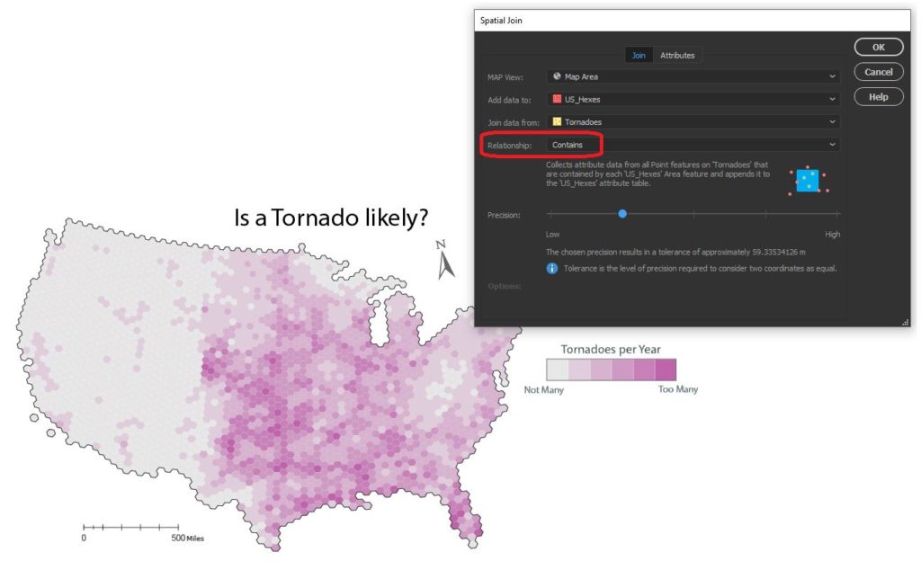
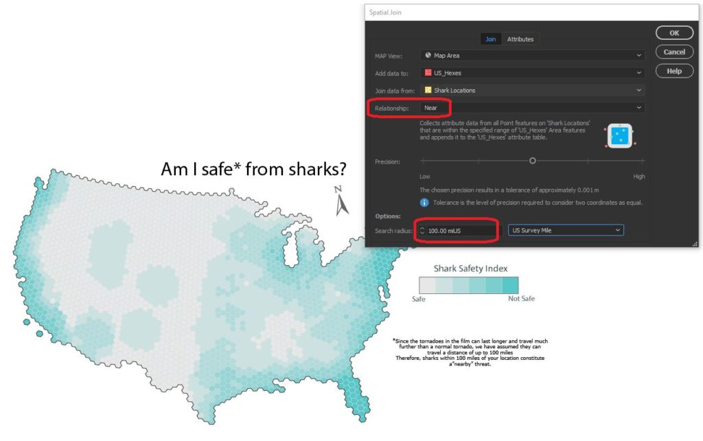
Since the challenge of the day is hexagons, we needed a way to get our messy point data into our clean “hexbin” format. The Spatial Join tool allows us to aggregate our point data (Tornado and Shark Locations) into a single hex-grid polygon dataset.
Credits to Daniel Huffman’s projectlinework.org for making this dataset available!
The Spatial Join tool includes several different options for “spatial relationships” that will determine how our point data is joined to the new hex-grid. We can also specify how the tool will aggregate the attribute information for our joined data. In this case, we join our Tornado point data based on a “contains” spatial relationship. This will aggregate all tornado points that are “contained” within a given hexbin. We also specify that the tool should aggregate the attribute information for all “contained” tornados by tallying up the number of tornado points within each hex. Since we know the dataset spans a 69-yr period, we can easily calculate the average annual tornado frequency for each hexagon.
We apply a similar technique to our shark location data, this time specifying a “near” spatial relationship. We used some back-of-the-envelope math to estimate that a Sharknado (as it appears in the film) lasts substantially longer and travels farther than a normal tornado, meaning sharks as far away as 150 miles still present a potential risk. We can specify a search range of 150 miles and this will be applied to our spatial relationship as a cut-off distance.
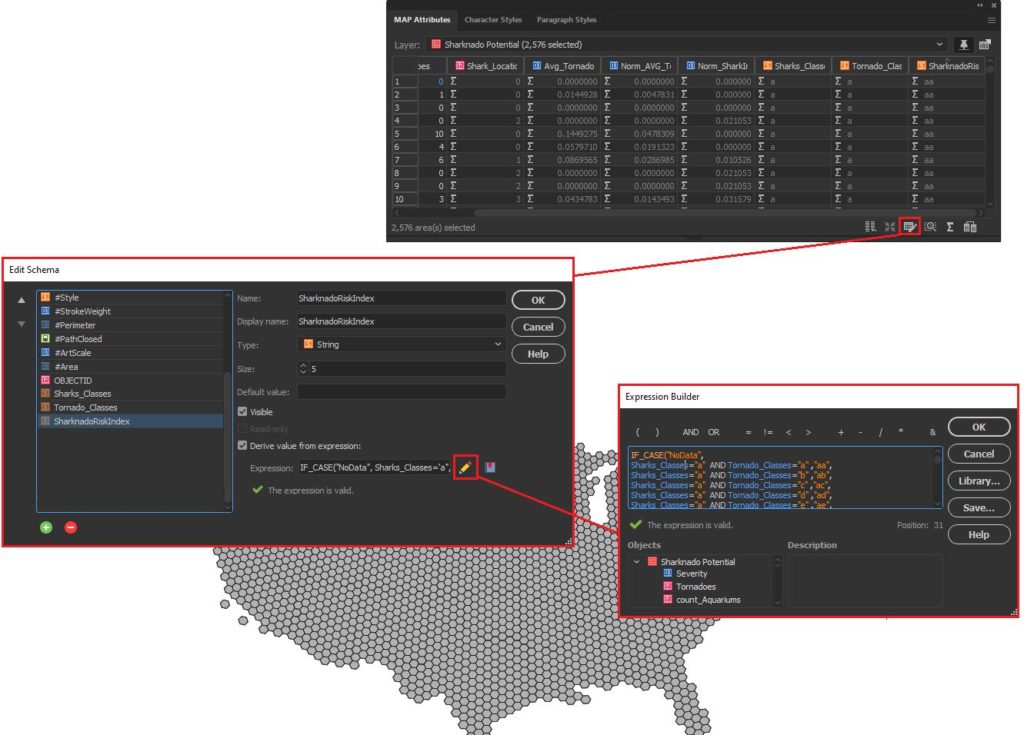
Edit attributes with expressions
We assumed that Sharknado risk is highest when a given area is prone to tornadoes and also has a high concentration of potential shark locations. Given this, we came up with a basic equally-weighted, bi-variate risk index to assign a “Sharknado Risk” score based on these two variables. To calculate this score for each hexagon in our hexbin grid, we applied some custom expressions using MAP Attributes. First, we assigned a Tornado risk score from 1 to 6 based on the low to high frequency of tornadoes. We assigned a similar score for “Shark proximity” based on the concentration of potential shark locations. Finally, we combined these values into 36 unique scores to evaluate sharknado risk.
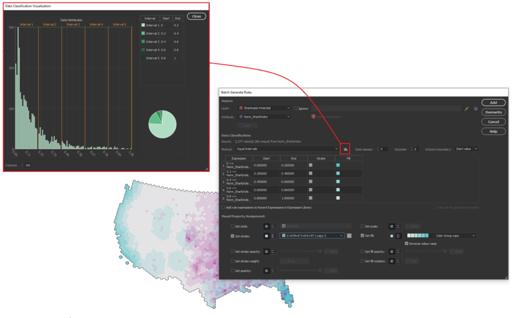
Stylize maps easily with MAP Themes
The final step is to stylize our map and create a layout. With MAP Themes, we can create rules-based stylesheets to easily stylize our map data in no time. MAPublisher comes with a great selection of built-in MAP Swatches, including several color brewer-based swatches that work great for choropleth-style maps like this. We used these swatches to create a custom, bi-variate swatch group to visualize each score of our “Sharknado Risk Index”. The MAP Themes tool also provided a neat data distribution viewer, which also allows us to inspect a histogram of our dataset. Although we used discrete categories for each of our risk scores, the data distribution viewer is very useful when working with continuous datasets since it allows you to see how your bin-widths will affect the display of colour on your choropleth.
The final touches
With stylization complete, Day 4 of the #30DayMapChallenge is almost in the bag. We can create a north arrow, and a scale bar and create a custom legend to facilitate easy interpretation. Since we are still within an Illustrator environment, we can use all the powerful native illustrator tools to add graphical design elements, text, and artwork to create a fun, infographic-style map. Although we were happy to call the map finished at this point, the great thing about making maps is there is also room to add more. For example, we might try using LabelPro to create custom labels that mark high and low-risk areas, or we could create insets to highlight specific regions of interest. The possibilities are endless!
We had a great time putting together this fun map for the #30DayMapChallenge, and we are excited to see what we can do for the remaining themes on the calendar! For those of you who are also making maps for the challenge, a reminder that the Avenza Map Competition is still accepting submissions. Share your map, compete with other map-makers in the community, and win some great prizes!
We are very excited to announce the release of MAPublisher 10.9, our latest version of the MAPublisher extension for Adobe Illustrator.
With MAPublisher 10.9, we are bringing forward full compatibility with Adobe Illustrator 2022, Windows 11, macOS 12, support for Vector GeoPackages and TopoJSON data formats, improvements to the Buffer Art tool, and several bug fixes.
Here’s what you can expect with the latest MAPublisher 10.9 release:
Compatibility with Adobe Illustrator 2022, Windows 11, and macOS 12
We want to ensure our users enjoy a truly seamless experience with the Adobe Illustrator workspace. Our team has worked to ensure that MAPublisher 10.9 is fully compatible with Adobe Illustrator 2022 that was announced at Adobe Max last week.
MAPublisher 10.9 is also fully compatible with the newly released Windows 11, as well as macOS 12 Monterey.
Import TopoJSON data
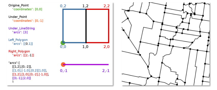
New to MAPublisher 10.9 is the ability to import TopoJSON type data formats directly into Adobe Illustrator. A TopoJSON is built off the GeoJSON data format in a way that encodes topology. Geometries in TopoJSON files are collected together from shared line segments called arcs. In this way, TopoJSON data formats can reduce redundancies and improve storage efficiency for spatial data.
Import and Export Vector GeoPackages
Many of our users have requested the ability to import and export vector GeoPackage data. We are happy to announce the full support of vector GeoPackages is now offered with MAPublisher 10.9. Vector GeoPackages are based on SQLite databases and offer an open-source, compact, lightweight, and flexible data format for easy and efficient storage or geoprocessing of spatial data.
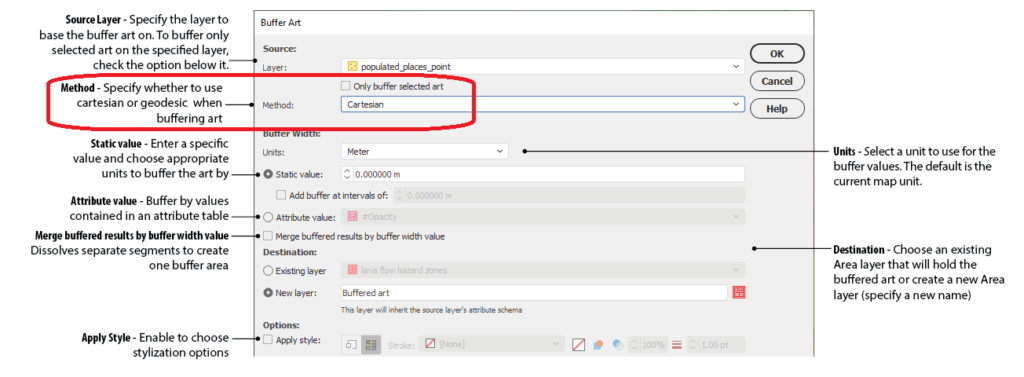
Geodesic Options for the Buffer Art Tool
Geodesic options are now available for the Buffer Art tool. This functionality will provide more accurate distance buffers for point data when working on features distant from lines of true scale. Find this option in the “method” section of the Buffer Art tool.
Default Data filters and Styles on import
MAPublisher 10.9 users can create unique data filters and style settings that can be automatically applied to newly imported data in MAPublisher.
Changes to Compatibility
Avenza announces that compatibility support is changing for its desktop mapping software. Starting with MAPublisher 10.9, both Windows 7 and Adobe CS6 will no longer be supported. Users will require a valid Adobe Creative Cloud subscription and a compatible operating system to utilize the improvements and enhancements offered in MAPublisher 10.9. For questions and more information on how these changes around compatibility may affect your organization, please contact our Support Centre.
MAPublisher 10.9 is immediately available today, free of charge to all current MAPublisher users with active maintenance subscriptions and as an upgrade for non-maintenance users.
Enter the Avenza Map Competition!
The Avenza Map Competition is live! Enter our map competition for a chance to showcase your favourite maps with the Avenza community and win prizes! The competition consists of two categories: “Open” and “Student”, with two sets of exciting prizes.Submit your Map today!