One of the most difficult steps in map design is choosing an appropriate colour scheme that helps the viewer to visualize data. The colour scheme should also contribute to the esthetic of the map. It can be a delicate balance. However, if you’ve worked in the realm of data visualization at any time during the past 20 years, whether it’s creating graphs, infographics or maps, there’s a good chance that you’ve used the ColorBrewer Color Advice tool to make colour selection easier.

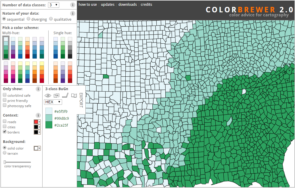
The ColorBrewer Color Advice tool was created in 2001 by Cynthia Brewer, an American professor of Geography. The tool was updated in 2013 by Brewer and contributors from Penn State University and Axis Maps. It’s an online tool for cartographers that suggests various colour schemes and previews what a map using those colours might look like. Change up the colour schemes to see how easy it is to distinguish the colours from one another on a map. The tool also makes it easier to see how outlier colours stand out against the rest of the colour scheme.
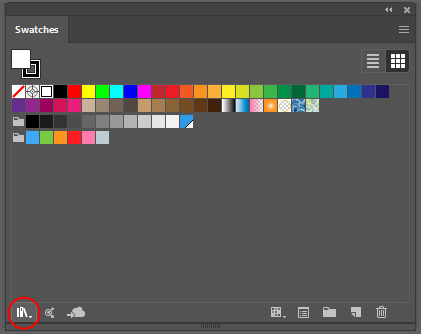
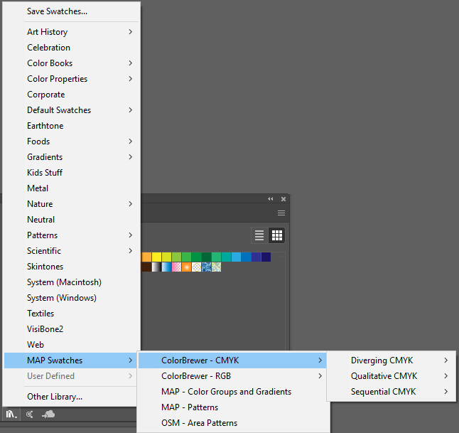
Since the ColorBrewer Color Advice tool is so useful for cartographers, we made it easily accessible in MAPublisher so that you can experiment with colour schemes while styling your maps in Adobe Illustrator. All the color ramps are available directly from the Illustrator Swatch Library. To access the colour ramps, go to the Swatches panel, then Swatch Library > MAP Swatches > ColorBrewer RBG or ColorBrewer CMYK.


Check out the ColorBrewer colour ramps next time you’re styling a map in Adobe Illustrator, using the MAPublisher plug-in, and see what a difference the right colour scheme can make to the readability and esthetic of your map!


