


It seems we can’t find what you’re looking for. Perhaps searching can help.
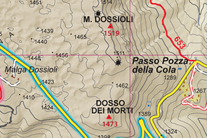
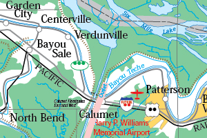
The Cartographic Standard
Create maps with geospatial mapping tools in Adobe® Creative Cloud®

Powerful cartography and GIS
software for Adobe Illustrator®

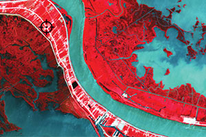
Spatial imaging tools for
Adobe Photoshop®

Intelligent, collision-free
labeling add-on for MAPublisher